


Sara Soueidan PRO
Lebanese Inclusive web UI engineer, author, speaker, and educator.
Fronteers, Amsterdam, October 10th, 2014
Animating SVGs
*We won't be covering JS in this talk
<svg xmlns="http://www.w3.org/2000/svg" version="1.1" width="300px" height="300px" viewBox="0 0 300 300">
<polygon
fill = "#FF931E"
stroke = "#ED1C24"
stroke-width = "5"
points = "279.1,160.8 195.2,193.3 174.4,280.8 117.6,211.1 27.9,218.3 76.7,142.7 42.1,59.6 129.1,82.7 197.4,24.1 202.3,114 "/>
</svg>
star.svg
Shared with CSS |
SVG-Only |
|---|---|
|
|
clip-rule, flood-color, flood-opacity, stop-opacity, kerning, tech-anchor, color-profile, color-rendering, fill, fill-opacity, fill-rule, marker, marker-end, marker-mid, marker-start, stroke, stroke-width, stop-color, lighting-color, enable-background, dominant-baseline, color-interpolation-filters, color-interpolation, glyph-orientation-horizontal, glyph-orientation-vertical, shape-rendering, baseline-shift, alignment-baseline, stroke-miterlimit, stroke-linejoin, stroke-linecap, stroke-dashoffset, stroke-dasharray, stroke-opacity |
In SVG2, more presentation attributes will be added.
<svg xmlns="http://www.w3.org/2000/svg" version="1.1" style="width: 300px; height: 300px;" viewBox="0 0 300 300">
<polygon
style="fill: #FF931E; stroke: #ED1C24; stroke-width: 5;"
points = "279.1,160.8 195.2,193.3 174.4,280.8 117.6,211.1 27.9,218.3 76.7,142.7 42.1,59.6 129.1,82.7 197.4,24.1 202.3,114 "/>
</svg>
star.svg
<svg xmlns="http://www.w3.org/2000/svg" version="1.1" width="300px" height="300px" viewBox="0 0 300 300">
<style type="text/css">
polygon { fill: ... ;}
</style>
<polygon points = "279.1,160.8 195.2,193.3 174.4,280.8 117.6,211.1 27.9,218.3 76.7,142.7 42.1,59.6 129.1,82.7 197.4,24.1 202.3,114 "/>
</svg>
star.svg
<!DOCTYPE html> <html><head>...</head>
<body>
<style type="text/css">
svg { width: ...; }
polygon { fill: ... ; }
</style>
<svg version="1.1" viewBox="0 0 300 300">
<!--SVG content-->
</svg>
</body>
</html>
star.svg
<?xml version="1.0" standalone="no"?>
<?xml-stylesheet type="text/css" href="styles.css"?>
<svg xmlns="http://www.w3.org/2000/svg" version="1.1" width="300px" height="300px" viewBox="0 0 300 300">
<!-- SVG Content -->
</svg>
star.svg
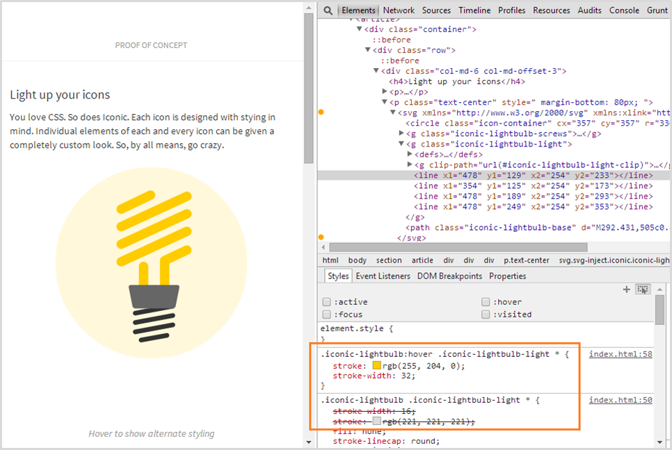
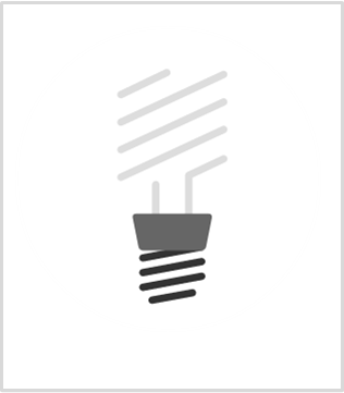
Example: Iconic
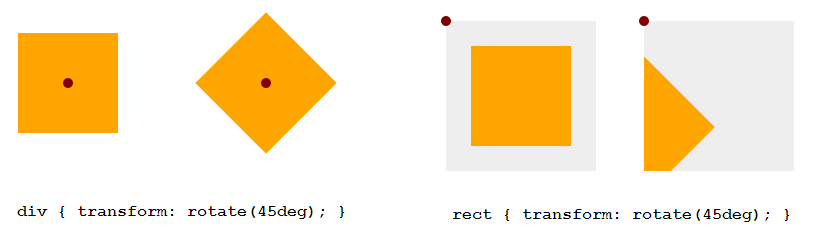
transform-origin (default value)
HTML Elements (div, ::before, etc.)
SVG Elements (circle, rect, etc.)
50% 50%
(the center of the element itself, calculated relative to its box model)
0 0
(top left corner of the SVG canvas, not of the element itself)
Example: 45deg Rotation
<!DOCTYPE html>
<div style="width: 100px; height: 100px; background-color: orange"> </div>
<svg style="width: 150px; height: 150px; background-color: #eee">
<rect width="100" height="100" x="25" y="25" fill="orange" />
</svg>
Example
<!DOCTYPE html><style>
div, rect { transform-origin: 50% 50%; }
</style>
Setting transform-origin in percentages does not work as expected. Use absolute values instead.
Example Animations Demo
.wheel {

        -webkit-transform-origin: 50% 50%;

        transform-origin: 193px 164px;

        animation:  spin 4s cubic-bezier(.49,.05,.32,1.04) infinite alternate;

}

@keyframes spin {

   50% {

      transform: rotate(360deg);

   }

}
* The future: http://dev.w3.org/fxtf/motion-1/
Embedding Technique
CSS Animations
<img src="mySVG.svg" alt=".." />
CSS Interactions
Yes, only if inside <svg>
No
.el {background: url(mySVG.svg);}
No
Yes, only if inside <svg>
<object type="image/svg+xml" data="mySVG.svg"><!--fallback--></object>
Yes, only if inside <svg>
Yes, only if inside <svg>
<embed type="image/svg+xml" src="mySVG.svg" />
Yes, only if inside <svg>
Yes, only if inside <svg>
<iframe src="mySVG.svg"><!--fallback--></iframe>
Yes, only if inside <svg>
Yes, only if inside <svg>
<svg><!--SVG content--></svg>
Yes
Yes
What
Why
Current Browser Support
SVG SMIL animations work in all browsers except IE and Opera Mini
<animate>
Used to animate scalar attributes and properties over a period of time.
<animateTransform>
Used to animate one of SVG's transformation attributes over time, such as the transform attribute.
<animateMotion>
Used to animate/move an element along a motion path.
<set>
Used to assign animation values to non-numeric attributes and properties (e.g visibility).
<animate id="myAnim"
         attributeName=" "
         from=" "
         to=" "
         ...
/>
id
*You don't need to specify an animation name for the animation to work.
<animate xlink:href="#myElement"
         id="myAnim"
         attributeName=" "
         from=" "
         to=" "
         ...
/>
xlink:href
*The target element must be part of the current SVG document fragment.
Nesting the animation element inside the target
<circle cx="50" cy="50" r="20">
    <animate
         attributeName=" "
         from=" "
         to=" "
         ... />
</circle>
<animate xlink:href="#myCircle"
         id="myAnim"
         attributeName="cx"
         attributeType="XML"
         from=" "
         to=" "
         ...
/>
attributeName & attributeType
*Only one attribute name can be specified per animation element.
<animate id="move" link:href="#myCircle"
         attributeName="cx" attributeType="XML"
         from="50"
         to="450"
         dur="10s"
         fill="freeze"
/>
animation-name: move;
animation-duration: 5s;
animation-fill-mode: forwards;
@keyframes move {
    from {/* ... */}
    to { /* ... */ }
}
<animate id="move" xlink:href="#myCircle"
         attributeName="cx" attributeType="XML"
         from="50" to="450"
         dur="3s" fill="freeze"
         repeatCount="indefinite"
         repeatDur="00:30"
/>
animation-name: move;
animation-duration: 5s;
animation-fill-mode: forwards;
animation-iteration-count: infinite;
@keyframes move {
    from {/* ... */}
    to { /* ... */ }
}
<animate xlink:href="#myCircle"
         attributeName="cx" attributeType="XML"
         from="50" to="450"
         dur="1s"
         fill="freeze"
         begin="click"
         restart="whenNotActive"
/>
Examples of values
begin
click
focus
click + 2s
click + 01:30
click + 01:05:33
1s
15min
indefinite (relies on JS)
otherAnim.begin
otherAnim.begin + 1s
otherAnim.end - 1min
otherAnim.repeat(1)
otherAnim.repeat(1) + 5s
<circle id="orange-circle" r="30" cx="50" cy="50" fill="orange" />
<rect id="blue-rectangle" width="50" height="50" x="25" y="200" fill="#0099cc"></rect>
<animate xlink:href="#orange-circle" attributeName="cx" from="50"

to="450" dur="5s" fill="freeze" begin="click" id="move"/>
<animate xlink:href="#orange-circle" attributeName="fill" from="orange"

to="#0099aa" dur="2s" repeatcount="indefinite" fill="freeze"

begin="0s" end="move.begin" id="circ-color-anim"/>
<animate xlink:href="#blue-rectangle" attributeName="x" from="50"

to="425" dur="5s" fill="freeze" begin="move.begin + 1s" id="rect-anim"/>
Example
The CSS Animations Way
@keyframes bounce {
    0% {
        top: 0;
        animation-timing-function: ease-in;
    }
    15% {
        top: 200px;
        animation-timing-function: ease-out;
    }
    30% {
        top: 70px;
        animation-timing-function: ease-in;
    }

    /*...other keyframes...*/

    90% {
        top: 170px;
        animation-timing-function: ease-in;
    }
    100% {
        top: 200px;
        animation-timing-function: ease-out;
    }
}
<animate
    id="bounce"
    xlink:href="#orange-circle"
    attributeName="cy"
    from="50"
    to="250"
    dur="3s"
    begin="click"
    fill="freeze"
    values="50; 250; 120;250; 170; 250; 210; 250"

    keyTimes="0; 0.15; 0.3; 0.45; 0.6;
              0.75; 0.9; 1"

    keySplines=".42 0 1 1;
                 0 0 .59 1;
                 .42 0 1 1;
                 0 0 .59 1;
                 .42 0 1 1;
                 0 0 .59 1;
                 .42 0 1 1;
                 0 0 .59 1;"
    calcMode="spline"
/>
The SMIL Animations Way
Notes
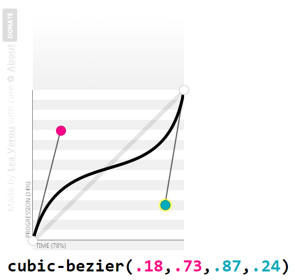
keySplines control points: visual representation
Shape Tweening
<path fill="#1EB287">

    <animate

             attributeName="d"

             dur="1440ms"

             repeatCount="indefinite"

             keyTimes="0; .0625; .208333333; .3125; .395833333; .645833333; .833333333; 1;"

             calcMode="spline"

             keySplines="0,0,1,1; .42,0,.58,1; .42,0,1,1; 0,0,.58,1; .42,0,.58,1; .42,0,.58,1; .42,0,.58,1"

             values="M 0,0

                     C 50,0 50,0 100,0

                     100,50 100,50 100,100

                     50,100 50,100 0,100

                     0,50 0,50 0,0

                     Z;


                     M 0,0

                     C 50,0 50,0 100,0

                     100,50 100,50 100,100

                     50,100 50,100 0,100

                     0,50 0,50 0,0

                     Z;


                     M 50,0

                     C 75,25 75,25 100,50

                     75,75 75,75 50,100

                     25,75 25,75 0,50

                     25,25 25,25 50,0

                     Z;
                     ... "


    />


  </path>
<animateTransform
           xlink:href="#deepPink-rectangle"
           attributeName="transform"
           attributeType="XML"
           type="rotate"
           from="0 75 75"
           to="360 75 75"
           dur="2s"
           begin="0s"
           repeatCount="indefinite"
           fill="freeze"
/>
<set
   xlink:href="#deepPink-rectangle"
   attributeName="fill"
   to="#0099AA"
   begin="click"
   dur="3s"
/>
Specifying a motion path
<animateMotion
           xlink:href="#circle"
           dur="1s"
           begin="click"
           fill="freeze"
           path="M0,0c3.2-3.4,18.4-0.6,23.4-0.6c5.7,0.1,10.8,0.9,16.3,2.3    c13.5,3.5,26.1,9.6,38.5,16.2c12.3,6.5,21.3,16.8,31.9,25.4c10.8,8.7,21,18.3,31.7,26.9c9.3,7.4,20.9,11.5,31.4,16.7
    c13.7,6.8,26.8,9.7,41.8,9c21.4-1,40.8-3.7,61.3-10.4c10.9-3.5,18.9-11.3,28.5-17.8c5.4-3.7,10.4-6.7,14.8-11.5
    c1.9-2.1,3.7-5.5,6.5-6.5"
/>
OR
<animateMotion xlink:href="#circle" dur="1s" begin="click" fill="freeze">
    <mpath xlink:href="#motionPath" />
</animateMotion>
1
2
<path id="motionPath" d="..." />1
2
Setting the orientation
without changing orientation
<animateMotion
    xlink:href="#car"
    dur="3s"
    begin="0s"
    fill="freeze"
    repeatCount="indefinite"
    rotate="auto">
   <mpath xlink:href="#motionPath" />
</animateMotion>
<animateMotion
    xlink:href="#car"
    dur="3s"
    begin="0s"
    fill="freeze"
    repeatCount="indefinite"
    rotate="auto-reverse">
   <mpath xlink:href="#motionPath" />
</animateMotion>
Setting the orientation
flipping the car with transforms
Laying text along a path
<path id="myPath" fill="none" stroke="#000000" stroke-miterlimit="10" d="M91.4,104.2c3.2-3.4,18.4-0.6,23.4-0.6c5.7,0.1,10.8,0.9,16.3,..."/>
<text>
    <textpath xlink:href="#myPath">
      Text laid out along a path.
    </textpath>
</text>
Animating the text offset
<text>
    <textpath xlink:href="#myPath">
      Text laid out along a path.

      <animate attributeName="startOffset" from="0%" to ="100%" begin="0s" dur="5s" repeatCount="indefinite" keyTimes="0;1" calcMode="spline" keySplines="0.1 0.2 .22 1"/>
    </textpath>
</text>
(again)
Embedding Technique
SMIL Animations
<img src="mySVG.svg" alt=".." />
SMIL Interactions
Yes
No
.el {background: url(mySVG.svg);}
No
Yes
<object type="image/svg+xml" data="mySVG.svg"><!--fallback--></object>
Yes
Yes
<embed type="image/svg+xml" src="mySVG.svg" />
Yes
Yes
<iframe src="mySVG.svg"><!--fallback--></iframe>
Yes
Yes
<svg><!--SVG content--></svg>
Yes
Yes
By Sara Soueidan
Fronteers, October 2014, Amsterdam.


