


Schalk Venter
🔧 Front-end Development / 🎨 UI Design / 🌍 Social Good / ❤️ Destigmatising mental illness
" Since Web forms broker crucial interactions like checkout and registration, it shouldn’t come as a surprise that they can have a big impact on business goals. Increased completion rates of 10–40 percent were not uncommon in many of the form redesign projects I’ve been part of. [...] The number of customers purchasing went up by 45 percent. The extra purchases resulted in an extra $1.5 million the first month. For the first year, the site saw an additional $300,000,000."
Luke Wroblewski
Web Form Design (2008)
"Given the impact that form design can have on crucial metrics such as completion and error rates, it’s only natural to ask: How can we design good forms? Unfortunately, the right answer is a bit unsatisfying: It depends. [...] Most are presented as design patterns that outline how they can be applied—for example, if your goals are “x,” then a good solution may be “y.” Or similarly, if your constraints are “a,” then a worthwhile approach is “b.”"
Luke Wroblewski
Web Form Design (2008)
"Design patterns serve as guidance and solutions to people solving similar problems over and over. The reason for design patterns is twofold. [...] First, instead of solving the same problem from scratch every time, we can instead use previously designed, available, recognized, and well-researched solutions. [...] Second, by solving the same problem in the same way, users have a consistent and more coherent experience."
Adam Silver
Form Design Patterns (2018)
"The elements of this language are entities called patterns. Each pattern describes a problem that occurs over and over again in our environment, and then describes the core of the solution to that problem, in such a way that you can use this solution a million times over, without ever doing it the same way twice."
Christopher Alexander
A Pattern Language (1977)
"Users spend most of their time on other sites. This means that users prefer your site to work the same way as all the other sites they already know. [...] This Law is not even a future trend since it has been ruling the Web for several years. It has long been true that websites do more business the more standardized their design is. Think Yahoo and Amazon. Think "shopping cart" and the silly little icon. Think blue text links."
Jakob Nielsen
End of Web Design (2000)
"Web conventions survey may lead you to uncover common form organization structures that have emerged on the Web. For instance, mapping out what information is asked in ecommerce shopping cart forms reveals some interesting insights."
Luke Wroblewski
Web Form Design (2008)
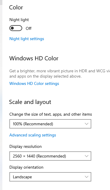
"Changing label alignments within the same form, however, should really be avoided since it can cloud the clear path to completion people seek."
Luke Wroblewski
Web Form Design (2008)
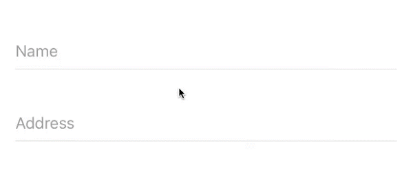
"The results of live site testing across several different geographies have also supported top-aligned labels as the quickest way to get people through forms. These studies also had higher completion rates (over 10 percent higher) than the left-aligned versions of forms they were tested against. Because of these quick completion times and high completion rates, some designers always recommend using top-aligned labels."
Luke Wroblewski
Web Form Design (2008)
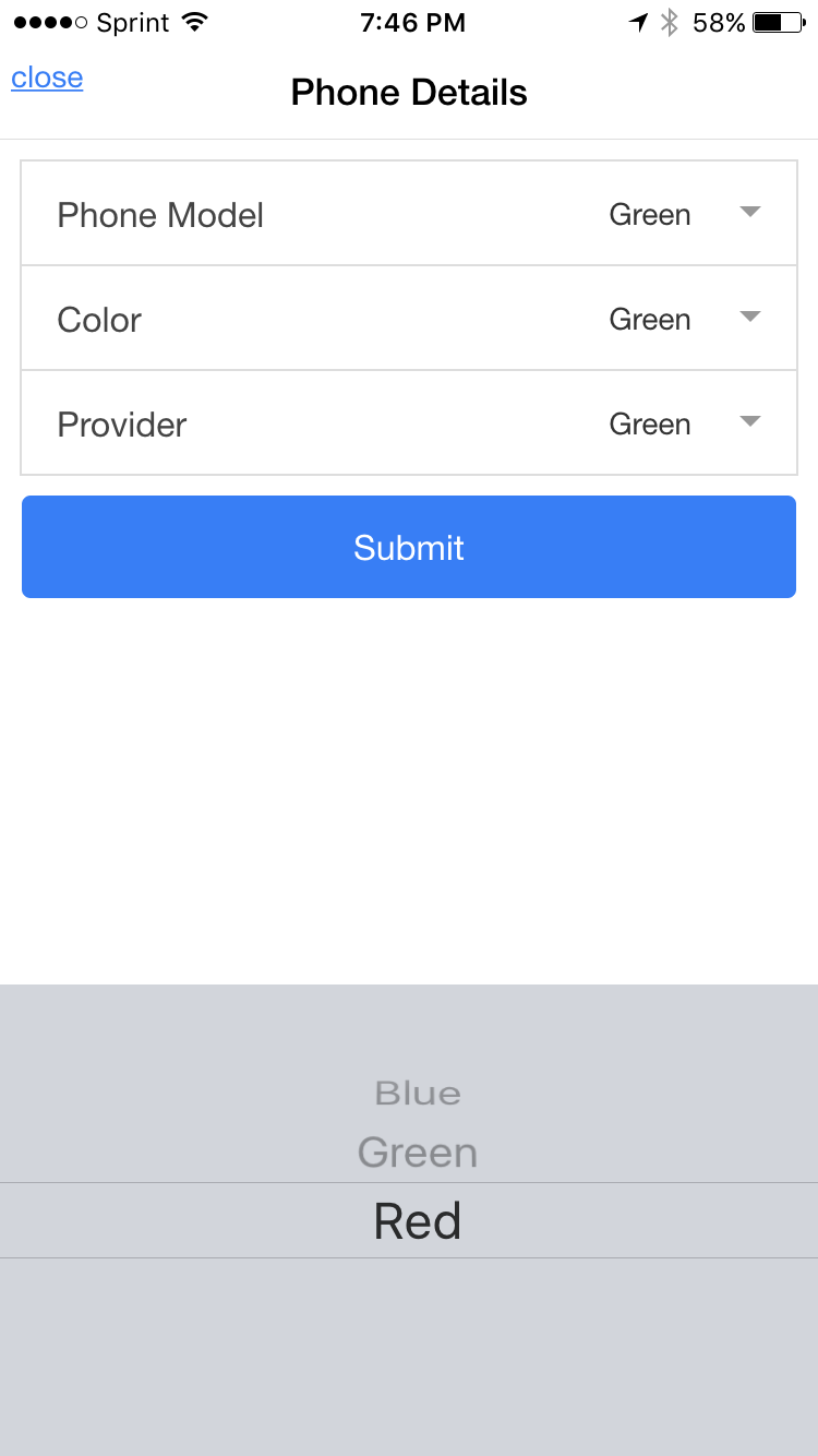
"In cases where screen real estate is at a premium, combining labels and input fields into a single user interface element may be appropriate. Most commonly, this requires placing input labels inside their corresponding input fields. [...] Make sure that you distinguish clearly between labels and data, especially when using labels within input fields."
Luke Wroblewski
Web Form Design (2008)
"Because labels within fields need to go away when people are entering their answer into an input field, the context for the answer is gone. So if you suddenly forget what question you're answering, tough luck—the label is nowhere to be found. As such, labels within inputs aren't a good solution for long or even medium-length forms. When you're done filling in the form, all the labels are gone!"
Luke Wroblewski
Web Form Design (2008)
"The float label pattern by Matt Smith is a technique that uses the label as a placeholder. The label starts inside the control, but floats above the control as the user types, hence the name."
Adam Silver
Form Design Patterns (2018)
"Seems like a lot of effort when you could simply put labels above inputs & get all the benefits/none of the issues."
Luke Wroblewski
Web Form Design (2008)
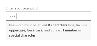
"The first problem is that sites don’t always refer to this field as the CVC number. Sometimes it’s referred to as a security code number or card verification value (CVV). Being specified as an acronym doesn’t help either. And to top it off, on the card the number is never accompanied by a description, making it hard to reconcile the requirements. To fix this, we should employ the hint text pattern to tell users exactly what it is and where to find it. For example: “This is the last three digits on the back of the card.”"
Adam Silver
Form Design Patterns (2018)
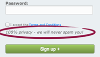
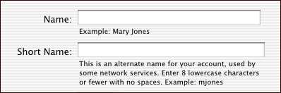
"Here, it’s because we can send users a receipt, which is particularly important if checking out anonymously. Additionally, the email may provide details about how to return the item, or cancel or change the order. We can tell users this transparently via the hint text. [...] Remember, the hint is not just for formatting rules: it’s for anything that will help users fill out the field. This transparency builds trust, reduces effort, and promotes the feature all at the same time."
Adam Silver
Form Design Patterns (2018)
"Tempting as it may be simply to spell out how people should fill in an input field, help text isn't the holy grail of Web form completion. For starters, if excessive instructions are required to explain how to complete your form, then chances are the questions you are asking are either phrased poorly, too complex, or just plain unnecessary. Excessive help text may be an indicator that it's time to go back to the drawing board and make sure the questions you are asking people are the right ones"
Luke Wroblewski
Web Form Design (2008)
"One of the most challenging aspects of designing great forms is determining the most appropriate input controls. Because there is always more than one way to express a particular interaction or request a particular type of data [...] It is typical for the design team to struggle with trade-offs that pit click-efficiency against error prevention, learn-ability against efficiency, majority case against corner case, and flexibility against clarity."
Luke Wroblewski
Web Form Design (2008)
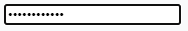
"This way users can choose to reveal their password when they know nobody is looking, reducing the risk of typos. [...] The password reveal interface we constructed above toggles the button’s label between “Show password” and “Hide password."
Adam Silver
Form Design Patterns (2018)
"Said another way, if this input field is long but my answer is short, have I misunderstood the question? Best not to make people think too much and instead use a consistent length for all the fields that don’t benefit from clear affordances. [...] Where possible, ensure that field lengths provide meaningful affordances that help people answer questions effectively. Otherwise, utilize a consistent length that provides enough room for correct answers."
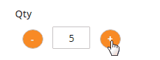
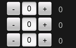
Luke Wroblewski
Web Form Design (2008)
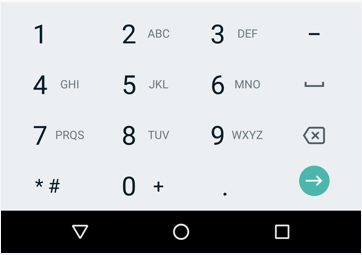
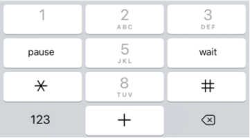
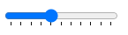
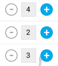
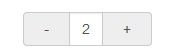
"Number inputs have little spinner buttons (also called steppers), which let users increase or decrease the input’s value by a constant amount. [...] When testing mobile flight booking forms, we found people preferred steppers for selecting the number of passengers. [...] The only downside is that the browser-provided spinners are tiny, which make them difficult to use. And some browsers don’t show them at all. We can solve this problem by creating our own custom stepper component."
Adam Silver
Form Design Patterns (2018)
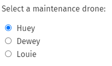
"Radio buttons were named after the physical buttons used on older radios to select preset stations – when one of the buttons was pressed, other buttons would pop out, leaving the pressed button the only button in the pushed in position."
Wikipedia
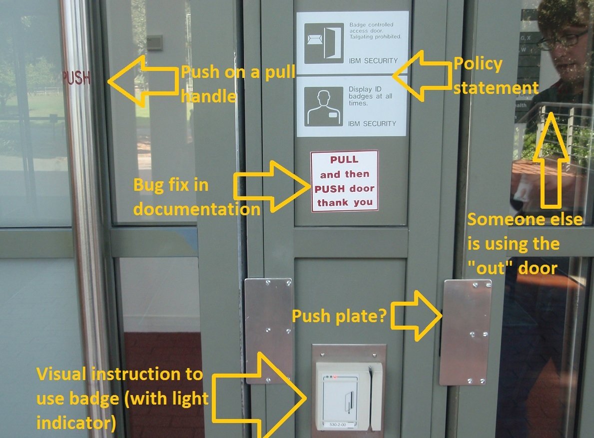
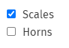
“Interactive things have perceived affordances; the way they look tells us what they do and how to use them. That’s why checkboxes are square and radio buttons are round. Their appearance isn’t just for show — it signals what to expect from them. Making a checkbox round is like labeling the Push side of a door Pull."
Daniel de Laney
Checkboxes are Never Round (2015)
"The problem with radio buttons is that they’re less suitable when there are many options. An airline could fly to hundreds of destinations, making the page long and hard to scan. This in turn means users have to scroll a lot more."
Adam Silver
Form Design Patterns (2018)
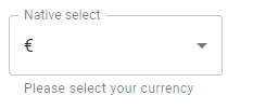
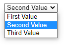
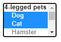
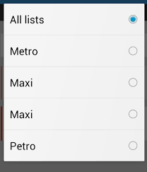
"List boxes can act as a set of radio buttons (allowing people to select exactly one choice from a set of mutually exclusive options) or as a set of checkboxes (allowing people to select any number of choices from a list of options). [...] Despite these advantages, the dual nature of list boxes (mutually exclusive single selection or multiple selection) tends to cause problems for many people. As a result, list boxes are rarely used in Web forms."
Luke Wroblewski
Web Form Design (2008)
"In his article, Miller discussed a coincidence between the limits of one-dimensional absolute judgment and the limits of short-term memory. In a one-dimensional absolute-judgment task, a person is presented with a number of stimuli that vary on one dimension (e.g., 10 different tones varying only in pitch) and responds to each stimulus with a corresponding response (learned before). Performance is nearly perfect up to five or six different stimuli but declines as the number of different stimuli is increased."
Wikipedia
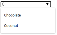
"Users need a control that lets them filter a long list of destinations. A control that marries the flexibility of a text box with the assurance of a select box. This type of control goes by many different names, including: type ahead, predictive search, and combo box [...] Autocomplete controls work by filtering options (destinations in this case) as the user types. As suggestions appear, users can select one quickly, automatically completing the field. This saves users having to scroll (unless they want to), while also being able to forgive small typos."
Adam Silver
Form Design Patterns (2018)
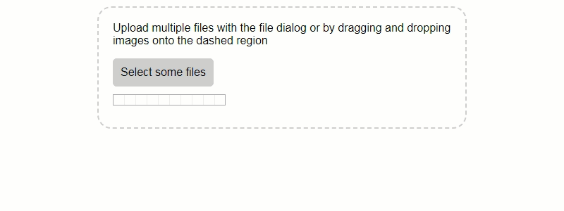
"On one hand, uploading a file is only marginally more complex than, say, inputting text or clicking a checkbox. On the other hand, there are number of unique design challenges and opportunities that arise, especially when there’s a need to upload multiple files at the same time"
Adam Silver
Form Design Patterns (2018)
"A file picker is another type of form control. When clicked, it will spawn a dialog that lets users browse files on their computer or device. Once a file is selected, the dialog closes and the picker updates to reflect the file has been chosen."
Adam Silver
Form Design Patterns (2018)
"If all users need to do is upload a single file, then you can add a file picker to your form, and you’re pretty much done [...] That would be it, if you ignored two significant problems. First, users can only select files within a single folder. If they need to upload files from different folders, they can’t. Of course, users could move all the files into a single folder beforehand but this puts the onus on the user."
Adam Silver
Form Design Patterns (2018)
"Second, not all browsers support the multiple attribute. And when support is lacking, a single file input may be found wanting. For example, take a form which asks users to submit receipts. When the multiple attribute is supported, users can upload all the relevant receipts and submit them. Without support, users can only upload a single receipt."
Adam Silver
Form Design Patterns (2018)
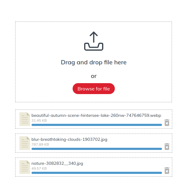
"Next, we want to show users when a file has been successfully uploaded. First, the file name is converted into a link so users can download and verify the file if they wish. Second, we inject a success message of “File uploaded” and a Remove button, which is useful if the file was uploaded by mistake."
Adam Silver
Form Design Patterns (2018)
"Generally speaking, there are two ways to communicate to users about uploading files. The first is to use “Attach,” but this seems best suited for email. In almost every other situation “Upload” seems more common, which is what we used for our generic drag-and-drop upload form earlier."
Adam Silver
Form Design Patterns (2018)
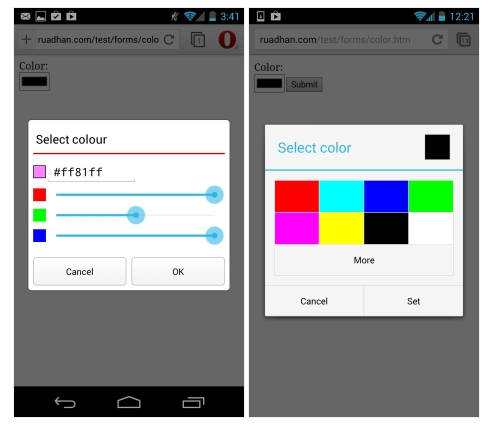
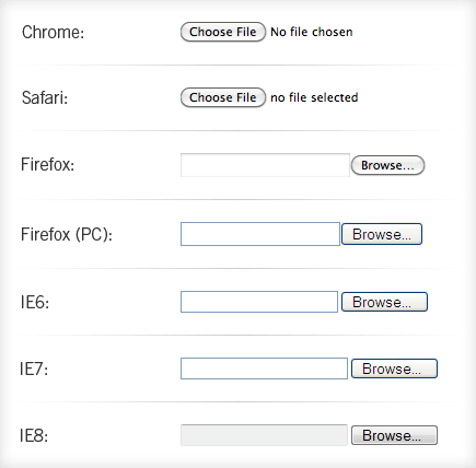
"Styling file pickers has always been tricky because browsers ignore any attempt at doing so with CSS. We have to resort to hacking, which is not usually a good idea — that’s why it’s called hacking. But let’s walk through how it could work, what can be achieved, and the pitfalls that are involved."
Adam Silver
Form Design Patterns (2018)
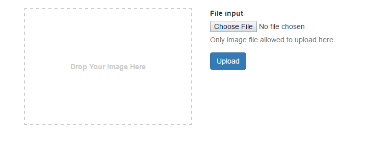
"It’s also worth noting that a drag-and-drop enhancement is just that — an enhancement. It should be used in conjunction with a standard file picker. First, because users can’t actually drag and drop files on mobile, for example. Second, users with dexterity problems, such as tremors, may have difficulty dragging a file. [...] It’s conventionally styled with a dashed border. [...] When the user is dragging files over the drop zone, they should be given feedback so they know that the files can be dropped."
Adam Silver
Form Design Patterns (2018)
"To truly master form construction on the Web, you’ll need to get past all of that. You’ll need to embrace the eccentricities of form controls, and maybe even be a little Zen-like about the strange characteristics they exhibit. After all, it’s not their fault—they’re just rendered that way. [...] Just be sure to keep in mind that form controls render quite differently across different browsers and operating systems, so don’t spend too much time trying to achieve pixel-perfection."
Luke Wroblewski
Web Form Design (2008)
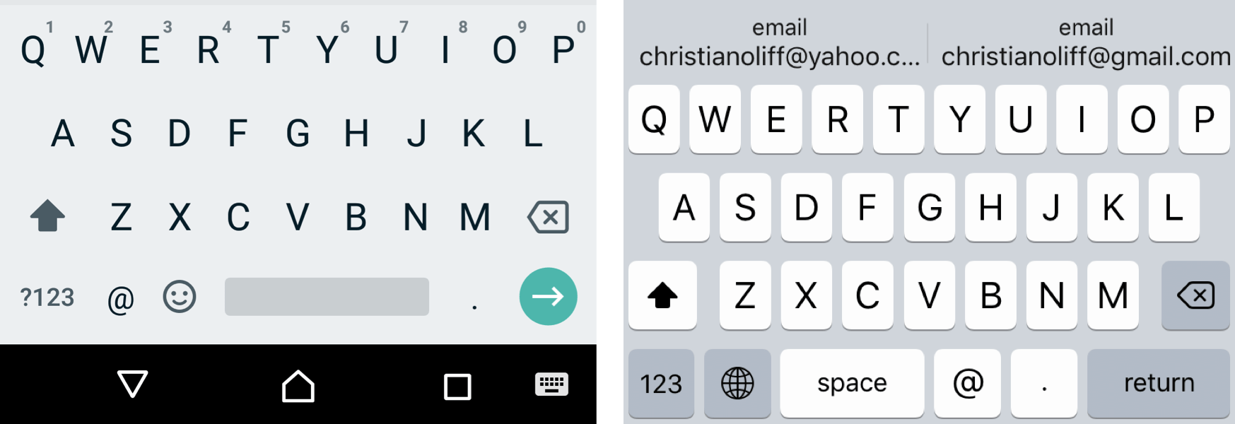
"For example, some browsers don’t understand <input type="email">. That’s fine, though, because users will get a text box (<input type="text">) instead. Users can still enter an email address; they just don’t get an email-specific keyboard on mobile."
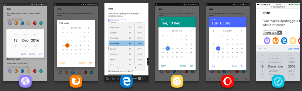
Adam Silver
Form Design Patterns (2018)
"Depending on your situation, this level of support may be fine. Perhaps entering a date is of low priority, or happens too infrequently to worry about. Or perhaps none of your users will ever use an unsupported browser. But finding a date is integral to the flight booking experience. We ought to provide a better experience for people using an unsupported browser."
Adam Silver
Form Design Patterns (2018)
"Powerful design comes from the reuse of a small number of simple patterns. This is the essence of the power that a grid provides for visual designers. For example, grids with sweeping horizontal and vertical lines help designers place new elements on the page, while considering their relationship to the whole. Similarly, interaction designers have begun using consistent interaction patterns to simplify design decisions and provide global consistency.[1] So what patterns of structure underlie a form?"
Luke Wroblewski
Web Form Design (2008)
"A Group is two or more inputs with some kind of relationship. Three of the most frequent types of Group inputs are Compound inputs, Related inputs, and Parent/Child inputs. These input types are important because they are each suited to different types of problems, and they handle errors and dependencies differently."
Luke Wroblewski
Web Form Design (2008)
"According to a survey conducted by Yankelovich Partners, a majority of people want more control over the details of their lives, but a majority of people also want to simplify their lives. There you have it—the paradox of our times."
Barry Schwartz
The Paradox of Choice (2008)
"Progressive disclosure is an interaction design pattern often used for making applications easier to learn and less error-prone. It does that by deferring some advanced or rarely used features to a secondary screen. The classic example of this pattern in action is from the print dialog box in the Mac OS. When you command the system to print a page, only a small subset of choices are exhibited in the dialog box, and if the user wants more advanced options, they can click on the "Show Details" button and reveal these features in a secondary screen."
Wikipedia
"Inline additions provide additional input fields to the people that need them without getting in the way of people that don’t. These input fields are often thought of as advanced or additional options, but they don’t have to be any more complicated than a normal set of choices presented in the form by default. "
Luke Wroblewski
Web Form Design (2008)
"Page jumping pushes existing content down the form and can sometimes disrupt people’s awareness of their position on the page. As a result, it’s always a good idea to try and minimize the amount of page jumping within a form. When using inline additions that expose additional input fields below an action, try to avoid very large sets of input fields that will push the content on a Web page down substantially"
Luke Wroblewski
Web Form Design (2008)
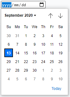
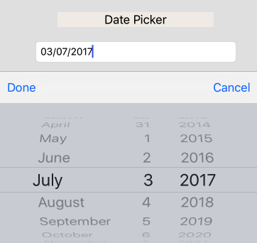
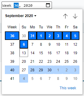
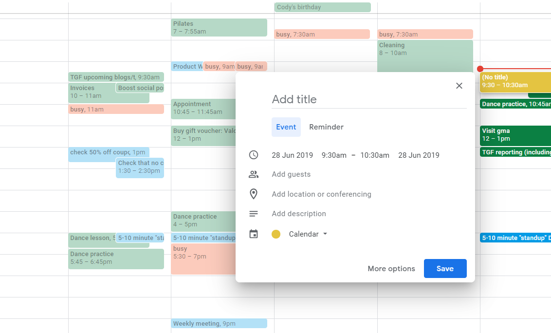
"Another way to display additional options is to use an overlay: a set of additional input fields that sits on top of a form like a dialog window on your computer’s desktop. Perhaps the most common example of these is the calendar widget that allows people to select specific dates as answers to questions posed by a form."
Luke Wroblewski
Web Form Design (2008)
By Schalk Venter
Text-fields, checkboxes, dropdowns, oh my!


