Learn to Make a Website
with CodeCademy

Lesson 9: Shadows + Buttons
Instruction Overview
Understand
- The box-shadow effects with CSS cards
- How a link can be turned into a button
Apply
- Retrieve the card project from the last class and finalize the design using box shadow
- Use CSS to turn the link into a button
Create
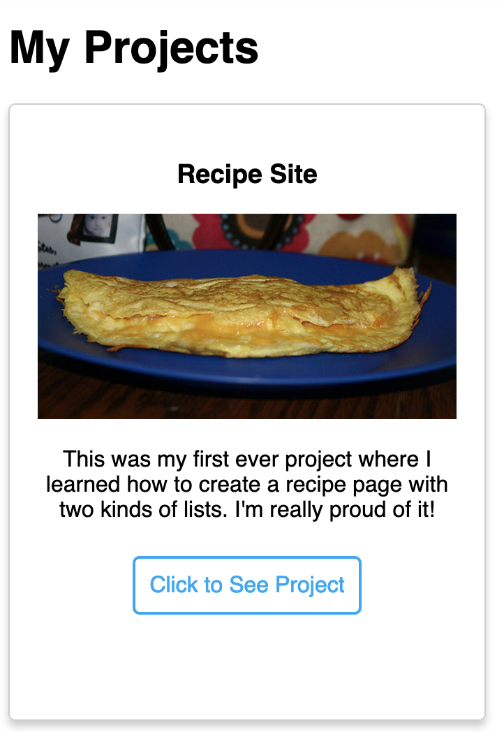
- Develop a HTML/CSS portfolio card that "floats" above the screen and has a button to lead to the project
Solution: https://codepen.io/scholarstem/pen/aMzdNz
For the instructor's eyes only
Class goals
☐Add a box-shadow to the card
☐Convert link into a pretty button
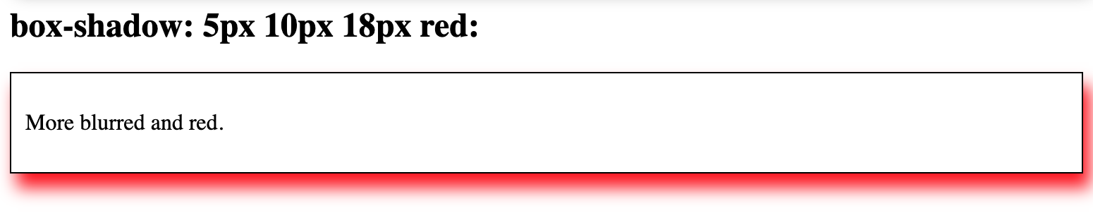
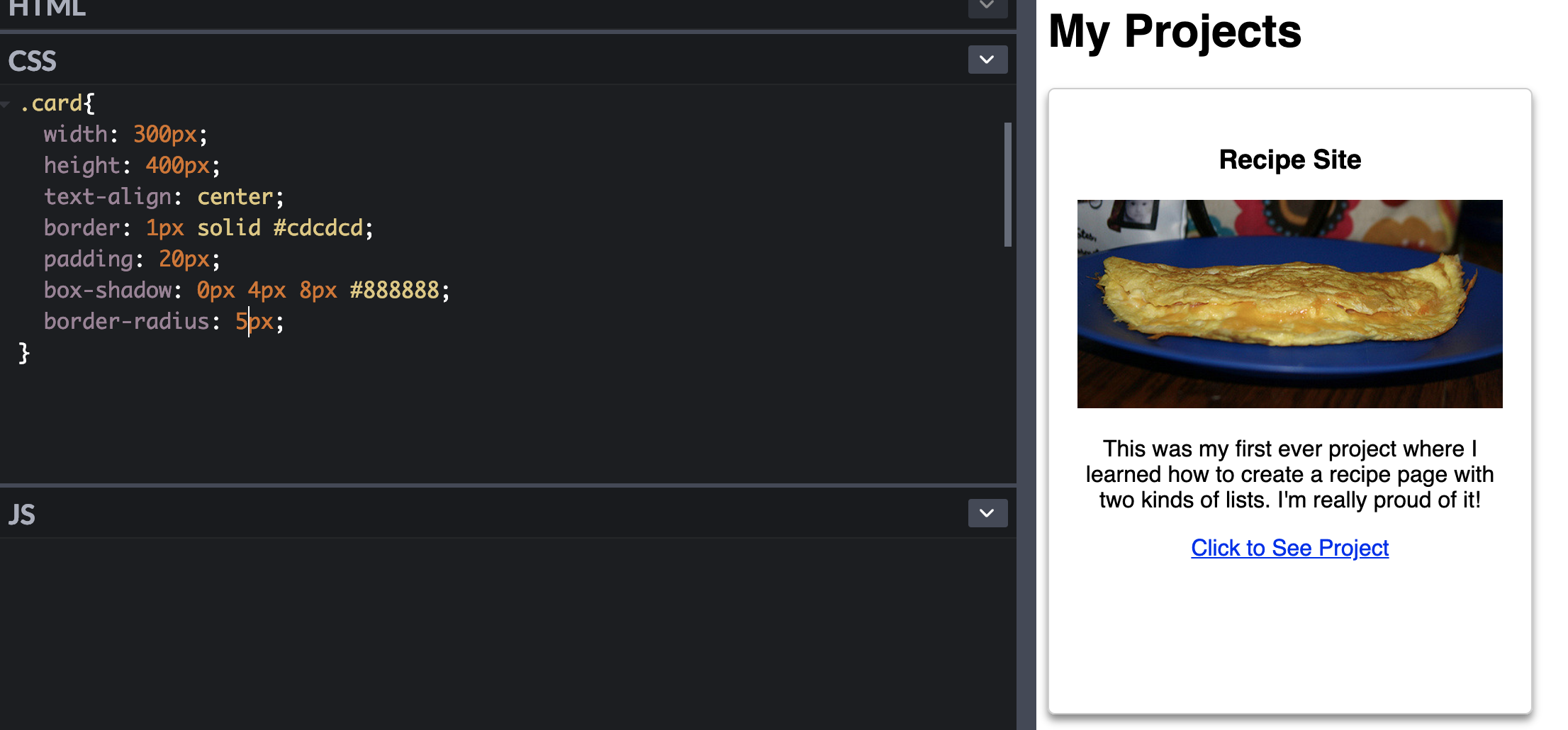
How does a box-shadow work?
Let's see how we can make our cards pop out of the screen!
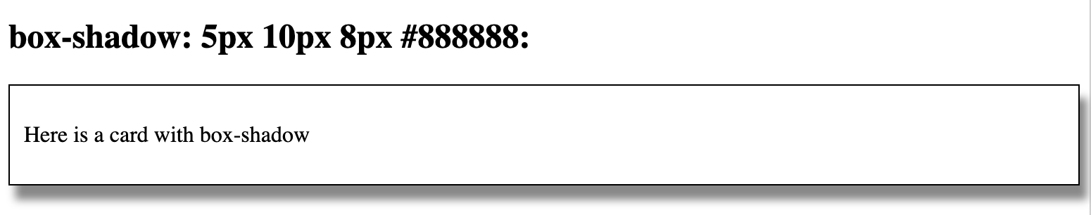
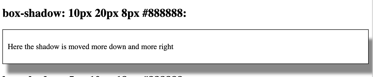
These values move the shadow down and to the right
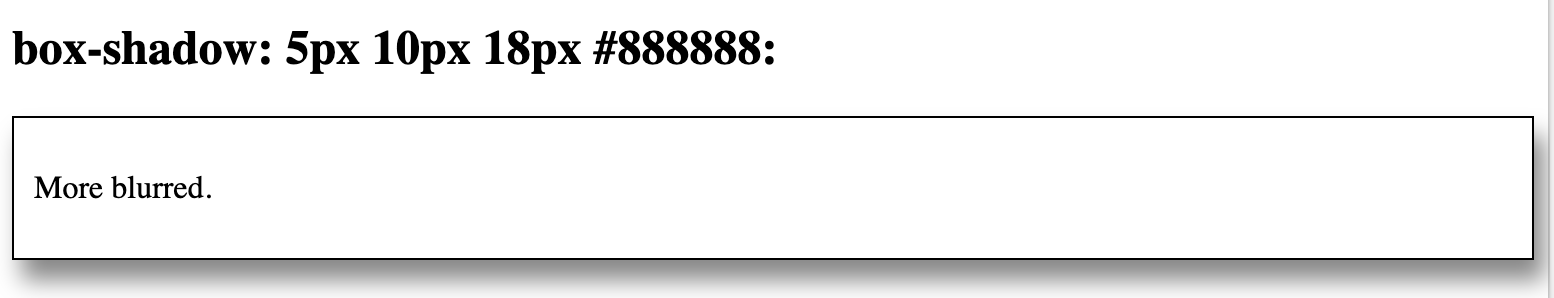
This value indicates the blur
This value indicates the color
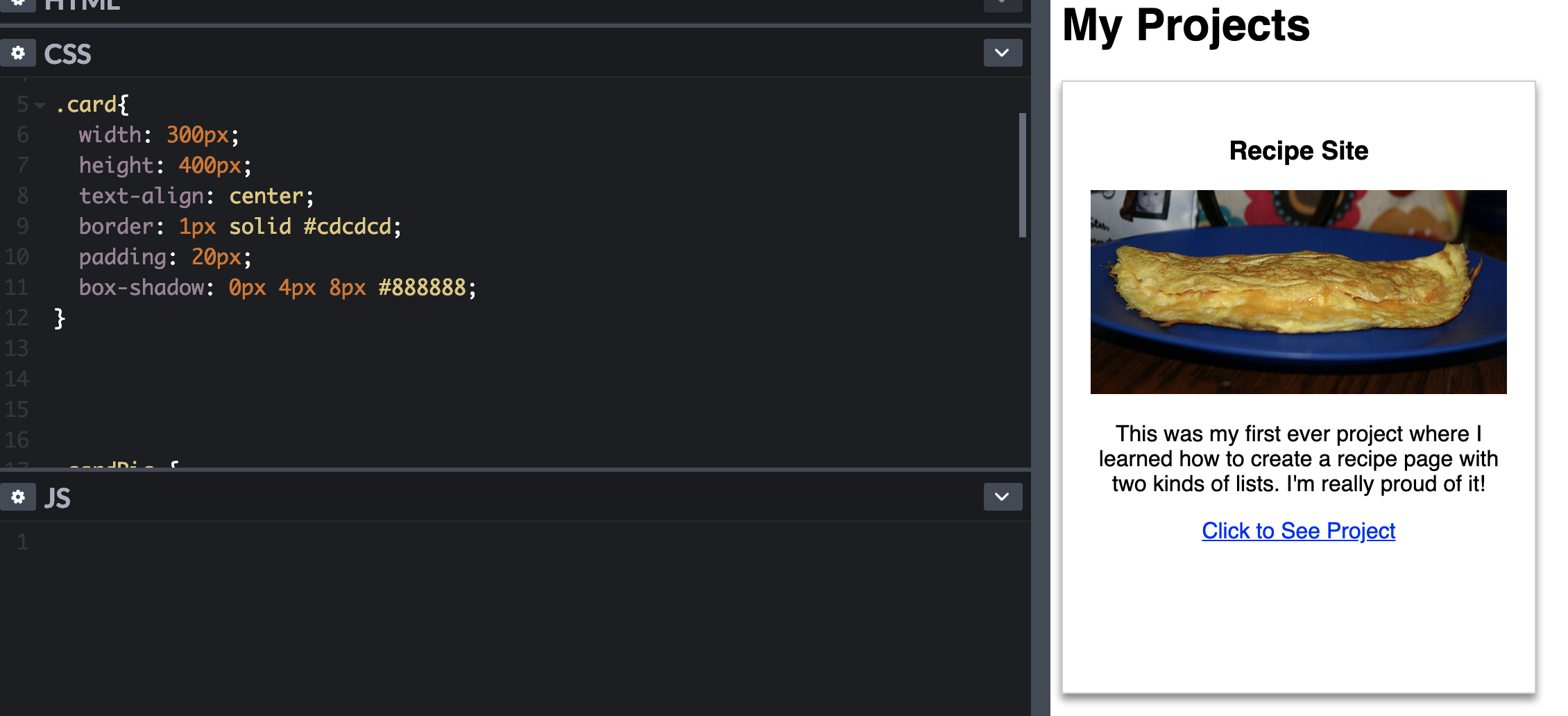
Let's open up CodePen
Head over to www.codepen.io and open the project card page from last time
Task
☐Add a box-shadow to your card (try out different options!)
8 min
Class goals
☑Add a box-shadow to the card
☐Convert link into a pretty button
We can make the card's corners more rounded
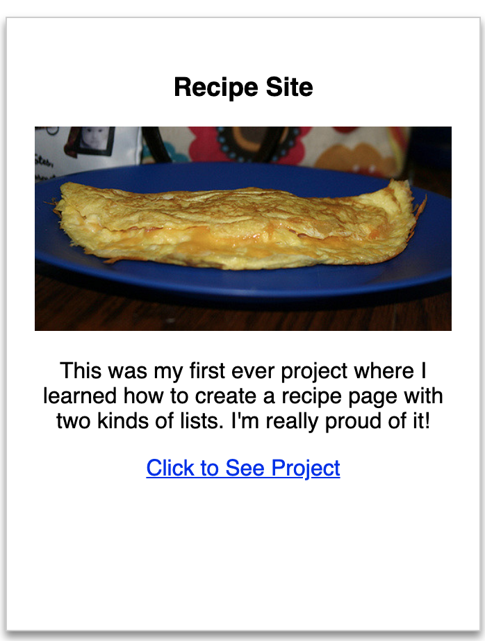
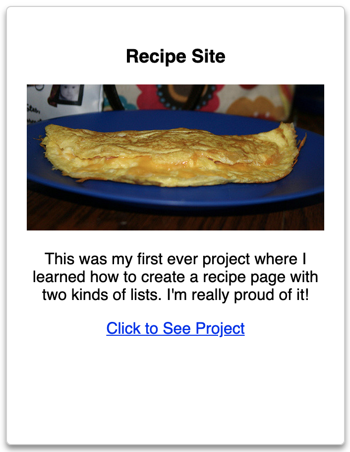
It's as simple as adding a border-radius
Task
☐Add a border-radius to your card
5 min
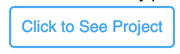
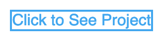
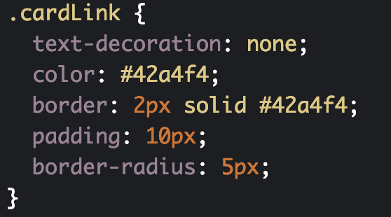
Let's turn our ugly link into a pretty button
We can do it all with CSS!
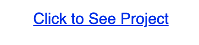
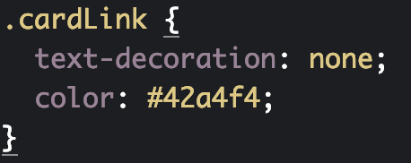
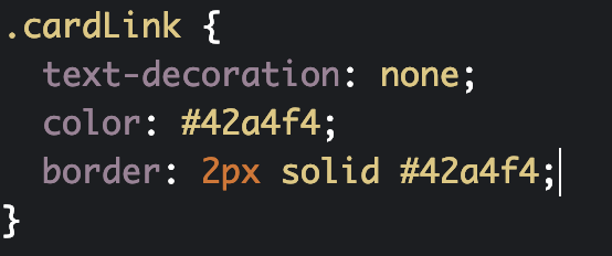
First, let's get rid of the underline and change the color

Next, we can add a border around the button
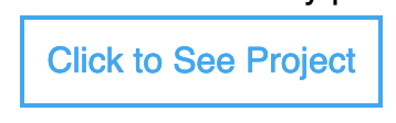
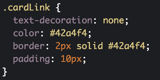
Let the button breathe with some padding
Finally, round the corners with border-radius
Class goals
☑Add a box-shadow to the card
☑Convert link into a pretty button
👏🏿
Task
☐Customize the button to your style (can make it bigger or a different color)
☐Figure out how to add space between the text and the button
You'll receive the solution in the next lesson!
10 min
Next Lesson:
Learn about the hover effect
Make a Website with CodeCademy Lesson 9 - Shadows + Buttons
By scholarstem


