Grids best practice
What are Grids?
A grid is a container or item that automatically handles different screen sizes and orientations.
The grids can change their size depending on the window’s current size and adjust shape accordingly.
This ensures that we give the users exactly the best interface and it allows the content to appear consistent across different platforms.
Grid Item vs. Grid Container?
A Grid can have two types of layouts: containers and items. It’s a pretty easy concept, a container contains grid items, and a grid item is in a grid container. A container has special properties that can be set but we’ll touch on that later. The two properties are not mutually exclusive, so you can have a grid that’s both an item and a container.
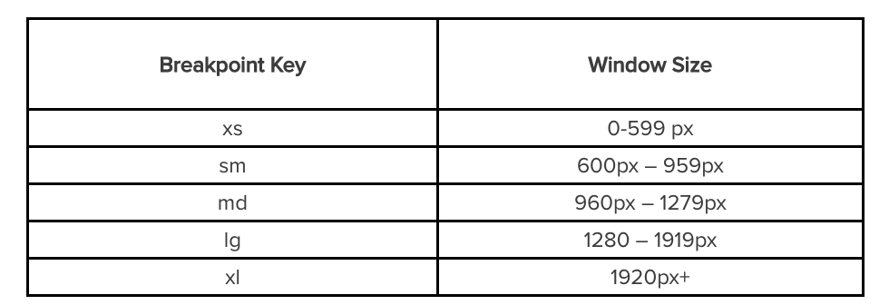
Grid Items, Columns, and Break Points
This section contains the most important information for understanding Material UI Grids. Feel free to re-read it a few times if it doesn’t make sense at first.
By default, Material UI Grids will try to space your items perfectly evenly, so if you have something simple, like 4 grids items, each item will take up 25% of the window.
But, Material UI Grids work on a 12 column grid-layout, and each grid width is a certain percentage of that. So, if we have a Grid of 6, that width should be about 50%.
Grid Items, Columns, and Break Points
Grid Items, Columns, and Break Points
<Grid container>
<Grid item xs={6} sm={2} md={8} lg={12} xl={3} style={{background:randomColor()}}>
Hooray something is here!
</Grid>
<Grid item xs={6} sm={10} md={4} lg={12} xl={9} style={{background:randomColor()}}>
Hooray something is too!
</Grid>
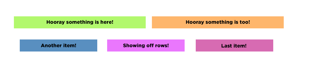
</Grid>Container Magic
With Grid Containers, we can arrange all of our grid items the way that we want to. The first thing we want to do is add spaces around the grid items so that the content isn't directly touching one another. We can add the prop ‘spacing’ and which takes in a value between 0 and 10.

The space between each grid is the number you chose, times 8pixel. For example, spacing={2} is 16 pixels.
function App() {
  return (
    <div  className="App">
      <Grid container spacing={3}>
        <Grid item xs={6}>
          <div style={{background:randomColor()}}>Hooray something is here!</div>
        </Grid>
        <Grid item xs={6}>
          <div style={{background:randomColor()}}> Hooray something is too! </div>
        </Grid>
        <Grid item xs={4}>
          <div style={{background:randomColor()}}> Another item! </div>
        </Grid>
        <Grid item xs={4}>
          <div style={{background:randomColor()}}> Showing off rows! </div>
        </Grid>
        <Grid item xs={4}>
          <div style={{background:randomColor()}}> Last item! </div>
        </Grid>
      </Grid>
    </div>
  );
}
Grids best practice
By sddtc


