Creating Responsive Emails
What we use?
Why we use it?
How it works?
The issues we faced and how we resolved them?
What we use?
Currently we are using Foundation emails.
It provides both CSS and SASS versions. We're using the SASS version.
Some plugins:
> Panini
> Inky
Why we Foundation?
It is suitable for our email designs.
Our email structure uses table structure with rows and columns that grow and shrink based on device size and Foundation provides control over the sizes on both desktop and mobile.
How it works?
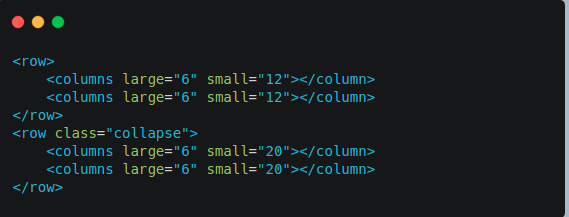
First we define the parameters of our grid system. It is basically the number of columns in each row.
Then we provide the size to each column.
The issues we faced and how we resolved them?
Unexpected behavior on both desktop and mobile devices.
The column widths collapsed on mobile devices.
We observed that width of overall document affected the grid system.
So we tried a hack to resolve the issue.
Thanks for tolerating.....
Questions???
Creating Responsive Emails
By shahnawaz19415


