


Naser Hassani
Software Engineer
In the name of God
TEHRN RESPONSIVE WEB DESIGN CONFERENCE
#RWDCONF94
There is millions of frameworks...
Design and Delivering
Resilient, Accessible, Faster, Smaller
Websites
for make it, we need..
are nagging and grumpy
that they want:
FREE detailed CONTENT as soon as possible.
CUSTOMER IS ALWAYS RIGHT
but
website
unlimited
Distinct devices
(11,868 the year before)
ANDROID viewport sizes overlaid
connection speed among 200 countries (2015, March-April)
Price: 46 th
lazy
WEB Designer and Developer
Loves:
Large ASSETS :
500KB hero picture, even on mobile!
use jQuery for one DOM modification!!
use jQuery-UI for ???
use Bootstrap for grid!
use 3 different web-font in one page!
use font-awesome for only 4 icon!
each script, styleSheets and even tiny png icon, deserve one file!
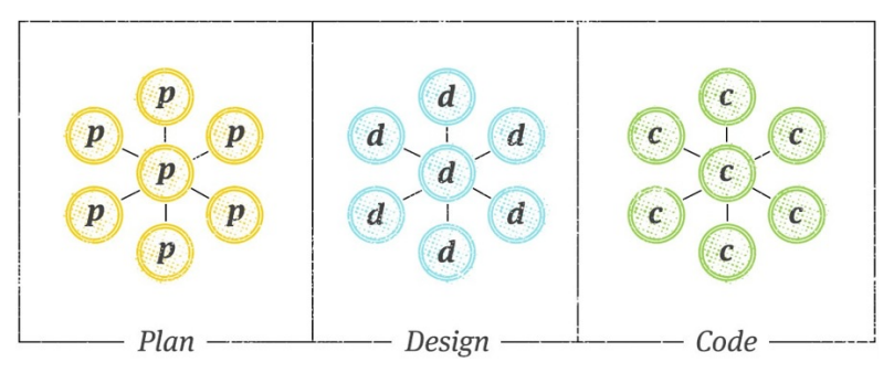
We’re not designing pages, we’re designing systems of components.
— Stephen Hay
designing systems
Strategy
Layouts
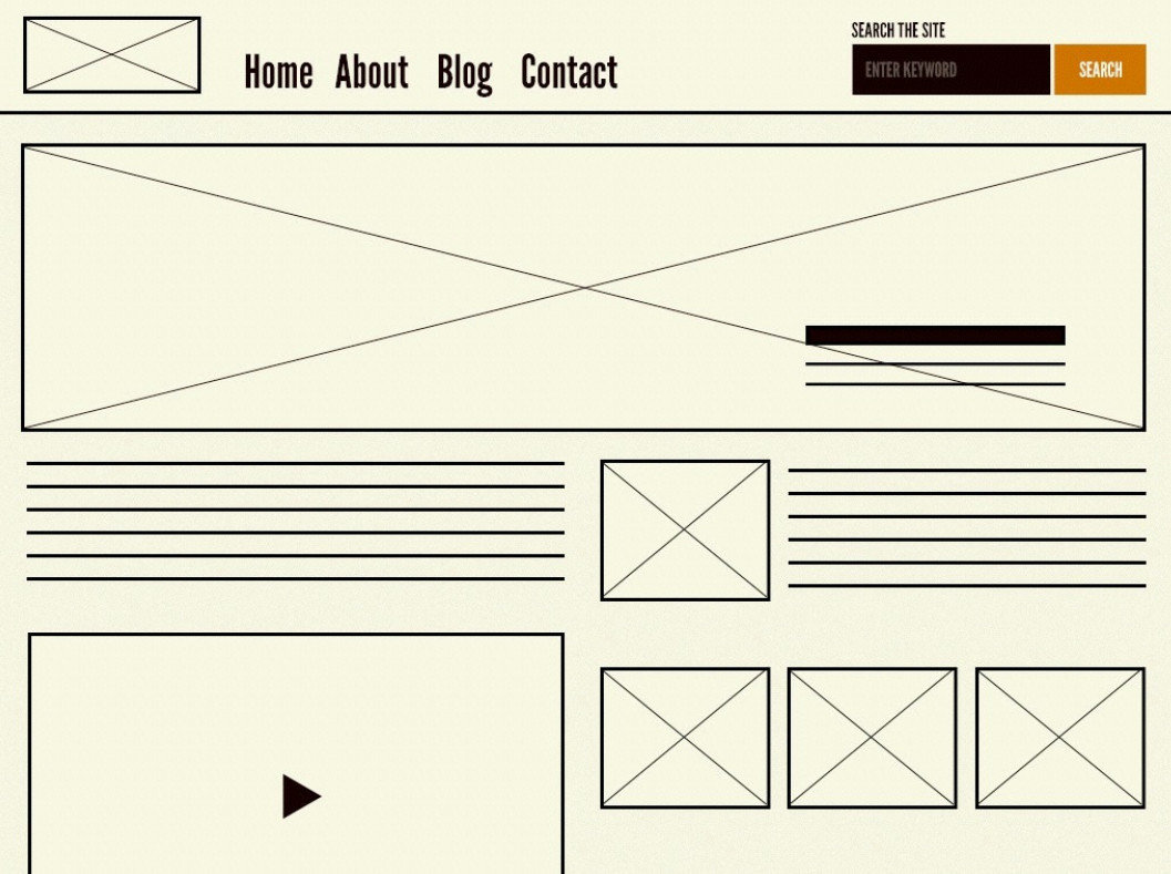
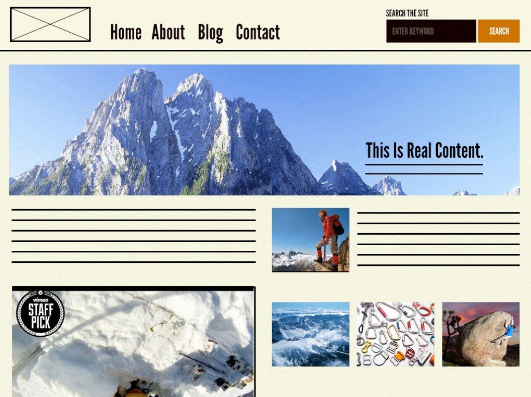
Homepage layout
Subpage layout
Article index layout
Article layout Product
index layout Product
detail layout Sign up
flow Checkout flow
is will be a book by Brad Frost.
Atoms
Molecules
Organisms
Templates
Pages
a website is
we have need
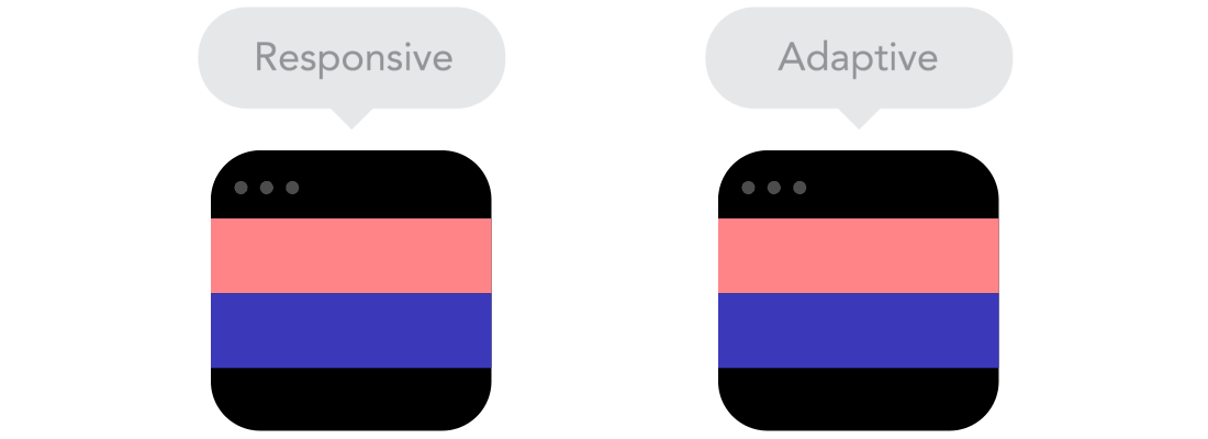
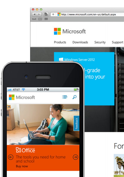
RESPONSIVE
“The design process is weird and complicated because it involves people and organisations, which often are weird and complicated."
— Mark Boulton
Design
Front-end
Back-end
LAUNCH
throw in some content
think about user
Content
Design
Back-end
LAUNCH
slightly better
UX
Front-end
RWD
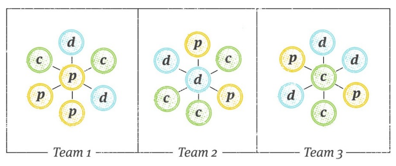
“Build smaller, tactical teams that are capable of executing multiple rounds of planning, design, and code quickly and independently."
— Trent Walton
Instead of dividing teams into skill sets,
build complementary teams , focused on small tasks.
Each small team tasks:
<designer>we love you</designer>
 for( var i = 0; i <= designerLoves.length; i++ )

	if( designerLoves[i] === 'code' )

console.log('WE LOVE DESIGNER')please reading more about
A Flexible Grid (Fluid: % + Min Widths)
Flexible Media (Images, Video)
img { max‐width: 100% }
FitVids.js
(Not Just) Media Queries
@media (min‐width: 20em) { /* CSS goes here */ }
The way in which CSS
media
queries
have been promoted for
mobile
hides
tough problems and
gives developers a
false promise
of a simple solution
for designing
for
small screens
.
- Jason Grigsby, @grigs
“
Get to a point with your web
strategy
where you don't crap your
pants every time
Apple
has a
keynote.
”
@brad_frost
WEB DESIGN
the web has
Who really wants to wait while they are waiting?
— Mike krieger
2014
2015
63.5
33.15
3.65
73.16
23.69
3.15
Desktop
Mobile
Tablet
2,219KB
The average weight of a web page (Sep 1 2015)
images
js
video
font
css
80.5 %
1,421 KB
368 KB
177 KB
116 KB
74 KB
52 KB
72 %
RWD sites whose small screen design weighs the same as the large screen design.
71%
Users expect your mobile site to load as quickly as your desktop site.
website
Doesn’t mean they get a free pass
1,421 KB
images are large
of each web page!
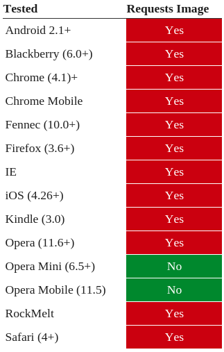
Downloading Images
<style>
  @media all and (max-width: 600px) {
    #test1 { display:none; }
  }
</style>


<div id="test1">
  <img src="images/test1.png" />
</div>
NOPE
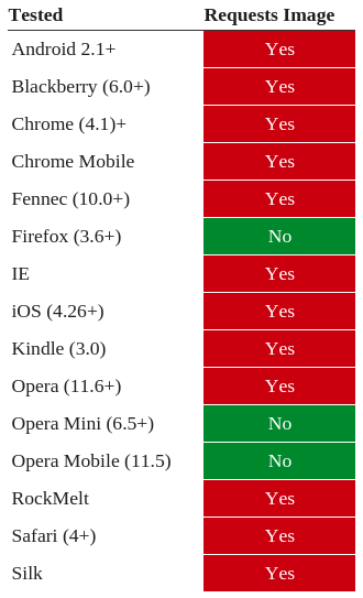
Downloading Images
<style>
  #test2 {
    background-image:url('images/test2.png');
    width:200px;
    height:75px;
  }
  @media all and (max-width: 600px) {
    #test2 {display:none;}
  }
</style>


<div id="test2"></div>
NOPE
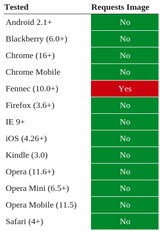
Downloading Images
<style>
#test3 div {
    background-image:url('images/test3.png');
    width:200px;
    height:75px;
}
@media all and (max-width: 600px) {
    #test3 { display:none; }
}
</style>


<div id="test3">
    <div></div>
</div>
OK
Downloading Images
<style>
@media all and (min-width: 601px) {
  #test5 {
    background-image:url('images/test5-desktop.png');
    width:200px;
    height:75px;
  }
}
@media all and (max-width: 600px) {
  #test5 {
    background-image:url('images/test5-mobile.png');
    width:200px;
    height:75px;
  }
}
</style>


<div id="test5"></div>
OK
images downloading
Recommendations
Don’t just optimize images
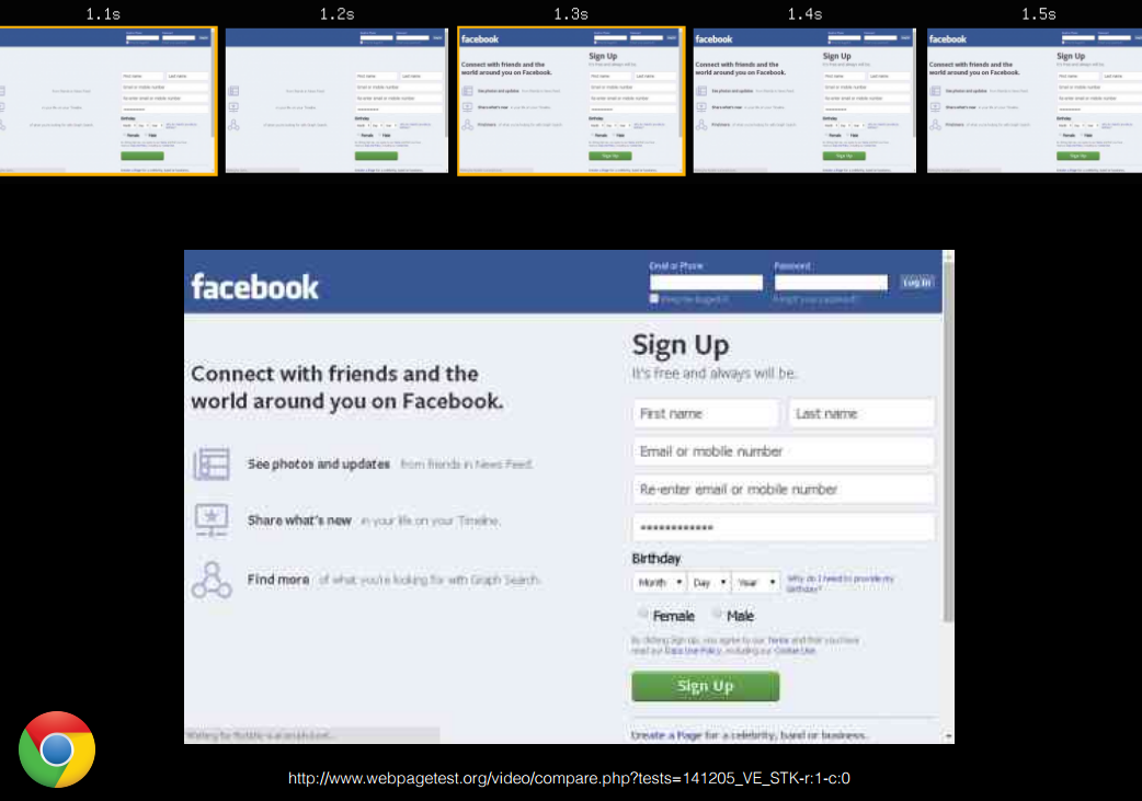
Allows authors to define various image resources and "hints" that assist a user agent to determine the most appropriate image source to display (e.g. high-resolution displays, small monitors, etc).
Srcset attribute - CR
A responsive images method to control which image resource a user agent presents to a user, based on resolution, media query and/or support for a particular image format
Picture element - CR
<img  src="small.jpg" srcset="sml.jpg 300w, lrg.jpg 800w" size="100vw">

<picture>

   <source srcset="large.jpg" media=" (minwidth: 800px) ">

   <source srcset="medium.jpg" media=" (minwidth: 400px) ">

   <img src="small.jpg" alt="rwd conf">

</picture>
Available now:
website
asynchronously
This CSS module defines a scripting interface to font faces in CSS, allowing font faces to be easily created and loaded from script. It also provides methods to track the loading status of an individual font, or of all the fonts on an entire page.
CSS Font Loading - CR
<script>

  document.fonts.ready().then(function() {

    document.documentElement.setAttribute( "class", "fonts-ready" );

  });

</script>

<style>
    p {
        font-family: sans-serif;
    }
    .fonts-ready p {
        font-family: iran-sans;
    }
</style>
Enabling Font Loading
<!--#if expr="$HTTP_COOKIE=/fonts\-loaded\=true/" -->
<html lang="fa" dir="rtl" class="fonts-loaded">
<!--#else -->
<html lang="fa" dir="rtl">
<!--#endif -->

<head>
    <style>
    body { font-family: sans-serif; }

    .fonts-loaded body { font-family: "iran-sans-light", sans-serif; }
    </style>

    <script>
      (function( w ){

        if( w.document.documentElement.className.indexOf( "fonts-loaded" ) > -1 ) return

        new w.FontFaceObserver( "iran-sans-light" )
          .check('ایران')
          .then( function(){
              w.document.documentElement.className += " fonts-loaded"
          });

      }( this ));
    </script>
</head>
Enabling fonts once loaded
With scripts, progressive rendering is
blocked for all content below the script.
<script	src></script>

</body><head>
<!-- Downloads right away -->
<script src async></script>
<!-- Waits to download -->
<script src defer></script>var script = document.createElement("script");
script.type = "text/javascript";
script.src = "foo.js";
script.async = "";
var ref = document.getElementsByTagName('script')[0];
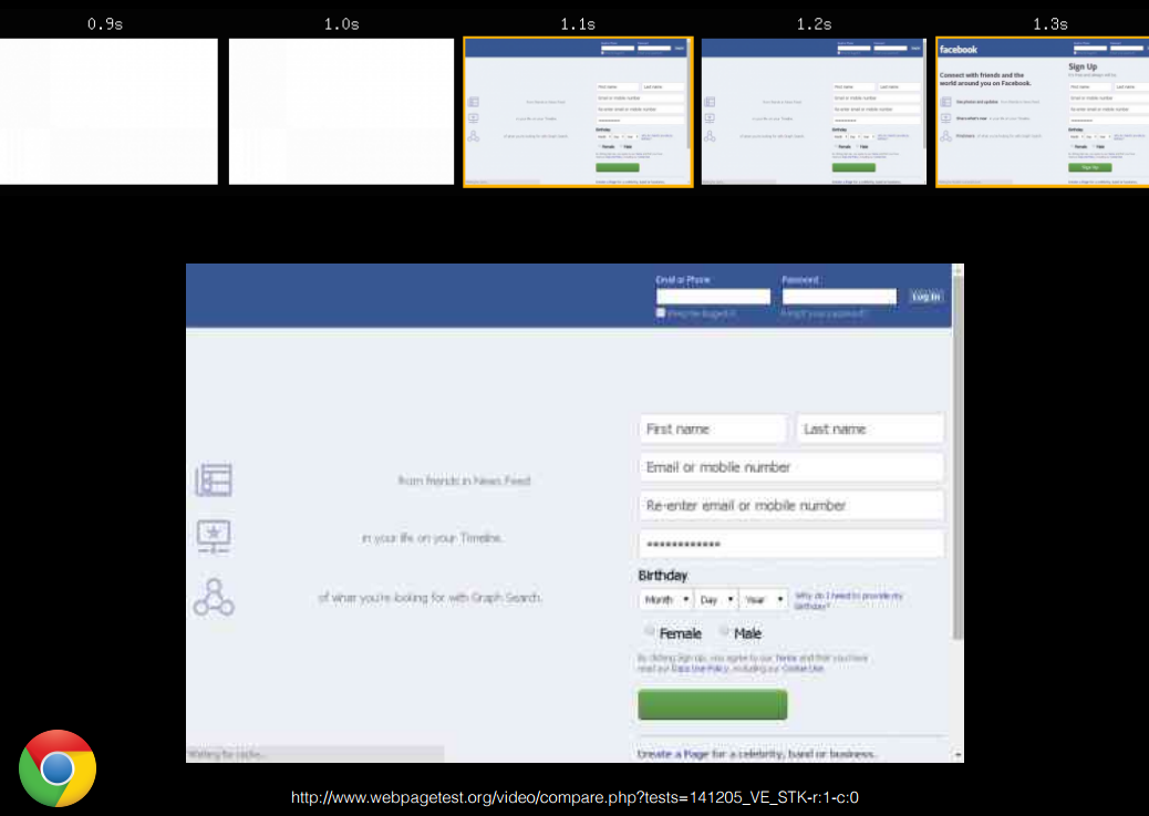
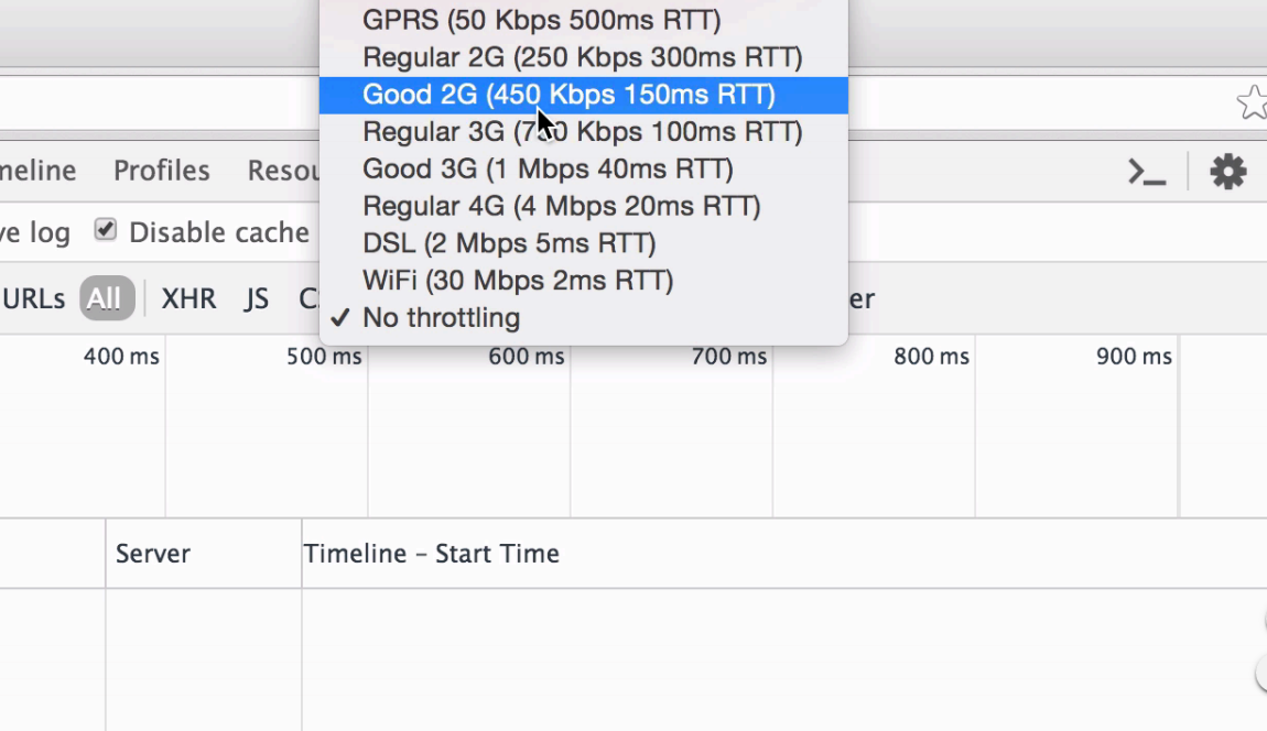
ref.parentNode.insertBefore(script, ref);performance measuring
Before you marry a person
you should first make them
use a computer with slow
Internet to see who they
really are.
TEHRN RESPONSIVE WEB DESIGN CONFERENCE
#RWDCONF94
By Naser Hassani