Semester 1
24–25
Data Spaces
Nine Sessions
Five Experiments
Group Work

1 Design Problem
In the current age, data has become a driving force in our daily lives. Our information channels, interactions and digital footprints are seamlessly and ubiquitously captured, collected by algorithms and analysed in data centres to steer the world we live in.
The use and treatment of data, often seen as a more scientific and technical matter, is now an increasingly important aspect of a designer's toolkit, processes, and knowledge. What methods can be employed to transform raw data into simple visual narratives in the realm of computational aesthetics?
Data Spaces
From data to simple visual narratives
2 Design Challenge
Data Spaces is a project that invites students to look at data from different angles and explore how data can be creatively gathered, quantified, experienced, and presented in physical and digital formats.
In this class and over the course of this project we will look at different forms of data and ways to give form to data. We want to apply different methods when collecting, analysing and expressing data.
Over the course of 3 weeks and 9 sessions students will develop a series of experiments that revolve around data and different methods to engage with and express data through digital and analog means.
Data Spaces
A series of experiments that revolve around data
3 Emphasis
The emphasis of this project will be on data comprehension and expression, tool learning and applying, experimentation, making and production, time management, presentation (of outcomes, not slides) and documentation.
In order to accomplish the above, good time management and team work is required.
Data Spaces
Experimentation, expression, time management, team work
4 Outcomes
The outcomes of this project will be accumulative. All experiments conducted will result in a body of work that will be archived in a web-based format.
At the end of the project, each group will present their outcomes in an ad hoc showcase, culminating in their submission of a web-based documentation website. The submission requirements and format will be communicated to the students accordingly.
Data Spaces
Submission of a web-based documentation
5 Approach
The project runs for three weeks and concludes with the last session. Students work in groups of two or three. The sessions are technical, hands-on or consultation-based, with the final session being a showcase of each group's work.
Most of the sessions will require students to work on an experiment based on a brief given. While each brief will require students to complete their experiment before the next session, it is important to note that the purpose of this project is to respond quickly and creatively to each experiment and make decisions on the spot, using this process to generate a variety of outcomes to be evaluated or reflected upon at a final showcase.
Data Spaces
The purpose of this project is to respond quickly and creatively to each experiment to practice ideation, time management, working in a team using different tools
Weekly Schedule
Three Weeks
Nine Sessions
Mondays
Tuesdays
Thursdays
9.30am
2.30pm
2.30pm
Week 1
Session 1–3
Week 2
Session 4–6
Week 3
Session 7–9
Introduction
Experiment 1
3 Exercises
Experiment 2/4
Workshop
Documentation website
Experiment 3
Data transformation
Weekly Schedule
Experiment 2/4
Workshop
Experiment 3 continues
Work-check
Experiment 5
Data expression
Experiment 5 continues
Showcase requirements briefing
Ad-hoc review
Feedback session
Showcase
and Submission
All lecturers
Data Spaces project concludes
Mondays
9.30am
Andreas and Shu Min
Tuesdays
2.30pm
Joanne and Jake
Thursdays
2.30pm
Andreas and Shu Min
Group work
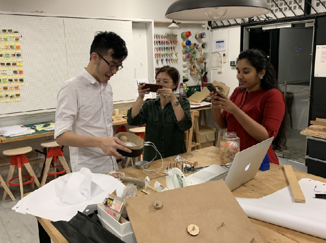
Students work in groups of 3
Group work
Lets take a few moments to form groups of 3.
As a group, you should be confident that you can do well in the following areas
Teamwork
Mix of skills
Be curious together
Time management
Documentation
Creative coding
Experiments
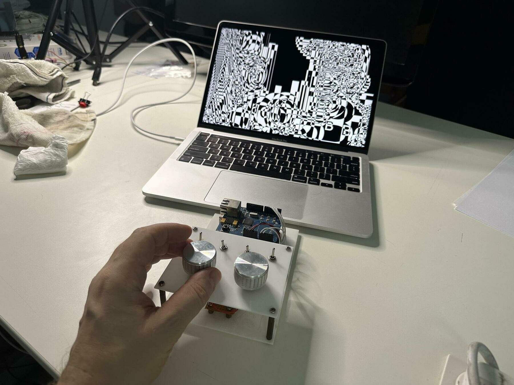
”Do you mean scientific experiments or what do you mean by design experiments? Both are indeed very different from each other, a scientific experiment can mean to close down on options to try and find and to prove something, whereas for a designer it is about opening up about creating and generating unknowns and that’s a very different set of assumptions with the same word experiment”.
Data Spaces
Experiments
An experiment (scientific or artistic) involves first-hand experience/making, followed by observation, analysis and reflection.
Artistic experiments discover unfamiliar and unexpected results, rather than work towards a particular known or predicted outcome.
They are commonly used in early stages of a project to explore multiple possibilities that may be refined or applied at a later stage (not required in this class).
No hypothesis is required at the beginning, the unknown leaves room for imagination, intuition and coincidence (happy accidents). Not evaluated on “success” or “failure”, but more nuanced critique.
Data Spaces
Experiments
Some References

Data Spaces
Some References
Design and Data
Computational Aesthetics
Data as Material
Some References

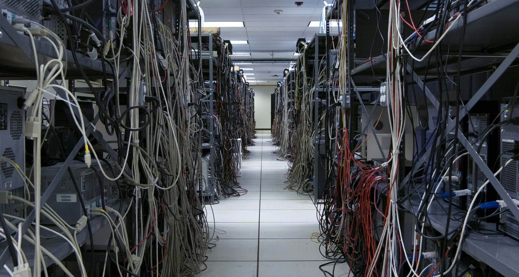
A Cloud, a basement, a Data Center? The Deep Lab book, image taken from a chapter by Ingrid Burrington, Datacentertips. link and link to book (online version)
Some References
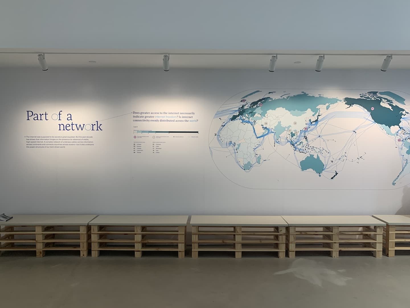
Part of a network
by Kontinentalist, displayed at SAM Tanjong Pagar Distripark.
The internet was supposed to be society's greater equaliser. But the past decade has shown that information hinges on the presence (or absence) of stable, high-speed internet. A complex network of undersea cables carries information across continents and connects countries across oceans–but it also underpins the power structures of our tech-driven world.
At Kontinentalist they tell data-driven stories about Asia.
Recorded Data
Some References
Recorded Data
Part of a network
by Kontinentalist, displayed at SAM Tanjong Pagar Distripark.
The internet was supposed to be society's greater equaliser. But the past decade has shown that information hinges on the presence (or absence) of stable, high-speed internet. A complex network of undersea cables carries information across continents and connects countries across oceans–but it also underpins the power structures of our tech-driven world.
0
Internet speed
superfast

Some References
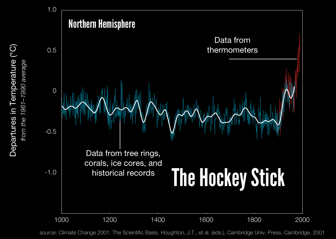
Time reconstructions (blue) and instrumental data (red) for Northern Hemisphere mean temperature (NH). link
The Hockey Stick
Michael Mann is most famously known for the "hockey stick," a plot of the past millennium's temperature that shows the drastic influence of humans in the 20th century. Specifically, temperature remains essentially flat until about 1900, then shoots up, like the upturned blade of a hockey stick.
That stick has become a focal point in the controversy surrounding climate change and what to do about it. Proponents see it as a clear indicator that humans are warming the globe; skeptics argue that the climate is undergoing a natural fluctuation not unlike those in eras past. But Mann has not been deterred by the attacks. "If we allowed that sort of thing to stop us from progressing in science, that would be a very frightening world"
Behind the Hockey Stick in Scientific American, 2005. link
Recorded Data
Some References
Time reconstructions (blue) and instrumental data (red) for Northern Hemisphere mean temperature (NH). link

The Hockey Stick
Michael Mann is most famously known for the "hockey stick," a plot of the past millennium's temperature that shows the drastic influence of humans in the 20th century. Specifically, temperature remains essentially flat until about 1900, then shoots up, like the upturned blade of a hockey stick.
That stick has become a focal point in the controversy surrounding climate change and what to do about it. Proponents see it as a clear indicator that humans are warming the globe; skeptics argue that the climate is undergoing a natural fluctuation not unlike those in eras past. But Mann has not been deterred by the attacks. "If we allowed that sort of thing to stop us from progressing in science, that would be a very frightening world"
Behind the Hockey Stick in Scientific American, 2005. link
Recorded Data
Some References
99% of Sea Turtles are now born female.
Global warming is creating a crisis in sea turtles' gender ratios, where 99% of them are being born female. Sea turtle populations have been facing a significant population decline further exasperated by climate change.
Climate change is affecting the gender balance of sea turtles.
Rising temperatures over the past four years in Florida have led to a disproportionate number of female sea turtles to be hatched, perhaps as many as 99% of the total eggs laid. Unlike many animals, the sex of a sea turtle isn’t determined when the egg is fertilized. Instead, whether you get a male or female all depends on the temperature of the ground the eggs incubate in.
If it stays below 81.86 degrees Fahrenheit, they’ll be male, says the National Oceanic and Atmospheric Administration (NOAA). Anything above 88.8 degrees and they’re female. (If the sand temps hover between those two ranges, it’s a mix of genders for the eggs.)
Fortune.com, August 2022. link
Recorded Data
Some References
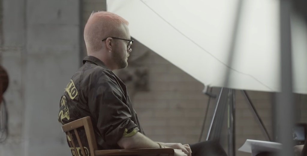
Cambridge Analytica Scandal
Revealed: 50 million Facebook profiles harvested for Cambridge Analytica in major data breach. Whistleblower describes how firm linked to former Trump adviser Steve Bannon compiled user data to target American voters
via The Guardian, The Cambridge Analytica Files, March 2018 link
A whistleblower has revealed to the Observer how Cambridge Analytica used personal information taken without authorisation in early 2014 to build a system that could profile individual US voters, in order to target them with personalised political advertisements.
Christopher Wylie, who worked with a Cambridge University academic to obtain the data, told the Observer: “We exploited Facebook to harvest millions of people’s profiles. And built models to exploit what we knew about them and target their inner demons. That was the basis the entire company was built on.”

Recorded Data
Some References
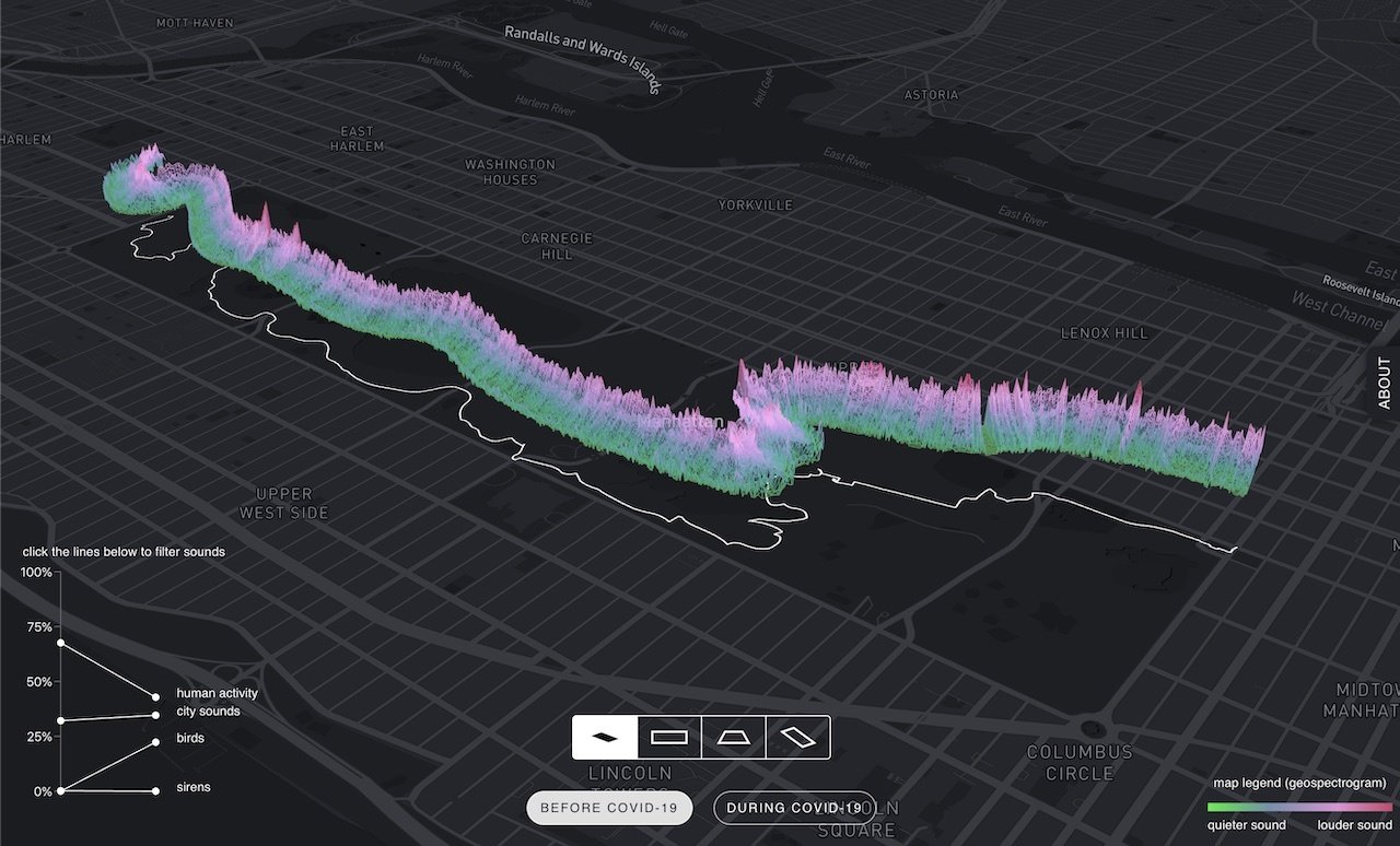
The Senseable City Laboratory is a research initiative at the Massachusetts Institute of Technology (MIT) that looks at the transformation of cities through design, science and data. website link
Recorded Data
Some References
How to automate Surveillance easily with Deep Learning, link
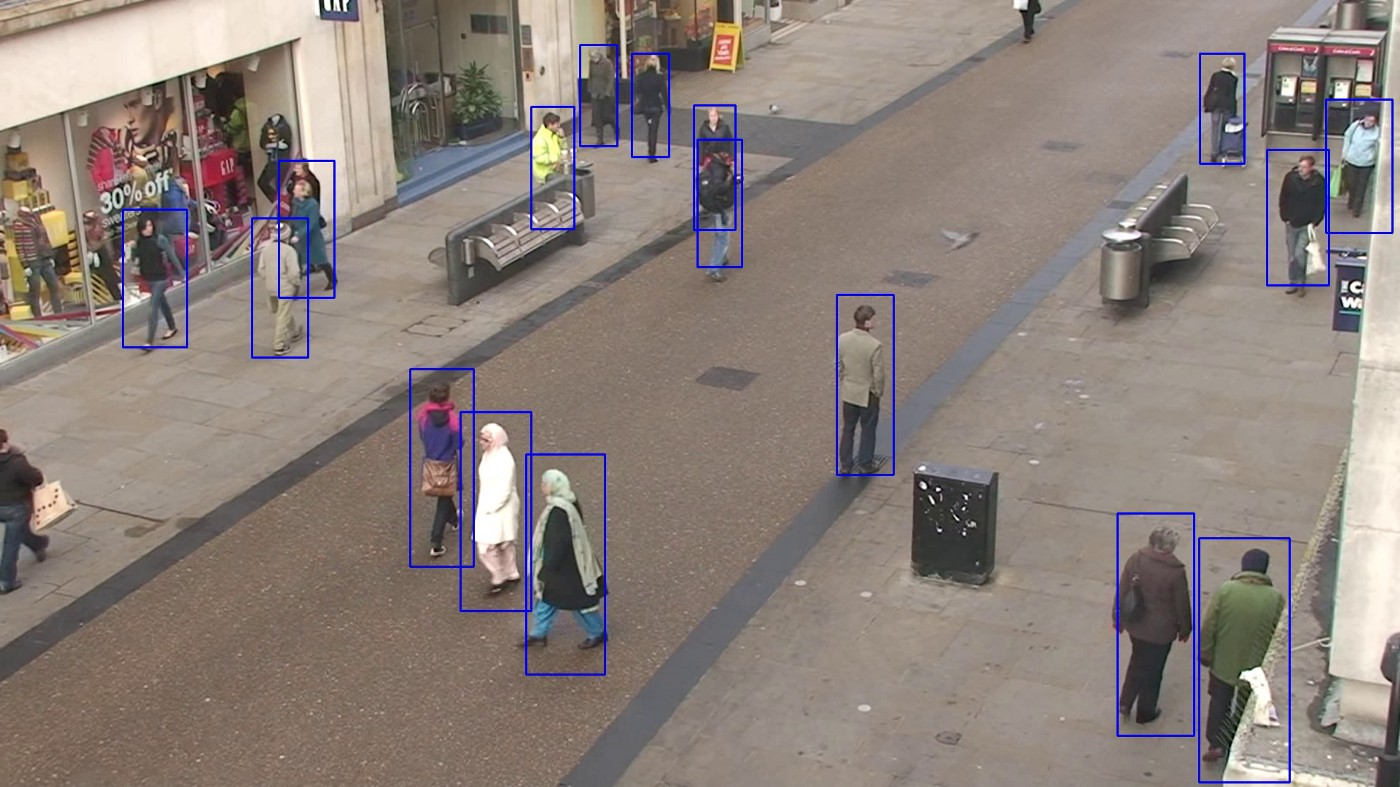
CCTV Object Recognition with AI
Real time Data
Some References
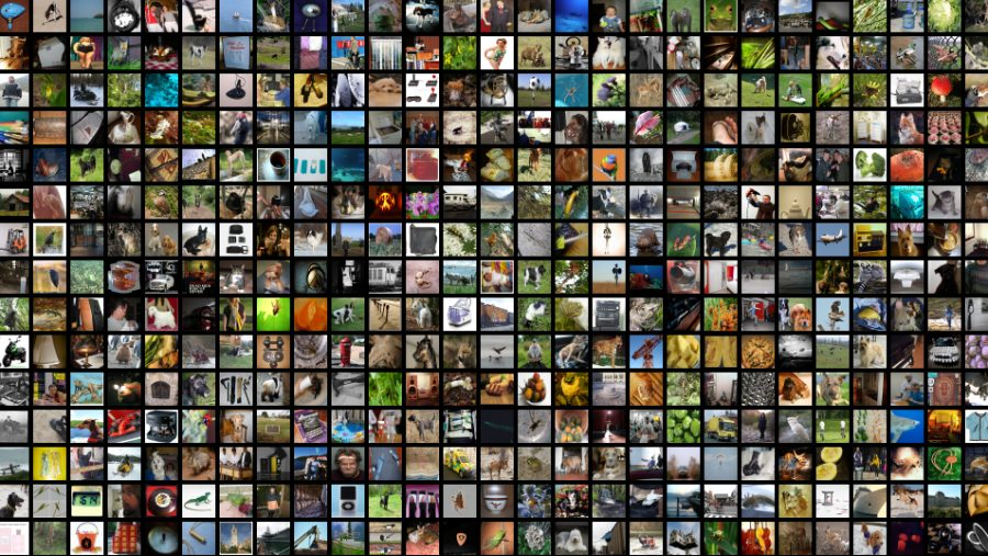
Multi-label image dataset (Tencent ML Images), contains nearly 18 million images, multi-labeled with up to 11,166 categories.
Labeled image datasets
In machine learning, the algorithm is fed large data sets, many of which are images. These images have been labeled and classified so that the algorithm can find patterns and similarities in the input images that it is not aware of at first. This is basically how many machine learning algorithms work. They are trained on large data sets, these data entries are then broken down into smaller fragments and patterns so that the algorithm can recognize input images that it has not seen or known before. Similar approaches are applied to audio and other sensor-data.
Recorded Data
Some References
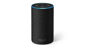
Amazon Echo smart speaker
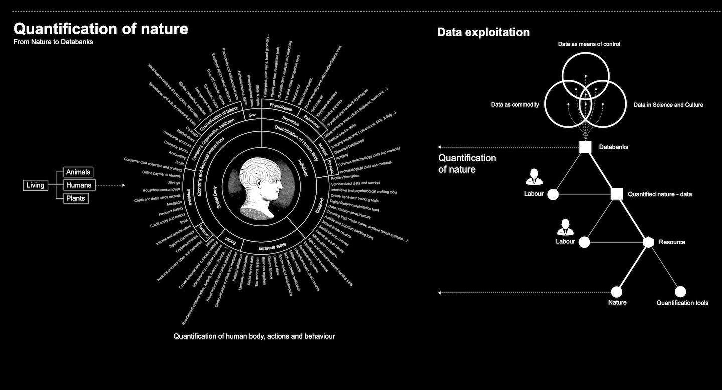
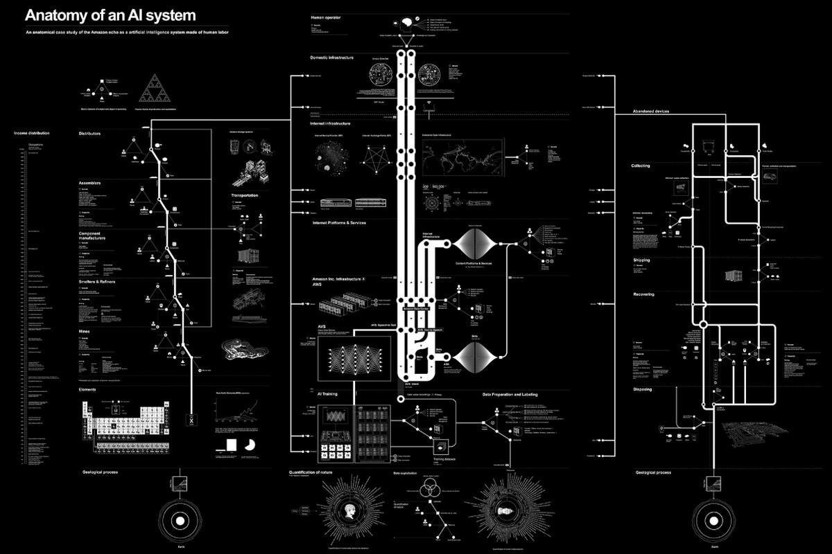
AI system powering Amazon Echo smart speaker
Some References

Some References
The Age of Data is an anthology of genre-redefining data-based art, featuring 40 artists, designers and studios.
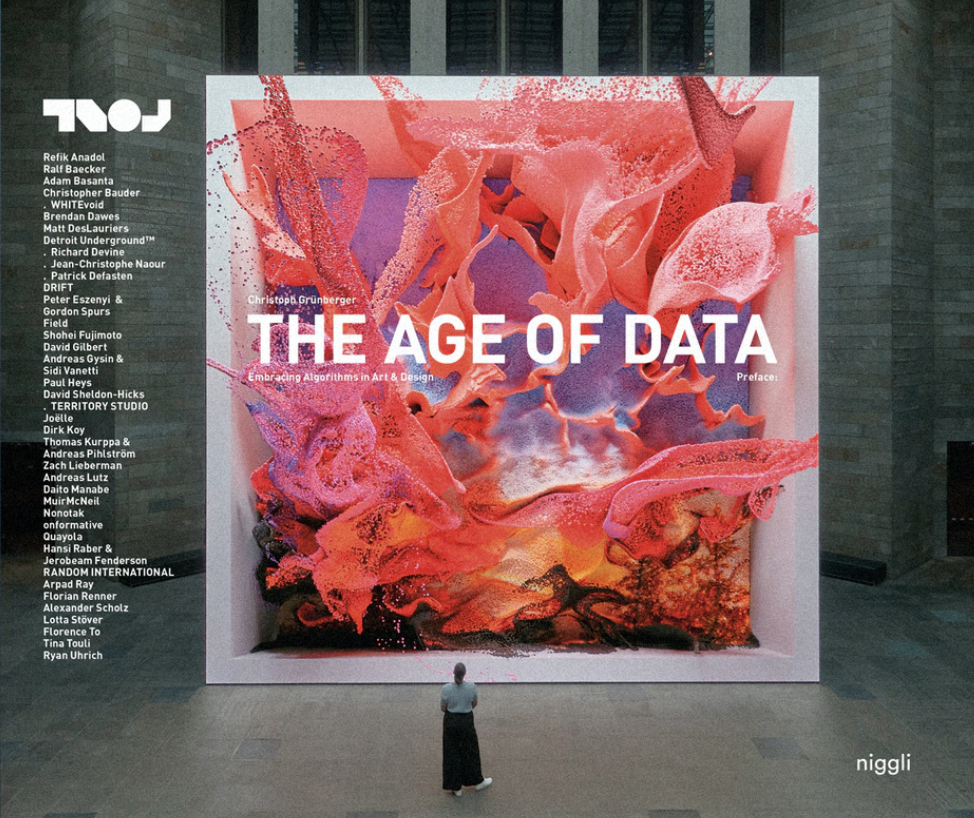
Refik Anadol in The Age of Data
Anadol's works are site-specific public art, he creates live audio/visual performances and immersive AI cinema installations with a parametric data sculpture approach. His work explores the space between digital and physical entities by generating a hybrid relationship between architecture and media arts with machine intelligence.
The systems, the hardware, the software around us is constantly changing, and the data becomes a new language between machines. But as humans, I think we have to learn this language as well.
in The Age of Data: Embracing Algorithms in Art & Design, 2022. link
Refik Anadol's work Datafall is currently screening in public space at Orchard Central.
Recorded Data, Procedural Data
Some References
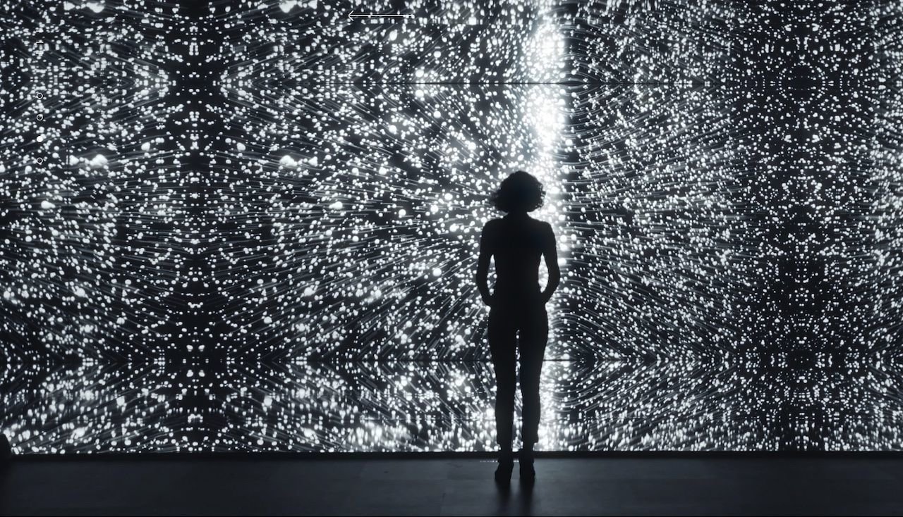
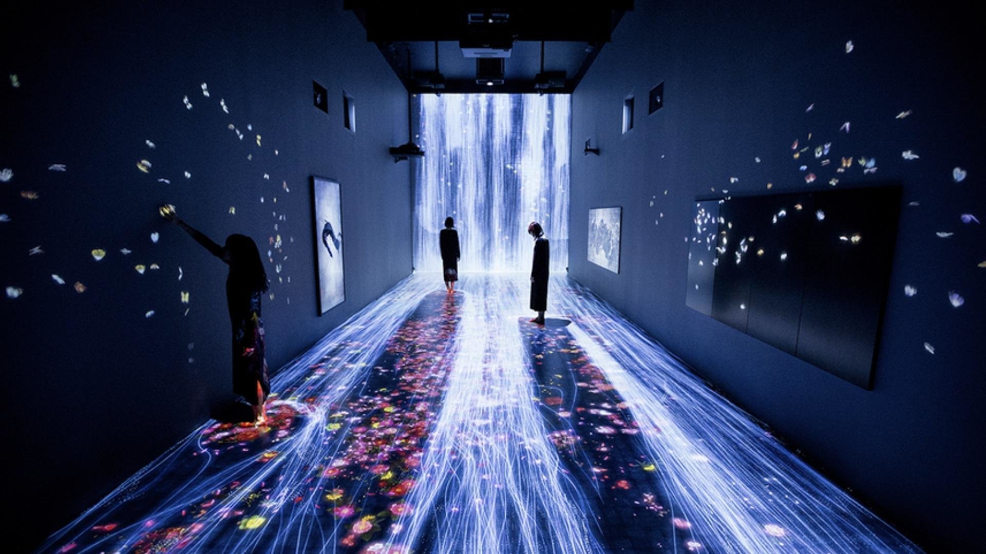
United Visual Artists, The Great Animal Orchestra, 2016.
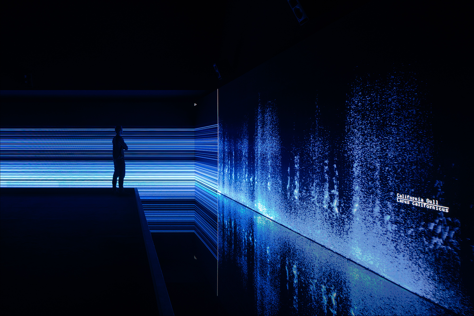
United Visual Artists
UVA’s diverse body of work integrates new technologies with traditional media such as sculpture, performance and site-specific installation.
The Great Animal Orchestra is a performative space in which spectrograms specifically crafted for and generated by Bernie Krause’s soundscapes form an abstract projected landscape, a visual interpretation of the various global locations and times of day that Krause made the original recordings.
On the floor, in front of the projections a shallow pool of black-coloured water seamlessly reflects the data and brings another dimension to the work. Speakers generate ripples to visualise the sound frequencies inaudible to the human ear. The installation envelops the audience encouraging them to linger and reflect on the language of the living sounds and the phenomenon that each animal has its own acoustic signature in the oral tapestry of its ecosystem.
Recorded Data, Procedural Data
Some References
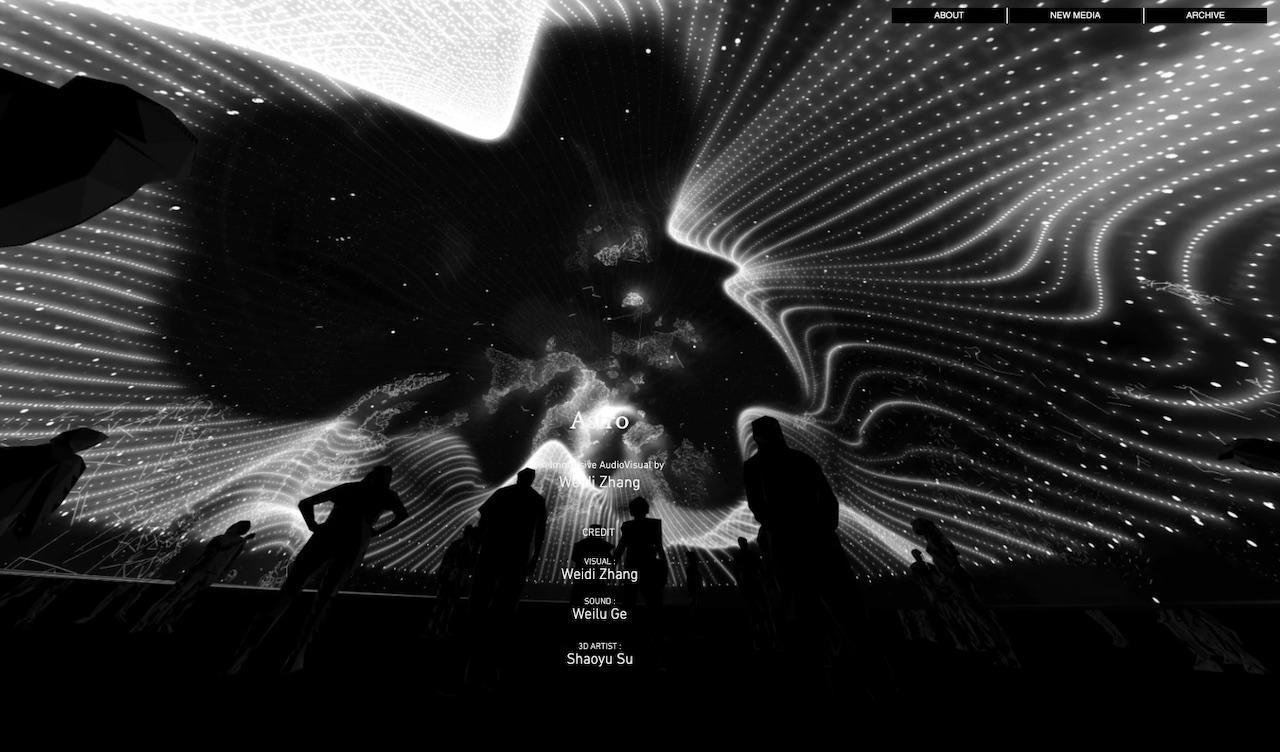
Weidi Zhang, astro. An immersive full-dome performance, and a projection on a facade as an extension of space. link
Recorded Data, Procedural Data
Some References
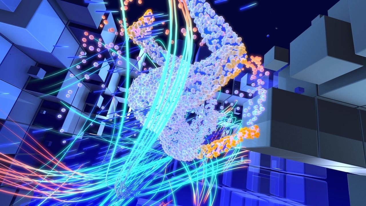
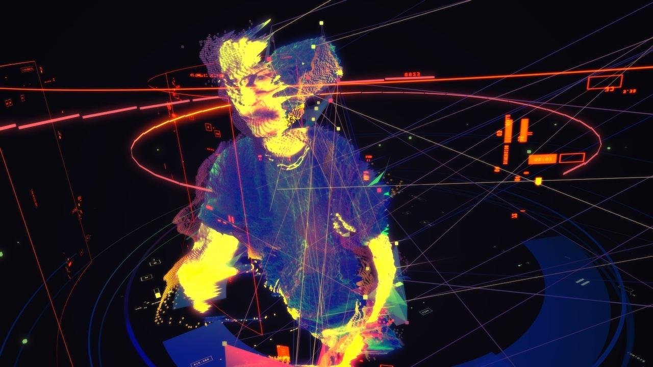
Defasten, motion visual works where visual aesthetic exists as audio reactive, hyper3d real-time graphics, from deconstructed cyberspaces, to retinal virtual experiences. link
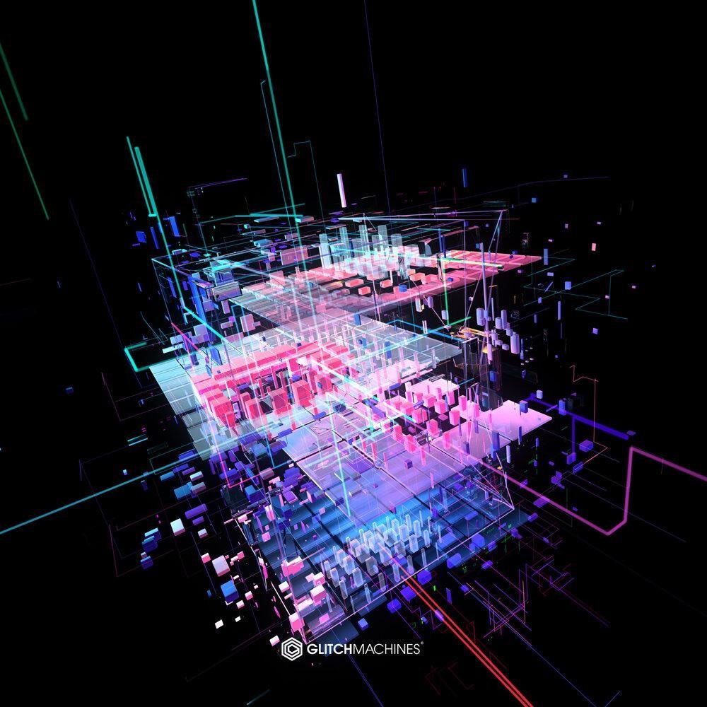
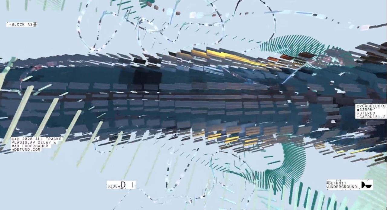
Real time Data, Procedural Data
Some References
Translating numbers into visual formats, data visualisations.
Federica Fragapane
Recorded Data
Some References
Translating numbers into visual formats, data drawings.
Stefanie Posavec and Giorgia Lupi
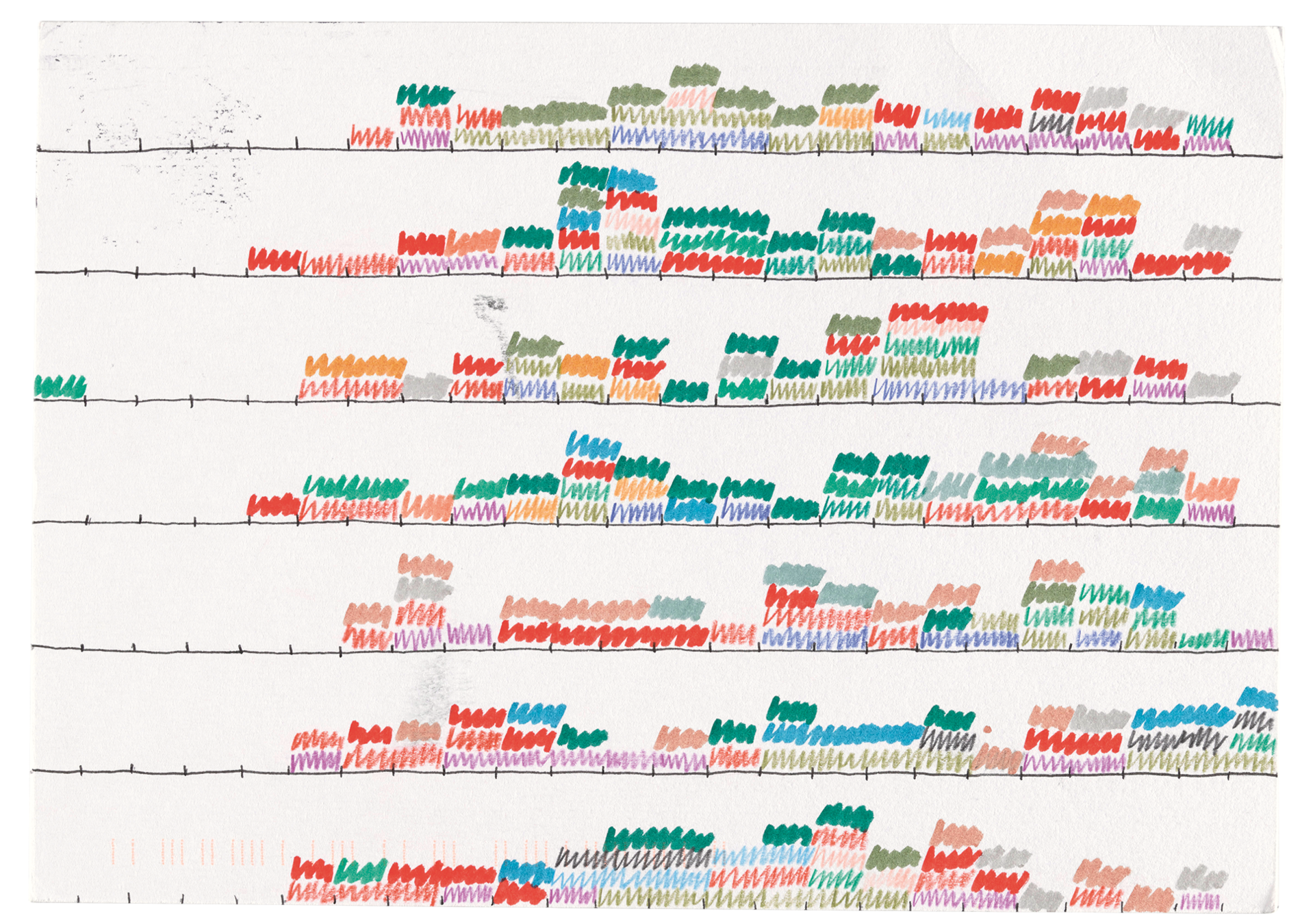
Dear Data
Dear Data is a year-long, analogue data drawing project between Stefanie Posavec and Giorgia Lupi, an information designer based in New York.
link
Recorded Data
Some References
Dear Data
Dear Data is a year-long, analogue data drawing project between Stefanie Posavec and Giorgia Lupi, an information designer based in New York.
link

Recorded Data
Some References
Dear Data
Dear Data is a year-long, analogue data drawing project between Stefanie Posavec and Giorgia Lupi, an information designer based in New York.
link
A week of clocks
Hi Giorgia! Still getting used to drawing again, hope I get better! Lots of the car radio clocks at 4am are because I had to leave too early to fly back from holiday! Other insights I've learned: I'm addicted to my phone I always check the time in bed even before the alarm goes off hence the 5am clock-watching! I obviously am an early riser :)


Recorded Data
Some References
The Future is Red, Yoon Chung Han, 2021.
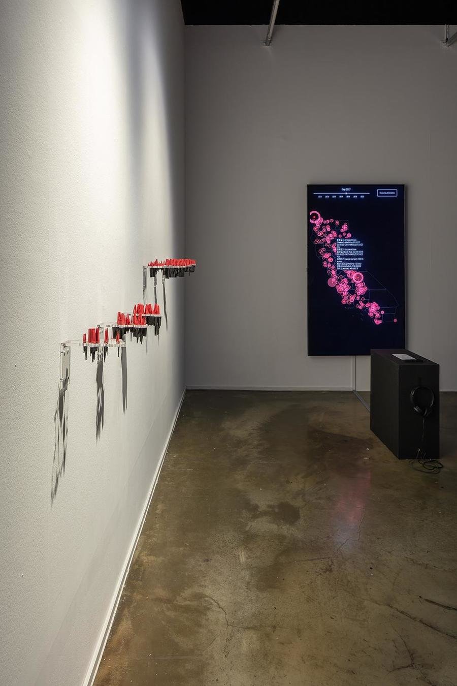
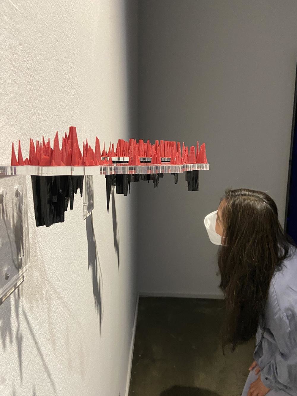
The Future is Red
Yoon Chung Han, 2021. Interactive art, Data-driven design. Tools: d3.js, 3D printing
The Future is Red is a data art installation that provides an interactive audiovisual experience to reveal the reality of climate change to audiences. Audiences can participate in this interactive art that presents two regions' wildfire data in visual and audio forms.
The audience members can learn about the wildfire and related damages in detail by observing 3D printed sculptures made of recycled filaments. Red-colored prints represent the wildfires and black-colored prints attached at the bottom represent the air quality of two regions. Viewers can observe a correlation between two data and the causes and effects of wildfire.
link
Recorded Data
Some References
Joy Division, Album cover, Unknown Pleasures, 1979.
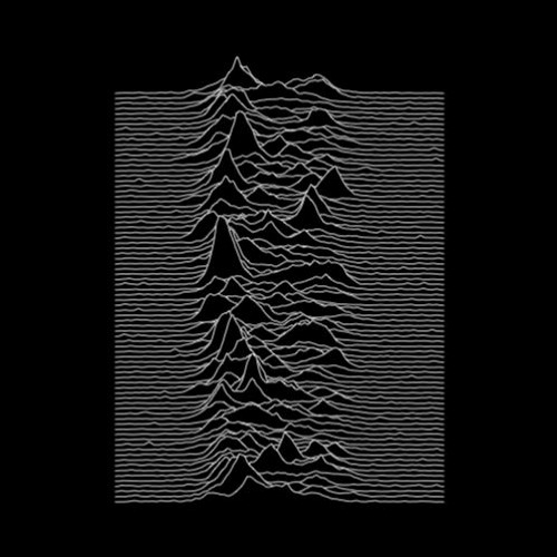
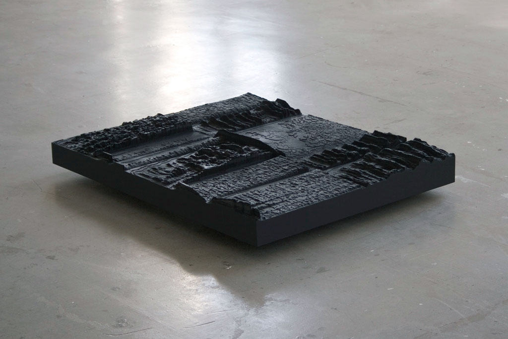
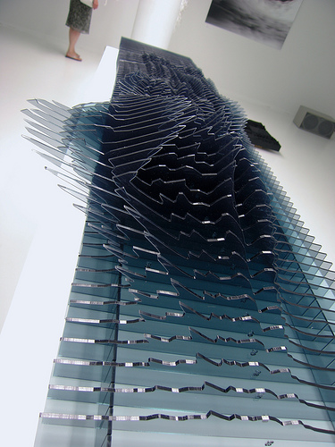
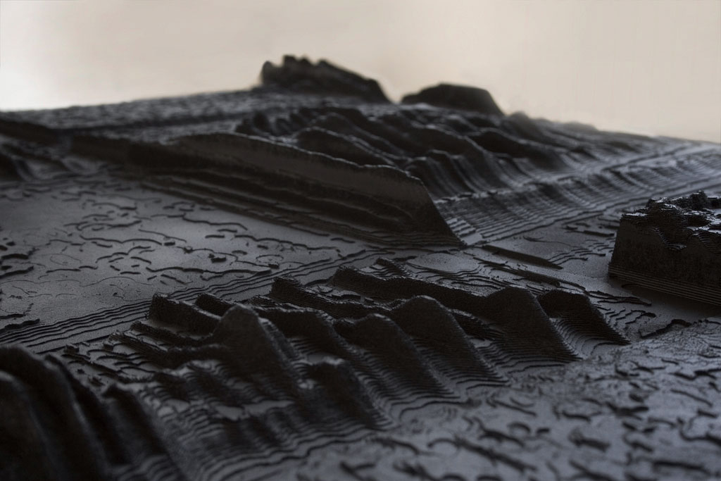
Binaural by Daniel Widrig & Shajay Bhooshan, 2007.
Reflection is a sound data sculpture by Andreas Fischer, 2007, link
Recorded Data
Some References
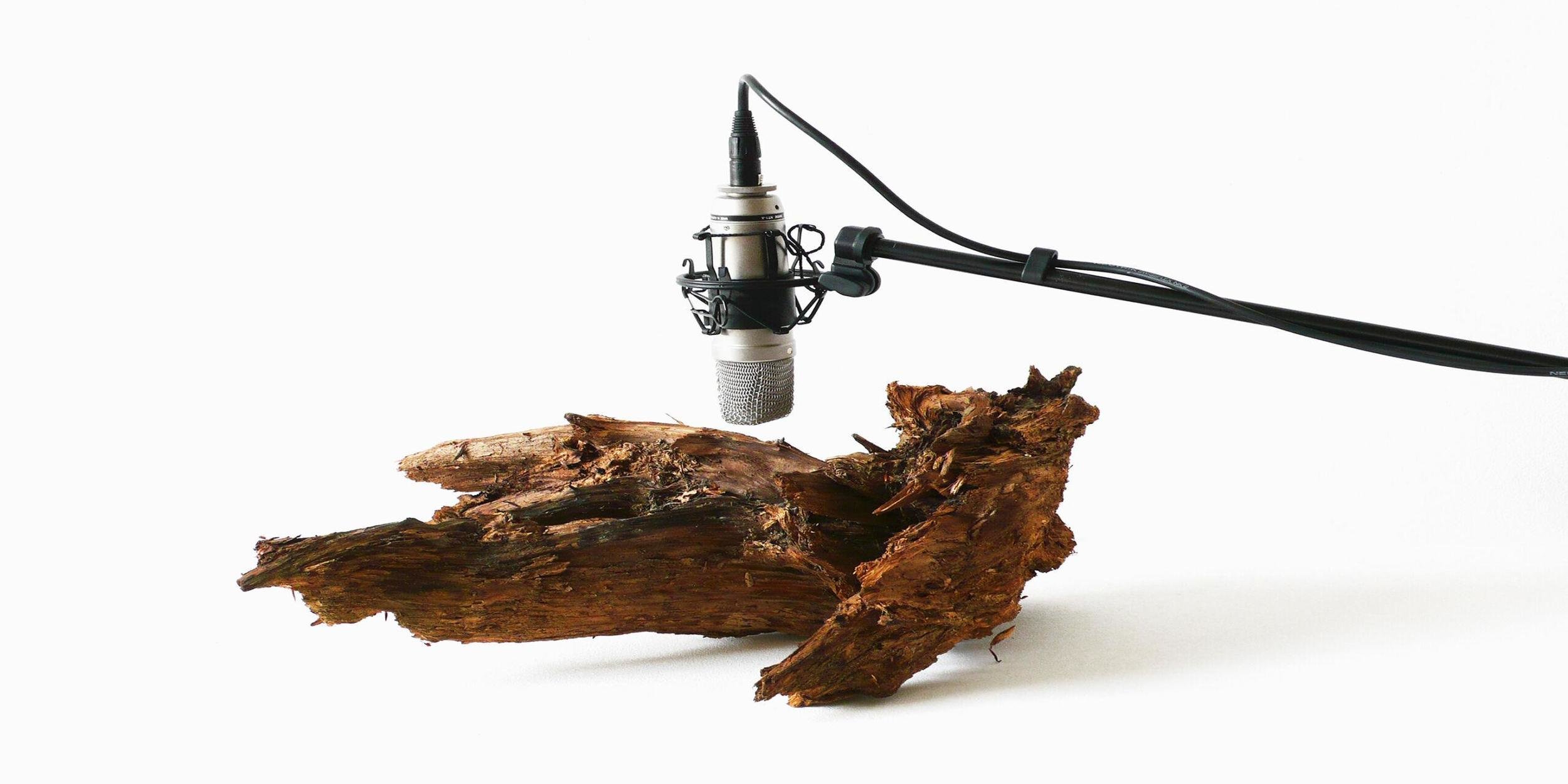
25 Woodworms
The kinetic-minimalist sound artist Zimoun’s video 25 Woodworms, Wood, Microphone, Sound System (2009) takes the sounds made by live woodworms at work as a starting point for the creation of an atonal, minimalist soundscape. A microphone mounted above a piece of bark amplifies the gnawing noises of the 25 woodworms enclosed in it, making these audible to the human ear.
The working woodworms become data by sensing and amplifying the sounds they emit. The data can be translated into the format of sounds itself or into visual representations like animations, or even physical objects.
link, video
Sensor Data
Some References
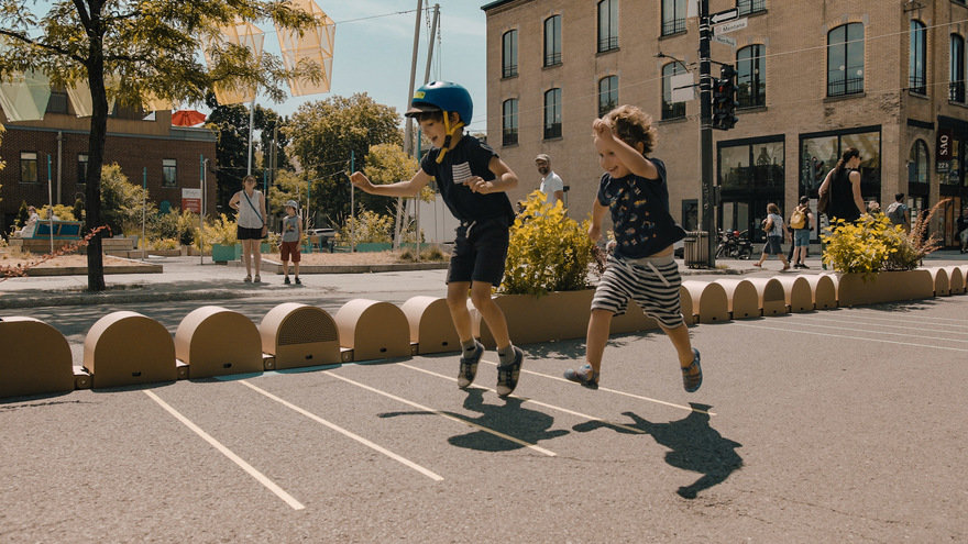
'Walk walk dance' is an interactive pathway of lines that trigger different musical patterns, transforming the act of walking (or waiting in line) into a collaborative performance. link
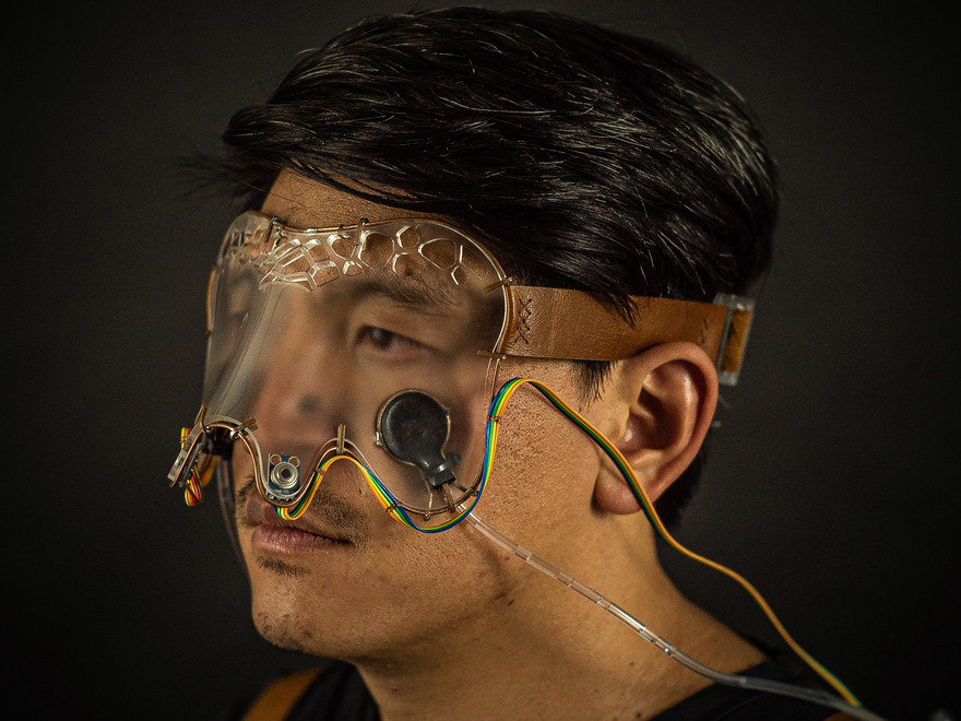
'Interface' by Jose Chavarría is an exploration on how to change the human perception of reality. 'Infrared Interface' senses other living creatures by sensing the infrared emission of bodies. Blurred vision allows the user to switch their attention to the new sense. Different infrared temperatures are felt by the user through pressure pads located on the cheeks. link
Sensor Data
Some References
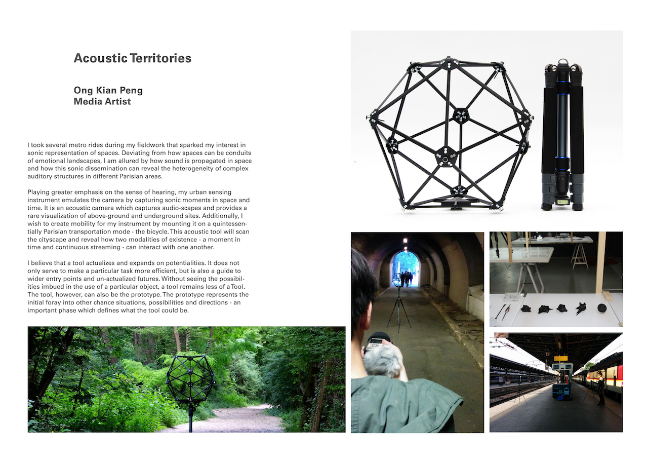
Acoustic Territories
by Ong Kian Peng, for the Urban Explorations project Paris, 2015
'I took several metro rides during my fieldwork that sparked my interest in sonic representations of spaces. Deviating from how spaces can be conduits of emotional landscapes, I am allured by how sound is propagated in space'
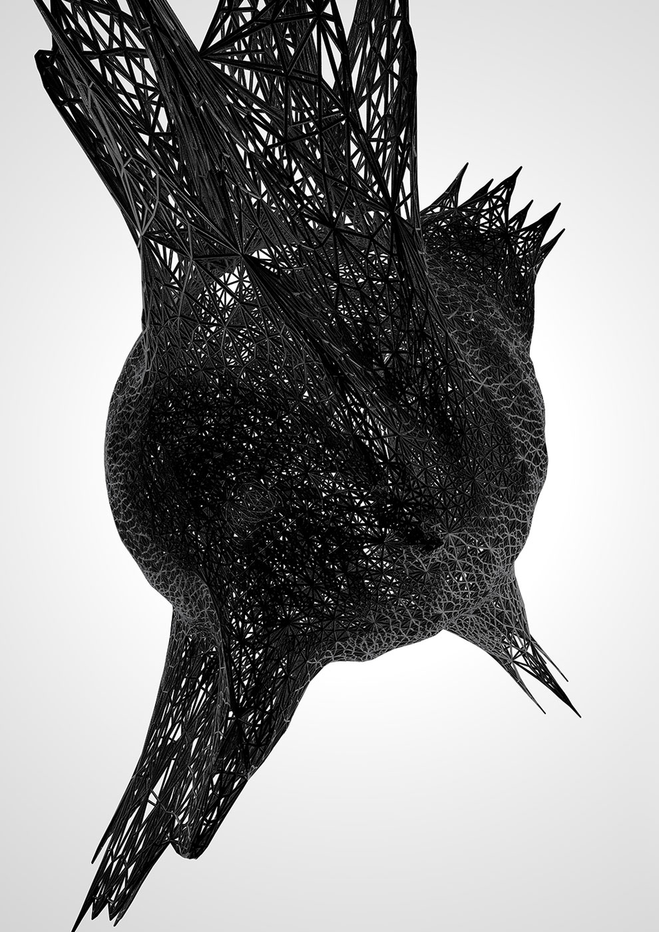
Kian Peng used recorded sounds captured with the use of his custom-built device to create a dataset of sounds that he later analysed and used to algorithmically shape 3D-printed objects as representations of visited and recorded spaces.
Acoustic Territories, a custom-built sound recording device to capture sound intensity at various urban locations.
Sensor Data
Some References
Gerhard Richter patterns book available in the library
Refik Anadol
Jennifer Jacobs Expressive Computation Lab
xCoAx proceedings and the Book of X
Jessica In. she draws with code
Found in translation by TheGreenEyl
Data Visualising Jurong by Kapilan Naidu
Computational aesthetics
Data as Material
Physical Interfaces
Studios
Platforms
Some References

Some References


Some References
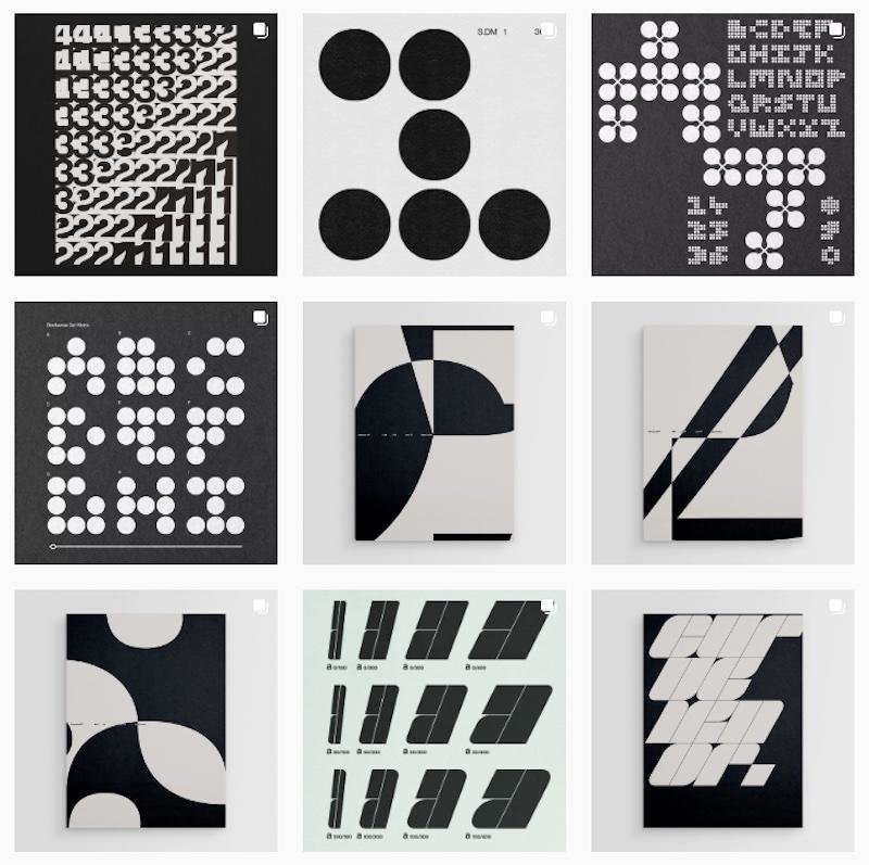
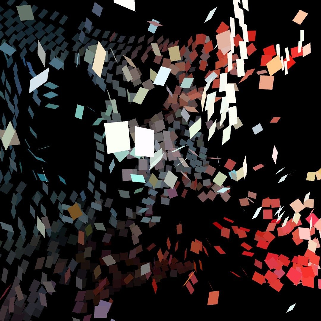
Some References
Grünberger, Christoph, and Paul Heys. The Age of Data: Embracing Algorithms in Art and Design. Niggli Verlag, 2021. Library
Levin, Golan and Tega Brain. Code as Creative Medium. MIT Press, 2021. Library.
Markus Weisbeck and Adrian Palko. Space for Visual Research 2: Workshop, Manual and Compendium. Spector Books, 2018. Library
Cairo, Alberto. The Functional Art: An Introduction to Information Graphics and Visualization. New Riders, 2013. Library
Conrad, Damien et. al. Graphic Design in the Post-digital Age: A Survey of Practices Fuelled by Creative Coding. Set Margins, 2024. Online, Library
Crawford, Kate. Atlas of AI: Power, Politics and the Planetary Costs of Artificial Intelligence. Yale University Press, 2021. Library.
Lima, Manuel. Visual complexity: Mapping Patterns of Information. Princeton Architectural Press, 2011. Library.
Lupi, Giorgia, and Stefanie Posavec. Observe, Collect, Draw!: A Visual Journal. Princeton Architectural Press, 2018.
O’Neil, Cathy. Weapons of Math Destruction: How Big Data Increases Inequality and Threatens Democracy, 2016. NLB.
Reas, Casey et al. Form+Code in Design, Art and Architecture. Princeton Architectural Press, 2010. Library.
Richardson, Andrew. Data-driven Graphic Design: Creative Coding for Visual Communication. Fairchild Books, 2016. Library
Richter, Gerhard. Patterns: Divided, Mirrored, Repeated. D.A.P/Distributed Art Publishers, 2012. Library
Small, Zachary. “Is it Good Enough to Fool My Gallerist?” New York Times, 2023. Online
Williams, Sarah. Data Action: Using Data for Public Good. MIT Press, 2022. Library
Readings
On screen
Approach
Giving data form through code
What methods can be employed to transform raw data into simple visual narratives in the realm of computational aesthetics?
Approach
Giving data form through code
Computational Aesthetics
• Using computational means like code to visualise and express data
• Based on given visual references and readings, students will make visual choices to match styles and techniques
• Rules and instruction based visual outcomes
• Generative and programmatic outcomes with creative coding techniques and tools
Approach
Giving data form through code
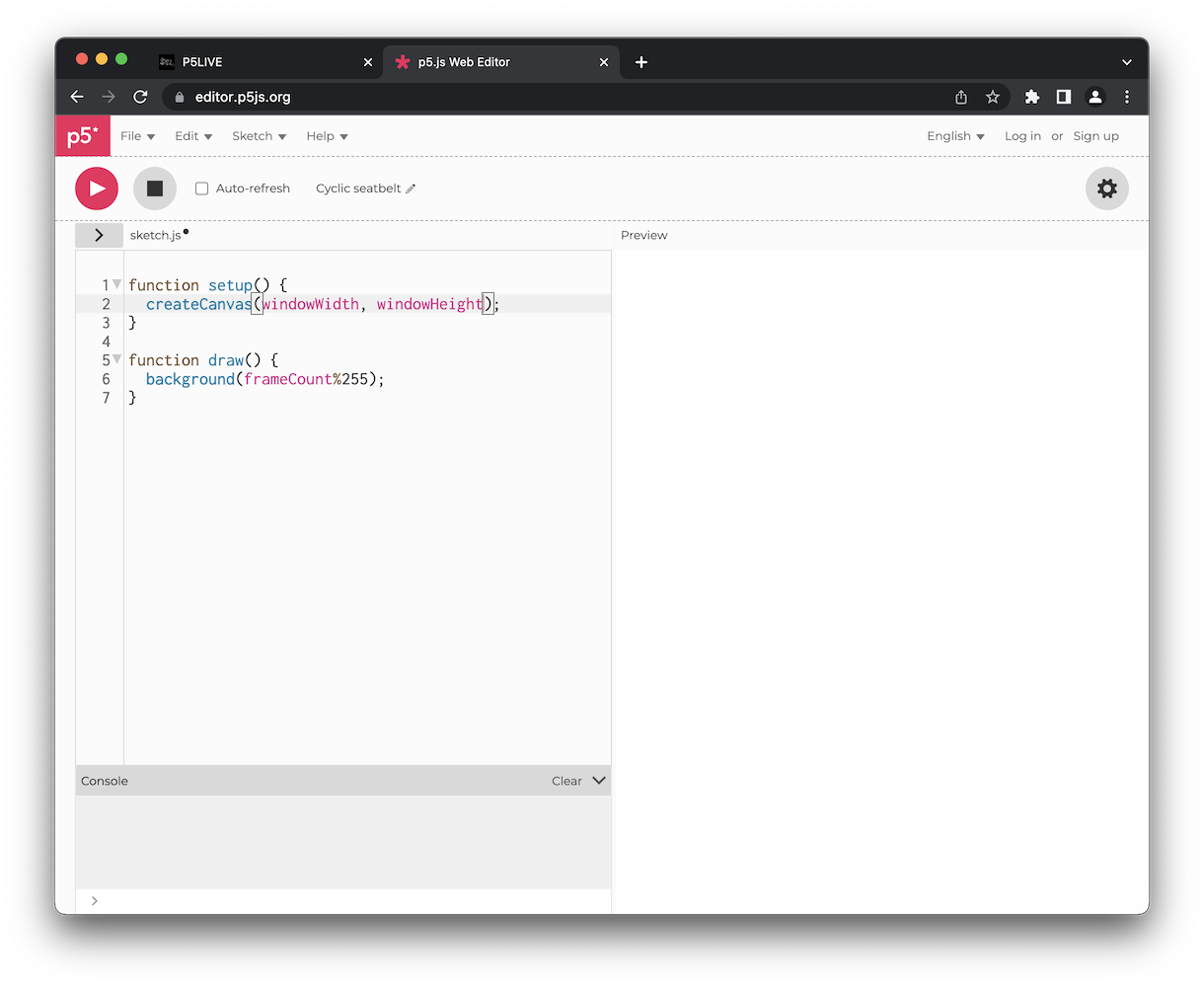
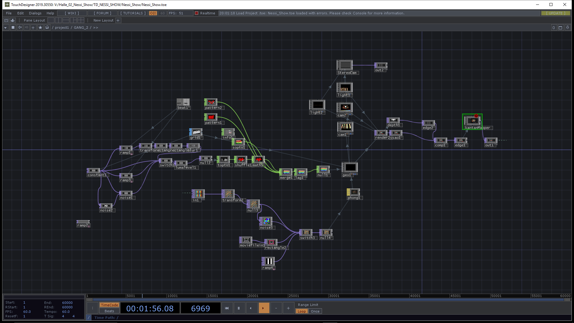
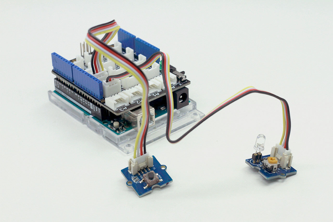
p5.js
Touchdesigner
Arduino
Approach
Giving data form through code
Recorded data
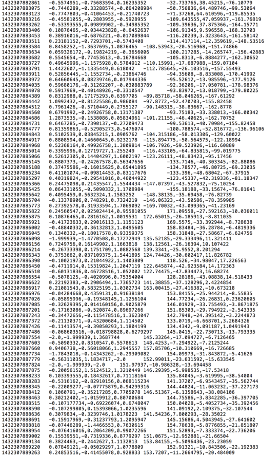
Data sets (number based, big data, quantified self; Students familiarise themselves with data by recording their own data and later bringing it into a format that can be read by code)
Procedural Data
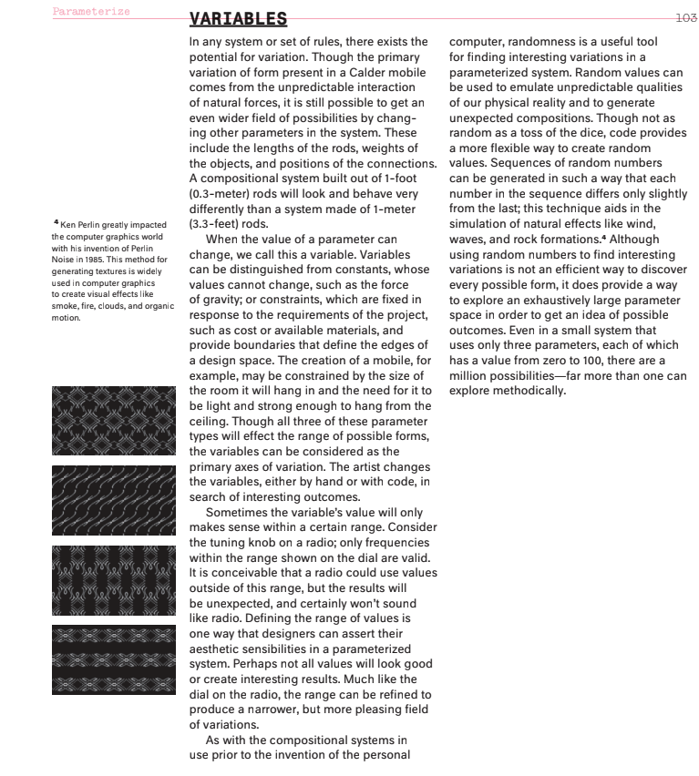
Numbers that are generated algorithmically, programmatically like random numbers or perlin noise, particle systems or cellular automata amongst others. This type of data is often used in generative content, design of virtual environments or motion graphics.
Sensor data
Interaction (sensors can take inputs from their environment and through user interaction, experiments that make use of an Arduino to capture sensor data will use that data to control visuals on screen)
Real time data
Sound, video (real time data can be a difficult topic to work with, one not only has to work with data that is constantly changing but complex at the same time)
Experiment 1
Experiment 3
Experiment 2/4
Experiment 2/4
Experiment 5
Approach
Giving data form through code
Data
Numbers
Recorded Data
Procedural Data
Sensor Data
Real time Data
Variables
Value Storage
Parameters
Change and apply to
Animation
Interaction
Shapes
Algorithmically processing data in code
Application
Approach
Giving data form through code
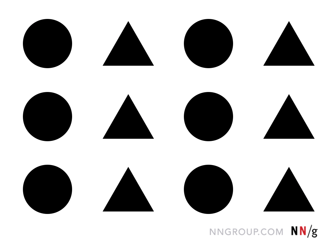
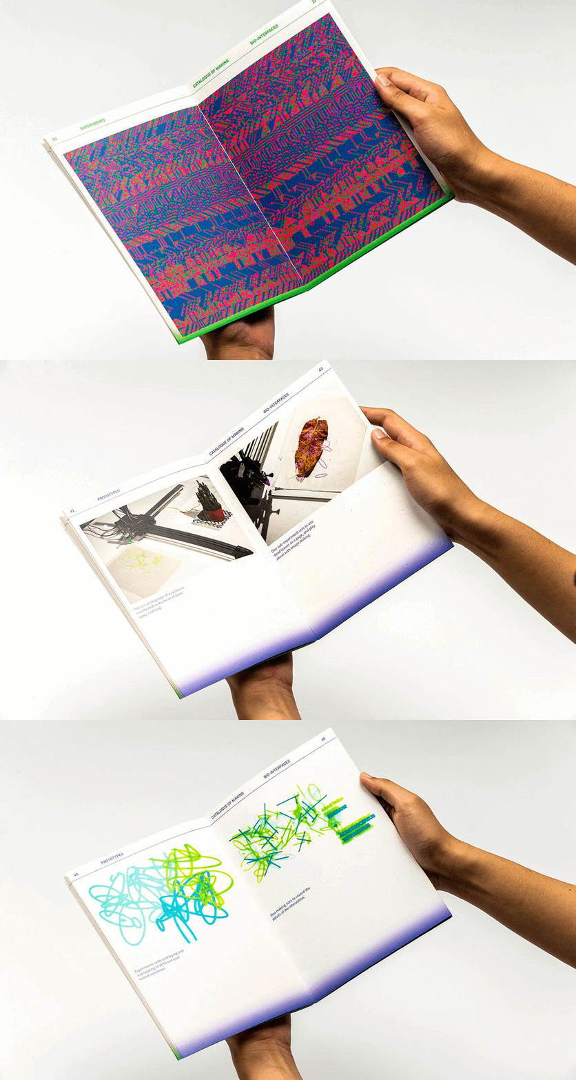
From simple to more sophisticated ideas and outcomes
Approach
Giving data form through code
By using code and data, we can apply different types of control to the applications we create.
From the four types of data discussed, we can control an application's output through various means.
Using sensor data, we can interact with an application via physical interfaces and sensors.
We can create visualizations of recorded data or respond to real-time data such as sound or video feeds.
We can generate procedural data programmatically using algorithms like Perlin noise or random functions.
It is through these applications which gives us ample possibilities and control over the outcomes that we can create in code:
to explore the beauty of computational aesthetics, to give form to content, to imagine new visual context.
Approach
How are we learning?
We want you to work quickly and to take risks, while keeping the focus on the quality of the outcomes you produce. Teamwork is essential to discuss and implement ideas and the best approach to achieve a result you can be proud of.
The success of your work depends on your curiosity and creativity in applying existing and new skills to your work.
The briefs you are given require you to learn more independently, make decisions and develop and implement your own ideas on a given topic or technique. The implementation here is open to interpretation and challenges you to apply different computational techniques using digital or analog means.
Approach
Giving data form through code
data, variables, parameters, control
Data
Numbers
Recorded Data
Procedural Data
Sensor Data
Real time Data
Variables
Value Storage
Parameters
Change and apply to
Functions
Algorithms
Shapes
let v0 = 0;
let v1 = frameCount * 3;
ellipse(10, 20, 100, 100);
ellipse(v0, v1, 100, 100);
Approach
Giving data form through code
data, variables, parameters, control
The text on the right describes the purpose of variables and parameters when used in code
How can the text to the right translate to p5.js, Arduino or Touchdesigner:
Variables are like containers within a computer program that store values such as numbers. This is important to understand once we want to apply changes to a program affecting its output. Variables help us change and reuse values in our code.
Parameters are used with functions. For instance, in p5.js, the ellipse() function takes 4 parameters inside its parentheses that determine the ellipse's position and size. Changing these values changes how the ellipse appears on screen.
Approach
Giving data form through code
data, variables, parameters, control
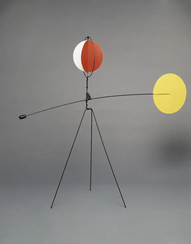
Outcome
The outcomes of this project will be accumulative. All experiments conducted will result in a body of work that will be archived in a web-based format.
At the end of the project, each group will present their outcomes in an ad hoc showcase, culminating in their submission of a curated web-based documentation website.
The showcase for session 9 is only 2 hours, where your group will show their body of work on a single table curated by you.
Outcome
Website
Experiment 1
Experiment 2
Experiment 3
Experiment 4
Experiment 5
About
+
Adapt to briefs quickly
Evaluate possibilities
Practice design skills
Respond to design challenges
Select and curate outcomes
Work within a short timeframe
Work together in/as a team
Session 1
Monday 9.30am
Experiment 1
3 Exercises
Session 1
Experiment 1
Exercise 1
Observe, collect, draw
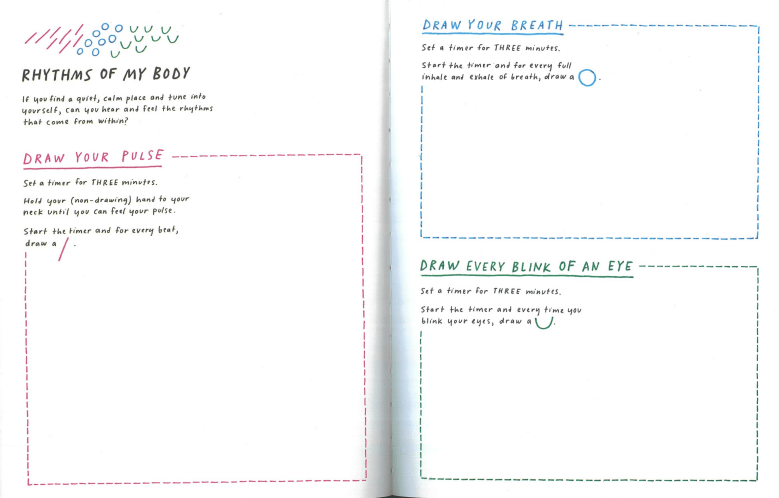
Based on the Rhythm of my Body exercise each group member will record their own (breath, pulse, blink) data.
→ Use pen and paper for this exercise
→ Document exercise
Session 1
Experiment 1
Exercise 1
Observe, collect, draw
Based on the Rhythm of my Body exercise each group member will record their own (breath, pulse, blink) data.
Use pen and paper for this exercise
Document exercise

30
Session 1
Experiment 1
Exercise 2
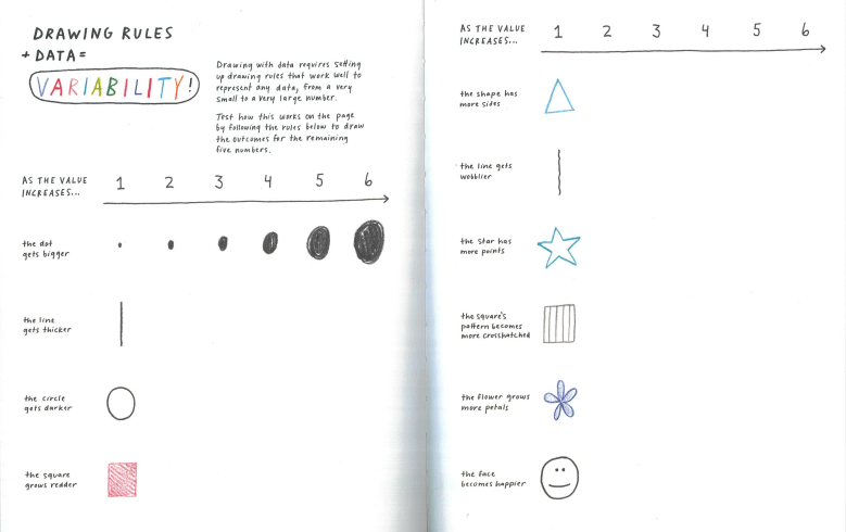
Variability
Based on the Variability exercise you will better understand how varying values in numbers will result in changes applied to form based on a given rule.
→ Use pen and paper for this exercise
→ Document exercise
Session 1
Experiment 1
Exercise 2
Variability

Based on the Variability exercise you will better understand how varying values in numbers will result in changes applied to form based on a given rule.
Use pen and paper for this exercise
Document exercise
20
Session 1
Experiment 1
Exercise 1 + 2
From the 2 exercises you have recorded 3 numbers for each group member and you have followed 10 rules to represent a number visually.
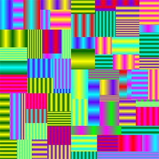
From these 2 exercises, write a small program with p5.js that applies variability to the numbers you have recorded as a group.
Session 1
Experiment 1
Exercise 3
From drawing to code
Steps to take
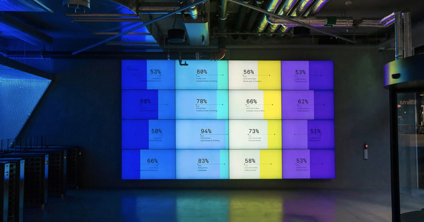
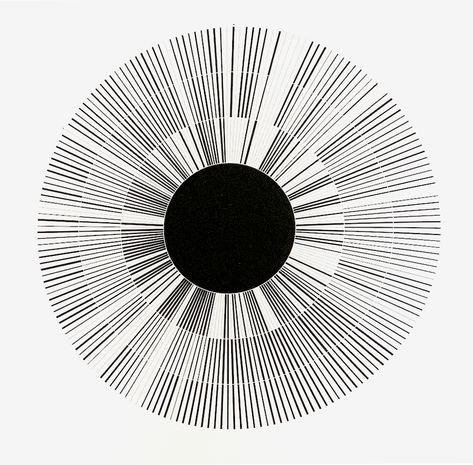
You will use p5.js and the recorded data (numbers from the first drawing exercise). In your code, draw shapes that visually represent that data. Create 3 coded variations and apply variability to shapes based on your number data.
You will decide which numbers to use. For example, you can count the shapes drawn for each category (pulse, breath, and blink), resulting in 3 numbers for each group member.
Here, the criteria are to work with minimal aesthetics, focusing on simplicity and clarity in your visual representations. Use minimal aesthetics to create a series of three coded variations.
You can use single shapes or use for-loops to create static or animated visuals. Animations can make use of coding concepts learned before to make shapes move with frameCount and sin() for example.
The colours used can be either black and white or a palette of 4 colours: one for the background and the other three for the different types of data shapes.
45
draw with code
aesthetics
shapes
colours

Session 1
Experiment 1, Exercise 3, visual direction
Session 1
Experiment 1, Exercise 3, visual direction
Session 1
Experiment 1
Homework
→ start with reading and reviewing the slides shared with you today
→ Complete all 3 exercises
→ Document process and outcomes for each of the 3 exercises in image and text (Write a short reflection on each exercise, focusing on the group's experience. The writing should be short and show a good range of descriptive, analytical and reflective writing ~70-120 words)
→ Keep p5.js sketches, you will need them for submission
→ at least one image for each variation required
→ optional: video recordings of animation, if applicable
All exercises for experiment 1
Exercise 3
Session 2
Tuesday 2.30pm
Experiment 2/4
Workshops
Prepare for this session
1. Install TouchDesigner from derivative.ca
2. After successfully installing, open Touchdesigner
3. Make an account and login at least once before class starts on Tuesday
4. You can do the installation from home but you should do so before your class starts
Procedural Data Workshop
Session 2
Experiment 2/4
Sensor Data Workshop
with Jake Tan
with Joanne Ho
Procedural Data
Numbers that are generated algorithmically, programmatically like random numbers or perlin noise, particle systems or cellular automata amongst others. This type of data is often used in generative content, design of virtual environments or motion graphics.
Sensor data
Interaction (sensors can take inputs from their environment and through user interaction; experiments that make use of an Arduino to capture sensor data will use that data to control visuals on screen)
Session 2
Experiment 2/4
Homework
→ Complete workshop deliverables based on workshop lead's requirements
→ Document process and outcome, where applicable document user interaction
(Write a short reflection on the workshop. The writing should be short and show a good range of descriptive, analytical and reflective writing ~70-120 words)
→ Homework to be completed before next week's Tuesday session
Session 3
Thursday 2.30pm
Documentation website
Experiment 3
Data Transformation
Prepare for this session
Review and read through slides
Bring outcomes from Experiment 1 to class
Session 3
Documentation website
The outcomes of this project will be accumulative. All experiments conducted will result in a body of work that will be archived in a web-based format.
We have prepared a website template for your, follow the link below to download.
The website will be used by you and your group to document your experiments, each experiment has its own outcome requirements which range from written text to images, videos and coded sketches (p5.js, Arduino and TouchDesigner).
• Landing page
• Single page per experiment (5 pages in total)
• About the team (1 page)
Changes to the design should be made through css (see custom.css to make changes to colour and typography) and the html files provided.
Session 3
Documentation website
Some recommendations, what to do and what to avoid, and examples. Images in this folder
Documentation
• Make a thoughtful selection of images that demonstrate your efforts in making multiple variations and experiments.
• Take good quality photographs. Consider the background, lighting, human presence or interaction. Dirty backgrounds are distracting
• Edit photos and videos; crop or make colour adjustments if necessary.
Layout
• Sequence images to construct a narrative for the reader to follow.
• Text and images should support each other.
• Use white space to organise and pace content.
Colour
• Decide on a cohesive colour scheme for the website. Make sure that it complements, and does not compete, with your images and text.
Typography
• Select suitable typeface(s) from Google Fonts. You will need a text typeface that is well-suited to reading on screens. The adventurous may want to explore pairing or combining multiple fonts.
• Establish type hierarchy, with different styles for headings, paragraph text, quotes, image captions and links.
Visual interest
• Integrate visually striking moments that add drama and delight, but only when appropriate, such as on the landing page.
• Image of mouse interaction is from this website
References (Website)
Aranda\Lasch good documentation of variation
Pentagram good documentation of final outcomes, layout.
Session 3
We take a 10 minute break
Session 3
Experiment 3: Data Transformation
1 / 4
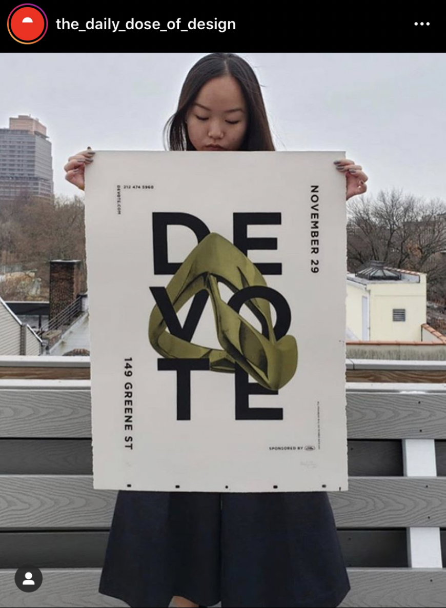
Based on the data recorded during session 1, you will populate a spreadsheet with your individual data to create a larger data set based on numbers recorded for pulse, breath and blink from the Rhythm of Body exercise.
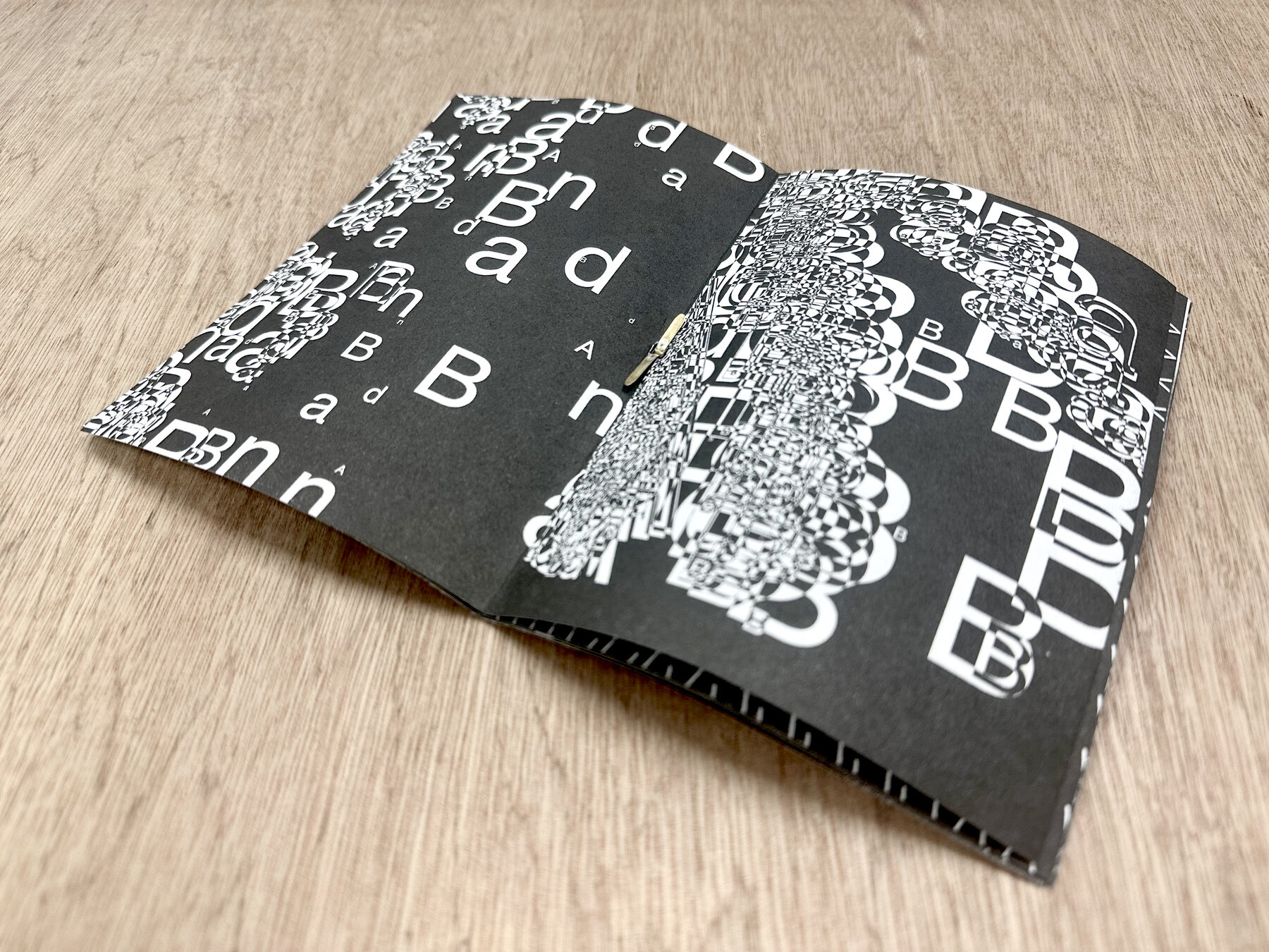
Data will then be exported to a .csv file which can be read and imported by a prepared p5.js sketch. You are then tasked to generate a series of data visual compositions (10 or more) to express one of these qualities on the right
Scale
Texture
Harmony
Movement
Session 3
Experiment 3: Data Transformation
2 / 4
The focus of this experiment is on transforming data into expressive, surprising and compelling visual forms.
Starting from 2D explorations students can venture into 3D if there is a good reason and they are technically confident.
Through this experiment multiple variations and possibilities should be explored through experimentation with form, variables, parameters and control.
The aim is to expand the conventions and languages of data visualisation beyond conventional data visualisation techniques and norms, such as graphs and charts, to arrive at more experimental and visually compelling results, while still embracing the insights that can be extracted from the dataset.
Session 3
Experiment 3: Data Transformation
3 / 4
See your data,
datawrapper demo
Free but only a limited number of graph renderings
Add your data to this spreadsheet
From the data generate a series of data visual compositions
Session 3
Experiment 3: Data Transformation
4 / 4
→ at least one p5.js sketch and variations of
→ a series of visual compositions resulting from a p5.js sketch (8-12)
→ compile compositions into printed format (zine, poster)
Experiment 3 starts today and then continues and concludes after the next session (session 4) next Monday.
Duration
Deliverables
Session 3
Experiment 3: Data Transformation
Homework
→ Complete outcomes based on experiment 3 requirements
→ Document process and outcome, where applicable document user interaction
(Write a short reflection on this third experiment. The writing should be short and show a good range of descriptive, analytical and reflective writing ~70-120 words)
→ Show good progress next Monday
Visuals should be completed so you can work on printed deliverables
→ Homework to be completed before next week's Thursday session
Session 4
Monday 9.30am
Experiment 3
Data Transformation continues
Consultations
Session 5
Tuesday 2.30pm
Experiment 2/4
Workshops
Prepare for this session
1. Install TouchDesigner from derivative.ca
2. After successfully installing, open Touchdesigner
3. Make an account and login at least once before class starts on Tuesday
4. You can do the installation from home but you should do so before your class starts
Procedural Data Workshop
Session 2
Experiment 2/4
Sensor Data Workshop
with Jake Tan
with Joanne Ho
Procedural Data
Numbers that are generated algorithmically, programmatically like random numbers or perlin noise, particle systems or cellular automata amongst others. This type of data is often used in generative content, design of virtual environments or motion graphics.
Sensor data
Interaction (sensors can take inputs from their environment and through user interaction, experiments that make use of an Arduino to capture sensor data will use that data to control visuals on screen)
Session 2
Experiment 2/4
Homework
→ Complete workshop deliverables based on workshop lead's requirements
→ Document process and outcome, where applicable document user interaction
(Write a short reflection on the workshop. The writing should be short and show a good range of descriptive, analytical and reflective writing ~70-120 words)
→ Homework to be completed before next week's Tuesday session
Session 6
Thursday 2.30pm
Experiment 5
Data Expression
Session 6
Experiment 5: Data Expression
1 / 4
Based on your understanding of the data recorded in previous experiments for pulse, breath and blink, translate these rhythms into sound. See the list on the right for suggestions.
Using this sound as input, process this data in real time to generate animated visuals that express pulsing, breathing and blinking. For this brief, you may use any tool covered in previous experiments (p5.js, TouchDesigner or Arduino)
Find the rhythms of pulse, breath and blink in:
Field recordings
of urban or natural environments
Music soundtrack
existing or newly composed
Speech or reading
for sound analysis or speech recognition
Vocalised sound
Experiment brief
Session 6
Experiment 5: Data Expression
2 / 4
The focus of this experiment is on expressing data as a narrative that is both conceptually and visually compelling.
Starting from 2D explorations, students can venture into 3D if there is a good reason and they are technically confident. Beyond the use of abstract forms, you may also explore the integration of text or images if this is appropriate.
The aim is to use data to communicate stories about our bodies, our environments, our music or literature (depending on your choice of sound) in experimental but also meaningful ways.
Focus, aim and objective
Session 6
Experiment 5: Data Expression
3 / 4
p5.js code templates
Demonstrates how to read audio from the microphone. Displays wave form and frequency spectrum. See comments to learn more about FFT, frequencies, wave forms.
Demonstrates how to read audio from the microphone and extract the overall amplitude as well as the amplitude for different frequency ranges.
Same as above but uses an audio file instead of the microphone as input.
Shows how to read the amplitude of an audio stream (microphone).
Same as above but uses an audio file instead of the microphone.
This sketch can recognise and respond to spoken words. In this example the colors of the background change.
Abstraction of bird sounds using FFT
Session 6
Experiment 5: Data Expression
4 / 4
Experiment 5 starts today and then continues and concludes after the next session (session 7) next Monday
1. Animated video
in digital format, MP4 file, 1080p
2. Visual sound score in printed format, this may be a
• Listening score to accompany
a soundtrack, or a
• Performance score that instructs how to perform a soundtrack
Duration
Deliverables
United Visual Artists, The Great Animal Orchestra, 2016.

United Visual Artists
UVA’s diverse body of work integrates new technologies with traditional media such as sculpture, performance and site-specific installation.
The Great Animal Orchestra is a performative space in which spectrograms specifically crafted for and generated by Bernie Krause’s soundscapes form an abstract projected landscape, a visual interpretation of the various global locations and times of day that Krause made the original recordings.
On the floor, in front of the projections a shallow pool of black-coloured water seamlessly reflects the data and brings another dimension to the work. Speakers generate ripples to visualise the sound frequencies inaudible to the human ear. The installation envelops the audience encouraging them to linger and reflect on the language of the living sounds and the phenomenon that each animal has its own acoustic signature in the oral tapestry of its ecosystem.
type of sound:
field recording in natural environment
Session 6
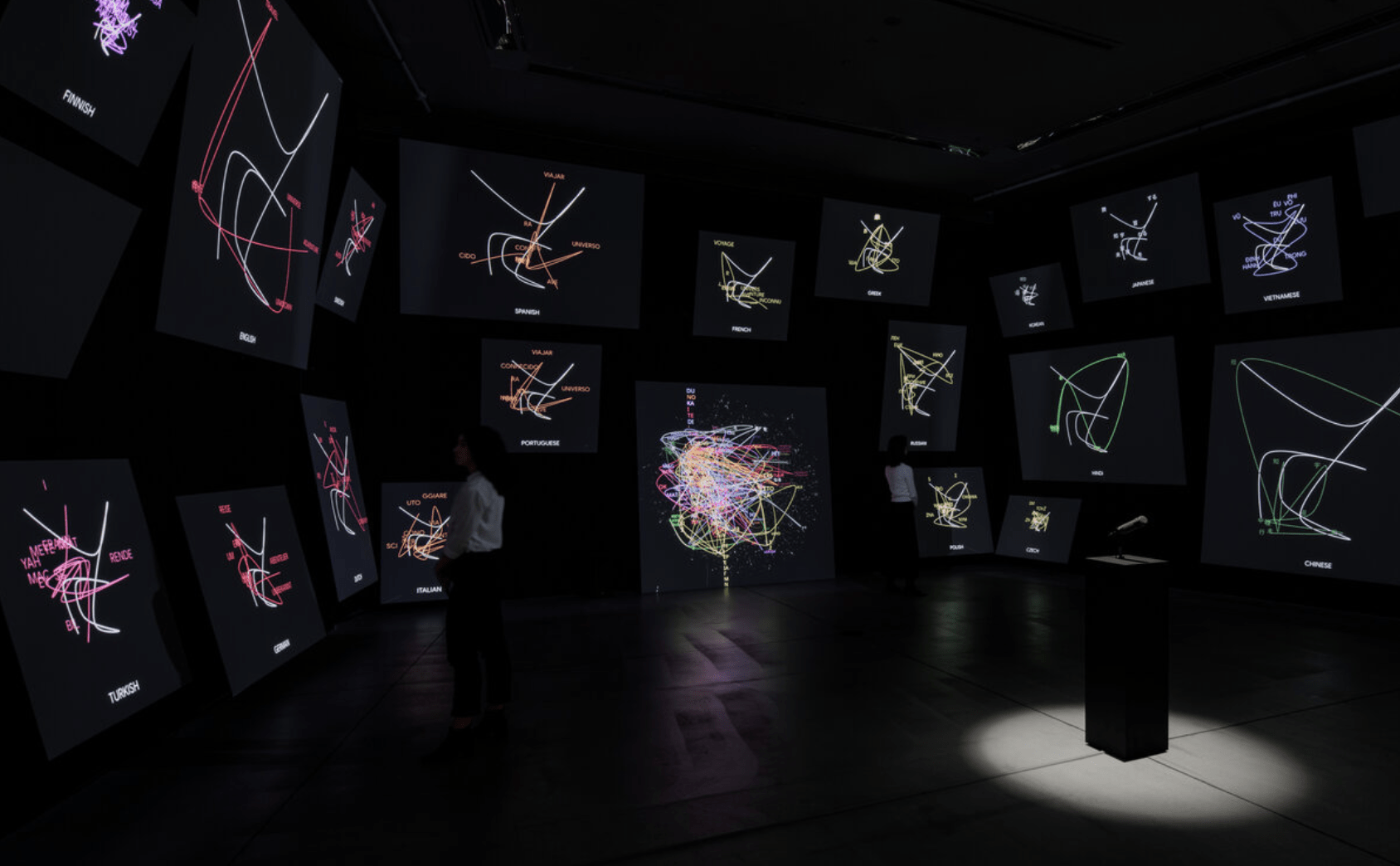
The Green Eyl. Found in Translation, 2021.
The Green Eyl
TheGreenEyl is a design and research practice based in Berlin and New York. They create exhibitions, installations, objects, images, interactions and algorithms.
Found in Translation is an interactive, immersive installation for the exhibition "Understanding Misunderstanding" at 21_21 Design Sight in Tokyo. Using their own spoken sentences, visitors viscerally experience the process of machine translation. Visualizations show how the machine learning model clusters words from different languages by semantic similarity, and translations are presented typographically and auditorily across 24 languages.
type of sound:
reading or speech
Session 6
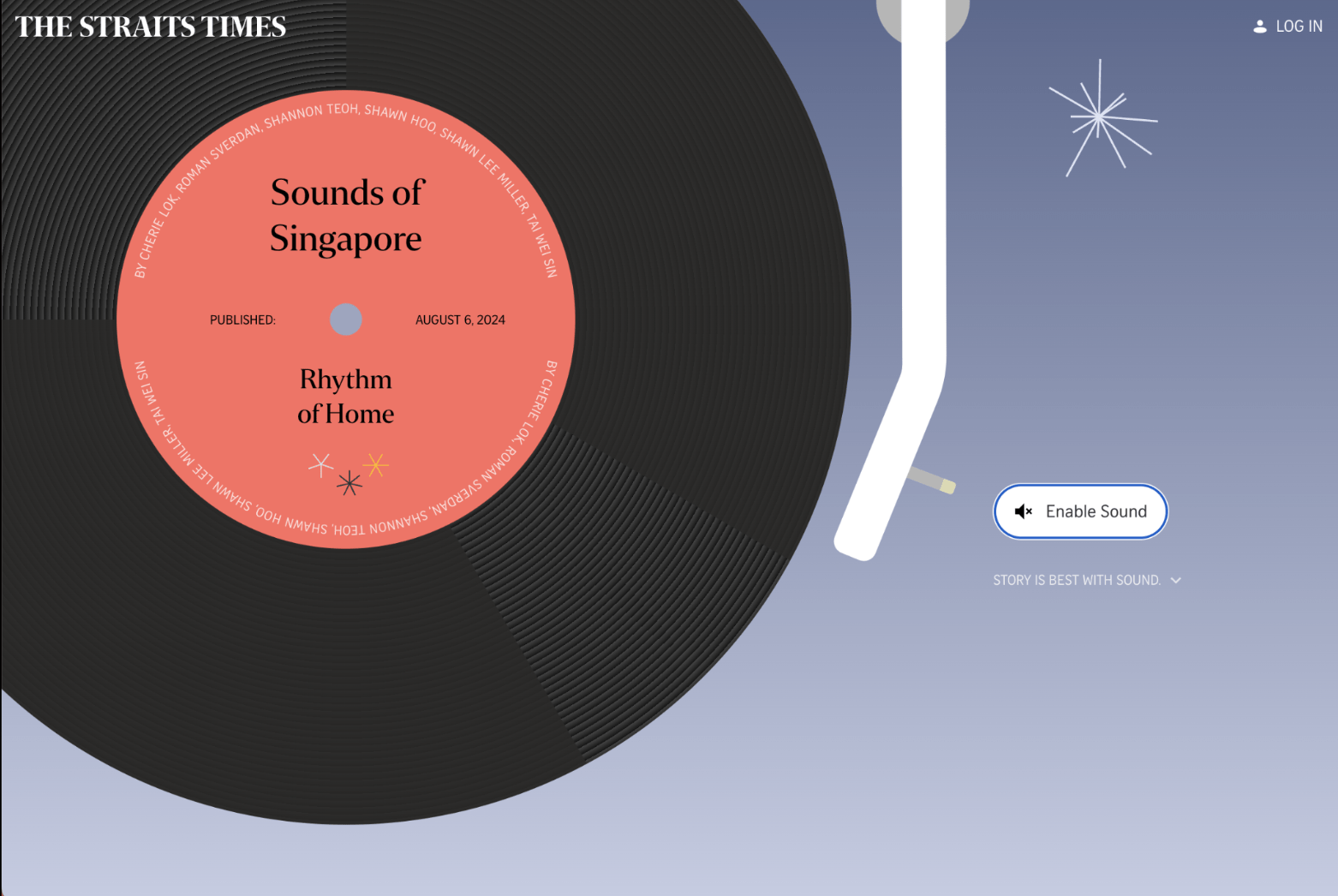
The Straits Times. Sounds of Singapore, 2024.
The Straits Times
Sounds of Singapore: Rhythm of Home is an interactive news article featuring the sounds of everyday life in Singapore.
Our city is filled with all sorts of sounds. They exist around us, in our homes, workplaces, communities and even our memories. In ever-evolving Singapore, new notes are constantly cutting through the cacophony of everyday life, while traditions left behind slink slowly into silence.This National Day, we have captured nine sounds that resonate with the Singaporean experience. See how many you recognise.
We travelled across town hunting for sounds. We revisited old haunts, stood in nature and followed the music. Our findings are compiled here, accompanied by poems written in response to the feelings evoked by each sound.
type of sound:
field recording in urban environment
Session 6
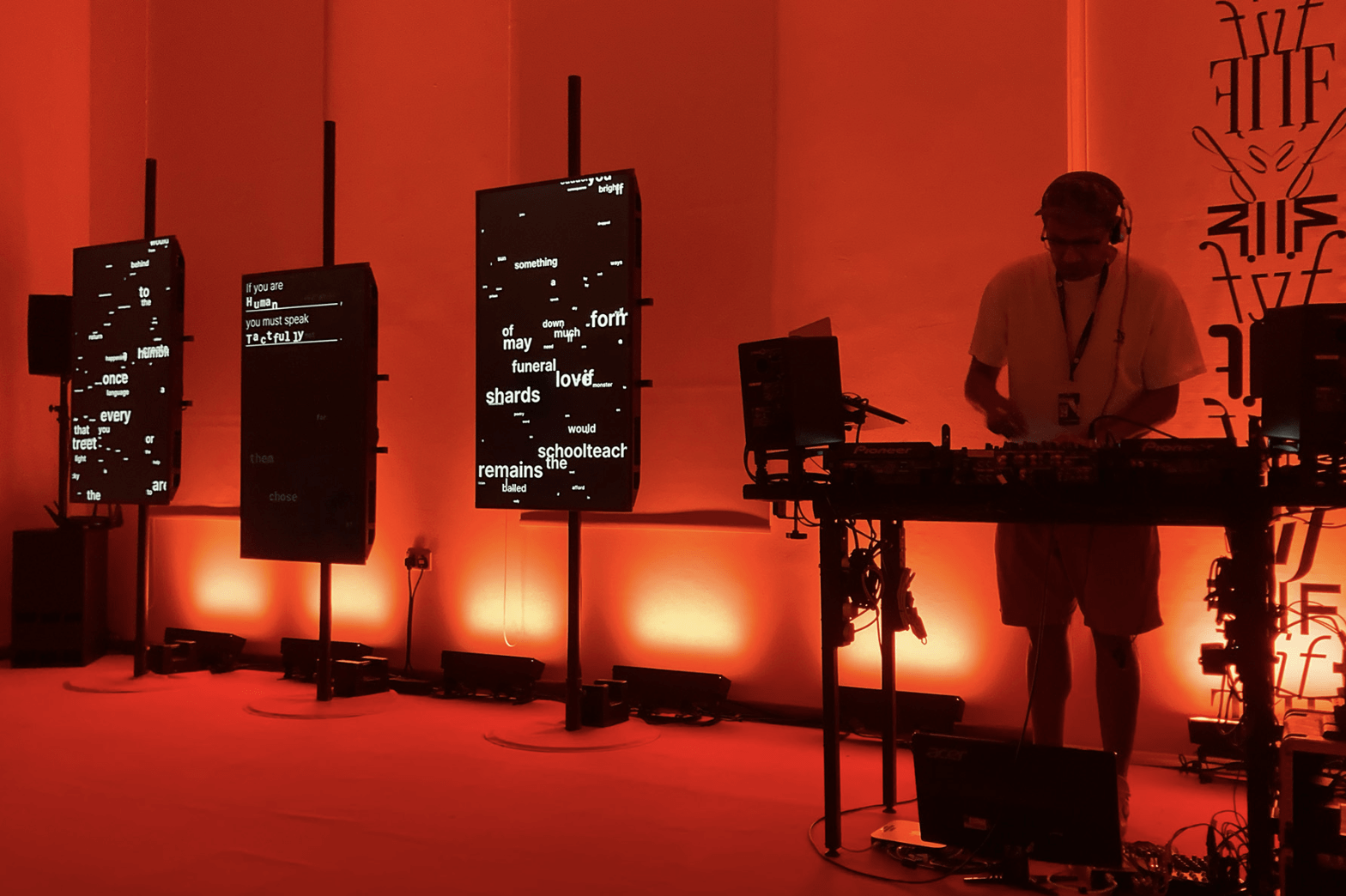
SISTRUM, If We Paused in Mid Thought. 2022.
SISTRUM
SISTRUM is an interdisciplinary collective that creates installations, exhibitions and digital platforms enquiring into the narrative quality of sound and the environment.
If We Paused in Mid Thought is a microsite, installation and performance for the 25th
edition of the Singapore Writers Festival. Drawing upon the festival theme ‘IF’, this work takes a participatory and generative approach to recomposing Cyril Wong’s poem over the festival, reimagining both the past and the future.
follow link for screen recording
type of sound:
music
Session 6
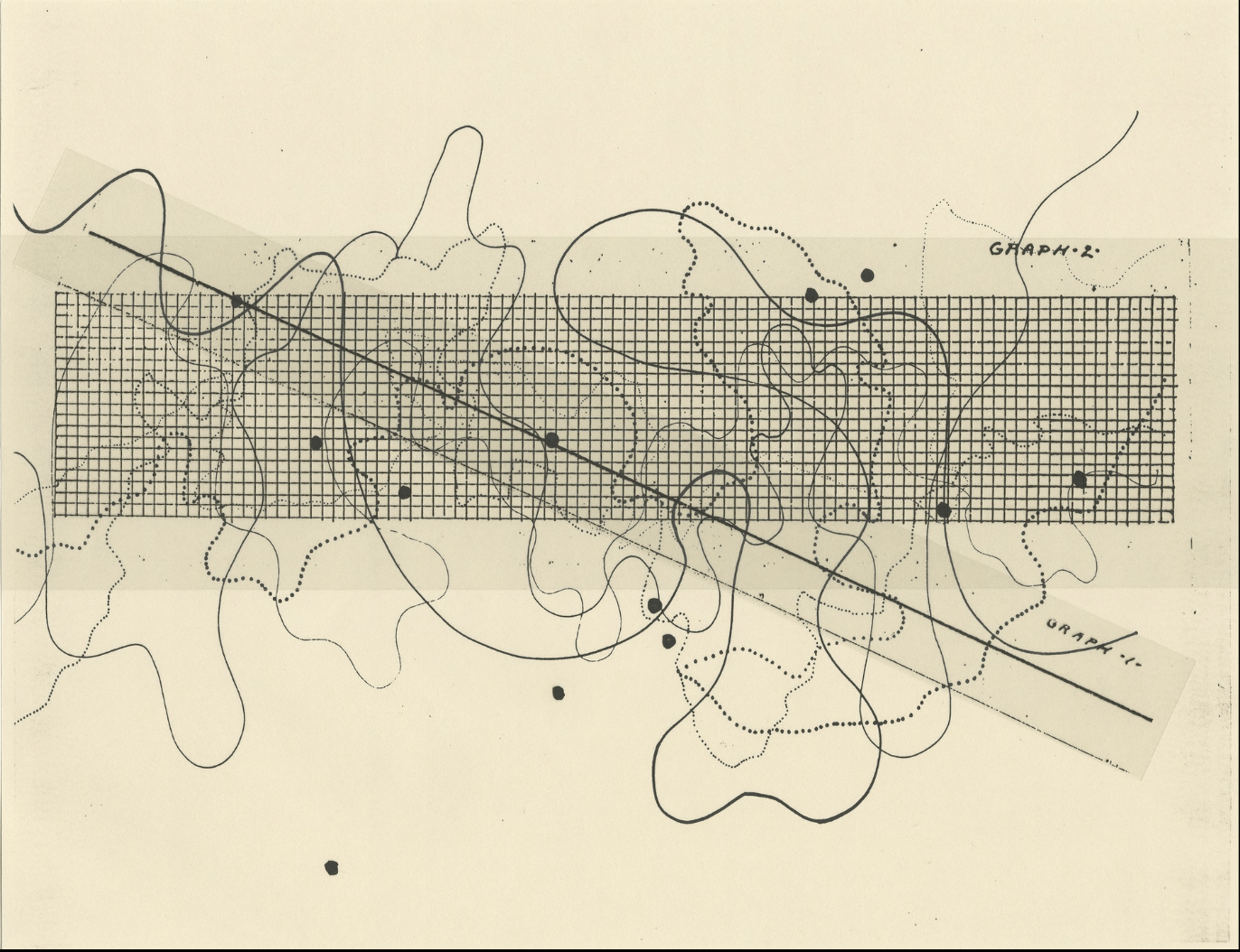
John Cage. Fontana Mix, 1958.
John Cage
John Cage was an experimental American composer who explored the use of chance and indeterminacy in his musical compositions. Fontana Mix is composition indeterminate of its performance, and was derived from notation CC from Cage’s Concert for Piano and Orchestra. The score consists of 10 sheets of paper and 12 transparencies.
The sheets of paper contain drawings of 6 differentiated (as to thickness and texture) curved lines. 10 of these transparencies have randomly distributed points (the number of points on the transparencies being 7, 12, 13, 17, 18, 19, 22, 26, 29, and 30). Another transparency has a grid, measuring 2 x 10 inches, and the last one contains a straight line (10 3/4 inch). By superimposing these transparencies, the player creates a structure from which a performance score can be made: one of the transparencies with dots is placed over one of the sheets with curved lines. Over this one places the grid. A point enclosed in the grid is connected with a point outside, using the straight line transparency. Horizontal and vertical measurements of intersections of the straight line with the grid and the curved line create a time-bracket along with actions to be made.
follow link for more
Visual music notation
Session 6
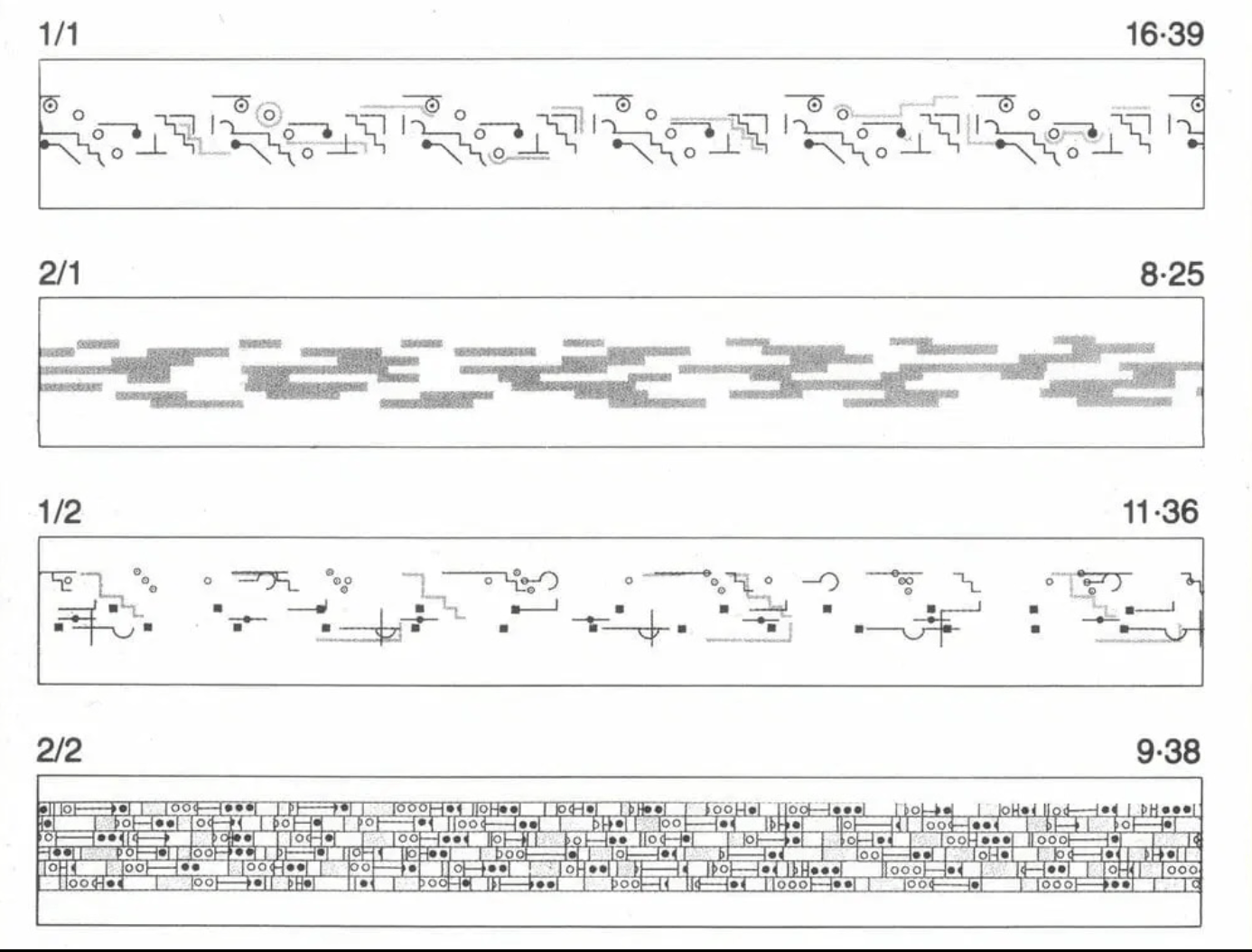
Brian Eno. Music for Airports, 1978.
Brian Eno
In 1978, Brian Eno released Ambient 1: Music for Airports, a landmark album in ambient and electronic music. Although it wasn’t the first ambient album, it was the first album to be explicitly labelled as ‘ambient music’. Music for Airports was a continuation of Brian Eno’s experimentation with the tape machine as a compositional tool, a process he’d begun three years prior with 1975’s Discreet Music. It also saw Eno’s further exploration of generative, systems-created music, whereby Eno would focus on creating a system that would generate ambient music, something he continues to explore in the modern age with his range of iOS apps.
Music for Airports liner notes contains a graphic score designed by Brian Eno himself. Not a trained musician, and unable to read or write sheet music, Brian Eno instead used graphic symbols to denote each musical phrase or loop. Look closely and you can see individual symbols on each row, each spaced apart differently, reflecting the recording technique used to craft the album.
follow link for more
Visual music notation
Session 6
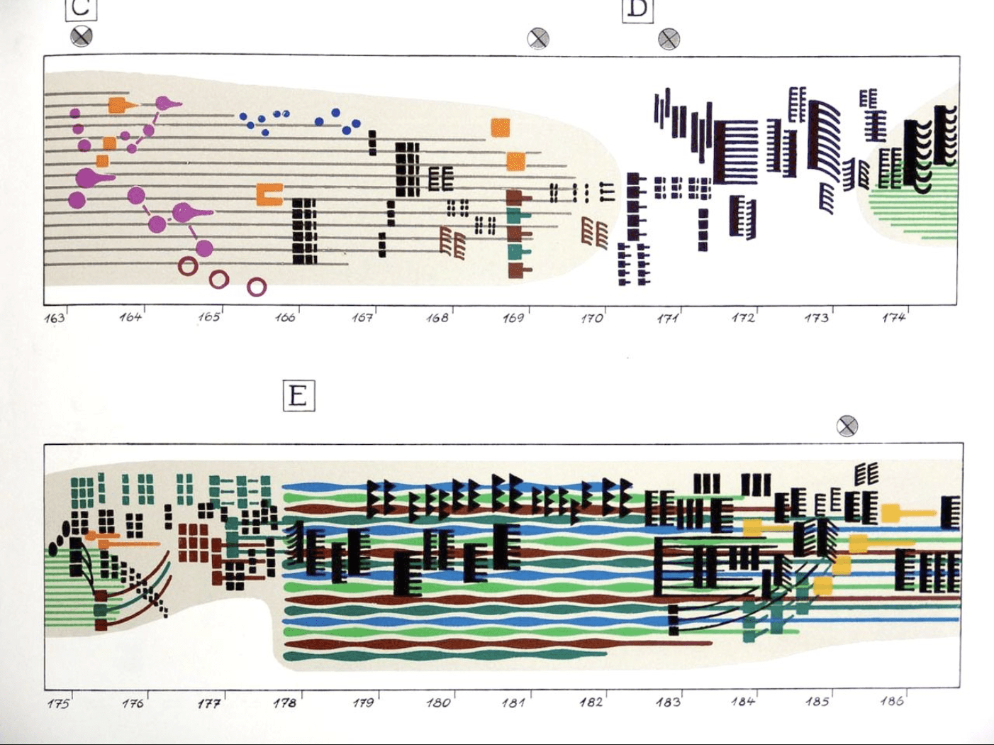
Rainer Wehinger
A visual listening score to accompany Gyorgy Ligeti's Artikulation
follow link for synced video
Visual music notation
Session 6
Session 2
Experiment 5: Data Expression
Homework
→ Record or select the type of sound to be processed
→ Explore multiple variations and possibilities of visualising this sound through coded animation
Homework
By next Monday (session 7)
→ Animated visuals should be completed so you can work on digital or printed deliverable and its documentation for your website
→ Experiment 5 to be completed before the final showcase (next Thursday)
Session 7
Monday 9.30am
Experiment 5
Data Expression continues
Showcase briefing
Session 7
Looking ahead to Session 9
Showcase and submission
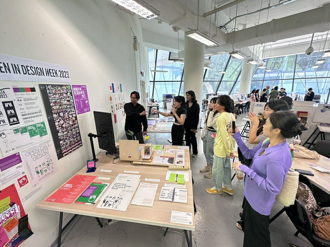
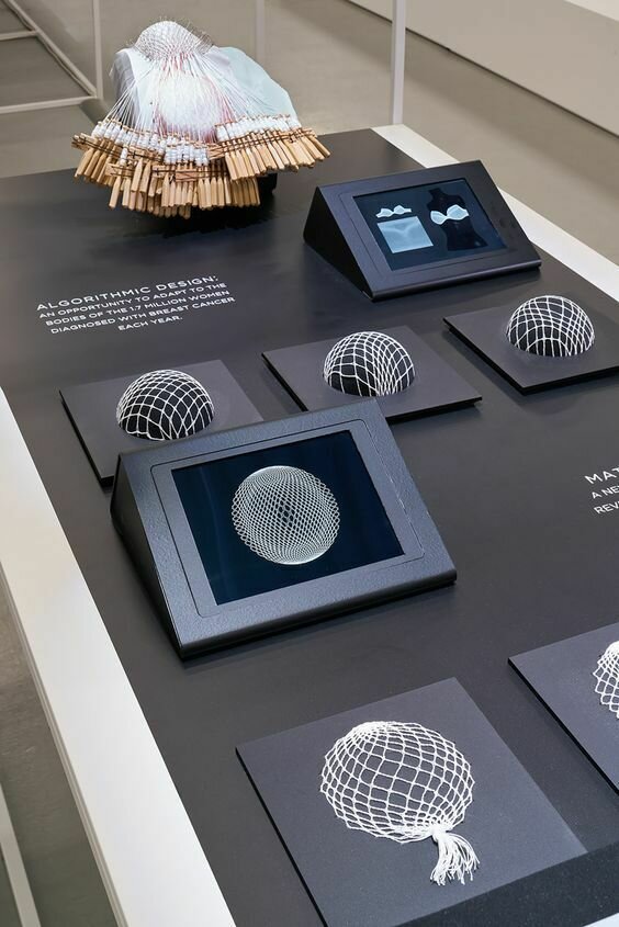
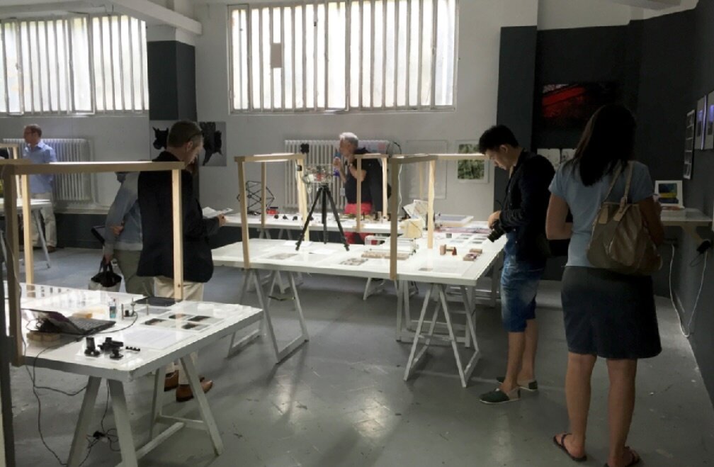
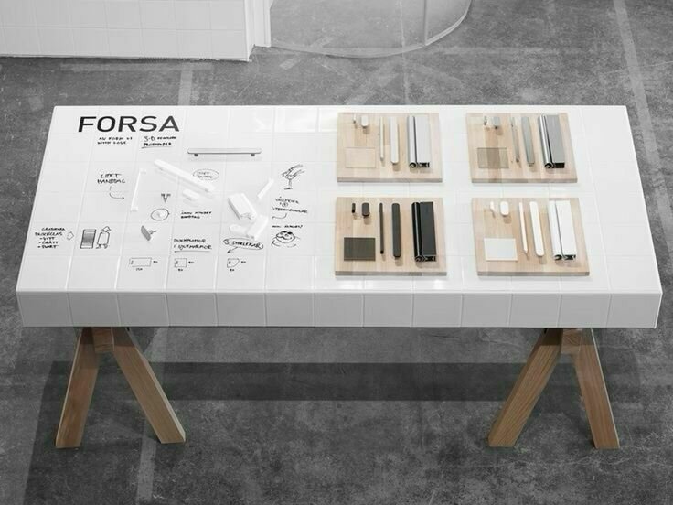
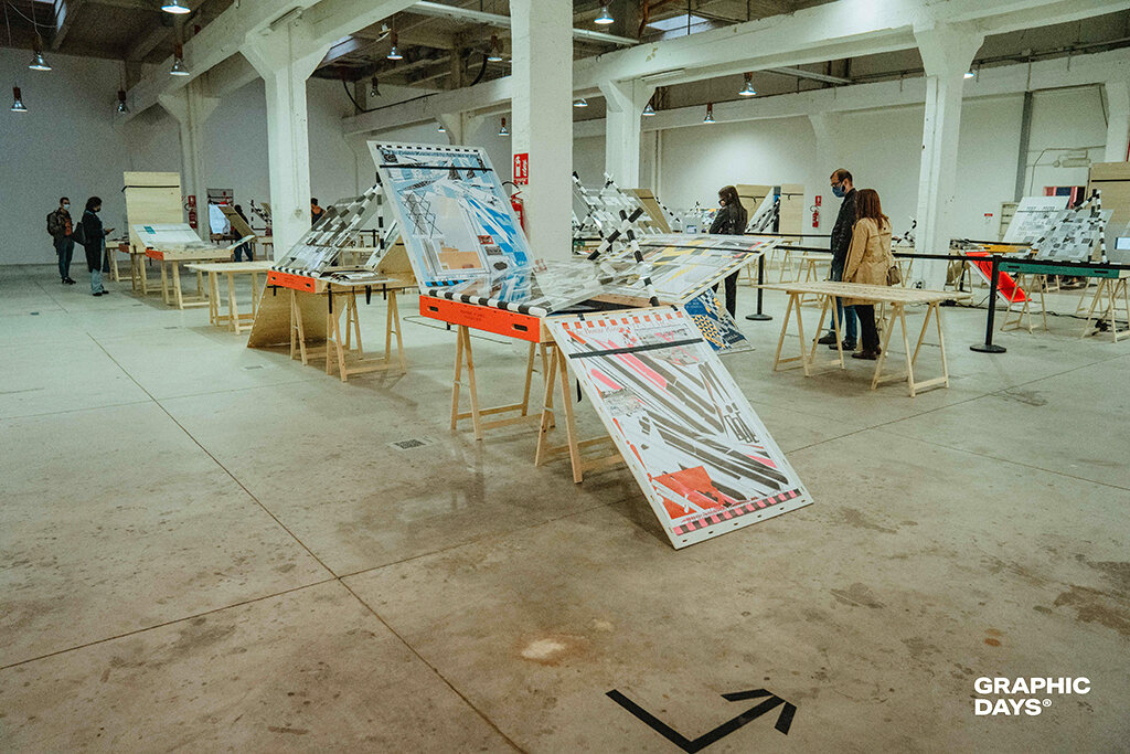
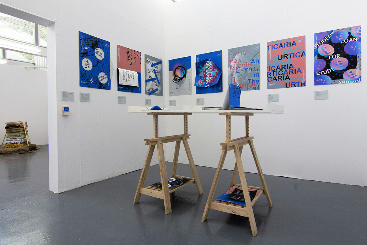
Session 9 will be about presenting your outcomes from all 5 experiments. These outcomes will be presented by each group in a physical display covering 1 studio table.
Most of the outcomes are digital and can be shown on a laptop. Some outcomes are physical and can be displayed as they are on your table.
The Arduino experiment does not need to work, but should be demonstrated in video format, the physical artefact should be present.
Showcase
Session 7
Looking ahead to Session 9
Showcase and submission

Take a look at the following slides for some inspiration for your table display.
Add some images of the final setup to your website!
Showcase
Session 7
Looking ahead to Session 9
Showcase and submission


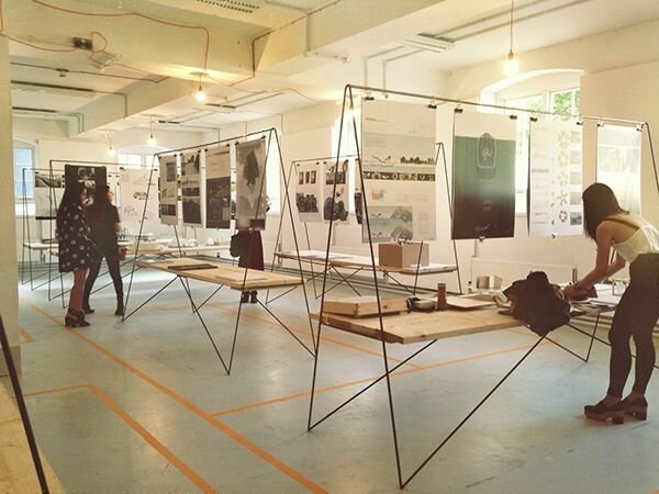
Showcase examples
Session 7
Looking ahead to Session 9
Showcase and submission
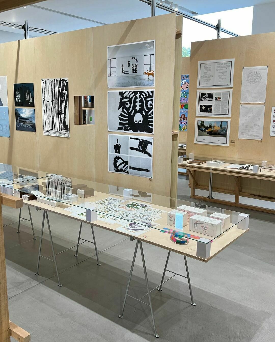
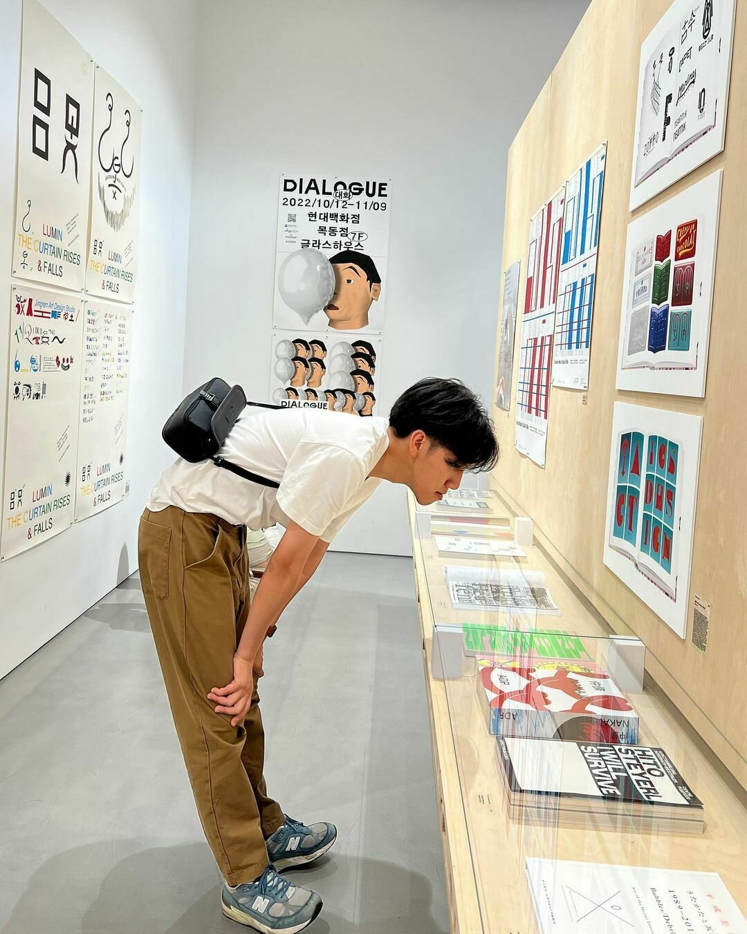
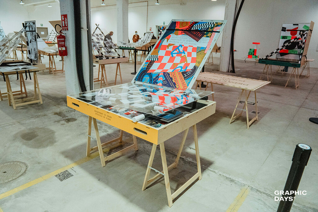
Showcase examples
Session 7
Looking ahead to Session 9
Showcase and submission
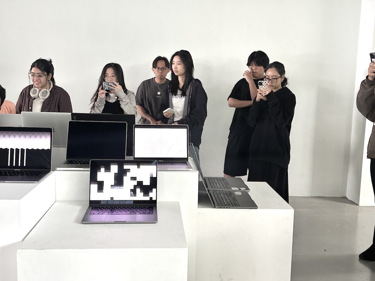

Showcase examples
Session 7
Looking ahead to Session 9
Showcase and submission
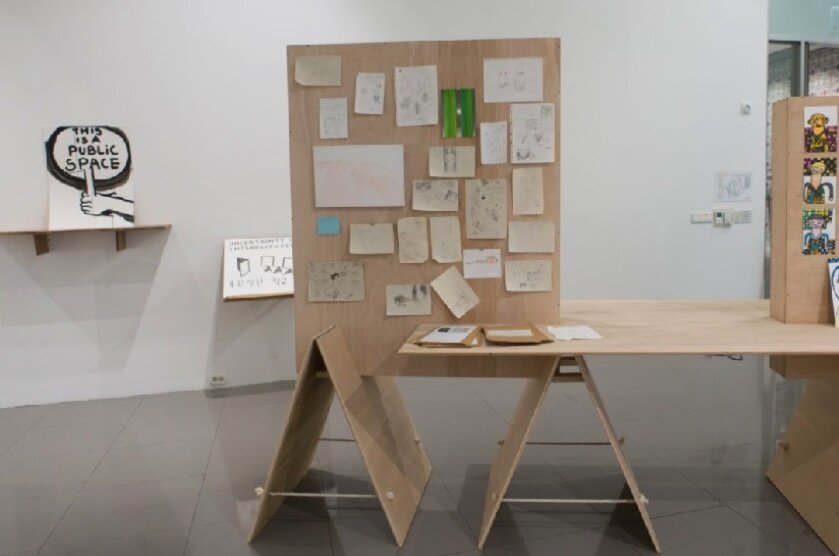
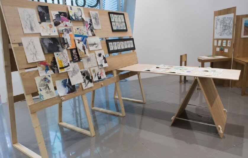
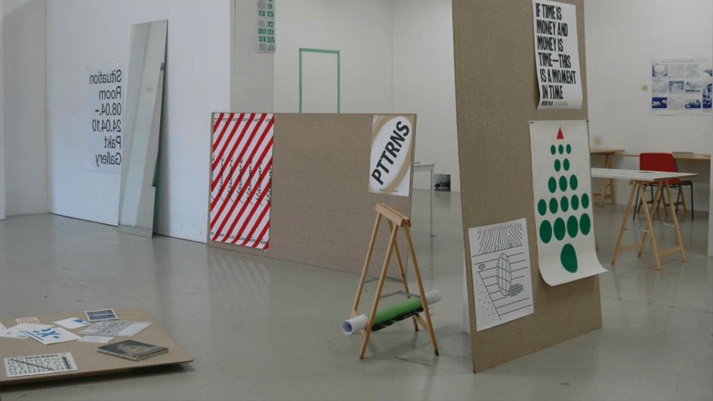
Showcase examples
Session 7
Looking ahead to Session 9
Showcase and submission
Showcase examples
Session 7
Looking ahead to Session 9
Showcase and submission
Submission
Submission of works is on session 9, 4.30pm
Each group submits the following
1. Link to website to be shared on this spreadsheet
2. Website files to be uploaded to submission folder
3. peer-evaluation
Session 8
Tuesday 2.30pm
Feedback and consultation
Session 9
Thursday 2.30pm
Showcase
Submission


Session 7
Session 9
Showcase and submission
Submission
Submission of works is on session 9, 4.30pm
Each group submits the following
1. Link to website to be shared on this spreadsheet
2. Website files to be uploaded to this submission folder and shared on this spreadsheet
3. peer-evaluation, please use this form
cid-3-2425
By Andreas Schlegel
cid-3-2425
- 1,497

