Matplotlib
函式庫介紹系列 - 1
這種圖表要怎麼畫呢?
如果你不喜歡Excel 的話(?
Matplotlib是Python當中用來繪圖、圖表呈現及數據表示非常重要的一個Package。Matplotlib是一個功能強大的開源(Open Source)工具包,用於表示及可視覺化數據。
Matplotlib
雖然Matplotlib最初是在模仿MATLAB圖形命令時被設計的, 但是它的底層使用的卻是Python語法風格和物件導向的方式, 與MATLAB沒有太大的關係, 兩者是相互獨立的。
Scripting Layer
Artist Layer
Backend Layer
Matplotlib 結構
Matplotlib 操作步驟
1. 準備數據
2. 創建空白圖表 Create Plot
3. 畫圖 Plot
4. 客製化圖表 Customize Plot
5. 儲存圖表 Save Plot
6. 顯示圖表 Show Plot
Matplotlib 操作步驟
import matplotlib.pyplot as plt
x = [1, 2, 3, 4, 5]           # Step 1
y = [5, 10, 20, 35, 45]       # Step 1
fig = plt.figure()            # Step 2
ax = fig.add_subplot(111)     # Step 3
plt.plot(x, y, color='blue', linewidth=2, marker='o') # Step 3&4
plt.xlim(1, 5.5)
plt.savefig('workflow.png')   # Step 5
plt.show()                    # Step 6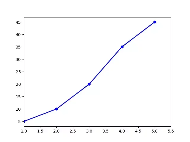
Plot anatomy

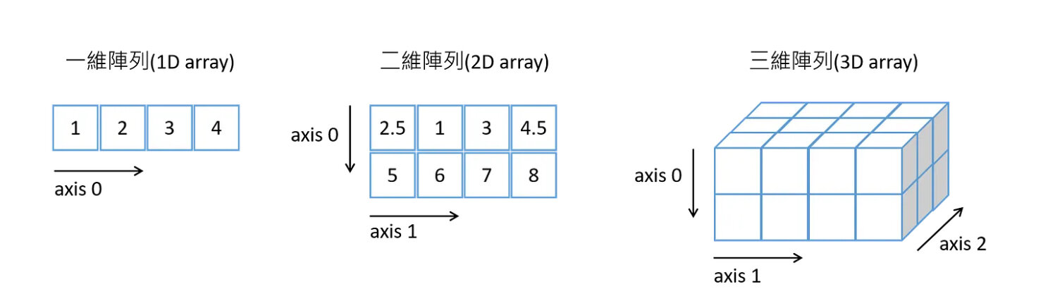
01 Data
NumPy
NumPy是Python在進行科學運算時,一個非常基礎的Package,同時也是非常核心的library,它具有下列幾個重要特色:
Text
- 高效能的多維陣列 (multi-dimensional array) 運算
- 可自行定義數據型態(Data Type),方便和不同資料庫整合
- 利用 NumPy Array 取代 Python List
- 是學習 Matplotlib, Pandas 等其他函式庫必備的基礎
import numpy as npa = np.array([1, 2, 3, 4]) #一維陣列建立
b = np.array([(2.5, 1, 3, 4.5), (5, 6, 7, 8)], dtype = float) #二維陣列建立
c = np.array([[(2.5, 1, 3, 4.5), (5, 6, 7, 8)],
[(2.5, 1, 3, 4.5), (5, 6, 7, 8)]], dtype = float) #三維陣列建立NumPy Array
np.linspace(0, 10, 5) # 建立一個0到10之間,均勻的5個數值陣列np.random.random((2,3)) # 建立一個2x3的隨機值矩陣
np.random.randint((2,3)) # 隨機值都是整數>>> a = np.array([1, 2, 3])
>>> b = np.array([(2.5, 1, 4.5), (5, 6, 7, 8)])
>>> a.shape # 維度Array dimensions
(3,)
>>> len(a) # 長度Length of array
3
>>> len(b) # 長度Length of array
2
>>> b.ndim # Number of array dimensions
1
>>> a.size # 元素數量Number of array elements
3
>>> b.size # 元素數量Number of array elements
2NumPy Array
>>> a = np.array([1, 2, 3])
>>> b = np.array([2, 4, 6])
>>> np.add(a, b)                   # 陣列加法,也可以a + b
array([3, 6, 9])
>>> np.subtract(a, b)              # 陣列減法,也可以a – b
Array([-1, -2, -3])
>>> np.multiply(a, b)              # 陣列乘法,也可以a * b
Array([ 2, 8, 18])
>>> np.divide(a, b)                # 陣列除法,也可以a / b
array([0.5, 0.5, 0.5])
NumPy Array
四則運算
>>> c = np.array([1, 4, 9])
>>> np.sqrt(c)
array([1., 2., 3.])
>>> np.sin(c)
array([ 0.84147098, -0.7568025 , 0.41211849])
>>> np.cos(c)
array([ 0.54030231, -0.65364362, -0.91113026])
>>> np.log(c)
array([0. , 1.38629436, 2.19722458])
其他數學運算
>>> a = np.array([2, 5, 7])
>>> b = np.array([(0, 1), (2, 3)])
>>> a.sum()                        # 整個陣列的總和 Array-wise sum
14
>>> a.max()                        # 整個陣列的最大值 Array-wise maximum value
7
>>> a.min()                        # 整個陣列的最小值 Array-wise minimum value
2
>>> b.max(axis=0)                  # 一行的最大值 Maximum value of an array row
array([2, 3])
>>> b.max(axis=1)                  # 一行的最大值 Maximum value of an array row
array([1, 3])
>>> np.median(a)                   # 中位數 Median
5.0
>>> np.mean(a)                     # 平均數 Mean
4.666666666666667
>>> np.std(a)                      # 標準差 Standard deviation
2.0548046676563256
NumPy Array
一些統計運算
NumPy Array
合併
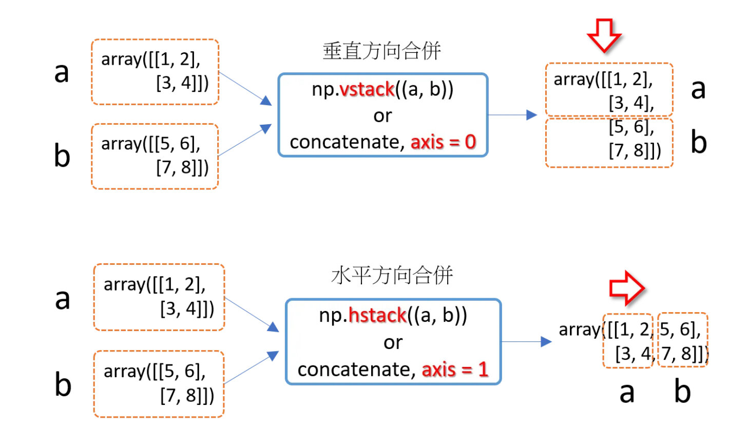
>>> np.concatenate((a, b), axis = 0)   # axis=0,沿垂直方向合併
array([[1, 2],
 [3, 4],
 [5, 6],
 [7, 8]])
>>> np.concatenate((a, b), axis = 1)   # axis=1,沿水平方向合併
array([[1, 2, 5, 6],
 [3, 4, 7, 8]])
NumPy Array
分割
>>> a = np.array([(1, 2, 3, 4, 5, 6), (-1, -2, -3, -4, -5, -6), (2, 4, 6, 8, 10, 12)])
>>> np.vsplit(a, 3)                # 垂直方向分割
[array([[1, 2, 3, 4, 5, 6]]), array([[-1, -2, -3, -4, -5, -6]]), array([[ 2, 4, 6, 8, 10, 12]])]
>>> np.hsplit(a, 2)                # 水平方向分割
[array([[ 1, 2, 3],
 [-1, -2, -3],
 [ 2, 4, 6]]), array([[ 4, 5, 6],
 [-4, -5, -6],
 [ 8, 10, 12]])]
>>> np.split(a, 3, axis=0)         # axis=0,沿垂直方向分割
[array([[1, 2, 3, 4, 5, 6]]), array([[-1, -2, -3, -4, -5, -6]]), array([[ 2, 4, 6, 8, 10, 12]])]
>>> np.split(a, 2, axis=1)         # axis=1,沿水平方向分割
[array([[ 1, 2, 3],
 [-1, -2, -3],
 [ 2, 4, 6]]), array([[ 4, 5, 6],
 [-4, -5, -6],
 [ 8, 10, 12]])]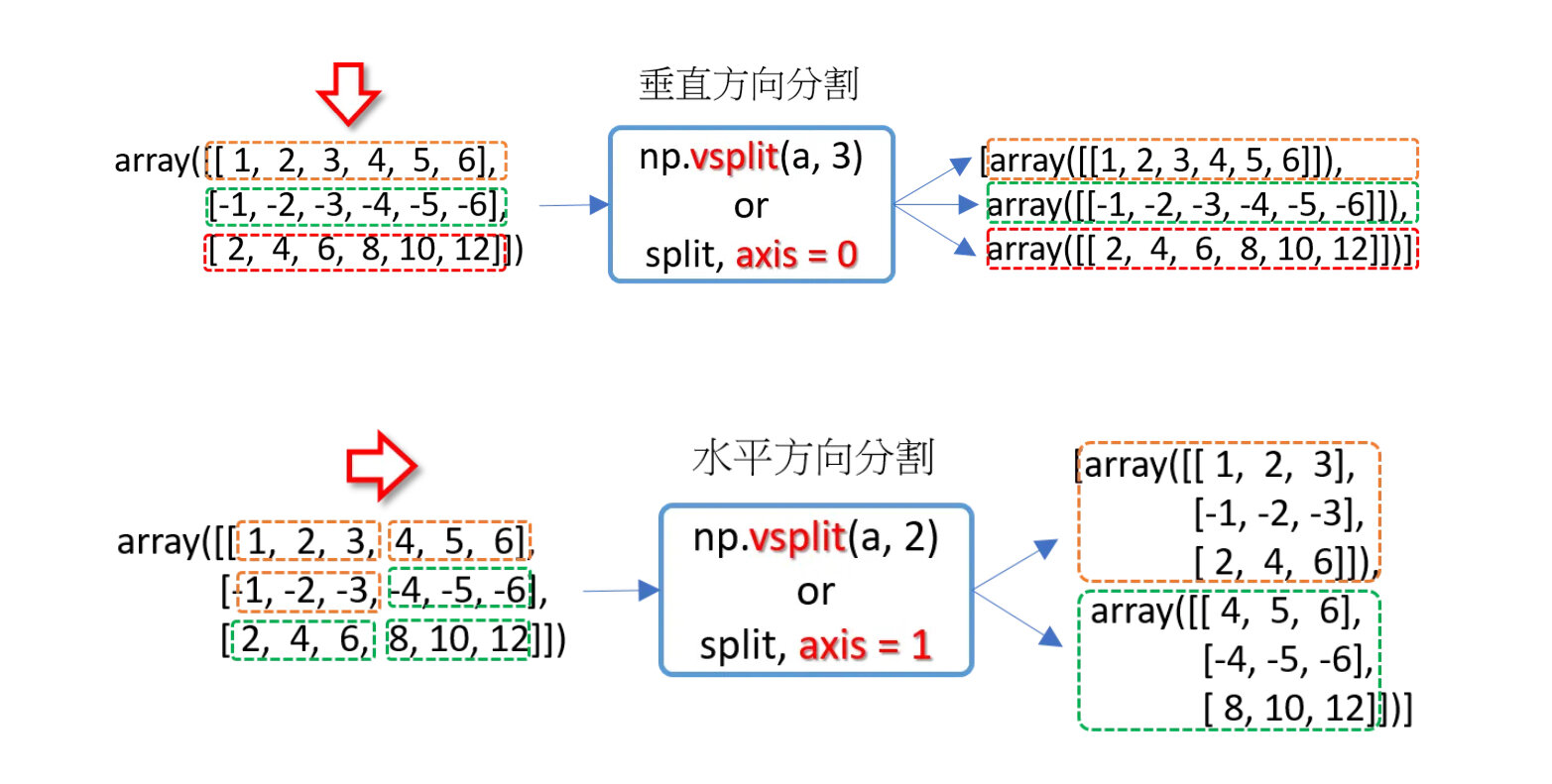
02 Create Plot
import matplotlib.pyplot as plt

x = [0, 1, 2, 3, 4]
y = [0, 1, 4, 9, 16]

plt.plot(x, y)
plt.show()
最基本的圖形
import matplotlib.pyplot as plt
import numpy as np

x = np.array([1, 2, 3, 4])
y = x*2

# first plot with X and Y data
plt.plot(x, y)

x1 = [2, 4, 6, 8]
y1 = [3, 5, 7, 9]

# second plot with x1 and y1 data
plt.plot(x1, y1, '-.')

plt.xlabel("X-axis data")
plt.ylabel("Y-axis data")
plt.title('multiple plots')
plt.show()
畫多條線
import matplotlib.pyplot as plt
import numpy as np

fruits = ['Apples', 'Bananas', 'Cherries', 'Dates']
sales = [400, 350, 300, 450]

plt.bar(fruits, sales, color='violet', width = 0.3)
# plt.barh 橫的直方圖
plt.title('Fruit Sales')
plt.xlabel('Fruits')
plt.ylabel('Sales')
plt.show()
直方圖
import matplotlib.pyplot as plt
import numpy as np
x = np.array([12, 45, 7, 32, 89, 54, 23, 67, 14, 91])
y = np.array([99, 31, 72, 56, 19, 88, 43, 61, 35, 77])
plt.scatter(x, y)
plt.title("Basic Scatter Plot")
plt.xlabel("X Values")
plt.ylabel("Y Values")
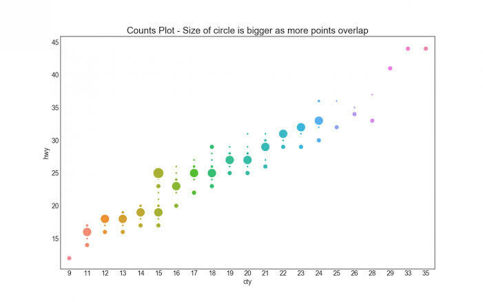
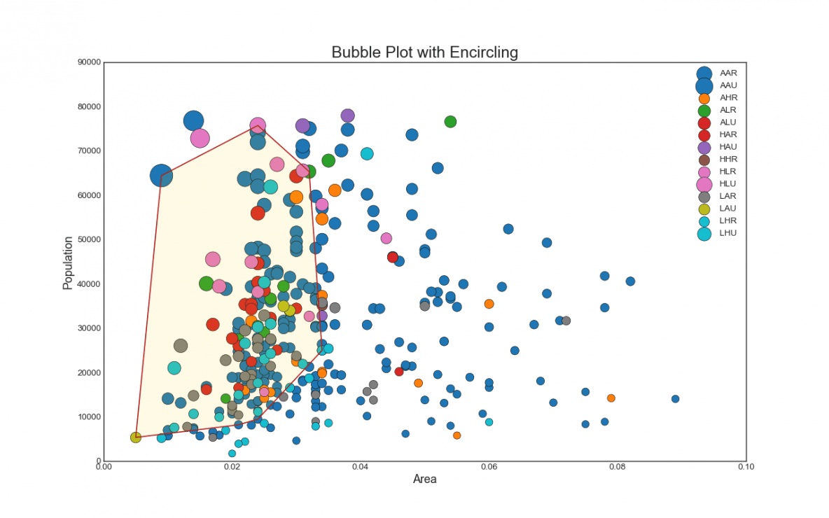
plt.show()散佈圖
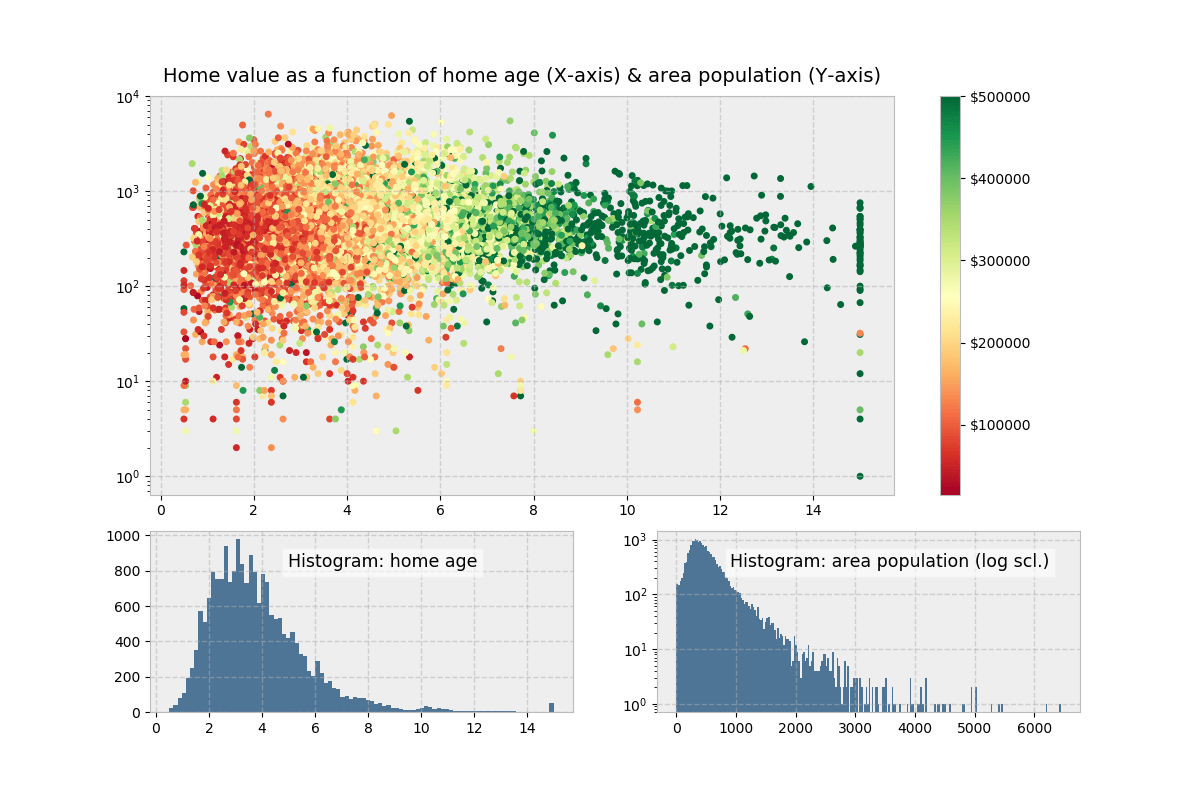
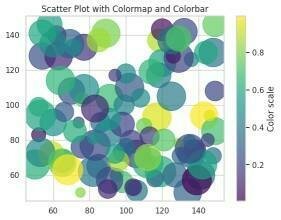
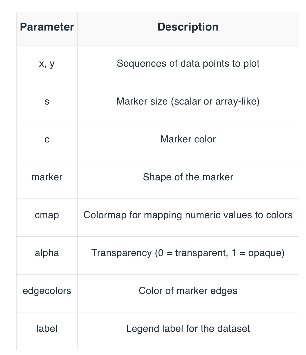
x = np.random.randint(50, 150, 100)
y = np.random.randint(50, 150, 100)
colors = np.random.rand(100)  # Random float values for color mapping
sizes = 20 * np.random.randint(10, 100, 100)

plt.scatter(x, y, c=colors, s=sizes, cmap='viridis', alpha=0.7)
plt.colorbar(label='Color scale')
plt.title("Scatter Plot with Colormap and Colorbar")
plt.show()
散佈圖 - 參數
# Import libraries
from matplotlib import pyplot as plt
import numpy as np


# Creating dataset
cars = ['AUDI', 'BMW', 'FORD',
        'TESLA', 'JAGUAR', 'MERCEDES']

data = [23, 17, 35, 29, 12, 41]

# Creating plot
fig = plt.figure(figsize=(10, 7))
plt.pie(data, labels=cars)

# show plot
plt.show()
圓餅圖
04 Save & Export
# Saving the plot as a JPEG file
plt.savefig("output.jpg")

# Saving the plot with additional parameters (this is optional)
plt.savefig("output1.jpg", facecolor='yellow', bbox_inches="tight", transparent=True)
儲存成圖片檔
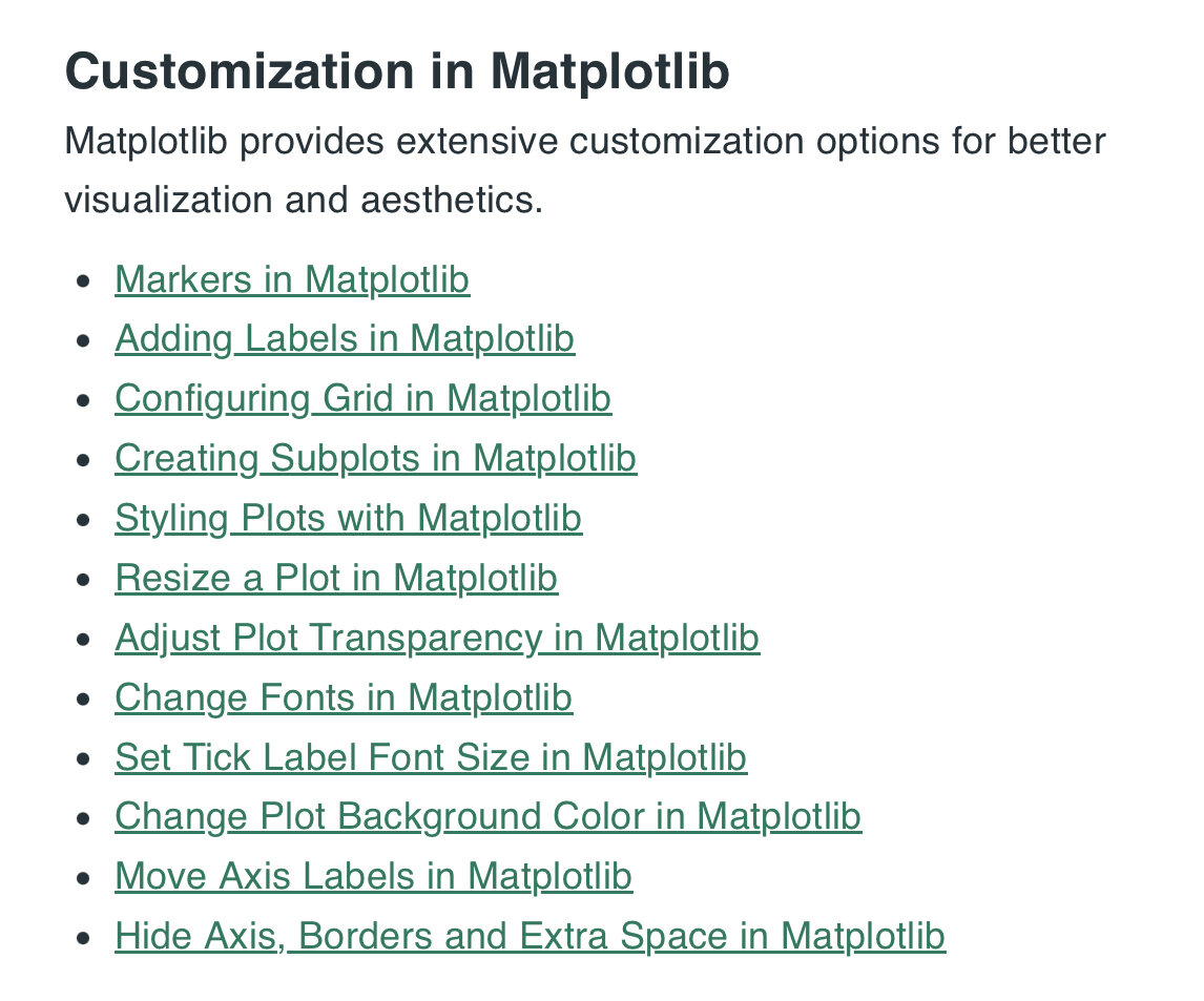
03 Customization ?
Matplotlib
By Suzy Huang


