Bevezetés az informatikába (BMEGT43A020)
2. Az adatábrázolás története
Az adatábrázolás eredete, története, magyar helyzet
Az adatábrázolás történetének különböző osztályozásai:
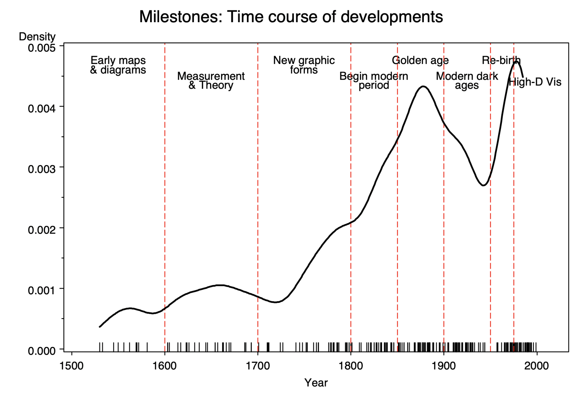
Michael Friendly: Milestones in the history of thematic cartography, statistical graphics, and data visualization (2008)
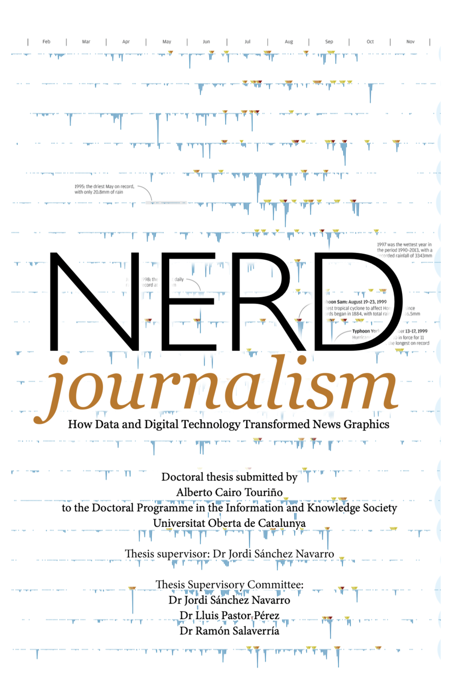
Alberto Cairo: Nerd Journalism (2017)
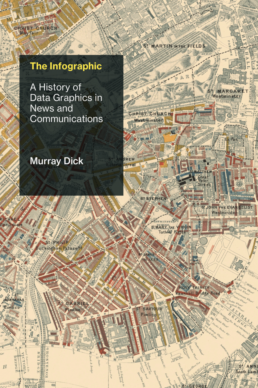
Murray Dick: The Infographic (2020)

Alberto Cairo: Nerd Journalism (2017)
- Rise of data charts and maps (adatábrázolás felemelkedése)
- Pictoral turn (képi fordulat)
- First-Second-Third computer age (digitális korszak)

Murray Dick: The Infographic (2020)
- the proto-infographic (kezdetleges)
- the classical (klasszikus)
- the improving (fejlődő)
- the commercial (kereskedelmi)
- the ideological (ideologikus)
- the professional (professzionális)

1600 előtt – korai térképek és diagramok (Friendly 2008)
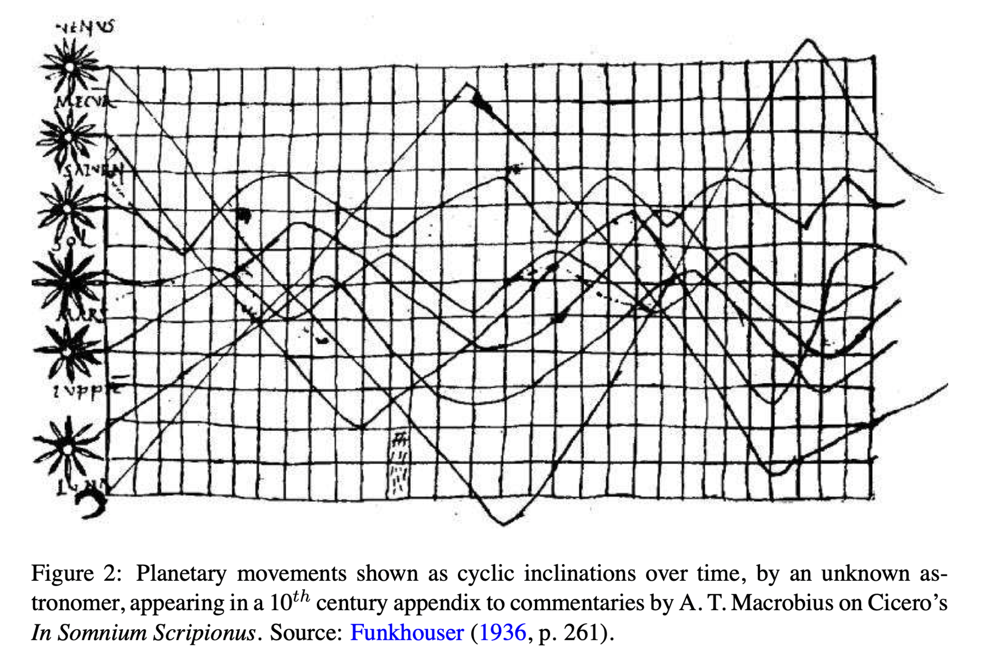
The earliest seeds of visualization arose in geometric diagrams, in tables of the positions of stars
and other celestial bodies, and in the making of maps to aid in navigation and exploration.
legkorábbi grafikai leképezése kvantitatív információnak (Friendly, 2006)
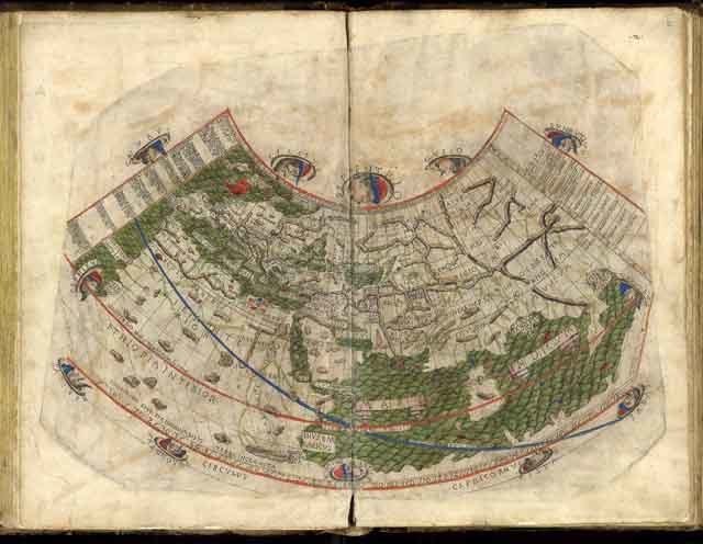
Legkorábbi térképek
I.E. 6200: Legkorábbi térkép?
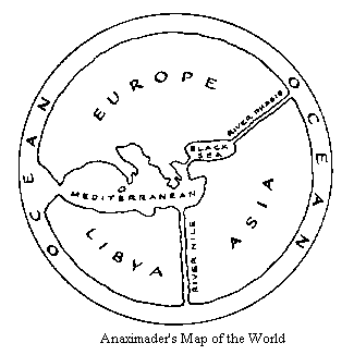
I.E. 550: Legkorábbi világtérkép?
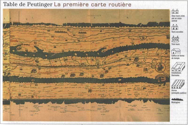
I.E. 336-335: ókori római "útvonaltérkép"
I.SZ. 90-150: Klaudiosz Ptolemaiosz világtérképe
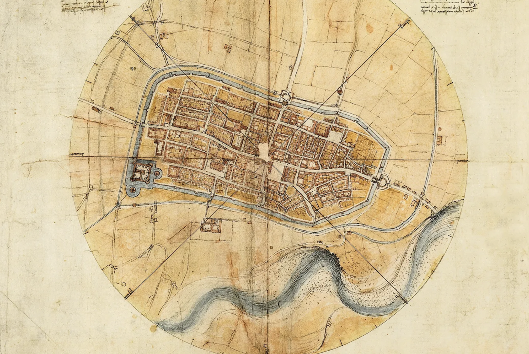
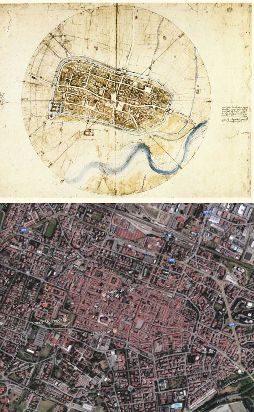
Leonardo Da Vinci Imola-térképe (1502)
Leonardo probably also used an instrument called a bussola, a device that measures degrees inside a circle—like the one that surrounds his city map. Painstakingly recording the angles of each turn and intersection in the town and measuring their distance from each other would have given him the data he needed to recreate the city as seen from above, using the bussola to maintain proper scale. Other methods would have been involved, all of them commonly available to surveyors, builders, city planners, and cartographers at the time. Leonardo trusted the math, even though he could never verify it, but like the best mapmakers, he also wanted to make something beautiful. (Forrás)
Videó: How Leonardo da Vinci made a "satellite" map in 1502

Sz: 1452. április 15.
E: 1519. május 2.
olasz polihisztor

Mercator-vetület (1569) – Gerardus Mercator
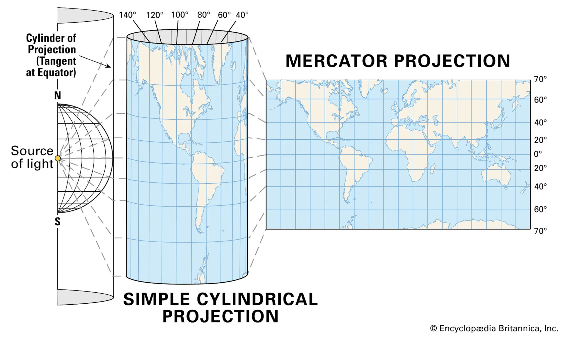
Sz: 1512. március 5.
E: 1594. december 2.
flamand térképész
1600-as évek. mérések és matematikaelmélet (Friendly 2008)
Among the most important problems of the 17th century were those concerned with physical measurement- of time, distance, and space- for astronomy, surveying, map making, navigation and territorial expansion. This century saw great new growth in theory and the dawn of practice- the rise of analytic geometry, theories of errors of measurement and estimation, the birth of probability theory, and the beginnings of demographic statistics and "political arithmetic".
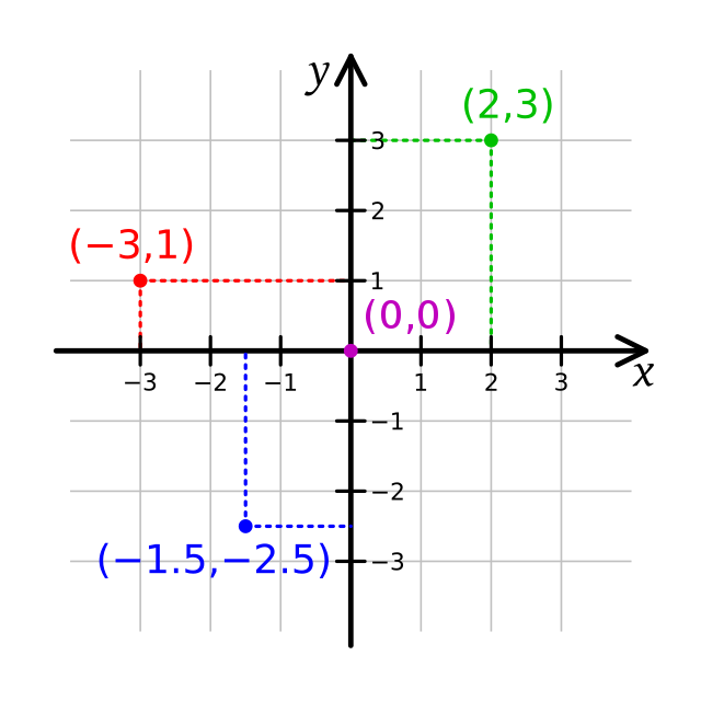
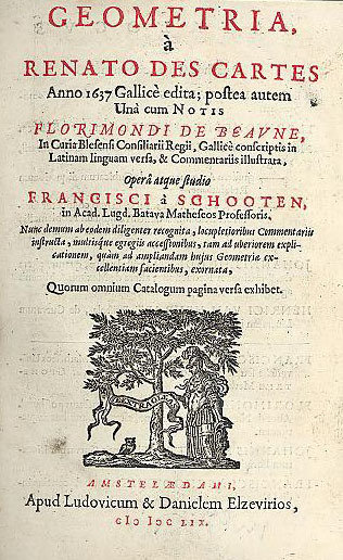
1637: karteziánus koordináta rendszer (René Descartes [Cartesius])
Sz: 1596. március 31.
E: 1650. február 11.
francia filozófus
természetkutató
matematikus
1700-as évek: új ábrázolási módszerek (Friendly 2008)
The 18th century witnessed, and participated in, the initial germination of the seeds of visualization which had been planted earlier. Map-makers began to try to show more than just geographical position on a map. As a results, new graphic forms (isolines and contours) were invented, and thematic mapping of physical quantities took root. Towards the end of this century, we see the first attempts at the thematic mapping of geologic, economic, and medical data.
1. Proto-infografikus/kezdetleges korszak (Dick 2020)
Joseph Priestley
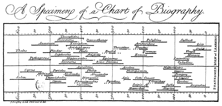
Chronographs were perceived as the safest way to incorporate history into British primary education, as a form of rote learning
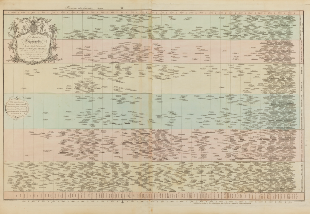
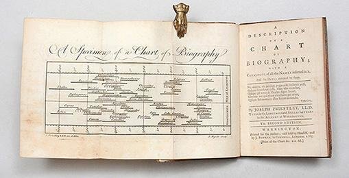
1765: Joseph Priestley idővonala (Chart of Biography)
I.E. 1200-I.Sz. 1800, kb 2000 név
Államférfiak és harcosok; teológusok és metafizikusok; matematikusok és fizikusok; költők és művészek; szónokok és kritikusok; történészek
The choice of names in this chart reflects Priestley’s awareness of his audience, as well as being an astute piece of localized marketing
commercial success and a popular sensation, and went through dozens of editions
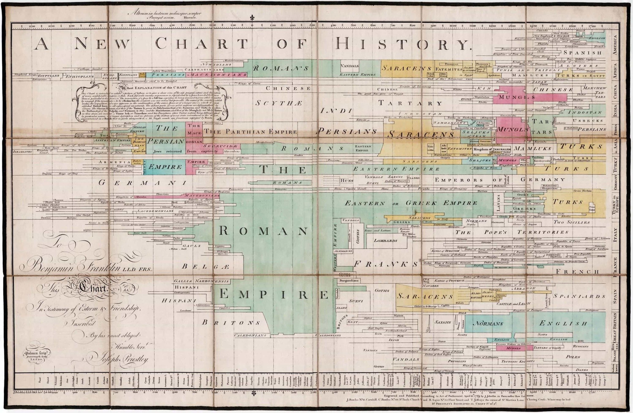
New Chart of History (1769)
2. klasszikus korszak (Dick 2020)
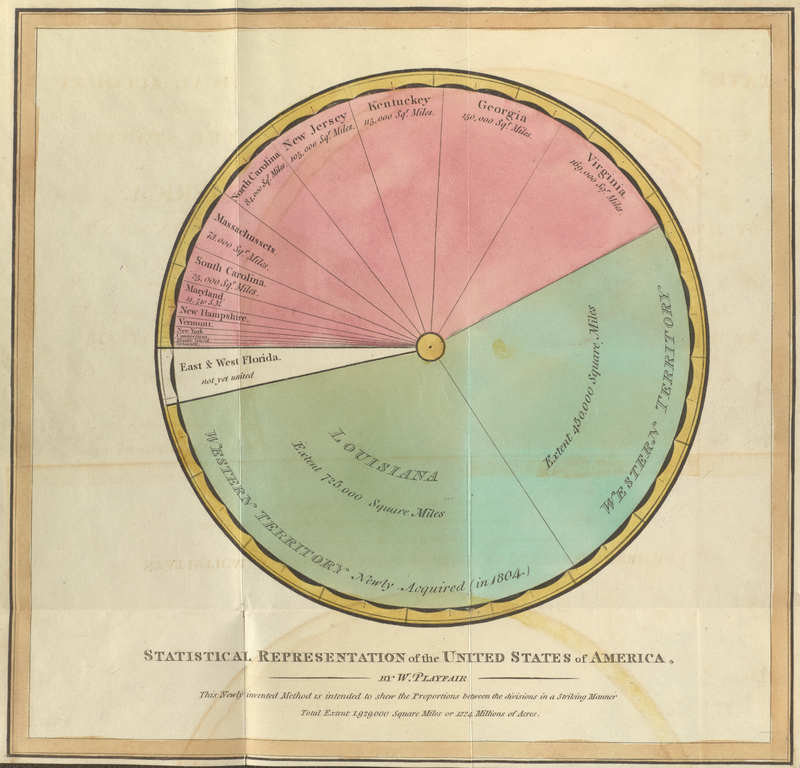
William Playfair
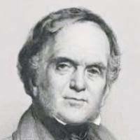
Sz: 1759. szeptember 22.
E: 1823. február 11.
skót politikai közgazdász
Commercial and Political Atlas (1786)
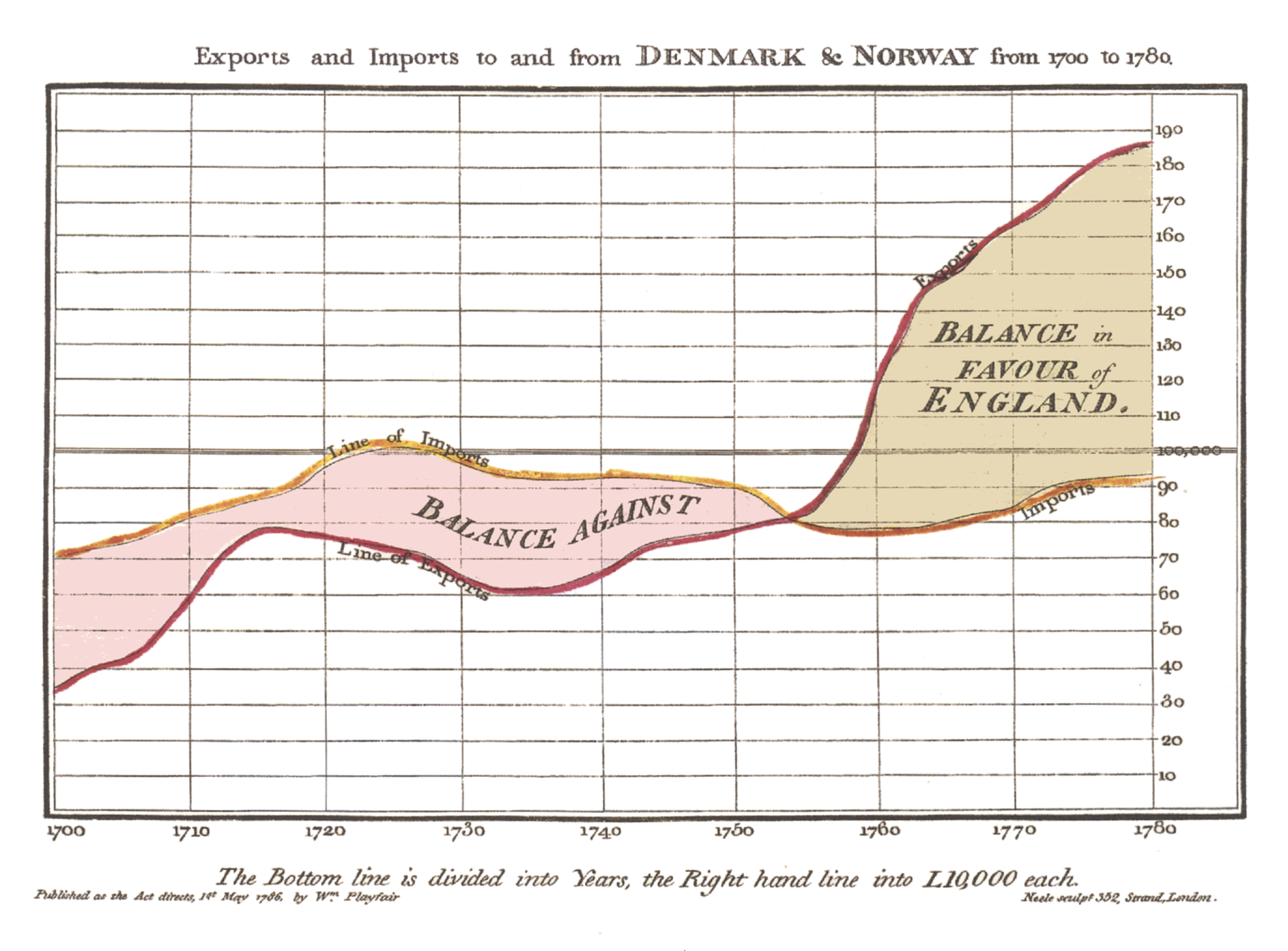
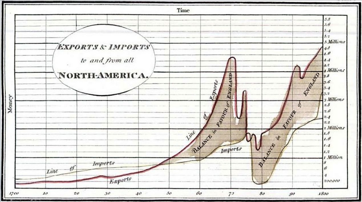
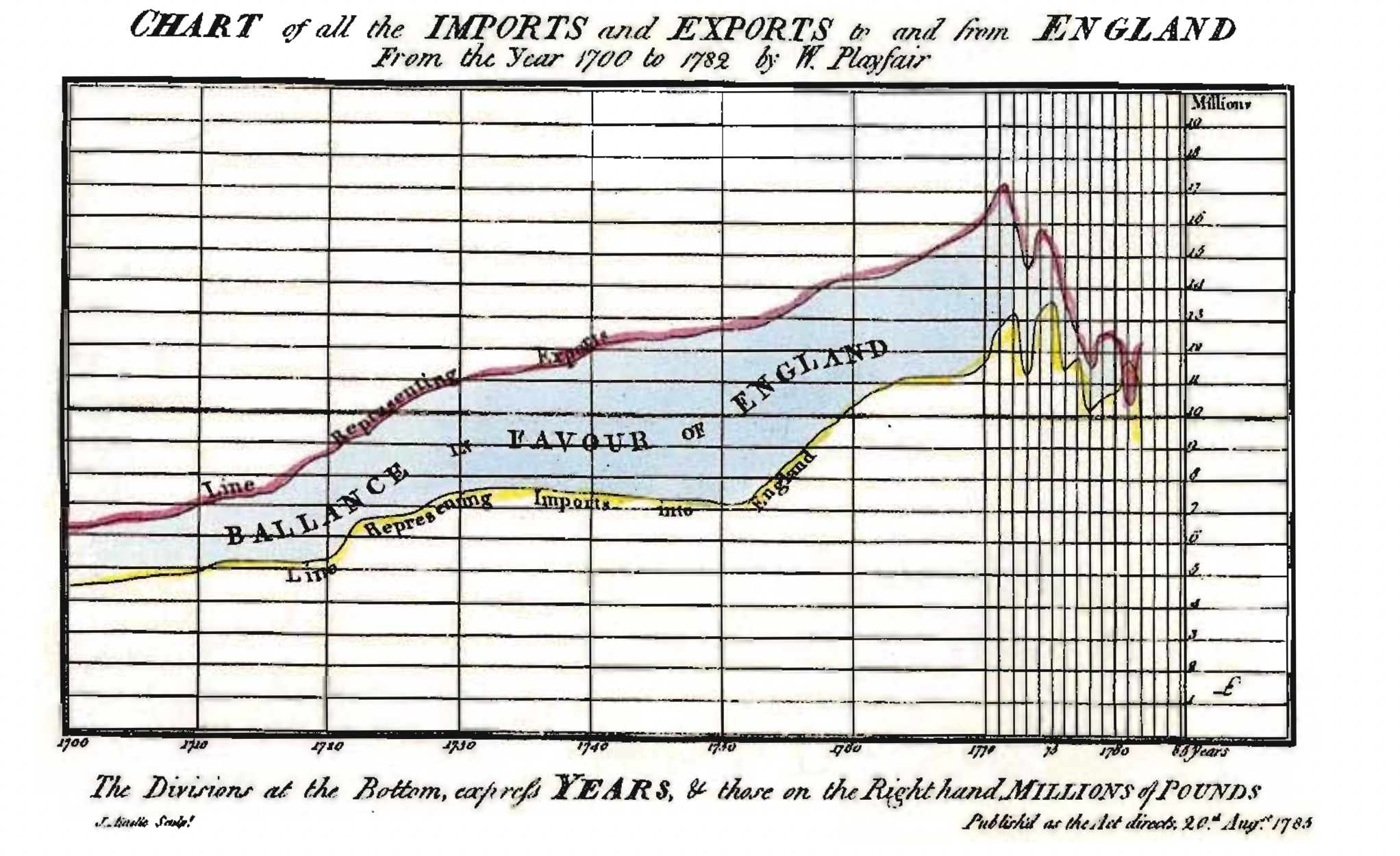
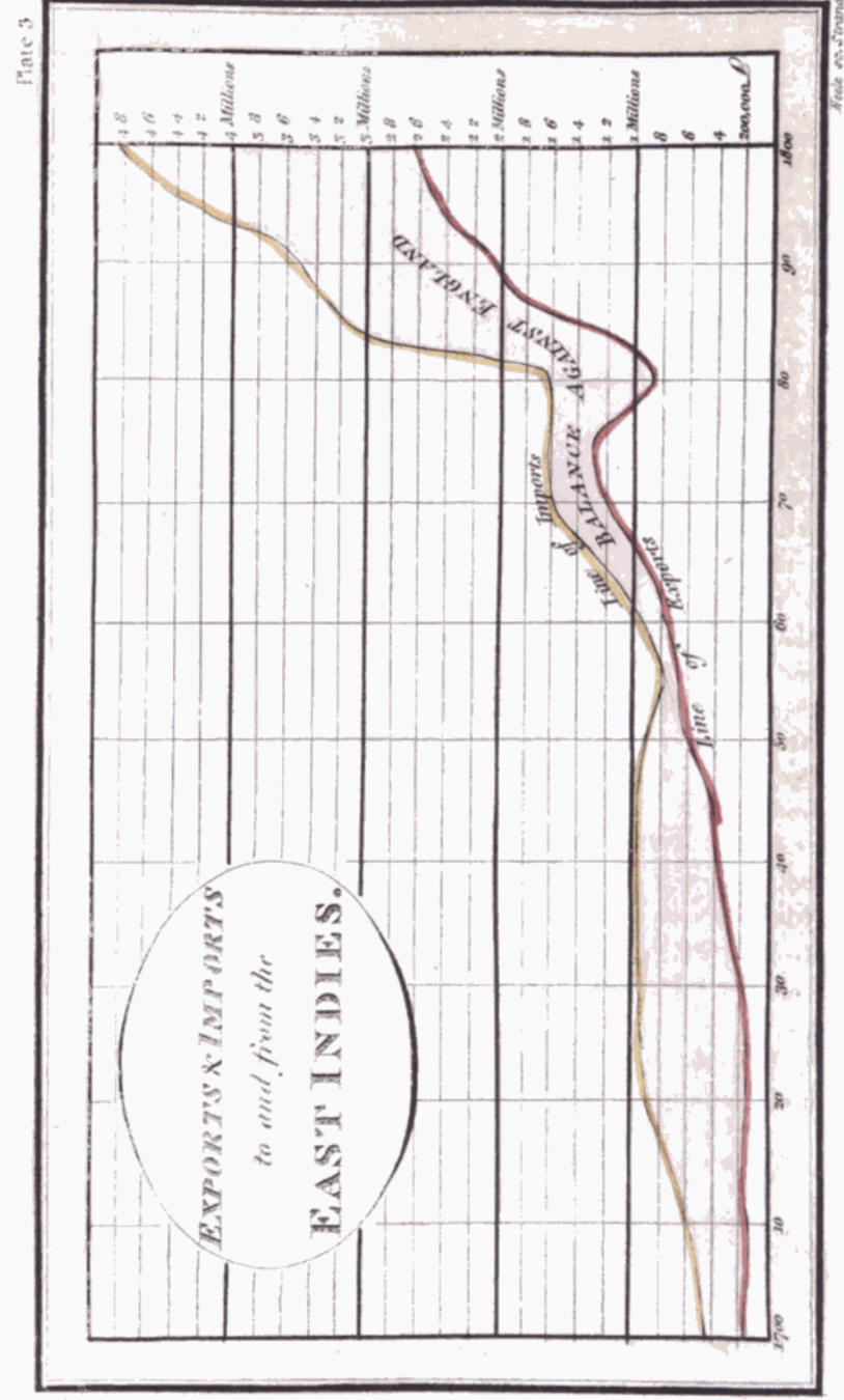


Reálérték
Nominális érték
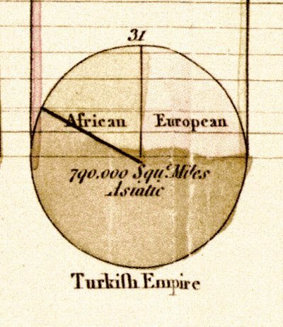
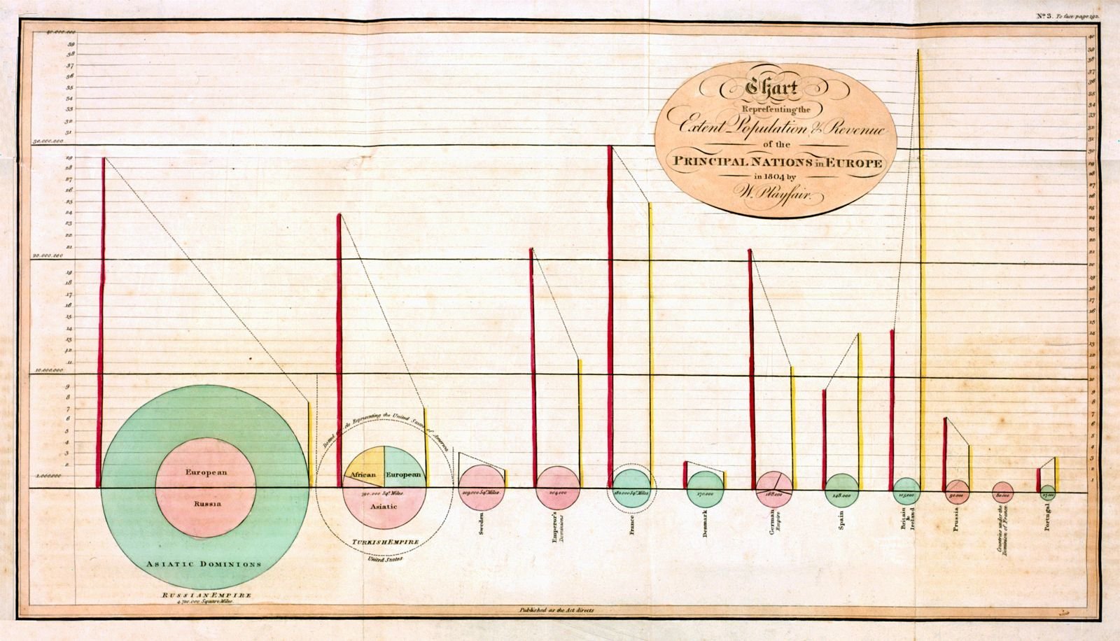
Statistical Breviary (1801)
1800-1850: a modern grafikus ábrázolás kezdete (Friendly 2008)
explosive growth in statistical graphics and thematic mapping, at a rate which would not be equalled until modern times.
bar and pie charts, histograms, line graphs and time-series plots, contour plots, and so forth.
The Statistical Account of the United States of America (1805)
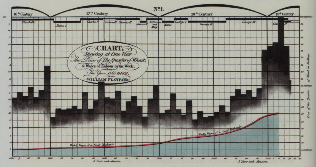

A Letter on our Agricultural Distresses, their Causes and Remedies; accompanied with Tables and Copper-plate Charts, shewing and comparing The Prices of Wheat, Bread, and Labour, from 1565 to 1821. (1821)
3. fejlődő korszak (Dick 2020)
1850-1900: Aranykor (Friendly 2008)
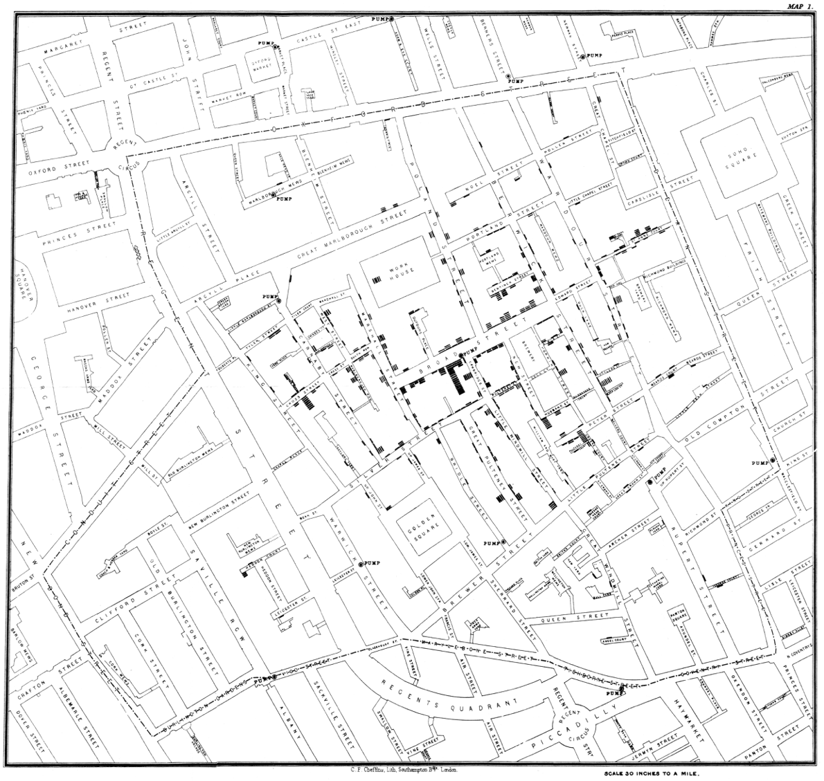
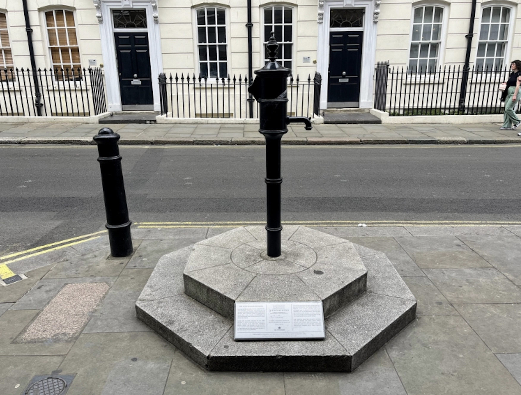
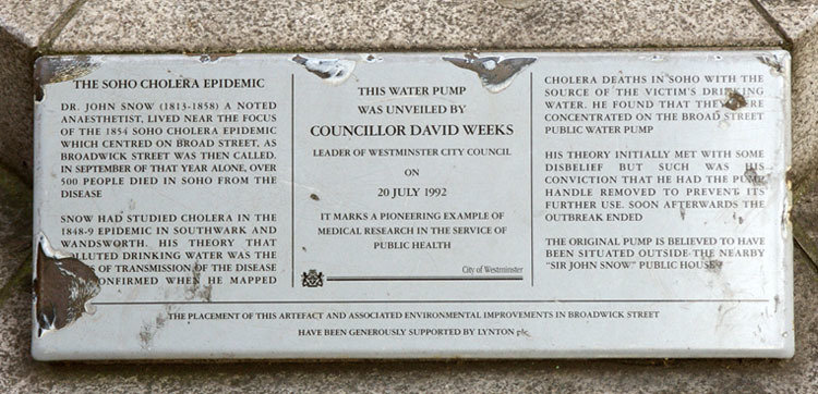
John Snow, koleratérkép
Sz: 1813. március 15.
E: 1858. június 16.
brit orvos
modern epidemiológia
"atyja"
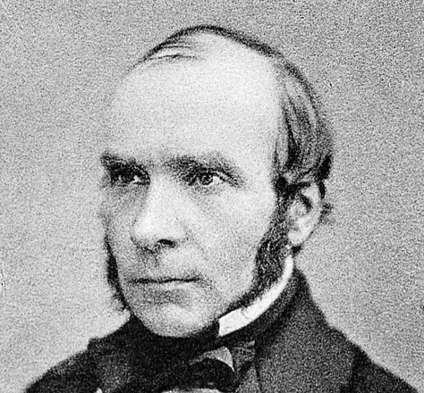
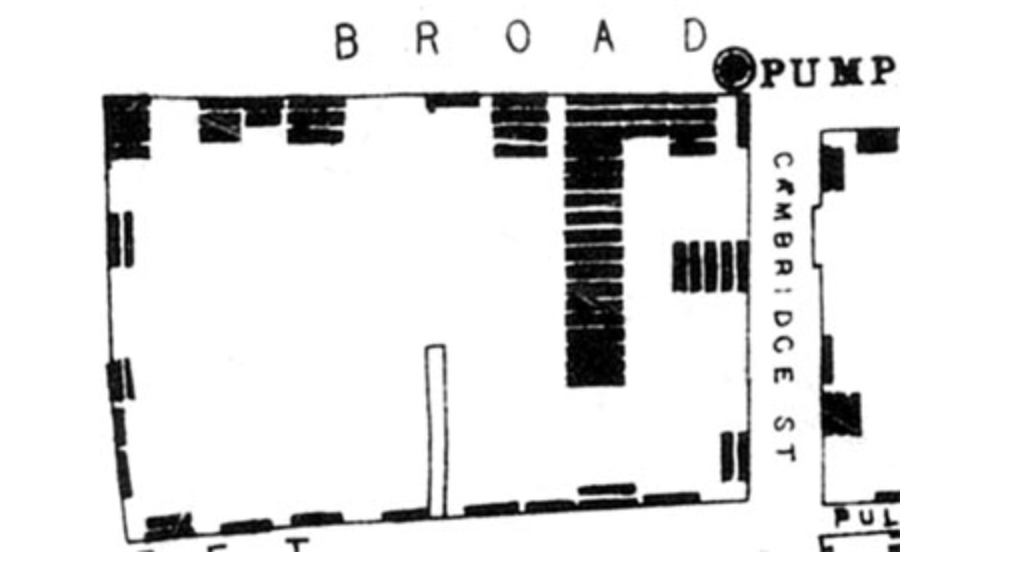
On the Mode of Communication of Cholera (1855)

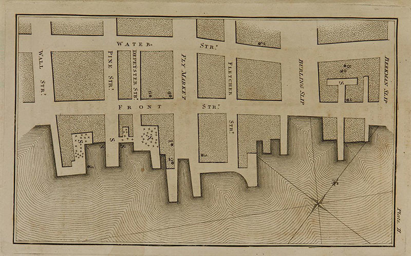
Valentine Seaman: An Inquiry into the Cause of the Prevalence of the Yellow Fever in New-York (1798). Első fertőzéstérkép

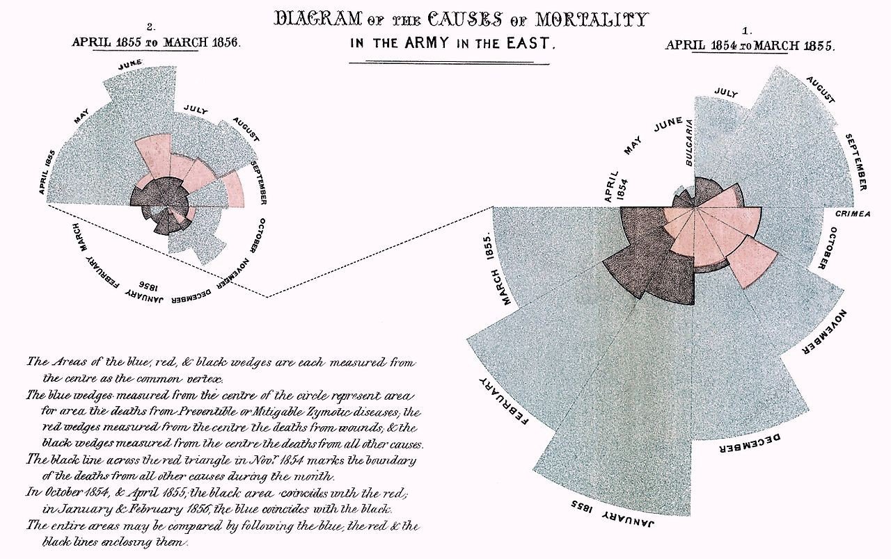
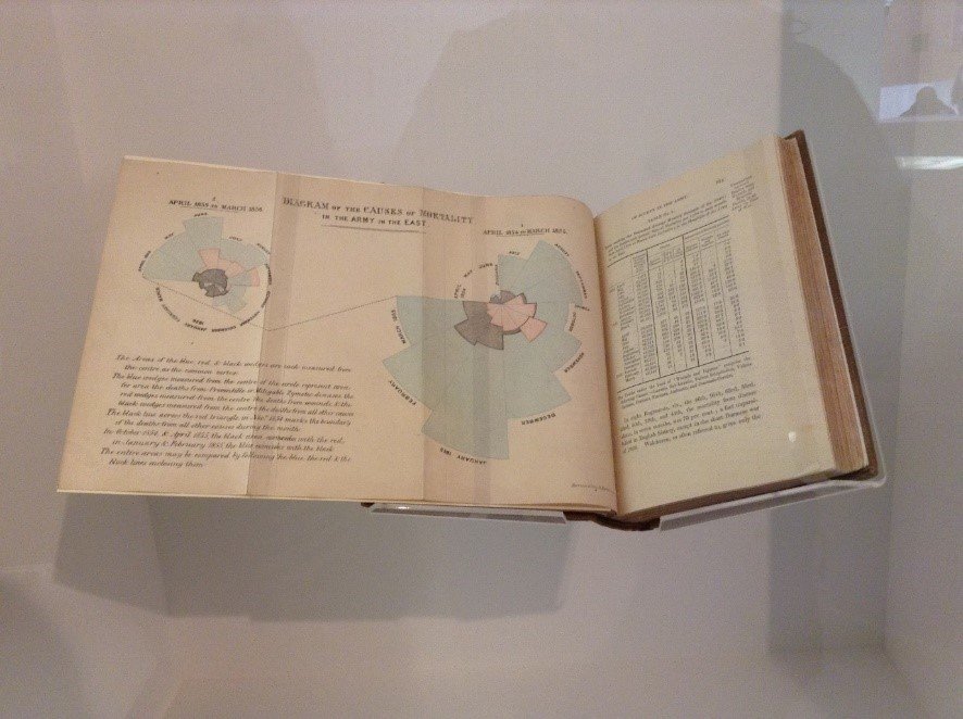
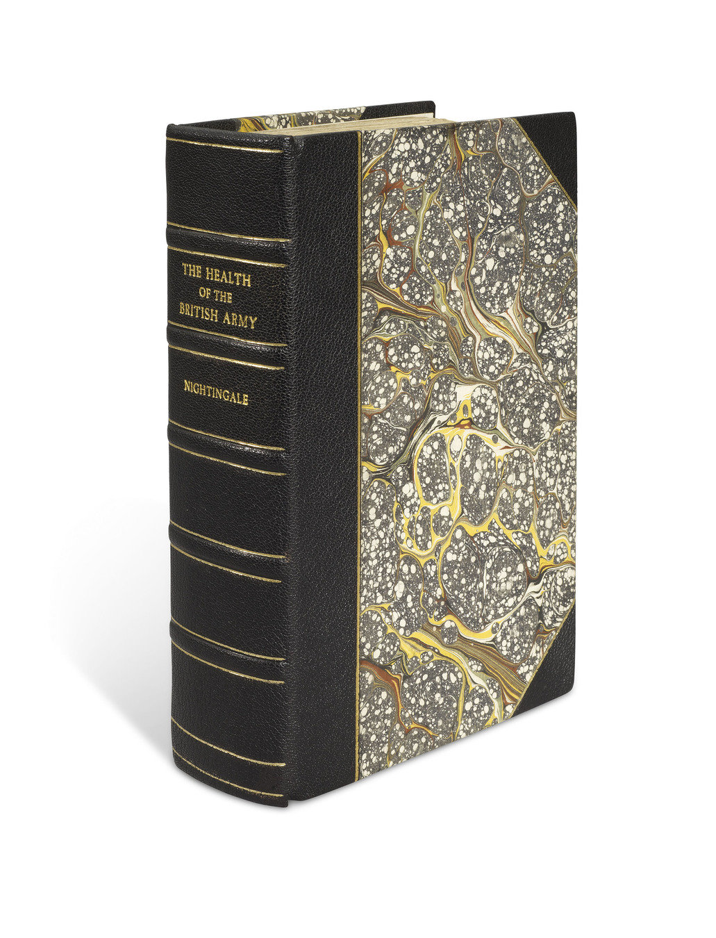
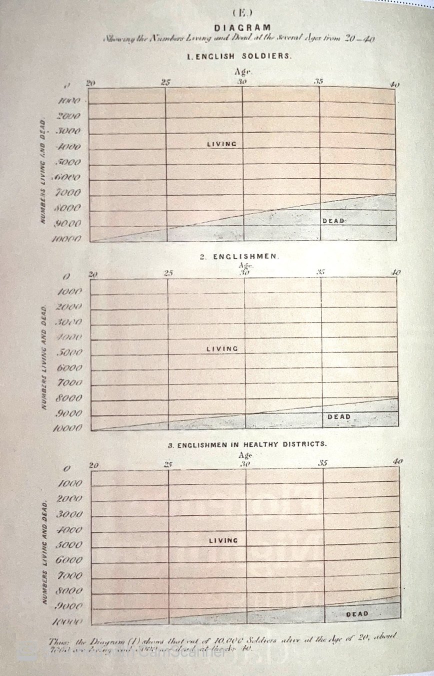
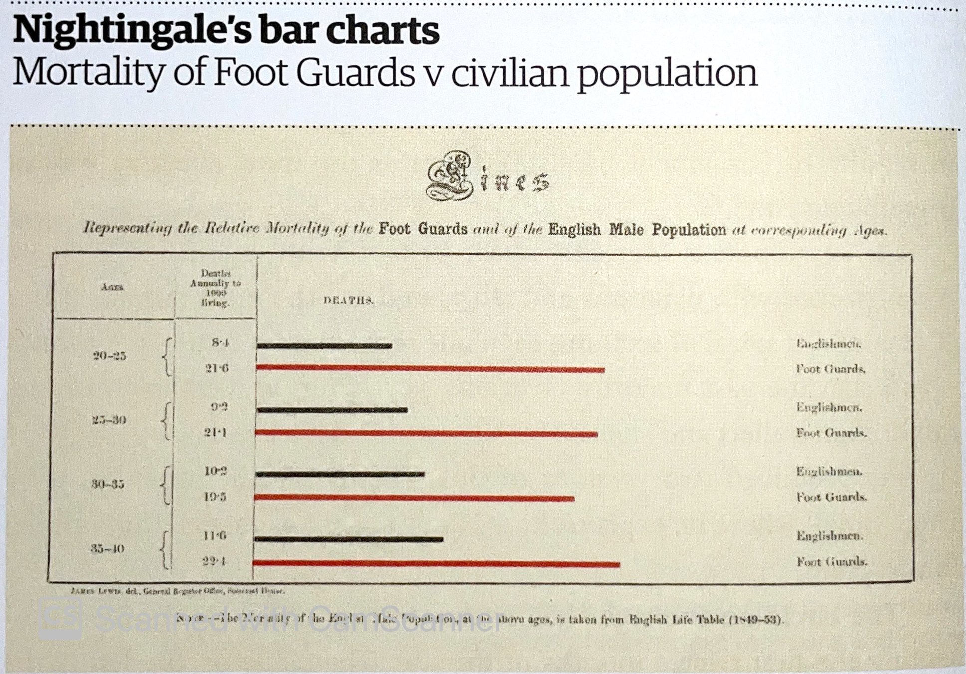
Florence Nightingale és a "coxcomb" vagy rózsadiagram
Sz: 1820. május 12.
E: 1910. augusztus 13.
brit ápolónő és statisztikus
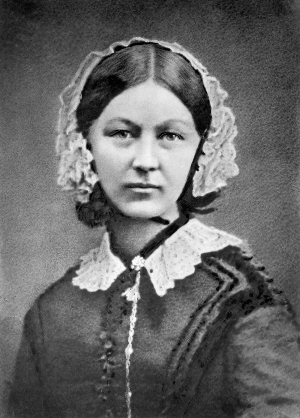
Notes on Matters Affecting the Health, Efficiency, and Hospital Administration of the British Army (1858) (Mortality of the British Army)
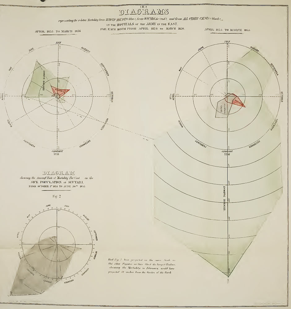
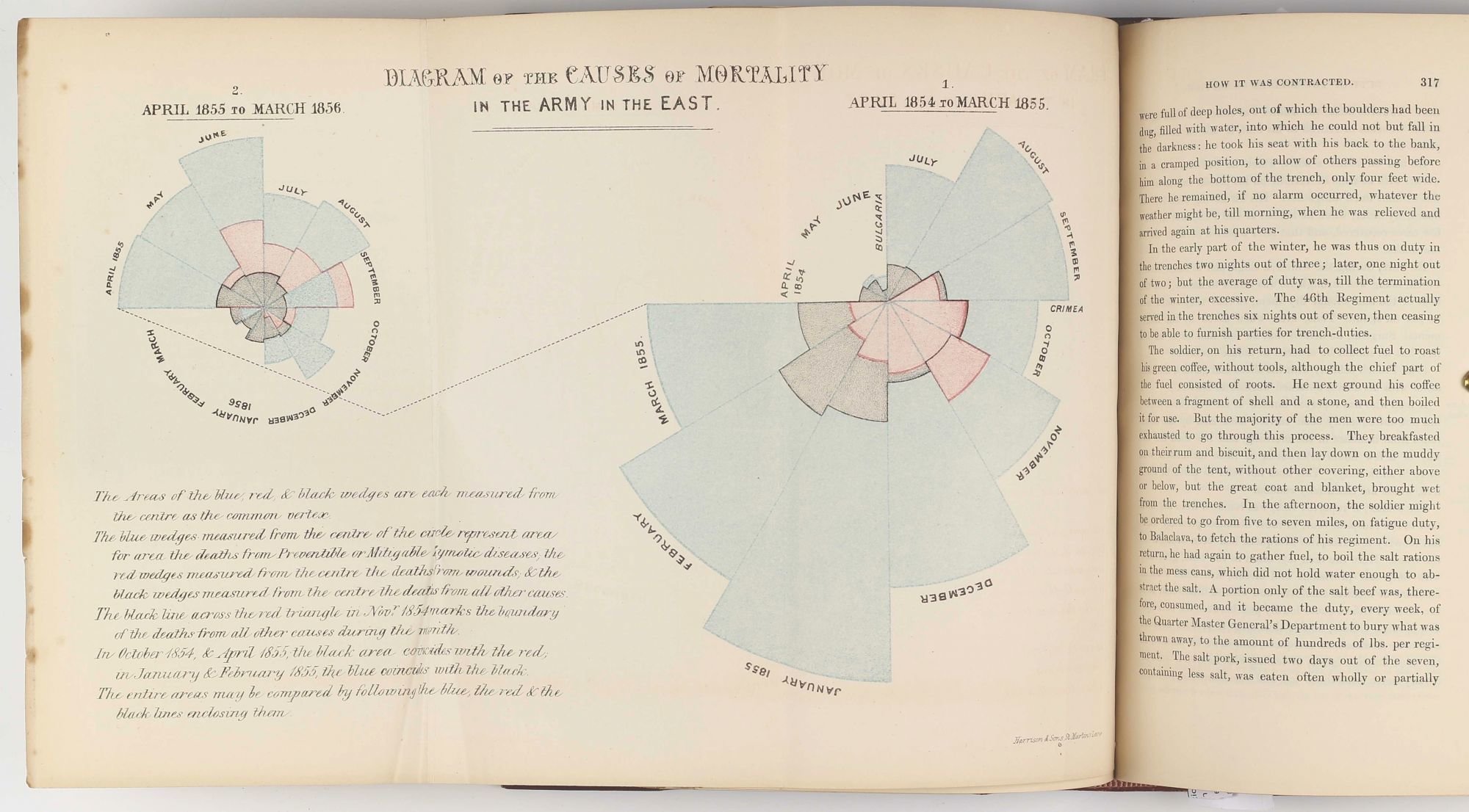
"denevérszárny"
"rózsadiagram"
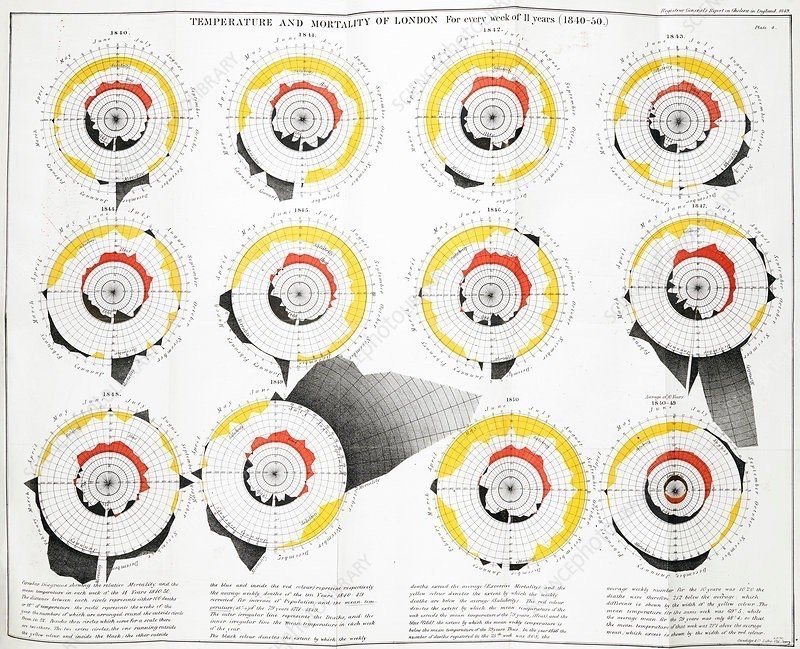
William Farr: hőmérséklet és halálozási ráta Londonban. Report on the Mortality of Cholera in England (1852) (link)
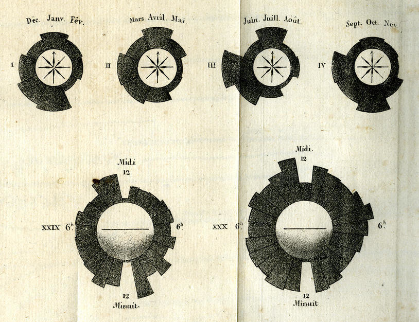
André Michel Guerry. Szél fújásának iránya
Születések és halálozások a nap során (1829)
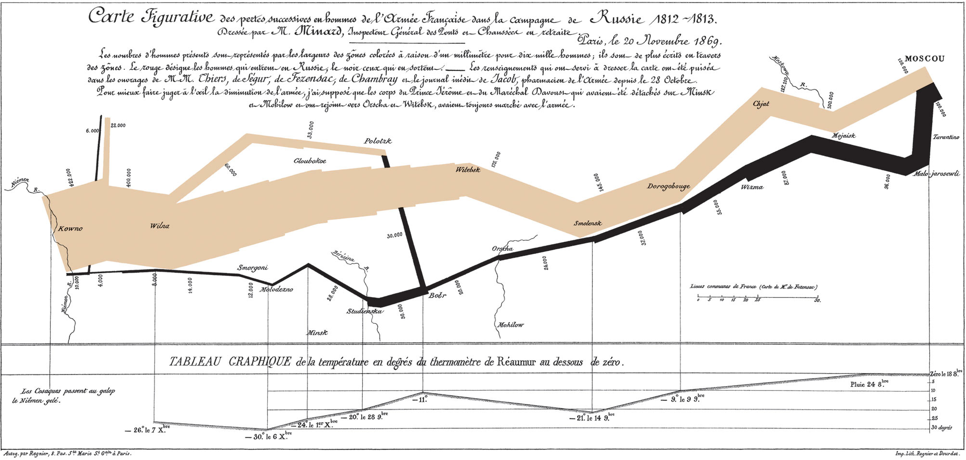
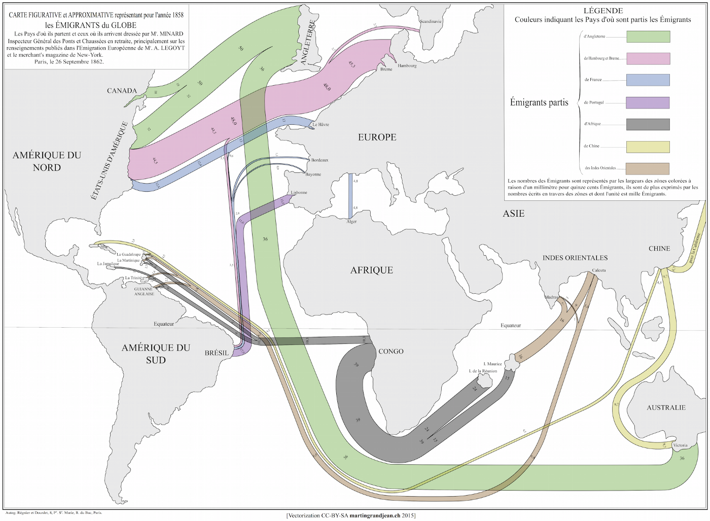
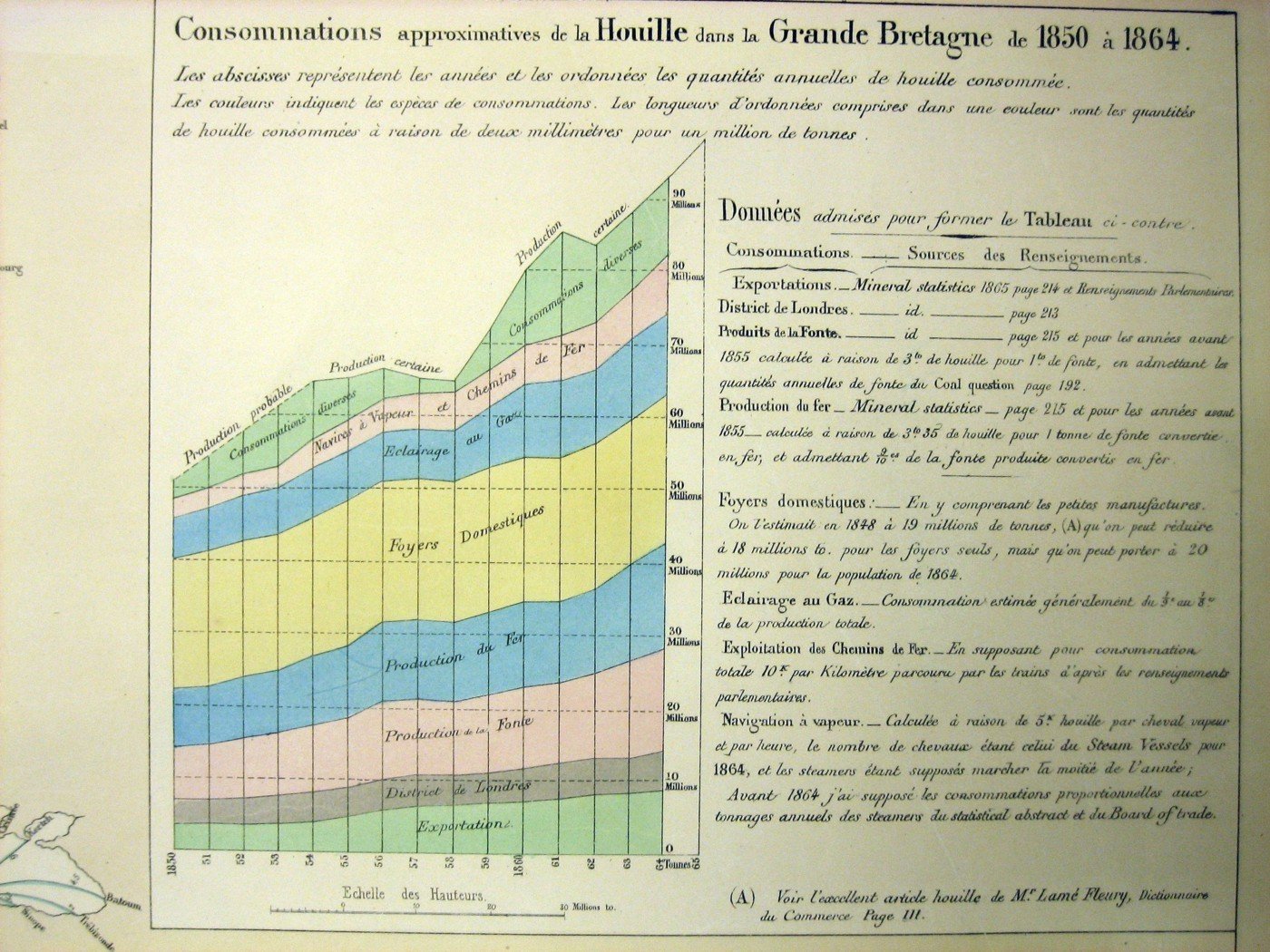
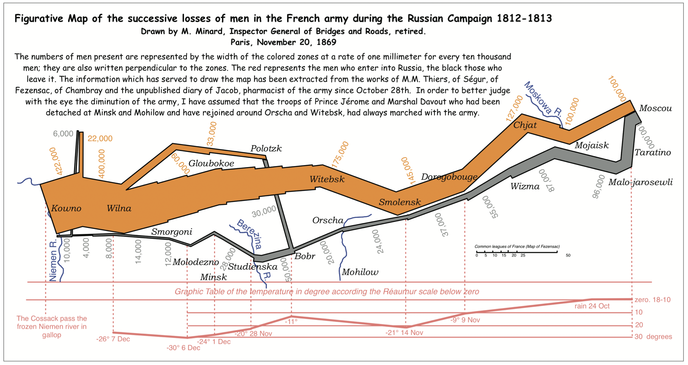
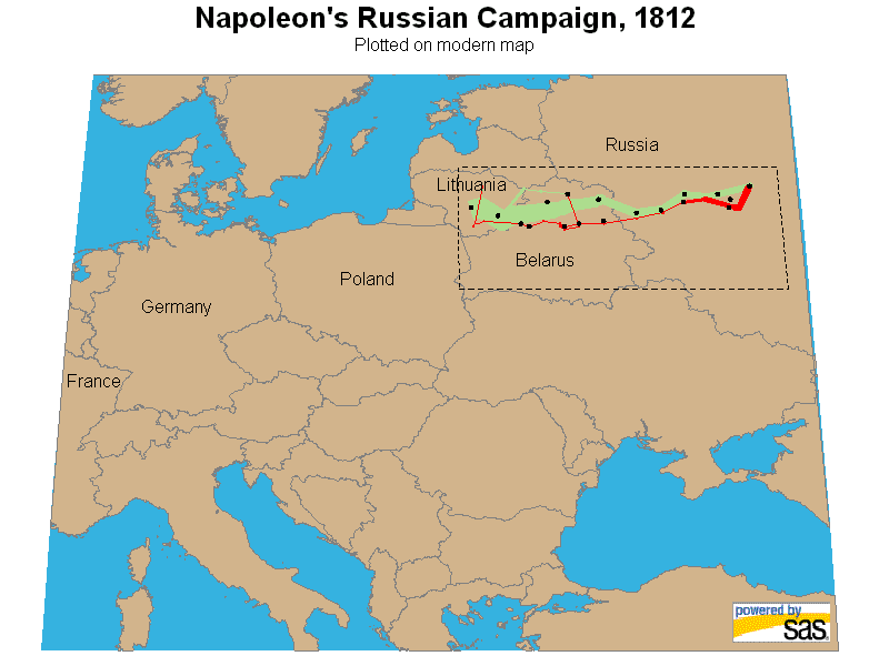
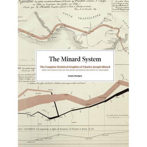
Charles Joseph Minard: folyamtérkép (Napóleon 1812-es orosz hadjárata, 1869)
Sz: 1781. március 27.
E: 1870. október 24.
francia építészmérnök
statisztikus
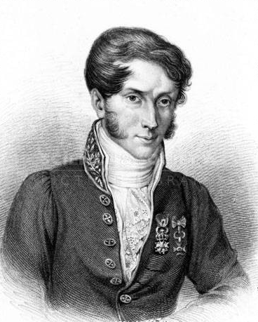
Des tableaux graphiques et des cartes figuratives (1869)
Minard's first statistical graphic, from 1825, depicts several time series related to Paris pavement maintenance over the preceding two centuries.
Minard's first flow map, from 1845, depicts road traffic between Dijon and Mulhouse.

Minard's map using pie charts to represent the cattle sent from all around France for consumption in Paris (1858)
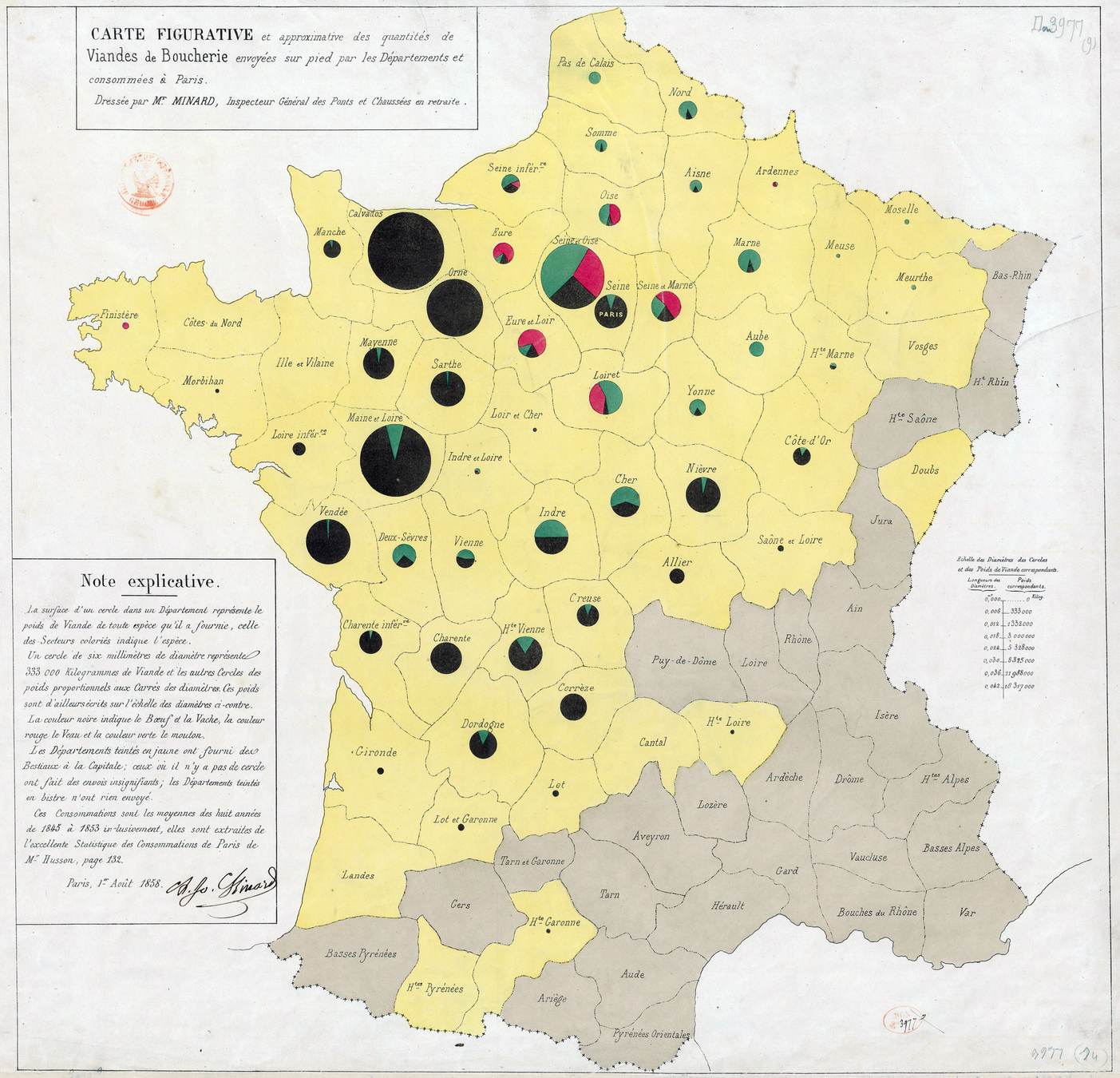
emigrációs térkép, 1858
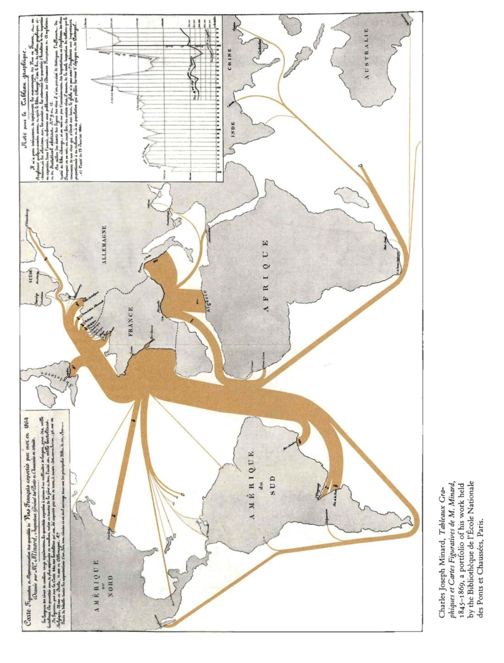
Francia bor export, 1864
Szénhasználat Bretagne-ban, 1866
Napóleon 1812-es orosz hadjárata (1869)
Feladat: milyen típusú adatokat mutat be az ábra?
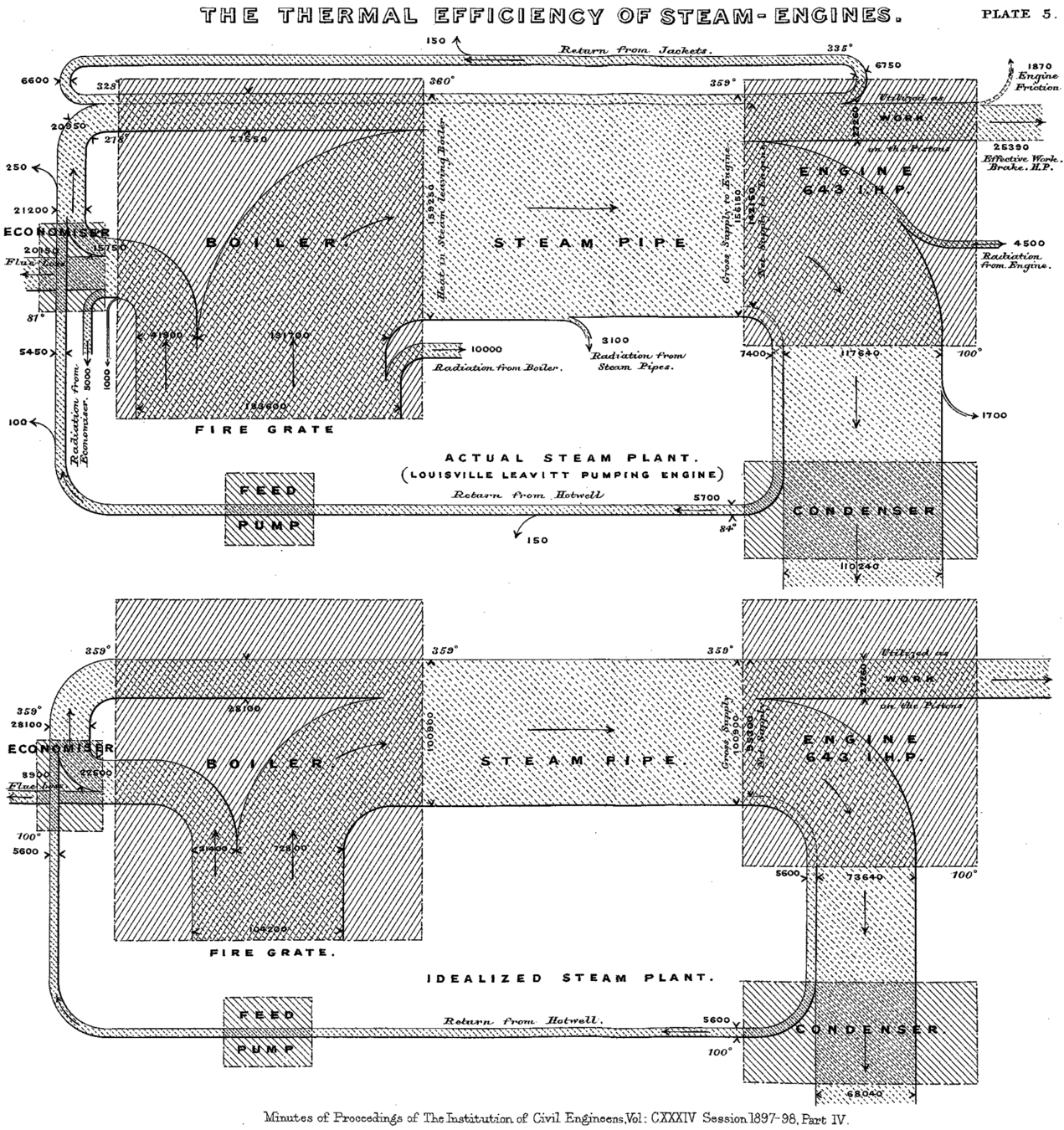
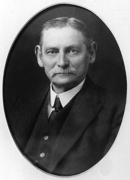
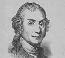
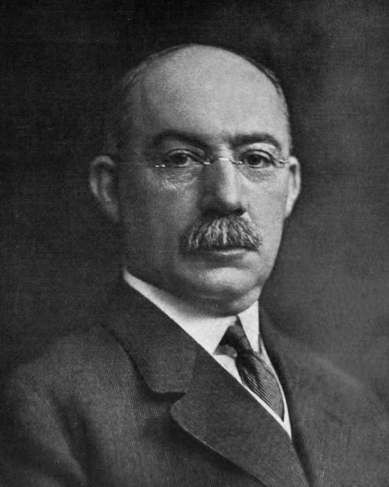
Matthew Henry Phineas Riall Sankey, ír hajóskapitány
1898-as ábra, gőzmozdony energiahatékonyságát ábrázolta folyamábrán
Sz: 1868. február 23.
E: 1963. augusztus 27.
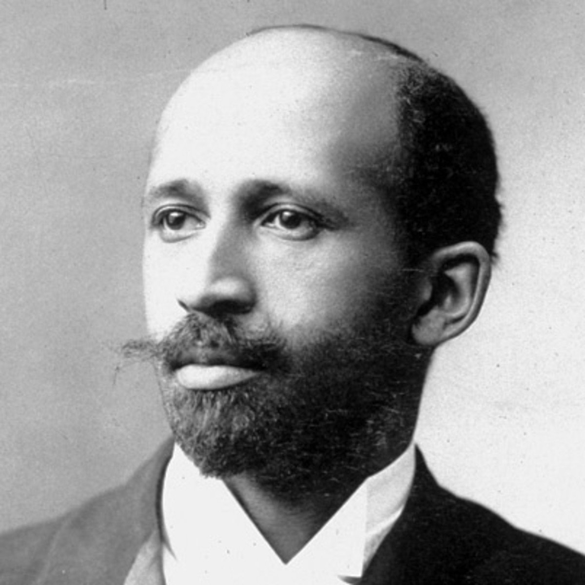
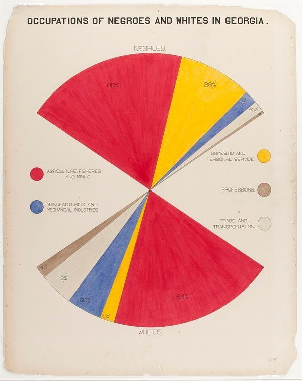
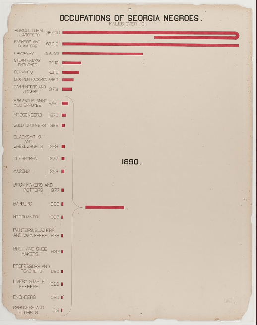
amerikai pedagógus, szociológus, történész, politikus, író
1900-1950: Modern sötét korszak (Friendly 2008)
W.E.B. Du Bois, Párizsi világkiállítás (1900)
Sz: 1861. május 20.
E: 1919. november 23.
amerikai gépészmérnök
menedzsment tanácsadó
Henry Laurence Gantt: Gantt-diagram (1910-es évek)
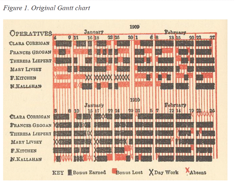
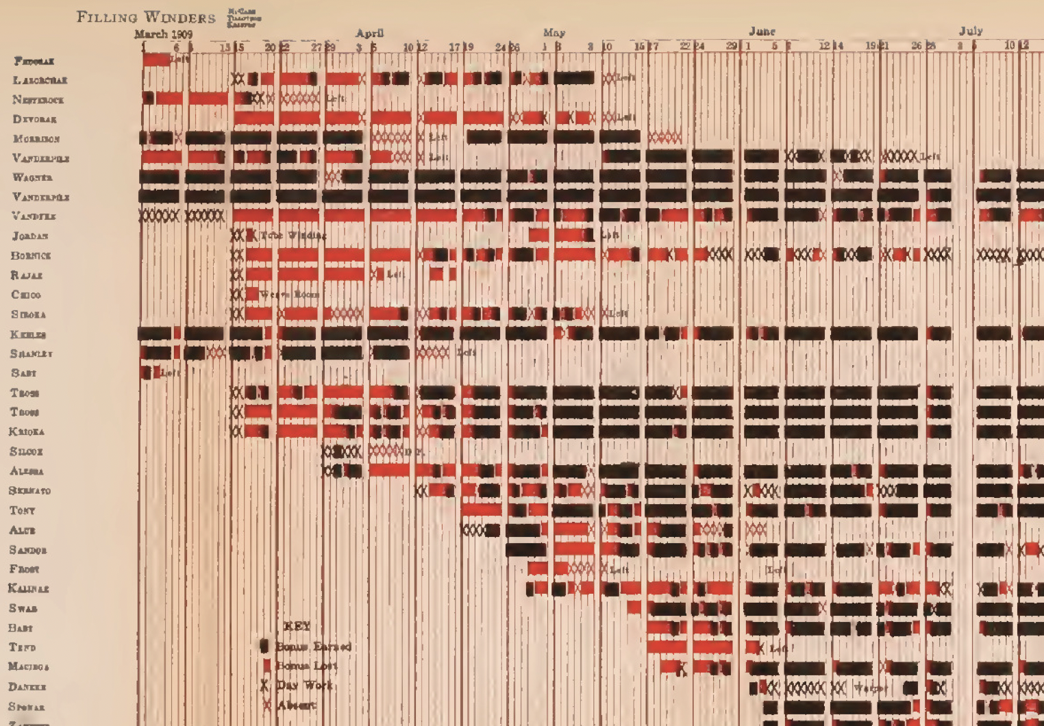
Sz: 1880. december 10.
E: 1945. december 22.
osztrák közgazdász
filozófus
szociológus
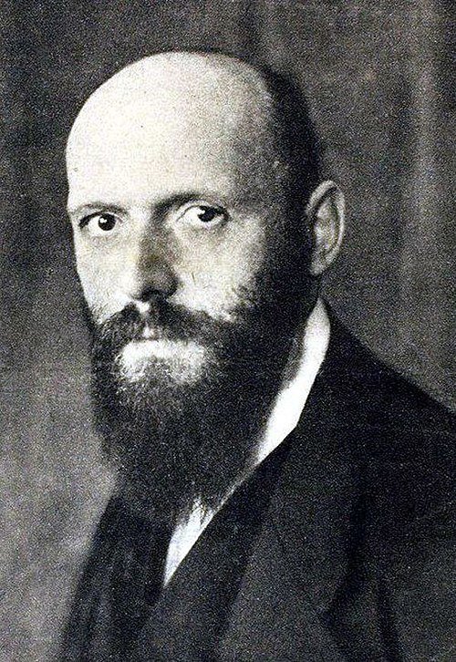
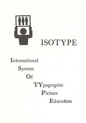
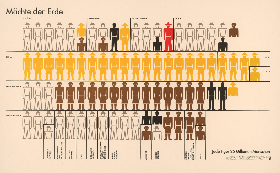
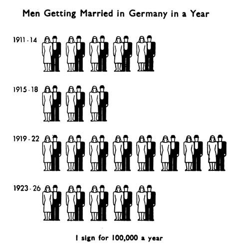
Otto Neurath, ISOTYPE (International System of Typographic Picture Education, 1925-1935)
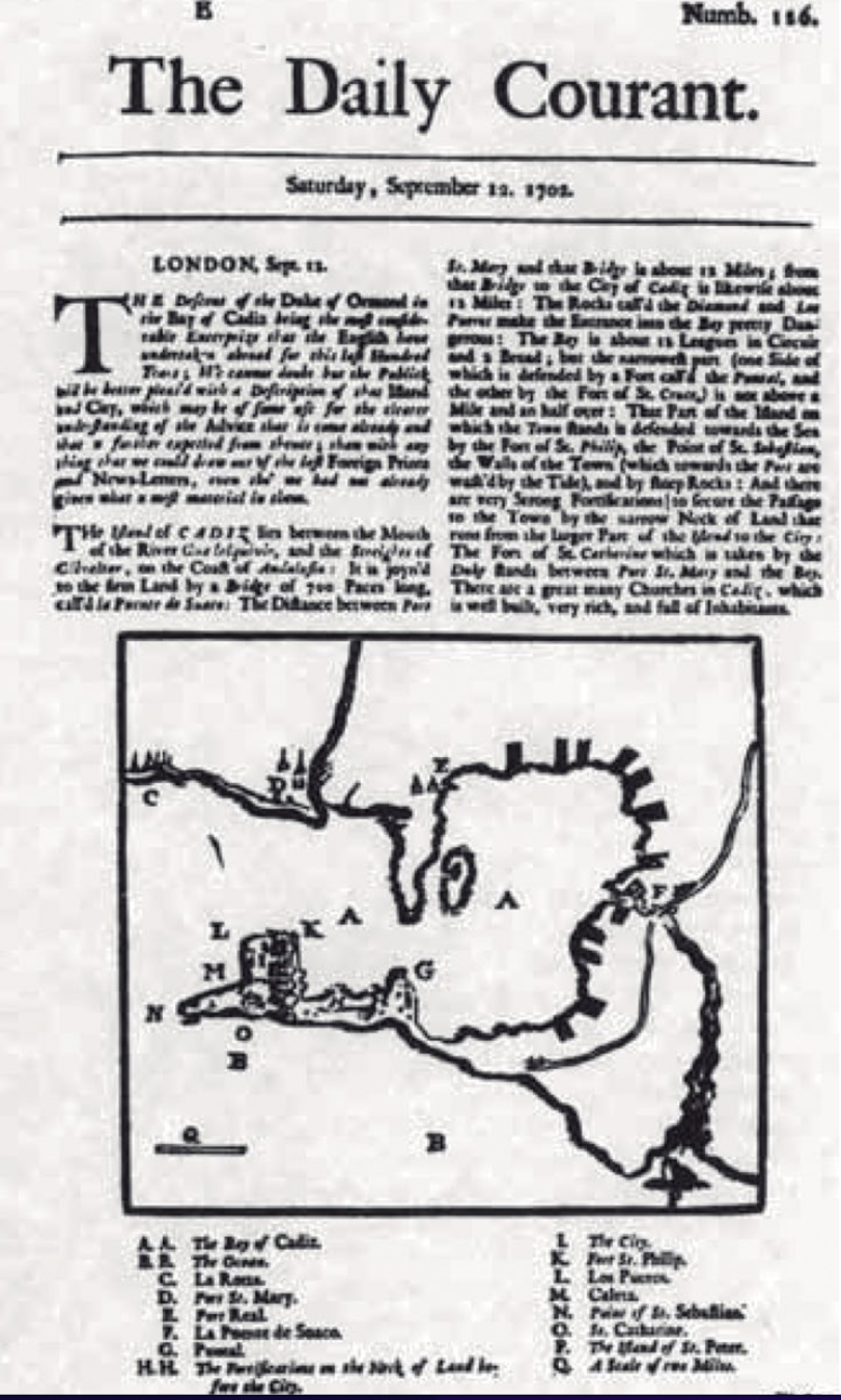
1702, Daily courant (spanyol város megszállását bemutató térkép)
Adatábrázolások a sajtóban
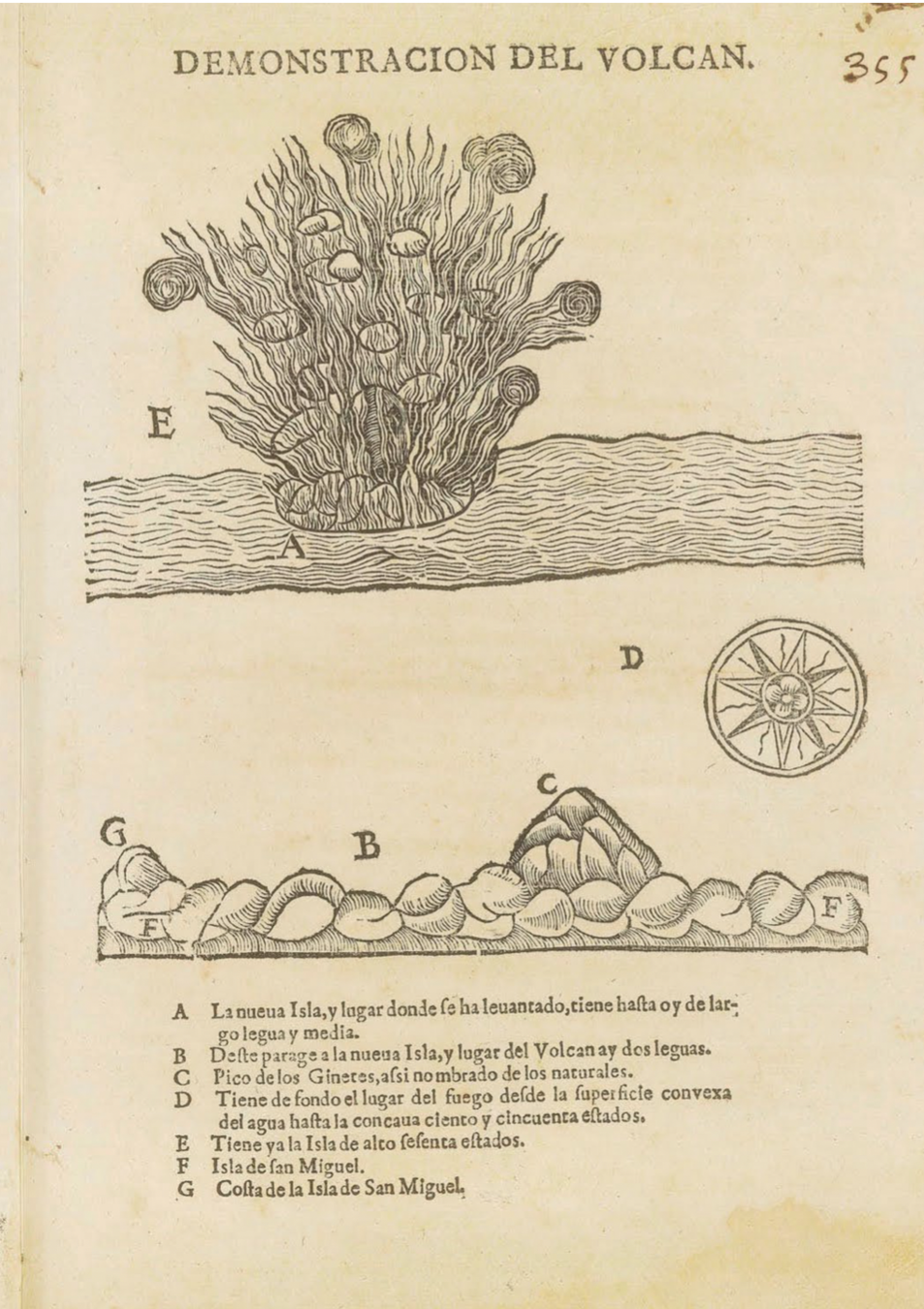
1638, Azori-szigeteknél lévő vulkán leírása
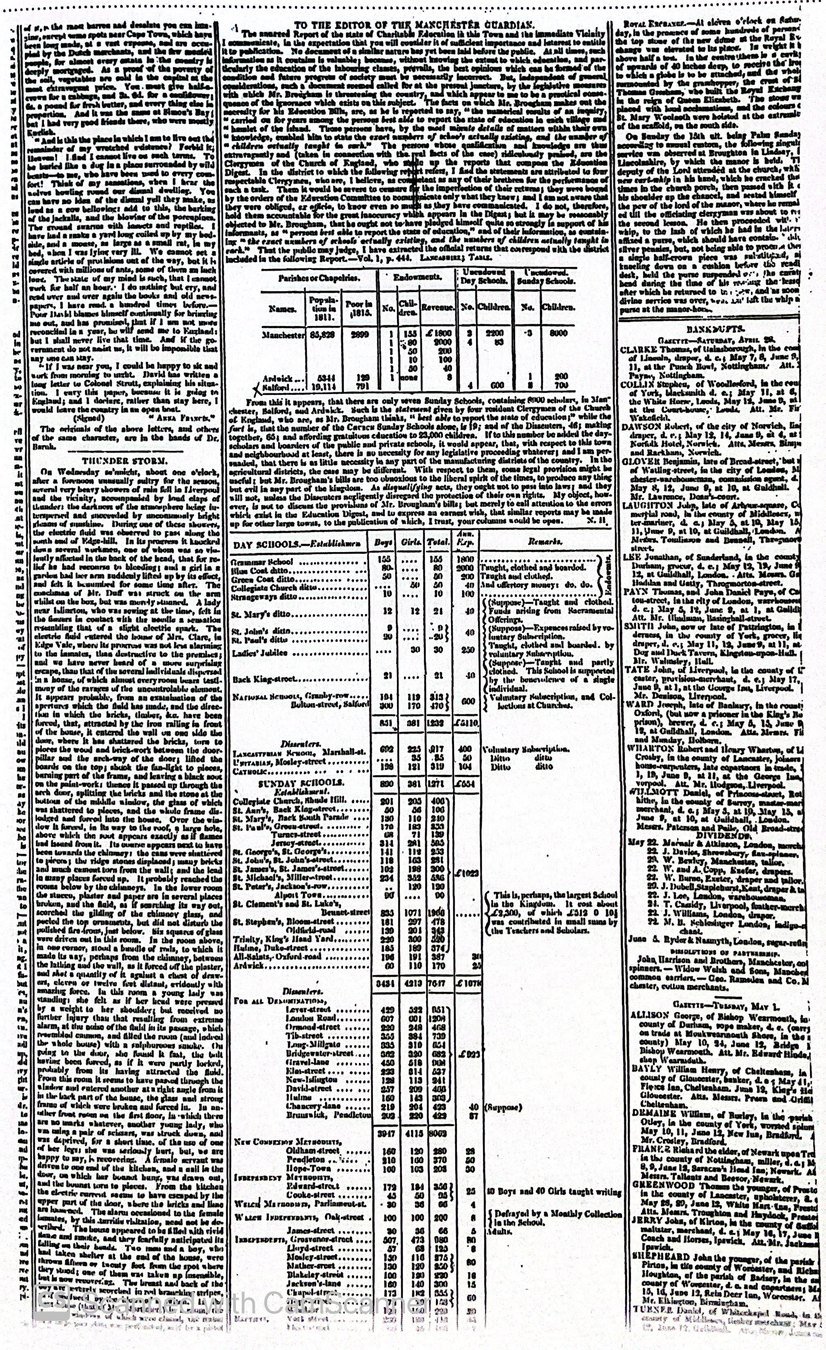
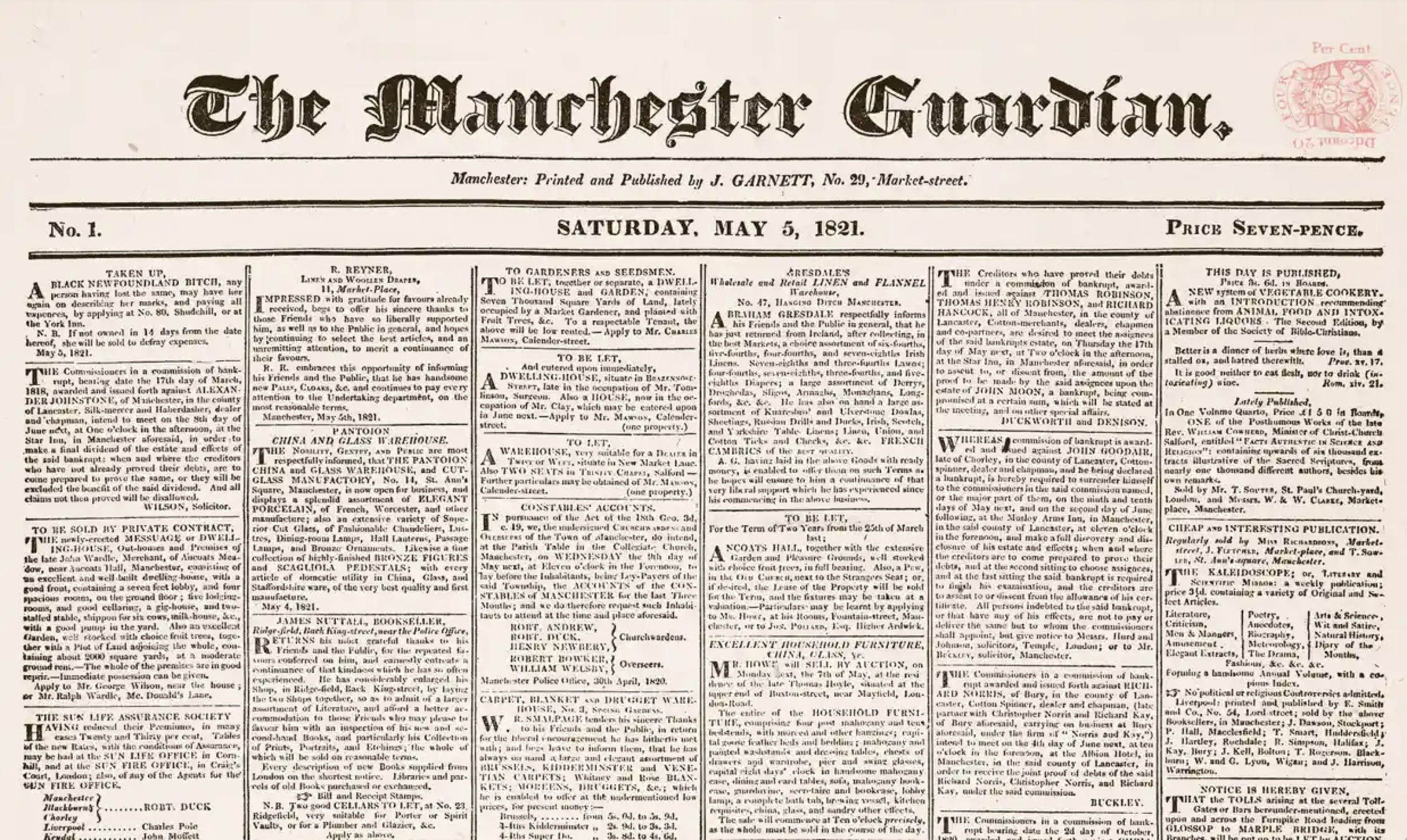
1821, The Manchester Guardian, adattábla az iskolák diákjairól, ingyen oktatásban részesültek számáról
Technikai akadályok: drága, lassú és nehéz előállítani képeket, grafikonokat
Olvasók nem találkoztak ábrákkal, nem voltak hozzászokva
There were lots of statistics in the paper. Journalists wrote about trends in the bond markets, activity in the commodity markets, and changing birth rates. Numbers were a big part of the media; they just weren’t visualized.
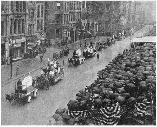
1913. május 17. statisztikai ábrázolások felvonulása
Képi fordulat: olvashatóbb, rendszerezett struktúra az újságokban
fewer columns, prominent illustrations, horizontal layout, and simplified headline typography. The front pages clearly became less dense and more orderly, as indicat- ed by several measures (Barnhurst and Nerone, 2001: 192, 194).
Technikai fejlődés, képek és diagramok megjelenése a 19 század végén, 20. század elején
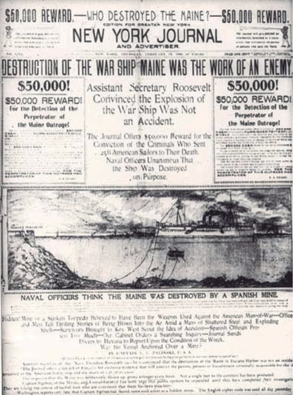
The period between 1800 and 1870 saw rapid advances in the efficiency, and in the capabilities, of newspaper printing. These changes in turn led to the emergence of illustrations during the 1870s, by means of zincography (the mechanical engraving of line blocks), which rendered wood-engraving obsolete (Hutt, 1973). New techniques in paper produc- tion led to cheaper and more easily available sources, which in turn led to the emergence of a range of illustrated dailies (Ibid.). Prior to 1890, few daily newspapers used illustrations, but by the 1920s photographic half- tones were ubiquitous (Dick, 2020, p 103)
A szélesebb közönséghez szóló lapokban több ábra volt (reklámok is), de a "komoly sajtó" sokáig tartózkodott az illusztrációktól, a "szó ereje" sokáig a domináns nézet volt.
The period between 1800 and 1870 saw rapid advances in the efficiency, and in the capabilities, of newspaper printing. These changes in turn led to the emergence of illustrations during the 1870s, by means of zincography (the mechanical engraving of line blocks), which rendered wood-engraving obsolete (Hutt, 1973). New techniques in paper produc- tion led to cheaper and more easily available sources, which in turn led to the emergence of a range of illustrated dailies (Ibid.). Prior to 1890, few daily newspapers used illustrations, but by the 1920s photographic half- tones were ubiquitous (Dick, 2020, p 103)
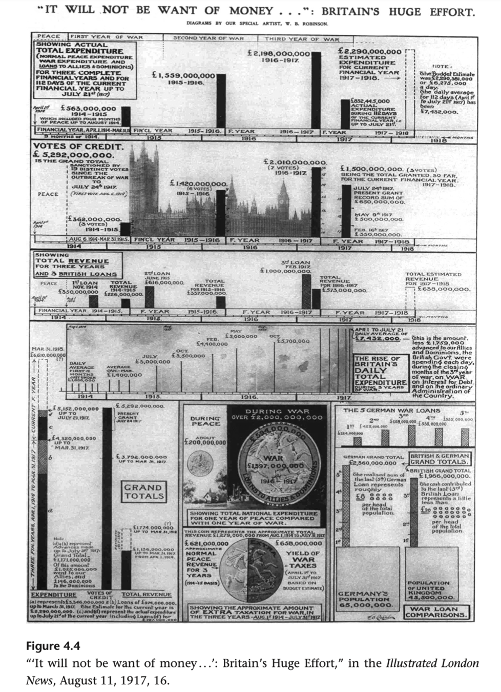
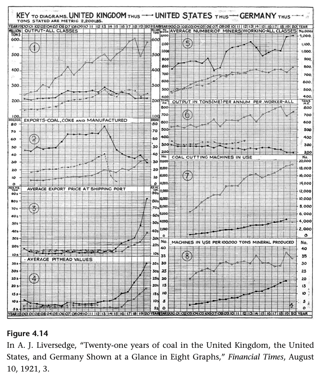
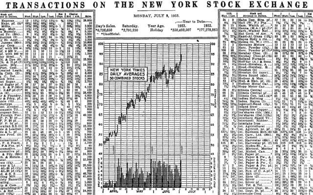
Pénzügyi, gazdasági lapokban gyakorivá váltak az ábrák (pl. Financial Times), New York Times-ban az első ábrák egyike tőzsdei mozgást ábrázolt (1933).
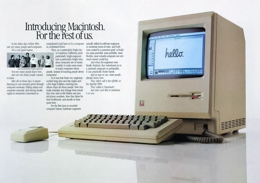
Számítógép által asszisztált korszak (1950-es évek)
5. ideologikus és 6. professzionális korszak (Dick 2020)
1950- jelen: újjászületés, interaktivitás kora (Friendly 2008)
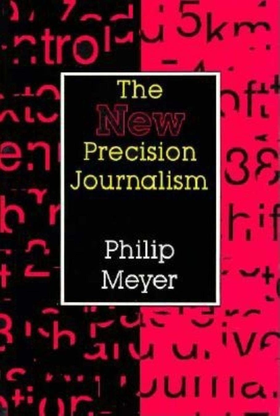
Philip Meyer: CAR (Computer Assisted Reporting), 1967
Sz: 1930. október 27.
újságíró

az adatalapú újságíráson felül magában foglal társadalomtudományi, közgazdasági, térinformatikai, adattudományi és statisztikai módszereket is.
We are drowning in information. The web has given us access to data we would never have found before. (Simon Rogers, 2009)


Sz: 1967. december 24.
adatújságíró
Big Data: WikiLeaks (2010)
- Afgán háború (92 201 sor)
- Iraki háború (391 000 sor)
- USA diplomáciai üzenetek (251 287 sor)

miért terjed az adatújságírás az online térben?
- internet miatt széleskörű hozzáférhetőség az adathoz
- felhasználóbarát, elérhető táblázatkezelő és vizualizációs alkalmazások
- Egyre növekvő érdeklődés
- adatalapú cikkek, melyek nagy hatással voltak az emberekre, ami az adatújságírás eszköztára nélkül nem valósulhatott volna meg
- Open Source Intelligence (OSINT)
- Minden adat, minden feldolgozható adatként
- Élő (real-time) adatábrázolás
- Technológiai kiterjesztések, perifériák (VR, AR, AI)
- Interaktivitás, animációk
Következő óra
Szeptember 22: adatábrázolási módszerek, az ábrázolások osztályozása
Feladat 1 plusz pontért:
Olvasd el Jonathan Schwabish Better Data Visualisations című könyvének első részét (13-63. oldal), vázlatpontokban foglald össze: milyen Gestalt-elvek vannak; melyik öt alapelvet fekteti le az író, miért fontosak; a 'forma' és a 'funkció' mentén milyen ábrázolási kombinációk lehetségesek.
Plusz 1 pontért:
A Data Viz Dispatch bármelyik heti összefoglalójából keress egy kiemelt ábrát, és a fenti vázlat alapján jellemezd: milyen Gestalt-elvet alkalmaz, megfelel-e az alapelveknek, 'forma' és 'funkció' alapján milyen kategóriába esik?
Kedd 20:00-ig. Tárgy: BMEGT43A020_09.22_[NEPTUN KÓD]
Köszönöm a figyelmet!
szabo.krisztian96@gmail.com
BME2
By Szabó Krisztián


