Bevezetés az informatikába (BMEGT43A020)
4. az ábrázolások hibái, hazug ábrázolások
kahoot.it
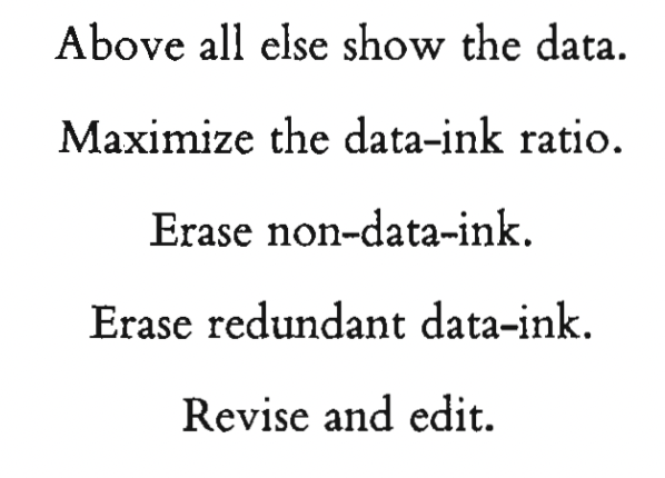
Az ábrázolások hibái, hazug ábrázolások

1. E. R. Tufte: Visual and Statistical Thinking: Displays of Evidence for Making Decisions. 5-15pp
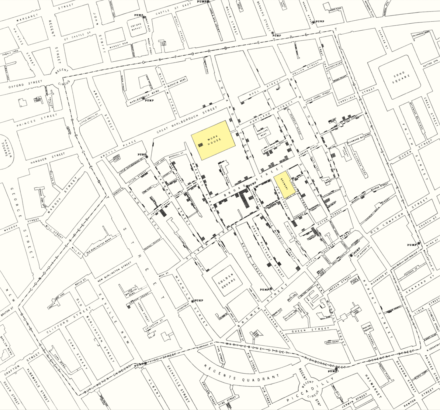
Milyen hibákat emel ki Snow térképén, milyen megoldásokat, alternatívákat kínál?
2. https://marypatcampbell.substack.com/p/geeking-out-florence-nightingale
+
https://99percentinvisible.org/episode/florence-nightingale-data-viz-pioneer/transcript/
Hogyan csalt Nightingale a rózsadiagrammal? Mi olvasható ki az adatokból más ábrázolási típus választásával?
3. E. R. Tufte: The Visual Display of Quantitative Information (2001).Chartjunk: Vibrations, Grids and Ducks (107-121pp)
Milyen vizuális hibák miatt tart egyes ábrákat Tufte “Chartjunknak”?
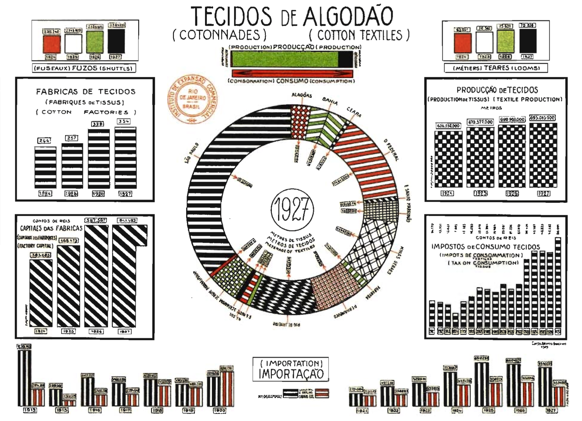
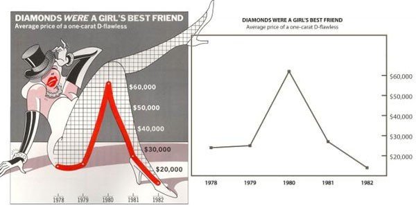
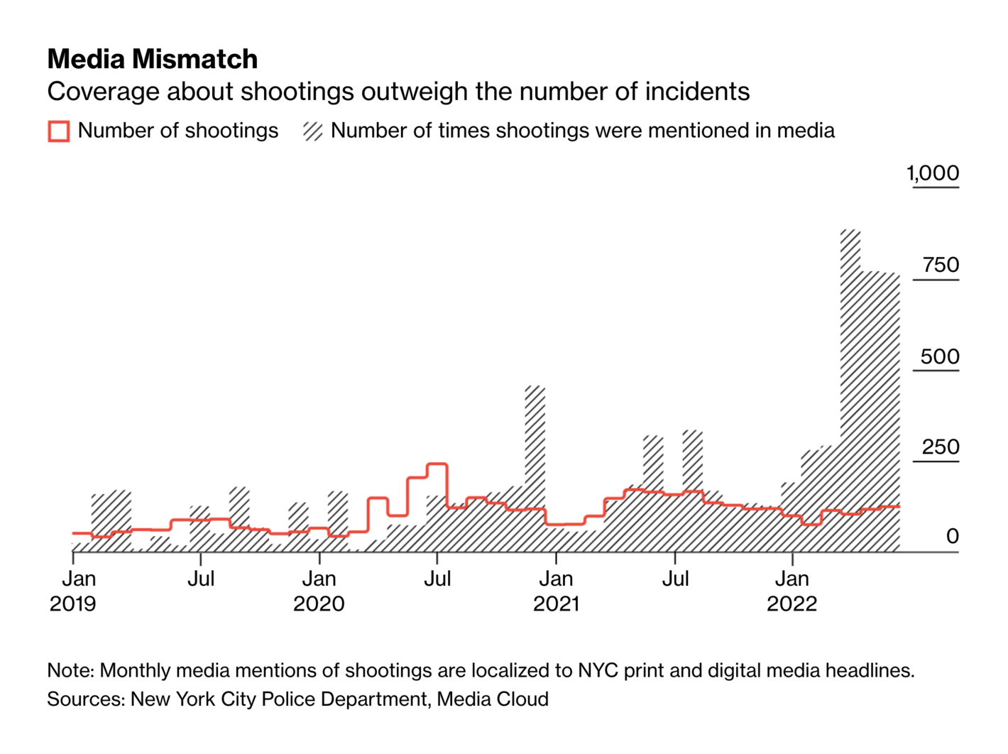
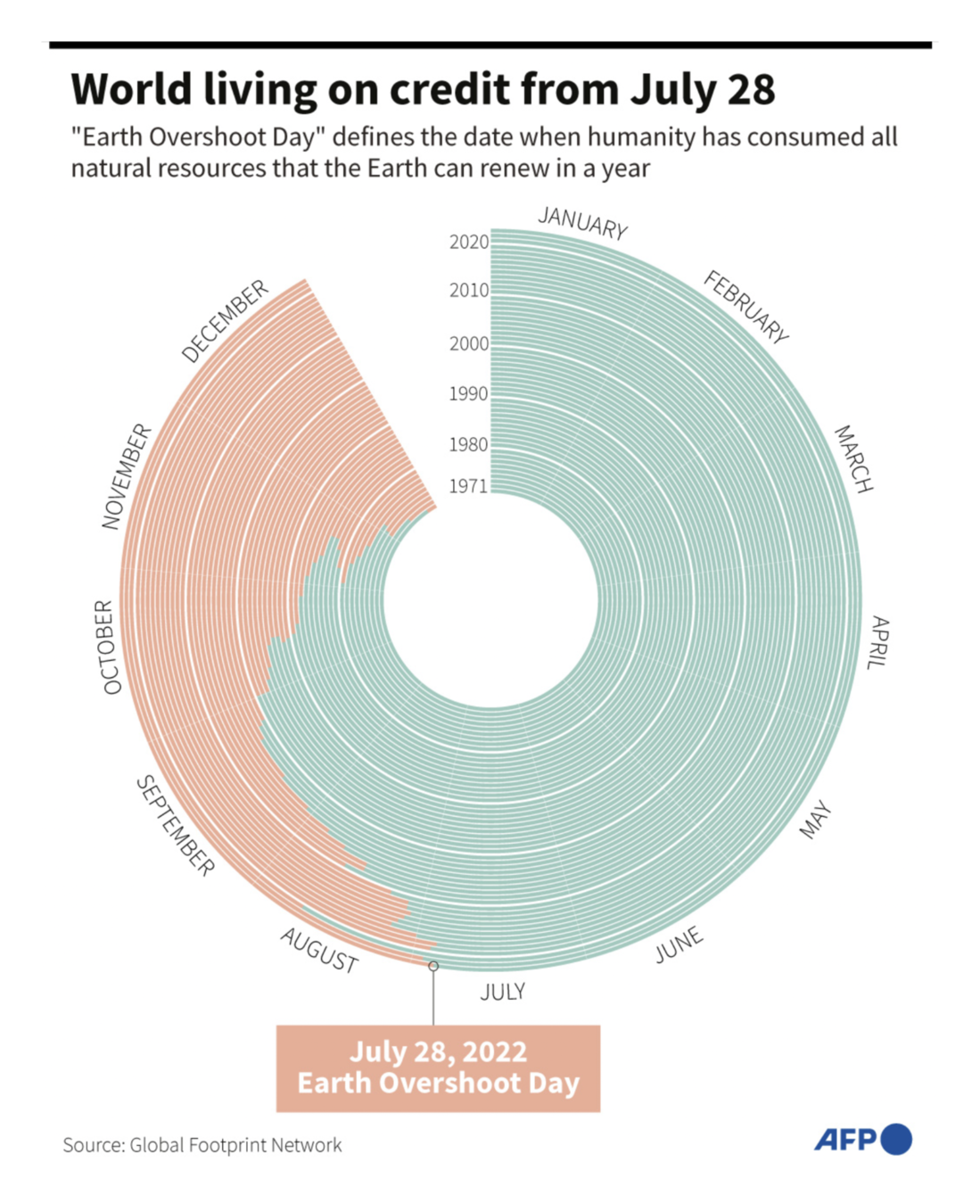
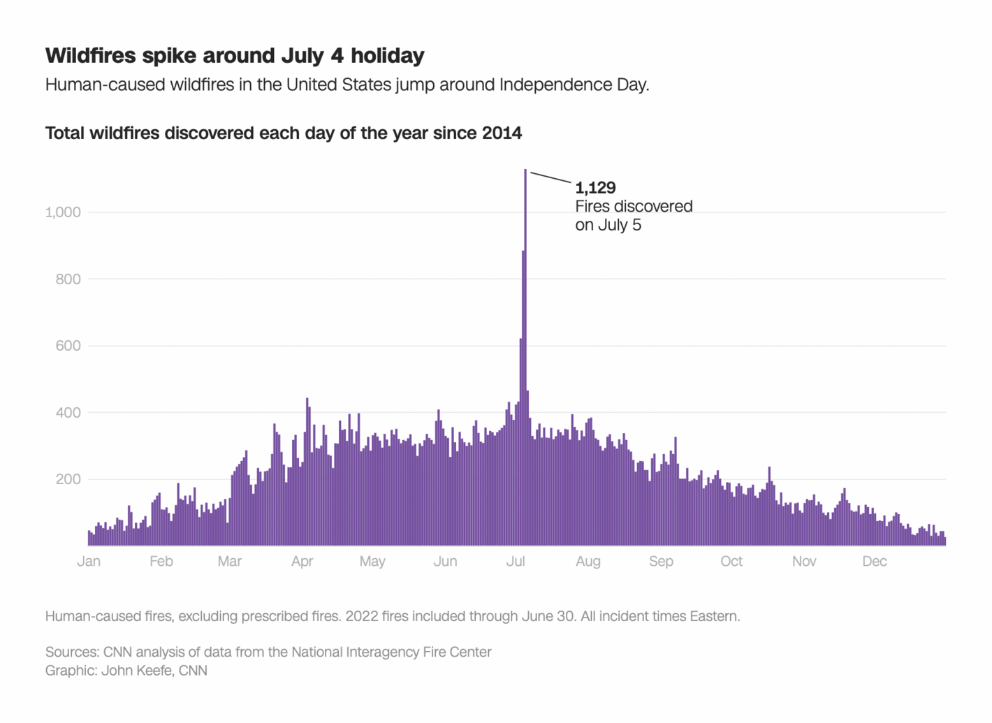
4. Keress a Data Vis Dispatch-ban két olyan ábrát, amit te más diagramként mutatnál be: milyen ábra lenne az, miért?
1. E. R. Tufte: Visual and Statistical Thinking: Displays of Evidence for Making Decisions. 5-15pp
Milyen hibákat emel ki Snow térképén, milyen megoldásokat, alternatívákat kínál?
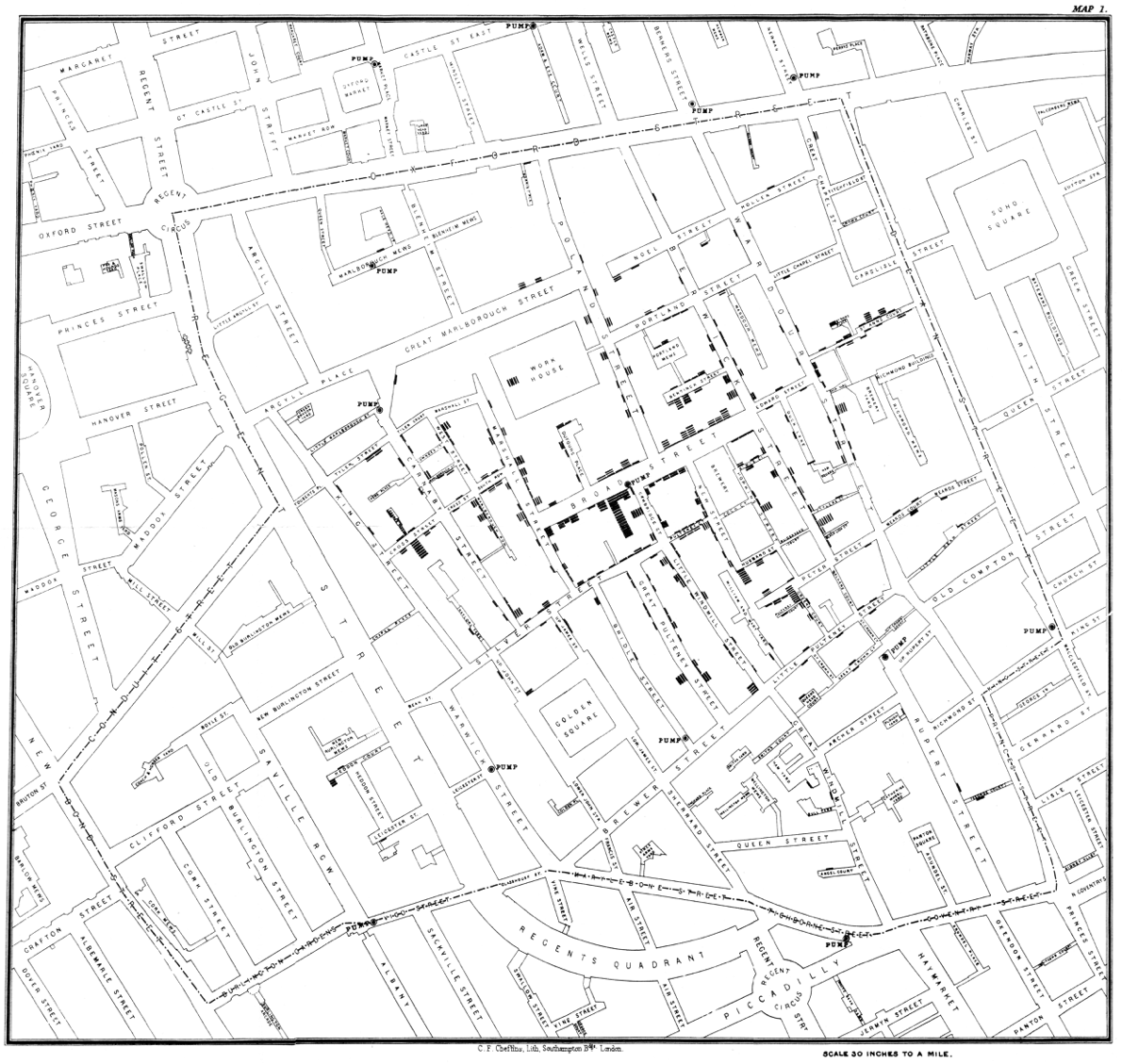
1. Megfelelő kontextus és ábrázolási mód kiválasztása
This map reveals a strong association between cholera and proximity to the Broad Street pump, in a context of simultaneous comparison with other local water sources and the surrounding neighborhoods without cholera
the passage of time is a poor explanatory variable, practically useless in discovering a strategy of how to intervene and stop the epidemic
2. Mihez képest?
to understand fully the cause of the epidemic also requires an analysis of those who escaped the disease.
3. Alternatív magyarázatok, ellenérvek
The point is to get it right, not to win the case
contradictory instances, a number of deaths from cholera with no obvious link to the Broad Street pump
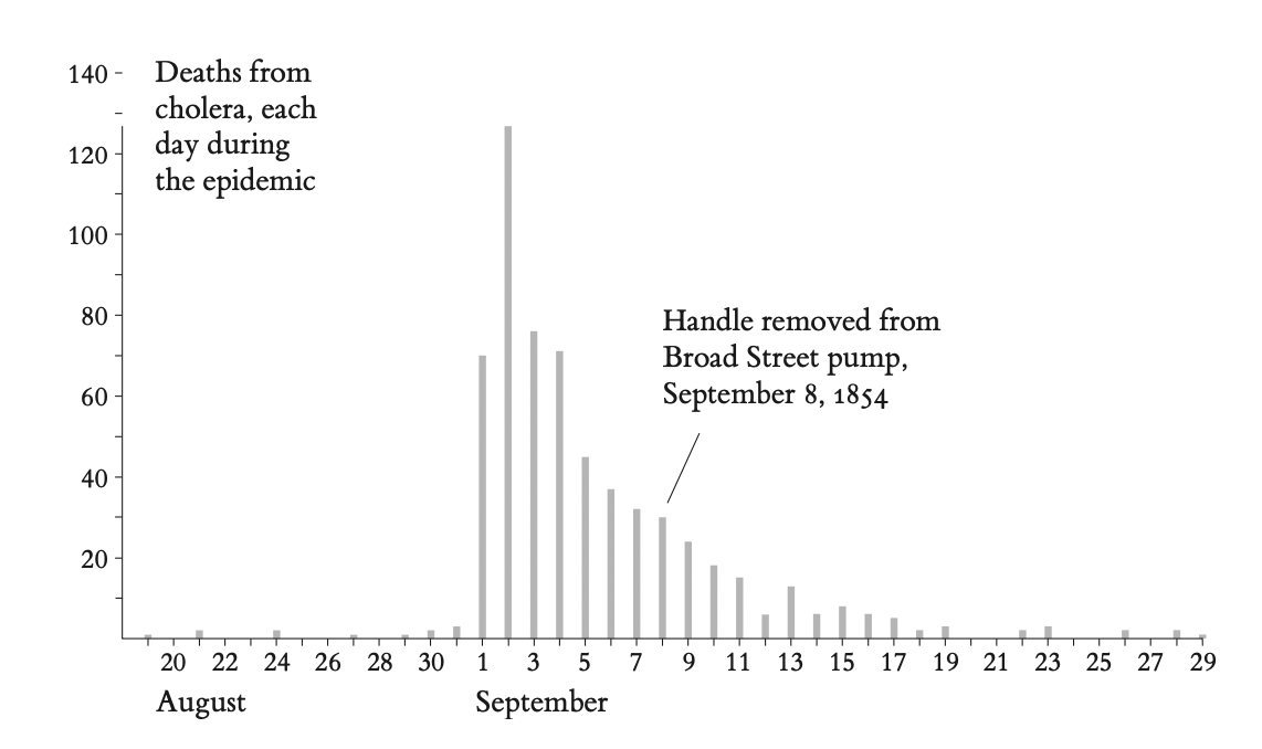
it is not at all clear that the removal
of the handle of the Broad Street pump had much to do with ending the epidemic
The epidemic was already in rapid decline by the time the handle was removed. Yet, in many retellings of the story of the epidemic, the pump-handle removal is the decisive event, the unmistakable symbol of Snow’s contribution.
4. Hibák
The big problem is that dot maps fail to take into account the number of people living in an area and at risk to get a disease:
“an area of the map may be free of cases merely because it is not populated."
Snow’s dot map does not assess varying densities of population in the area around the pump.
Ideally, the cholera data should be displayed both on a dot and a rate map
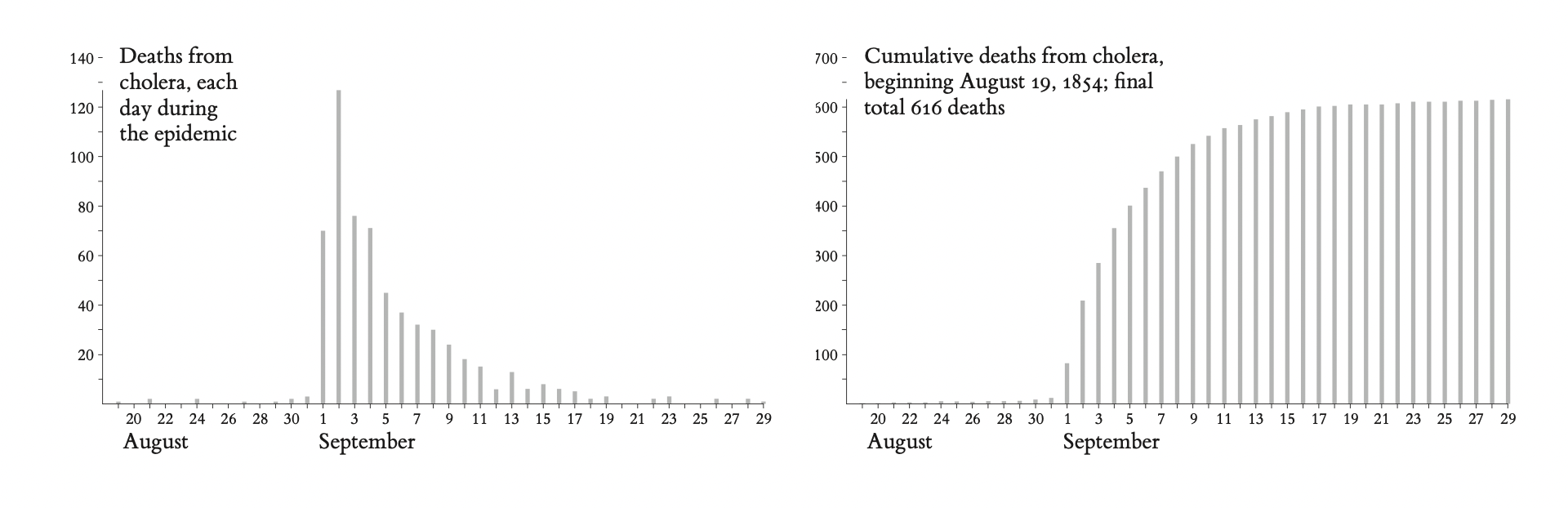
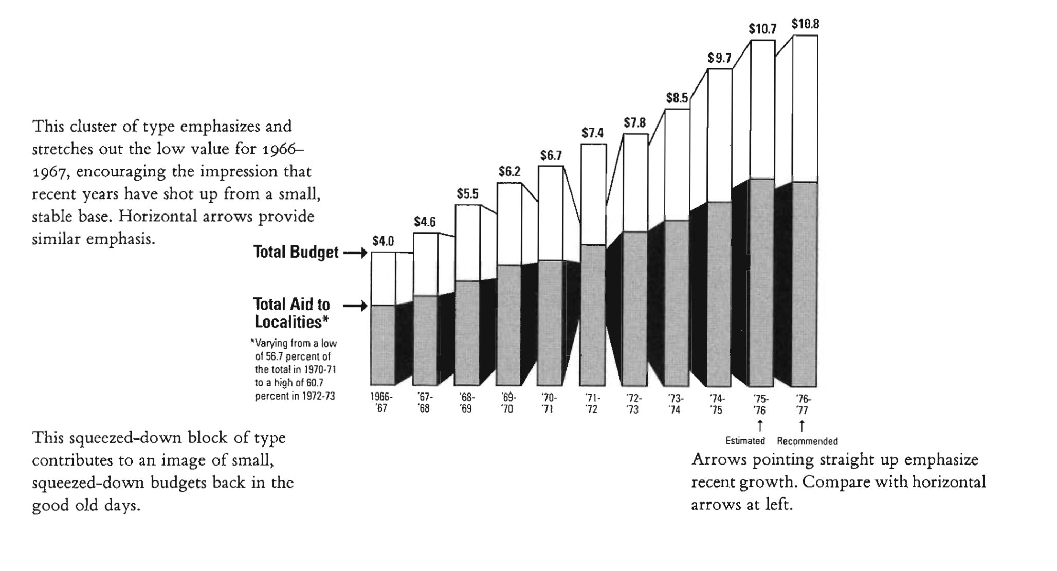
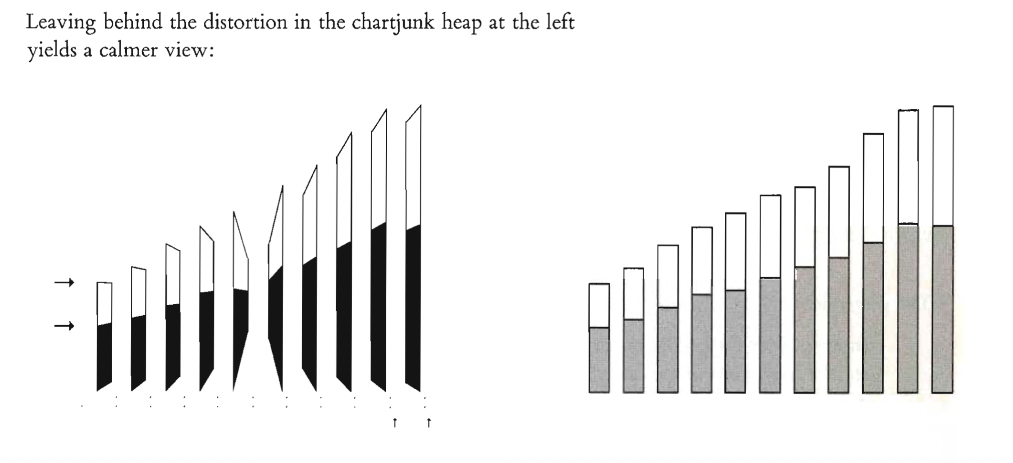
Aggregations by area can sometimes mask and even distort the true story of the data. For two of the three examples at right, constructed by Mark Monmonier from Snow’s individual-level data, the intense cluster around the Broad Street pump entirely vanishes in the process of geographically aggregating the data.
diffcult to reproduce on a single page
the cholera symbols become murky and the type too small

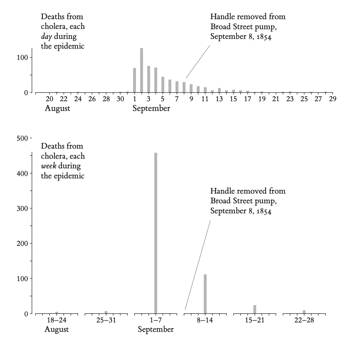
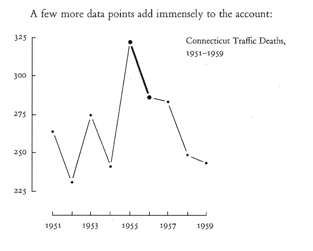
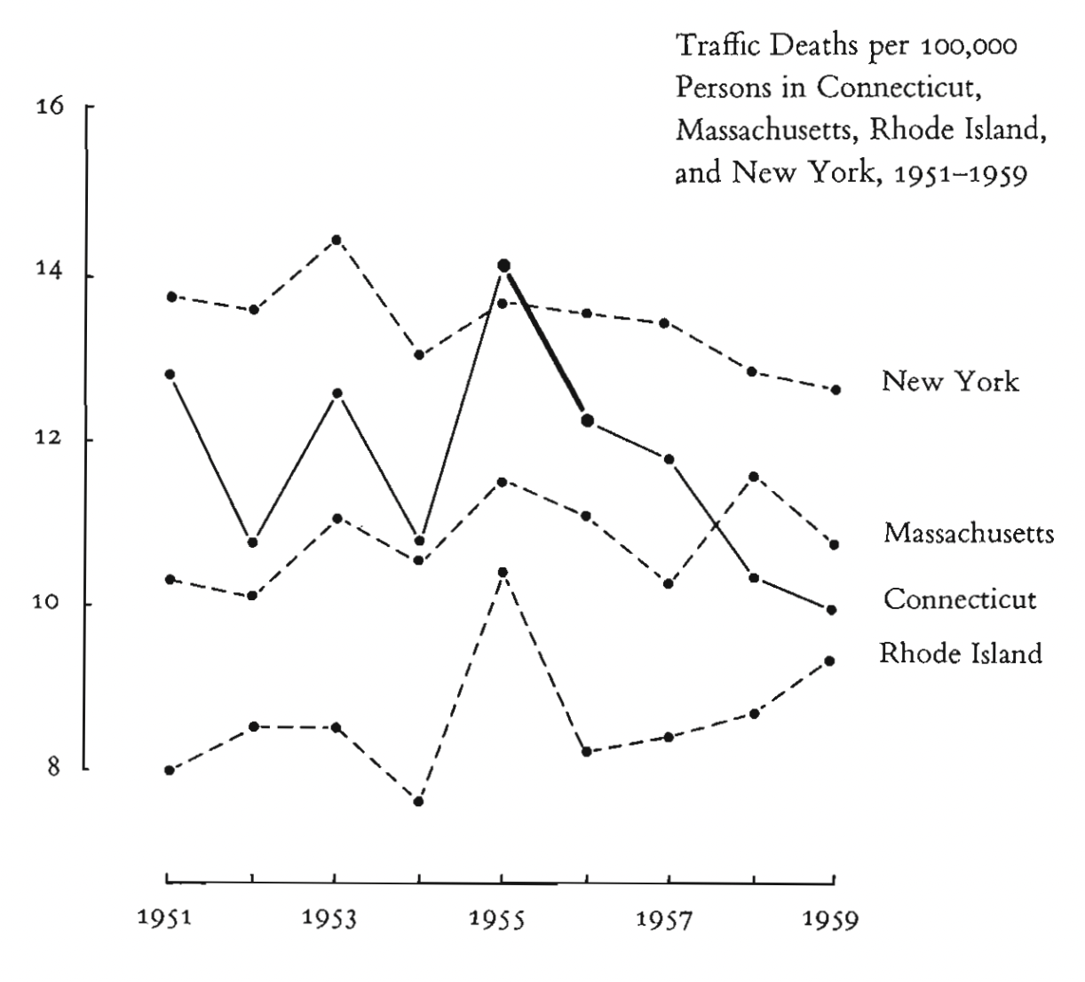
Aggregations over time may also mask relevant detail and generate misleading signals
Since two or more days typically pass between consumption of the in- fected water and deaths from cholera, the removal date might properly be lagged in relation to the deaths
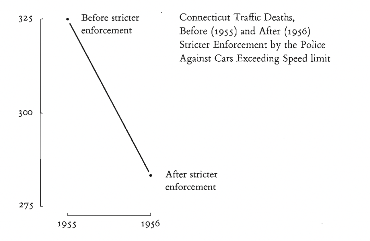
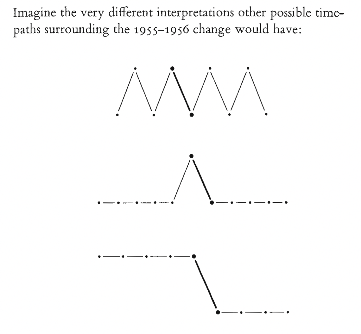
Time-series are exquisitely sensitive to choice of intervals and end points
2. https://marypatcampbell.substack.com/p/geeking-out-florence-nightingale
+
https://99percentinvisible.org/episode/florence-nightingale-data-viz-pioneer/transcript/
Hogyan csalt Nightingale a rózsadiagrammal? Mi olvasható ki az adatokból más ábrázolási típus választásával?
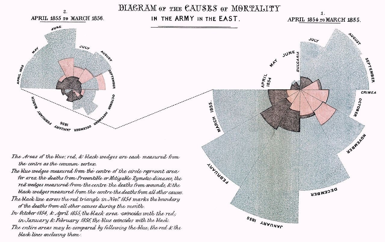
The number of deaths should be normalized against the “exposure” – that is, the number of people in the army were around to die.
a badly designed graph or a graph based on flimsy data… well, they can be remarkably persuasive too
The inherent problem is the difficulty of making good comparisons across the wedges. In general, for such small data sets, tables will outperform graphics.
Tables can be clearer, but tables don’t grab your attention in 500 milliseconds. And kings and queens and ministers and newspaper editors are busy, as Nightingale rather acidly noted when she sent her report to Queen Victoria.
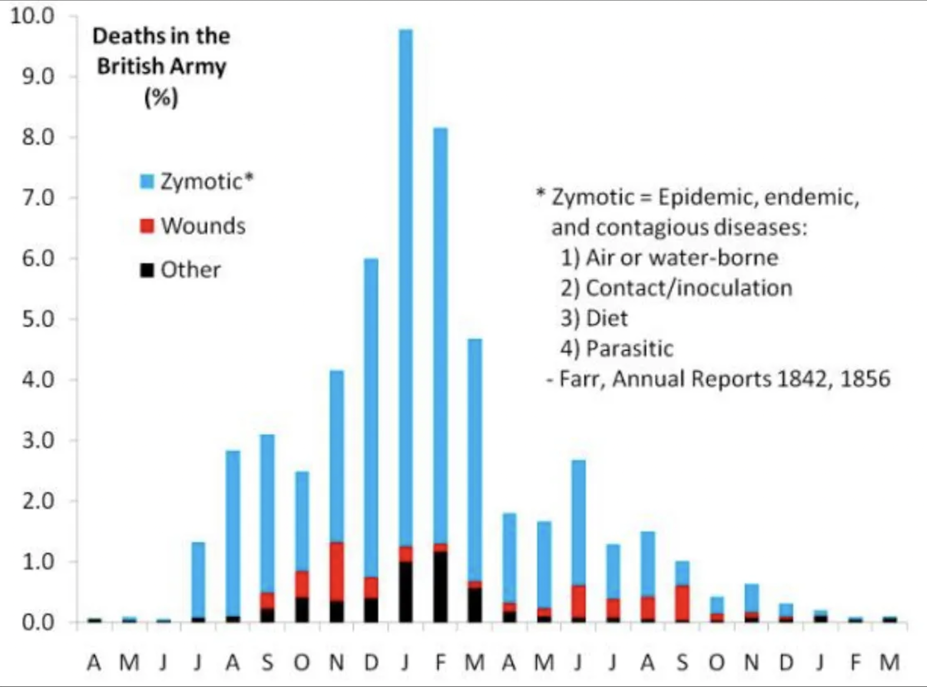
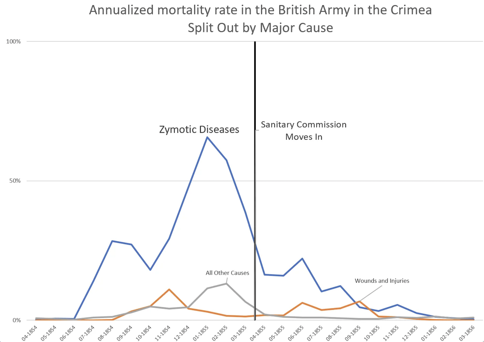
It’s so shocking to see the data from the Rose Diagram replotted as a bar chart. When you do that, the stark before and after story is lost. By the time the sanitary commission arrived in March, flushing horses out of the water supply and carrying away tons of human excrement, deaths had already been falling sharply for a couple of months.
But let’s be careful because it seems that if you give us 500 milliseconds alone with a pretty graph, we’re all suckers. The first data visualization to change the world did so by exploiting our visual gullibility. Florence, Nightingale’s beautiful graphic proved a powerful weapon, and now it’s a weapon that anyone with any motive can pick up and use.
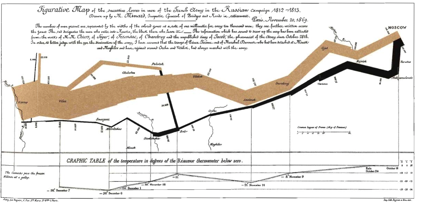
Hibák és észrevételek Minard folyamtérképéhez
- Első ránézésre nehéz megállapítani a folyam irányát, a színek jelentését, a térbeli elhelyezkedést: ebben segít a mellékelt leírás, a jelmagyarázat, a diagramra írt számok és helynevek
- A helynevek elhelyezkedése nem pontos és nem kimerítő
- A Moszkvába vezető út nincs időben ábrázolva, a visszaútnál is csak néhány dátum szerepel
- A hőmérséklet ábrázolása azt sugallja, hogy a hadsereg a téli hideg miatt tizedelődött meg, miközben az oda vezető úton nagyobb volt a veszteség: ezt az ábra nem magyarázza meg (csata, leszakadás, betegségek?)
- Moszkvában egy hónapig tartózkodott a sereg, de a térképből ez nem derül ki (a dátumok hiánya miatt): a sereg egyenletes mozgását sugallja
3. E. R. Tufte: The Visual Display of Quantitative Information (2001).Chartjunk: Vibrations, Grids and Ducks (107-121pp)
Milyen vizuális hibák miatt tart egyes ábrákat Tufte “Chartjunknak”?
Optikai illúziók (Moiré-hatás)
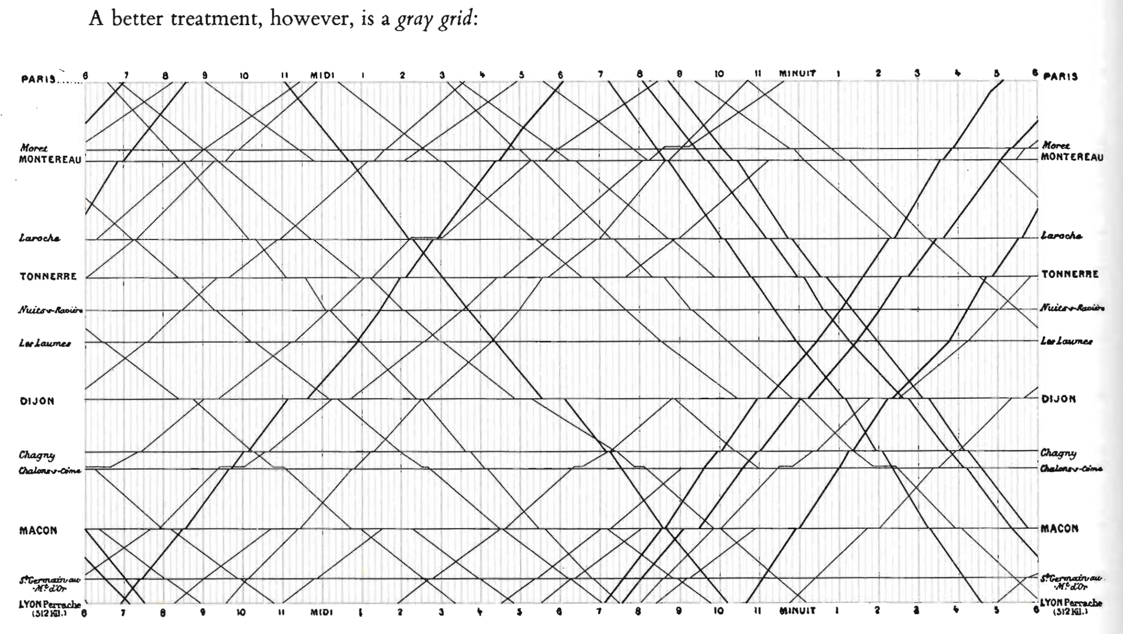
Rácsvonalak
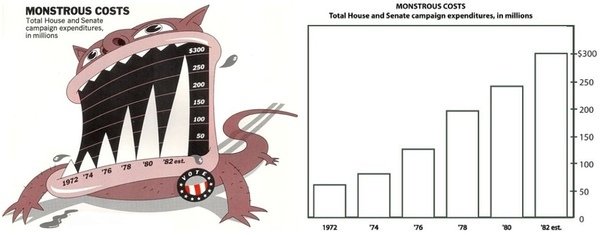
A "Kacsa" – túldizájnolt diagramok
Technológia vs adat
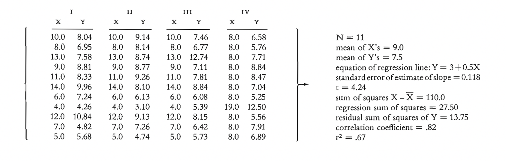
Anscombe négyese (1973):
a statisztikai átlagolás buktatói
most people don’t comment about the relationship between the different series, which, at the end of the day, is what we want to understand. It turns out that each of the four pairs yield the same standard information: the same average values of the X series and the Y series; the same variance for each; the same correlation between X and Y; and the same estimated regression equation
(Schwabish)
Hogyan hazudnak az diagramok?
Rossz dizájn


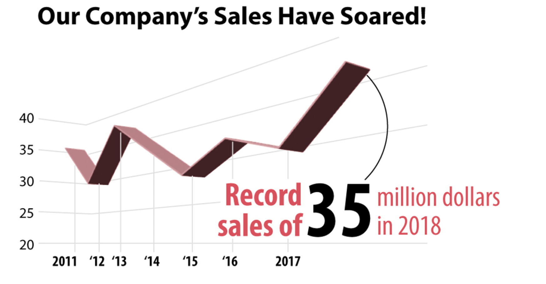
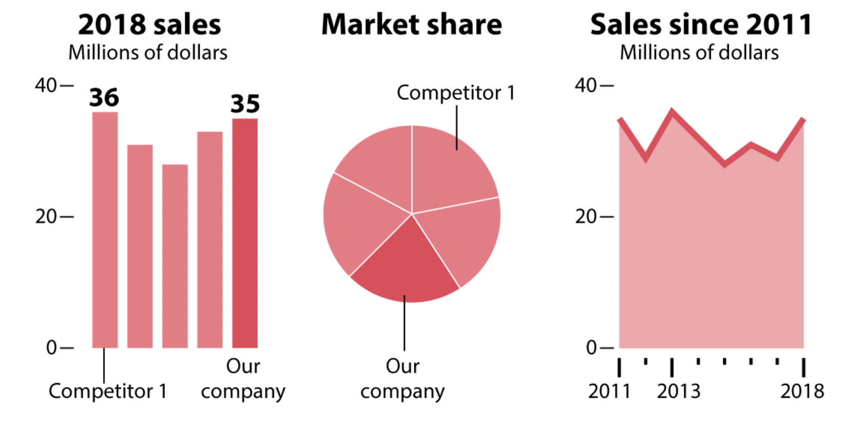
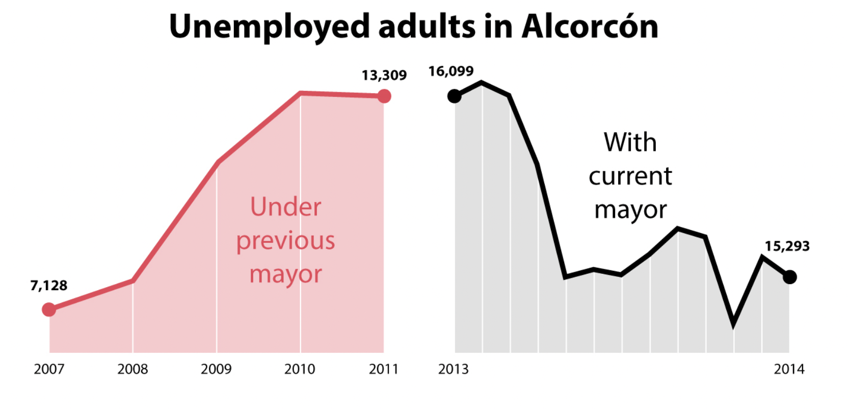
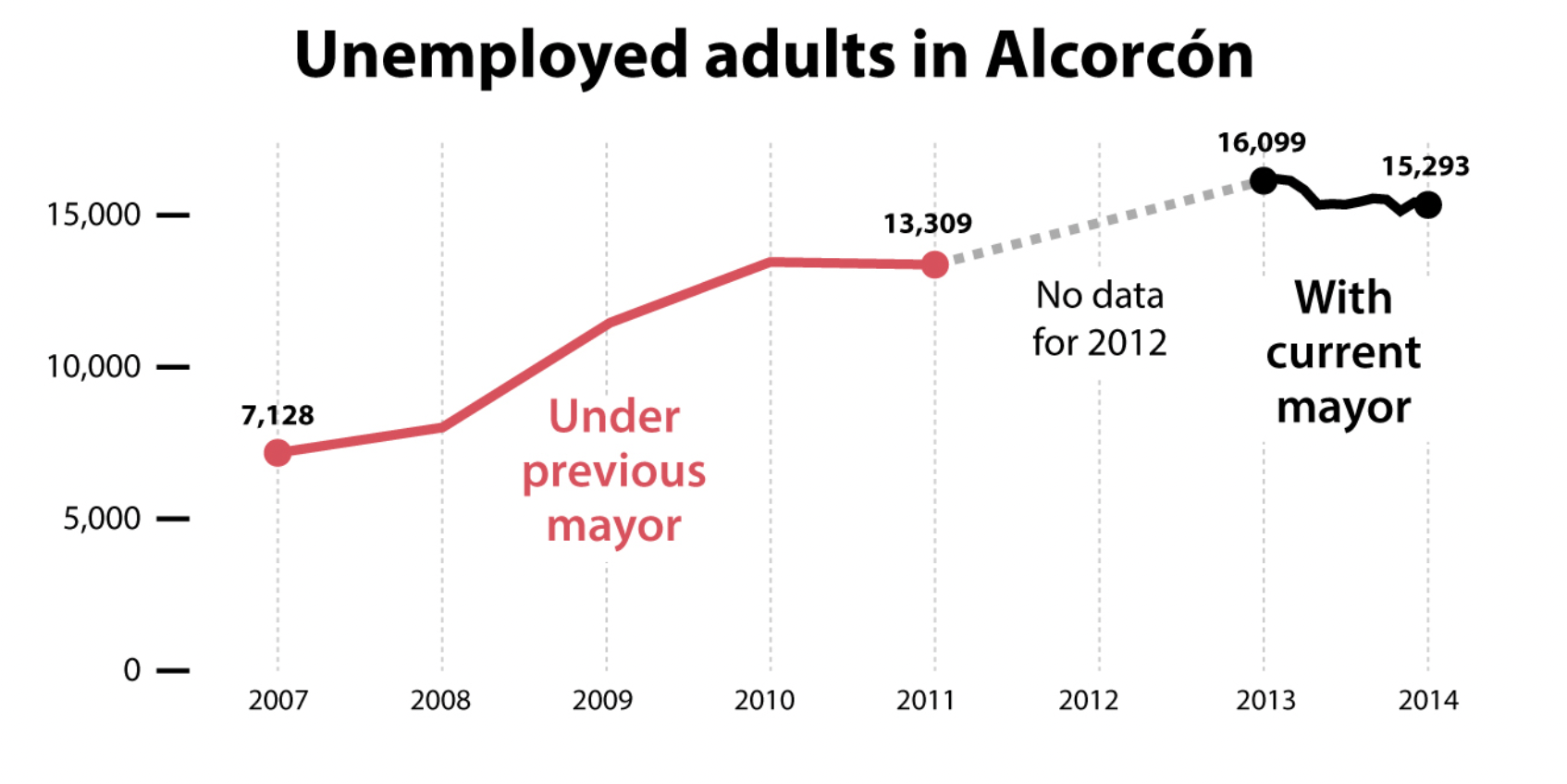
Hogyan hazudnak az diagramok?
Rossz adat
A chart may look pretty, intriguing, or surprising, but if it encodes faulty data, then it’s a chart that lies.
Distrust any publication that doesn’t clearly mention or link to the sources of the stories they publish.
Hogyan hazudnak az diagramok?
Túl kevés vagy túl sok adat ábrázolása

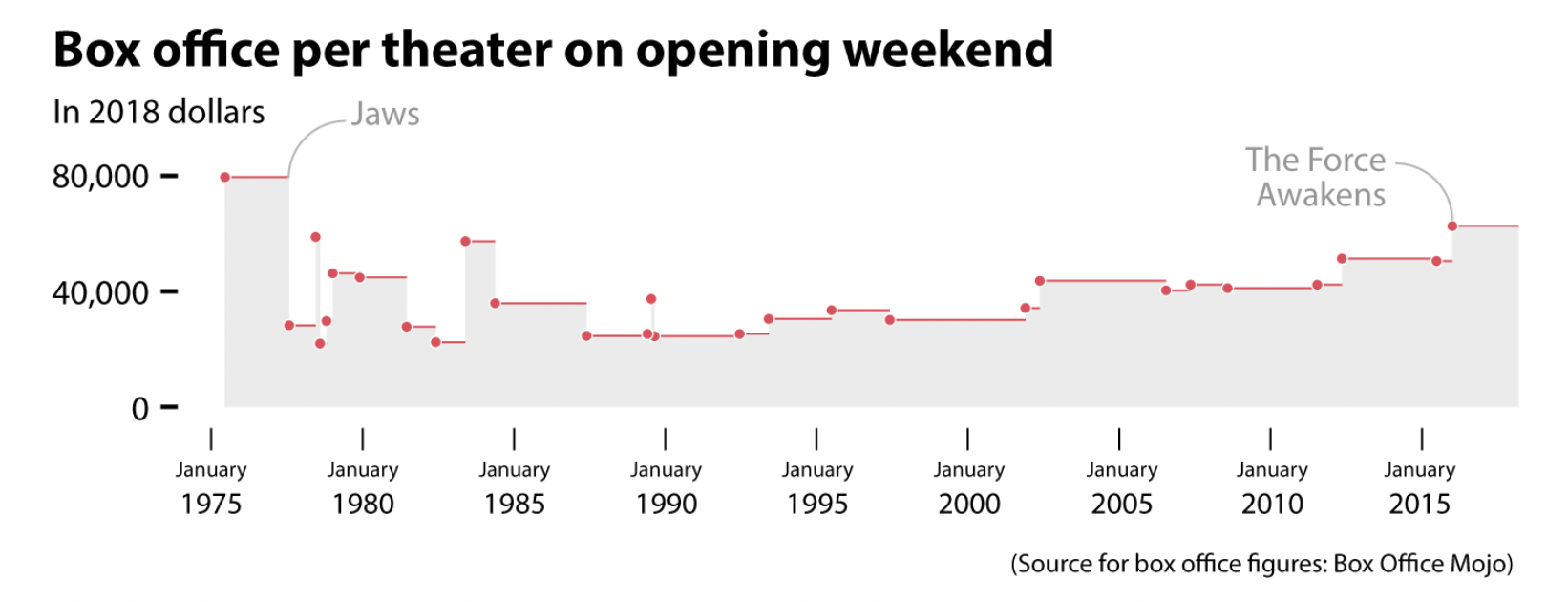
All models are fallible, incomplete, and uncertain, but when all of them tell a similar story, albeit with variations, your confidence in them ought to increase
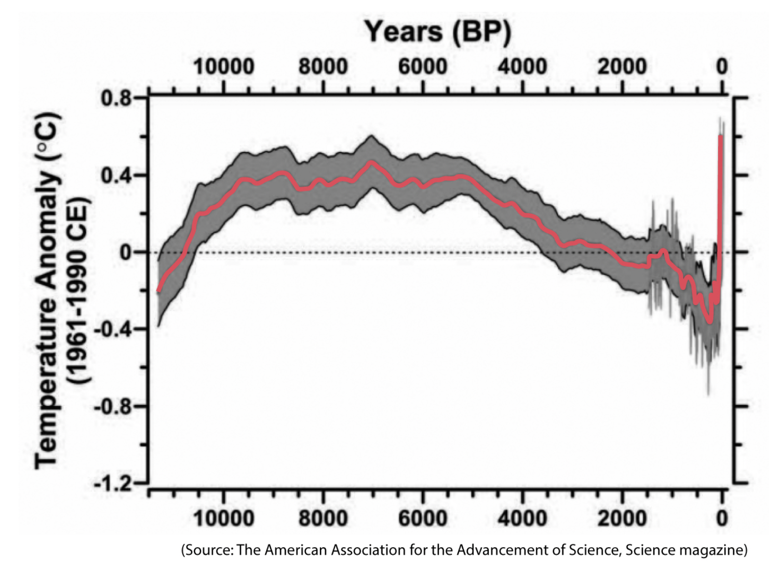
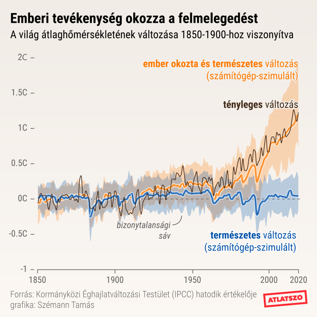
Hogyan hazudnak az diagramok?
Bizonytalanság ábrázolásaa
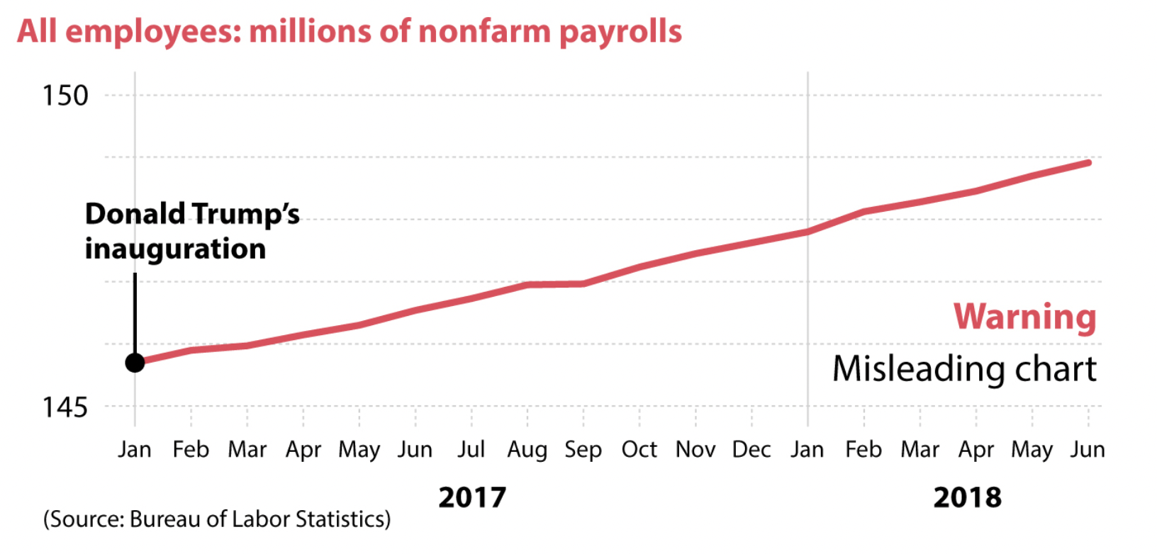
Hogyan hazudnak az diagramok?
Félrevezető mintázatok
Következő óra
Október 13.: mindennapi vizualizálás (GDJ)
Plusz 1 pontért:
Models and Streams of Data Journalism (Uskali és Kuutti): Sorold fel a különbségeket a hétköznapi (General) és a oknyomozó (Investigative) újságírás között.
Október 4. kedd 20:00-ig. Tárgy: BMEGT43A020_10.13_[NEPTUN KÓD]
Köszönöm a figyelmet!
szabo.krisztian96@gmail.com
BME4
By Szabó Krisztián


