INFOGRAPHICS
(BN-INFGRA-04-GY)
2. Origins of data visualisation and data journalism
Origins of data visualisation and data journalism

Different classifications of data visualisation history:
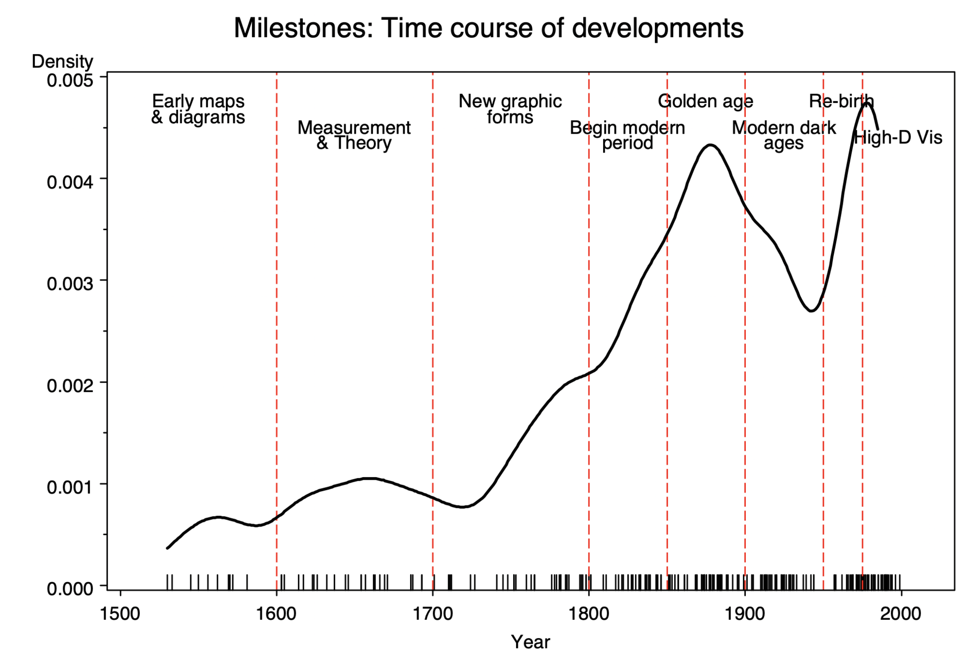
Michael Friendly: Milestones in the history of thematic cartography, statistical graphics, and data visualization (2008)
Alberto Cairo: Nerd Journalism (2017)
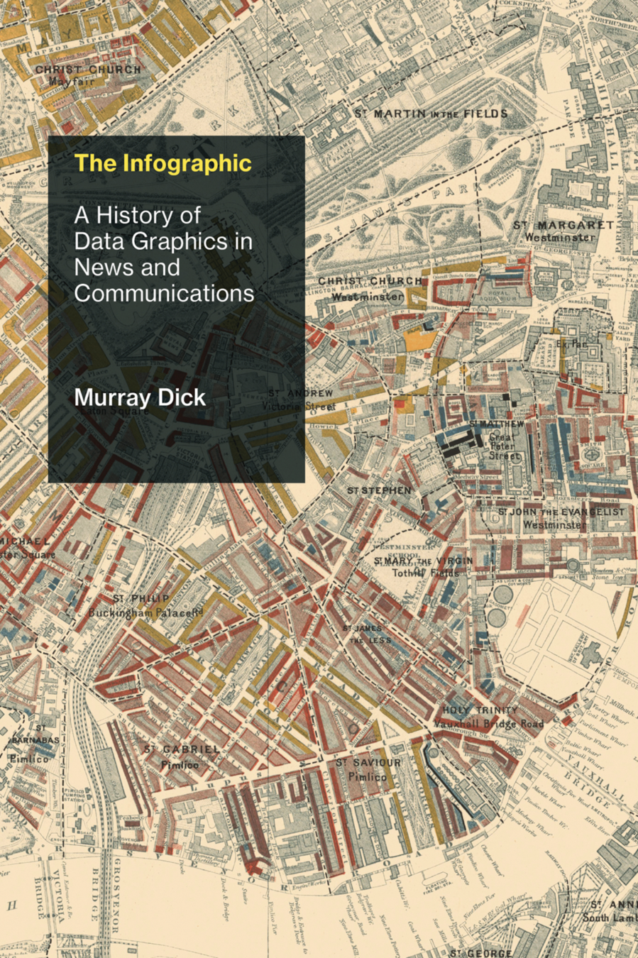
Murray Dick: The Infographic (2020)

Alberto Cairo: Nerd Journalism (2017)
- Rise of data charts and maps
- Pictoral turn
- First-Second-Third computer age

Murray Dick: The Infographic (2020)
- the proto-infographic
- the classical
- the improving
- the commercial
- the ideological
- the professional

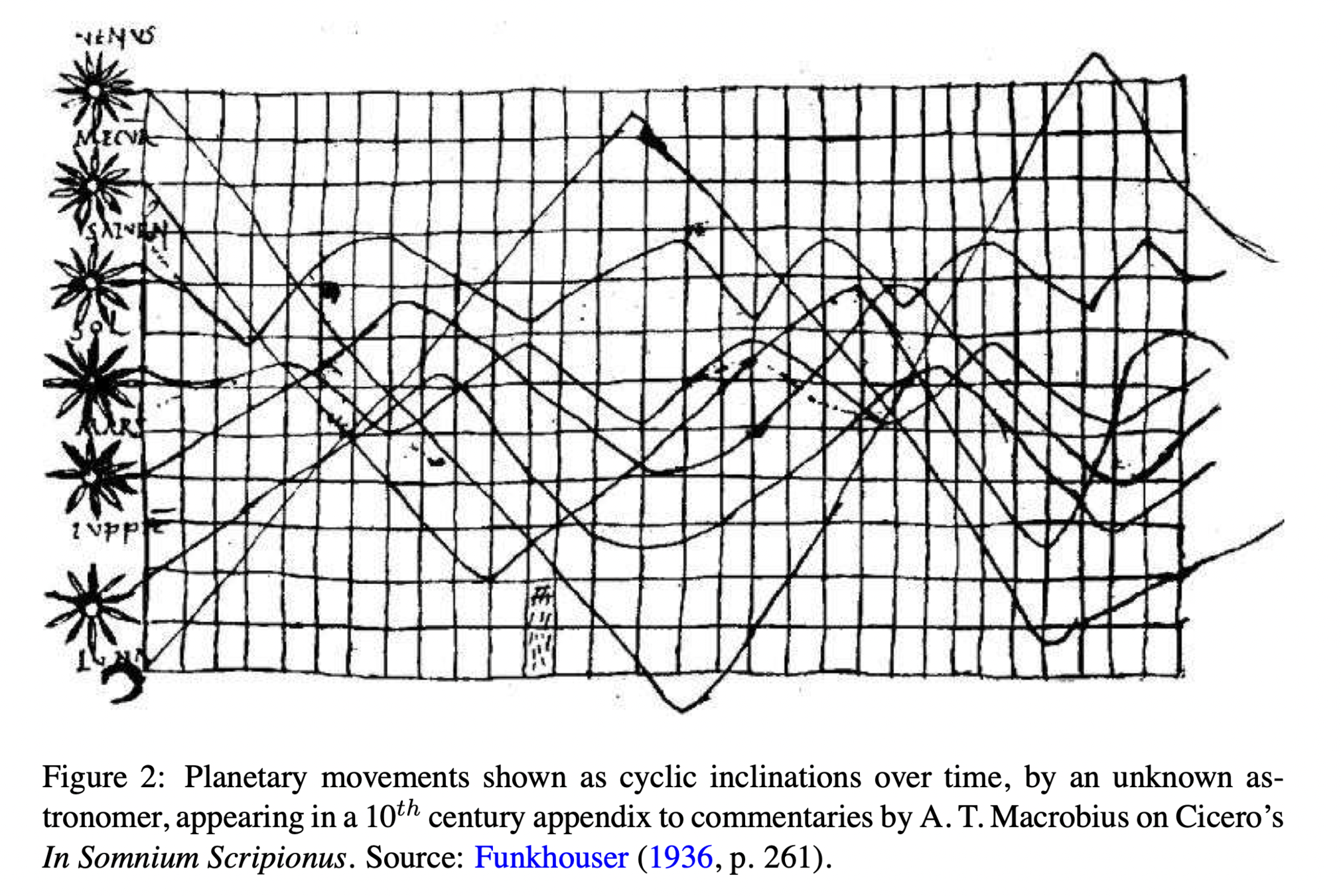
Pre-1600 – Early maps and diagrams (Friendly 2008)
The earliest seeds of visualization arose in geometric diagrams, in tables of the positions of stars
and other celestial bodies, and in the making of maps to aid in navigation and exploration.
the earliest graphical depictions of quantitative information (Friendly, 2006)
Earliest maps
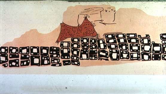
6200 BC: earliest map?
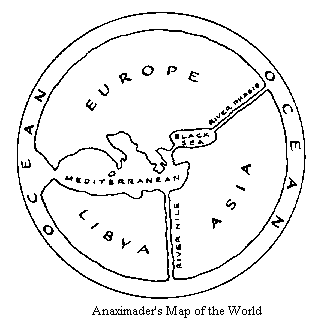
550 BC: earliest world map?
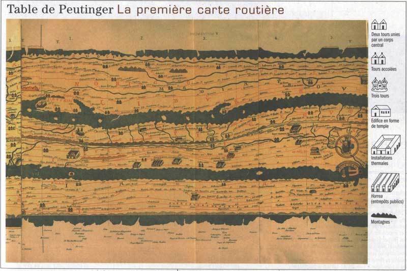
336-335 BC: Roman route map
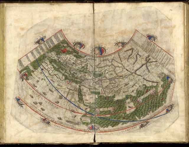
90-150: world map of Claudius Ptolemy
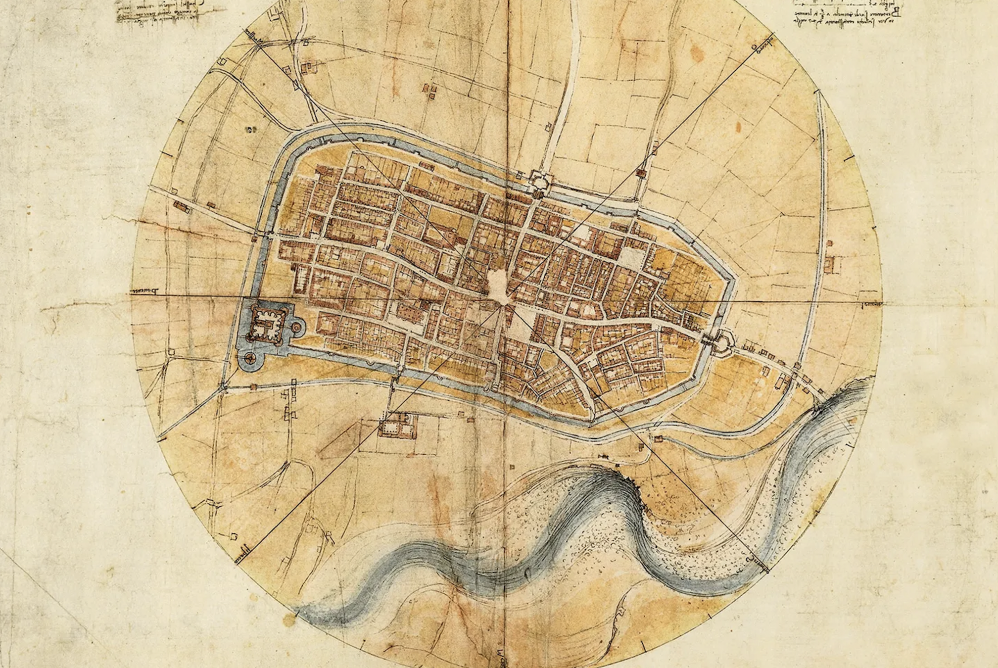
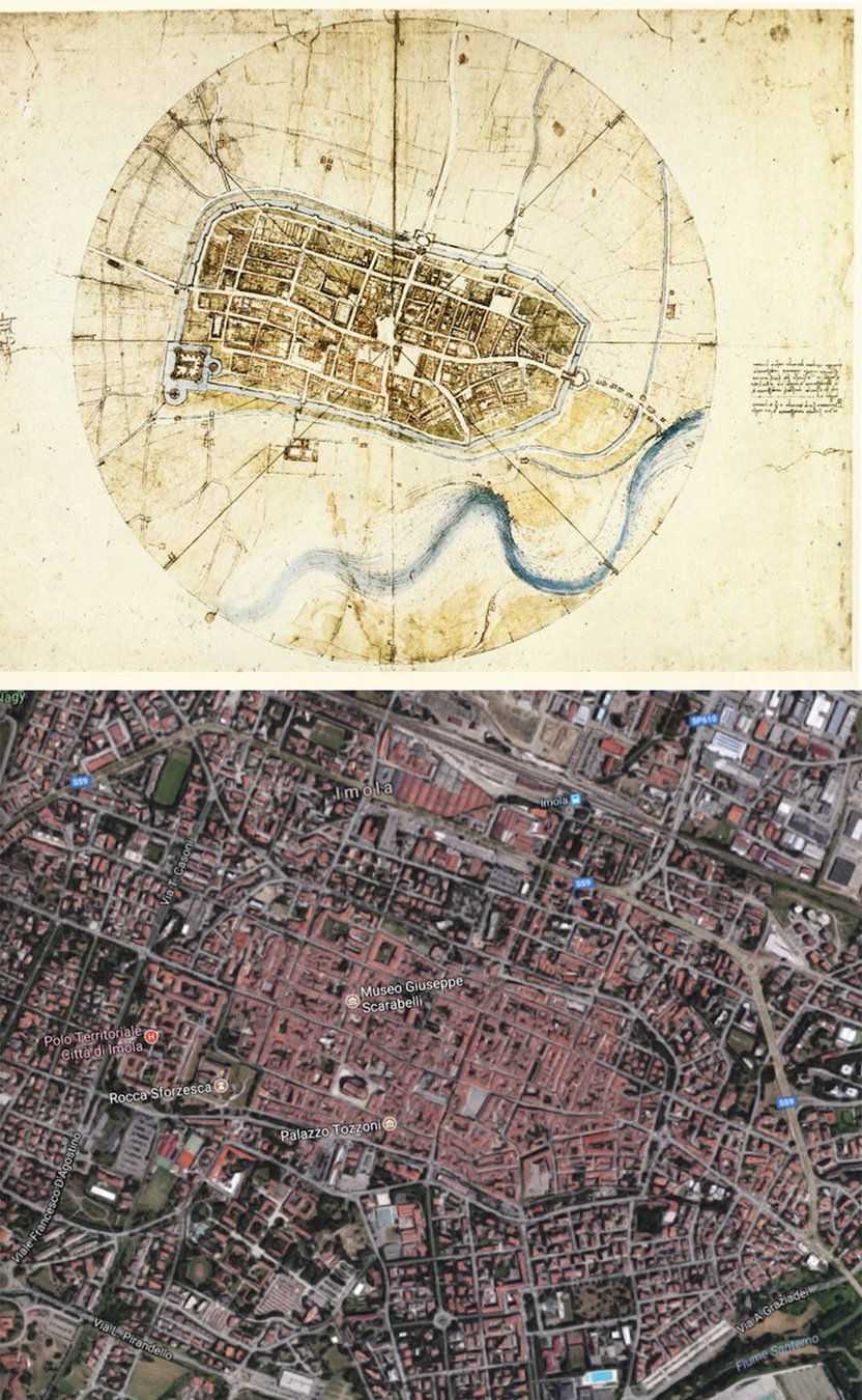
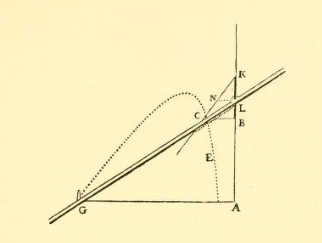
Leonardo Da Vinci's map of Imola (1502)
Leonardo probably also used an instrument called a bussola, a device that measures degrees inside a circle—like the one that surrounds his city map. Painstakingly recording the angles of each turn and intersection in the town and measuring their distance from each other would have given him the data he needed to recreate the city as seen from above, using the bussola to maintain proper scale. Other methods would have been involved, all of them commonly available to surveyors, builders, city planners, and cartographers at the time. Leonardo trusted the math, even though he could never verify it, but like the best mapmakers, he also wanted to make something beautiful. (Source)
Video: How Leonardo da Vinci made a "satellite" map in 1502

B: April 15th 1452.
D: May 2nd 1519
Italian polymath

Mercator-projection (1569) – Gerardus Mercator
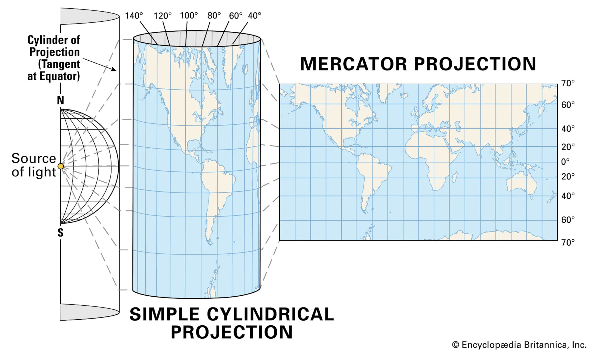

B: March 5th 1512.
D: December 2nd 1594.
Flemish geographer
cartographer
1600-1699. Measurement and theory (Friendly 2008)
Among the most important problems of the 17th century were those concerned with physical measurement- of time, distance, and space- for astronomy, surveying, map making, navigation and territorial expansion. This century saw great new growth in theory and the dawn of practice- the rise of analytic geometry, theories of errors of measurement and estimation, the birth of probability theory, and the beginnings of demographic statistics and "political arithmetic".
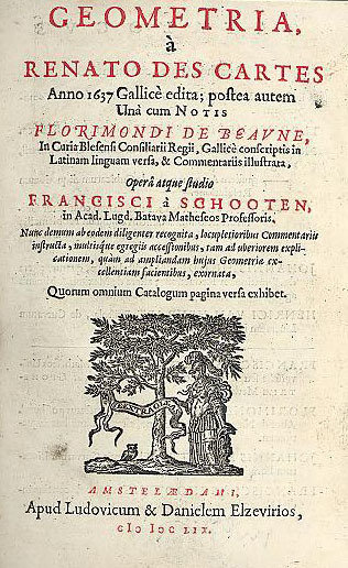
1637: Carthesian coordinate system (René Descartes [Cartesius])
B: March 31st 1596.
D: February 11th 1650
French philosopher
scientist
mathematician

1700-1799: New graphic forms (Friendly 2008)
The 18th century witnessed, and participated in, the initial germination of the seeds of visualization which had been planted earlier. Map-makers began to try to show more than just geographical position on a map. As a results, new graphic forms (isolines and contours) were invented, and thematic mapping of physical quantities took root. Towards the end of this century, we see the first attempts at the thematic mapping of geologic, economic, and medical data.
1. Proto-infographic (Dick 2020)
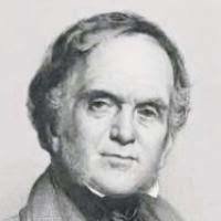
Joseph Priestley

B: March 13th 1733.
D: February 6th 1804.
British philosopher
chemist
discovery of oxygen (1774)
(Link)
Chronographs were perceived as the safest way to incorporate history into British primary education, as a form of rote learning
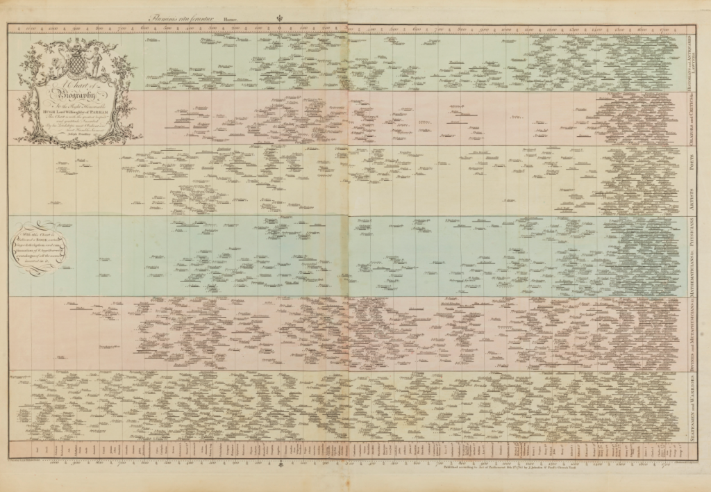
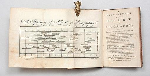
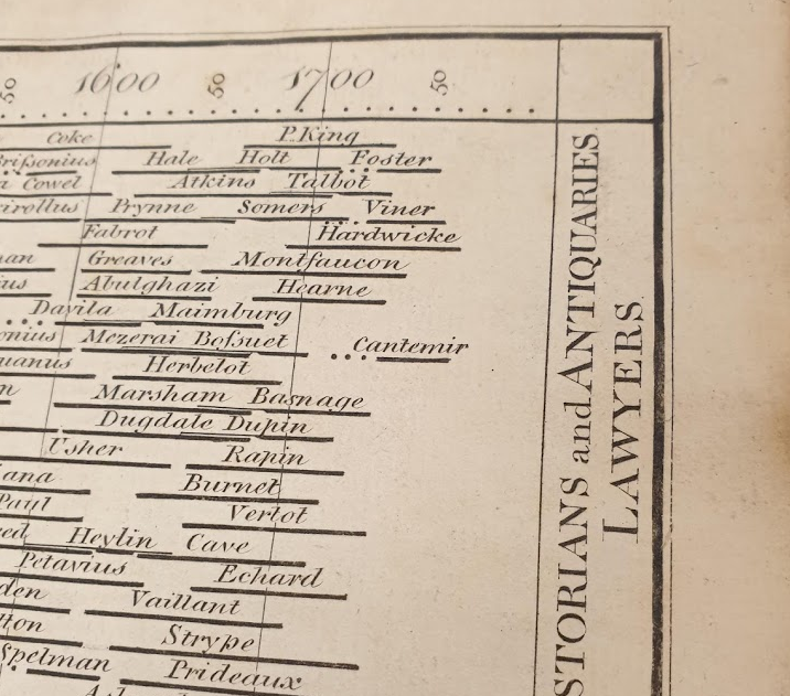
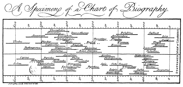
1765: timeline of Joseph Priestley (Chart of Biography)
1200 BC-1800 AD, approx. 2000 names
Statesman and Warriors, Divines and Metaphysicians, Mathematicians and Physicians, Poets and Artists, Orators and Critics, and Historians and Antiquarians.
The choice of names in this chart reflects Priestley’s awareness of his audience, as well as being an astute piece of localized marketing
commercial success and a popular sensation, and went through dozens of editions
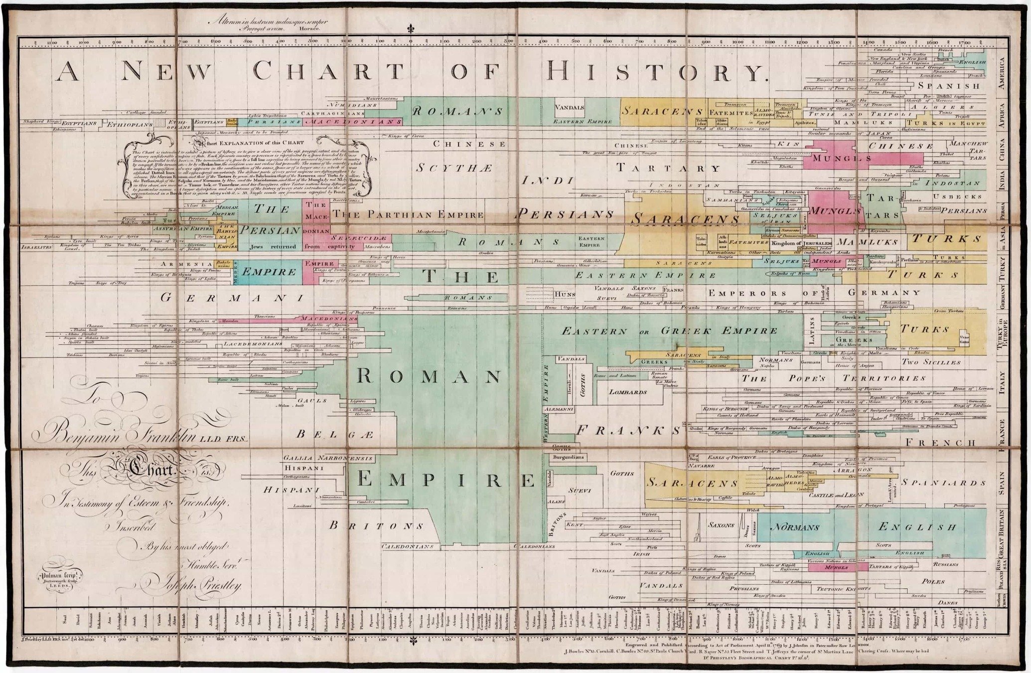
New Chart of History (1769)
2. The classical (Dick 2020)
William Playfair
B: September 22nd 1759.
D: February 11th 1823.
Scottish political economist
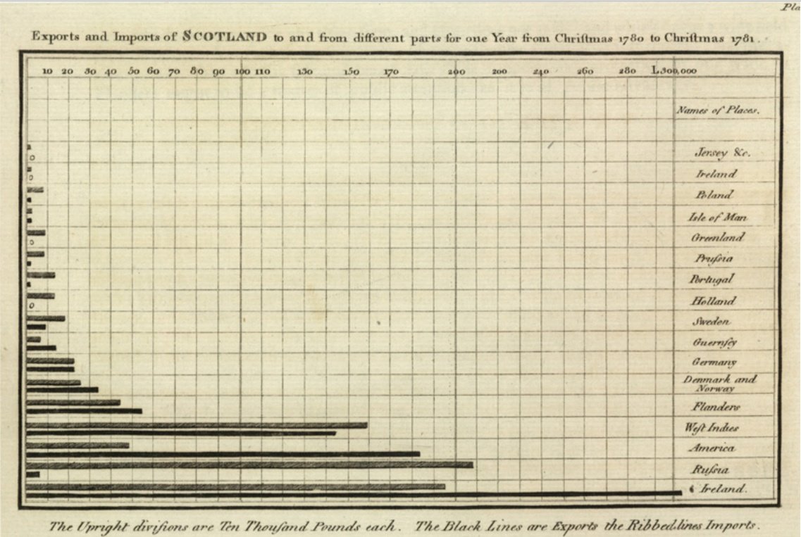
Commercial and Political Atlas (1786)
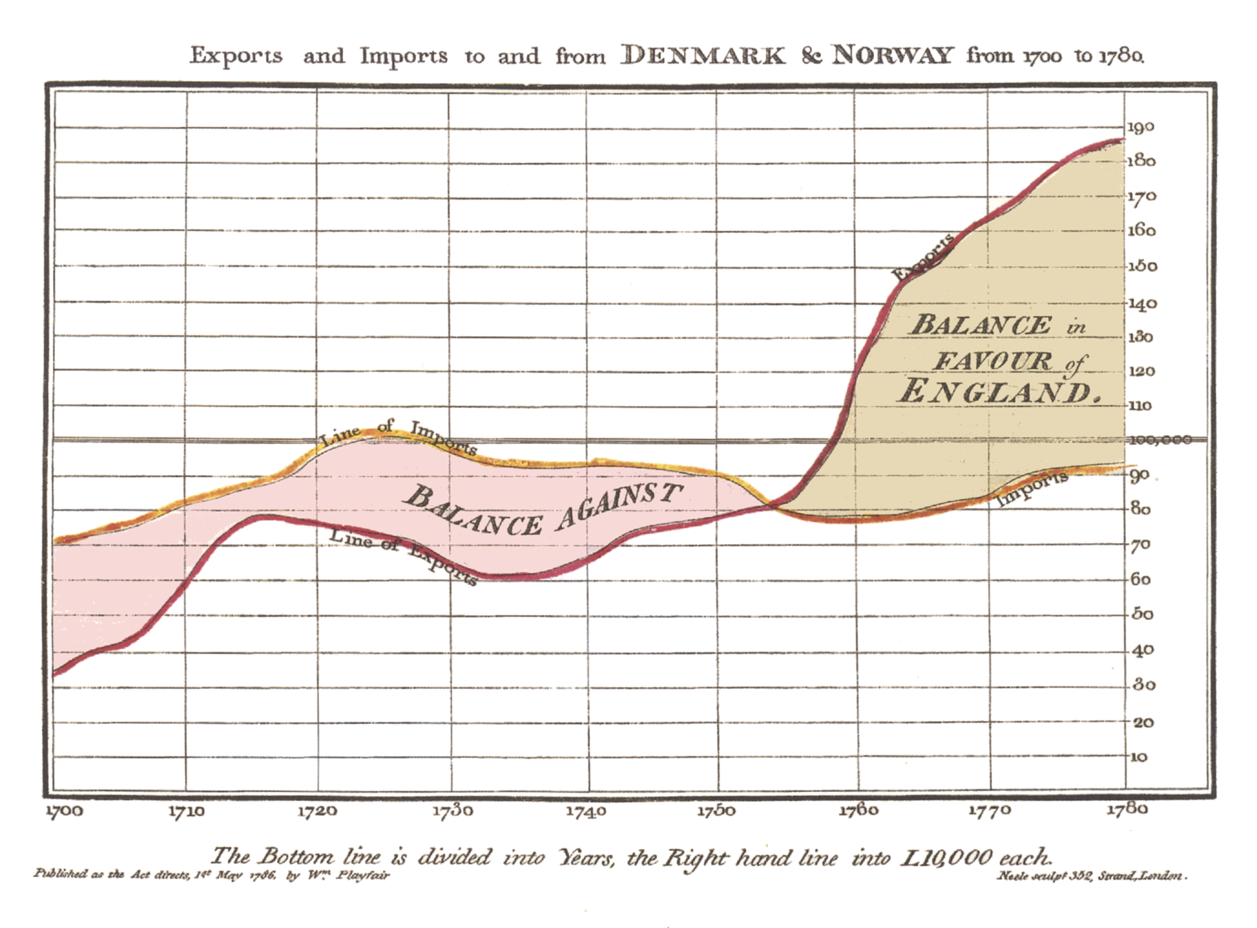
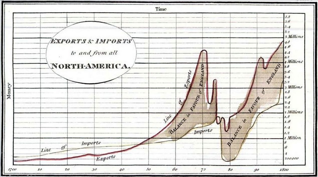
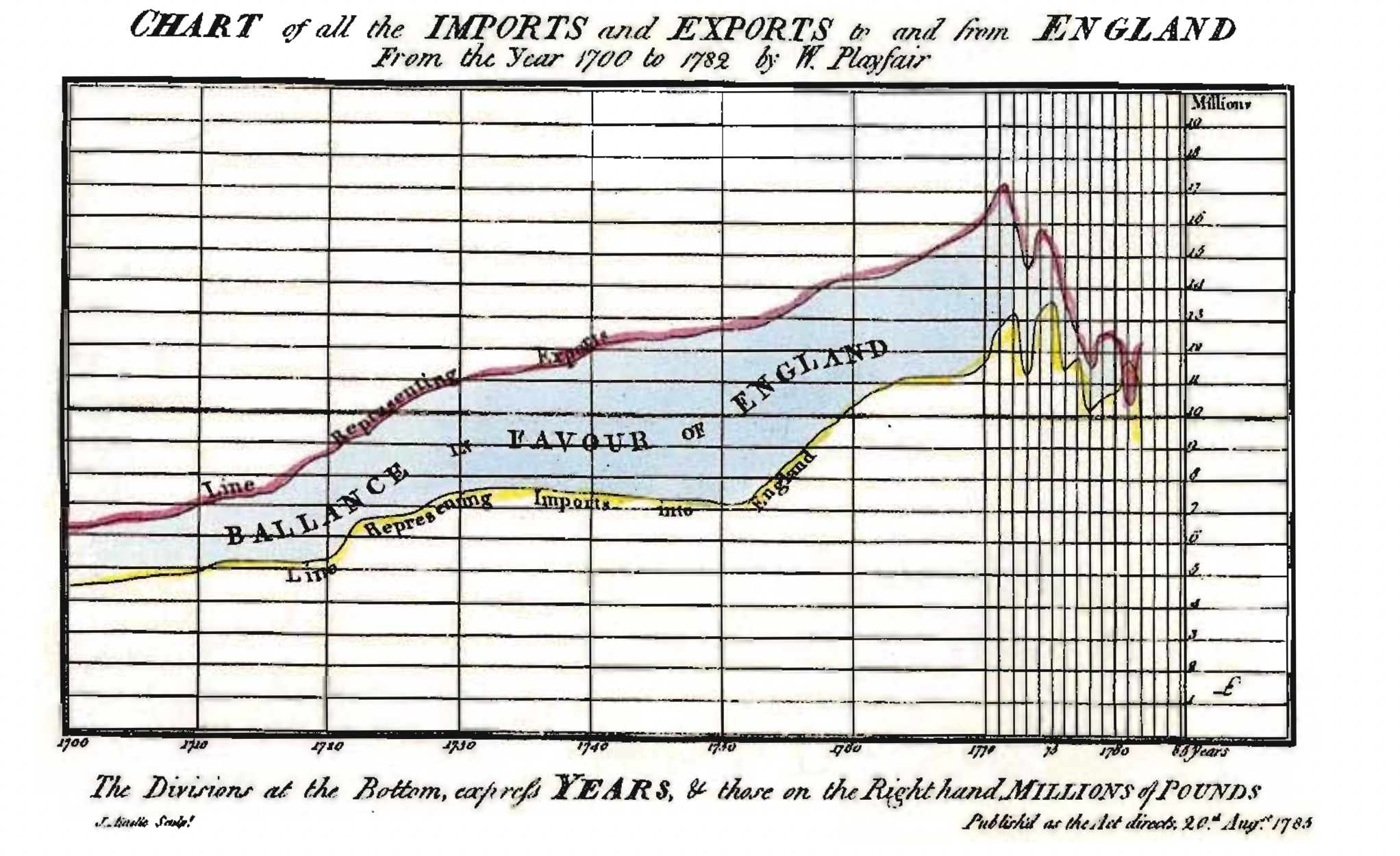
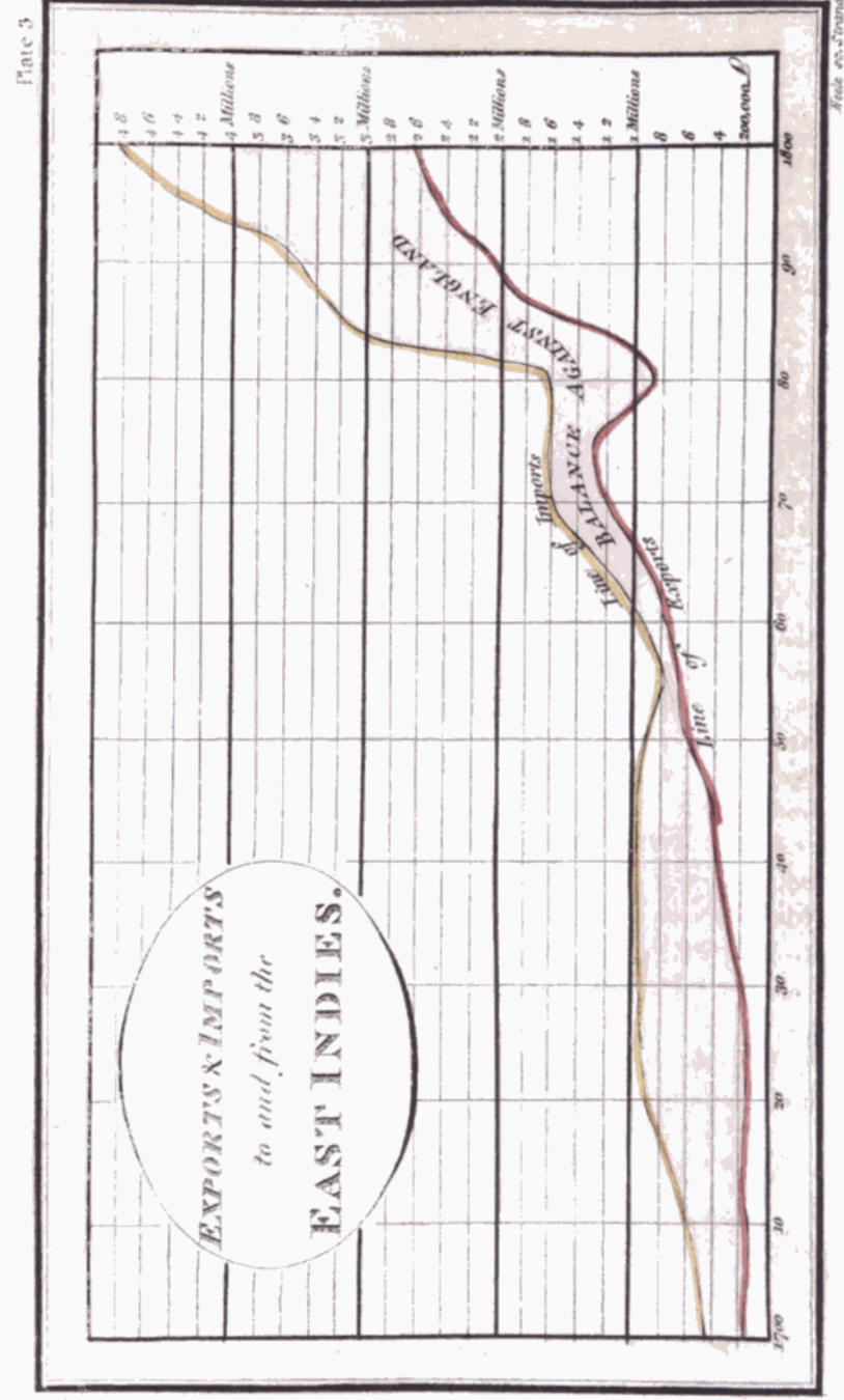


Real value
Nominal value
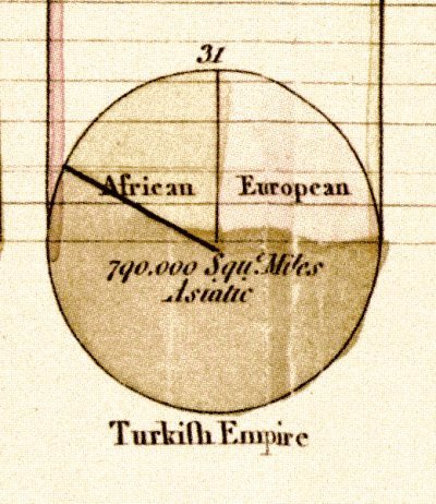
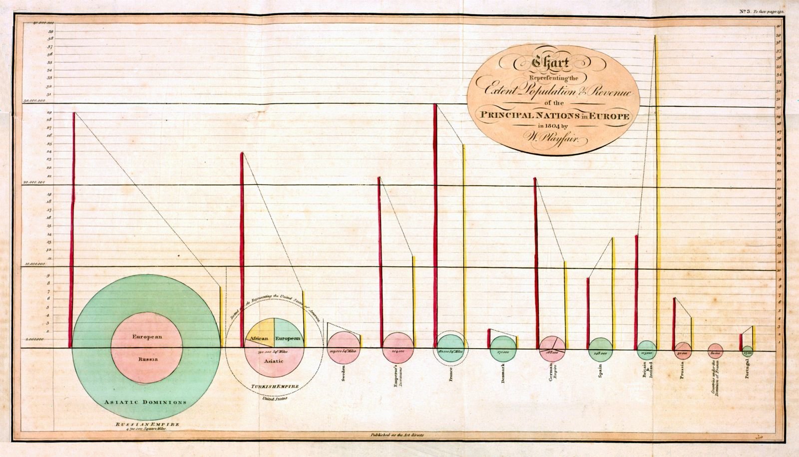
Statistical Breviary (1801)
1800-1850: Beginnings of modern data graphics (Friendly 2008)
explosive growth in statistical graphics and thematic mapping, at a rate which would not be equalled until modern times.
bar and pie charts, histograms, line graphs and time-series plots, contour plots, and so forth.
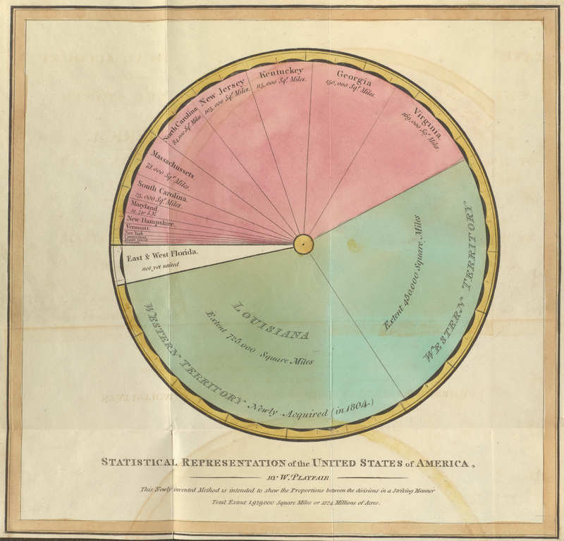
The Statistical Account of the United States of America (1805)
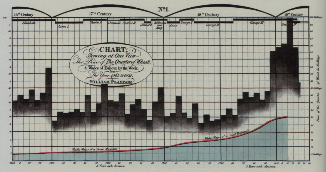

A Letter on our Agricultural Distresses, their Causes and Remedies; accompanied with Tables and Copper-plate Charts, shewing and comparing The Prices of Wheat, Bread, and Labour, from 1565 to 1821. (1821)
3. The improving (Dick 2020)
1850-1900: Golden Age of data graphics (Friendly 2008)
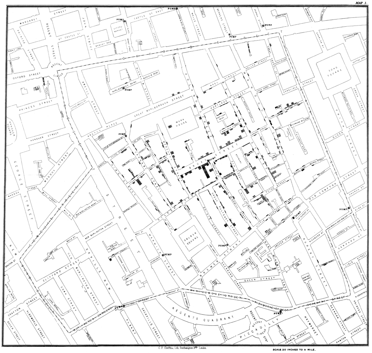
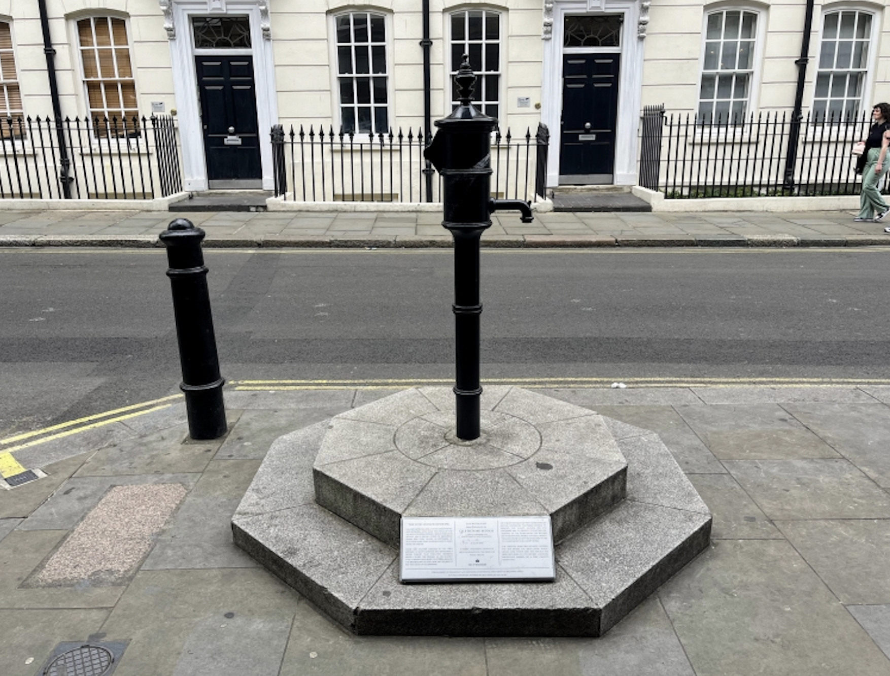
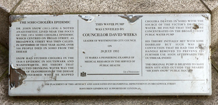
John Snow, cholera map
B: March 15th 1813.
D: June 16th 1858.
British doctor
forefather of modern epidemiology
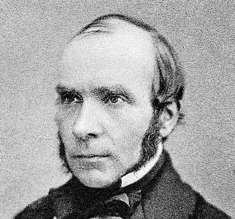
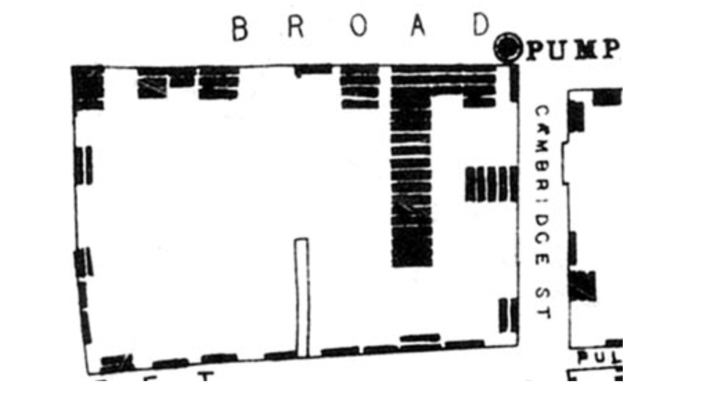
On the Mode of Communication of Cholera (1855)

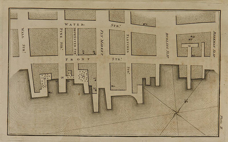
Valentine Seaman: An Inquiry into the Cause of the Prevalence of the Yellow Fever in New-York (1798). First disease map

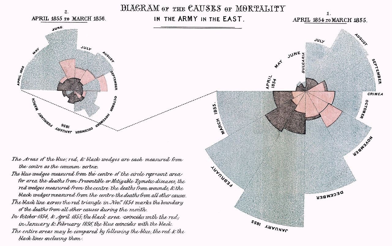
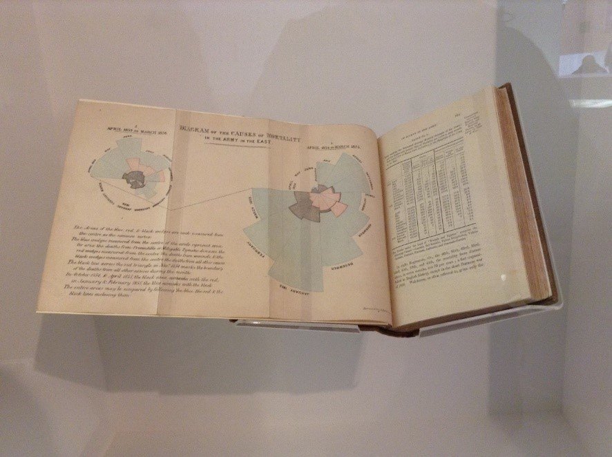
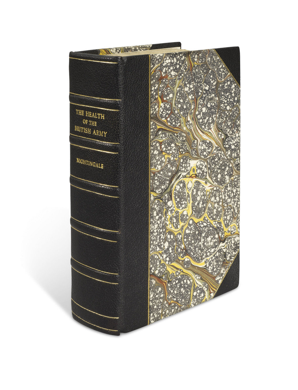
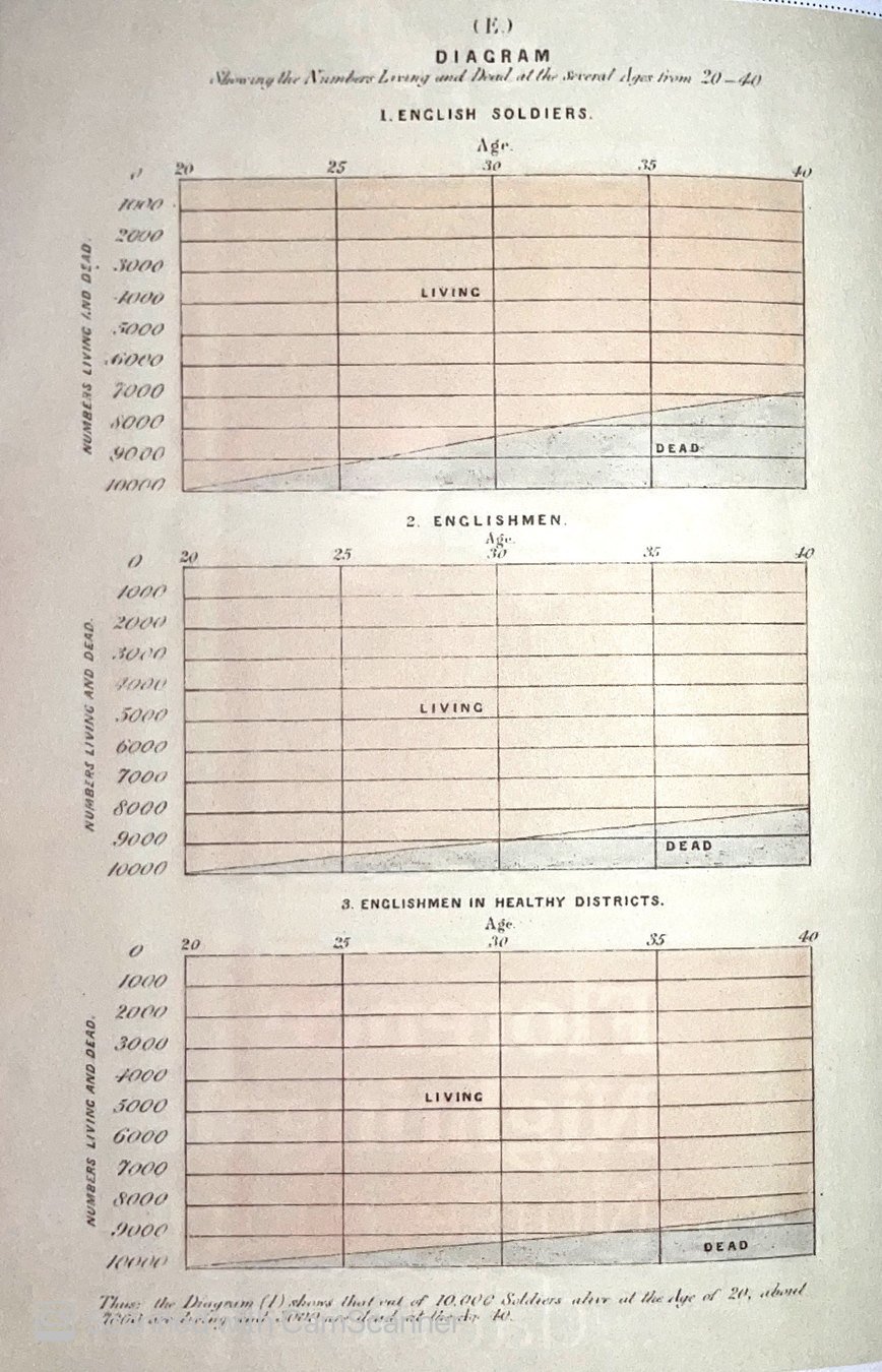
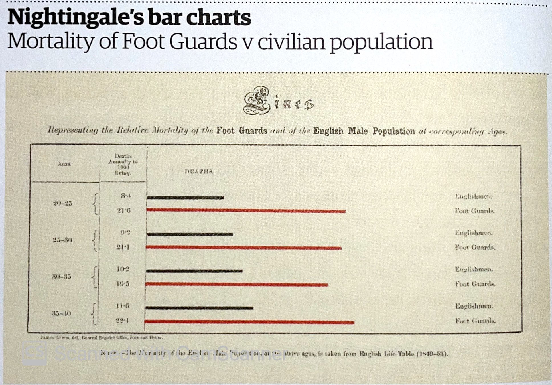
Florence Nightingale and the "coxcomb" ore rose chart
B: May 12th 1820.
D: August 13th 1910.
British nurse and statistician
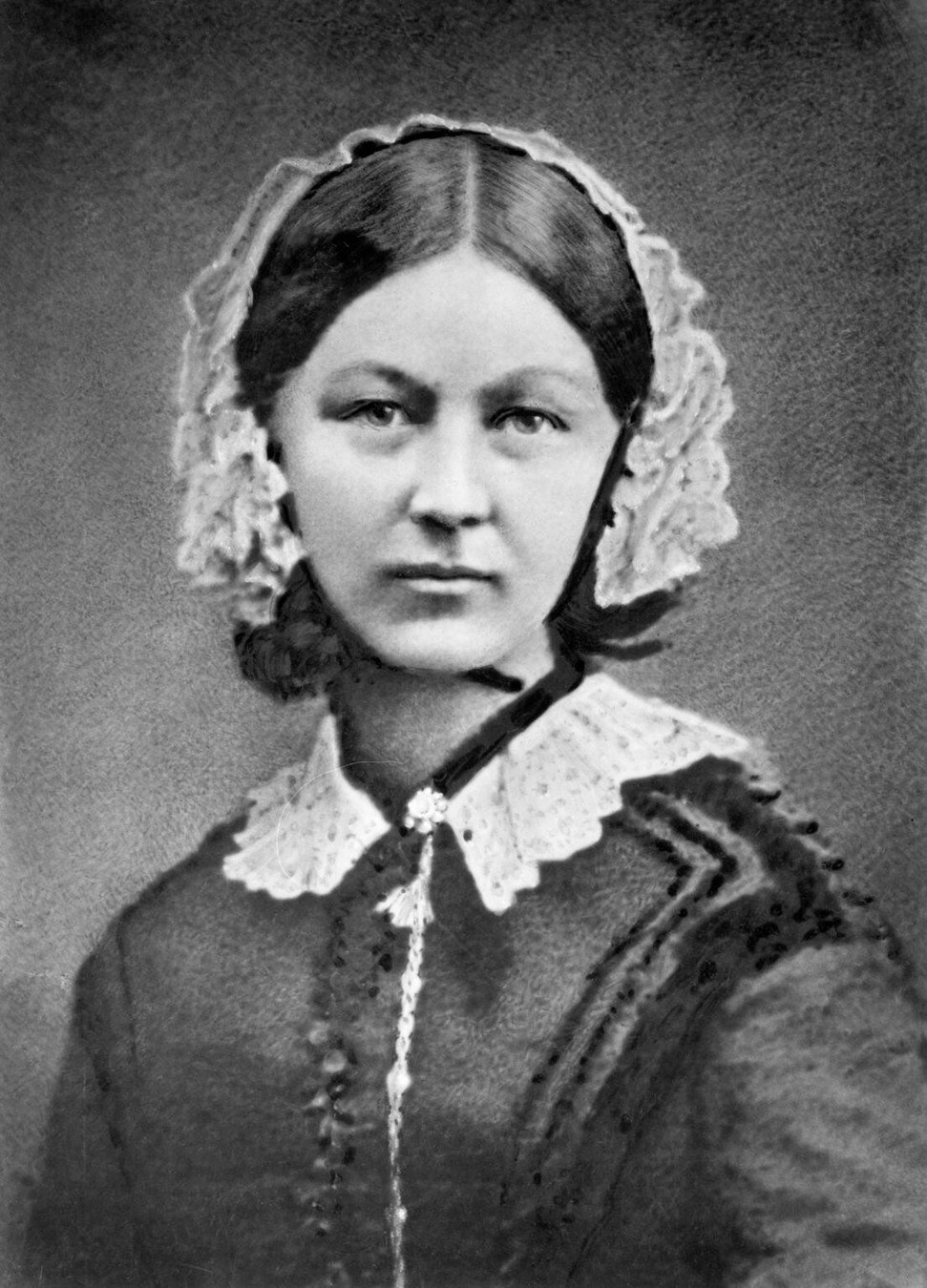
Notes on Matters Affecting the Health, Efficiency, and Hospital Administration of the British Army (1858) (Mortality of the British Army)
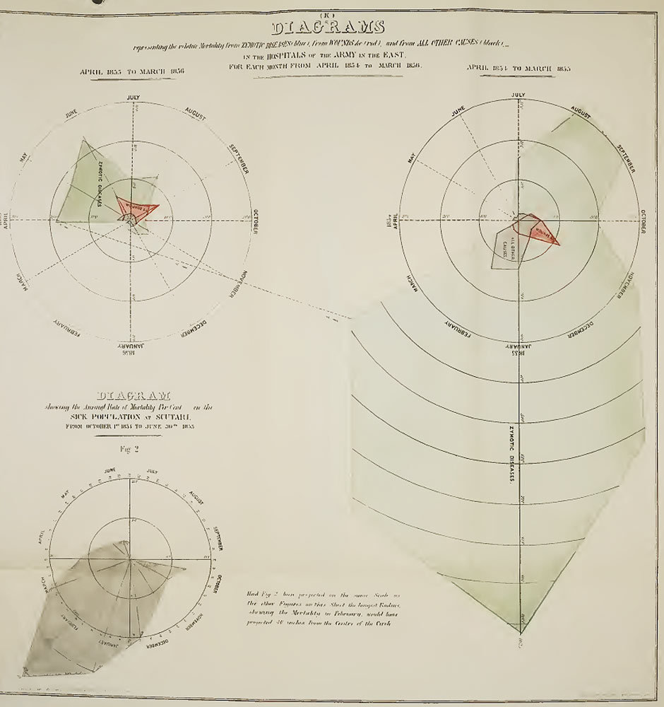
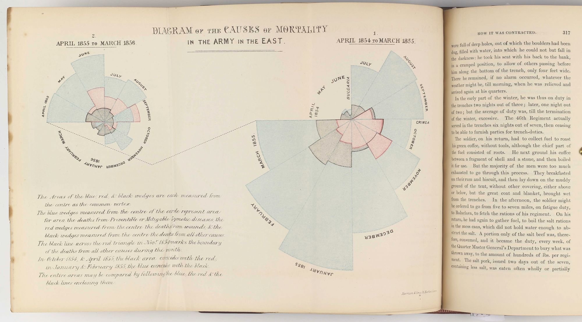
"Bat's wing"
"rose chart"
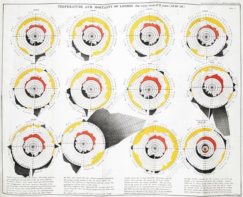
William Farr: temperature and death rate in London. Report on the Mortality of Cholera in England (1852) (link)
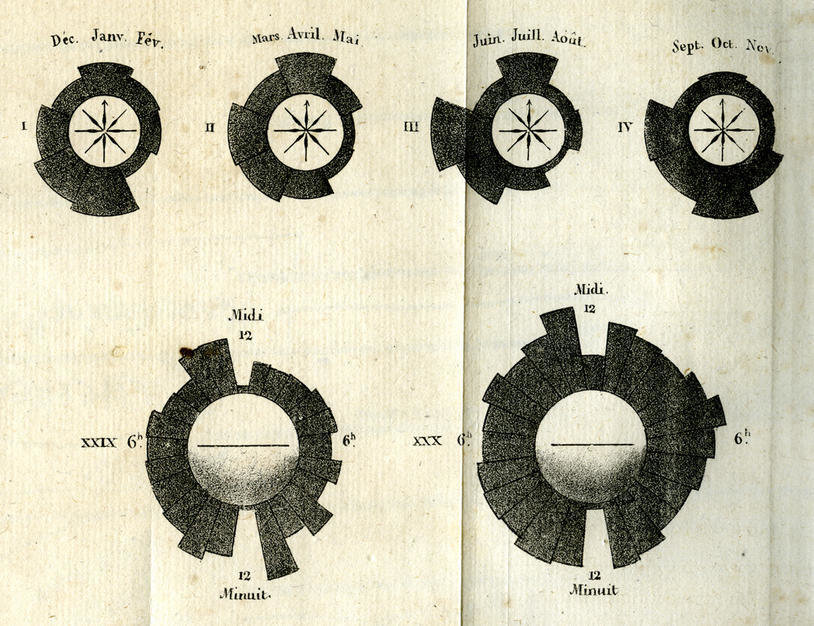
André Michel Guerry. Direction of wind
Births and deaths during the day (1829)
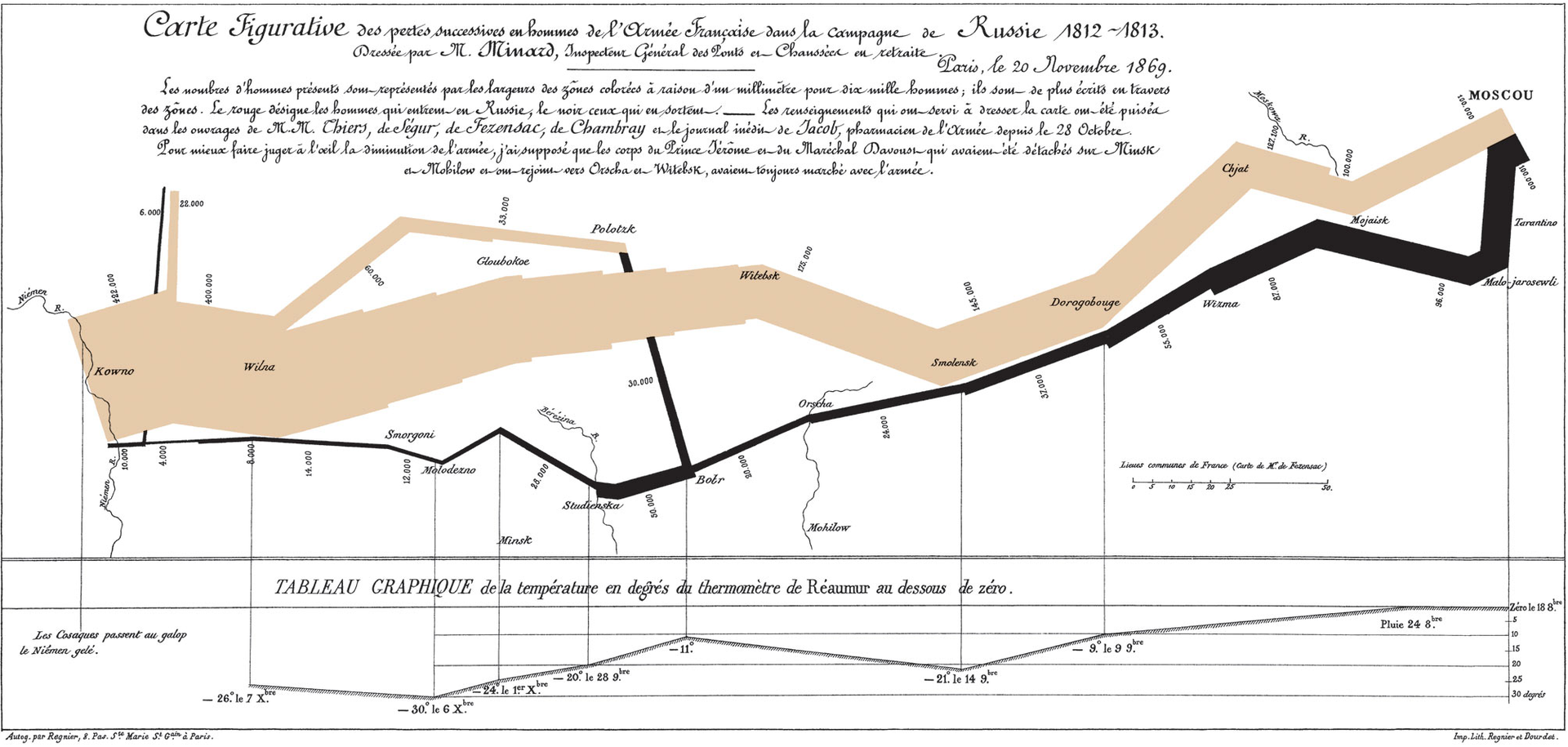
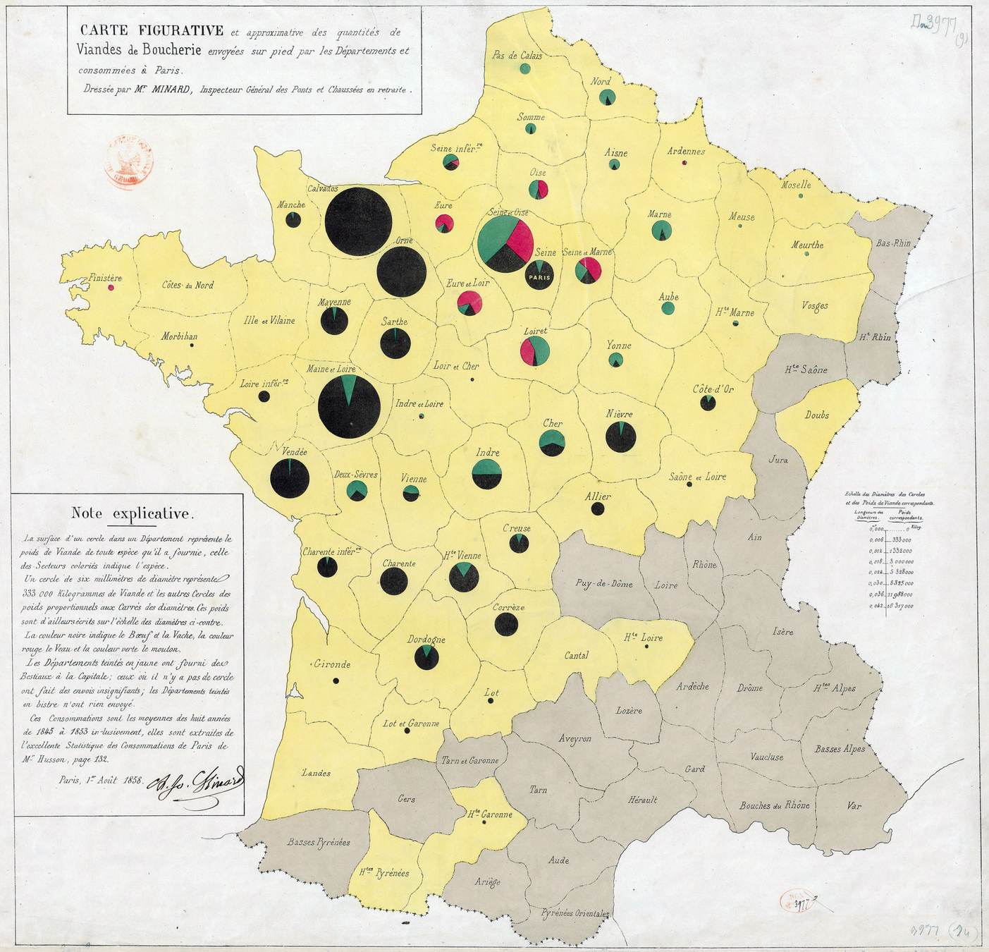
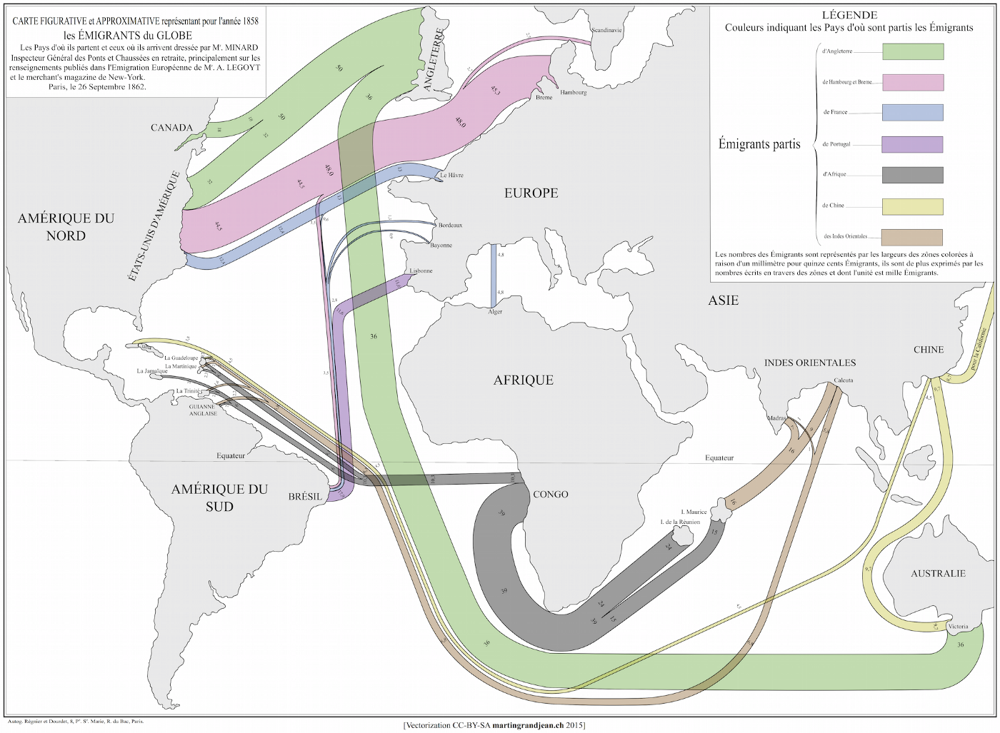
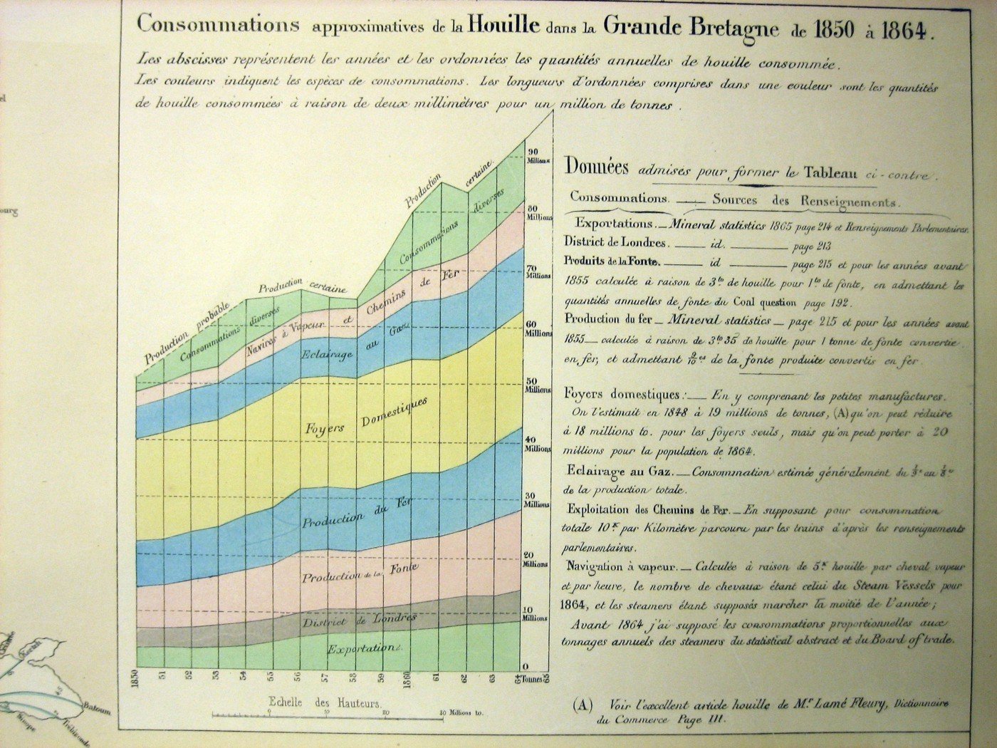
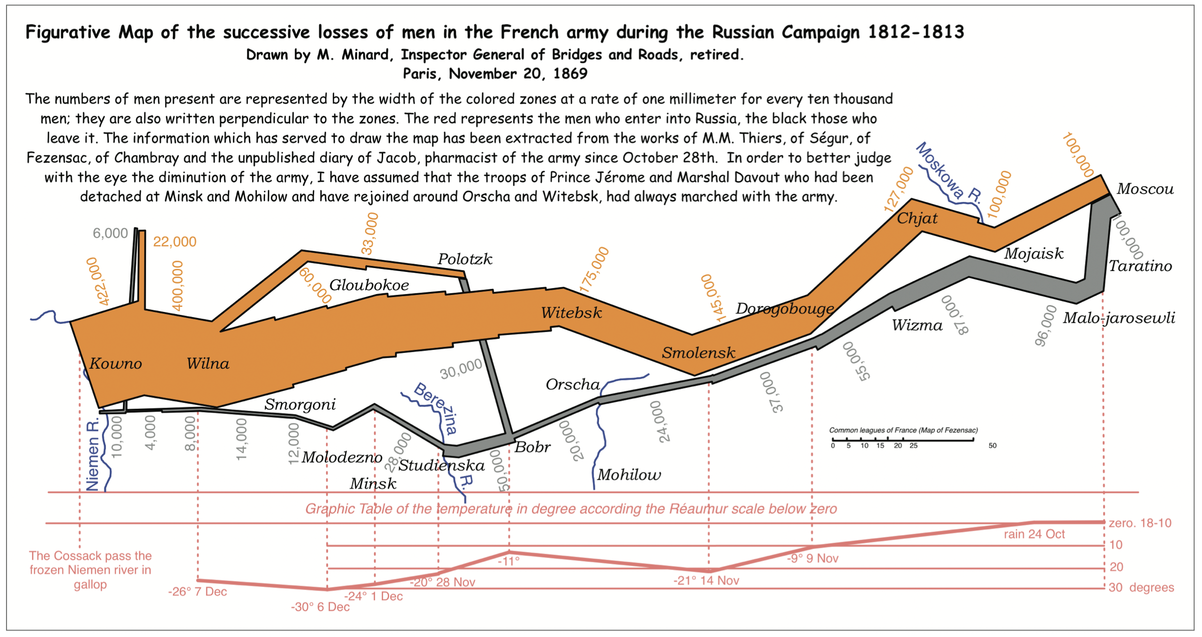
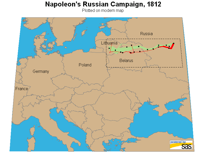
Charles Joseph Minard: flow map (Napoleon's Russian campaign in 1812, 1869)
B: March 27th 1781.
D: October 24th 1870.
French civil engineer
statistician

Des tableaux graphiques et des cartes figuratives (1869)
Minard's first statistical graphic, from 1825, depicts several time series related to Paris pavement maintenance over the preceding two centuries.
Minard's first flow map, from 1845, depicts road traffic between Dijon and Mulhouse.

Minard's map using pie charts to represent the cattle sent from all around France for consumption in Paris (1858)
emigrációs térkép, 1858
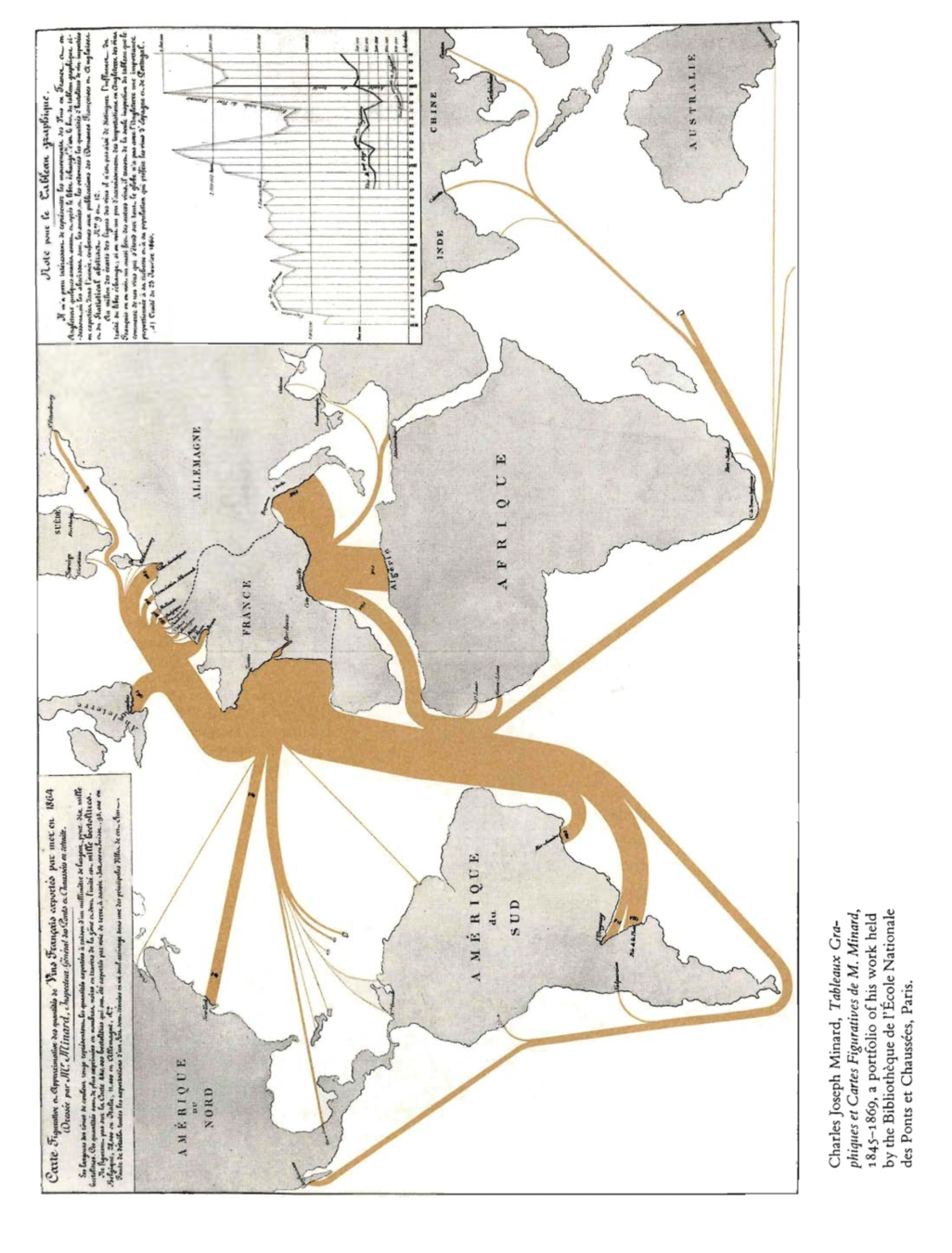
Francia bor export, 1864
Coal usage in Bretagne, 1866
Napoleon's Russian campaign in 1812 (1869)
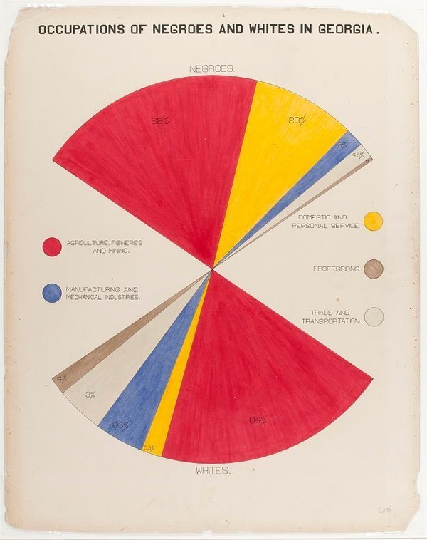
Excercise: what types of data does the chart show?


Matthew Henry Phineas Riall Sankey, Irish Captain
1898, energy efficiency of a steam engine
B: February 23rd 1868
D: August 27th 1963.
American teacher, sociologist, historian, politician, writer, civil rights activist
1900-1950: Modern Dark ages (Friendly 2008)
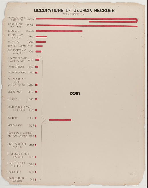
W.E.B. Du Bois, Paris Exposition (1900)
B: May 20th 1861.
D: November 23rd 1919
American engineer
management consultant
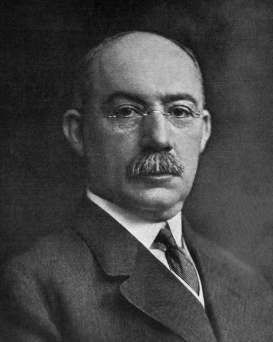
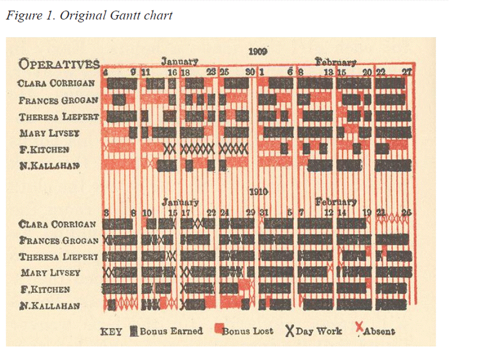
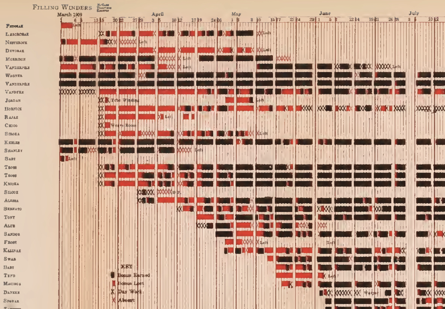
Henry Laurence Gantt: Gantt-chart (1910s)
B: December 10th 1880.
D: December 22nd 1945.
Austrian economist
philosopher
sociologist

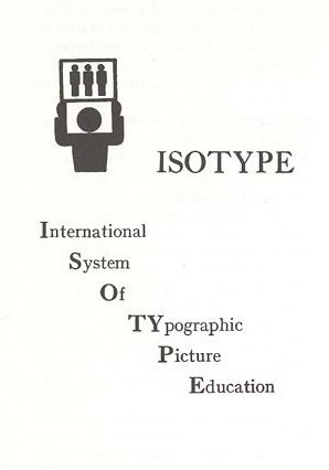
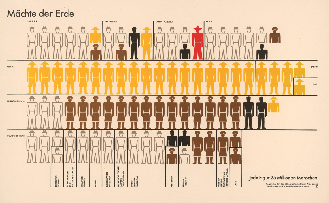
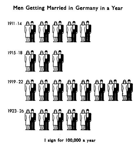
Otto Neurath, ISOTYPE (International System of Typographic Picture Education, 1925-1935)
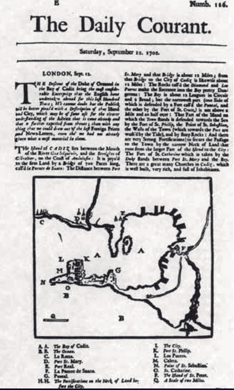
1702, Daily courant (map depicting the invasion of a Spanish city)
Data visualisations in the news
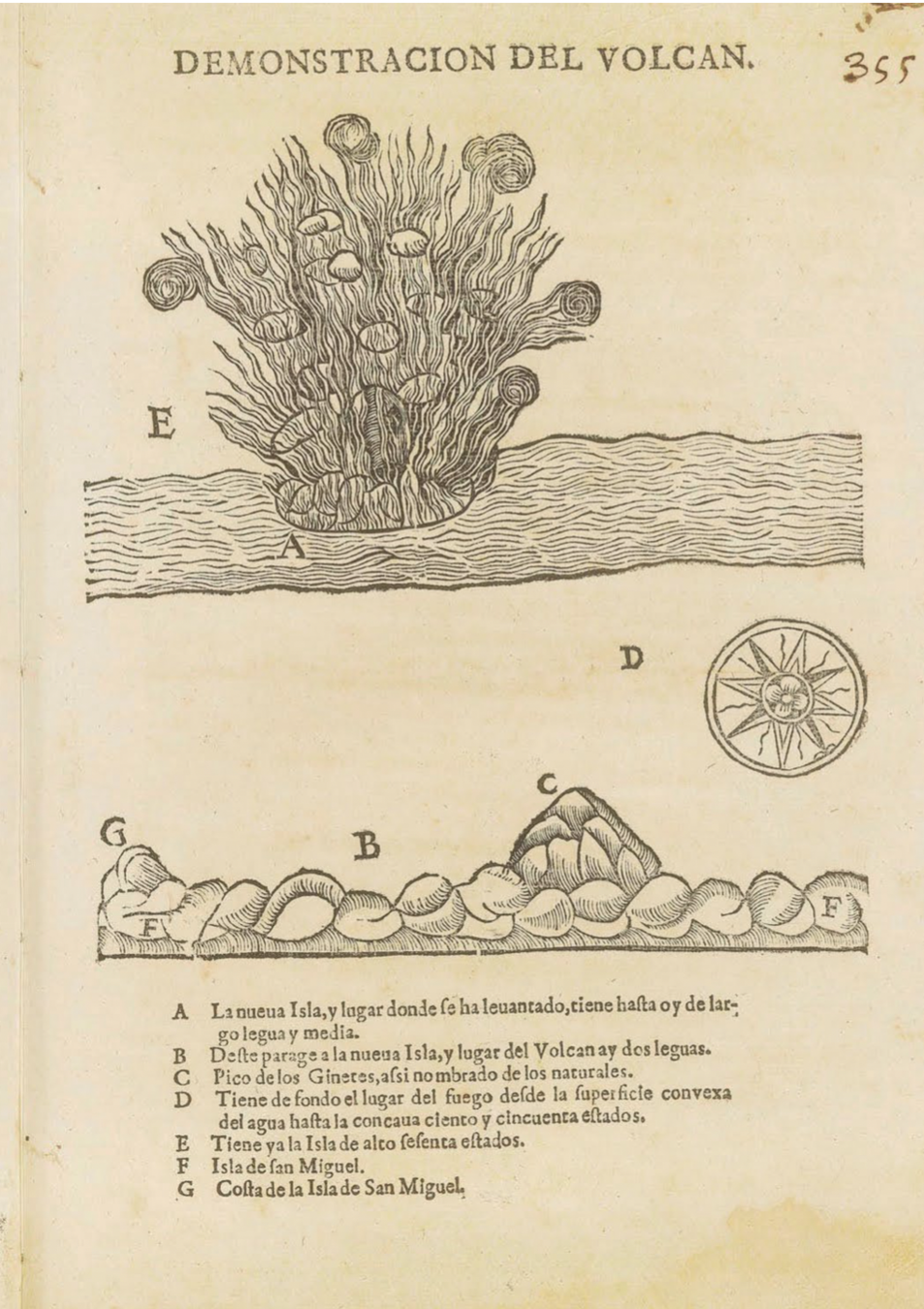
1638, description of a volcano near the Azores islands
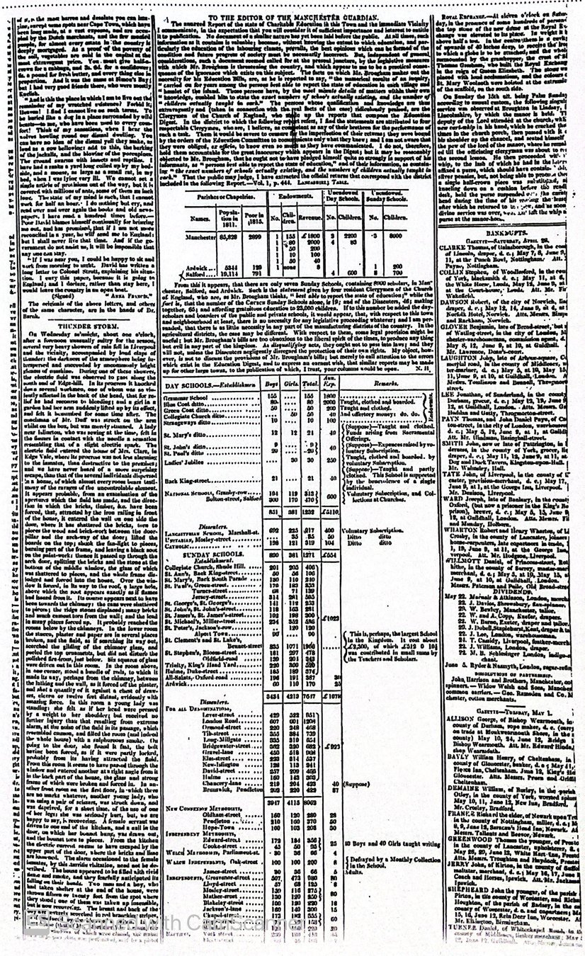
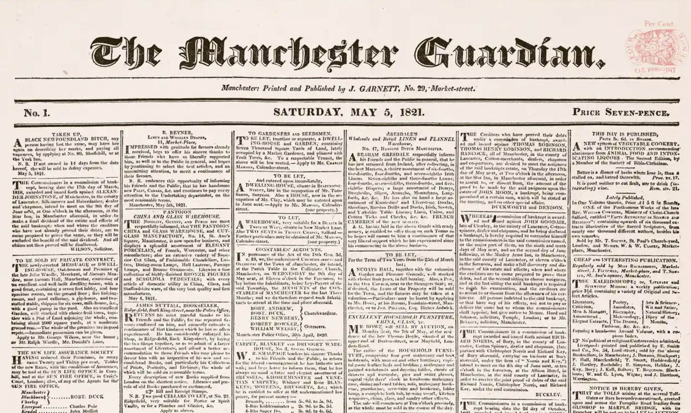
1821, The Manchester Guardian,
data table showing the students granted free education
Technical difficulties: expensive, slow and difficult to produce images, charts
Readers were not used to seeing charts
There were lots of statistics in the paper. Journalists wrote about trends in the bond markets, activity in the commodity markets, and changing birth rates. Numbers were a big part of the media; they just weren’t visualized.
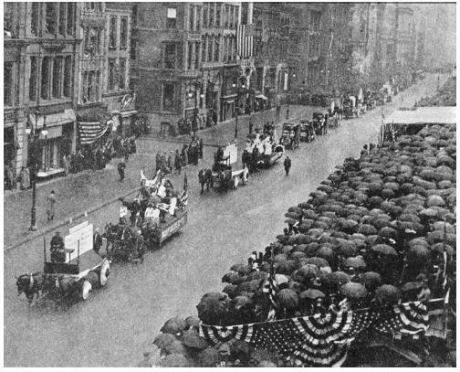
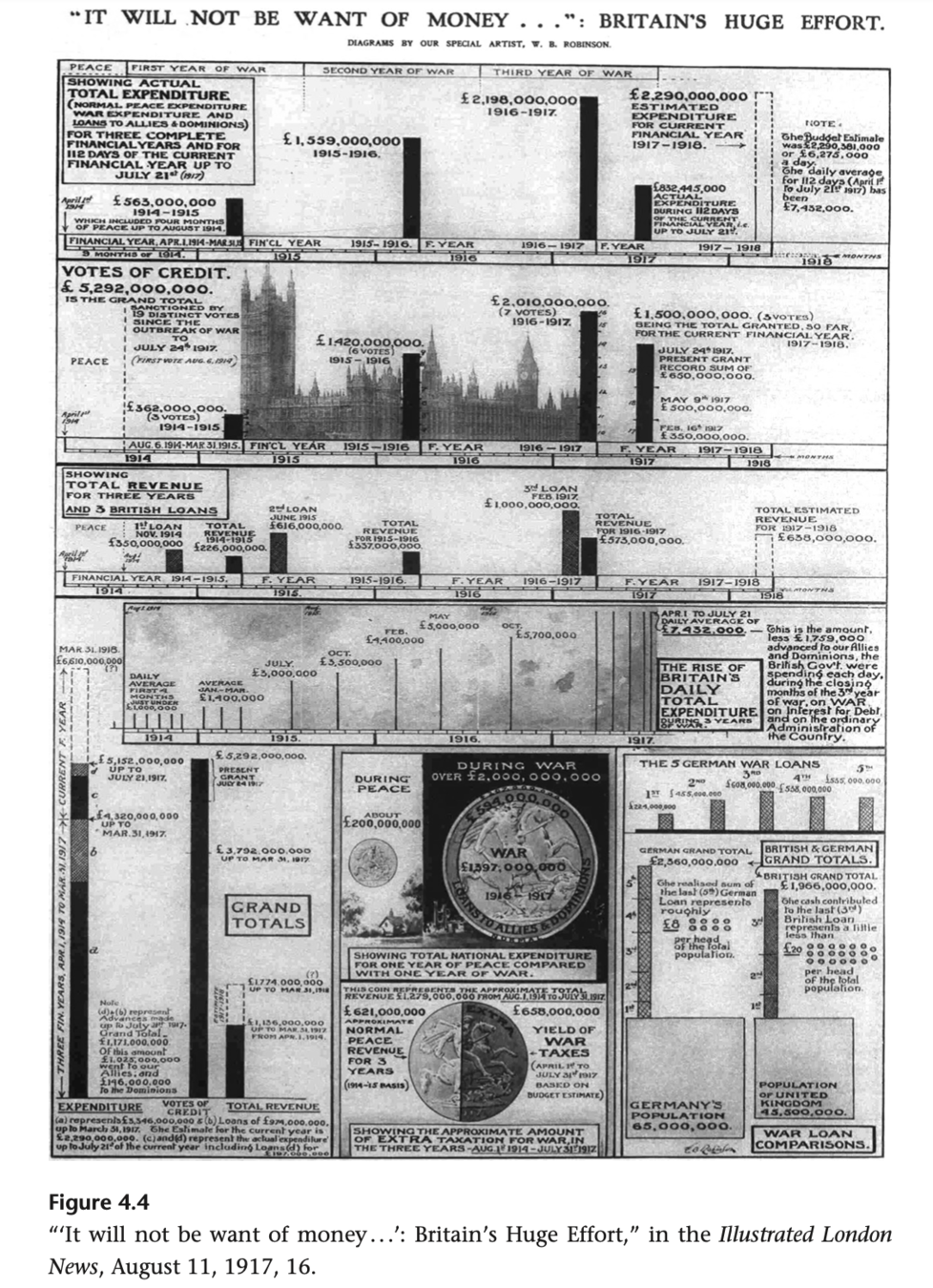
May 17th 1913. Parade of statistical graphics
Pictorial turn: more readable, more structured newspapers
fewer columns, prominent illustrations, horizontal layout, and simplified headline typography. The front pages clearly became less dense and more orderly, as indicat- ed by several measures (Barnhurst and Nerone, 2001: 192, 194).
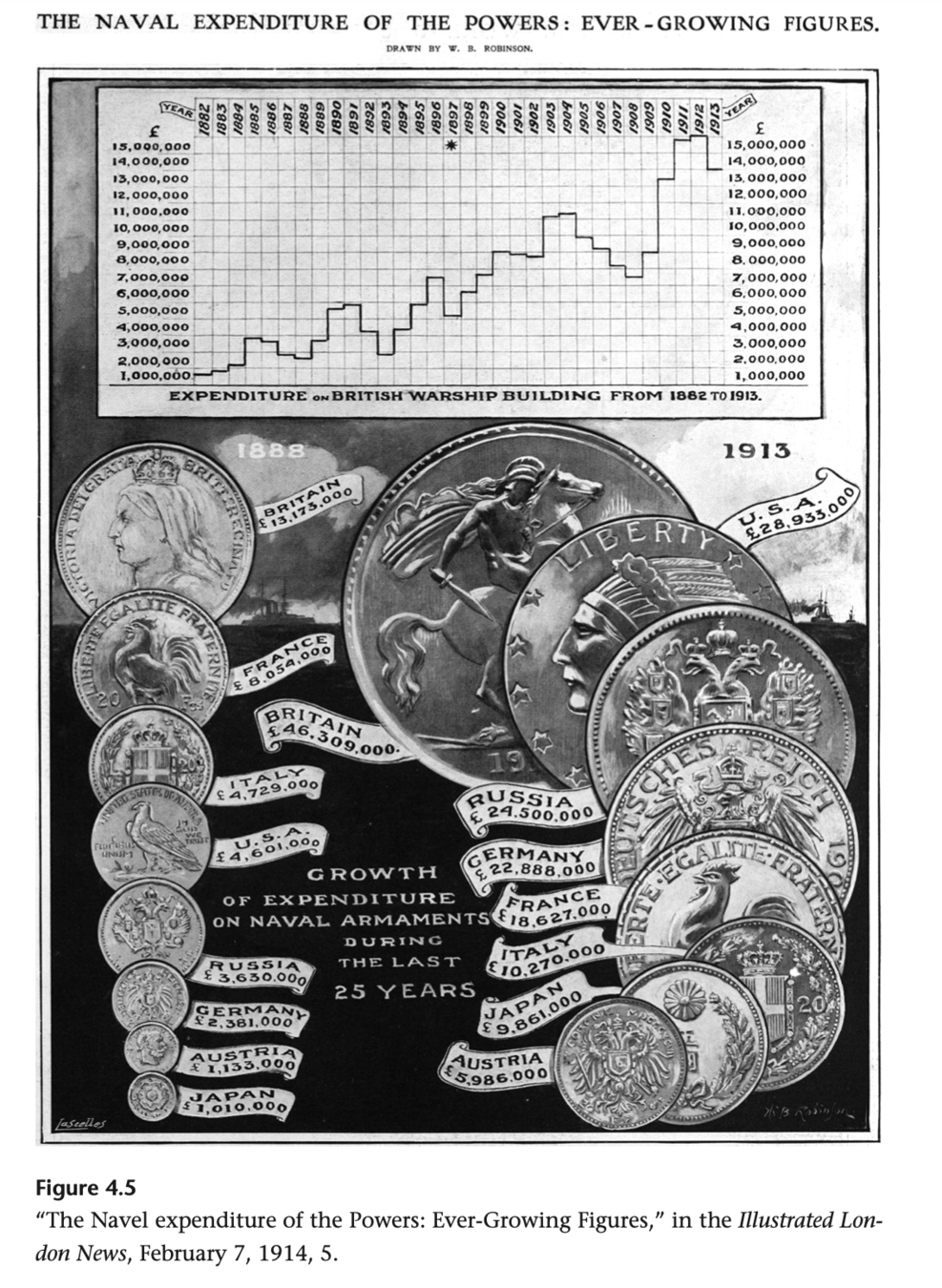
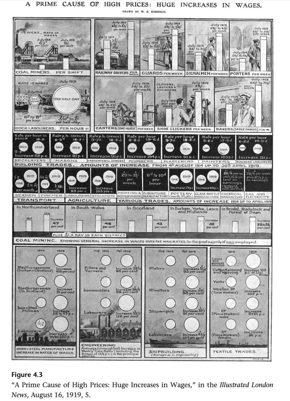
Technical developments, images and charts start to appear in the news at the end of the 19th, beginning of 20th century
The period between 1800 and 1870 saw rapid advances in the efficiency, and in the capabilities, of newspaper printing. These changes in turn led to the emergence of illustrations during the 1870s, by means of zincography (the mechanical engraving of line blocks), which rendered wood-engraving obsolete (Hutt, 1973). New techniques in paper produc- tion led to cheaper and more easily available sources, which in turn led to the emergence of a range of illustrated dailies (Ibid.). Prior to 1890, few daily newspapers used illustrations, but by the 1920s photographic half- tones were ubiquitous (Dick, 2020, p 103)
Newspapers reaching a wider audience had more charts (more as advertisements), but the "serious press" stayed away from illustrations for a longer time, the "whip of the word" was the dominant ideology.
The period between 1800 and 1870 saw rapid advances in the efficiency, and in the capabilities, of newspaper printing. These changes in turn led to the emergence of illustrations during the 1870s, by means of zincography (the mechanical engraving of line blocks), which rendered wood-engraving obsolete (Hutt, 1973). New techniques in paper produc- tion led to cheaper and more easily available sources, which in turn led to the emergence of a range of illustrated dailies (Ibid.). Prior to 1890, few daily newspapers used illustrations, but by the 1920s photographic half- tones were ubiquitous (Dick, 2020, p 103)
Financial, economy newspapers hade charts more often (eg. Financial Times).
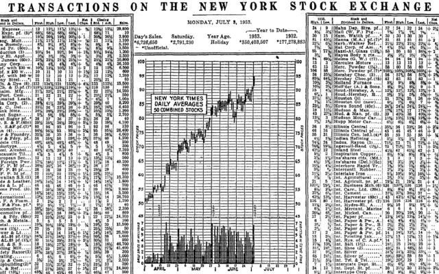
One of the first charts in The New York Times was about the changes of the stock exchange market (1933).
Computer assisted age (1950s)
5. The ideological and 6. The professional (Dick 2020)
1950- jelen: Re-birth, High-D (Friendly 2008)
Philip Meyer: CAR (Computer Assisted Reporting), 1967
B: October 27th 1930.
journalist

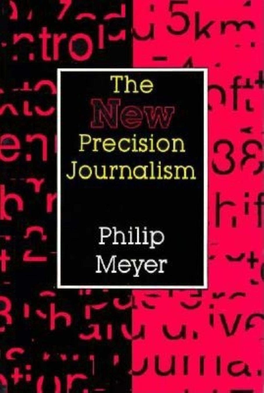
It is the basis for modern, digital data-based journalism, but it included sociological, economical, geographical, statistical methods as well.
We are drowning in information. The web has given us access to data we would never have found before. (Simon Rogers, 2009)


B: December 24th 1967.
data journalist
Big Data: WikiLeaks (2010)
- Afghan war logs (92 201 rows)
- Iraq war logs (391 000 rows)
- US embassy cables (251 287 rows)

Why can data journalism spread on the internet easily?
- The widespread availability of data via the internet
- easy-to-use spreadsheet packages on every home computer
- a growing interest in visualising data, to make it easier to understand
- some huge news stories that would not have existed without the statistics behind them
- Open Source Intelligence (OSINT)
- Everything is data, everything can be used as data
- Real-time data visualisation
- Technological developments, peripheries (VR, AR, AI)
- Interactivity, animations
Next lesson
30th September: Methods and classification of data visualisation
Homework:
Read the first part of Jonathan Schwabish's Better Data Visualisations book (pages 13-63), and summarize: what are the Gestalt-principles; which five principles does the author outline, why are these important; what combinations can we make along the categories "FORM" and "FUNCTION".
Then:
Look for a chart from the weekly summaries of the Data Viz Dispatch, and describe it based on what you read from the book: which Gestalt-principle(s) can you find used on the chart, does it fit the five principles of the author, which category does it fit into along the "FORM-FUNCTION" system?
7th March, Tuesday 20:00.
Thank you for your attention!
szabo.krisztian96@gmail.com
METU2
By Szabó Krisztián


