INFOGRAPHICS
(BN-INFGRA-04-GY)
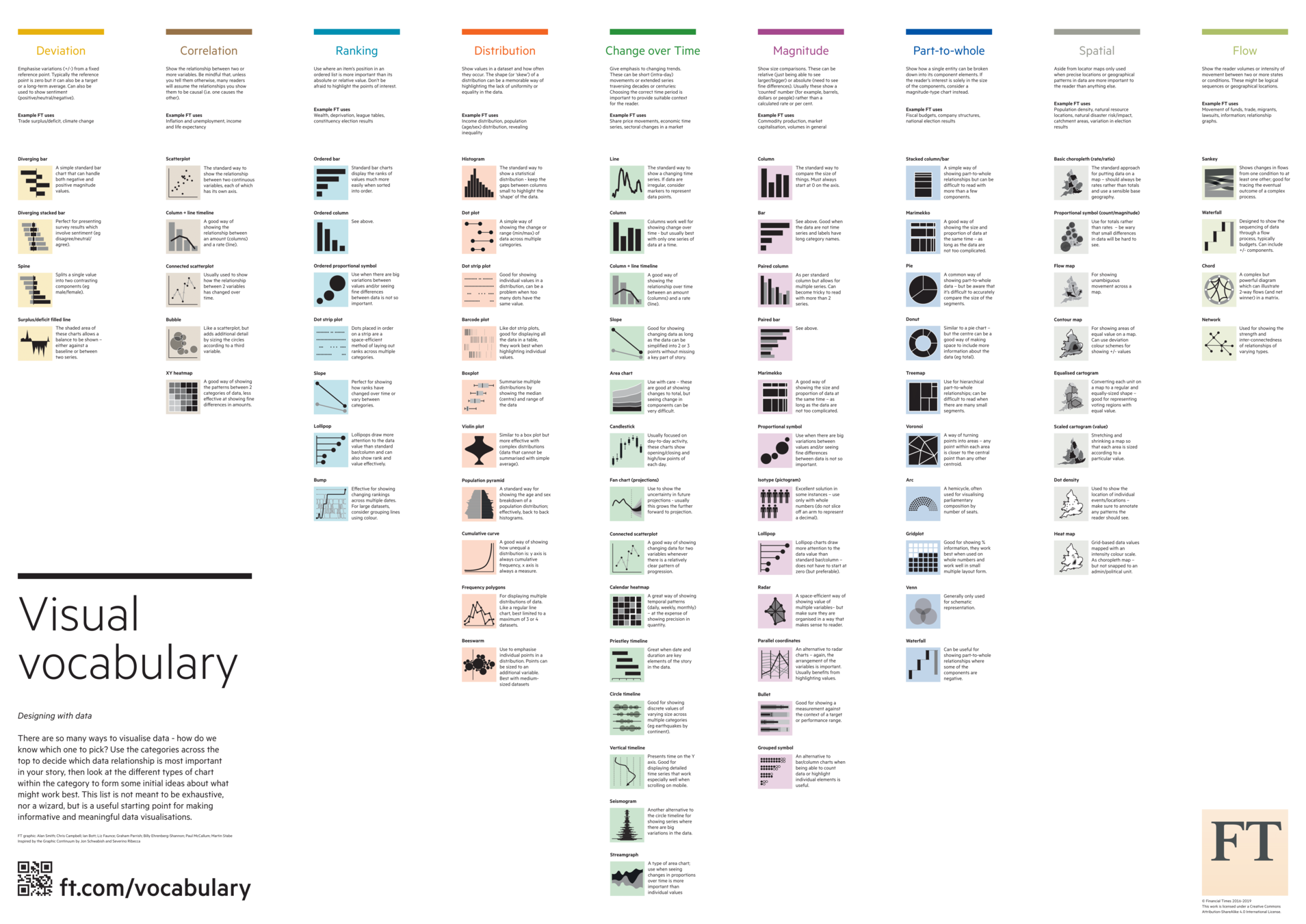
3. Methods and classification of data visualisation
Methods and classification of data visualisation
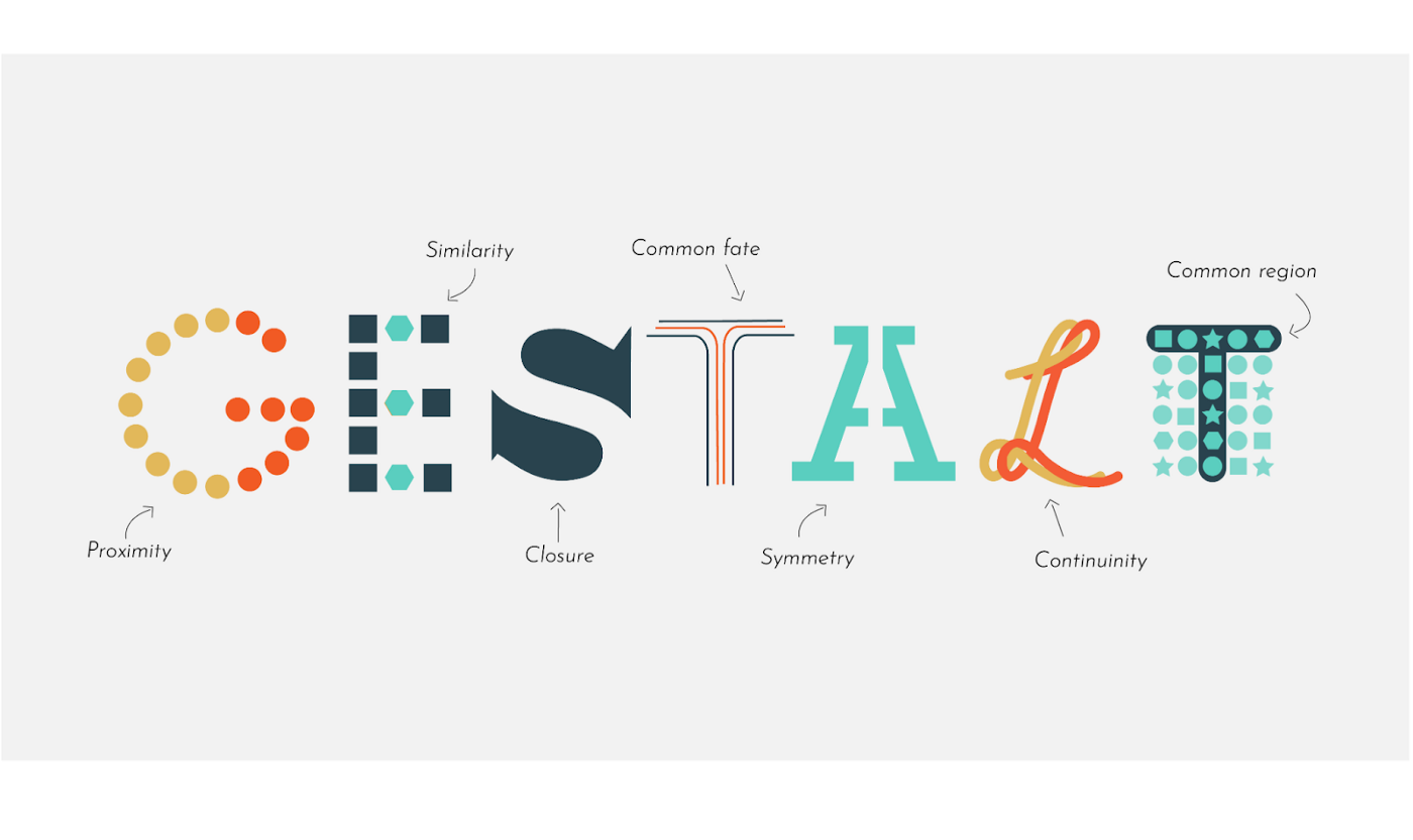
1912: Gestalt-philosophy – Max Wertheimer
B: April 15th 1880.
D: October 12th 1943
Austro-Hungarian psychologist
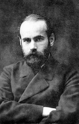

the whole is more than the sum of its parts
Phi phenomenon
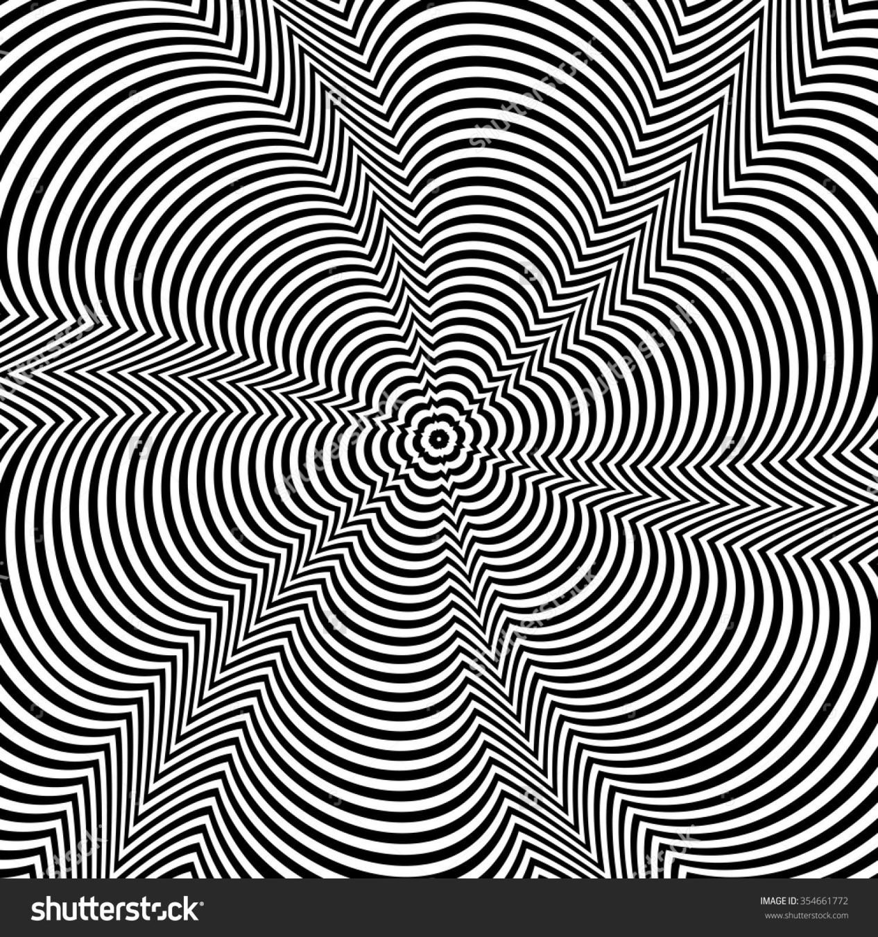


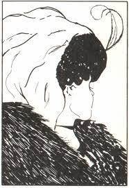
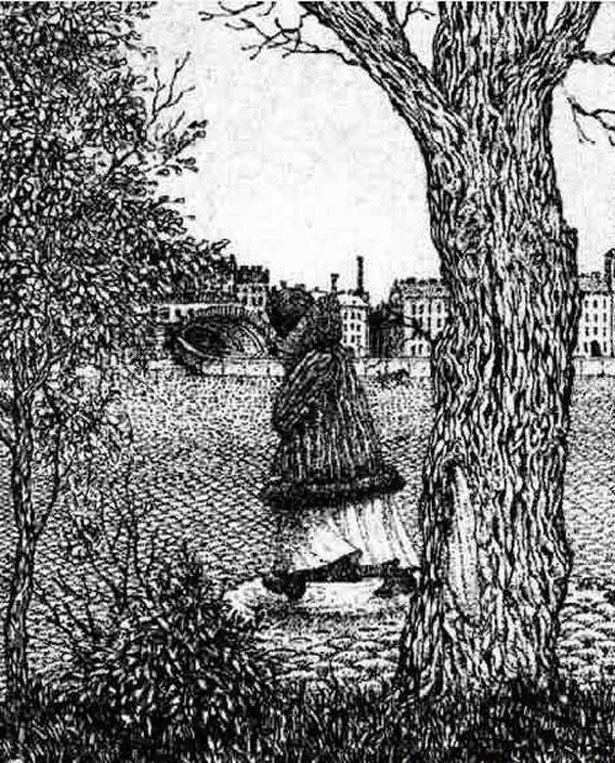

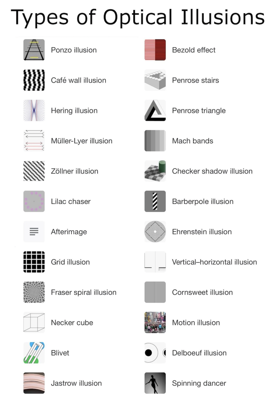
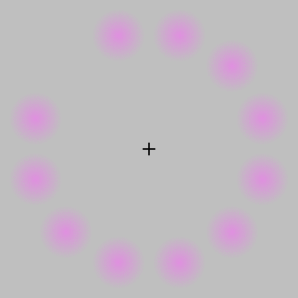
Some of the optical illusions emerge because the lower-level perceptual system hints on an attribute that does not actually exist or are inconsistent with other observations for that object. This confuses the higher-level cognition processes that are fed with such unconscious pre-assessments of the visual. The surprise or discomfort we experience when we become aware of such illusions is the reason why optical illusions are so intriguing to all of us.
The study of optical illusions is scientifically interesting because it provides hints on how visual cues are organized while or before the observation enters cognition.
By the time we observe an object consciously, many of its features have been assessed already – whether it moves, whether it is sharp, whether it is edible, whether it is angry at us and may well bite us, and so on
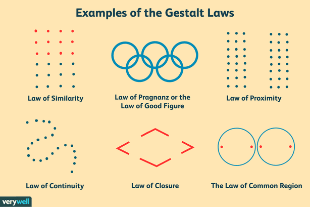
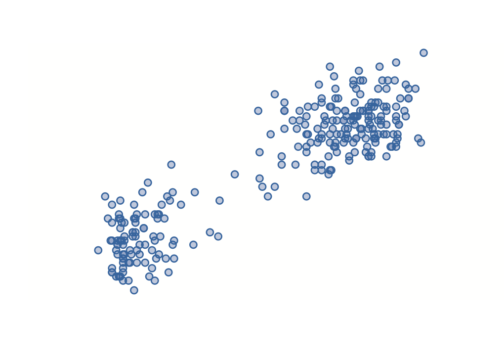
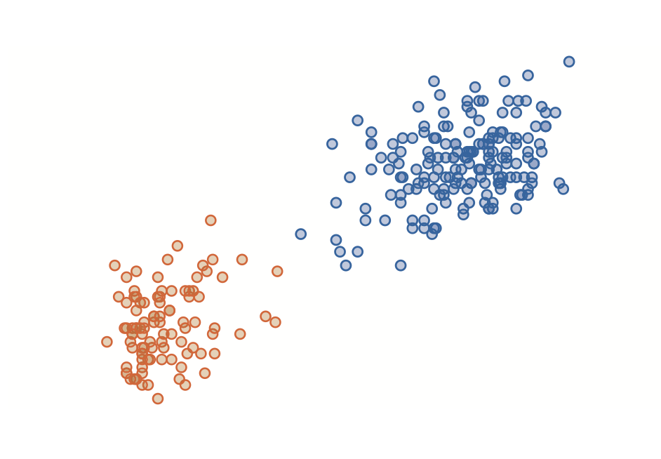
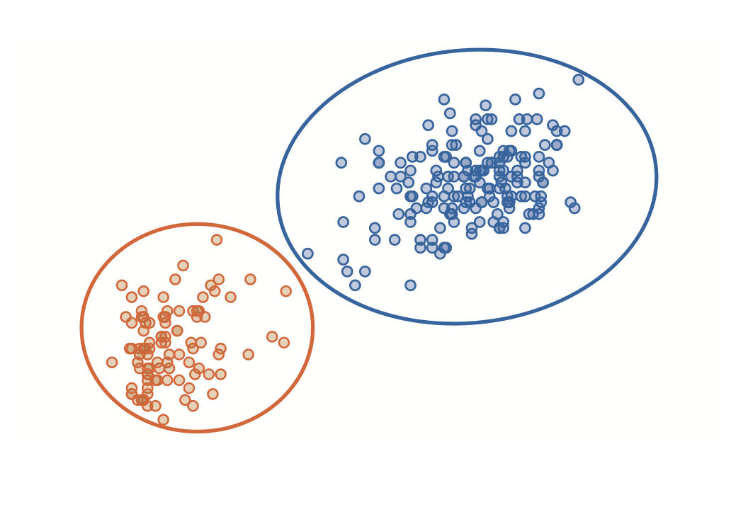
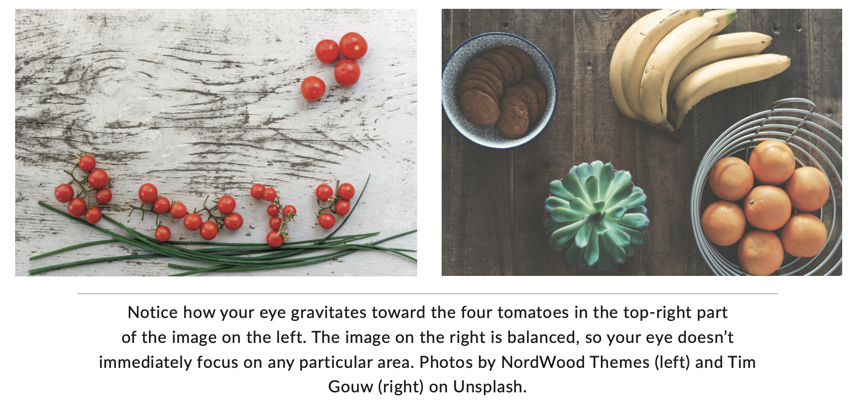
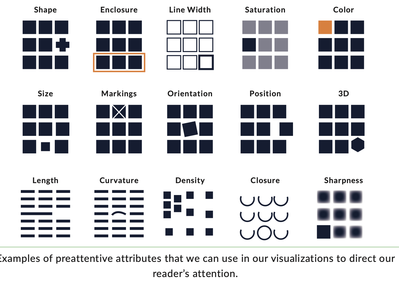
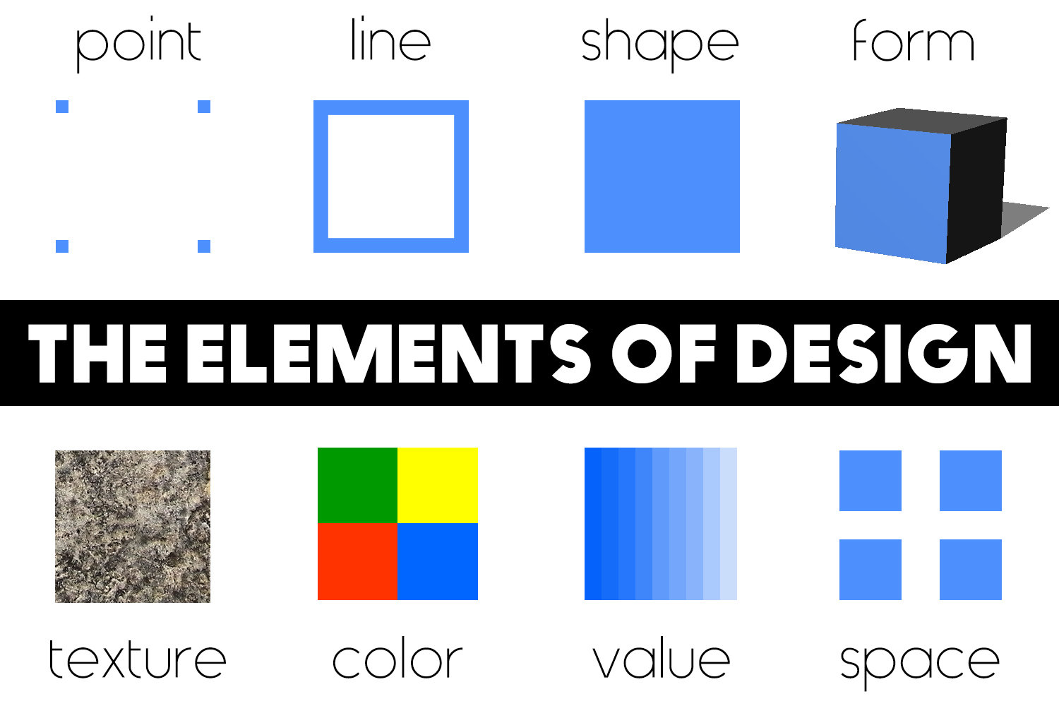
Proximity
Similarity
Enclosure
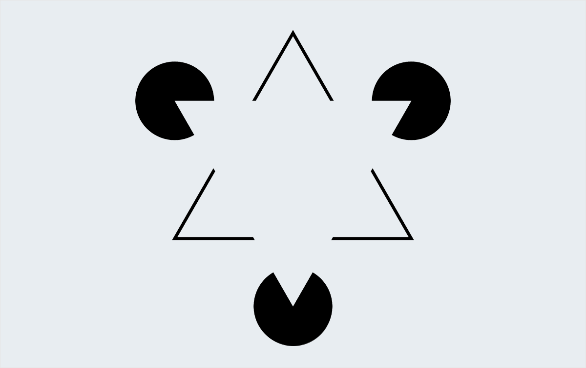
Closure
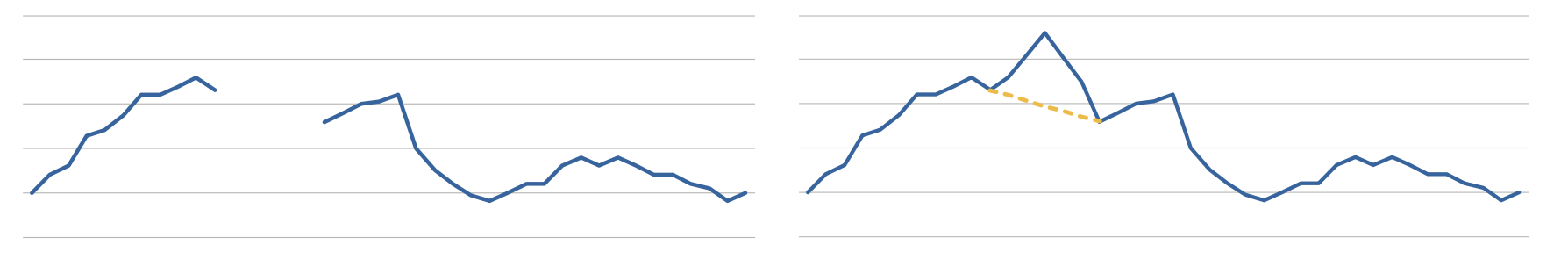
Continuity
Connection
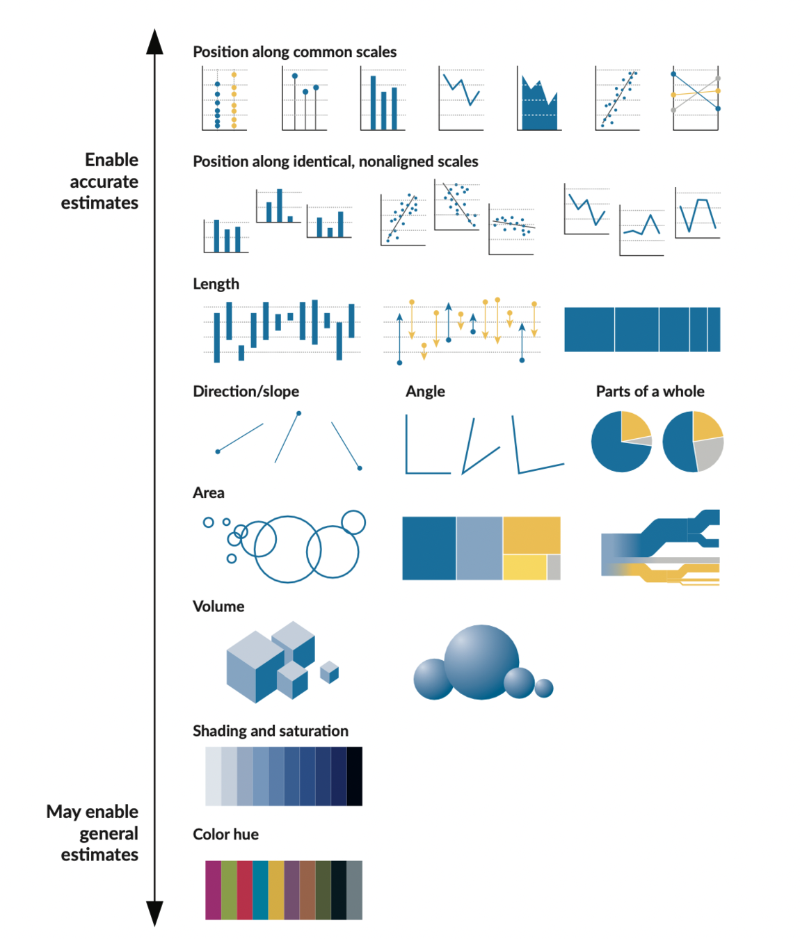
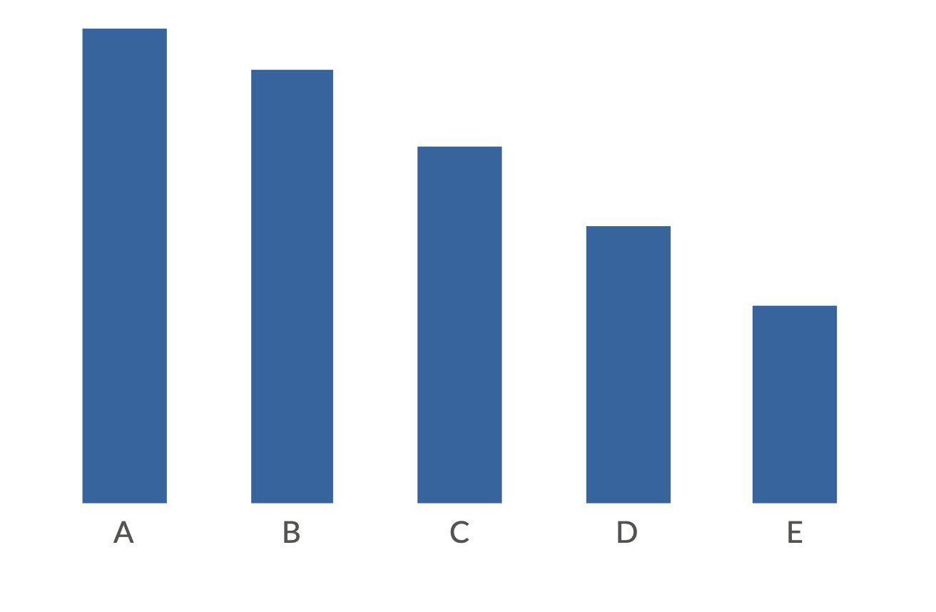
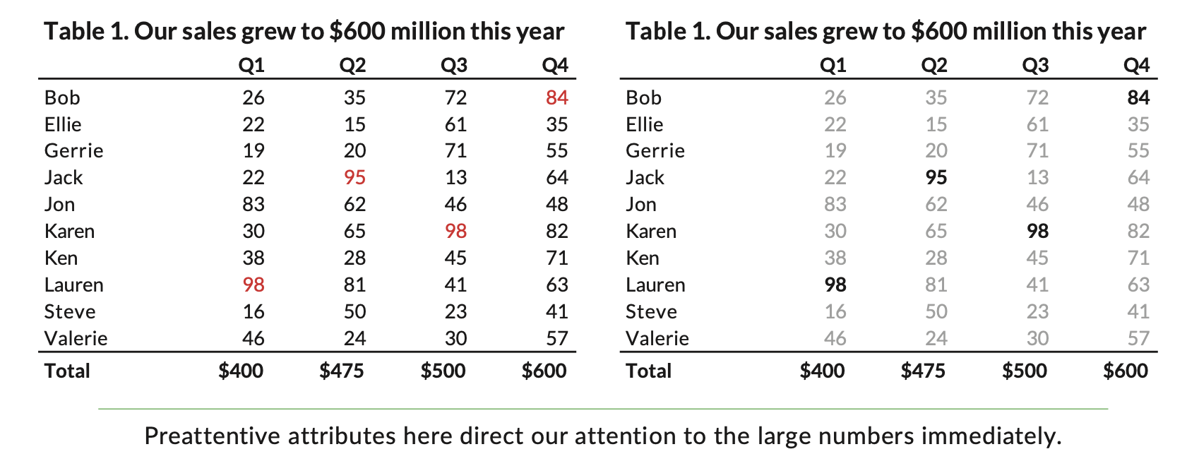
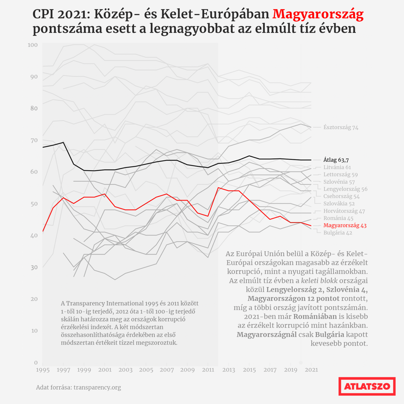
People see bar charts and line charts and pie charts all the time, and those charts are often boring. Boring graphs are forgettable. Different shapes and uncommon forms that move beyond the borders of our typical data visualization experience can draw readers in. Reading a graph is not like the spontaneous comprehension of seeing a photograph. Instead, reading a graph has more of the complex cognitive processes as reading a paragraph.
Data visualization is a mix of science and art. Sometimes we want to be closer to the science side of the spectrum—in other words, use visualizations that allow readers to more accurately perceive the absolute values of data and make comparisons. Other times we may want to be closer to the art side of the spectrum and create visuals that engage and excite the reader, even if they do not permit the most accurate comparisons.
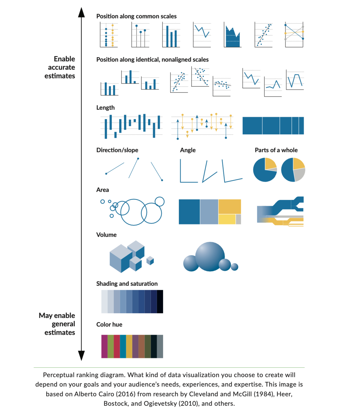
Preattentive processing
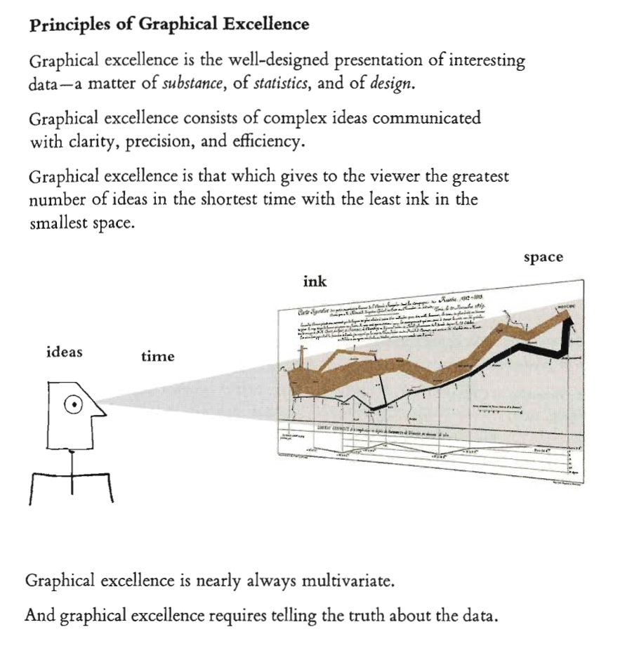
E. R. Tufte: The visual display of quantitative information, 2001
Graphical excellence
- Show the data
- make the viewer think about the data rather than about the methodology
-
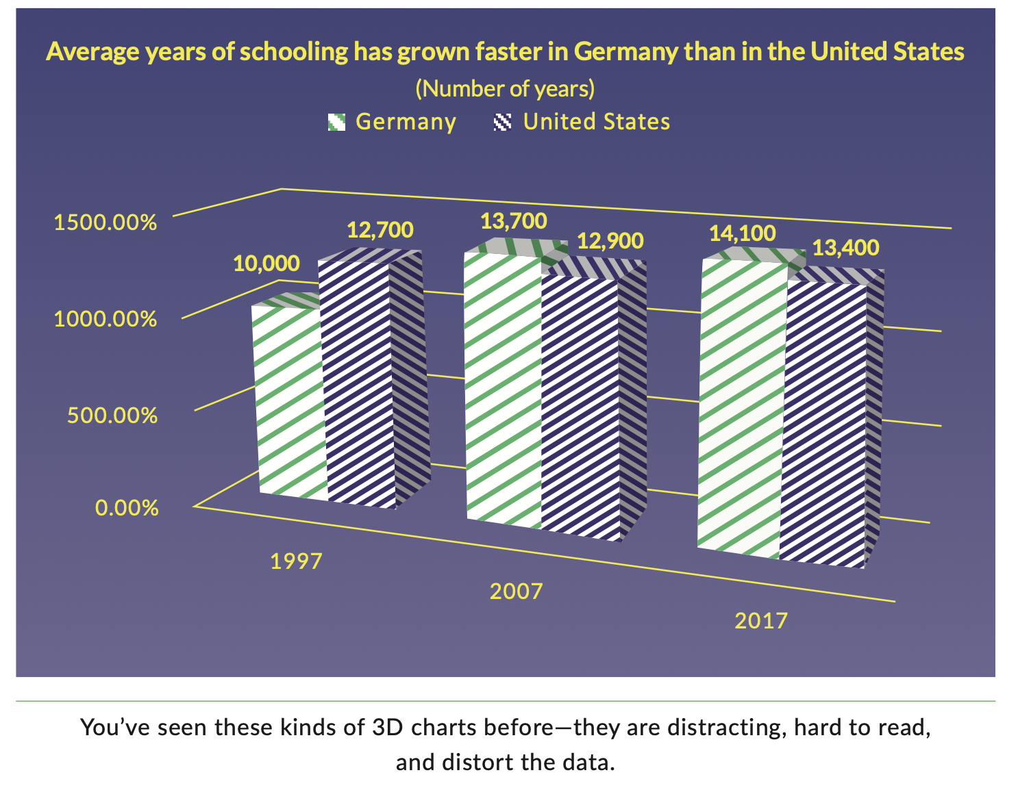
avoid distorting the story of the data
-
present many numbers in a small space
-
make large data sets coherent
-
encourage comparisons
-
show data at different levels of detail
-
make your chart with purpose: description, exploration, tabulation, decoration
-
integrate text to the chart
A good chart isn’t an illustration but a visual argument or part of an argument. (Cairo 2019)
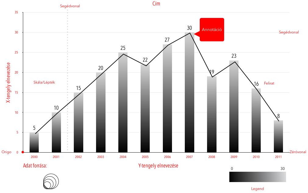
How to "read" a chart:
- Title, introduction (or caption), and source
- measurements, units, scales and legends
- Methods of visual encoding
- Read annotations
- Take a bird’s-eye view to spot patterns, trends and relationships
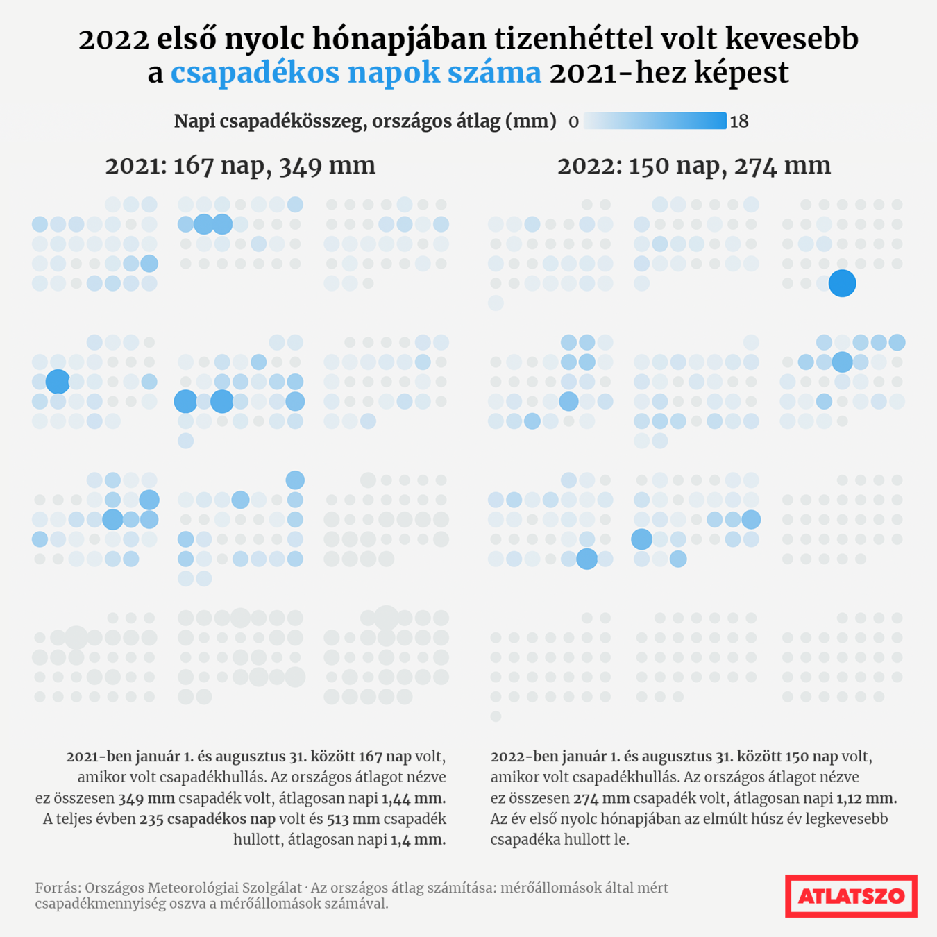
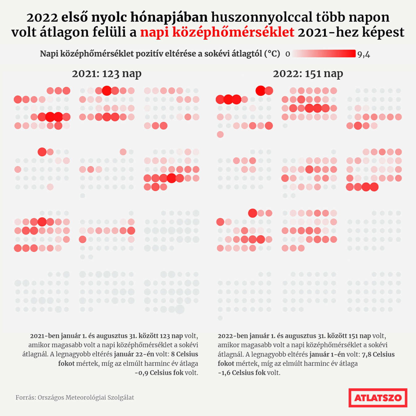
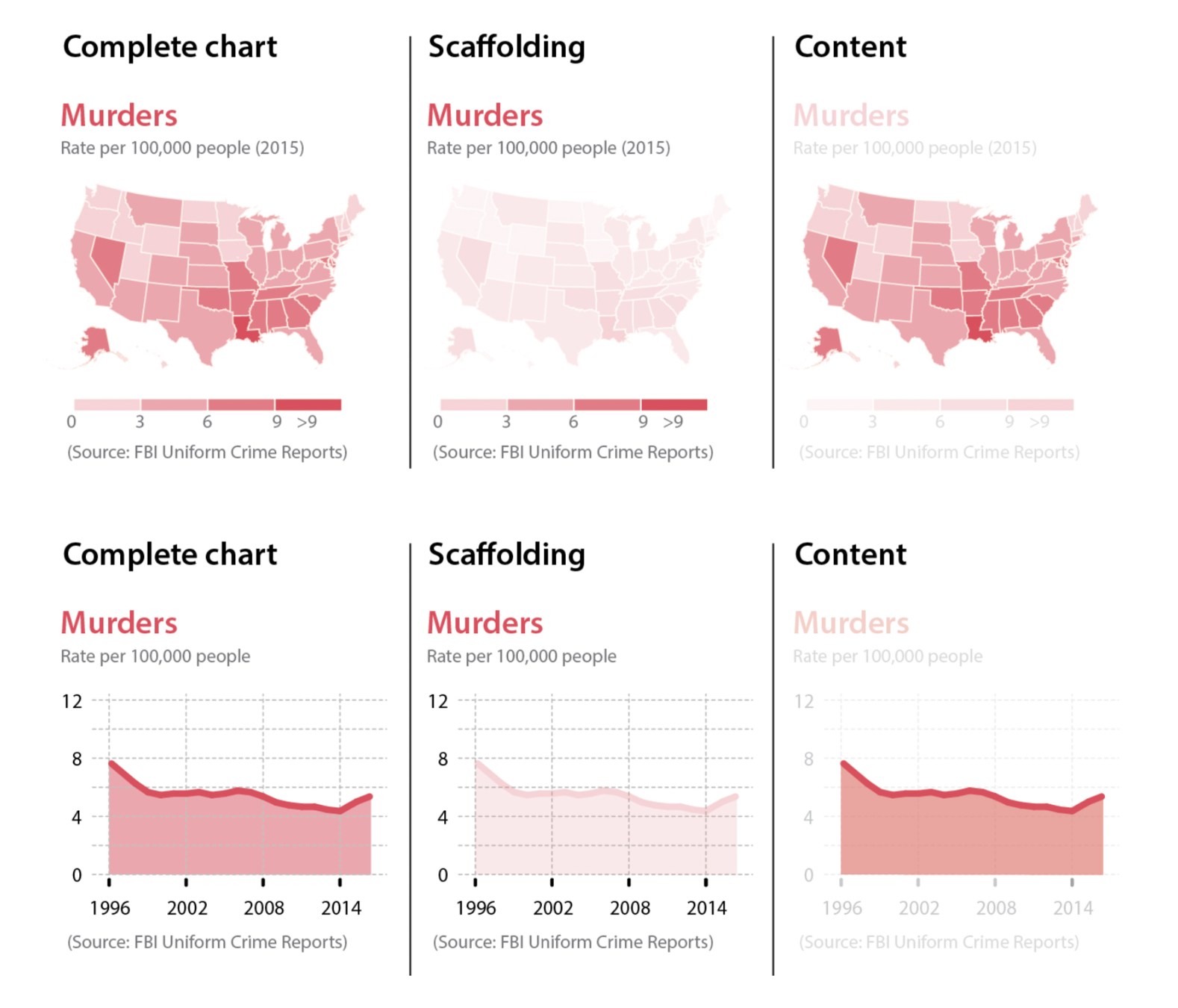
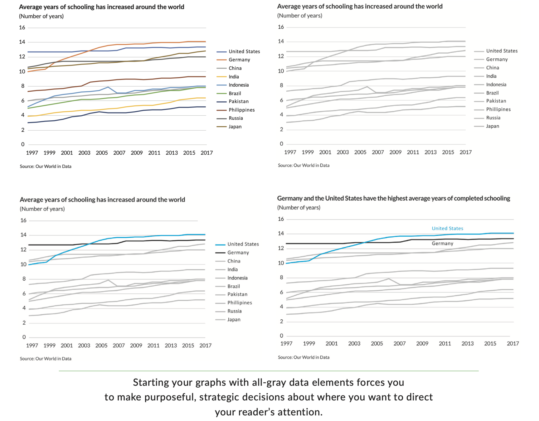
Five guidelines for better data visualisations (Jonathan Schwabish)
- Show the data
- Reduce the clutter
- Integrate the graphics and text
- Avoid the spaghetti chart
- Start with gray
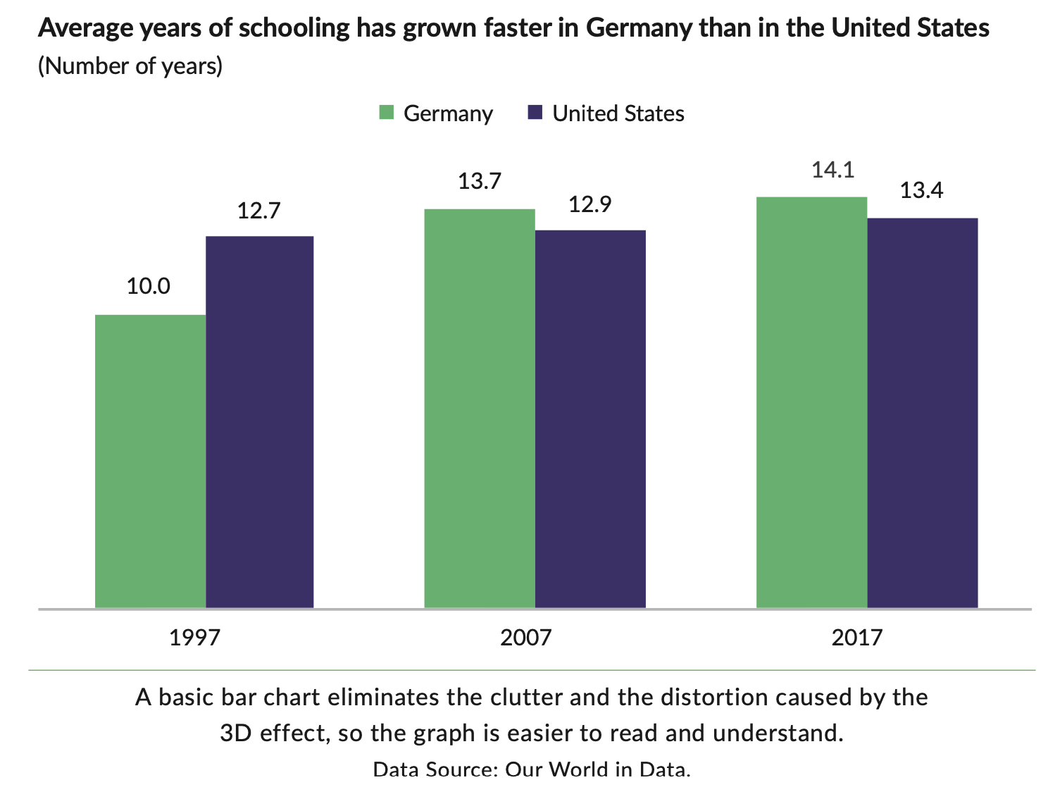
1. Show the data
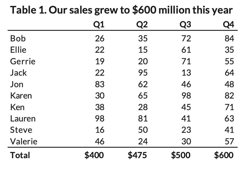
"Not all the data must be shown, but you should highlight the values, that are important to your argument"
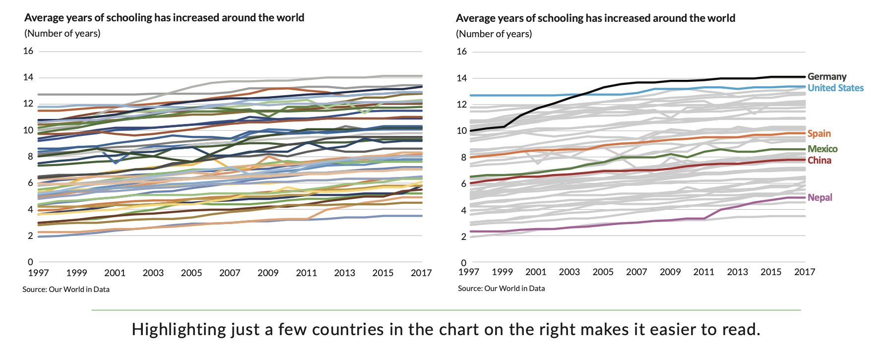
2. Reduce the clutter
"The use of unnecessary visual elements distracts your reader from the central data and clutters the page."
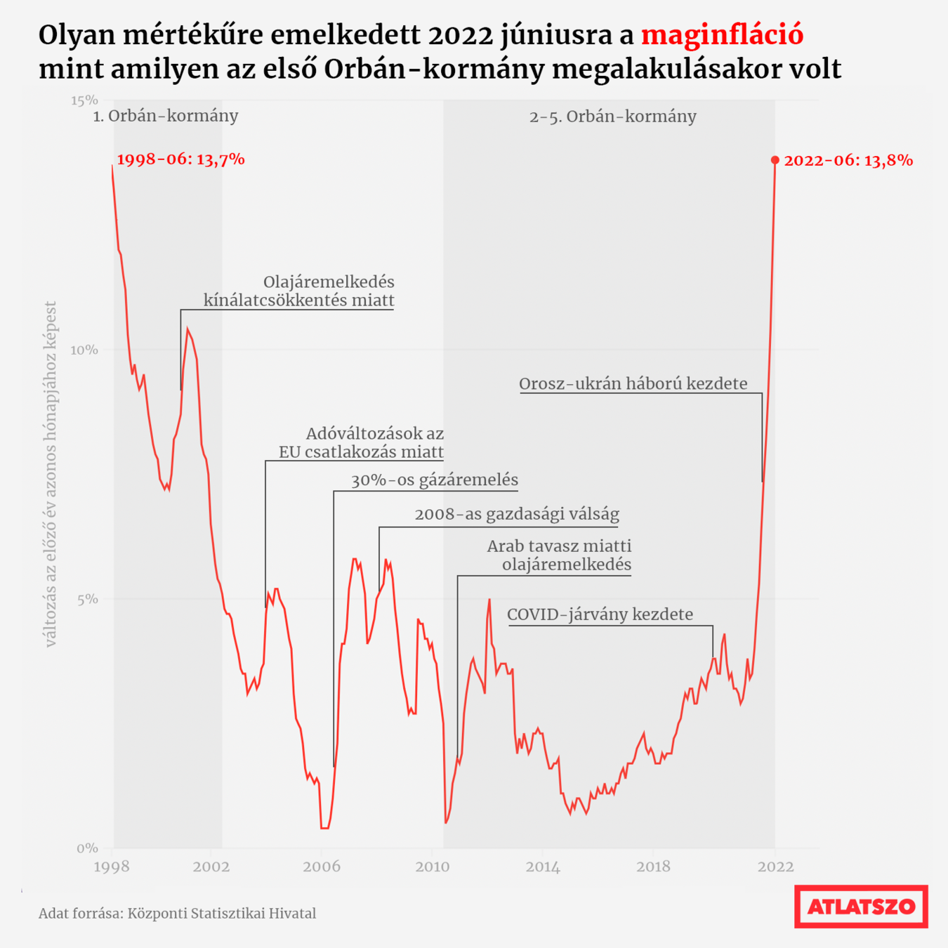
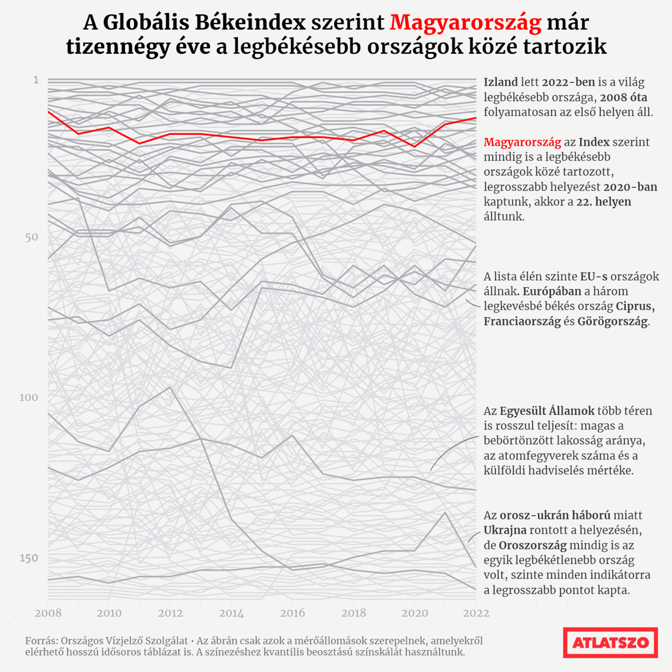
3. Integrate the graphics and text
"Far too often, we treat the text and annotations as an afterthought, but these elements can be used to explain how to read the content in the graph as well as how to read the graph itself."
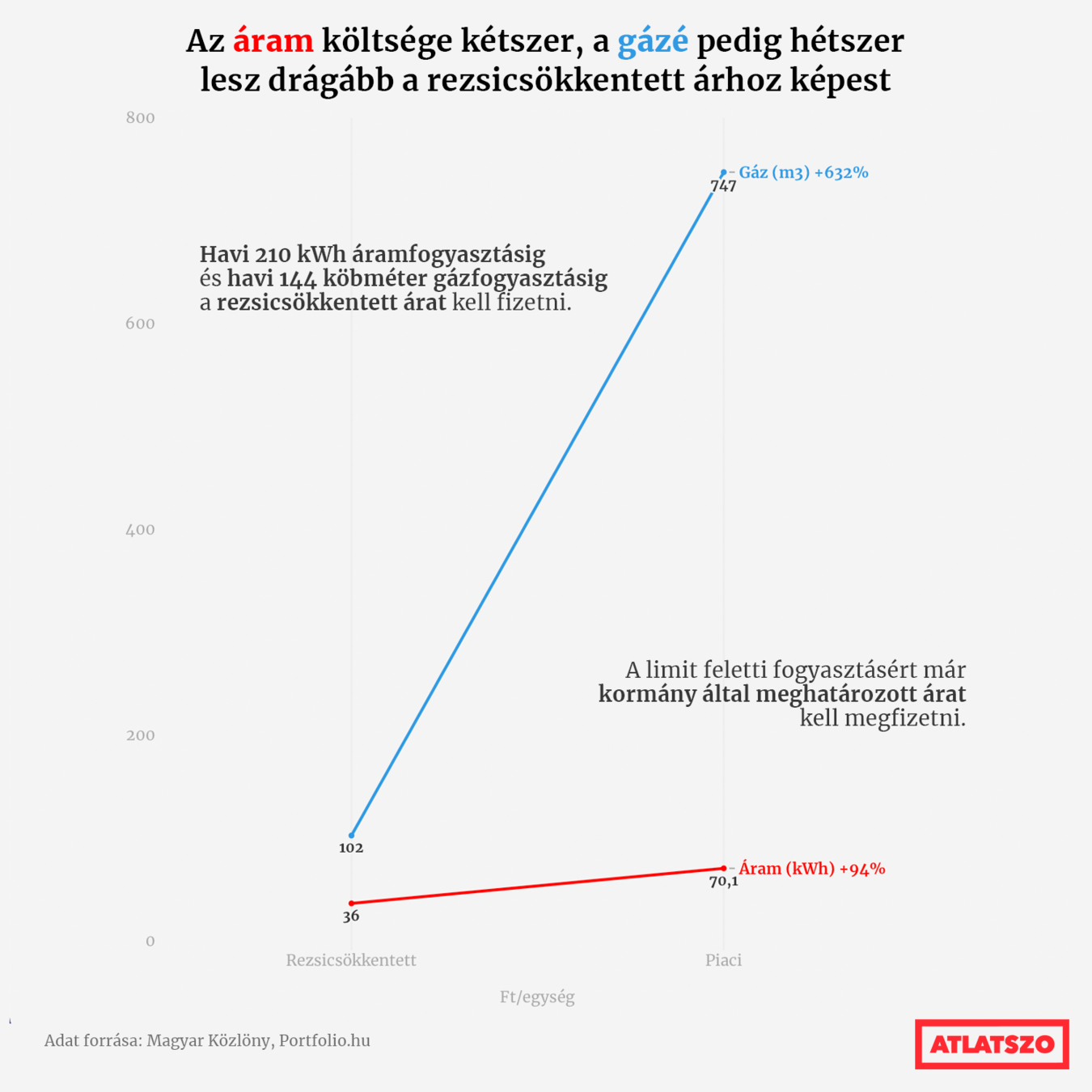
a. Remove legend
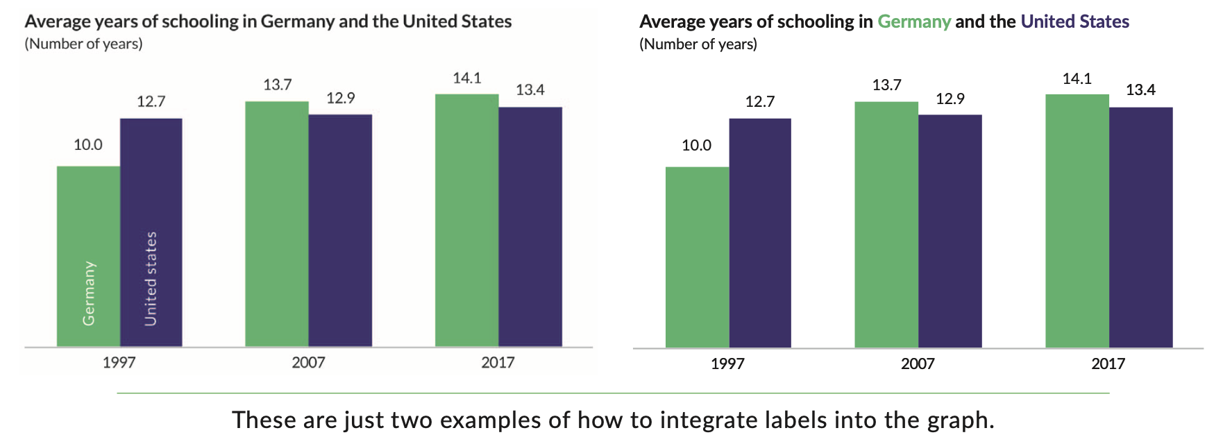
b. Write the title like a newspaper headline
c. Add explainers (annotations)
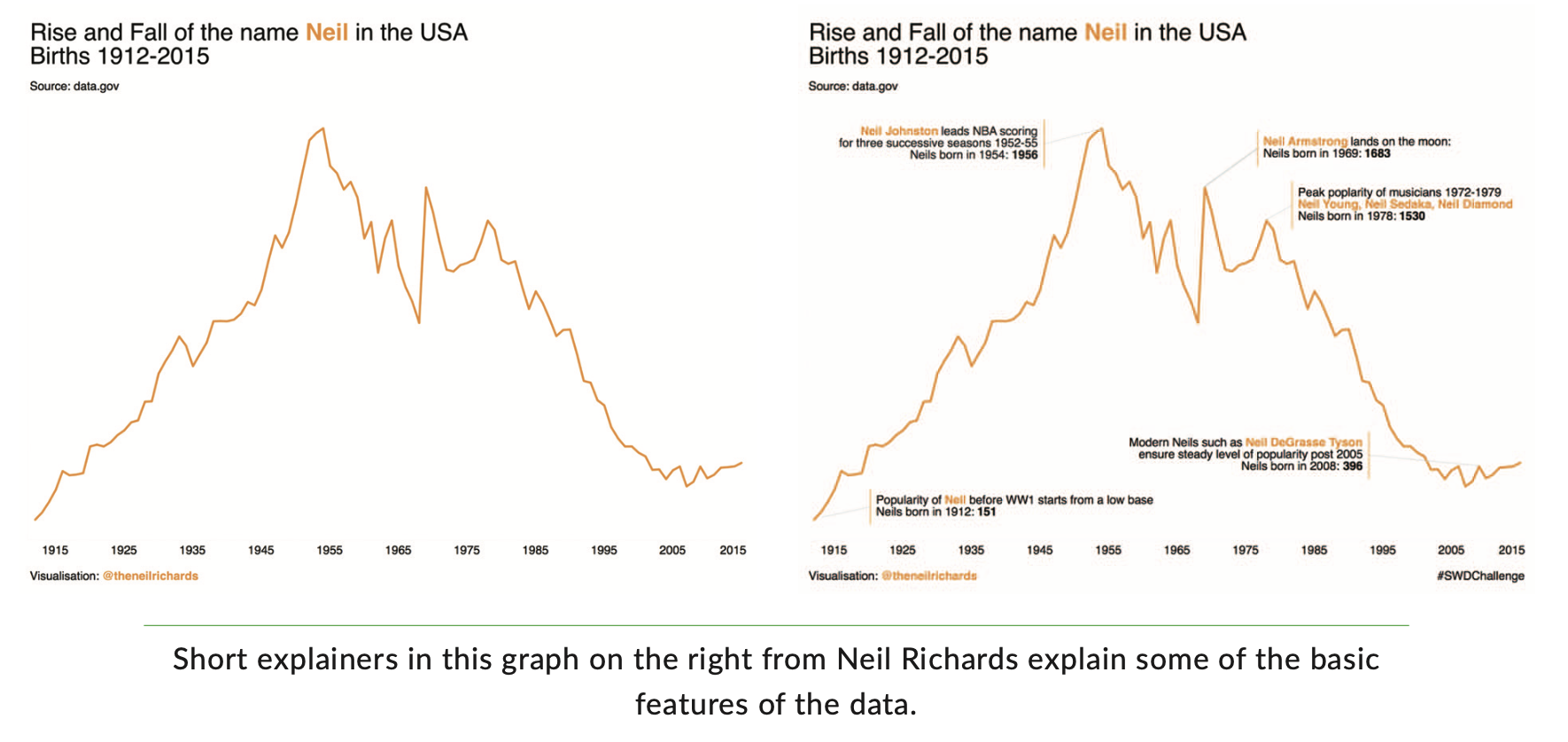
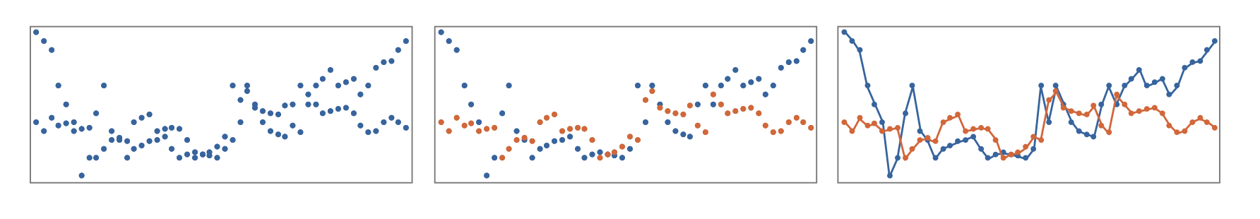
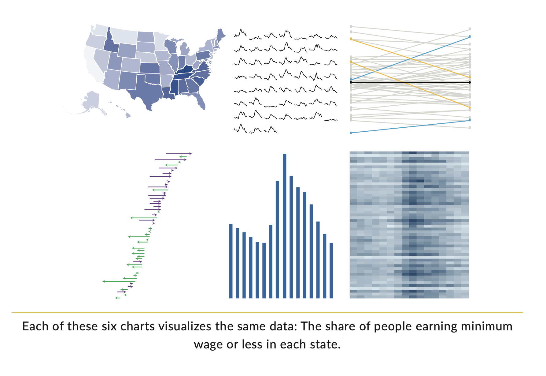
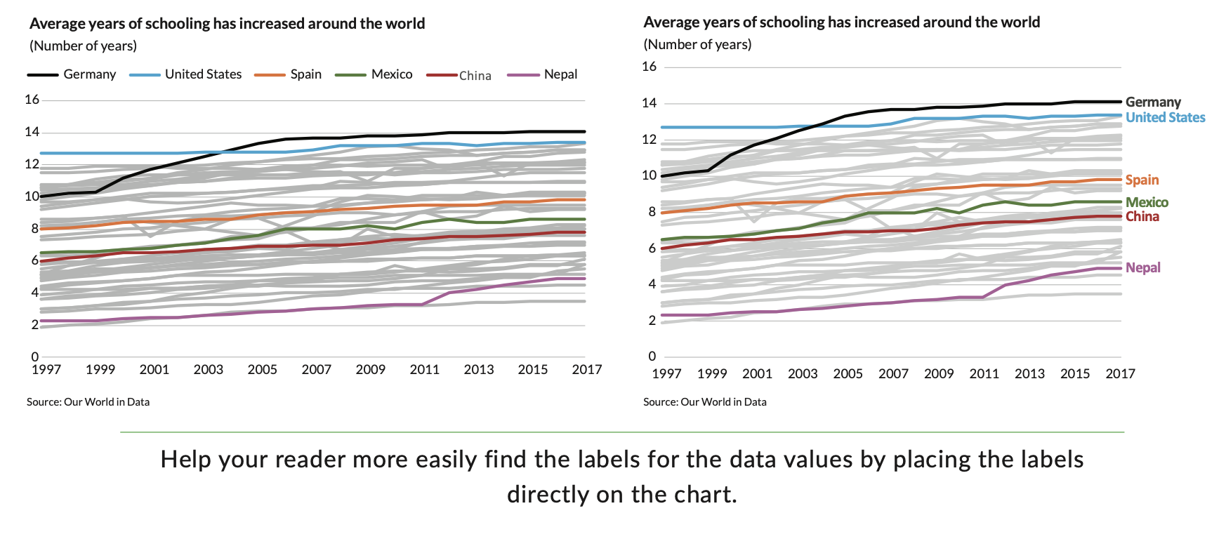
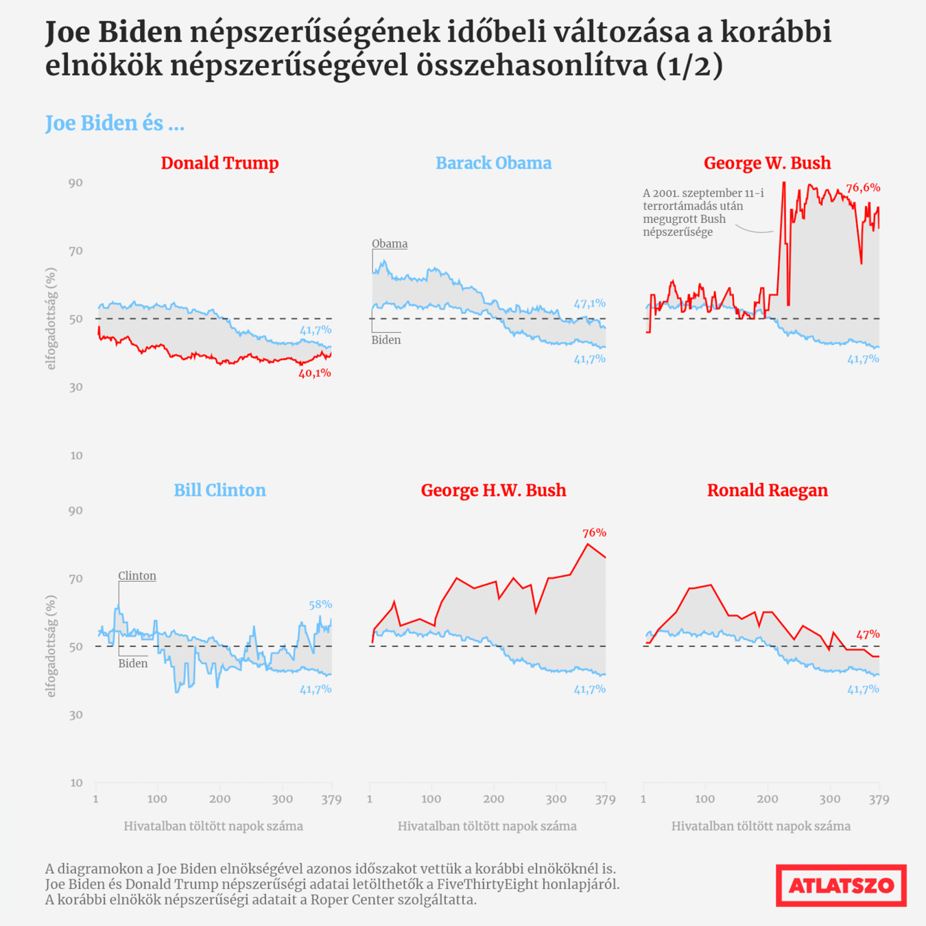
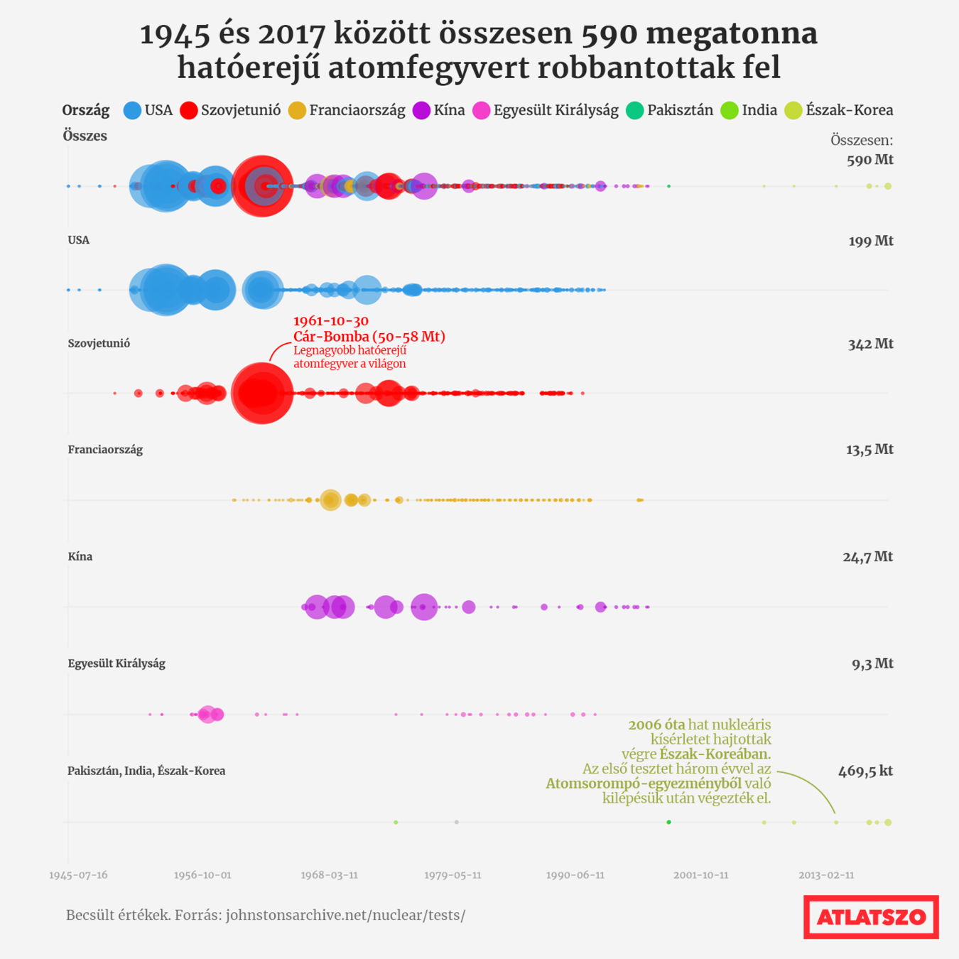
4. Avoid the spaghetti chart
"Instead of putting all of the data on one graph, create multiple, smaller versions with variations on the basic data. These are smaller charts that use the same scale, axes, and scope but spread the data across multiple visuals"
5. Start with gray
"You force yourself to be purposeful and strategic in your use of color, labels, and other elements"
FUNCTION
FORM
Explanatory
Exploratory
Static
Interactive
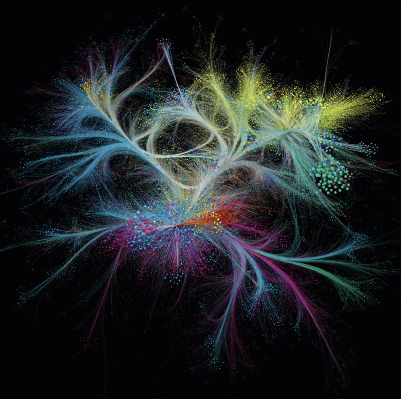
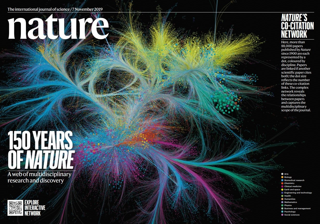
Albert-László Barabási
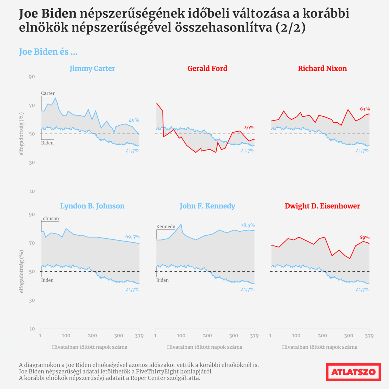
https://projects.fivethirtyeight.com/biden-approval-rating/?cid=rrpromo
https://graphics.reuters.com/JAPAN-AGING/010091PB2LH/index.html
https://www.zeit.de/politik/deutschland/2019-05/east-west-exodus-migration-east-germany-demography
https://www.nytimes.com/interactive/2021/01/14/climate/hottest-year-2020-global-map.html
https://www.nytimes.com/interactive/2021/01/19/upshot/trump-complete-insult-list.html
https://www.nytimes.com/interactive/2021/02/26/science/reopen-schools-safety-ventilation.html
7th October: Intentional and unintentional mistakes made during the visualisation process
E. R. Tufte: Visual and Statistical Thinking: Displays of Evidence for Making Decisions. 5-15pp
What mistakes does the writer highlight on Snow's map, what alternatives, solutions does he suggest?
OR
E. R. Tufte: The Visual Display of Quantitative Information (2001).Chartjunk: Vibrations, Grids and Ducks (107-121pp)
What visual mistakes does Tufte call "Chartjunk"? Give explanation and examples from the chapter
OR
https://marypatcampbell.substack.com/p/geeking-out-florence-nightingale
+
https://99percentinvisible.org/episode/florence-nightingale-data-viz-pioneer/transcript/
How did Nightingale cheat with the rose chart? What can be read from the data with a different type of chart?
OR
Find two charts in the weekly Data Vis Dispatch articles, that you would show as a different chart, why would you change it?
5th October, Wednesday 20:00. Subject: BN-INFGRA-04-GY_07.10_[NEPTUN CODE]
Next lesson
Thank you for your attention!
szabo.krisztian96@gmail.com
METU3
By Szabó Krisztián


