INFOGRAPHICS
(BN-INFGRA-04-GY)
4. Intentional and unintentional mistakes
Intentional and unintentional mistakes, lies

1
1. E. R. Tufte: Visual and Statistical Thinking: Displays of Evidence for Making Decisions. 5-15pp
What mistakes does the writer highlight on Snow's map, what alternatives, solutions does he suggest?
2. https://marypatcampbell.substack.com/p/geeking-out-florence-nightingale
+
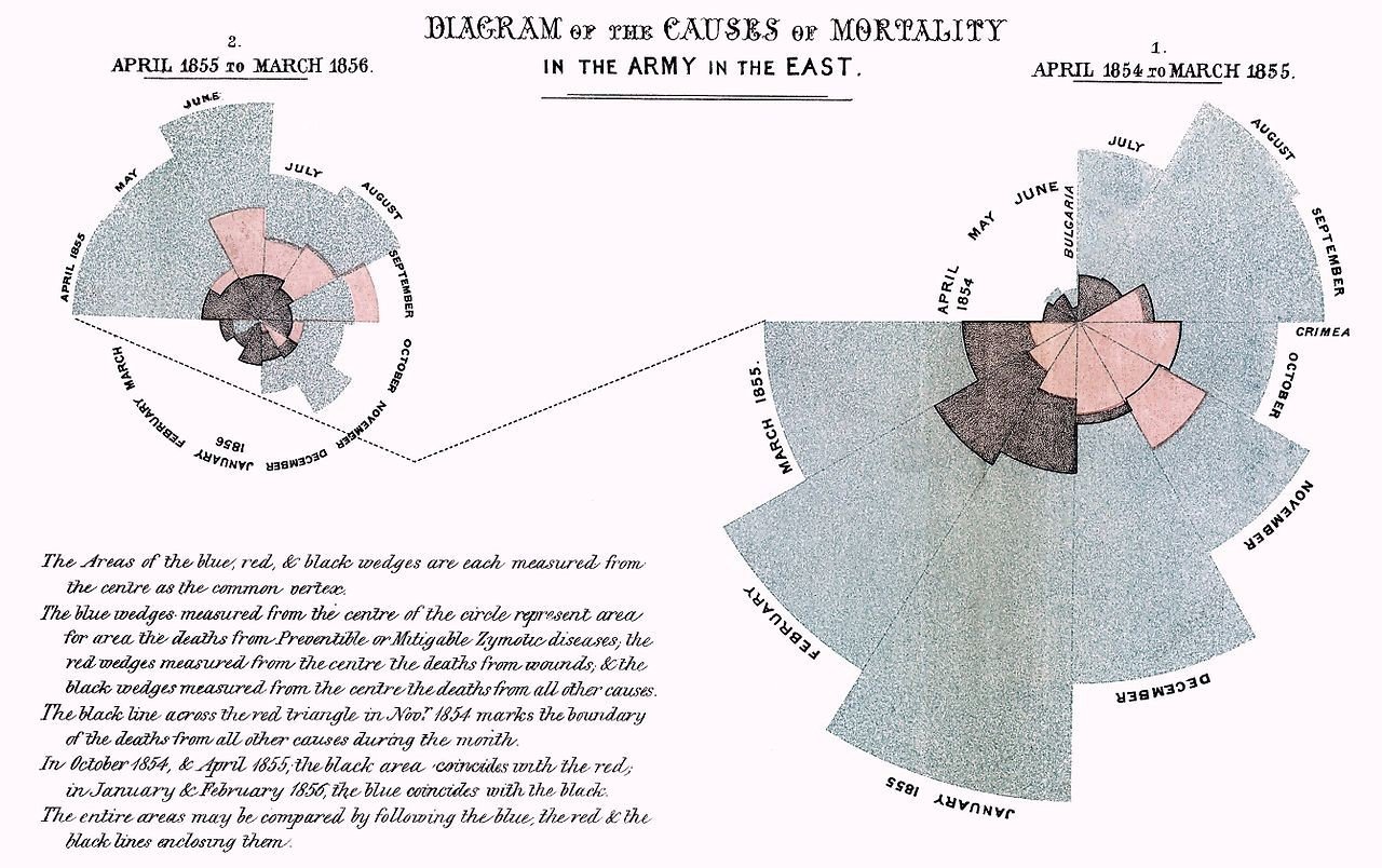
https://99percentinvisible.org/episode/florence-nightingale-data-viz-pioneer/transcript/
How did Nightingale cheat with the rose chart? What can be read from the data with a different type of chart?
3. E. R. Tufte: The Visual Display of Quantitative Information (2001).Chartjunk: Vibrations, Grids and Ducks (107-121pp)
What visual mistakes does Tufte call "Chartjunk"? Give explanation and examples from the chapter
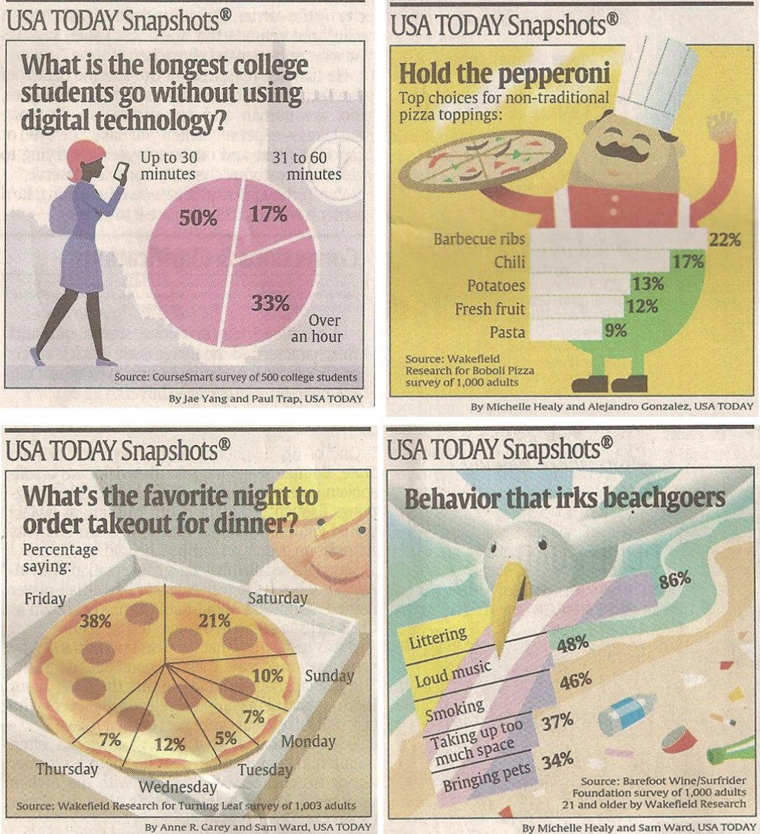
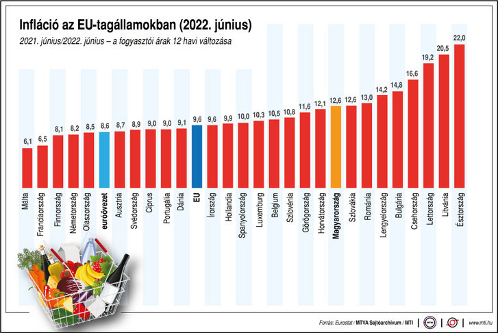
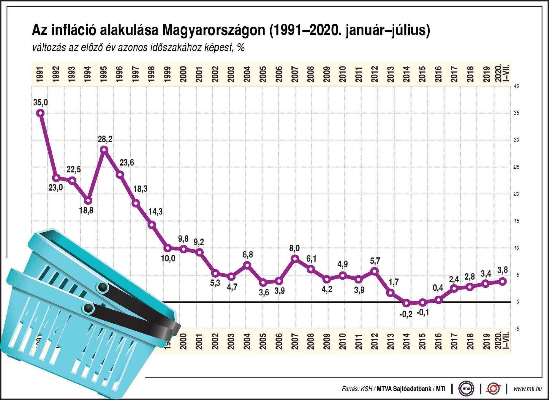
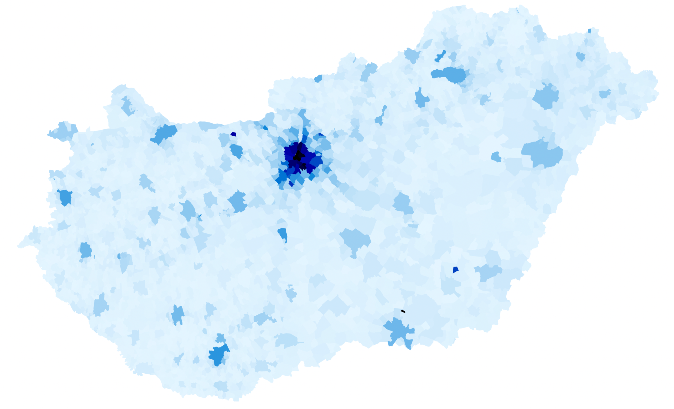
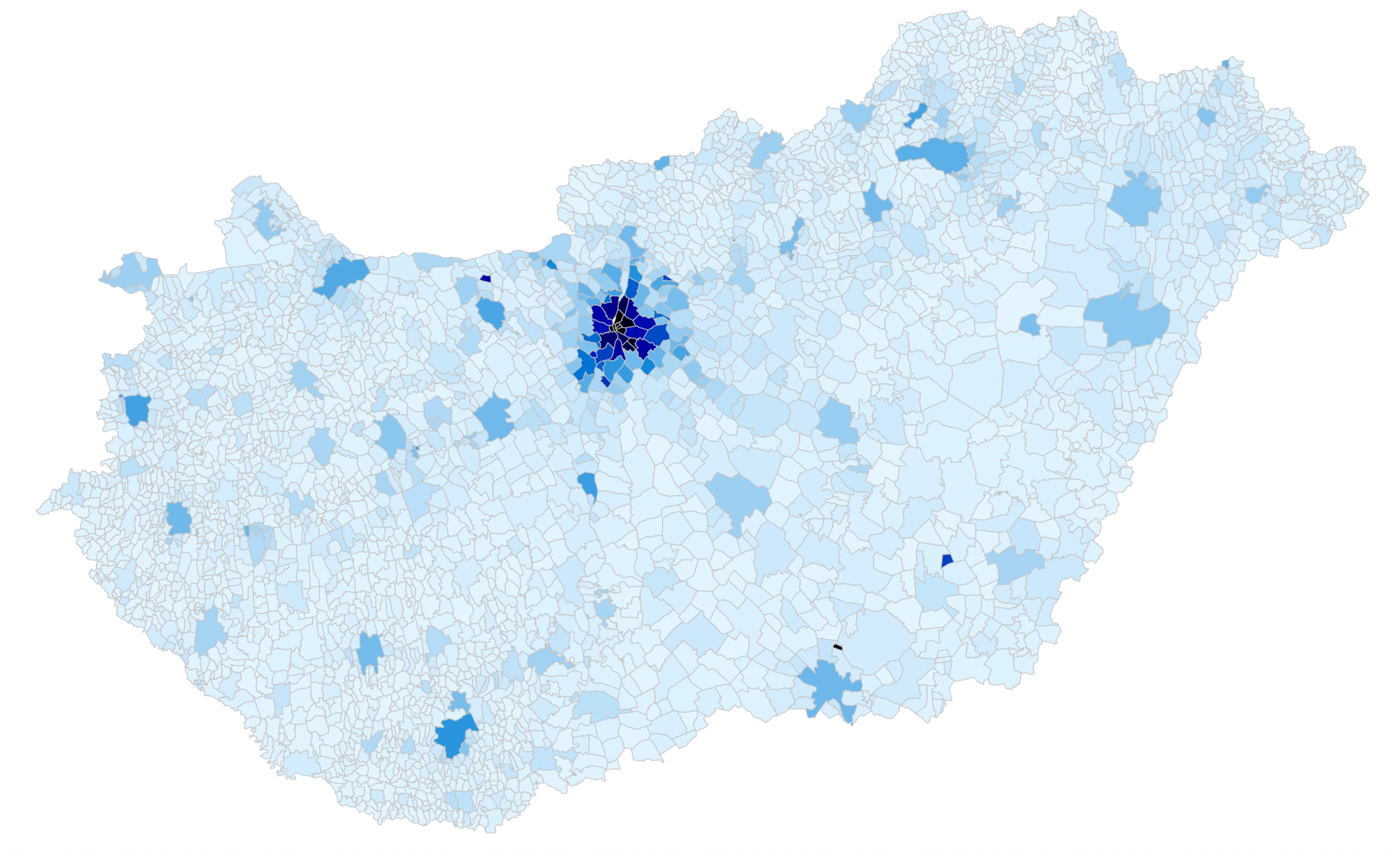
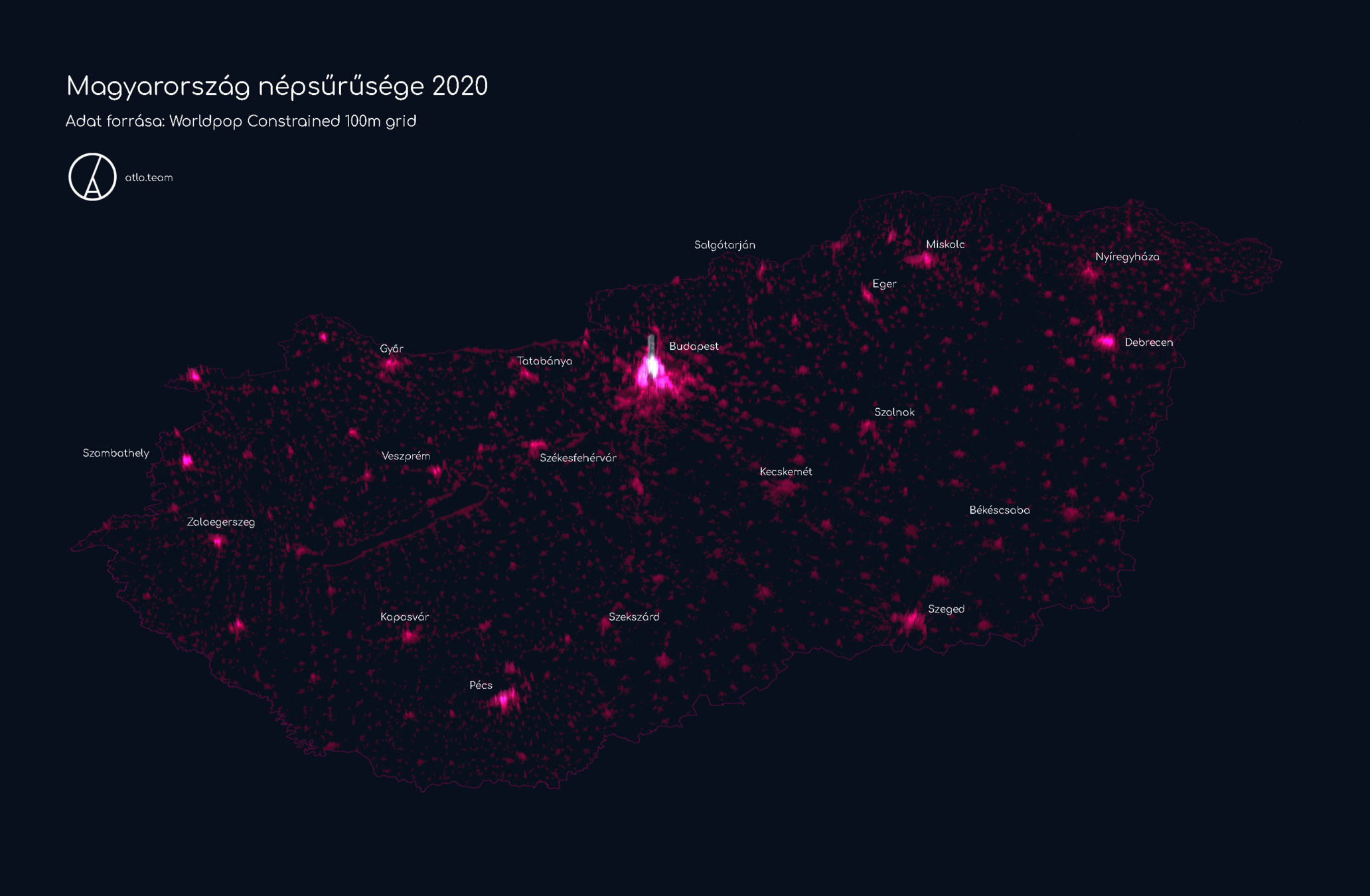
4. Find two charts in the weekly Data Vis Dispatch articles, that you would show as a different chart, why would you change it?
2
1. E. R. Tufte: Visual and Statistical Thinking: Displays of Evidence for Making Decisions. 5-15pp
What mistakes does the writer highlight on Snow's map, what alternatives, solutions does he suggest?
3
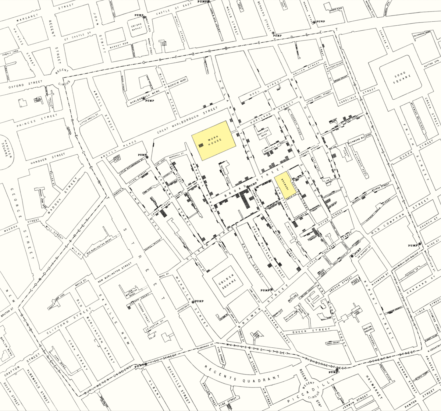
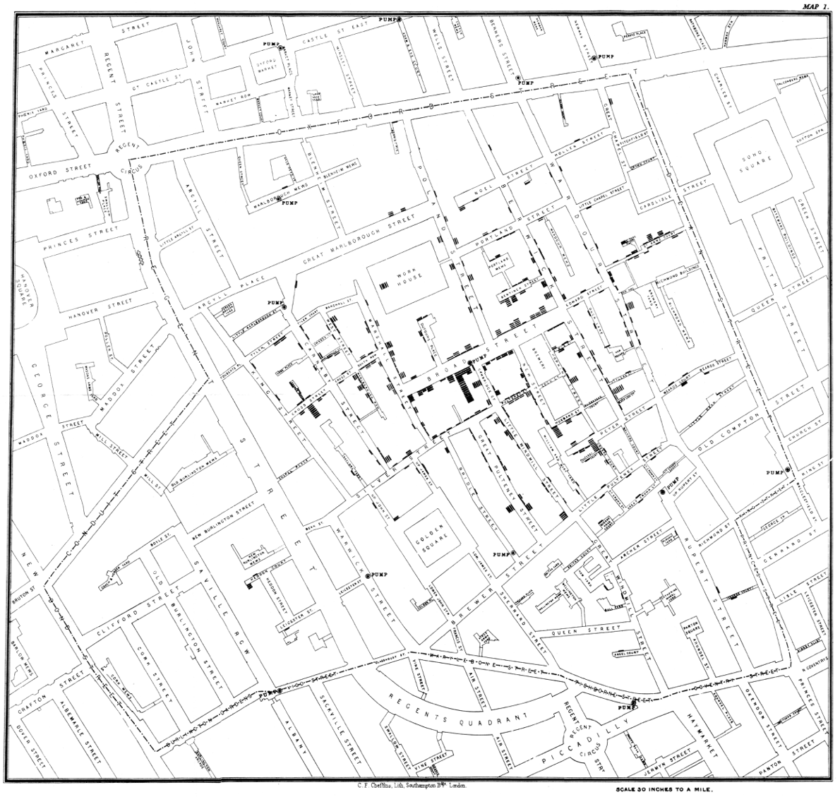
1. choosing context and visualisation
This map reveals a strong association between cholera and proximity to the Broad Street pump, in a context of simultaneous comparison with other local water sources and the surrounding neighborhoods without cholera
4
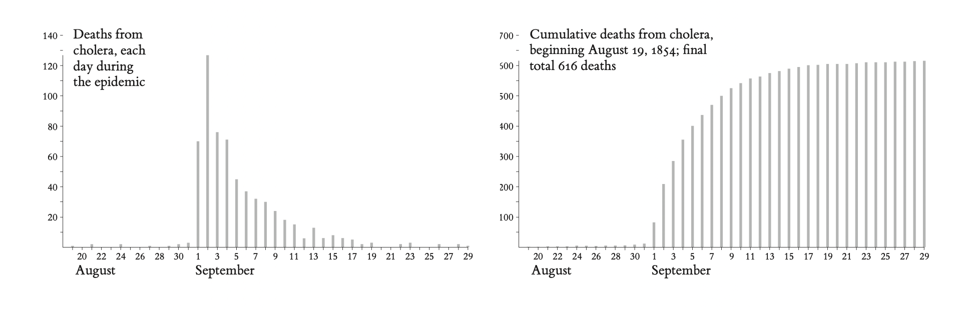
the passage of time is a poor explanatory variable, practically useless in discovering a strategy of how to intervene and stop the epidemic
5
2. Compared with what?
to understand fully the cause of the epidemic also requires an analysis of those who escaped the disease.
6
3. Alternatives, contrary cases
The point is to get it right, not to win the case
contradictory instances, a number of deaths from cholera with no obvious link to the Broad Street pump
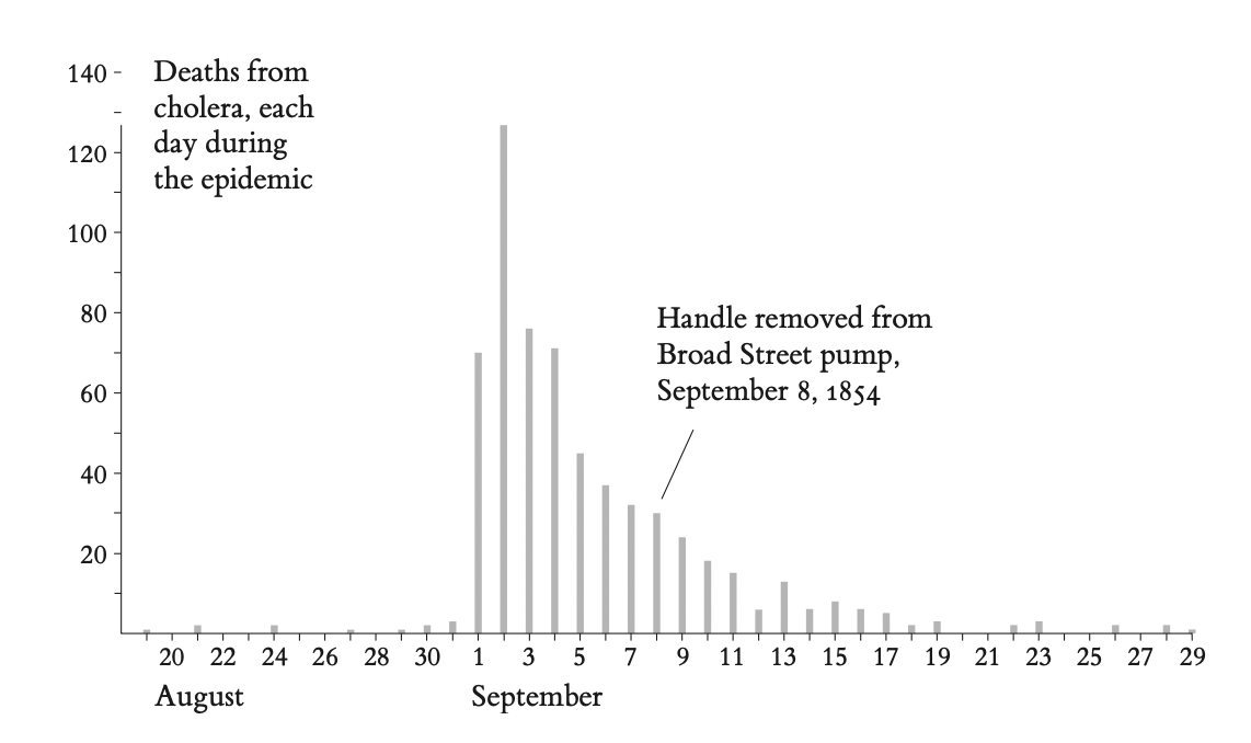
it is not at all clear that the removal
of the handle of the Broad Street pump had much to do with ending the epidemic
The epidemic was already in rapid decline by the time the handle was removed. Yet, in many retellings of the story of the epidemic, the pump-handle removal is the decisive event, the unmistakable symbol of Snow’s contribution.
7
4. Errors
The big problem is that dot maps fail to take into account the number of people living in an area and at risk to get a disease:
“an area of the map may be free of cases merely because it is not populated."
Snow’s dot map does not assess varying densities of population in the area around the pump.
Ideally, the cholera data should be displayed both on a dot and a rate map
Aggregations by area can sometimes mask and even distort the true story of the data. For two of the three examples at right, constructed by Mark Monmonier from Snow’s individual-level data, the intense cluster around the Broad Street pump entirely vanishes in the process of geographically aggregating the data.
diffcult to reproduce on a single page
the cholera symbols become murky and the type too small
(Mark Monmonier's alternative cloropleth maps)

8
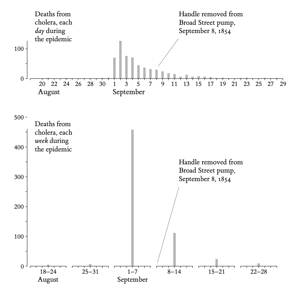
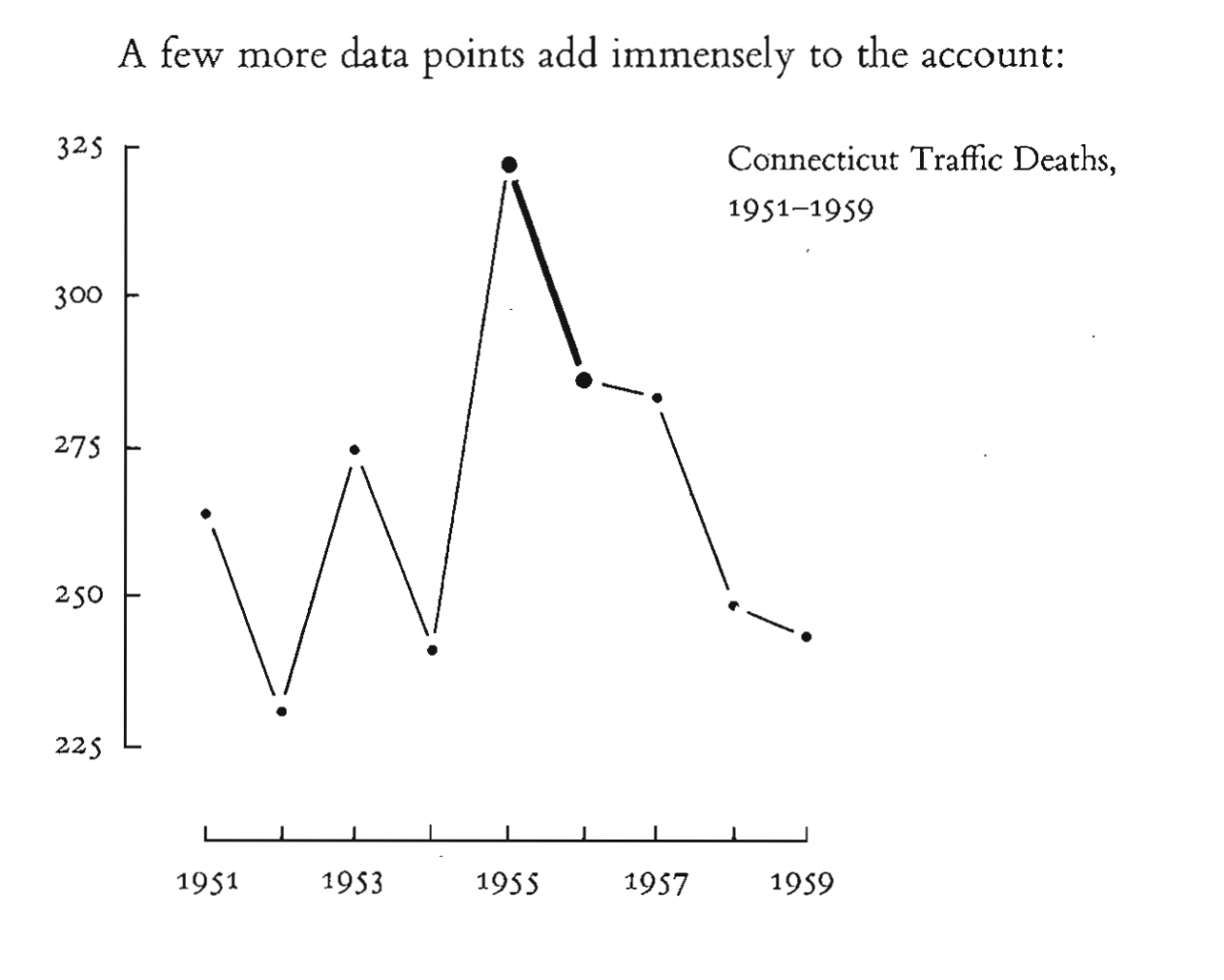
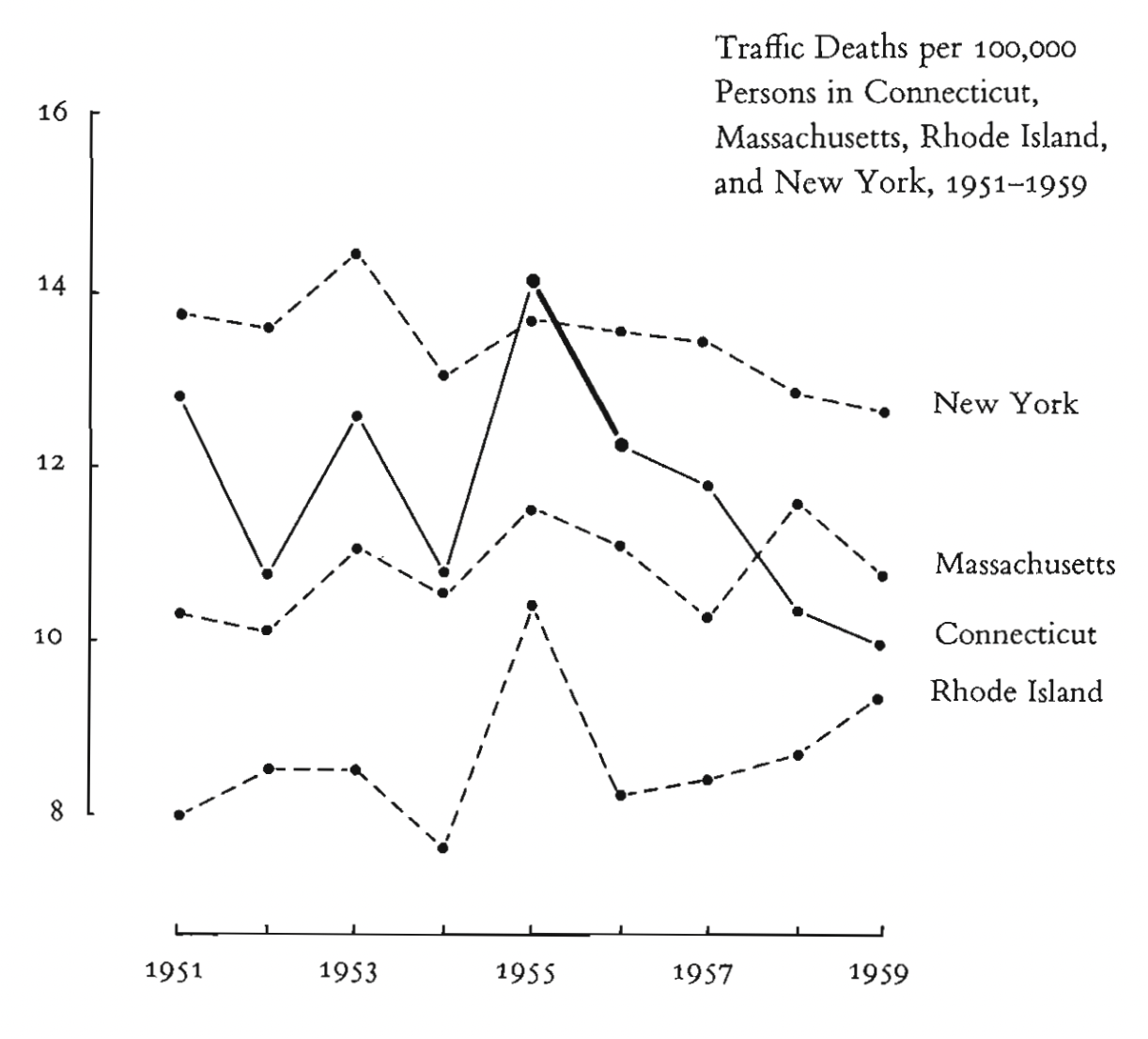
Aggregations over time may also mask relevant detail and generate misleading signals
Since two or more days typically pass between consumption of the in- fected water and deaths from cholera, the removal date might properly be lagged in relation to the deaths
Time-series are exquisitely sensitive to choice of intervals and end points
9
2. https://marypatcampbell.substack.com/p/geeking-out-florence-nightingale
+
https://99percentinvisible.org/episode/florence-nightingale-data-viz-pioneer/transcript/
How did Nightingale cheat with the rose chart? What can be read from the data with a different type of chart?
10
11
The number of deaths should be normalized against the “exposure” – that is, the number of people in the army were around to die.
12
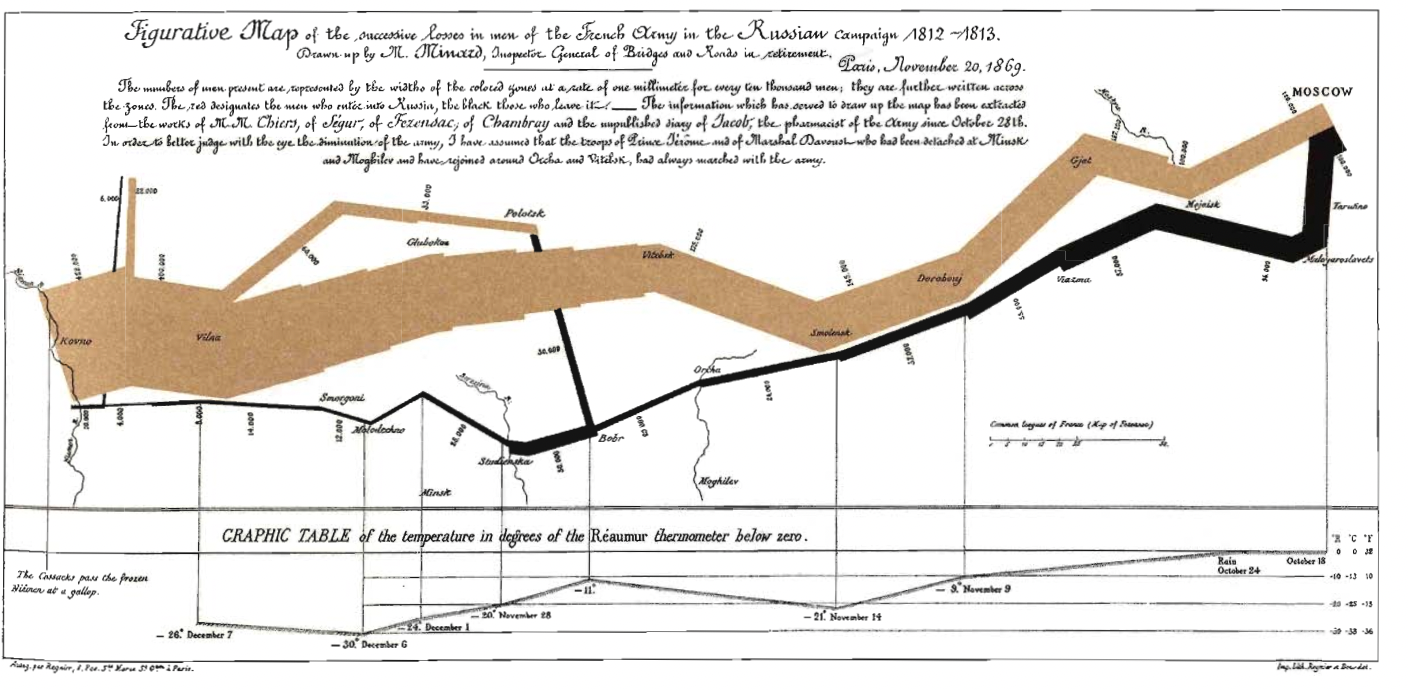
Errors and remarks in connection to Minard's flow map
At first glance, it is hard to determine the direction of the flow, the meaning of the colours, the geographical location: the description, legend and annotation helps
Place names are not comprehensive, not exact
No dates during the campaign towards Moscow, only a few selected dates on the way back
Connection to temperature suggests deaths were due to freezing cold. More deaths on the way there, but no explanation (diseases, battles, desertion?)
The army resided in Moscow for a month, the map suggests movement in a uniform rate
13
E. R. Tufte: The Visual Display of Quantitative Information (2001)
14
15
16
17
18
3. E. R. Tufte: The Visual Display of Quantitative Information (2001).Chartjunk: Vibrations, Grids and Ducks (107-121pp)
What visual mistakes does Tufte call "Chartjunk"? Give explanation and examples from the chapter
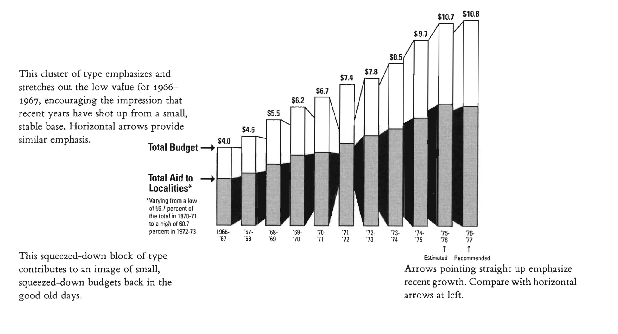
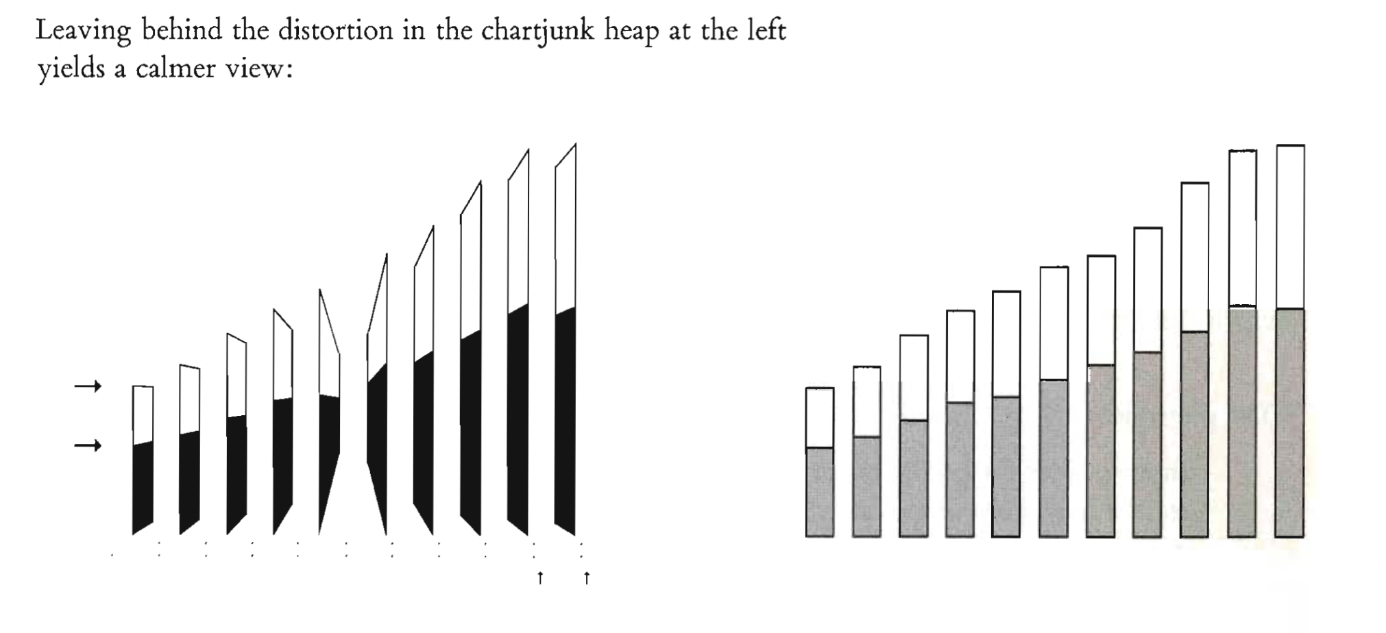
19
Optical illusions (Moiré-effect)
20
Gridlines
21
22
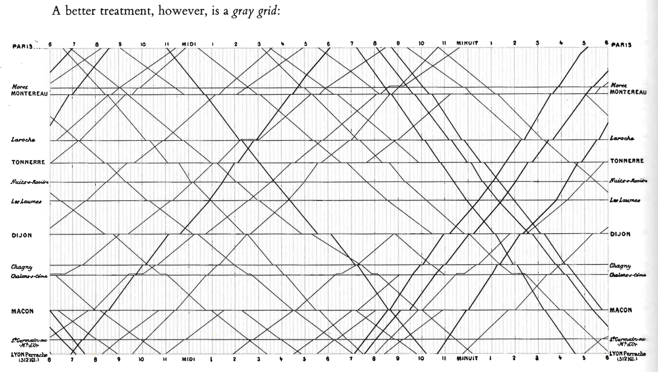
23
The duck – design above all else
Technology vs data
24
Consider this unsavory exhibit at right —chockablock with cliché and stereotype, coarse humor, and a content-empty third dimension. Is it the product of a visual sensitivity in which a thigh-graph with a fishnet-stocking grid counts as Creative Concept. [...] Lurking behind chartjunk is contempt for both information and for the audience. Chartjunk promoters imagine that numbers and details are boring, dull, and tedious, requiring ornament to enliven. Cosmetic decoration, which fre- quently distorts the data, will never salvage an underlying lack of content. If the numbers are boring, then you’ve got the wrong numbers. Credibility vanishes in clouds of chartjunk; who would trust a chart that looks like a video game? (Tufte 1990: 34).
25
26
27
28
29
30
31
32
33
34
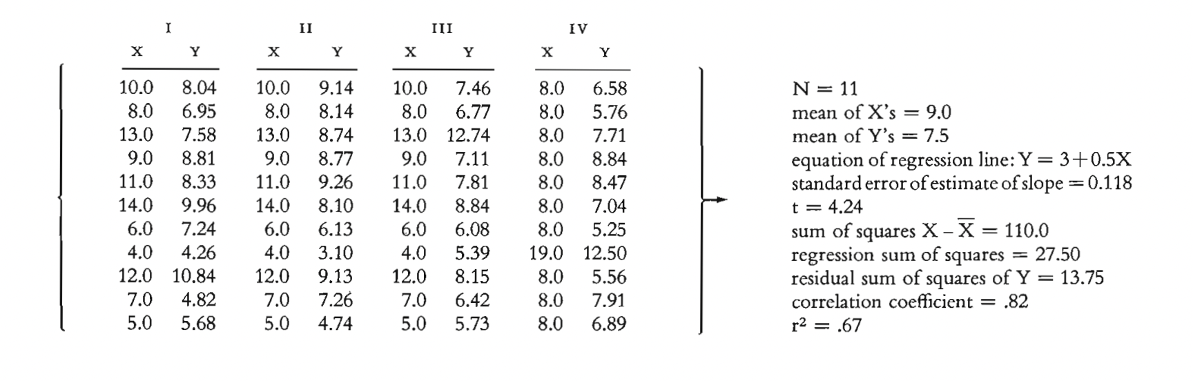
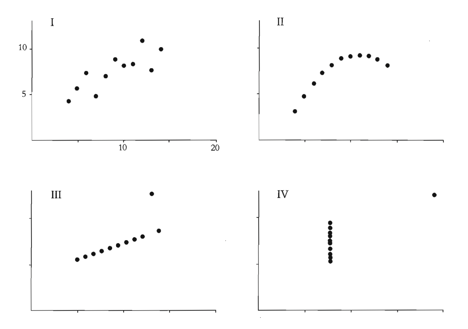
Anscombe's quartet (1973):
fallacies of statistical calculations
most people don’t comment about the relationship between the different series, which, at the end of the day, is what we want to understand. It turns out that each of the four pairs yield the same standard information: the same average values of the X series and the Y series; the same variance for each; the same correlation between X and Y; and the same estimated regression equation
(Schwabish)
35
36
37
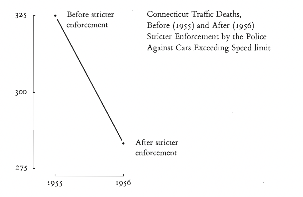
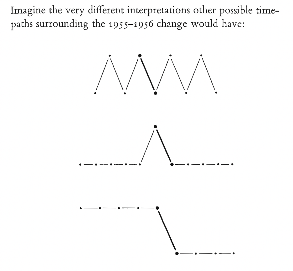
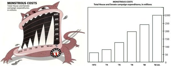
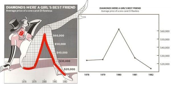
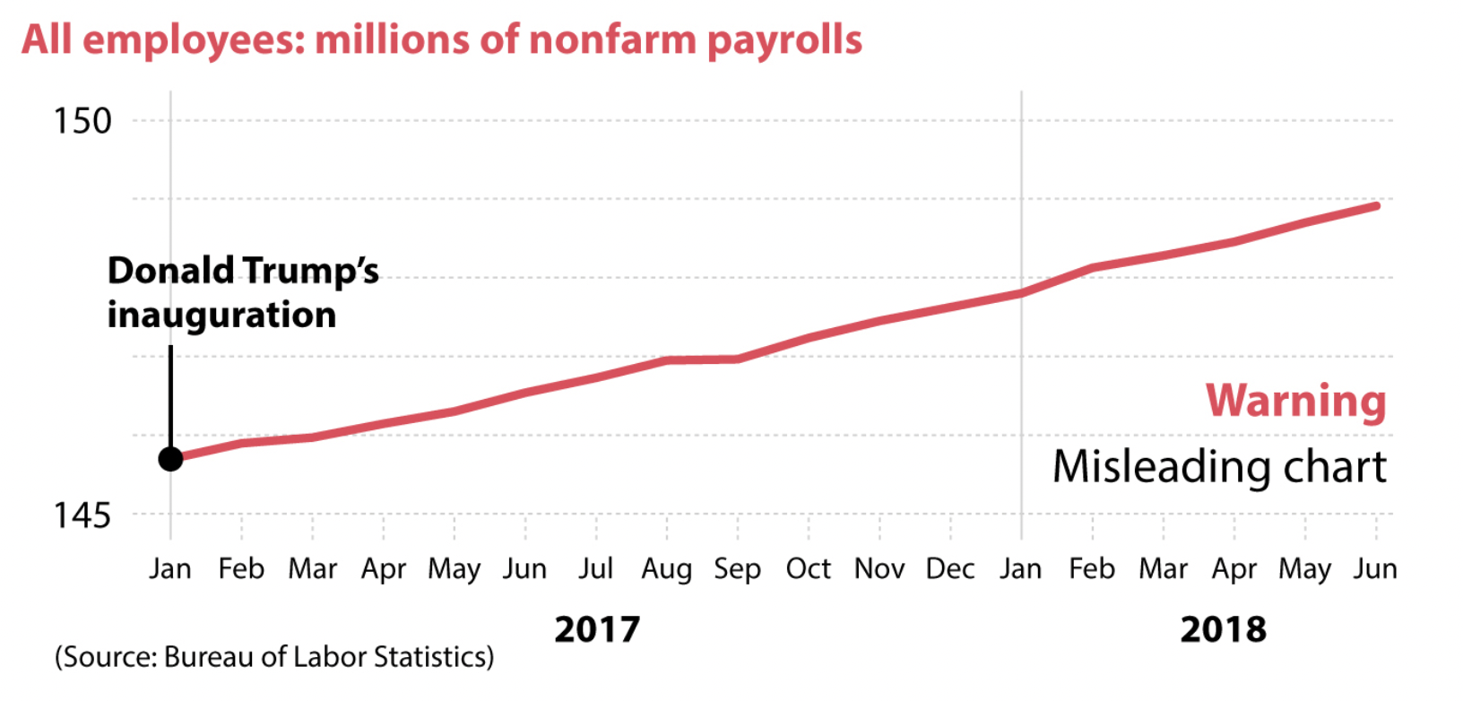
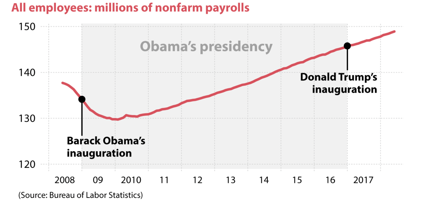
How charts lie?
Bad design


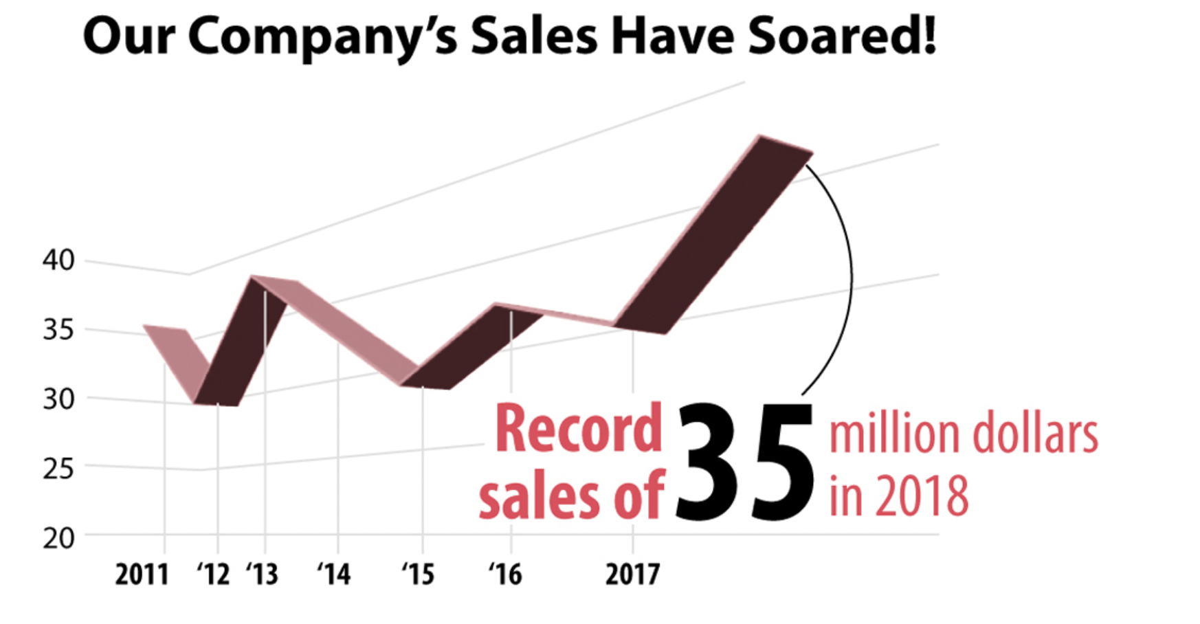
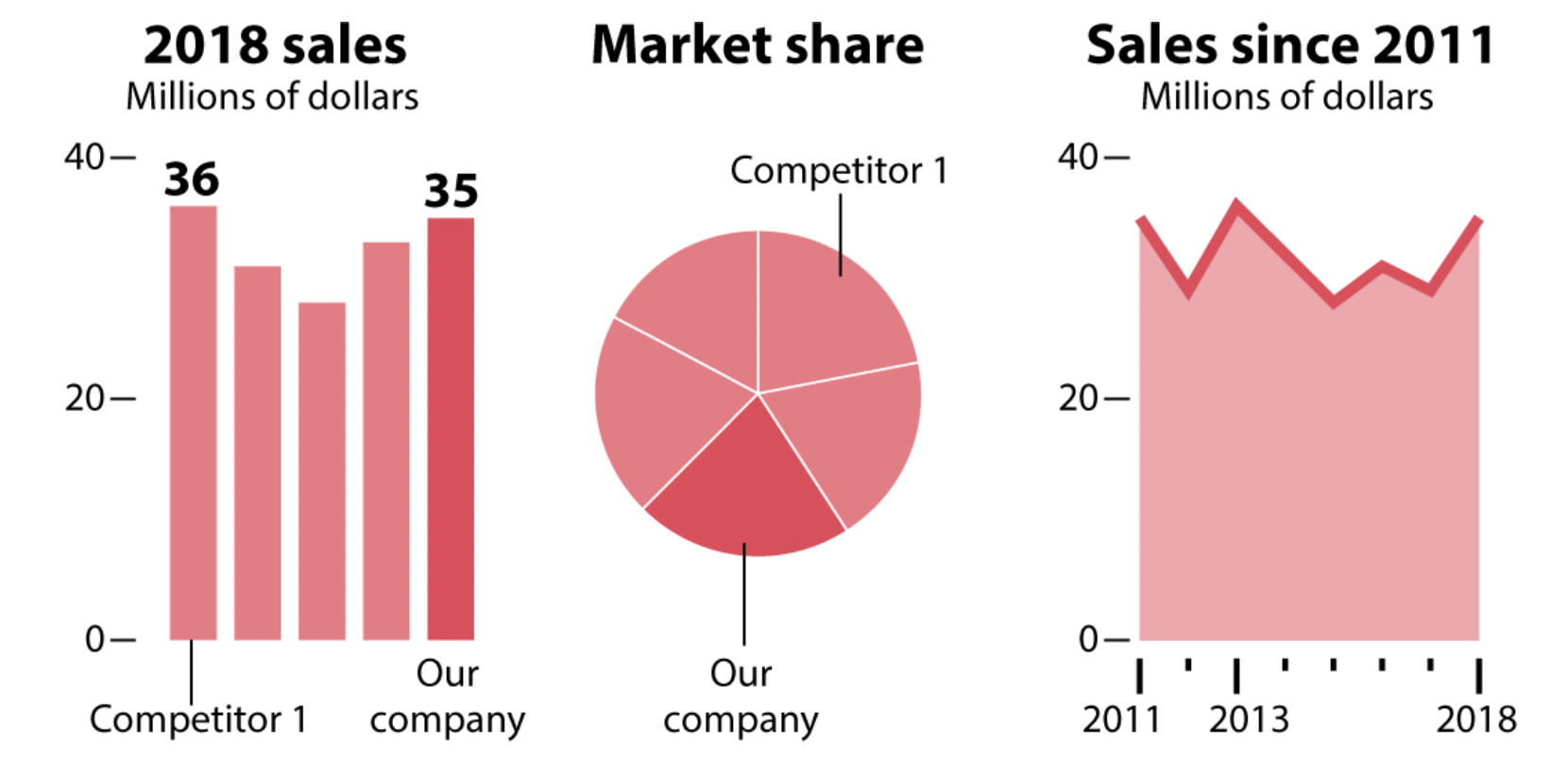
38
39
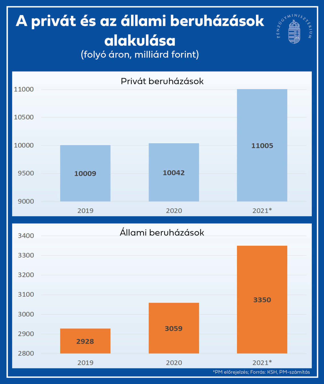
40
How charts lie?
Bad data
A chart may look pretty, intriguing, or surprising, but if it encodes faulty data, then it’s a chart that lies.
Distrust any publication that doesn’t clearly mention or link to the sources of the stories they publish.
41
How charts lie?
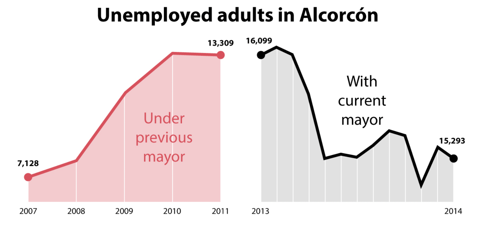
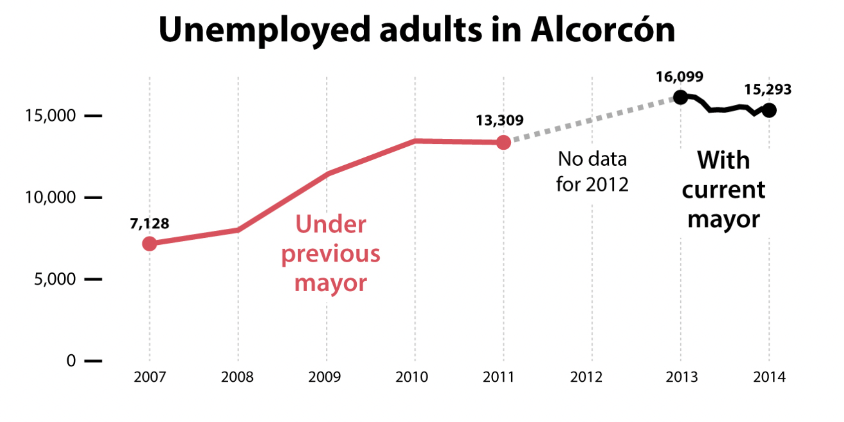
Too little or too much data shown

42
43
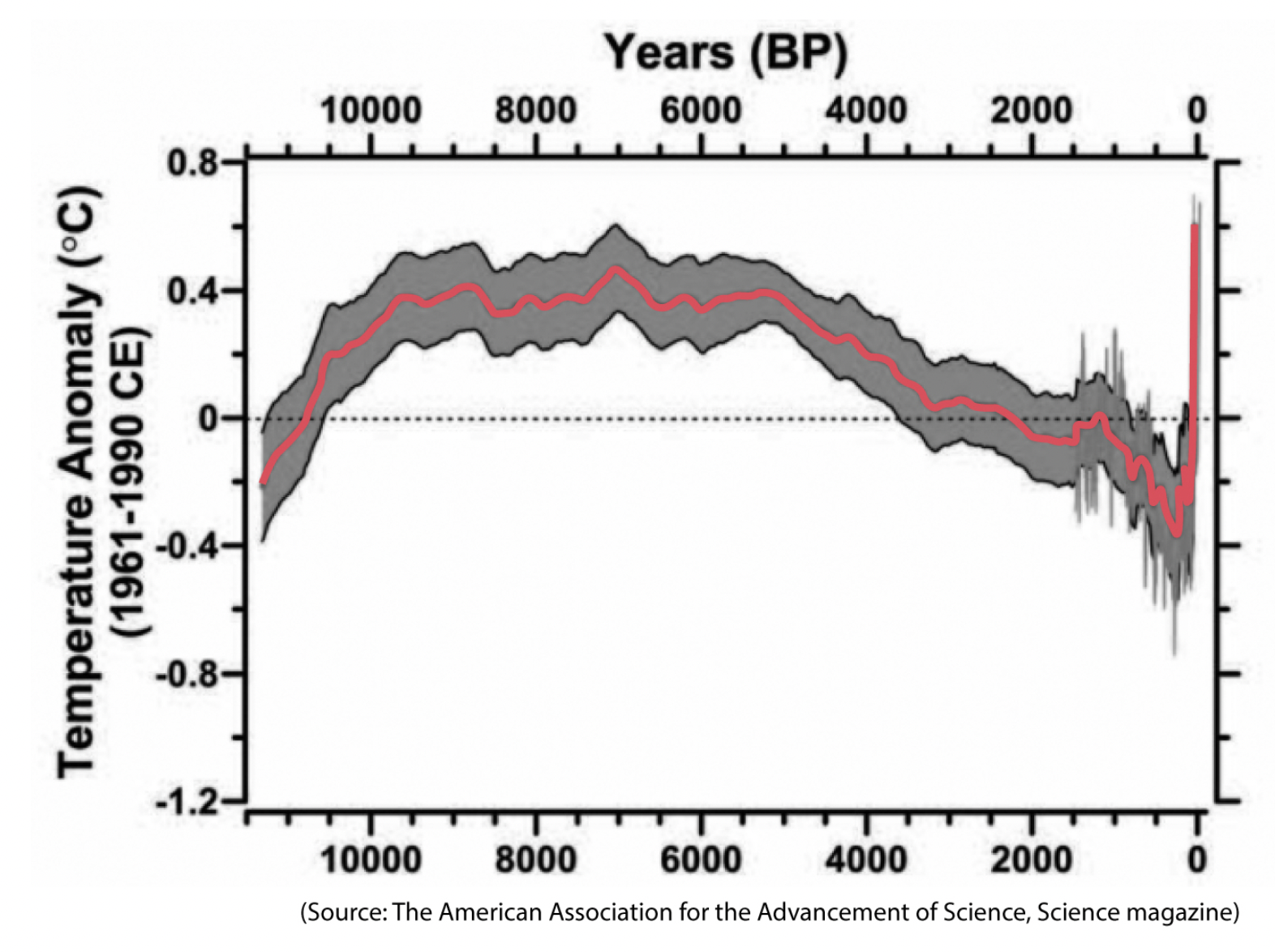
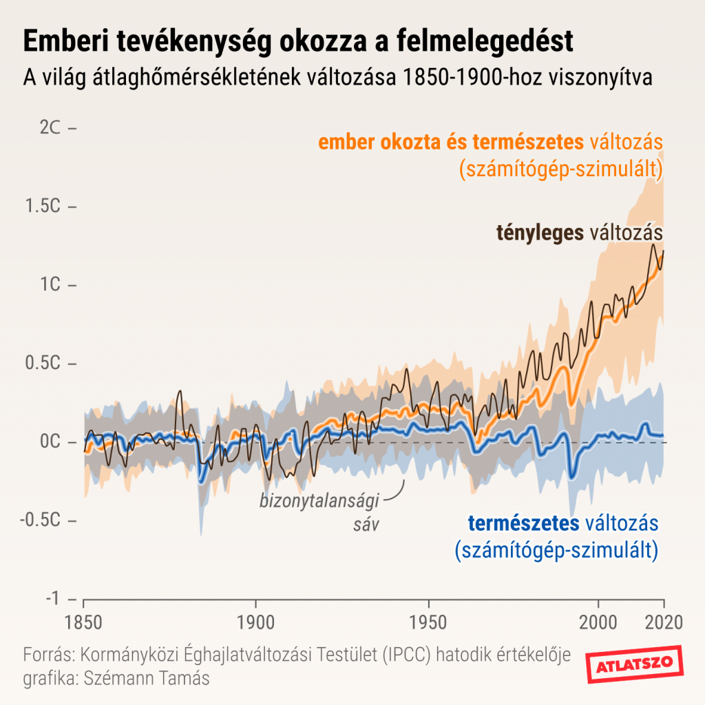
All models are fallible, incomplete, and uncertain, but when all of them tell a similar story, albeit with variations, your confidence in them ought to increase
How charts lie?
Visualising uncertainty
44
45
How charts lie?
Misleading patterns
46
47
48
49
50
51
52
54
55
14th October.: General and Investigative data journalism
Models and Streams of Data Journalism (Uskali és Kuutti): List all the differences between General (GDJ) and Ivestigative (IDJ) data journalism.
Deadline: 12th October, Wednesday 20:00. Subject of e-mail: BN-INFGRA-04-GY_14.10_[NEPTUN CODE]
Next lesson
56
Thank you for your attention!
szabo.krisztian96@gmail.com
METU4
By Szabó Krisztián


