


Tessa Kriesel
Agency & Community Engineer at Pantheon
Girl Develop It is here to provide affordable and accessible programs to learn software through mentorship and hands-on instruction.
#gdimplshtml201
@gdimpls
@tessak22
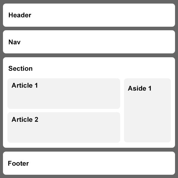
These elements can be used for the entire header and footer elements as well as article headers & footers.
Nav element is used to contain the major navigation such as main menu.
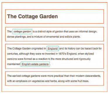
Section elements group related information together, like shown on the right.
You can have several sections when necessary.
Section of page that could stand alone and possibly be syndicated. Such as blog posts or even normal webpage content.
Used for two purposes - when within an article, it can contain more information for that article.
When inside of a page it is used for additional information about that page.
Although we learned about a lot of great layout elements, the div element still remains an important element!
Need help? Click here to download an example zip file.
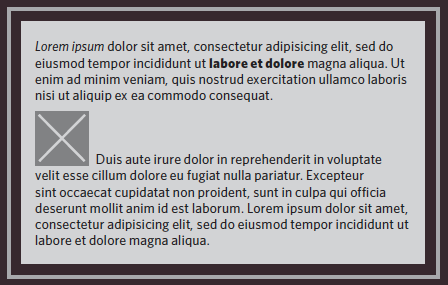
CSS allows you to create rules that specify how content of an element should appear.
Example: Top with CSS, bottom without CSS.
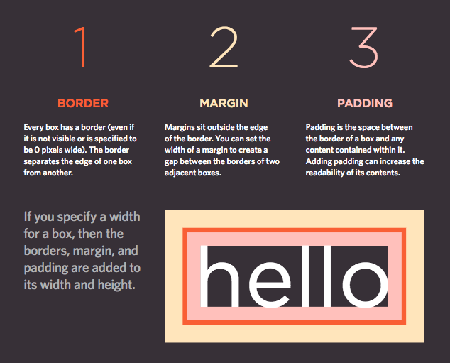
Imagine there is an invisible box around every HTML element.
CSS will allow us to make these elements appear the way we want them to.
PS: There are TONS more.
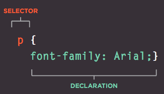
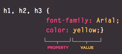
Anyone have any idea what this rule will do?
Selector element the rule applies to
Declarations how the selector should be styled
Declarations are broke into two parts separated by a colon.
Contain two parts; property & value.
You can include multiple properties in one declaration, separated by semi-colon.
Property aspects of the elements you want changed
Value specify the settings for that property
Include a separate name.css file.
Include <style> tags in the head of your website.
<link rel="stylesheet" type="text/css"
   href="css/style.css">
<style>
body {
font-family: Arial;
}
</style><p style="color: pink;">Hello. I am a paragraph.</p>pg 238 in book
Last Rule if two selectors are identical, the latter of the two will take precedence.
Specificity if one more specific than the others, that one will take precedence.
!important will be considered the most important
It most common to see generic rules up top and more specific rules as the stylesheet continues on.
It's important to know that not all browsers are created equal.
CanIUse.com is a great way to check browser compatibility.
Browsers assign automatic styles to webpages, sometimes thats great, but most of the time its not.
I am going to show you what a site looks like before and after a reset is established.
Download this zip and follow along with me.
body {background-color: purple;}The background of your website should be purple if you followed the steps correctly.
Need the completed exercise files? Download here.
RGB Values express colors based on how much red, green & blue are used to make it.
Hex Codes are 6 digit codes that represent the amount of red, green and blue in a color.
Color Names are 147 predefined color names that are recognized by browsers.
color allows you to assign a font color to your typography.
body {
    font-family: Arial, Verdana, sans-serif;
    color: blue;
}background-color allows you to assign a background color.
body {
    font-family: Arial, Verdana, sans-serif;
    background-color: blue;
    color: white;
}We can add an additional value to the RGB property to apply opacity!
RGBA still utilizes the red, green, blue values and then adds a for alpha and can be applied in decimal values, .5 being 50% opacity.
Be sure to check CanIUse.com to check compatibility!
Need the completed exercise files? Download here.
Now that we learned about fonts, let's use them!
font-family is the property used to apply a font in CSS. Be sure to apply backup fonts!
body {
    font-family: Arial, Verdana, sans-serif;
}font-size property allows you to set the font size.
body {
font-family: Arial, Verdana, sans-serif;
font-size: 16px;
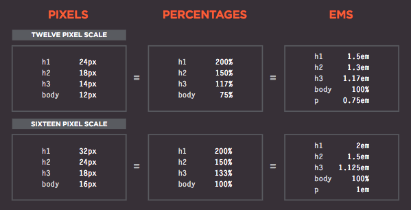
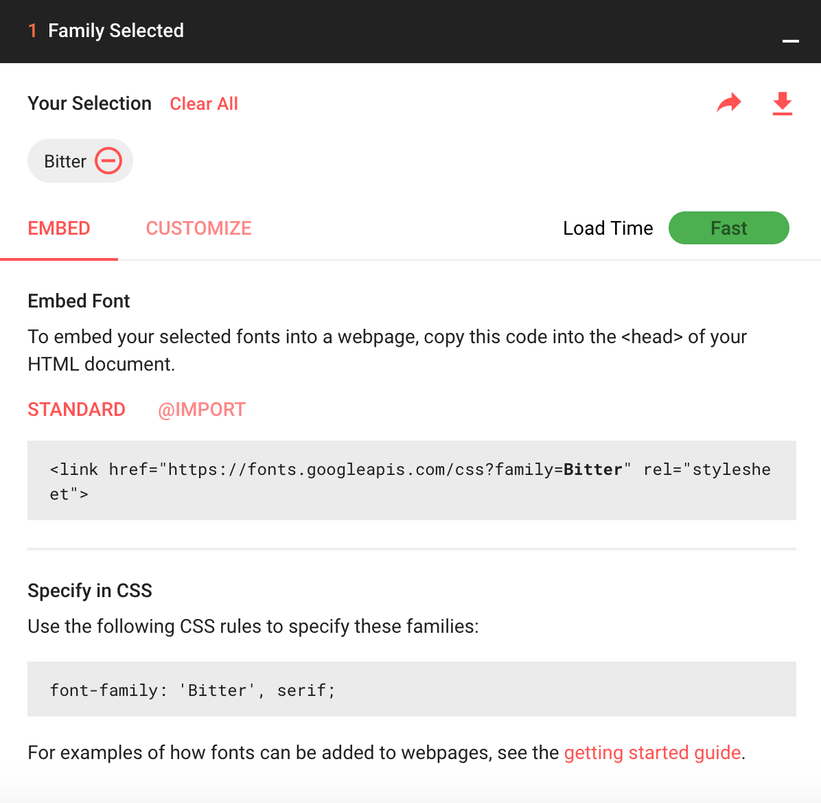
}My preferred font choice is Google fonts!
You can also use Typekit, Fonts.com and many more!
You can create custom font faces for your website with existing fonts!
See this in action in the completed exercise files.
font-weight is the property used to apply a weight to your typography.
body {
    font-family: Arial, Verdana, sans-serif;
    font-weight: bold;
}Possible Values:
normal, bold, bolder or lighter
100,200,300,400,500,700,800,900*
*400 = normal, 700 = bold
text-transform is the property used to apply a lowercase or uppercase value to your typography.
body {
    font-family: Arial, Verdana, sans-serif;
    text-transform: uppercase;
}Possible Values:
capitalize, uppercase, lowercase
text-decoration is the property used to apply an underline or strikethrough.
body {
    font-family: Arial, Verdana, sans-serif;
    text-decoration: underline;
}Possible Values:
underline, overline, line-through, none
line-height is the property that allows you to apply leading to your typography. Leading is the vertical space between lines.
body {
    font-family: Arial, Verdana, sans-serif;
    line-height: 16px;
}Possible Values:
normal, number (multiplier), length (px), %
letter-spacing is the property that allows you to apply spacing between letters, also known as Kerning.
word-spacing is the property that allows your to apply spacing between words (instead of letters).
body {
    font-family: Arial, Verdana, sans-serif;
    letter-spacing: 2px;
    word-spacing: 1em;
}Possible Values:
normal, length (px)
text-align allows you to apply a left, center, right or justified value to your text.
body {
    font-family: Arial, Verdana, sans-serif;
    text-align: center;
}Possible Values:
left, right, center, justify
text-indent allows you to apply an indentation to your typography.
body {
    font-family: Arial, Verdana, sans-serif;
    text-indent: 20px;
}Possible Values:
length (px, em), %
text-shadow allows you to apply a shadow to your typography.
body {
    font-family: Arial, Verdana, sans-serif;
    text-shadow: 1px 1px 0 #000000;
}Values (In order)
left to right distance | top to bottom distance | blue | color
a you can set link styles with a or a:link
:link set styles for links that haven't been visited
:visited set styles for links that been clicked on
a:link, a {
    color: red;
}

a:visited {
    color: blue;
}:hover sets style when a user hovers over element
:active sets style while an action is being completed
:focus sets style when your browser recognizes you are ready to interact. For example: clicking in form fields.
a:hover {color: purple;}
a:active {color: green;}
input:focus {background: #000; color: #fff;}Include new fonts in index.html
Apply fonts, sizes & styles through out index.html
Style your navigation in index.html, including psuedo styles.
Apply text styles like capitalization, underlines, leading, kerning & space.
Align and indent various areas of text.
Add some fun text shadows!
Need help? Download the completed exercise files here.
width lets you manually assign a width to an element.
height lets you manually assign a height to an element.
Possible Values:
auto (browser calculates), length (px, etc.), %
<div>
<p>The Moog company pioneered the commercial
manufacture of modular voltage-controlled
analog synthesizer systems in the early 1950s.</p>
</div>
div {
height: 300px;
width: 300px;
background-color: #4cdef5;
}
p {
height: 75%;
width: 75%;
background-color: #ff5992;
color: #ffffff;
}min-width sets a minimum size width
max-width sets a maximum size width
min-height sets a minimum size height
max-height sets a maximum size height
I use these a lot when I have big images that need to be brought down to a smaller size. Or don't want something to take up too much space.
Possible Values:
auto (browser calculates), length (px, etc.), %
border allows you to add a border around your elements.
border-width thin, medium, thick | px
border-style solid, dotted, dashed, double, ridge, inset, outset
border-color any color you can use we previously learned!
div {
    border: 1px solid black;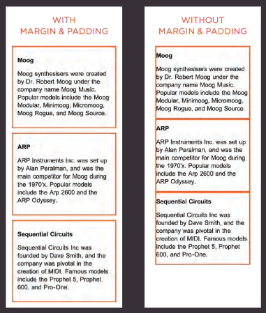
}padding allows you to add space around content, but inside of the border.
padding-direction applies padding to just that side; left, right, top or bottom.
div {
    /*padding: top right bottom left;*/
    padding: 10px 20px 10px 20px;
    /*this is also the same thing padding: top&bottom left&right;*/
    padding: 10px 20px;
    /*this is also the same but the longhand technique*/
    padding-left: 20px;
    padding-right: 20px;
    padding-top: 10px;
    padding-bottom: 10px;
}margin allows you to add space around content, but outside of the border.
margin-direction applies padding to just that side; left, right, top or bottom.
div {
    /*margin: top right bottom left;*/
    margin: 10px 20px 10px 20px;
    /*this is also the same thing margin: top&bottom left&right;*/
    margin: 10px 20px;
    /*this is also the same but the longhand technique*/
    margin-left: 20px;
    margin-right: 20px;
    margin-top: 10px;
    margin-bottom: 10px;
}
This applies an "auto" setting to the left and right margin, centering the element. However, the element needs a set width for this trick to work!
display allows you to manually set whether an element is inline or block. You can also use this property to hide an element.
Possible Values:
inline make inline-level element act like a block element
block make block-level element act like an inline element
inline-block causes a block element to flow like an inline element while still allowing block-like CSS declarations.
none remove the element from the document - html will appear through dev tools
visibility allows you to hide and show various elements but they still continue to hold their space, unlike display: none.
Possible Values:
hidden hides the element
visible shows the element
box-shadow allows you to add a shadow around an element.
Values (In order)
horz offset | vertical offset | blur | spread of shadow | color
You can also add inset to the beginning to create an inner shadow.
div {
    box-shadow: 5px 5px 5px 5px #777777;
}border-radius allows you to add rounded corners to an element.
Similar to padding, you can alter all 4 sizes; top, right, bottom, left.
div {
    box-shadow: 5px 5px 5px 5px #777777;
    border-radius: 10px;
}Open index.html in Exercise Site
Create two divs (boxes), apply margin, padding, borders and background colors to visually see the difference between each property.
Apply width and height to your div's
Try centering an element on the page
Use display to create an UL for navigation with the links displayed horizontally.
Use the visibility property to hide one of your nav items
Add a box shadow and rounded corners!
Need help? Download the completed exercise files here.
When you move any element from normal flow, boxes can overlap. The z-index property allows you to control which box appears on top.
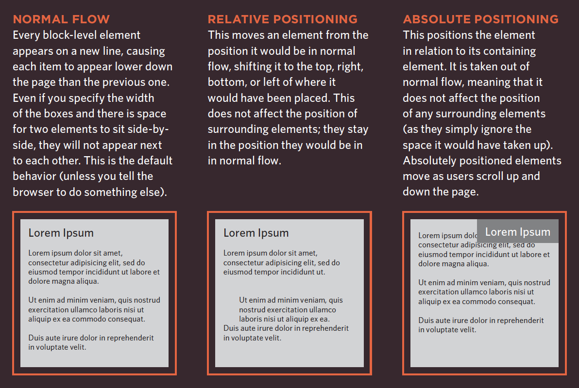
position: static indicates that elements should appear in normal flow. You may use this declaration if you are trying to override a previously mentioned declaration.
By default, the browser will assume all elements are static, unless otherwise specified.
position: relative moves an element in relation to where it
would have been in normal flow.
For example, you can move it 10 pixels lower than it would have
been in normal flow and 30 pixels from the left.
div {
    position: relative;
    top: 10px;
    left: 30px;
}position: absolute means the box is taken out of normal flow and no longer affects the position of other elements on the page. (They act like it is not there.)
The box offset properties (top or bottom and left or right)
specify where the element should appear in relation to its
containing element.
div {
    position: absolute;
    top: 10px;
    left: 30px;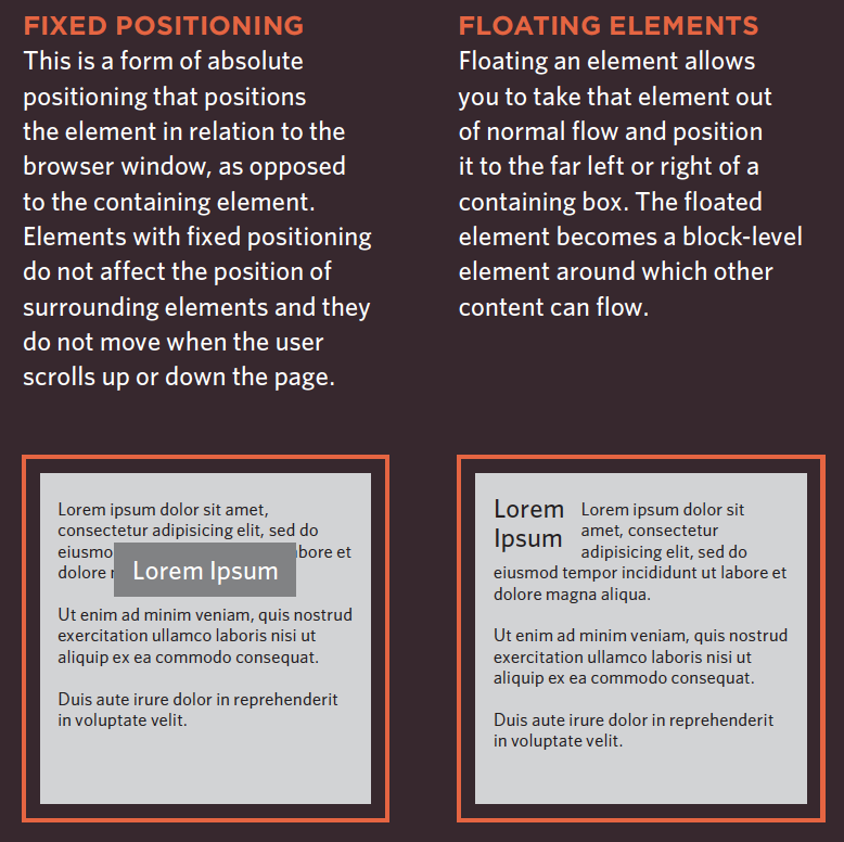
}position: fixed is a type of absolute positioning that requires the position property to have a value of fixed.
It positions the element in relation to the browser window.
Therefore, when a user scrolls down the page, it stays in the
exact same place.
div {
    position: fixed;
    bottom: 0px;
    right: 0px;
}z-index allows you to control which element sits on top, you can use the z-index property. It's value is a number, and the higher the number the closer that element is to the front.
For example, an element with a z-index of 10 will appear over the top of one with a z-index of 5.
This is best explained in the codepen below!
float allows you to take an element in normal flow and place it as far to the left or right of the containing
element as possible. OR place elements next to each other.
When you use the float property, you should also use the
width property to indicate how wide the floated element should
be.
clear property allows you to say that no element (within
the same containing element) should touch the left or righthand
sides of a box.
left side of the box should not touch any other elements appearing in the same containing element
right side of the box will not touch elements appearing in the same containing element
both of the sides of the box can not touch elements appearing in the same containing element.
none means elements can touch on either side
Open index.html in Exercise Site
Use positioning to add 4 boxes to your site - one with each different position value. Use z-index to move one on top of another.
Use floats to create a 3-4 column layout, similar to a newspaper. Be sure to have a header and a logo and utilize clear to ensure elements do not overlap.
Practice these skills as much as you can in the time allowed, floats are so hard!
Need help? Download the completed exercise files here.
We are going to break up into 3 groups.
In these groups you will collaborate about the project together, but build your websites individually.
Use the concepts you have learned to discuss the project and ideas with your client.
Each team member should help the client overall with new ideas and suggestions.
You should write the code for your specific website mostly by yourself.
Please seek advice from your team or the TA's if you need help with code or how to do something.
If you have project questions - reach out to your client.
Remember, use the TA's - they are here to help! Also, feel free to utilize the instructor during this time too!
You will have until 3:30pm to complete your project.
You will present your final project to your client for feedback.
*Depending on time, feedback may be delivered later on, via email.
Also be sure to register for
By Tessa Kriesel
Learn how to write CSS and style your website!


