Infatuation DS Audit,
Migration off MaterialUI
Design System Deep Dive
Olex Ponomarenko
Presented 2025-03-10
Project Scope - How it started
Eng Manager: "We are partway through a migration from MUI to Chakra, what's the status? Can we gain some velocity by closing it out?"
Introductory conversations with designers:
- Kevin (Lead designer): "Mobile and Web design are using separate components in Figma, but we are currently working on converging"
- Other folks: "We often find mismatches between Figma intent and web" incl. "things drift after getting shipped"
Context
- 4-5 Vertical squads
- 1 "platform squad" with devopsy eng, myself, and a mobile contractor
- This specific DS effort was ~ 1/2 of my time
- Kevin (design lead) was responsible / accountable to the design work, and had a lot of ongoing product work as well
- JPMC was doing a large-scale Accessibility audit of The Infatuation, with vague timelines
- Effort kicks off as Design System V1 with myself and Kevin as owners. Started a weekly project check-in that continues to this day as Design Systems Monthly
Issues before the DS Audit
- Code had many different "H4", plus bad use of html tags (a11y)
- Figma had doubles of H2, H3, H4 styles
Staged Plan:
- Introduce DS process, establish DS goals
(Launch DS v1 by EoY) - Disallow new MUI imports
- Grids launch (mobile + web), new Tokens available
- fully removed divergent typography & colors, CI step
- JPMC Accessibility Audit – issues on small screens ID'd
- iOS + Android DSv1 launch
- Responsive Mobile Pass
- Fully Removed MaterialUI
- Buttons, DX, Venue rework
Approx Dates:
- September 2022
- Late September
- Late October
- November
- Late November
- Dec ~10
- Dec ~15
- Jan ~2, 2023 (after C/F)
- Q1
Colors sub-project:
A royal (blue) mess
secondary: {
  pink: '#FD6FCE',
  pink700: '#ff8eda',
  orange: '#FC9B21',
  yellow: '#FFE34C',
  yellow700: '#ffec87',
  green: '#2DC791',
  green700: '#7ddbba',
  lightBlue: '#87D7FF',
  blue: '#87D7FF',
  blue100: '#0E54BC',
  blue500: '#4DA1F7',
  transparent: 'transparent',
},
neutral: {
  almostBlack: '#181818',
  grey200: '#B8B8B8',
  dark: '#181818',
  white: '#FFFFFF',
  100: '#EBECF0',
  200: '#999999',
  300: '#757575',
},
~20 variables omitted (DSv1)
$blue100: #0e54bc;
$blue300: #136aed;
$blue500: $blue40;
$blue700: #87d7ff;
$neutral-blue100: $coolgray100;
$neutral-blue300: #344563;
$neutral-blue400: #42526e;
$neutral-blue500: $coolgray60;
$neutral-blue600: #5e6c84;
$neutral-blue700: #6b778c;
$neutral-blue900: #8993a4;
$neutral-blue1000: $coolgray40;
$neutral-blue1100: #a5adba;
$neutral-blue1200: #b3bac5;
$neutral-blue1300: #c1c7d0;
$neutral-blue1400: $coolgray20;
$neutral-blue1500: #ebecf0;
$neutral-blue1600: #f4f5f7;
$neutral-blue1700: $coolgray10;
$neutral-grey300: #757575;
"New" Chakra code:
neutralBlue: {
  100: '#091E42',
  200: '#8993A4',
  300: '#B3BAC5',
  400: '#091E42',
  700: '#6B778C',
  1000: '#97A0AF',
  1700: '#FAFBFC',
},
semantic: {
  error: '#BF2600',
  success: '#006644',
  information: '#0747A6',
},
Custom CSS:
+ MUI color scheme...
+ one-offs
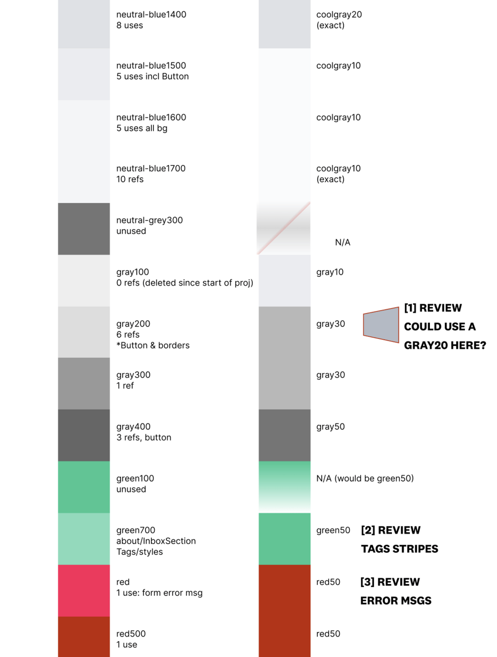
Cleaning up all the colors
- Worked with design to decide on color token naming, sent around relevant literature
- We went with my suggested format hue-NN, where NN ~= (100 - Lightness), rounded to the nearest 10
- Even if having 2x neutral hues doesn't make a lot of sense, at least now they have consistent naming
- Assisted with WCAG / a11y documentation – which of our header styles were OK with what colors, required AA contrast, AAA, etc
Cleaning up all the colors
ack --ignore-file="ext:snap" --ignore-file="ext:svg" --match "(#[0-9a-f]{6}|(?:rgba?|hsla?)\((?:\d+%?(?:deg|rad|grad|turn)?(?:,|\s)+){2,3}[\s\/]*[\d\.]+%?\))" --output="$&" --no-filename | sort | uniq- Using aggressive code-searching, assessed the problem – both number of "yolo" colors and variable usage
- Did the same for native mobile application
- Got buy-in from design using Figma visual aid
- Manually mapped & checked probable importance of ref's
"What are all the hex, rgba, hsla colors mentioned in this web, app?
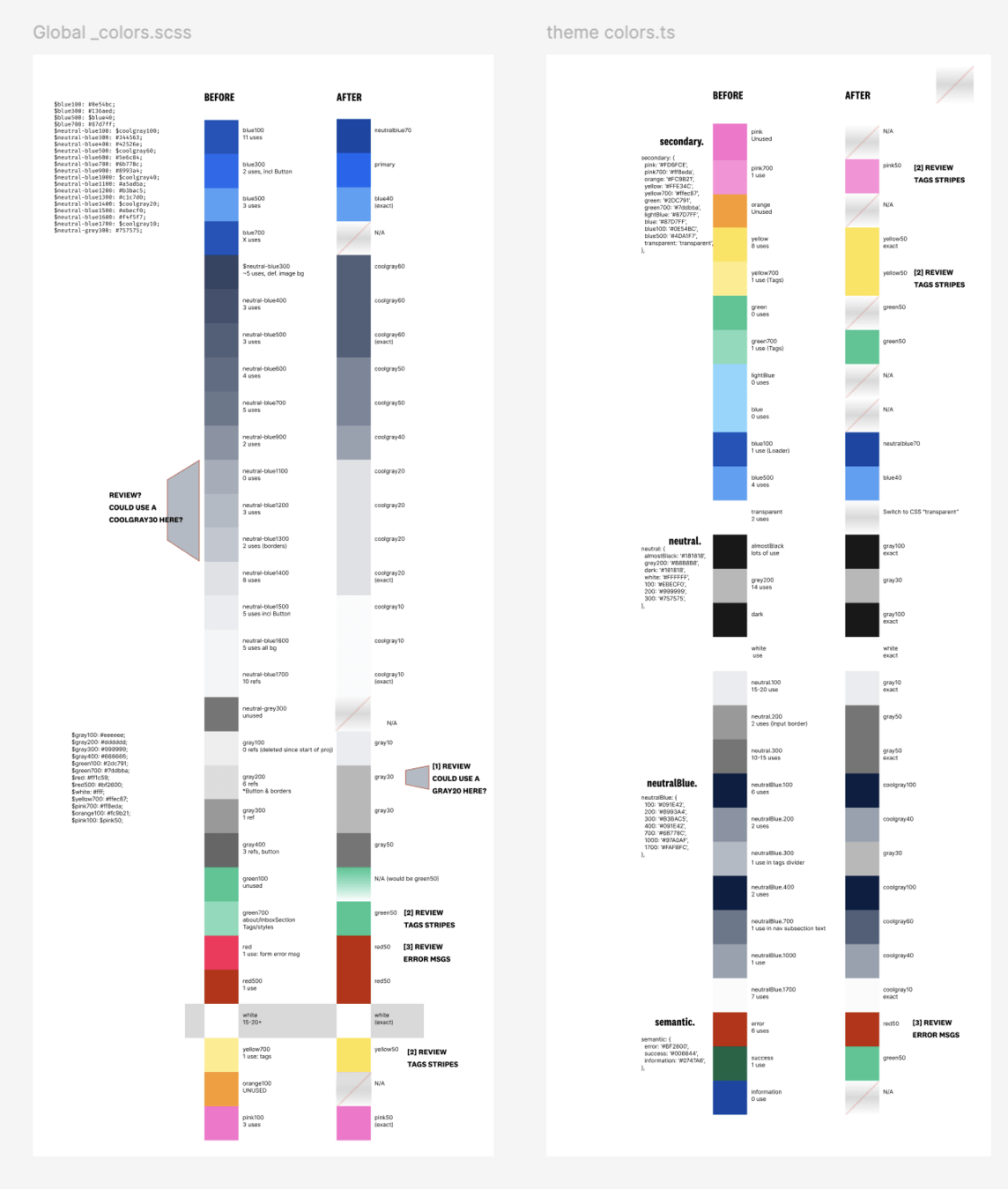
BEFORE
AFTER
Impact on Codebase
- PR 1: New color variables added
- Figma: Figma update, all other Figma colors removed, communication + documentation
- PR 2, 3: Audit work, clamped all colors to DSv1
-
PR 4: To prevent new colors from "spawning", code-search result is saved as snapshot count of unique colors
- Lightweight warning to acknowledge new colors, shadow values, etc, to be checked in code review
-
Colors since then:
- Some later iteration removed coolgray hues
- Current DS is at just 16 core colors, and ~25 extra one-off color instances in code (mostly svgs, gradients, shadows, etc)
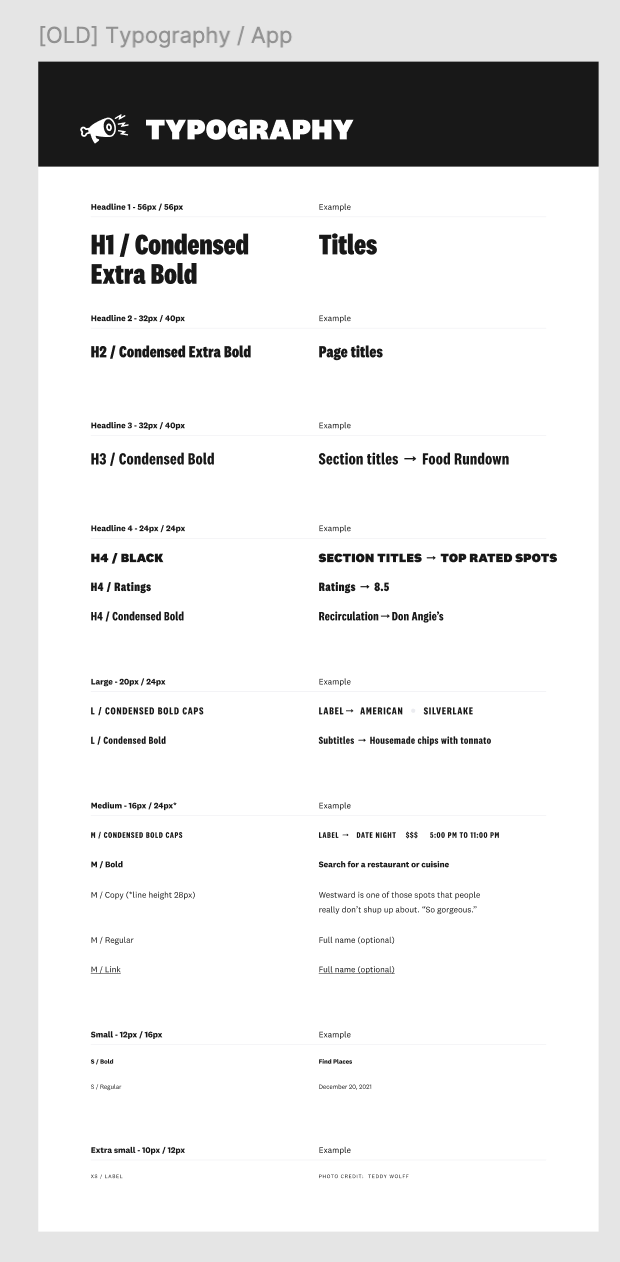
Typography - Before DSv1
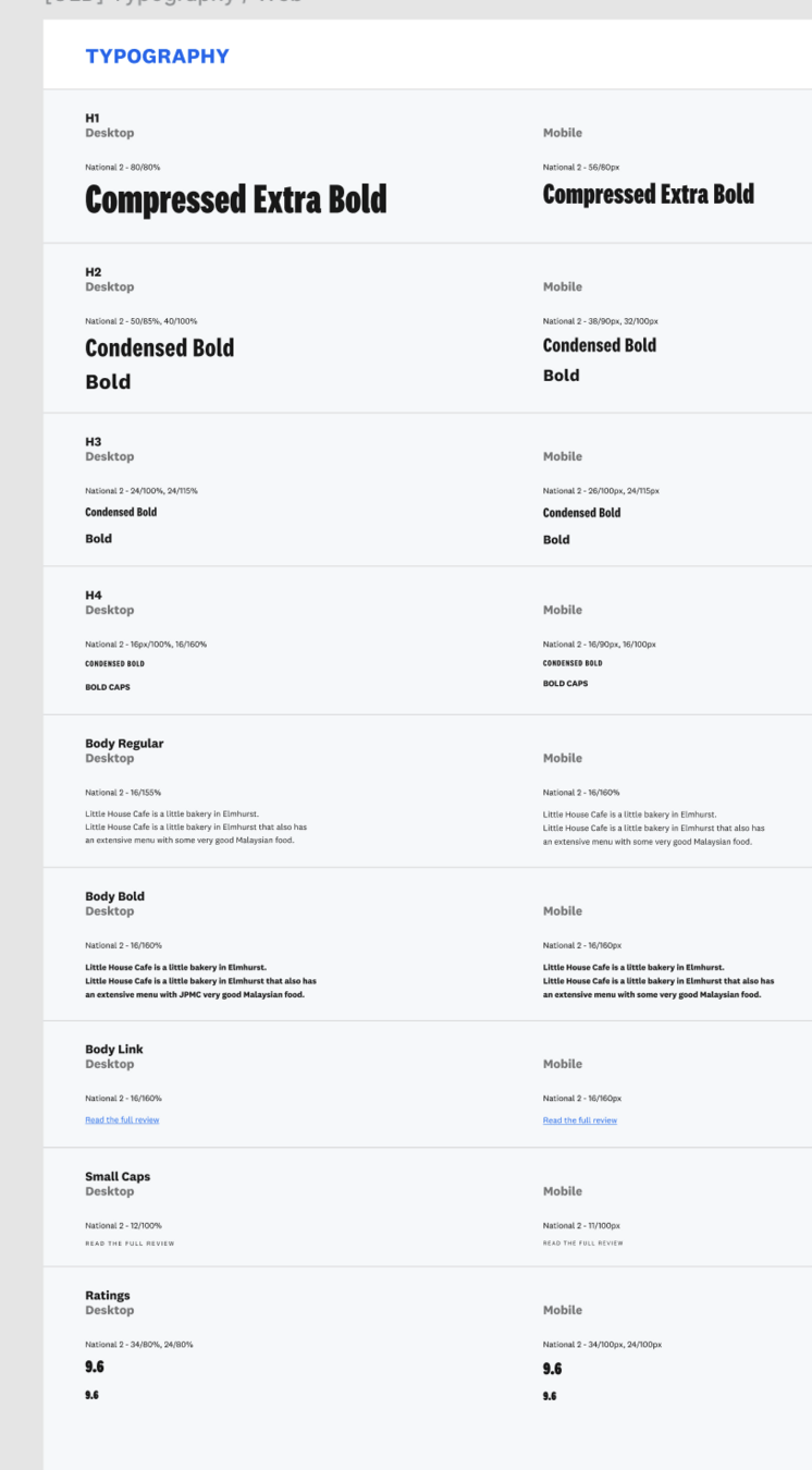
30+ styles defined in Figma, many more in code
Typography Changes
Similar process to colors:
- Audited existing font style* combinations, pushed for removing fonts for performance reasons
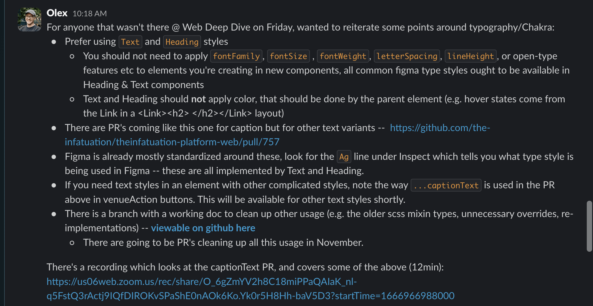
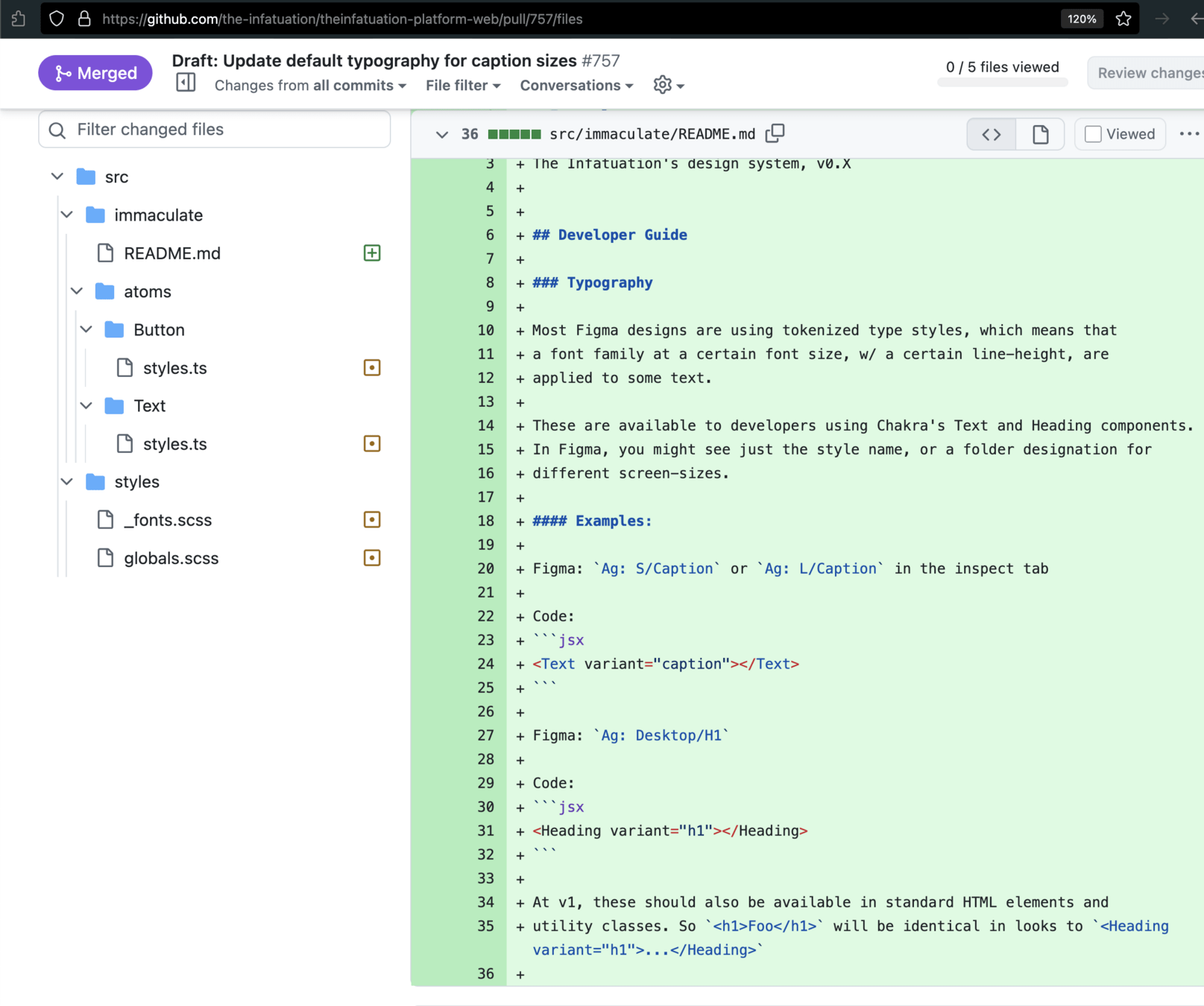
- PR 1: Added DSv1 stripped down 7-style toolkit + Documentation of how to apply styles (e.g. How to make an H2 semantic header w/ H3 styling, etc)
- Figma: Modified some of the designs for responsiveness, fixing issues on small screens and tablet sizes
- PR 2..N: Cleaned up all non-conforming styles (100+ files)
- Last PR: Removed 2 whole fonts (55kb+ page weight)
* - specific combos of (font X weight X letter-spacing X etc)
a11y / Responsive type audit
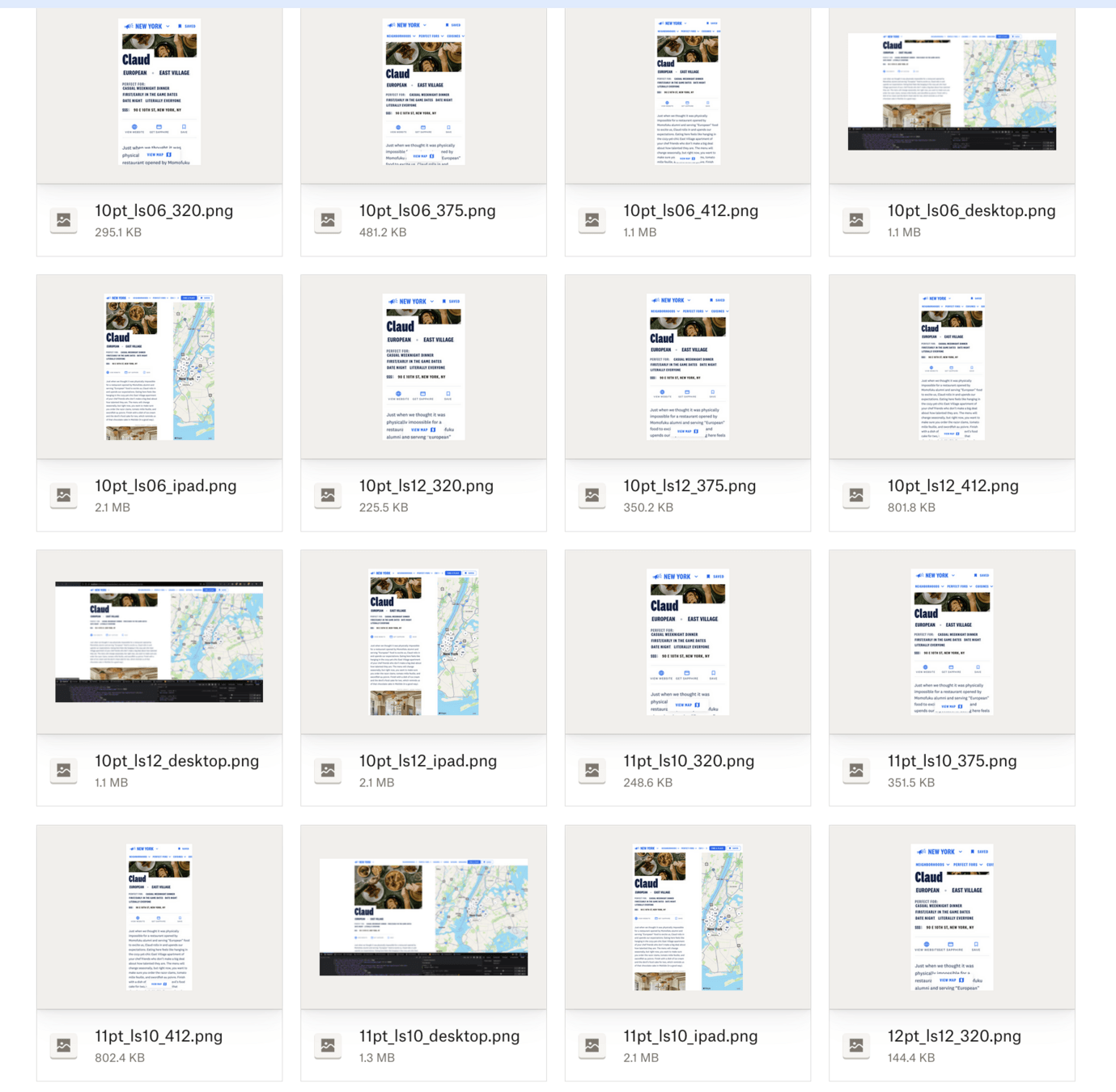
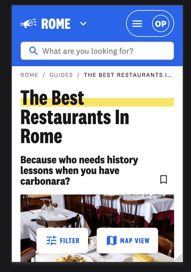
One of two galleries to drive size + letter-spacing conversations; this one for smallest "caption" size. Used core component to show responsive issues; and present potential solutions:
Rollout to Engineering
- Slack communications
- Synchronous meeting with in-depth walkthrough of design-engineering rationale, video recorded
- Documentation with first PRs that introduce variants
Overall DSv1 Project Results
- About 4 months from idea start to completion, occurring in parallel with other platform work
- Application size: -60KB JavaScript gzipped size, -55KB Fonts, -18KB CSS size (~10-15% savings)
- Accessibility & bugs: Lots of consistency improvements outside of original scope of "DSv1"
- DX: Went from ~2.5 avg "importables" to ~1 for core components like Buttons, Image, Grid, etc
- Designers loved the changes too, easier handoff, fewer styles in Figma and better organized
After the DS Project
- A11Y improved for 320px screens & 1600+
- Culture of detail-oriented followups in PR
- Successful annual audits from JPMC A11Y
- Huge gains in app & web consistency
After the DS Project
- Gained trust & confidence with eng / design / product leadership: used this to introduce annual DX retro, and later Storybook, selective screenshot testing, and
- Mentored a Sr Engineer throughout my tenure at Infatuation, who shadowed & took over the recurring Design Systems process in Q2 2024
Thanks, that's all!
olex.pono@gmail.com
deck
By Olex Ponomarenko


