HTML & CSS
Presenter: 崔家華
Date: 2017-12/7, 14, 21
Link: https://goo.gl/SKpoNj
What are "HTML" and "CSS"?
● The skeleton and core of webpages.
● Basically, just a markup and a design language,
they are not really program languages.
● Epic easy


HTML - Start

● Hyper Text Markup Language
● HTML Contains a series of elements,
and elements are composed of tag and
content .

● For example:
HTML - Intro(1)
<!DOCTYPE html>
<html lang="en">
<head>
  <!-- Text encoding -->
  <meta charset="UTF-8">
  <!-- The title of a website -->
  <title>My First Website</title>
</head>
<body>
  <!-- Content to be show -->
</body>
</html>
● Declaration of HTML document type: <!DOCTYPE html>,
● The HTML document itself begins with <html> tag and
the declaration are required for legacy reasons .
ends with </html> tag.
HTML - Intro(2)
<!DOCTYPE html>
<html lang="en">
<head>
<meta charset="UTF-8">
<!-- The title of a website -->
<title>My First Website</title>
</head>
<body>
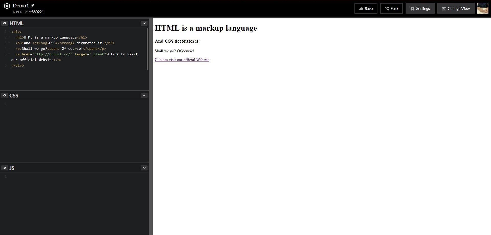
<div>
<h1>HTML is a markup language</h1>
<h3>And <strong>CSS</strong> decorates it!</h3>
<p>Shall we go?<span> Of course!</span></p>
<a href="http://nchuit.cc/" target="_blank">Click to visit our official Website</a>
</div>
</body>
</html>● The <head> element defines some settings(or properties) of
● The <body> element consists of content in the webpage.
the html file, like "text encoding", "viewport", "title", etc.
● Again, these elements would be work rightly only if matching
the "open" and "close" tag.
HTML - Quick Demo
HTML - Intro(3)
<!DOCTYPE html>
<html lang="en">
<head>
    <meta charset="UTF-8">
    <title>Pusheen</title>
</head>
<body>
    <input type="text">   <!-- recommend this -->
    <input type="text" /> <!-- both are accepted -->
    <img src="https://goo.gl/lr477z" alt="image not found">
    <br>
    <hr>
</body>
</html>
● However, some elements are void elements
● These elements only need "start" tag.
(aka self-closing tag). Such as <input>, <img>,
<br>, <hr> and so on.
HTML - Basic(1)
Headers
<h1>PPAP</h1>
<h2>PPAP</h2>
<h3>PPAP</h3>
<h4>PPAP</h4>
<h5>PPAP</h5>
<h6>PPAP</h6>
<p>I have a pen</p>
<p>I have an apple</p>
<p>Unh, apple-pen</p>Paragraph
<p><span style="color: red">Pine</span>apple</p>
Span
Pineapple
PPAP
PPAP
PPAP
PPAP
PPAP
PPAP
I have a pen
I have an apple
Unh, apple-pen
CSS
HTML - Basic(2)
Anchor
<a href="https://www.google.com">Let's google</a>
<a href="https://www.google.com" target="_self">Let's google(Same window)</a>
<a href="https://www.google.com" target="_blank">Let's google(New window)</a>
<a href="#someAnchor">Go to X anchor</a>
<img src="https://goo.gl/6nEBX8">
<img src="https://xxx/NCHUIT_LOGO.png">Image
HTML - Basic(3)
Container
<div>
    <h1>It's Thursday</h1>
    <p>I'm thirsty</p>
    <p>I want to <a href="">play a game</a>
</div>HTML - Basic(4)
Ordered list
<ol>
    <li>87</li>
    <li>65</li>
    <li>33</li>
    <li>10</li>
</ol>
<ul>
<li>LadyGaga</li>
<li>Jessie J</li>
<li>Ariana Grande</li>
<li>The Weeknd</li>
</ul>Unordered list
- 87
- 65
- 33
- 10
- LadyGaga
- Jessie J
- Ariana Grande
- The Weeknd
HTML - Basic(5)
Table
<table>
  <caption>Pusheen自我介紹</caption>
  <thead>
    <tr>
      <th>姓名</th>
      <th>Pusheen</th>
    </tr>
  </thead>
  <tbody>
    <tr>
      <td>物種</td>
      <td>花貓</td>
    </tr>
    <tr>
      <td>性別</td>
      <td>母的</td>
    </tr>
    <tr>
      <td>興趣</td>
      <td>吃</td>
    </tr>
  </tbody>
  <tfoot>
    <tr>
      <td colspan="2">窩揪4iPusheen</td>
    </tr>
  </tfoot>
</table>| 姓名 | Pusheen |
|---|---|
| 物種 | 花貓 |
| 性別 | 母的 |
| 興趣 | 吃 |
| 窩揪4iPusheen | |
HTML - Basic(6)
small
<p>ABCD<small>E</small>FG</p><p>Someone <strong>cheats</strong></p>strong
<p>Bellybutton is also known as <em>umbilicus</em>.</p>
em
Bellybutton is also known as umbilicus.
ABCD EFG
Someone cheats
<p><ins>I am the bone of my sword</ins></p>ins
I am the bone of my sword
<p>Party Rock for <del>yee</del></p>del
Party Rock for
yee
<p>This is a <mark>banana</mark></p>mark
This is a banana
HTML - Basic(6)
br
<p>I see</p>
<br>
<p>I come</p>
<br>
<p>I conquer</p>
<p>Today</p>
<hr>
<p>Tomorrow</p>hr
I see
I come
I conquer
Today
Tomorrow
HTML - Basic(7)
iframe(Youtube)
<iframe width="560" height="315" src="https://www.youtube.com/embed/jvipPYFebWc" frameborder="0"
gesture="media" allow="encrypted-media" allowfullscreen></iframe>
HTML - Basic(7)
iframe(Webpage)
<iframe width="560" height="315" src="https://nchuit.cc/" frameborder="0"></iframe>HTML - Basic(8)
Video
<video controls="controls" src="https://www.theroamer.com.tw/resources/708213662.mp4"></video>HTML - Basic(9)
Form
HTML - Reference
Let's have a practice!
Use what you've just learned
Wait! Something missing, right?
You need an editor to write code.
Codepen.io - Landind Page

● A online web editor, let's login with FB and create a pen!
● Besides simple web app template, there are also tons of
creation of designing, animation
Codepen.io - Works
Codepen.io - HowTo
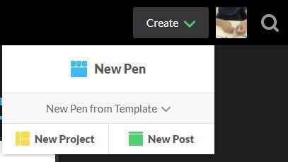
1. Create -> New Pen
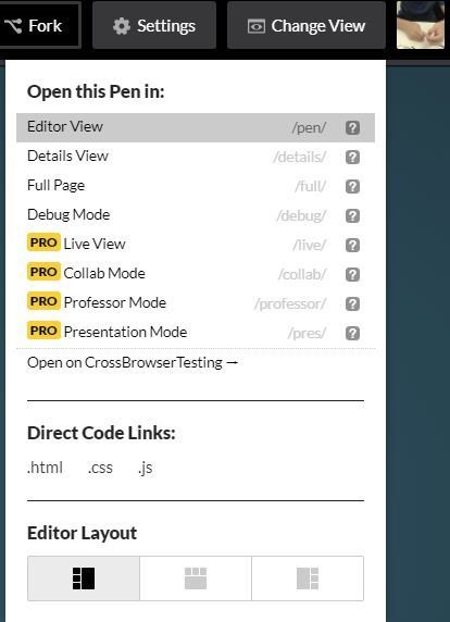
2. Change View -> Choose an "Editor layout"
The leftmost layout is recommended now.
Codepen.io - Editor
CSS - Start
:fill(FFCC00,1)/182147263-56a9f69f3df78cf772abc6aa.jpg)
● Cascading Style Sheets, is a simple de-
sign language to make web pages
presentable.
CSS - Intro(1)
● Some most used properties about Text
color, font-size, letter-spacing, line-height, font-family...
CSS - Intro(2)
● Some most used properties about Box Model
display, position, margin, padding, width, height, background, border, box-shadow, border-radius...etc
CSS Selectors(1)
● Define the elements to which a set of CSS rules apply.
There are five kinds of selectors:
- Type selector
- Class selector
- ID selector
- Universal selector
- Attribute selector
CSS Selectors(2)
● Type selector
Selects all elements match the given element name.
CSS Selectors(3)
● Class selector
Selects all elements that have the given class attribute.
CSS Selectors(4)
● ID selector
Selects an element based on the value of its id attribute. There should be only one element with a given ID in a document.
CSS Selectors(5)
● Universal selector
Selects all elements. Optionally, it may be restricted to a specific namespace or to all namespaces.
CSS Selectors(6)
● Attribute selector
Selects elements based on the value of the given attribute.
CSS - Selectors(7)
○ A website to make you understand CSS selector
Practice makes better, right?
CSS Pseudo Family(1)
● Pseudo Classes
○ :hover, :active, :visited, :checked
○ A CSS pseudo-class is a keyword added to a selector that specifies a special state of the selected element(s).
/* Syntax */

selector:pseudo-class {
  property: value;
}
CSS Pseudo Family(2)
● Pseudo Elements
○ E.g. ::first-line, ::before, ::after
○ A CSS pseudo-element is used to style specified parts of
an element.
/* Syntax */

selector::pseudo-element {
  property: value;
}
CSS Pseudo Family - Demo
CSS Specificity(1)
● Not only choose the right selector, but you shall need
to know how the specificity of style works.
1. style with suffix => !important
2. inline style => <span style="color: red"></span>
3. id selector
4. class, attribute, pseudo-classes selector
5. type selector and pseudo-elements selector
6. the latter where the style declare
● Each same style in different selectors would
be compared with the order below:
CSS Specificity(2)

每一層都是獨立的階級,不同階級就算數量上較多也贏不過上一層階級的;而當同階級同分時就會比對下一階層的總分,以此類推。
若依舊同分,則相同的屬性會以CSS stylesheet中最後設定的為主。
○ A website to make you calculate css specificity
CSS Layout - position(1)
● In order to make more complex layout, position is neccessary.
● There are four position value: static, relative, fixed and
absolute. By default, static is set.
CSS Layout - position(2)
● Très Bien, it's time to look at
margin and (top, right, bottom, left)
CSS Layout - display(1)
● The property display is most important in layout, each
HTML element has a default value. Most of them are set
to be block, some others are inline instead.
● display: block V.S display: inline
| display | block | inline |
|---|---|---|
| content | render at next line | render in same line |
| elements | div, p | span, a |
CSS Layout - display(2)
● Besides block and inline, there are inline-block, flex, inline-
flex, grid and so on. A quick demo is below.
CSS Layout - display(3)
● Wanna hide elements?
○ display: none
Also hide the space of the hidden elements.
○ visibility: hidden
The space of hidden elements remains.
CSS Layout - display(4)
● Nowadays, display: flex is one of the most import-
ant layout method in the modern web design.
○ A website to make you understand flex.
Let's Froggy!
CSS Layout - box-sizing


● box-sizing: content-box;
● box-sizing: border-box;
CSS Layout - Reference
● The Basic Concept of Layout
● More practice about flex
● A great tutorial site again
Let's Practice!!
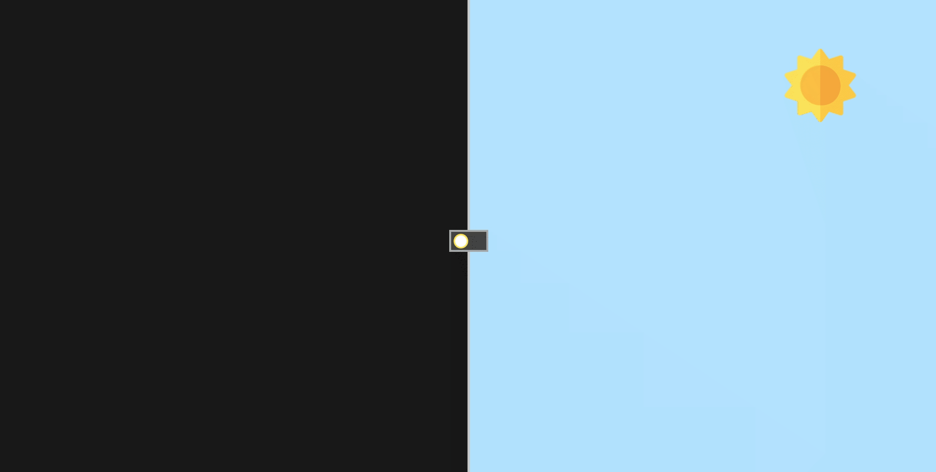
Switch Between Day&Night
The Origin Pen:
Author: Alberto Hartzet
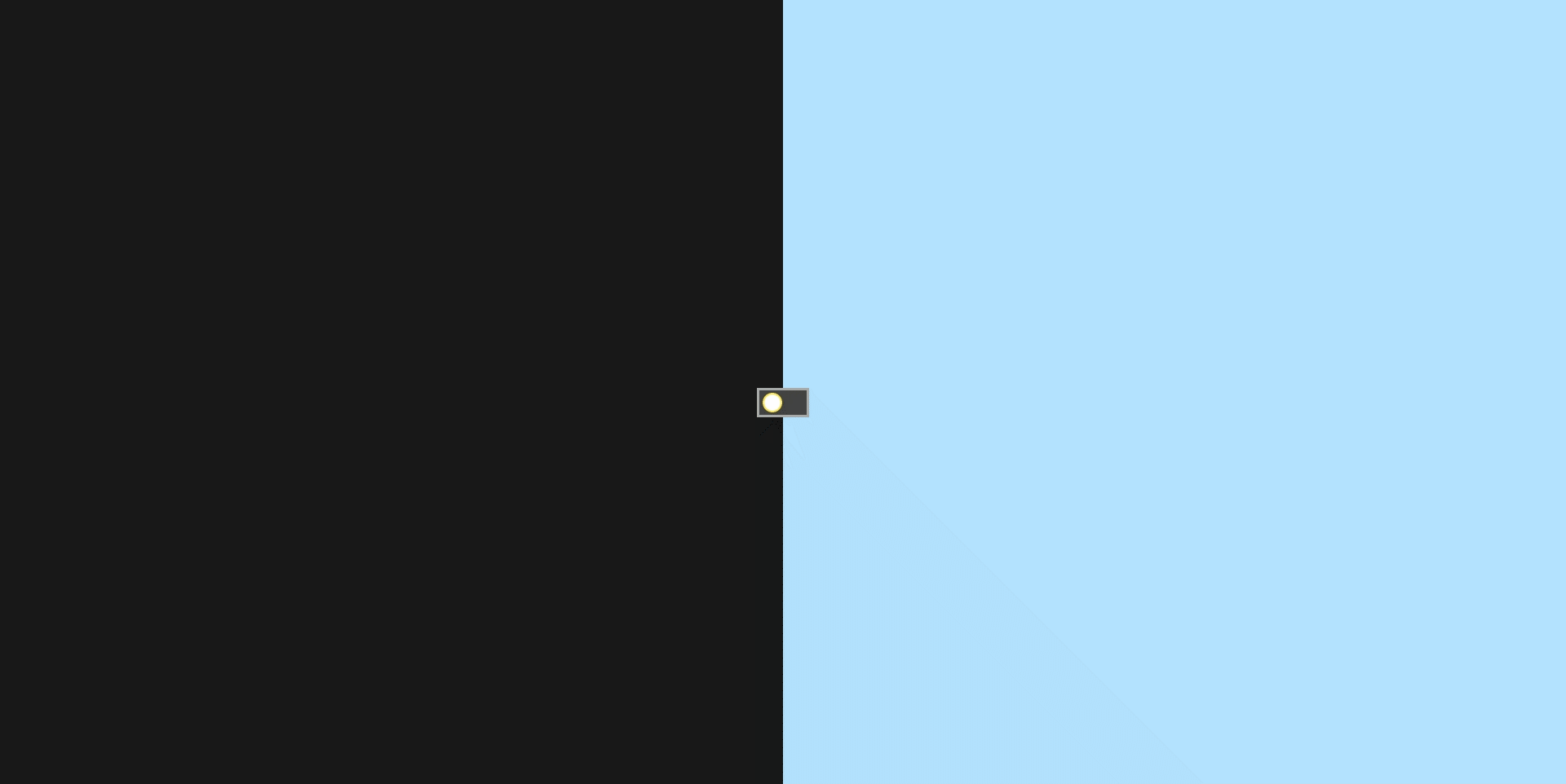
Day&Night Switch - Step 1
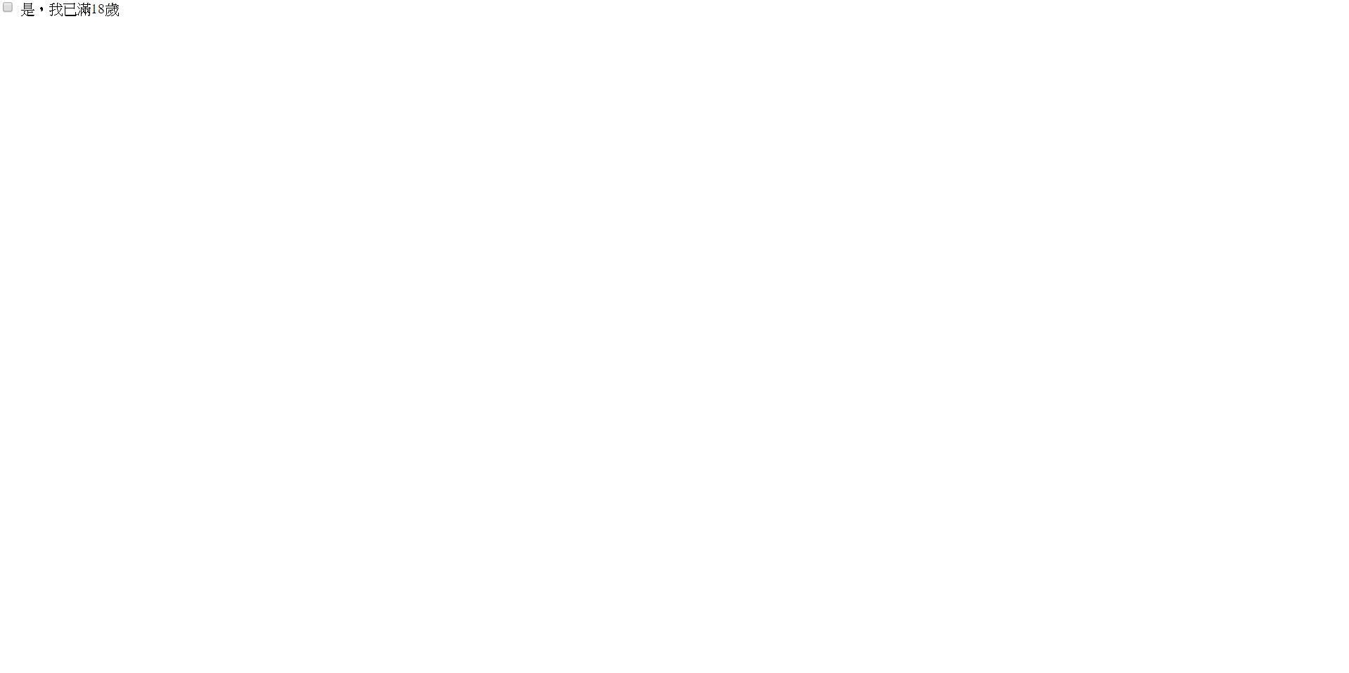
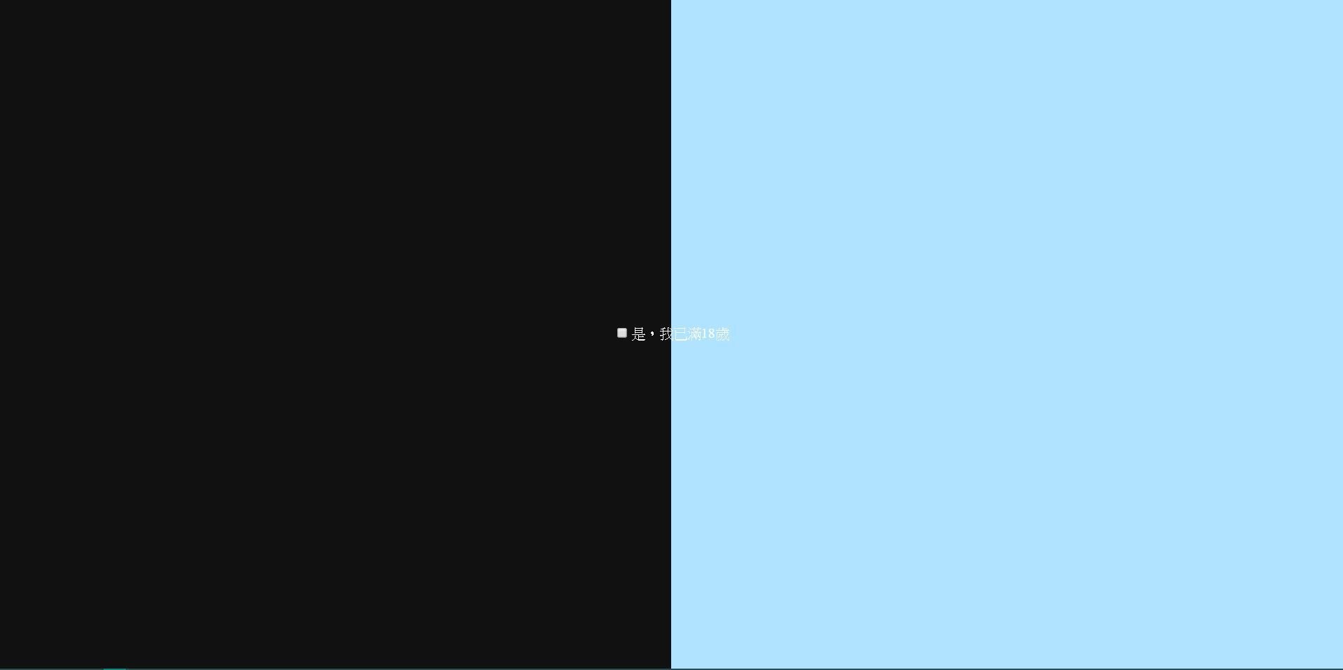
<!-- 請新增一個id為switch的核選方塊
     hint: <input> -->
<input ...>
<!-- 並在下方新增一個label,屬性for的值為
     核選方塊的id -->
<label>是,我已年滿18歲</label>
/* Initialize */
* {
box-sizing: border-box;
}
html, body {
margin: 0;
padding: 0;
height: 100%;
min-height: 100%;
}
● First, create a new "pen" to practice, copy the code below and paste to the right place.
html
css
What does the attribute for="switch" mean?
Question:
Hint:
Change the value of "id" in the input.
Result:
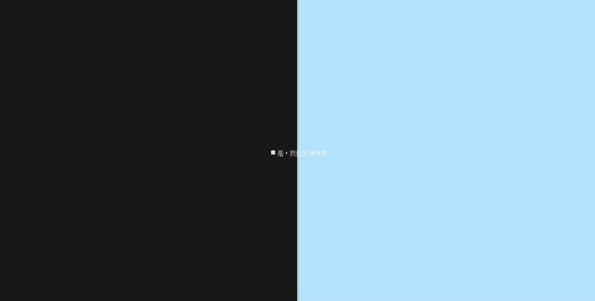
Day&Night Switch - Step 2
body {
  /*
    使用flex,將checkbox置中吧
  */

  /* 將高度設為 100% view height */
  min-height: 100vh;
  max-height: 100vh;

  /* 設定背景顏色為 #111 */
  background-color: #111;

  /* 字體顏色設定為白色 */
  color: white;

  /* 任何超出頁面的部分都將被隱藏 */
  overflow: hidden;
}
● You got a checkbox right? Try to center it both horizontal and vertical.
css(with comment)
body {
  /*
    使用flex,將checkbox置中吧
  */

  min-height: 100vh;
  max-height: 100vh;
  background-color: #111;
  color: white;
  overflow: hidden;
}
css(use this)
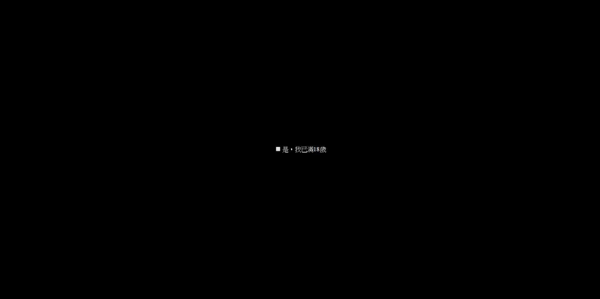
Result:
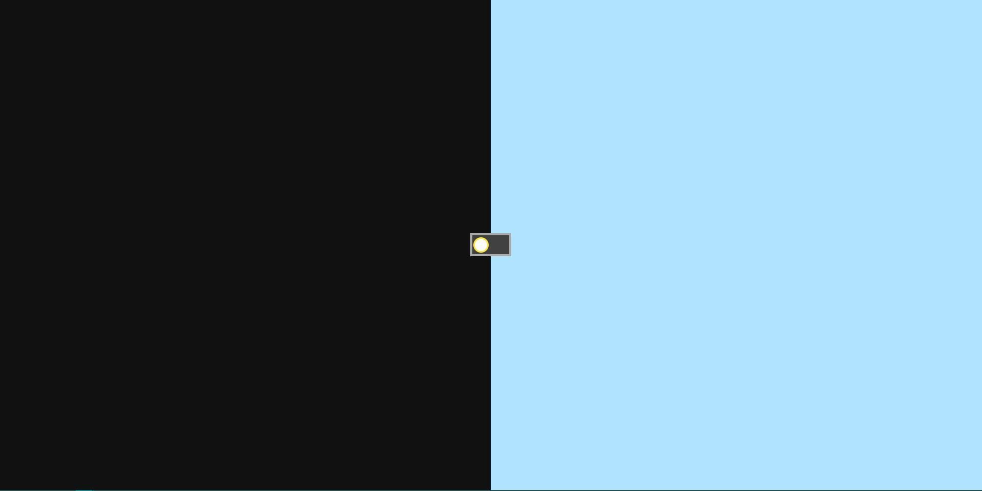
Day&Night Switch - Step 3
● Then add the day&night background
.back {
  /* 使用flex讓兩區塊水平排列 */
  display: ;

  /* 讓整個容器塞滿頁面 */
  position: ;
  top: ;
  right: ;
  bottom: ;
  left: ;
}
.back div {
  /* 每個色塊寬度為容器一半,有兩種寫法 */

}
.back .left {
  background-color: #111;
}
.back .right {
  background-color: #B0E3FF;
}
css
<input type="checkbox" class="toggle" id="switch">
<label for="switch">是,我已年滿18歲</label>
<!-- 由於有分不同顏色的區塊,
     我們需要自訂一個容器,且
     將兩色塊水平並列 -->
<!-- Use Emmet -->
.back>(.left+.right)
html
Result:
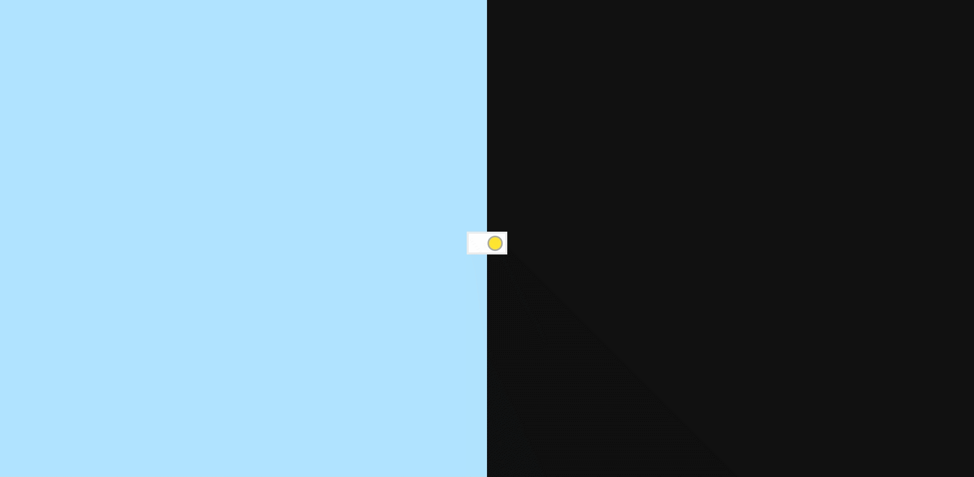
Day&Night Switch - Step 4
● The fixed back results in the layer problem, then
the checkbox is covered by it.
● We have to add z-index to solve it.
label {
  /* 保留其餘樣式 */
  z-index: 1;
}
css
<input type="checkbox" id="switch">
<label for="switch">是,我已年滿18歲</label>
<div class="back">
  <div class="left"></div>
  <div class="right"></div>
</div>
html
Day&Night Switch - Step 5
● Use pseudo-element to add a vertical divider between left and right.
.back::before {
  content: '';
  position: ;
  width: 1px;
  height: ;
  background: #ccc;
  transform: translateX(-50%);
}
css
Result:
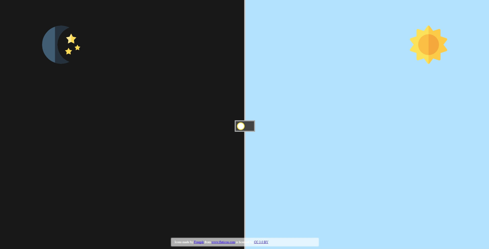
Day&Night Switch - Step 6
● Before customizing the checkbox, we would like to check that how to change background by clicking the switch(checkbox)?
#switch:checked ~ .back .left {
  background-color: #B0E3FF;
}
#switch:checked ~ .back .right {
  background-color: #111;
}
css
Yep, it's a pseudo-class!
Day&Night Switch - Step 7
● Okay, having the switch, the next we need to do is customizing the style of the switch.
/* 將原本的checkbox隱藏 */
#switch {

}

label {
  /* 客製化開關容器,寬度為64px,高度為36px,背景顏色為#414141,邊框為3px solid #aaa */
  z-index: 1;
  cursor: pointer;
}
label .switcher {
  /* 客製化開關主體,高度、寬度皆為24px,背景為白色,並運用border-radius將其變成圓形 */
  margin-left: 4px;
  border: 2px solid #ffe633;
}
css
<input type="checkbox" id="switch">
<label for="switch">
  <div class="switcher"></div>
</label>
html
Result:
Day&Night Switch - Step 8
● Handle the style after clicked the switch
/* Handle the style after the checkbox has been checked */
#switch:checked ~ label {
  background: #fff;
  border-color: #eee;
}
#switch:checked ~ label .switcher {
  background: #ffe633;
  border-color: #aaa;
  margin-left: 30px;
}
css
Result:
Looking forward to next step?
Wait a minute, you have to learn
CSS transition and animation to
complete the last half of the project.
Go ahead!
CSS - Transition(1)
● CSS Transition allows property changes in CSS values to occur smoothly over a specified duration.
● transition property is a shorthand property for
- transition-property
- transition-duration
- transition-timing-function
- transition-delay
CSS - Transition(2)
/* property name | duration | timing function | delay */
transition: margin-right 4s ease-in-out 1s;

/* You can use different durations on different properties */
.box {
  transition: margin-right 4s, color 1s;
}
● Syntax and usage
/* Not every css property can be used in transition,
the transition below will not work */
.forbidden {
  transition: display 2s;
}
● Tip of transition-property
/* Bulit-in timing functions are 'ease', 'ease-in', 'ease-out',
   'ease-in-out', 'ease-out-in' and 'linear'; however, there are
   some special timing-function could be used.
*/
.special-transition {
  transition: flex .2s cubic-bezier(.17,.67,.99,.19);
}
● Special timing-function - cubic-bezier
CSS - Transition(3)-Demo
CSS - Transition - Reference
Day&Night Switch - Step 9
● Now add transitions to the switch
label {
  /* 保留前幾Step的style */
  /* 請新增一個property為all,持續時間為0.85秒,時間函數為cubic-bezier(0.8, 0, 0.05, 1)
     的transition(轉場) */
  transition: ;
}

label .switcher {
  /* 同上 */
  transition: ;
}
css
Result:
Day&Night Switch - Step 10
● Changing background instantly is pretty weird right? Try to add transition to the back.
.back div {
  /* 請新增一個property為all,持續時間為0.35秒,延遲為0.5秒,
     時間函數為cubic-bezier(0.8, 0, 0.05, 1)的transition(轉場) */

}
css
Result:

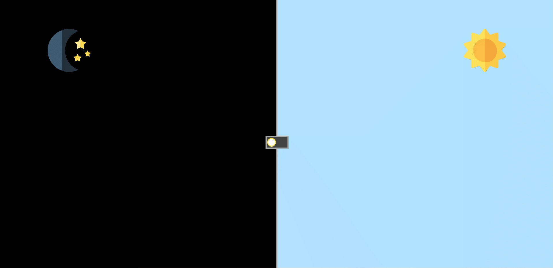
Day&Night Switch - Step 11
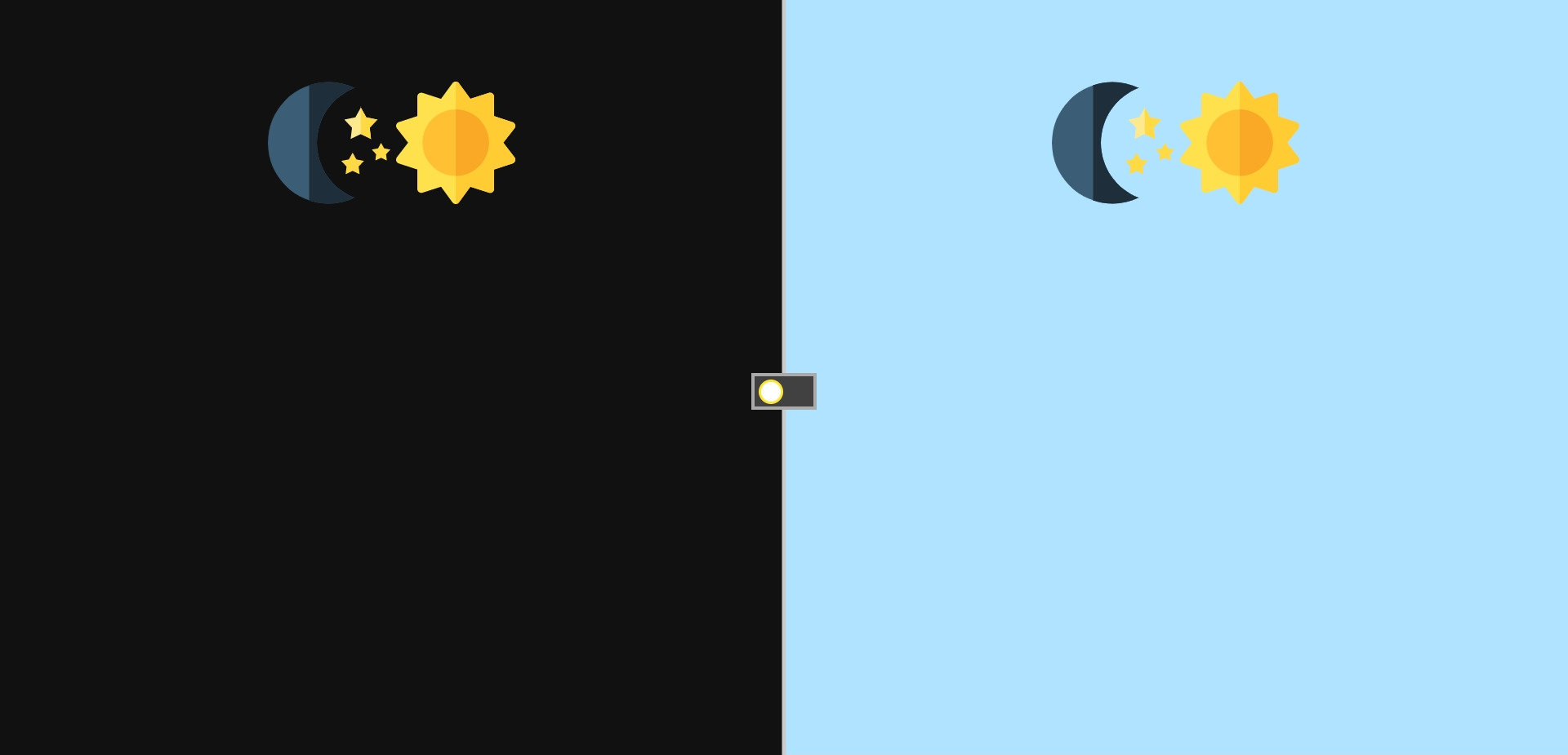
● Add "moon" and "sun"
/* Set the sun/moon style */
.back .svg {
  width: 120px;
  margin-top: 80px;
}
css
<div class="back">
  <div class="left">
    <img src="https://image.flaticon.com/icons/svg/270/270173.svg" alt="moon" class="svg moon">
    <img src="https://image.flaticon.com/icons/svg/375/375811.svg" alt="sun" class="svg sun">
  </div>
  <div class="right">
    <img src="https://image.flaticon.com/icons/svg/270/270173.svg" alt="moon" class="svg moon">
    <img src="https://image.flaticon.com/icons/svg/375/375811.svg" alt="sun" class="svg sun">
  </div>
</div>
html
Result:
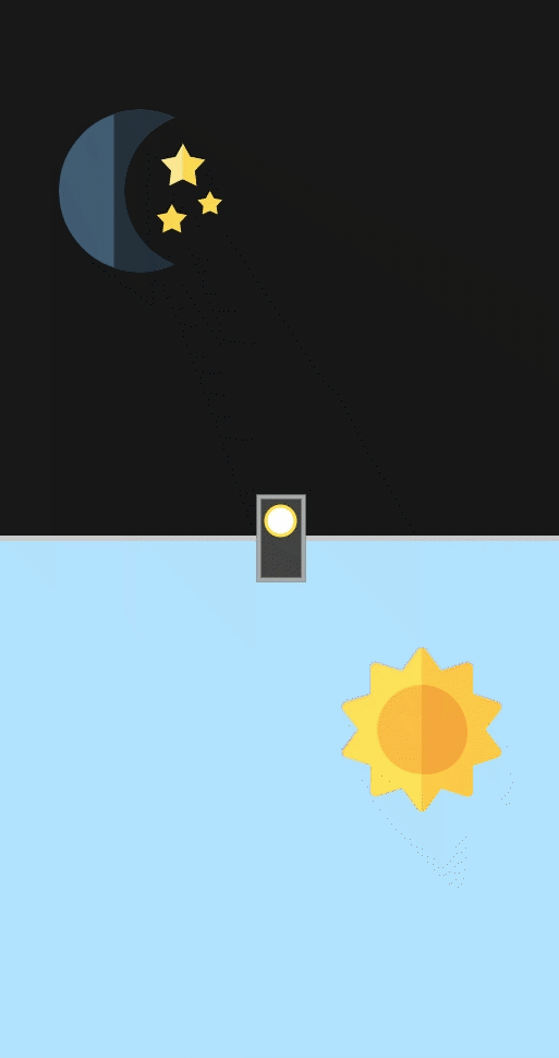
Day&Night Switch - Step 12
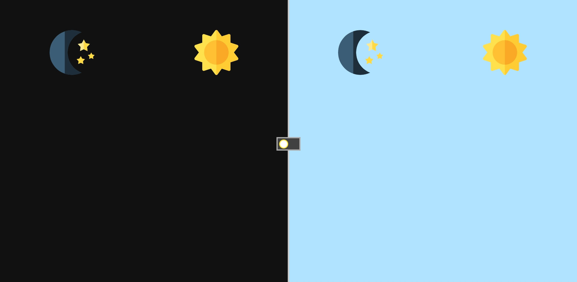
● Then make them in a proper position
/* Make them locate on right position */
.back div {
  display: flex;
  justify-content: space-around;
  align-items: flex-start;
  width: 120px;
  margin-top: 80px;
}
css
Result:
CSS - Animation(1)
● This CSS module describes a way to animate the values of CSS properties over time, using keyframes.
● The behavior of these keyframe animations can be controlled by specifying their duration, number of repeats, and repeating behavior.
CSS - Animation(2)
● animation is a shorthand property for
- animation-name
- animation-duration
- animation-timing-function
- animation-delay
- animation-iteration-count
- animation-direction
- animation-fill-mode
- animation-play-state
CSS - Animation(3)
/* @keyframes duration | timing-function | delay |
iteration-count | direction | fill-mode | play-state | name */
animation: 3s ease-in 1s 2 reverse both paused slidein;

/* @keyframes duration | timing-function | delay | name */
animation: 3s linear 1s slidein;

/* @keyframes duration | name */
animation: 3s slidein;
● Syntax and usage
CSS - Animation(4)
@keyframes moonSlideIn {
  0% {
    transform: translateY(-400px);
    opacity: 0;
  }
  100% {
    transform: translateY(0);
    opacity: 1;
  }
}
@keyframes moonSlideOut {
  0% {
    transform: translateY(0);
    opacity: 1;
  }
  100% {
    transform: translateY(-400px);
    opacity: 0;
  }
}
@keyframes sunSlideIn {
  from {
    transform: translateY(100vh);
    opacity: 0;
  }
  to {
    transform: translateY(0);
    opacity: 1;
  }
}

@keyframes sunSlideOut {
  from {
    transform: translateY(0);
    opacity: 1;
  }
  to {
    transform: translateY(100vh);
    opacity: 0;
  }
}
CSS - Animation - Reference
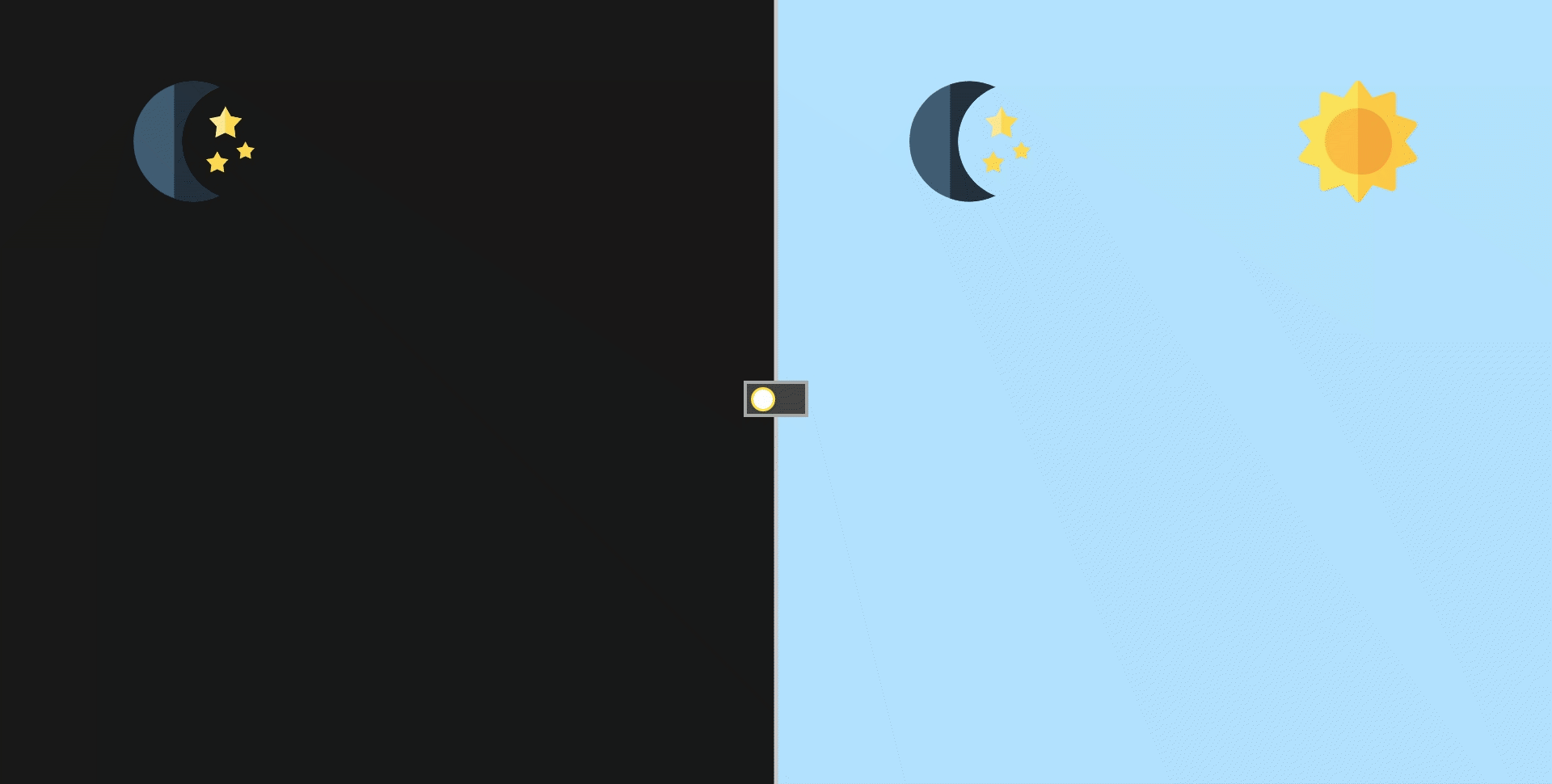
Day&Night Switch - Step 13
● First, declare keyframes about sun, then use them.
/* 太陽滑進的animation,從容器下方滑到預設位置,
   同時透明度由0轉1 */
@keyframes sunSlideIn {
  from {
    transform: translateY(100vh);
    opacity: 0;
  }
  to {
    transform: translateY(0);
    opacity: 1;
  }
}

/* 太陽滑出的animation,即對稱太陽滑進的動作 */
@keyframes sunSlideOut {
  from {
    transform: translateY(0);
    opacity: 1;
  }
  to {
    transform: translateY(100vh);
    opacity: 0;
  }
}
keyframes
/* 左半邊預設為黑夜,所以太陽必須滑出 */
.back .left .sun {
  animation: sunSlideOut .5s cubic-bezier(0.8, 0, 0.05, 1) forwards;
}
/* 右半則預設白天,所以太陽必須滑入 */
.back .right .sun {
  animation: sunSlideIn .5s cubic-bezier(0.8, 0, 0.05, 1) forwards;
  animation-delay: .5s;
}

/* 點選switcher之後,與原狀態相反 */
#switch:checked ~ .back .left .sun {
  animation: sunSlideIn .35s cubic-bezier(0.8, 0, 0.05, 1) forwards;
  animation-delay: .5s;
}
#switch:checked ~ .back .right .sun {
  animation: sunSlideOut .5s cubic-bezier(0.8, 0, 0.05, 1) forwards;
}
css
Result:
Day&Night Switch - Step 14
● The sudden appear of sun is weird, because during
the animation-delay, the origin style of sun would
be applied. To solve the problem, we need to set
initial style correctly.
/* 將圖片預設透明度全開,便不會在transition-delay時出現 */

.back .svg {
  /* 保留其餘樣式 */
  opacity: 0;
}
css
Result:
Day&Night Switch - Step 15
● (Challenge)
Now only given you the keyframes of moon, try to
apply it to the right selector!
/* 月亮滑進的animation,從容器上方滑到預設位置,
   同時透明度由0轉1 */
@keyframes moonSlideIn {
  from {
    transform: translateY(-400px);
    opacity: 0;
  }
  to {
    transform: translateY(0);
    opacity: 1;
  }
}

/* 月亮滑出的animation,即對稱月亮滑進的動作 */
@keyframes moonSlideOut {
  from {
    transform: translateY(0);
    opacity: 1;
  }
  to {
    transform: translateY(-400px);
    opacity: 0;
  }
}
keyframes
Result:
CSS - RWD(1)

● Responsive web apps use technologies like media
queries and viewport to make sure that their UIs
will fit any device.
● Aka Responsive Web Design.
CSS - RWD(2)
● Viewport
<!DOCTYPE html>
<html>
<head>
  <!-- Add metas below to enable RWD -->
  <meta http-equiv="X-UA-Compatible" content="IE=edge, chrome=1"/>
  <meta name="viewport" content="width=device-width, initial-scale=1, minimum-scale=1, maximum-scale=1">
</head>
CSS - RWD(2)
● Media queries is composed of
○ media types:
■ screen, print, all
○ media features:
■ width, height, with max/min prefix
■ device-width, device-height with max/min prefix
■ orientation
■ ...... and so on
/* media types */
@media screen {
  a {
    color: red;
  }
  .entry {
    margin-top: 10px;
    font-size: 20px;
  }
}
/* media features */
@media (max-width: 768px) {
a {
color: red;
}
.entry {
margin-top: 10px;
font-size: 20px;
}
}CSS - RWD(3)
● Most used syntax
/*
  max-,表示這個數字以下(包含)的都適用。
  min-,表示這個數字以上(包含)的都適用。
*/

/*如果螢幕寬度為 500px (含) 以上,就套用這些 css 設定*/
@media screen and (min-width:500px) {
  css 設定寫在此
}

/*如果螢幕視窗為直立,就套用這些css設定
螢幕視窗橫向說法: orientation:landscape*/
@media screen and (orientation: portrait) {
  css 設定寫在此
}

/* 更複雜的media query,表示在400px以上且700px以下時會套用此樣式 */
@media screen and (min-width: 400px) and (max-width: 700px) {
  css 設定寫在此
}
CSS - RWD - Reference
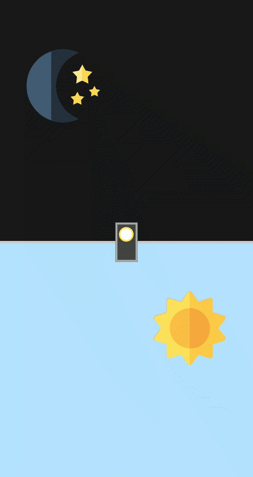
Day&Night Switch - Step 16
<!-- Add metas below to enable RWD -->
<meta http-equiv="X-UA-Compatible" content="IE=edge, chrome=1"/>
<meta name="viewport" content="width=device-width, initial-scale=1, minimum-scale=1, maximum-scale=1">
● Add metas of the general RWD settings
Day&Night Switch - Step 17
● Then add the media query
@media (min-width: 350px) and (max-width: 700px) {
  label {
    transform: rotateZ(90deg);
  }
  .back {
    flex-direction: column;
  }
  .back::before {
    transform: rotateZ(90deg);
  }
  .back div {
    width: 100%;
    height: 50%;
  }
}
css
Result:
How to see this?
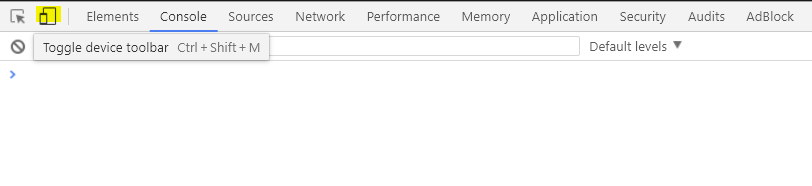
First, select the debug mode of your pen, then
1. Use your mobile phone and open the url, or
2. In the debug page, open Chrome devtools
and switch to the mobile-simulated mode
(Press F12)
Day&Night Switch - Step 18
● Something is overflow, right? The sun seems to slide
.back div {
  /* 保留其餘樣式 */

  /* 因動畫跑出去容器的部分需要被隱藏 */
  overflow: ;
}
css
● We only need one property to solve this problem.
one part through another, but that is not correct.
Come up with it!
Result:
Day&Night Switch - Step 19
● Noticed that sun and moon icon looks great, right?
.license {
  position: absolute;
  width: 30%;
  padding: 6px 10px;
  left: 50%;
  transform: translateX(-50%);
  bottom: 1.2rem;
  background: rgba(255,255,255,.65);
  box-shadow: 0 0 3px 1px rgb(255,255,255);
  font-size: 10px;
  transition: all .35s;
}
.license:hover {
  background: rgb(244, 255, 0);
}
css
It is made by designer thus some license are set,
we shall use the icons in certain way to support
their works not to be copied or pretended.
<!-- 把license區塊新增在back之後 -->
<div class="license">
  Icons made by <a href="http://www.freepik.com" title="Freepik">Freepik</a>
  from <a href="https://www.flaticon.com/" title="Flaticon">www.flaticon.com</a>
  is licensed by <a href="http://creativecommons.org/licenses/by/3.0/" title="Creative Commons BY 3.0" target="_blank">CC 3.0 BY</a>
</div>
html
Result:
Day&Night Switch - Step 20

Thanks for your listening!
HTML&CSS-1(2017/12/8)
By tim54100

