introduction to bootstrap
COMP 126: Practical Web Design & Development for Everyone
setup options
- Download Bootstrap 5 at getbootstrap.com & unzip it; add the .css and .js files you wish to use to your project via links in the <head>; or
- Use the Bootstrap Remote CDN instructions to add the Bootstrap deployment to your <head> area (recommended); or
- npm, for those already familiar with npm/command line:
npm i bootstrap@5.3.2
BOOTSTRAP CDN SETUP
the bootstrap grid system
Step 1: THE container
.container (s, m, l)
.container-fluid
Step 1: THE container
.container-(sm, md, lg)
<div class="container-sm">100% wide until small breakpoint</div>

<div class="container-md">100% wide until medium breakpoint</div>

<div class="container-lg">100% wide until large breakpoint</div>

<div class="container-xl">100% wide until extra large breakpoint</div>

<div class="container-xxl">100% wide until extra extra large breakpoint</div>
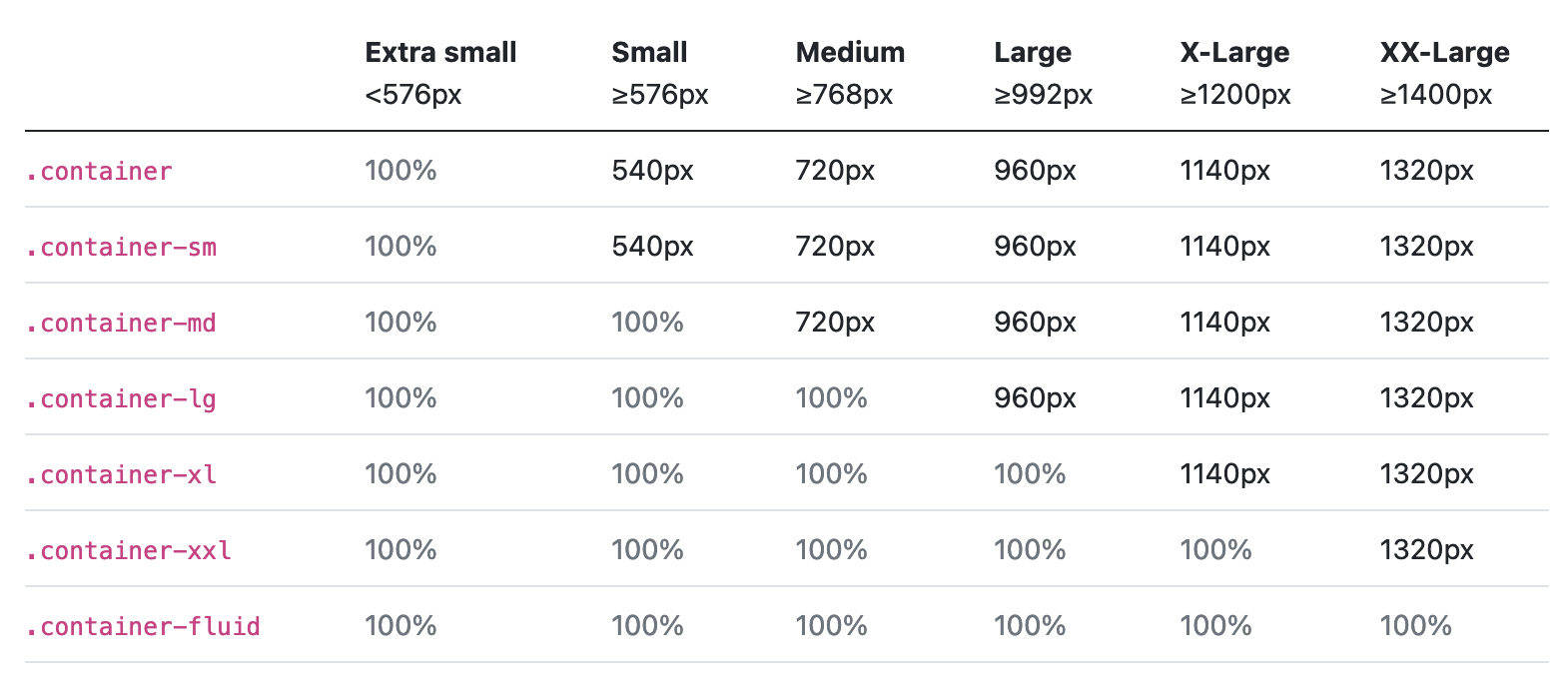
BREAKPOINTS
Containers
step 2: tHE row
- .row class
- syntax: <div class="row"></div>
- rows contain columns & columns contain content; only columns can be immediate children of rows
- rows extend the full width of the container
Step 3: THE column/s
stuff to know about the .col class
- you can define different numbers of columns for different sizes (that adjust according to screensize breakpoints): e.g., <div class="col-sm-10 col-md-6">
- columns go inside rows
- content goes inside columns
- columns have default padding
- rows' negative margins offset padding on the first and last columns (far left and far right)
example: container, row, three columns
example: nested columns
CONTENT
BOOTSTRAP FORMS
bootstrap components
126-Bootstrap
By tkjn