RESPONSIVE WEB DESIGN
COMP 126: Practical Web Design & Development for Everyone
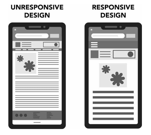
a responsive design requires:
- meta information for the browser (viewport meta tag)
- a fluid layout that automatically resizes/realigns to be usable and look good on any (reasonable) viewport (browser/device) size or orientation
- images, video, media, & styling that automatically scale to be usable and look good on any (reasonable) viewport size or orientation
- a way to change the things that still look weird at some sizes & orientations regardless of your fluid/scalable styling: in this case, that means media queries
1. the viewport <meta> tag
<meta name="viewport"
      content="width=device-width,initial-scale=1.0"/>
Add this to your <head> (not <header>) element:
Translation:
"Please check the width of the viewport before rendering this page in the browser and scale/display the page's contents according to that width."
2. fluid layout widths
3. scalable media
4. media queries
a media query is a CSS feature that can be used to instruct a website or app to adapt features of its design for different screens and media types
@media media type and (media feature/condition: breakpoint) {
  // CSS rules that kick in when the feature is present or the condition is met
}
media features: What does the browser check for?
- conditions such as screen size: min-width (for mobile first design, which is recommended in most cases) or max-width (if your default styles are for desktop; this is not recommended
- features & more: https://css-tricks.com/a-complete-guide-to-css-media-queries/
- screen is the condition we'll be using most often--specifically, screen size
breakpoints: where should the change happen?
Some typical breakpoints are
- 320px — 480px: Mobile devices
- 481px — 768px: iPads, Tablets
- 769px — 1024px: Small screens, laptops
- 1025px — 1200px: Desktops, large screens
- 1201px and more : Extra large screens, TV
...but these are flexible. Some systems/orgs have their own. Or just set breakpoints where your design "breaks"!
SO:
@media screen and (min-width: 480px) {
  .text {
    font-size: 16px;
  }
}
media/device type
operator
condition
breakpoint
1. write your default styles
2. ADD @MEDIA styles after the default styles & inside a media query
A flexbox layout with a media query
126-responsive design
By tkjn