COMP 126: Practical Web Design & Development for Everyone
UI DESIGN:
COLOR & TYPOGRAPHY
COLOR
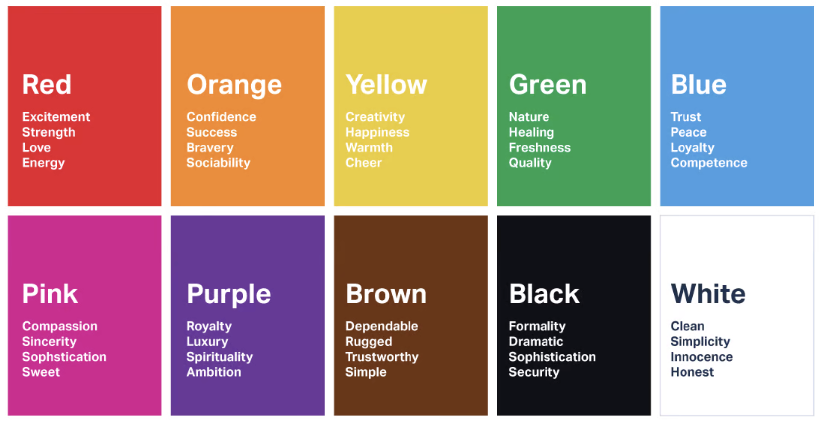
What are the associations? What mood, reputation, or tone do you hope to evoke?
WhAT does color do?
- LEGIBILITY. aka readability, which is to say: high contrast.
- VISUAL APPEAL. This is less about taste or preference and more about creating a harmonious experience. (Unless disharmony is your goal for very specific reasons, and you really know what you're doing.)
- BRAND RECOGNITION. Choose a striking brand color or color combination, and stick with it.
CONSIDERATIONS
Design in grayscale first
- Start in pure b&w then build in grays/lower opacity accordingly to increase/lower impact
- Use the "squint test" to see if your layout reflects the hierarchy you're trying to create
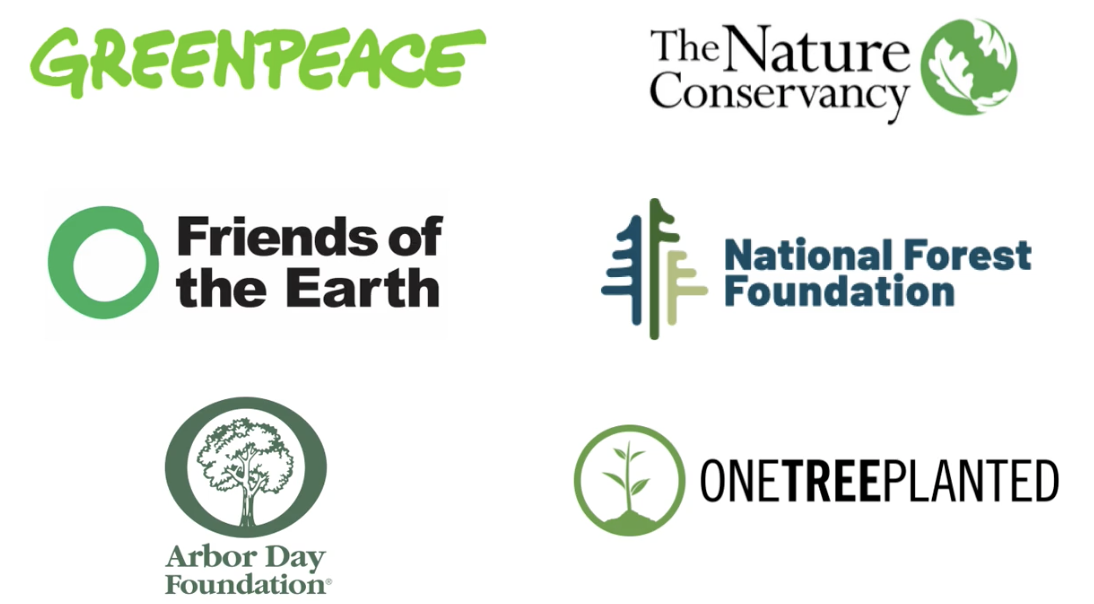
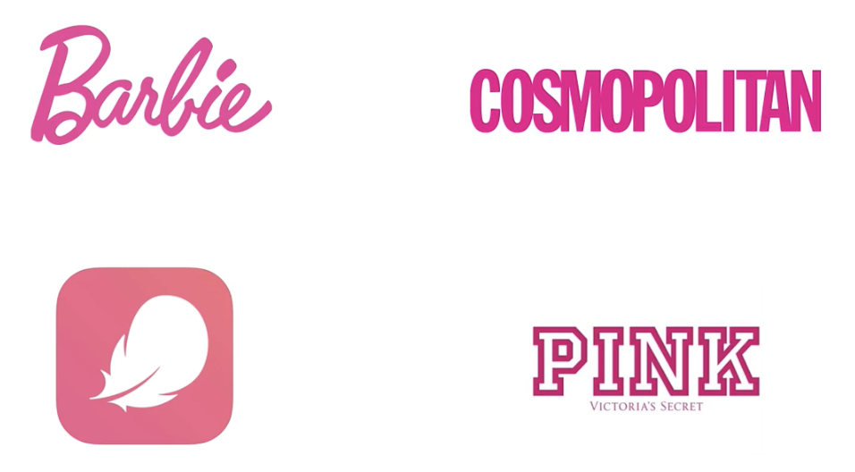
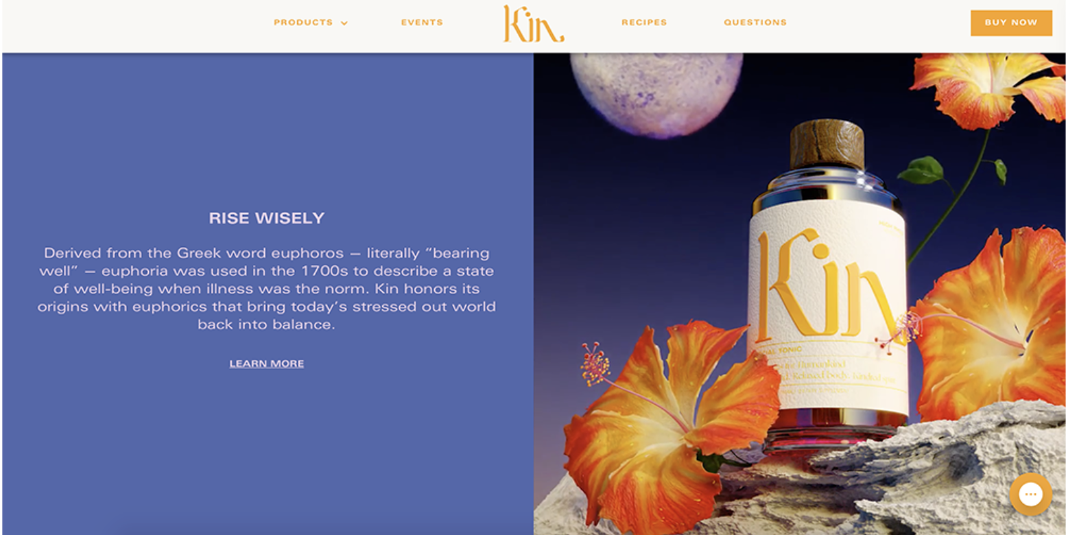
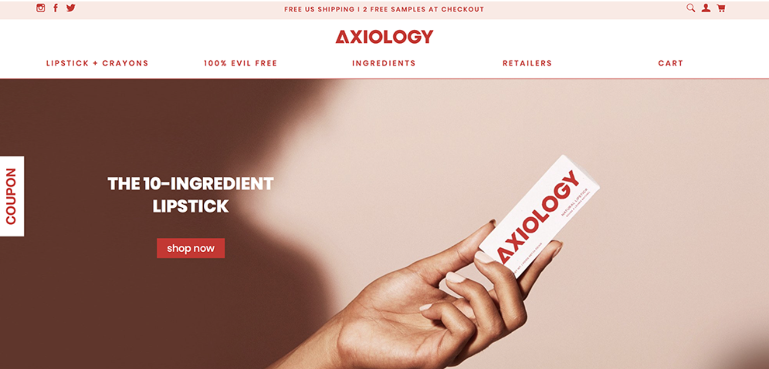
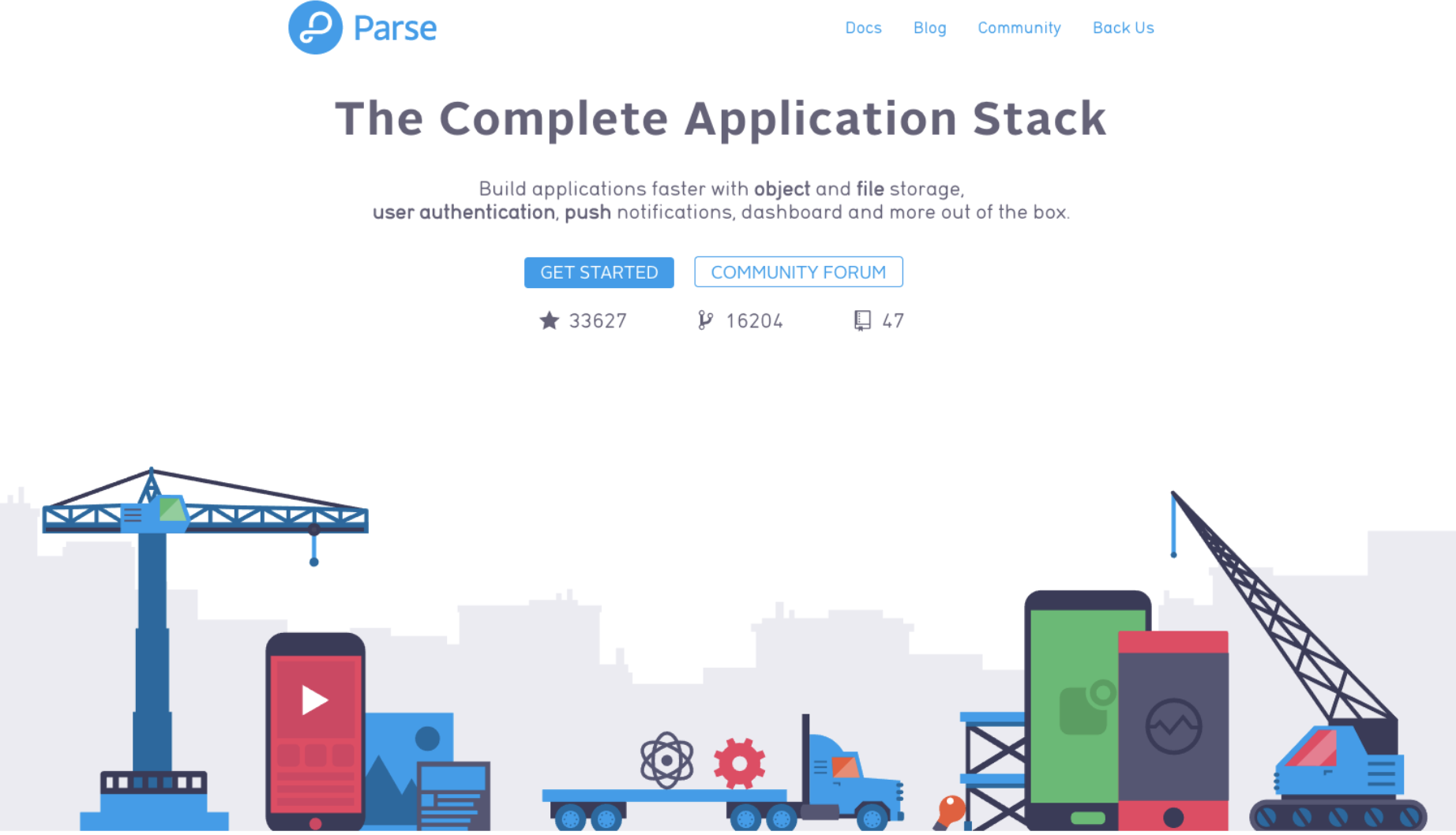
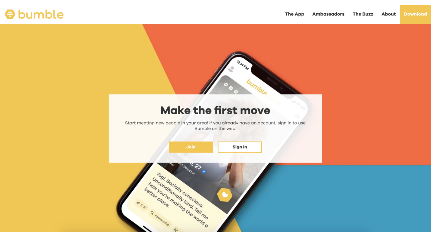
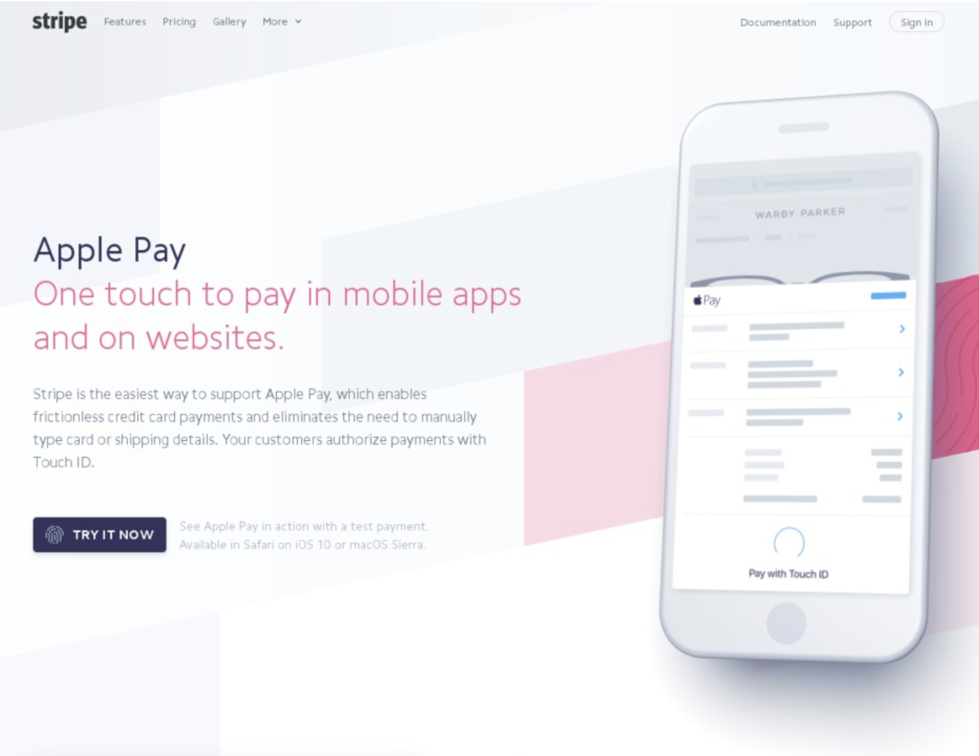
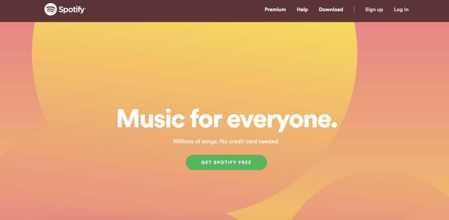
dominant/brand color
If you have an existing logo or signage to work with, consider sticking with that
Research other websites/apps in your space, and rule out any really obvious colors


DON'T BE REDUNDANT
Secondary color/s & neutrals
Remember:
- Rule of thumb: One dominant/brand color, 1-2 secondary colors, + neutrals for text & background
- 60/30/10 rule: it can be broken, but it's a good place to start
- High contrast between text & background is a must for accessibility & usability
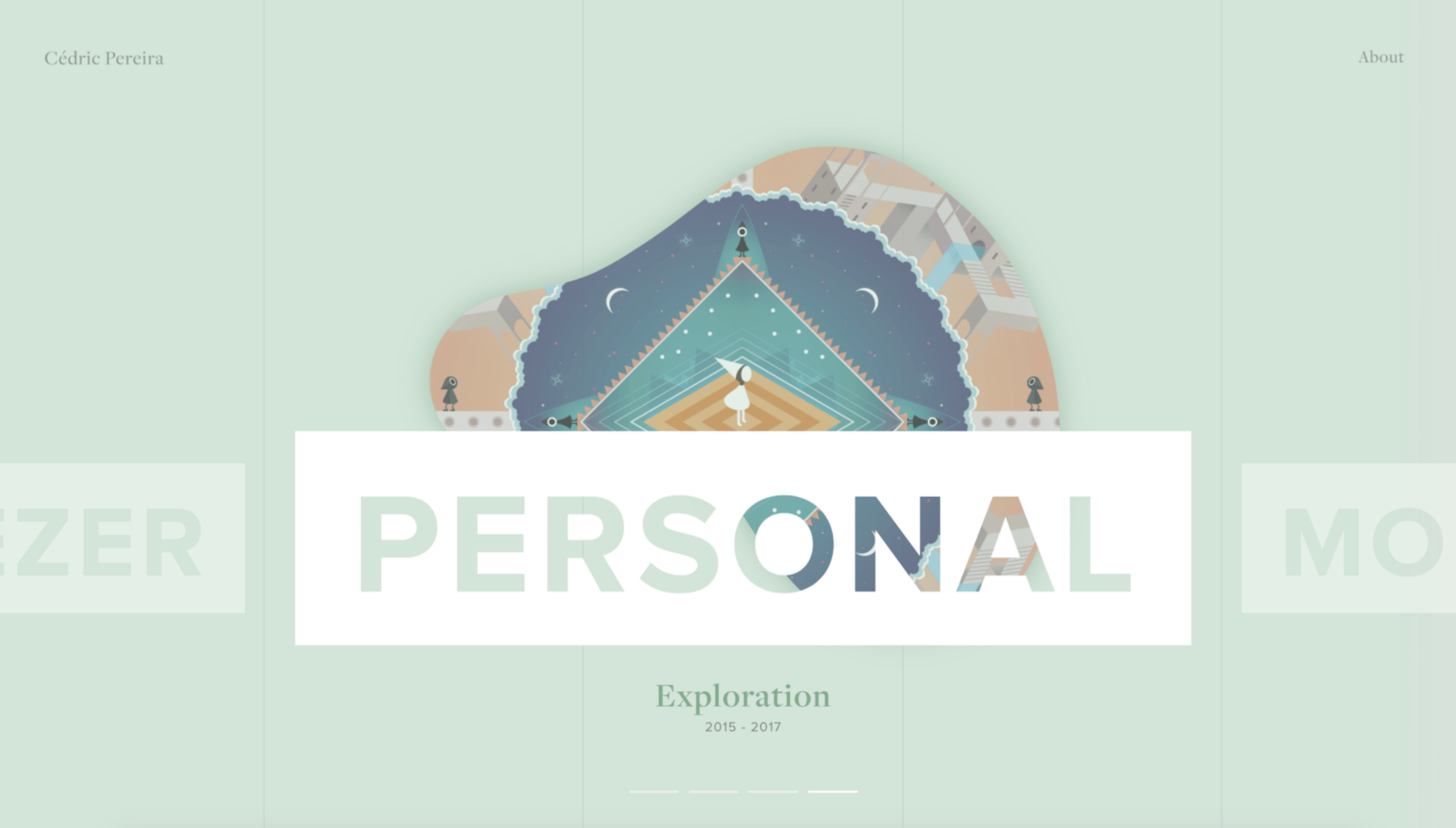
Analogous color schemes

- Colors are beside each other on the color wheel
- Very harmonious, but make sure there's enough contrast
Complementary color schemes
- Colors are opposite one another on the color wheel
- Great for contrast, but you should use one as primary and one as accent to keep things harmonious
Monochromatic color schemes
- A single base hue paired with its shades and tints
- Also very harmonious, but again, make sure there's enough contrast to emphasize calls to action
Triadic color schemes
- Three colors evenly spaced across the color wheel
- Conveys a sense of high energy
- Should be used carefully, as it can lead to a cluttered, busy look if not balanced
Primary color schemes
- Variations on the primary colors of red, blue, and yellow
- Similar to triadic scheme, but less perfectly triadic
- Very high energy & bold
- Can look childish if too on the nose
Other APProaches
pastel
muted
gradient
b&w with pops
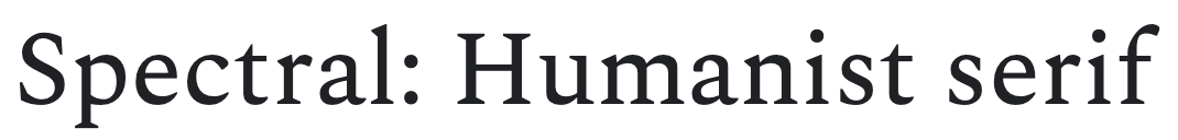
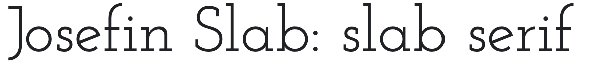
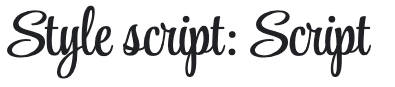
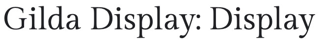
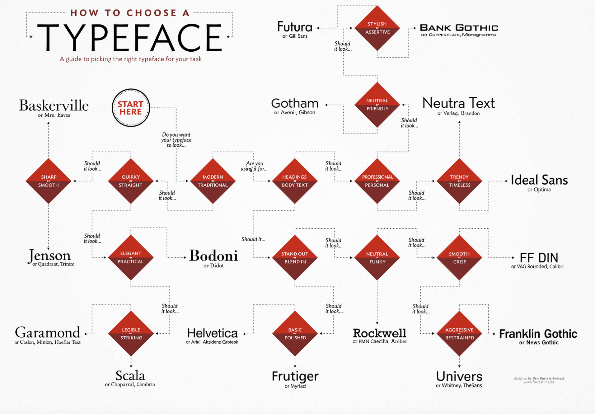
TYPOGRAPHY
TYPEFACE
FONTS


classic ~ traditional
legal ~ academic
bold ~ old-style
friendly ~ authoritative
readable small ~ gov't ~ education
headers ~ titles
headers ~ titles ~ clarity


other types
126-Color & Typography
By tkjn