Extending native HTML inputs

HTML
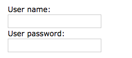
- Form elements
- The most important form element is the <input> element.
Angular
All you need is the ngModel selector to activate it
Creates a FormControl instance from a domain model and binds it to a form control element.
Turning Dumb Input into a Smart one
<smart-input />
- requires own html template (doing complex stuff like pipes and *ngIf *ngFor
<input smart-input />
Attribute directives attach behavior to elements.
An Attribute directive changes the appearance or behavior of a DOM element.
<!-- TYPESCRIPT -->
export const CUSTOM_LABEL_CONTROL_VALUE_ACCESSOR: any = {
provide: NG_VALUE_ACCESSOR,
useExisting: forwardRef(() => LabeledCheckbox),
multi: true
};
@Component({
selector: "labeled-checkbox",
template: `
<div class="checkbox">
<input type="checkbox" [attr.id]="id" [(ngModel)]="model" [checked]="model" tabindex="{{tabIndex}}" [disabled]="disabled">
<label [attr.for]="id">{{label}}</label>
</div>
`,
providers: [CUSTOM_LABEL_CONTROL_VALUE_ACCESSOR]
})
<!-- HTML -->
<labeled-checkbox [label]="'Label 1'" [id]="'Label 1'"
[(ngModel)]="checkboxModel"></labeled-checkbox>
<!-- TYPESCRIPT -->
export const CUSTOM_DATETIMEPICKER_CONTROL_VALUE_ACCESSOR: any = {
provide: NG_VALUE_ACCESSOR,
useExisting: forwardRef(() => DateTimePicker),
multi: true
};
@Component({
selector: "date-time-picker",
template: `
<div class="input-group date" #datetimepicker>
<input type="text" [attr.id]="id" class="form-control" #input tabindex="{{tabIndex}}" (focus)="selectAll()"
(blur)="_blurEvent($event)" placeholder="{{placeholder}}" />
<div class="input-group-addon">
<span class="fa fa-calendar"></span>
</div>
</div>
`,
providers: [CUSTOM_DATETIMEPICKER_CONTROL_VALUE_ACCESSOR]
})
<!-- HTML -->
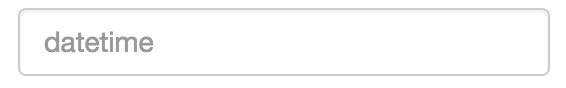
<date-time-picker id="fromTime"
[(ngModel)]="from" (blur)="blurEvent($event)"></date-time-picker>Problems building smart-input with <Component />
@Component({
    selector: "date-time-picker",
    template: `
    <div class="input-group date" #datetimepicker>
      <input type="text" [attr.id]="id" class="form-control" #input tabindex="{{tabIndex}}" (focus)="selectAll()"
      (blur)="_blurEvent($event)" placeholder="{{placeholder}}" />
      <div class="input-group-addon">
        <span class="fa fa-calendar"></span>
      </div>
    </div>
 `
});

export class DateTimePicker {

    @Output() blur: EventEmitter<any> = new EventEmitter<any>();
    @Input() placeholder: string = this.service.shortDateTimeFormat;
    @Input() tabIndex: number;
    @Input() autofocus: boolean = false;
    @Input() id: string;
}

/*
if you have to configure one or more attributes, please consider to replace component to a directive
*/
Props V.S. Attributes
@Component({
selector: "date-time-picker",
template: `
<div class="input-group date" #datetimepicker>
<input type="text" [attr.id]="id" class="form-control" #input tabindex="{{tabIndex}}" (focus)="selectAll()"
(blur)="_blurEvent($event)" placeholder="{{placeholder}}" />
<div class="input-group-addon">
<span class="fa fa-calendar"></span>
</div>
</div>
`
});
export class DateTimePicker {
@Output() blur: EventEmitter<any> = new EventEmitter<any>();
@Input() placeholder: string = this.service.shortDateTimeFormat;
@Input() tabIndex: number;
@Input() autofocus: boolean = false;
@Input() id: string;
}
<!-- HTML -->
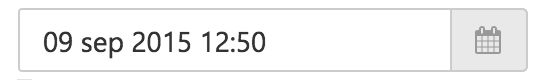
<date-time-picker id="fromTime" [(ngModel)]="from" (blur)="blurEvent($event)"></date-time-picker>Invalid Duplicated <input id="" />
@Component({
    selector: "date-time-picker",
    template: `
    <div class="input-group date" #datetimepicker>
      <input type="text" [attr.id]="id" class="form-control" #input tabindex="{{tabIndex}}" (focus)="selectAll()"
      (blur)="_blurEvent($event)" placeholder="{{placeholder}}" />
      <div class="input-group-addon">
        <span class="fa fa-calendar"></span>
      </div>
    </div>
 `
});

export class DateTimePicker {

    @Output() blur: EventEmitter<any> = new EventEmitter<any>();
    @Input() placeholder: string = this.service.shortDateTimeFormat;
    @Input() tabIndex: number;
    @Input() autofocus: boolean = false;
    @Input() id: string;
}

<!-- HTML -->
<date-time-picker id="fromTime" [(ngModel)]="from" (blur)="blurEvent($event)"></date-time-picker>
Difficult to support Form validation states
<date-time-picker required pattern="" [(ngModel)]="input"/>
<!-- trying to implement smarter-input as component, but form-validation is not supported! -->

<div class="form-group"
     [ngClass]="{'has-error': toDateTime.invalid && toDateTime.dirty && toDateTime.touched}">
    <date-time-picker [(ngModel)]="inputModel.to" required #toDateTime="ngModel"></date-time-picker>
</div>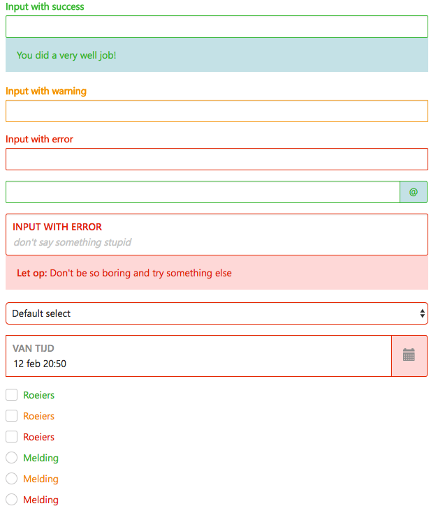
FORM
FORM-GROUP
FORM-CONTROL
FORM-GROUP
FORM-CONTROL
FORM-GROUP
FORM-CONTROL
<input smarter-input />
Extending native HTML inputs with Angular
By tlimpanont


