the basics
measurements
ABSOLUTE
fixed values
RELATIVE
relationships defined
by a series of relative measurements
72pt
6 picas
1 inch
25.4mm
the em
the en
the em dash
the en dash
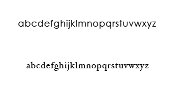
lower case alphabet
used as a guide when setting type
90mm
78mm
the em
- relative unit
- define basic spacing functions
- linked to size of the type
- defines:
- paragraph
- indents
- spacing
the en
half an em dash
There is NO relationship between the em and en and the capitals 'M' and 'N'
em
en
hyphen
—
–
-
same as the pt size of the type
1/2 an em
1/3 an em
em
en
hyphen
—
–
-
pauses in speech
nested clauses and stand in for 'to'
10–11 or 1975–1981
hyphenated words
'half-tone'
the pica
points, pixels, inches, mm
Pica
-
measuring lines of type
-
equal to 12 points
-
6 picas / inch
-
72 points / inch

pixels
relative meaurement
A pixel is a single square 'picture element' (hence pix-el),
A 10x10 image is made up of a set of pixels in
a grid 10 wide by 10 high, totaling 100 pixels.
How many pixels = 1pt
?
depends on the resolution of
your image.
If your image is 72ppi (pixels per inch)
then one point will equal exactly one pixel.
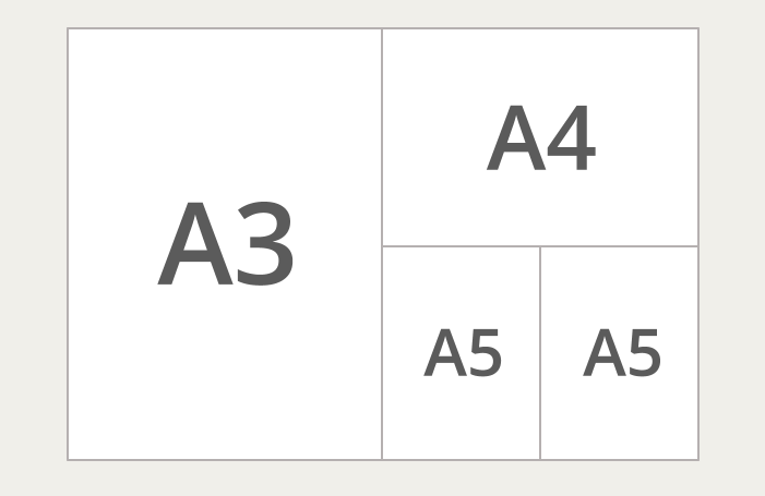
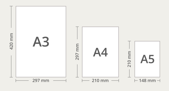
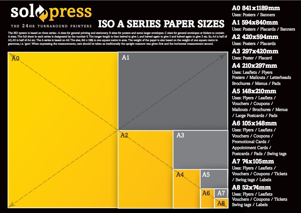
paper sizes
and formats
there are two predominant systems in use today. They are the international and North American systems.
the International Standard - ISO216
the North American System
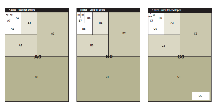
ISO 216
The basis for the whole system is the A0 format which has an area of one square meter.
ISO 216
has an aspect ratio equal to the square root of two (1:4142) which makes it simple to enlarge or reduce a document for printing on another ISO paper format.
standard sizes
A – paper
B – books
C – envelopes
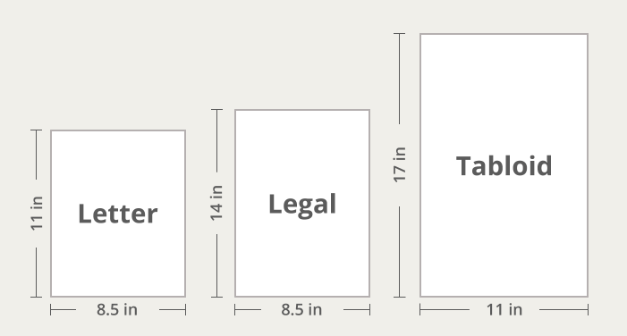
north american sizes
sizes are based on traditional formats with arbitrary aspect ratios
screen sizes
SVGA – 800x600
XGA – 1024x768
2008
screen sizes
1368x768
1920x1080
1024x768
1280x800
1440x900
2015
768x1024
1280x1024
1600x900
1680x1050
1360x768
screen sizes: responsive design
1920x1080
1366x768
360x640
414x896
1536x864
375x667
2021
screen sizes: design for breakpoints
With a huge number of device targets and screen sizes across the Windows 10 ecosystem, rather than optimizing your UI for each device, we recommended designing for a few key width categories (also called “breakpoints“):
-
Small (smaller than 640px)
-
Medium (641px to 1007px)
-
Large (1008px and larger)
2021
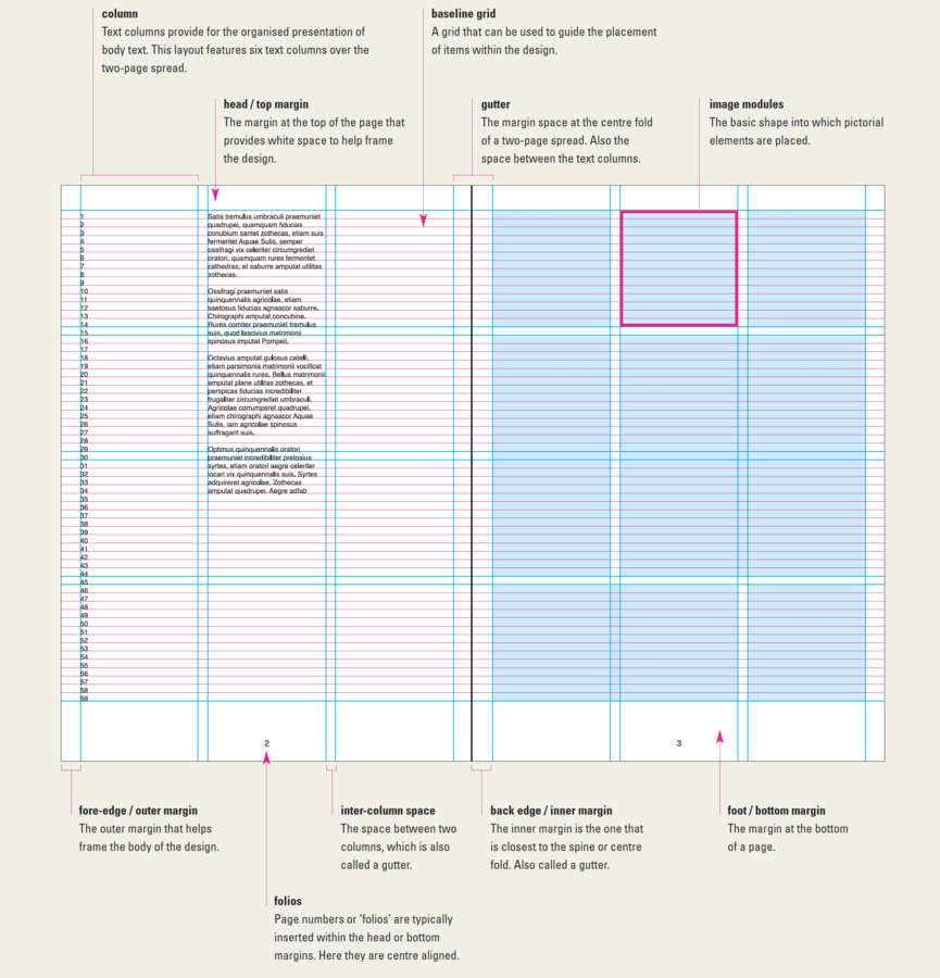
Layout
active/passive
hot / active space


cool / passive space
the basics
By Travis Masingale


