CSS grid
▪️▪️
▪️▪️
What is it?
CSS Grid is a two-dimensional layout system created specifically to tackle grid-based user interfaces on the web.
- Codrops

▪️▪️
▪️▪️
Why do we need it?
- dynamic code
- more control over the grid
- floats and tables were not made for grid
.wannabe-grid {
  display: table;
}

.wannabe-grid-children {
  display: table-cell;
}

.wannabe-v2-grid {
  float: left;
  width: 33.33333%;
}
▪️▪️
▪️▪️
How to use it?
By setting (at least) these properties to the container
- display property
- grid-template-columns
- grid-template-rows
.grid-container {
  display: grid;
  grid-template-columns: 200px 200px 200px;
  grid-template-rows: 50px 50px;
}
▪️▪️
▪️▪️
Grid container
-
Sets the number of rows and columns
-
grid-template-columns, grid-template-rows
Grid column
- Sets the placement of grid items controlled by CSS properties
- grid-column-start, grid-column-end and many others
Two components of every grid
▪️▪️
▪️▪️
Properties for the grid container
▪️▪️
▪️▪️
Display property
.grid-container {
  display: grid;
}Inspector recognizes the grid
▪️▪️
▪️▪️
grid-template-columns
- sets the size of the columns
- space separated list
- units (px), fractions, percentage
Example on the next slide 👉
▪️▪️
▪️▪️
grid-template-rows
- sets the size of the rows
- space separated list
- units (px), fractions, percentage
▪️▪️
▪️▪️
Properties for the grid columns
▪️▪️
▪️▪️
How to count columns and rows?
- grid-column-start
- grid-column-end
- grid-row-start
- grid-row-end
▪️▪️
▪️▪️
grid-column-start
- sets the start position for a grid item within a column
- span | integer
▪️▪️
▪️▪️
grid-column-end
- sets the end position for a grid item within a column
- span | integer
▪️▪️
▪️▪️
grid-row-start
- sets the start position for a grid item within the row
- span | integer
▪️▪️
▪️▪️
grid-row-end
- sets the end position for a grid item within the row
- span | integer
▪️▪️
▪️▪️
Shorthand
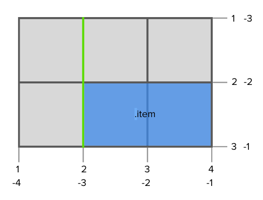
.item {
  grid-column: 4 / 5;
  /* grid-column-start grid-column-end */
  grid-row: 2 / 3;
  /* grid-row-start grid-row-end */
}
...and back to properties for the grid container
▪️▪️
▪️▪️
grid-row-gap
- sets the size of the gap between rows
- unit
Example on the next slide 👉
▪️▪️
▪️▪️
grid-column-gap
- sets the size of the gap between columns
- unit
▪️▪️
▪️▪️
Explicit grid
- defined by grid-template-rows, grid-template-columns
Implicit grid
- browser will assume the size of the columns
▪️▪️
▪️▪️
Examples from every slide can be found here
👇
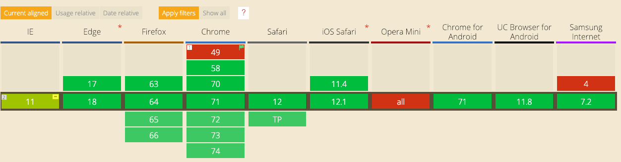
Browser support
▪️▪️
▪️▪️
Explore
- http://cssgridgarden.com/
- https://medium.freecodecamp.org/learn-css-grid-in-5-minutes-f582e87b1228
- https://tympanus.net/codrops/css_reference/grid/#section_grid-inspector-tool
- https://bitsofco.de/how-the-minmax-function-works/
▪️▪️
▪️▪️
How to code a responsive grid?
👩💻
▪️▪️
▪️▪️
Kveščns?
🙄
▪️▪️
▪️▪️
Who wants to speak on the next meetup?
▪️▪️
▪️▪️
Thank you for your attention
🙌
▪️▪️
▪️▪️
CSS grid
By tonkec palonkec


