CSS Media Queries
Made by Antonija with
What?
- CSS logic
- if else statement
- detects the size of the screen
Why?
- responsive web design
- css that adjusts to different screen size and different devices
How?
- using @media rule with min-width or max-width and screen type (print, screen)
/*
  sets body's bg color to blue to screens
  that are wide 768px or wider than that
*/

@media (min-width: 768px) {
    body {
        backgorund-color: blue;
    }
}
/*
sets body's bg color to blue for
screens that are not wider than 767px
*/
@media (max-width: 767px) {
body {
backgorund-color: blue;
}
}min-width and max-width in @media
Media queries target different media types
@media print {
    /* styles applied only to print (printers) */
    body {
        background-color: blue;
    }

}
@media speech {
    /*
      styles applied only to print devices
      that read the page out loud
     */
    body {
        background-color: blue;
    }
}
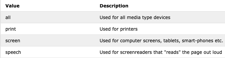
Media Types
Mobile first approach
- adds CSS styles for mobile devices first
- global and desktop styles are outside of the media queries
- apply styles from the smallest to the largest
- uses only min-width
- overwriting in the media queries is important
- order of media queries is important
body {
   /*
     body is black unless it gets
     overwritten by media query

     body will be black on all every
     screen size that is larger than
     or equal to 768px
   */

   background-color: black;
}

@media (min-width: 768px) {
  /*
   body is orange only on the screens
   that are not wider than 768px
  */

   body {
     background-color: orange;
   }
}
Benefits of the mobile first approach
-
constraints of mobile are solved first
-
"heavy" (video, large imgs) content loaded only on desktop => faster page
-
loads the minimal content of the page
Desktop first approach
- adds CSS styles for desktop devices first
- global styles are outside of the media queries
- apply styles from the largest to the smallest
- uses only max-width
- overwriting in the media queries is important
- order of media queries is important
body {
   /*
     body is black unless it gets
     overwritten by media query

     body will be black on every
     screen size that is larger than
     but not equal to 991px
   */

   background-color: black;
}

@media (max-width: 991px) {
    body {
        background-color: orange;
    }
}

@media (max-width: 767px) {
    body {
      background-color: purple;
    }
}
Explore!
Coding time!
I heard you worked with floats last time, is that right?
Let's create responsive layout with floats
Open code editors!
😎
Media Queries
By tonkec palonkec


