R26: Digipak and advert research for RnB music videos
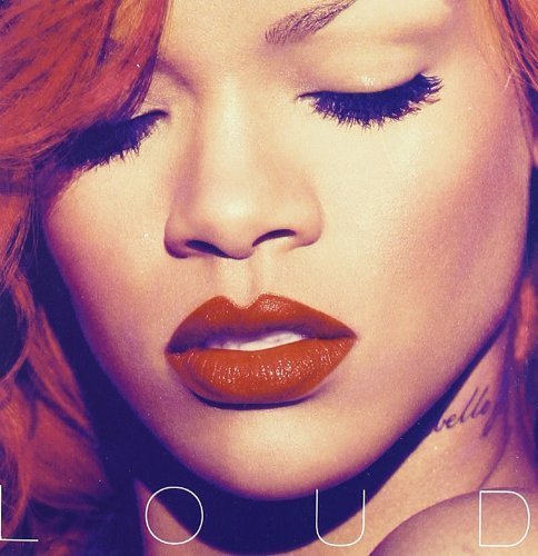
Rihanna - Loud. Album digipak and advert
The Rnb genre often sexualises women, with the 'male gaze' being a key part of how the women are portrayed. The Red used on Rihanna's lips and hair, has connotations of love and lust which will attract men who fancy her, and women who want to be like her. The aesthetics of the cover are very minimalistic, with the album name being the only words on the page.
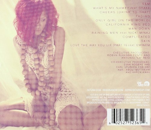
Rihanna - Loud. Album digipak and advert
The image used on the back cover portrays Rihanna as very innocent, based on the way she is posing, and looking away from the camera. The red hair is still a key part, but there is a hazy effect which takes away from the raunchiness, possibly displaying another side to the artist. The font colour matches Rihanna's hair colour, and they all mesh well together.
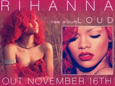
Rihanna - Loud. Album digipak and advert
The digipak features both neutral(cream) and bright(red) colours, however the advert has focused more on the red, and posing Rihanna with her mouth open and with her chest area exposed. These features sexualise the artist, appealing to a certain market. The font's are all the same, and create a house style that is clearly recognisable.
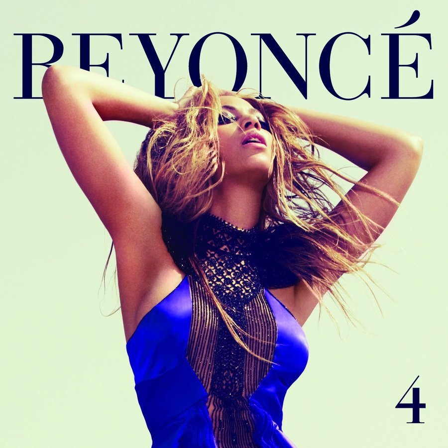
Beyonce - 4 album digipak and advert
Beyonce's name is a key part of this cover, as she is an icon in the music industry, so having her name bold and big displays clearly to the consumer that it is her brand. The image used of the artist is also important as her hair is blowing in the wind, and she is in quite a sexy stance - all making her an alluring women. The album name is also shown smaller in the corner.
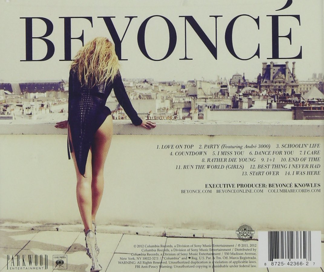
Beyonce - 4 album digipak and advert
Again, Beyonce's name is a key factor of the digipak - clearly showing the artists name so in turn drawing the correct audience in. An artistic shot on a rooftop creates a scenic view, with an over the shoulder shot of Beyonce with not much clothing, and her iconic long hair emphasises the brand.
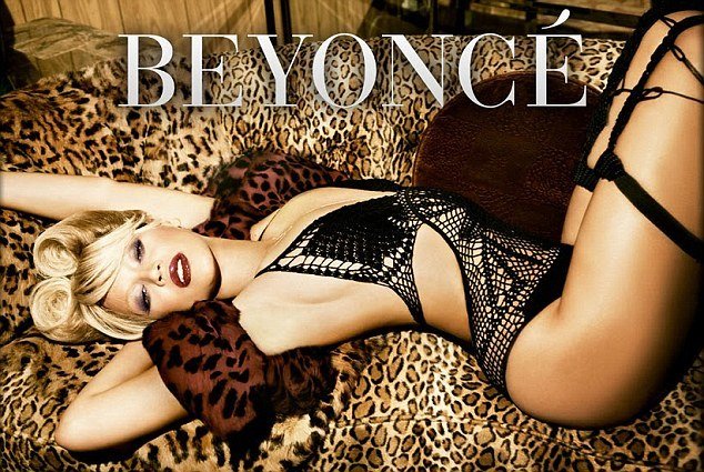
Beyonce - 4 album digipak and advert
This advert for 4 uses slightly different colours and textures, however the font and size of the artists name is still used, tying the digipak and advert together. The image of Beyonce presents her as sexy, as the 'male gaze' is being used, as well as her in lingerie and posing to extenuate her curves. The leopard print adds a boudoir feel to the advert, which also adds to the tone.
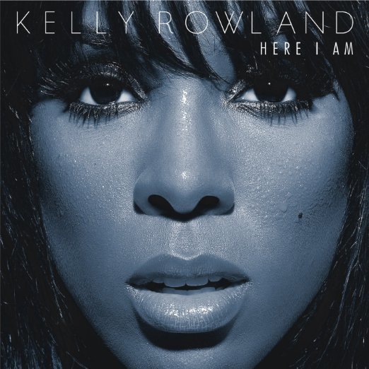
Kelly Rowland - Here I Am digipak and advert
A close up image of Kelly Rowland is used, which is common of the RnB genre. The blue tones add an edge to the photo. The artist has water droplets on her skin, and this combined with her bold eyes and parted mouth attract the audience. The font is minimalistic, and doesn't take away from the representation that is being made of Kelly Rowland.
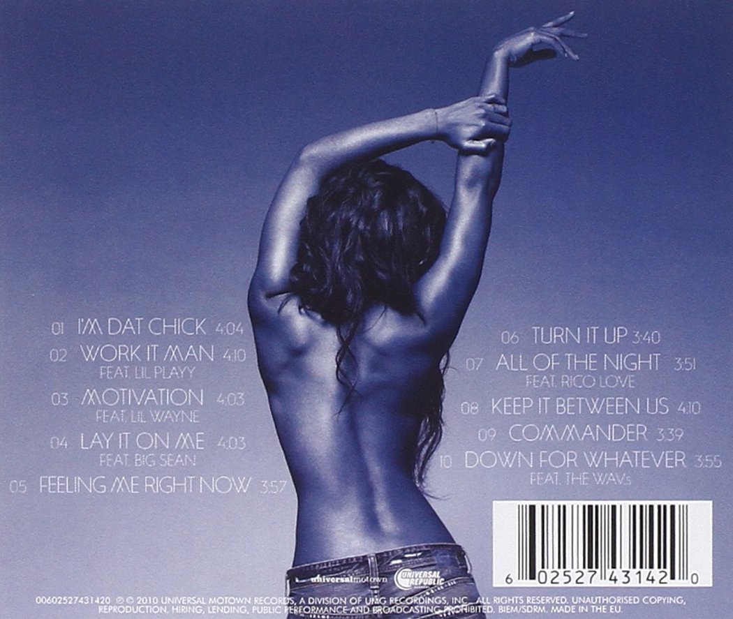
Kelly Rowland - Motivation single digipak and advert
The colours remain consistent, with purple/blue tones still present. However, instead of a close up, a long shot of the artist is used. Kelly is topless, though shown from the back to add a sense of innocence, but it doesn't remove that lust that comes from being half naked. The font is also minimalistic.
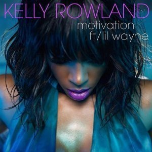
Kelly Rowland - Motivation single digipak and advert
The purple and blue colours used in this cover are very deep and alluring. They tie in throughout the whole piece, with Kelly's lips matching the font colour of her name. The artists hair, lips and glistening skin are key to attracting an audience, as they work together to present the artist as alluring.
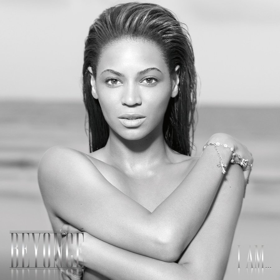
Beyonce - I Am Sasha Fierce album digipak and advert
A mid shot of Beyonce is used, where she is topless though covering herself with her arms which takes away from the raunchiness and adds a sense of bareness and purity. The fact that she has no make-up, and slicked back hair suggests this too. The title and artist of the album isn't very bold, and is hidden which makes the image of Beyonce the most important part.

Beyonce - I Am Sasha Fierce album digipak and advert
This image is very contrasting from the last, with an 'alter ego' of Beyonce being portrayed. Though black and white is still used, there are elements of gold which is still fitting to the house style. Her pose is less innocent and instead empowering, which will appeal to the female audience. The font is small and not a key part of the digipak.
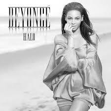
Beyonce - I Am Sasha Fierce album digipak and advert
This is an advert for Beyonce's Halo single. The house style is still clear, and you can tell it is promoting I Am Sasha Fierce. A long shoot is used, and the innocent theme is still present.
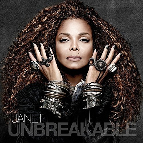
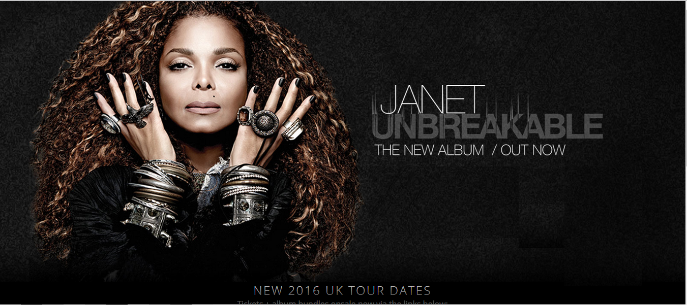
Janet Jackson - Unbreakable digipak and album advert
Much like the other album covers, the artist is a key part. Here Janet is portrayed as regal and powerful, with her long hair, glowing skin and jewellery. The colours aren't too bright, yet they add in with the regal tone of the piece.
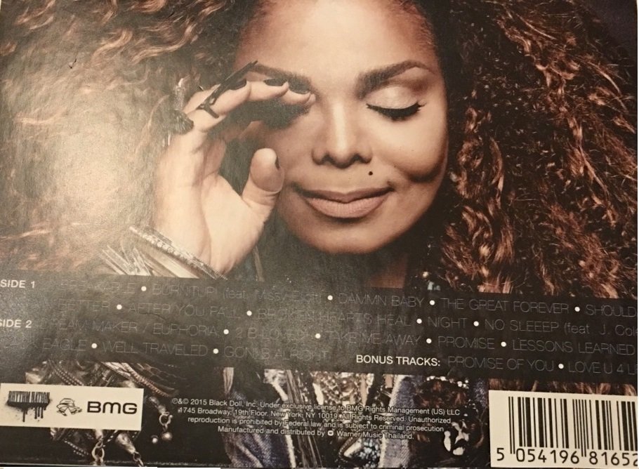
Janet Jackson - Unbreakable digipak and album advert
The image on the back of the album is a bit more innocent, perhaps showing another side of the artist. The same colours are used.
Janet Jackson - Unbreakable digipak and album advert
This advert uses the same image from the album cover, which is a key signifier to the audience that they are from the same album. The colours and font are consistent with the digipak.
r26
By topazlynch