Email Template
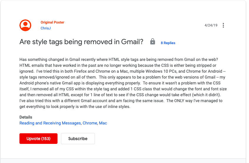
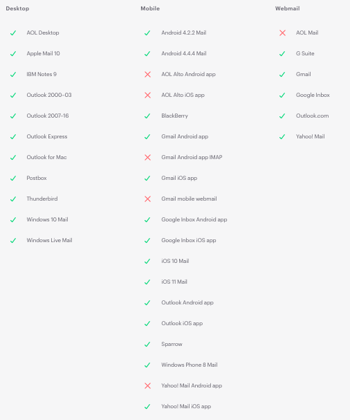
cross platform problems
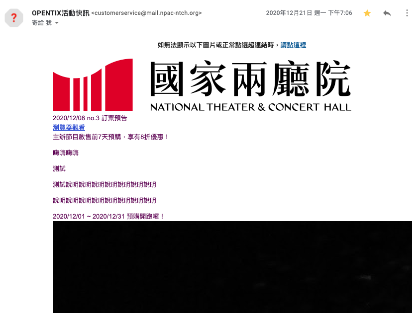
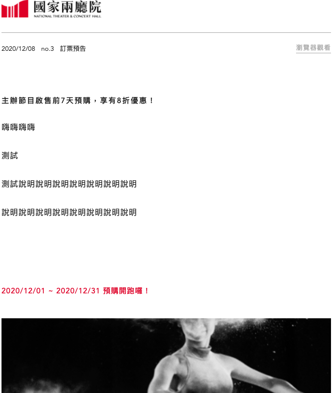
You'll receive something like ...
custom html

okay... so let's start to create a html like usual
<!DOCTYPE html>
<html lang="zh-TW">
<head>
<title>電子報</title>
<meta charset='utf-8' />
<meta name='viewport' content='initial-scale=1, maximum-scale=1' />
<style type="text/css">
.wrapper {
width: 100%;
max-width: 720px;
margin: 0 auto;
}
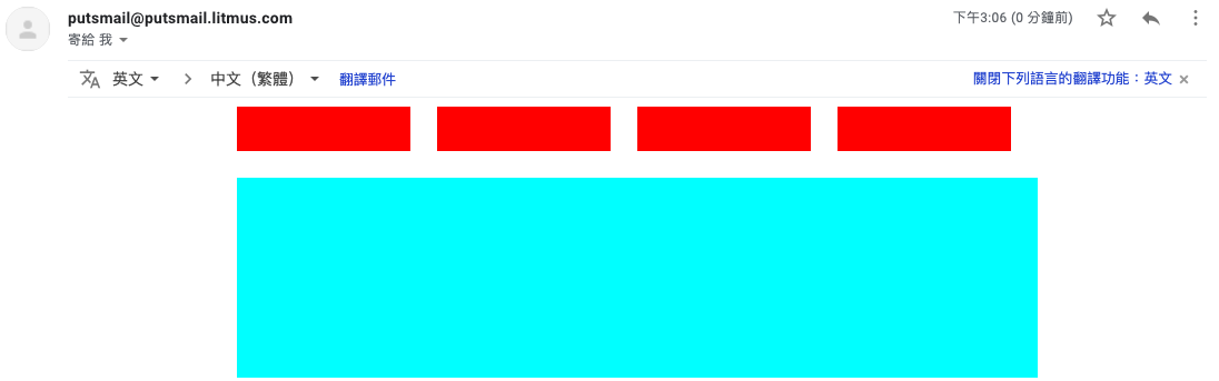
.flex-container {
display: flex;
flex-flow: row wrap;
align-items: flex-start;
justify-content: flex-start;
}
.box {
width: 280px;
height: 40px;
background-color: red;
margin: 0 24px 24px 0;
}
.grid-container {
display: grid;
grid-template-columns: repeat(2, 1fr);
grid-gap: 24px;
}
.grid-box {
width: 100%;
height: 60px;
background-color: aqua;
}
</style>
</head>
<body>
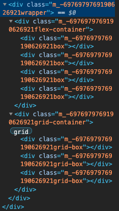
<div class="wrapper">
<div class="flex-container">
<div class="box"></div>
<div class="box"></div>
<div class="box"></div>
<div class="box"></div>
</div>
<div class="grid-container">
<div class="grid-box"></div>
<div class="grid-box"></div>
<div class="grid-box"></div>
</div>
</div>
</body>
</html>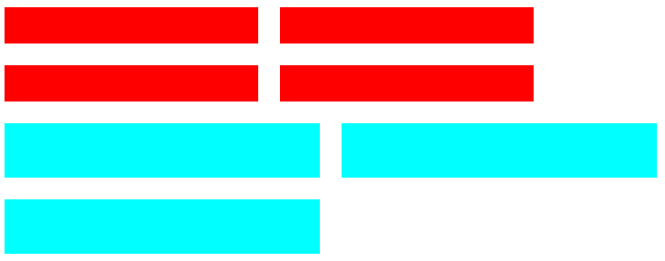
Send email (*´∀`)~♥
٩(ŏ﹏ŏ、)۶
Gmail
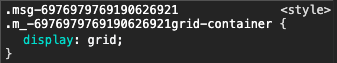
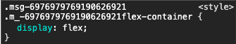
- Not Allowed: flex, grid, transition, css var...
- Allowed: media query, table ... etc
.wrapper {}

@media screen and (max-width: 767px) {
  .wrapper {}
}
<div class="wrapper" style="width: 100%;"></div>Gmail announced support media queries and <style> tag since 2016
<head>
  <style text="text/css">
    .wrapper { ... }
  </style>
</head>
<body>
  <div class="wrapper">
    <div style="width: 100%;" />
  </div>
</body>
How about other platforms ?
Everything looks good, but...
<!DOCTYPE html>
  <html lang="zh-TW">
    <head>
      <title>電子報</title>
      <meta charset='utf-8' />
      <meta name='viewport' content='initial-scale=1, maximum-scale=1' />
      <style type="text/css">
        * {
          box-sizing: border-box;
          font-family: 'Avenir', 'PingFang TC', '微軟正黑體', sans-serif;
        }
        html, body {
          padding: 0;
          margin: 0;
          background-color: #fff;
        }
        .partWrapper {
          padding: 20px 0 20px 0 !important;
        }
        .artibox-theme-artibox {
          --artibox-primary-light: #c1eef2;
          --artibox-primary: #CB333B;
          --artibox-primary-dark: #CB333B;
          --artibox-background: #f5f5f5;
          --artibox-surface: #fff;
          --artibox-text: #000;
          --artibox-link: #a8a8a8;
          --artibox-border: #F6F6F6;
          --artibox-divider: #c1c1c1;
          --artibox-placeholder: #9e9e9e;
          --artibox-icon: #7d7d7d;
        }

        .ntch-artibox-render-preview mark {
          color: var(--artibox-primary);
          background-color: inherit;
          transition: color 300ms ease-in-out;
          padding: 0 1px 0 0;
        }

        .ntch-artibox-render-preview a {
          color: var(--artibox-link);
          transition: color 300ms ease-in-out;
          text-decoration: underline;
        }

        .ntch-artibox-render-preview p {
          margin: 0;
          padding-top: 0;
          padding-bottom: 28px;
        }

        .header-block-wrapper {
          width: 100%;
          padding: 80px 0 100px;
        }

        @media only screen and (max-width: 767px) {
          .header-block-wrapper {
            padding: 0 0 80px;
          }
        }

      </style>
    </head>
    <body>
      <div style="width:100%;max-width:720px;height:100%;margin:0 auto;"><div class="header-block-wrapper"></div></div>
    </body>
  </html>
Try to figure out...
Until I found this article...
Then, I found...
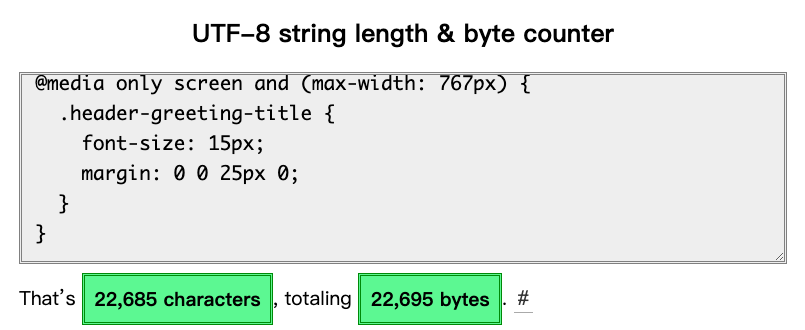
<style type="text/css">
// 22685 characters
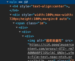
</style>How Gmail parse our html ?
<!DOCTYPE html>
<html lang="zh-TW">
  <head>
    <style type="text/css">
      .wrapper {
        width: 100%;
        max-width: 720px;
        margin: 0 auto;
      }
    </style>
  </head>
  <body>
    <div class="wrapper"></div>
  </body>
</html>
<!DOCTYPE html>
<html>
<head>
<!--Gmail Heads-->
<!-- Out template css parsed -->
<style nonce>
.msg-526586418936146449 .m_-526586418936146449wrapper {
width: 100%;
max-width: 720px;
margin: 0 auto;
}
</style>
</head>
<body>
<!-- Gmail Body -->
<!-- Our template start -->
<div class="msg-526586418936146449">
<div class="m_-526586418936146449wrapper"></div>
</div>
</body>
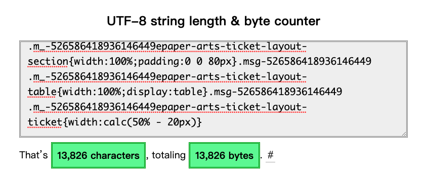
</html>How Gmail parse our html ?
<style type="text/css">
  .wrapper {
    width: 100%;
    max-width: 720px;
    margin: 0 auto;
  }
</style>
<style type="text/css">
  .block { ... }
  .image { ... }
</style>
<style type="text/css">
  .text { ... }
  .line { ... }
</style>
<style nonce>
.msg-526586418936146449 .m_-526586418936146449wrapper {
width: 100%;
max-width: 720px;
margin: 0 auto
}
</style>How Gmail parse our html ?
<style nonce>
.msg-526586418936146449 .m_-526586418936146449wrapper {
  width: 100%;
  max-width: 720px;
  margin: 0 auto
}
.msg-526586418936146449 .m_-526586418936146449block {
}
.msg-526586418936146449 .m_-526586418936146449image {
}
</style>
<style type="text/css">
.wrapper {
width: 100%;
max-width: 720px;
margin: 0 auto;
}
</style>
<style type="text/css">
.block { ... }
.image { ... }
</style>
<style type="text/css">
.text { ... }
.line { ... }
</style>How Gmail parse our html ?
<style nonce>
.msg-526586418936146449 .m_-526586418936146449wrapper {
width: 100%;
max-width: 720px;
margin: 0 auto
}
.msg-526586418936146449 .m_-526586418936146449block {
}
.msg-526586418936146449 .m_-526586418936146449image {
}
</style>If this style block overflow
<style type="text/css">
  .wrapper {
    width: 100%;
    max-width: 720px;
    margin: 0 auto;
  }
</style>
<style type="text/css">
  .block { ... }
  .image { ... }
</style>
<style type="text/css">
  .text { ... }
  .line { ... }
</style>Keep trying...
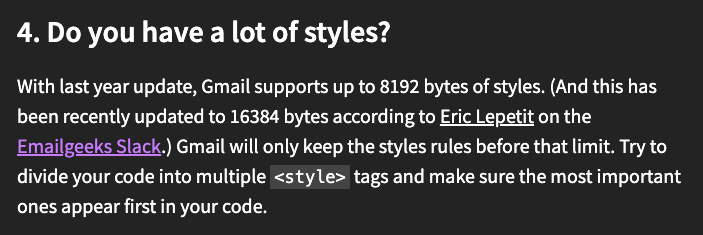
Is the 16384 bytes limitation existed ?
Can't add anymore codes
That is Gmail problems. How about others?
Problems I found
Yahoo (all devices)
- Not allowed "box-sizing", "calc"
<head>
  <style type="text/css">
    * {
      box-sizing: border-box;
    }
    .box {
      width: calc(100% - 280px);
      height: 40px;
    }
  </style>
</head>
<body>
  <div class="box" />
</body>
<head>
<style type="text/css">
* {
}
.box {
height: 40px;
}
</style>
</head>
<body>
<div class="box" />
</body>yahoo
Summary
The best solution is still using inline-style when making an email template
AND
Hope your css will not been eliminated by mail platform
One more thing
- Blink: Chrome, Edge, Brave, Opera (Chromium)
- Gecko: Firefox (Mozilla)
- Webkit: Safari
- EdgeHTML: formerly in Edge
References
Tools
Email Template
By Travor Lee


