Lesson 8
Visualising and Analysing
Network Data
Version 1.9.0
Last updated: 05/10/2018, 11:00pm

IS428 Visual Analytics for Business Intelligence
IS428 Visual Analytics for Business Intelligence
Content
- Introduction to Graph Analytics
- Graph Analytics in Actions
- Basic Principles of Graph
- Graph Analytics Process Model
- Graph Layouts
- Graph Visual Attributes
- Graph Metrics
- Graph Analytics Toolkits
IS428 Visual Analytics for Business Intelligence
Lesson 8: Visualising and Analysing Network Data
Introduction to Graph Analytics
- The study and analysis of data that can be transformed into a graph representation consisting of nodes and links.
IS428 Visual Analytics for Business Intelligence
Lesson 8: Visualising and Analysing Network Data
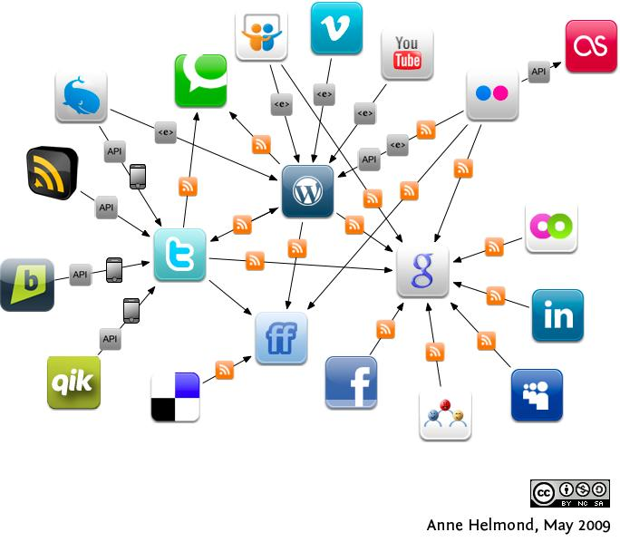
Real world graph
- Social media network
IS428 Visual Analytics for Business Intelligence
Lesson 8: Visualising and Analysing Network Data
Real world graph
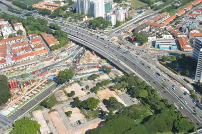


- Land transport networks
IS428 Visual Analytics for Business Intelligence
Lesson 8: Visualising and Analysing Network Data
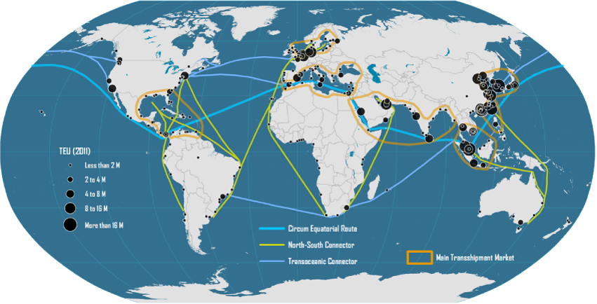
Real world graph
- Maritime transport networks

IS428 Visual Analytics for Business Intelligence
Lesson 8: Visualising and Analysing Network Data
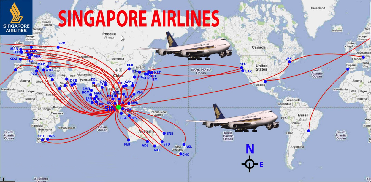
Real world graph
- Air transport networks
IS428 Visual Analytics for Business Intelligence
Lesson 8: Visualising and Analysing Network Data
Real world graph
- Utility networks


IS428 Visual Analytics for Business Intelligence
Lesson 8: Visualising and Analysing Network Data
Real world graph
- Social networks
IS428 Visual Analytics for Business Intelligence
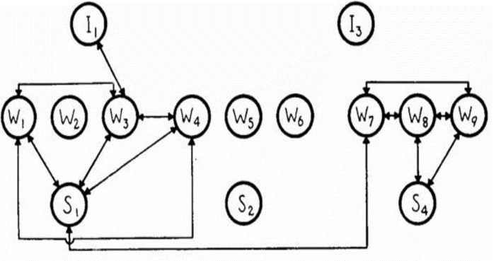
Lesson 8: Visualising and Analysing Network Data
Classical Graph Visualisation and Analysis
-
Using sociogram, also know as network graph, to study friendship ties amongst the Wiring Room employees

IS428 Visual Analytics for Business Intelligence
Lesson 8: Visualising and Analysing Network Data
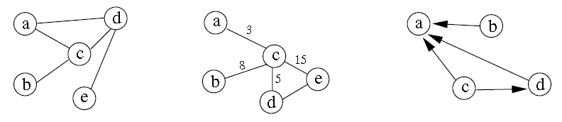
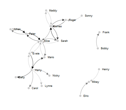
Basic Principles of Graph
Graph representation
-
On the left is a normal graph, in the centre is a graph in which each edge is given a numerical value, and to the right is a directed graph.
IS428 Visual Analytics for Business Intelligence
Lesson 8: Visualising and Analysing Network Data
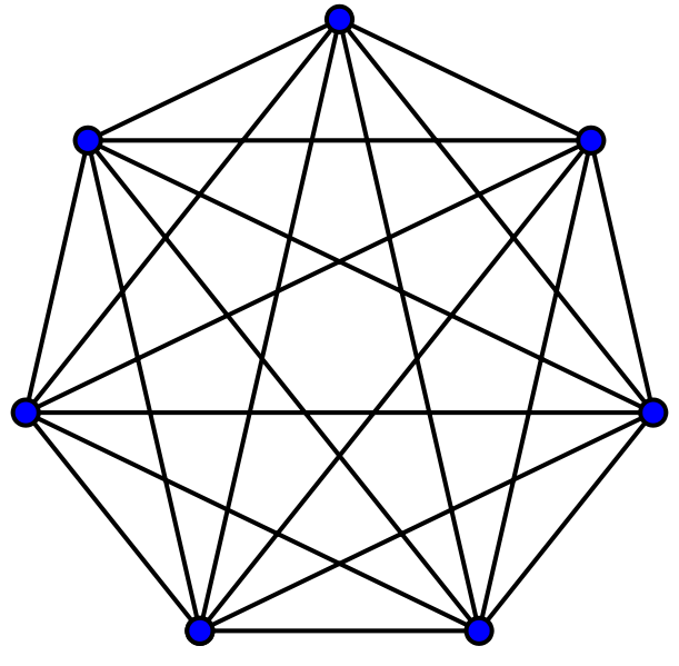
Basic Principles of Graph
A Complete Graph
-
A simple undirected graph in which every pair of distinct vertices is connected by a unique edge.
IS428 Visual Analytics for Business Intelligence
Lesson 8: Visualising and Analysing Network Data
Basic Principles of Graph
An un-directed graph
-
A simple graph in which every pair of distinct vertices (also known as nodes) are connected by an unique edge.
IS428 Visual Analytics for Business Intelligence
Lesson 8: Visualising and Analysing Network Data
Basic Principles of Graph
A directed graph
-
Have a clear origin and destination.
-
Also known as asymmetric edges.
IS428 Visual Analytics for Business Intelligence
Lesson 8: Visualising and Analysing Network Data
Basic Principles of Graph
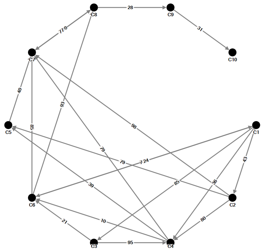
A weighted graph
- A weighted edge includes values associated with each edge that indicate the strength or frequency of tie. For example, numbers of calls between two staffs.
IS428 Visual Analytics for Business Intelligence
Lesson 8: Visualising and Analysing Network Data
Basic Principles of Graph
A weighted graph
-
Edges with different thickness are used to represent the monthly calls by staffs.
IS428 Visual Analytics for Business Intelligence
Lesson 8: Visualising and Analysing Network Data
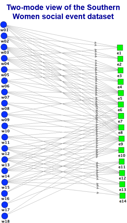
Basic Principles of Graph
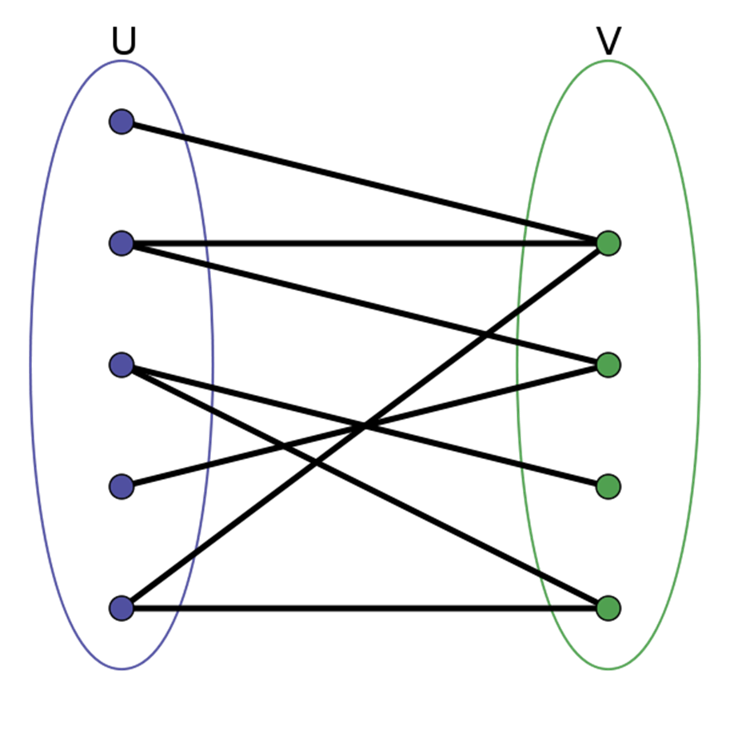
A Bipartite Graph
-
A graph whose vertices can be divided into two disjoint sets U and V such that every edge connects a vertex in U to one in V; that is, U and V are independent sets.
-
Equivalently, a bipartite graph is a graph that does not contain any odd-length cycles.
IS428 Visual Analytics for Business Intelligence
Lesson 8: Visualising and Analysing Network Data
Basic Principles of Graph
A Bipartite Graph-affiliation networks
IS428 Visual Analytics for Business Intelligence
Lesson 8: Visualising and Analysing Network Data
Basic Principles of Graph
A Multimodel Graph
- Social network connecting different types of vertices.
- For example, a network may connect peers to discussion forums and blog posts they have commented on.
IS428 Visual Analytics for Business Intelligence
Lesson 8: Visualising and Analysing Network Data
Basic Principles of Graph
Graph Analytics Process Model
IS428 Visual Analytics for Business Intelligence
Lesson 8: Visualising and Analysing Network Data
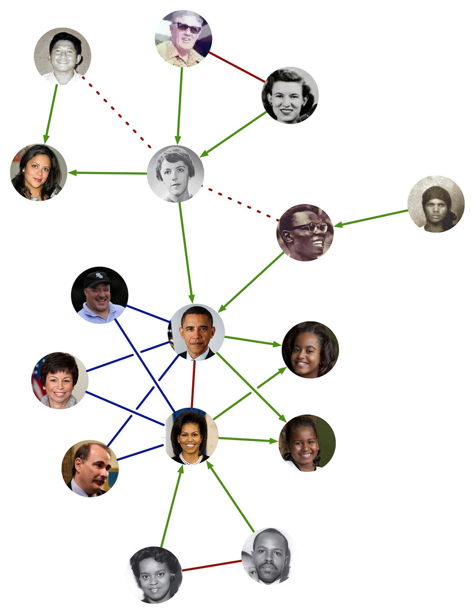
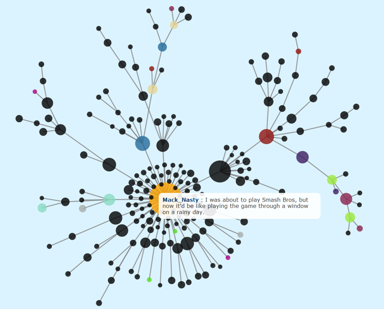
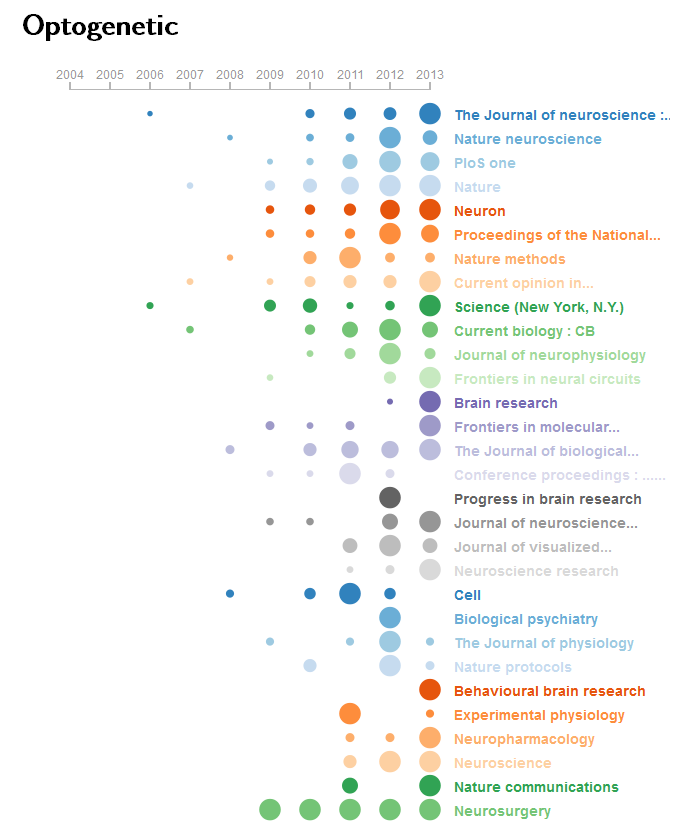
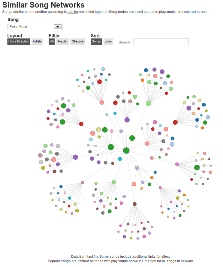
Graph Analytics in Action
-
Graph visualisation is used to understand online social network of a professor
IS428 Visual Analytics for Business Intelligence
Lesson 8: Visualising and Analysing Network Data
Graph Analytics in Action
-
Graph visualisation is used to show how the news are all connected by degrees of separation
For more information: https://blog.embed.ly/visualizing-discussions-on-reddit-with-a-d3-network-and-embedly-e3ac9297bebd#.2fs77r21y
IS428 Visual Analytics for Business Intelligence
Lesson 8: Visualising and Analysing Network Data
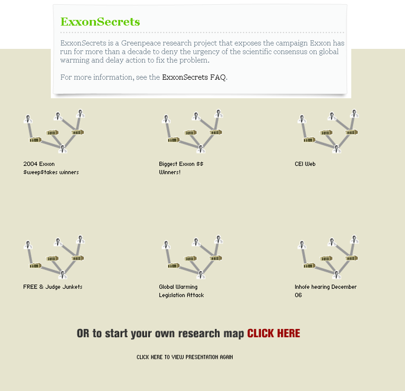
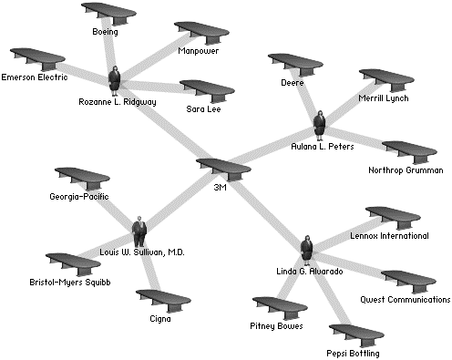
Graph Analytics in Action
-
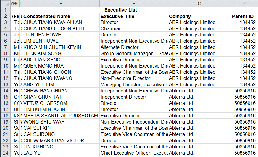
Using graph visualisation to understand business networks
IS428 Visual Analytics for Business Intelligence
Lesson 8: Visualising and Analysing Network Data
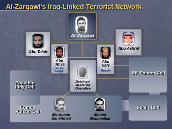
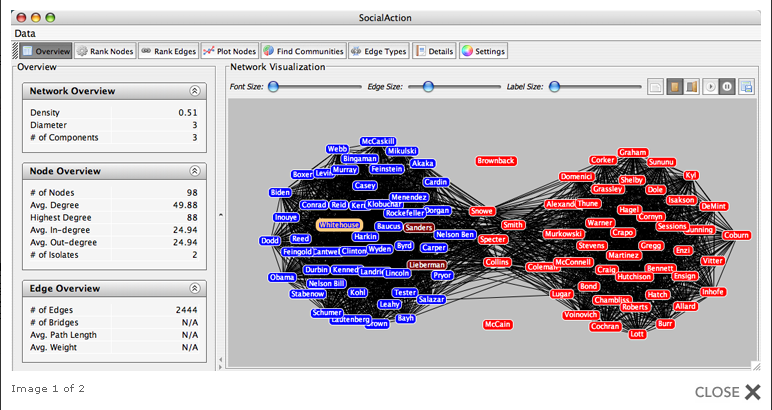
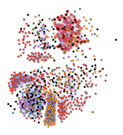
Graph Analytics in Action
-
Graph visualisation is used to reveal voting patterns among United States senators
IS428 Visual Analytics for Business Intelligence
Lesson 8: Visualising and Analysing Network Data
Graph Analytics in Action
-
Graph visualisation is used to support network instrution analysis
-
(a) Similarity graph of log entries and (b) Similarity graph of network scans
-
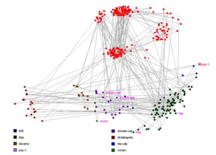
(a)
(b)
IS428 Visual Analytics for Business Intelligence
Lesson 8: Visualising and Analysing Network Data
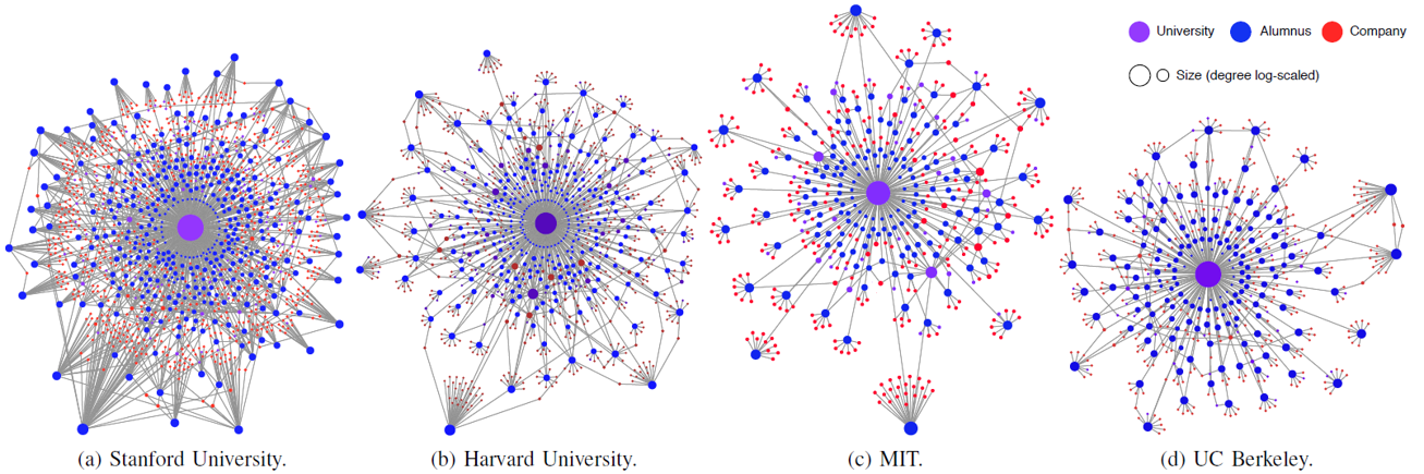
Graph Analytics in Action
-
Networks universities' alumni
IS428 Visual Analytics for Business Intelligence
Lesson 8: Visualising and Analysing Network Data
Graph Analytics in Action
-
Graph visualisation is used to study the interaction between project team members in a construction project.
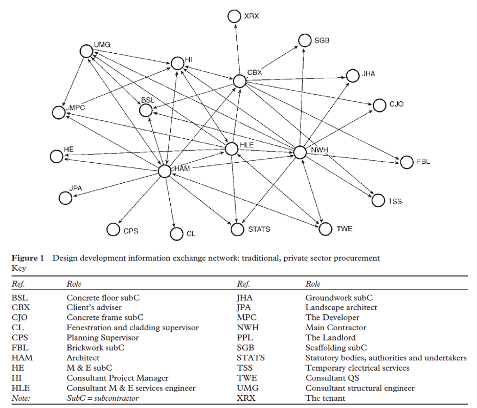
Source: Pryke, S.D.”Analysing construction project coalitions: exploring the application of social network analysis”, Construction Management and Economics, (2004), 22. pp. 787-797.
IS428 Visual Analytics for Business Intelligence
Lesson 8: Visualising and Analysing Network Data
Graph Analytics in Action
-
Graph visualisation is used to investigate community structure in protein-protein interaction networks.
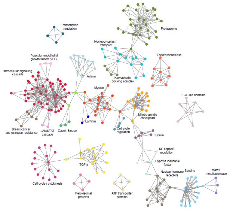
IS428 Visual Analytics for Business Intelligence
Lesson 8: Visualising and Analysing Network Data
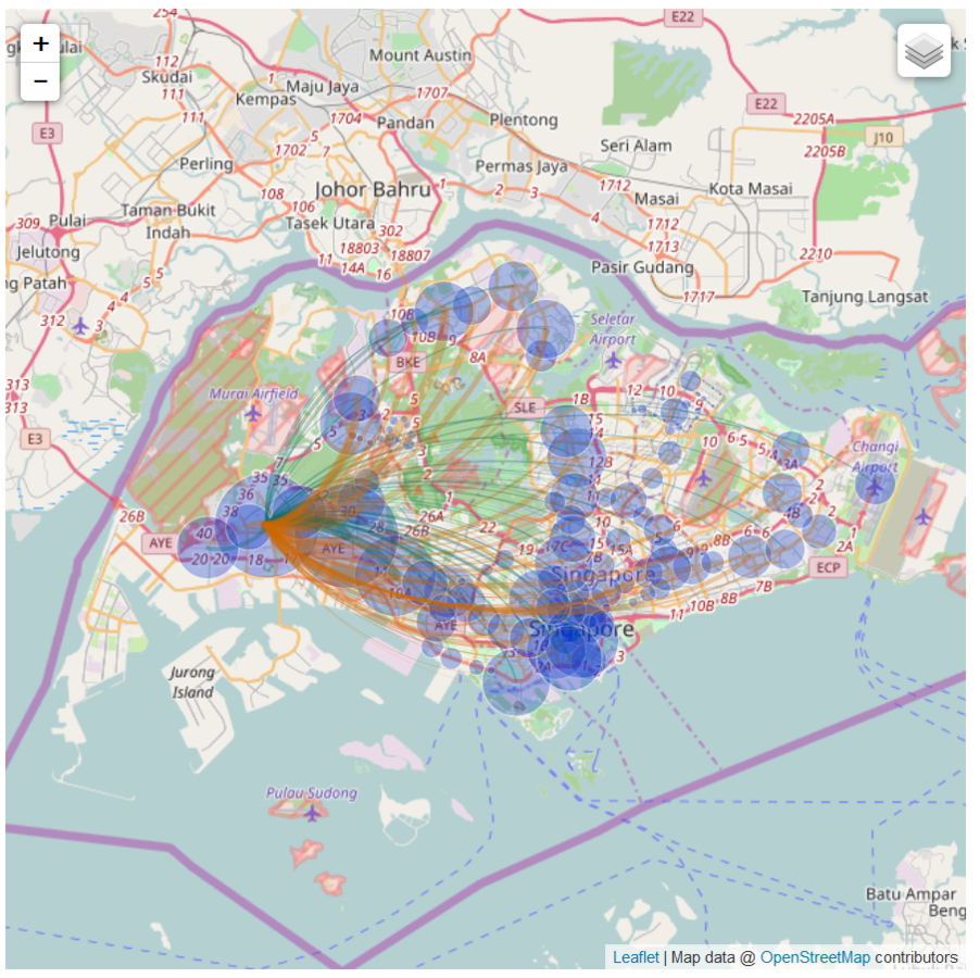
Graph Analytics in Action
-
Graph visualisation is used to study for multi-modal urban transport systems
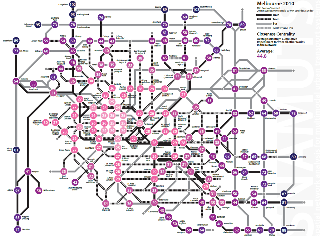
IS428 Visual Analytics for Business Intelligence
Lesson 8: Visualising and Analysing Network Data
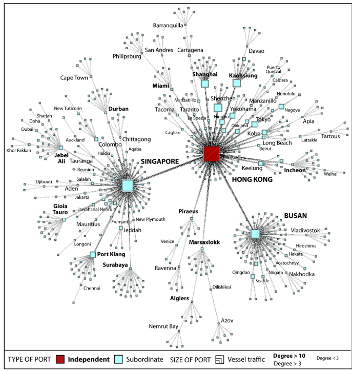
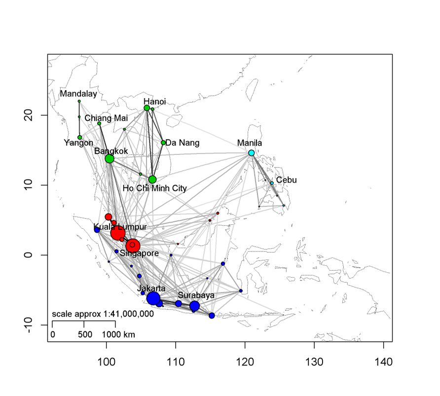
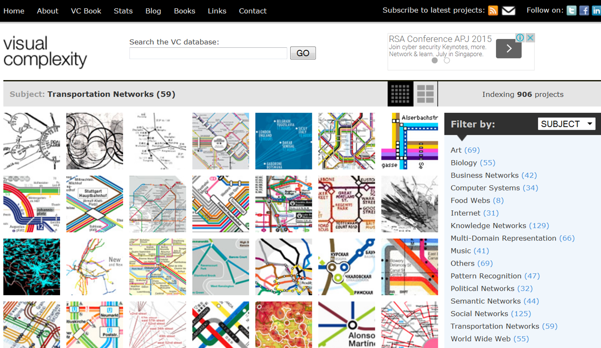
Graph Analytics in Action
-
Graph visualisation for global transportation networks study
IS428 Visual Analytics for Business Intelligence
Lesson 8: Visualising and Analysing Network Data
Graph Analytics in Action
-
To learn more, go to Visual Complexity
IS428 Visual Analytics for Business Intelligence
Lesson 8: Visualising and Analysing Network Data
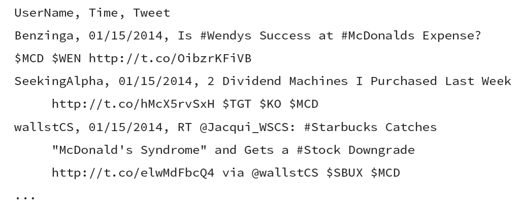
Graph Data
Source of Network Data
-
Unstructured data (for example, Tweets)

IS428 Visual Analytics for Business Intelligence
Lesson 8: Visualising and Analysing Network Data
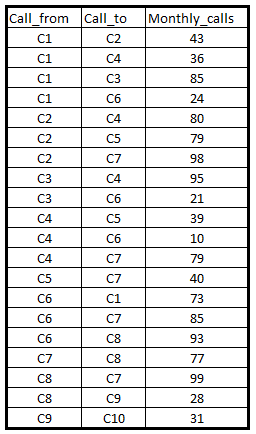
Graph Data
Source of Network Data
-
Structured data with node and link fields (for example, phone call)
IS428 Visual Analytics for Business Intelligence
Lesson 8: Visualising and Analysing Network Data
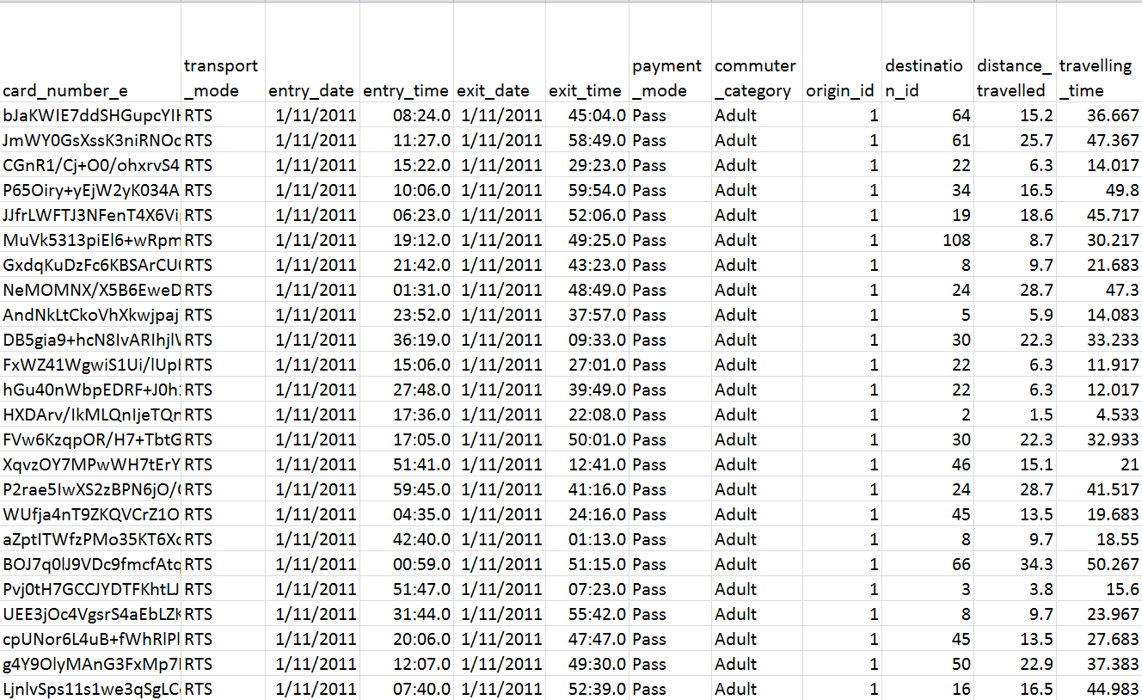
Graph Data
Source of Network Data
-
Transaction records (for example, EZLink card)
IS428 Visual Analytics for Business Intelligence
Lesson 8: Visualising and Analysing Network Data
Graph Data
Source of Network Data
-
Company directory such as OneSource and opencorporates (https://opencorporates.com/)
IS428 Visual Analytics for Business Intelligence
Lesson 8: Visualising and Analysing Network Data
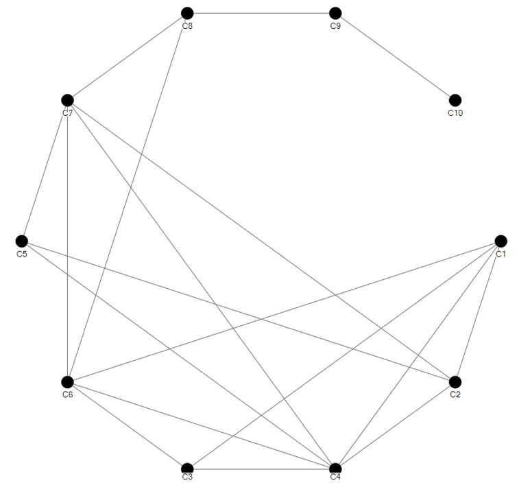
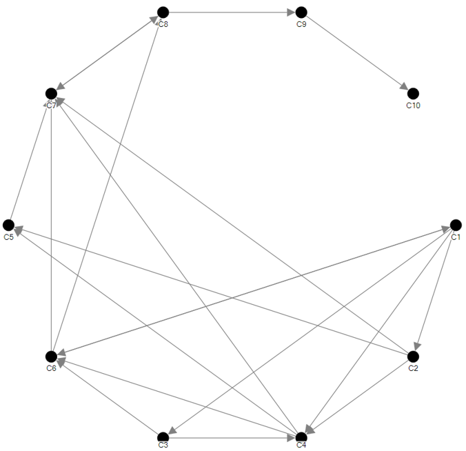
Graph Data
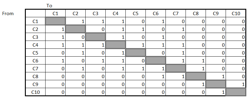
An undirected link table
-
Focus on interaction but not the direction.
-
For example C1 -> C6 and C6 -> C1 are considered as one interaction.
-
- The table is symmetric.
IS428 Visual Analytics for Business Intelligence
Lesson 8: Visualising and Analysing Network Data
Graph Data
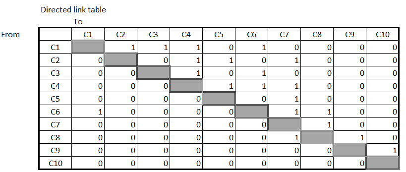
A directed link table
-
Focus on both interaction and direction.
-
For example C1 -> C6 and C6 -> C1 are considered as two different interactions.
-
-
The table is asymmetric.
IS428 Visual Analytics for Business Intelligence
Lesson 8: Visualising and Analysing Network Data
Graph Data
Popular Graph Data File Formats
-
GraphML, an XML-based file format for graphs.
-
GXL, graph exchange format based on XML.
-
Trivial Graph Format, simple text based format.
-
GML is another widely used graph exchange format.
-
DGML, Directed Graph Markup Language from Microsoft.
-
XGMML, an XML-based graph markup language closely related to GML.
-
Dot Language, a format for describing graphs and their presentation, for the Graphviz set of tools.
IS428 Visual Analytics for Business Intelligence
Lesson 8: Visualising and Analysing Network Data
Graph Data
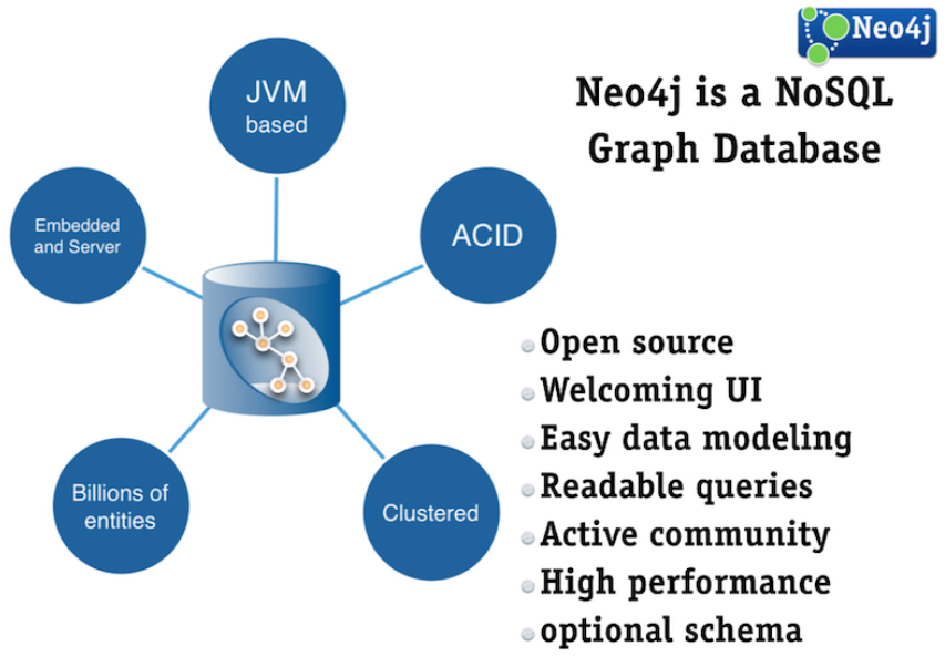
Graph database
IS428 Visual Analytics for Business Intelligence
Lesson 8: Visualising and Analysing Network Data
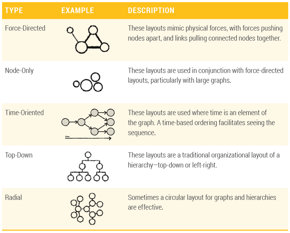
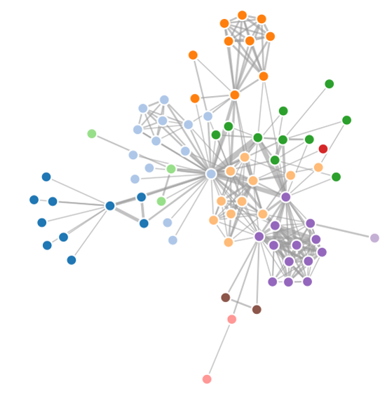
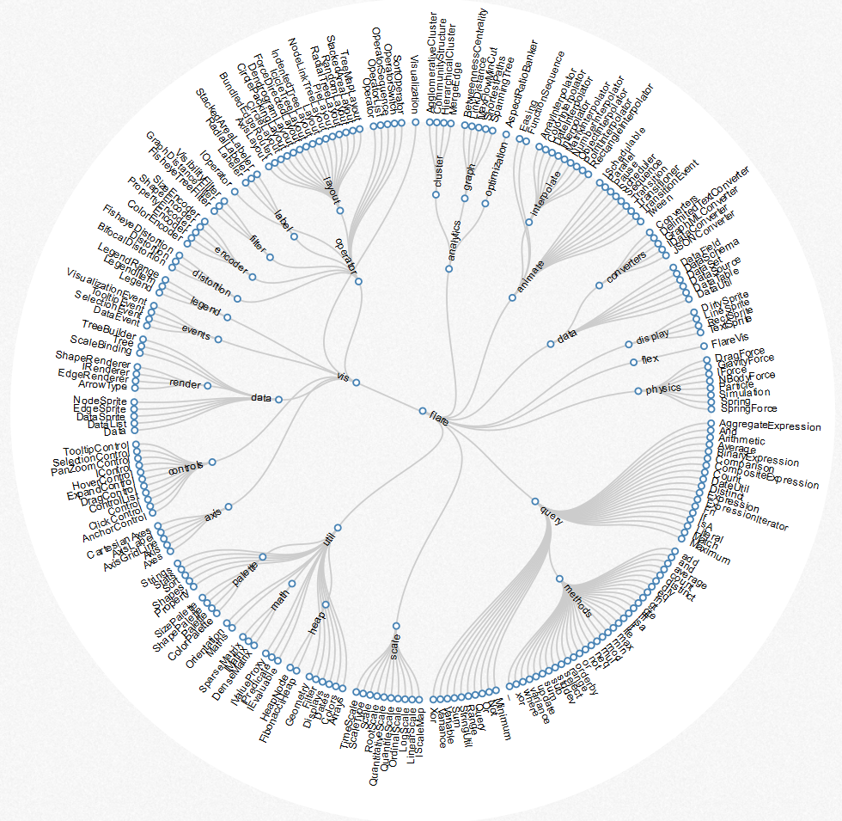
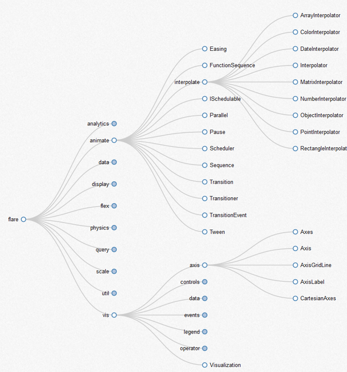
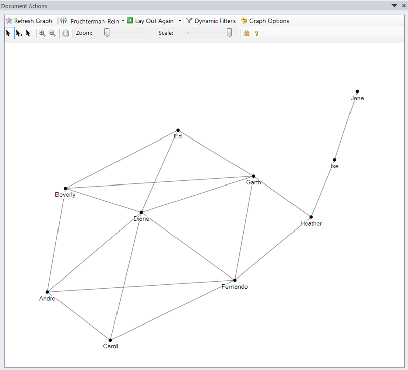
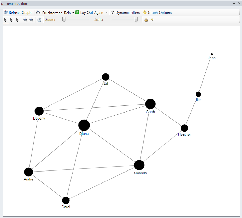
Graph Layout
Node-and-Link Layouts
- One common method for drawing graphs is to draw nodes as markers, and edges as lines connecting them (also referred to as links).
IS428 Visual Analytics for Business Intelligence
Lesson 8: Visualising and Analysing Network Data
Graph Layout
Force-Directed Layout
IS428 Visual Analytics for Business Intelligence
Lesson 8: Visualising and Analysing Network Data
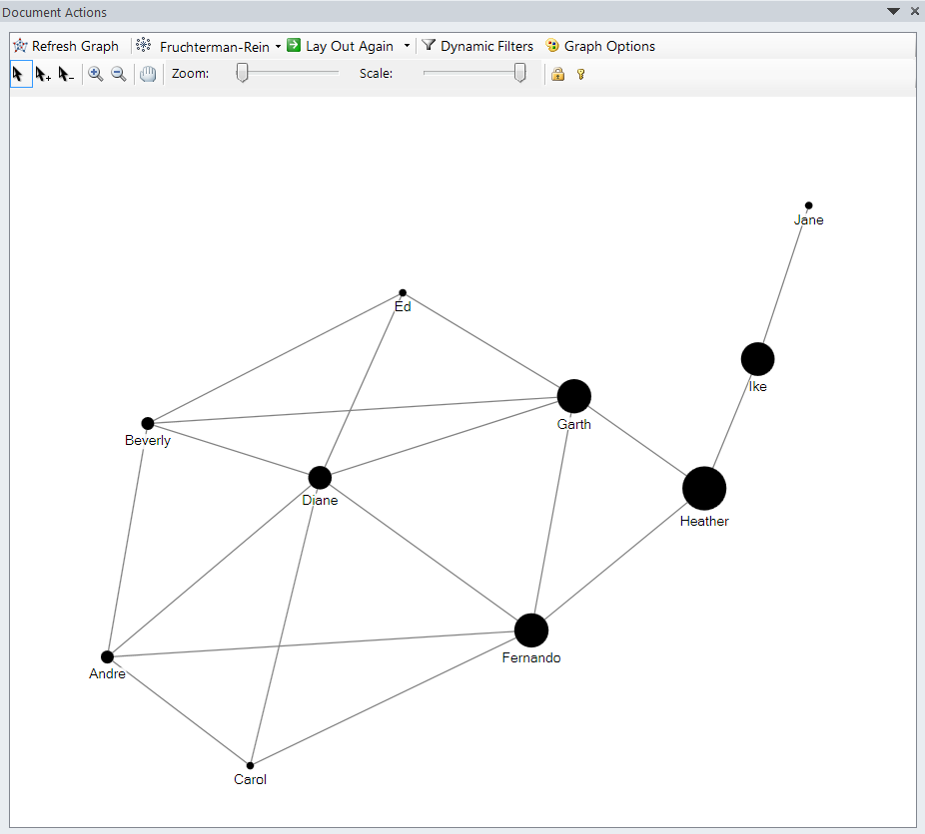
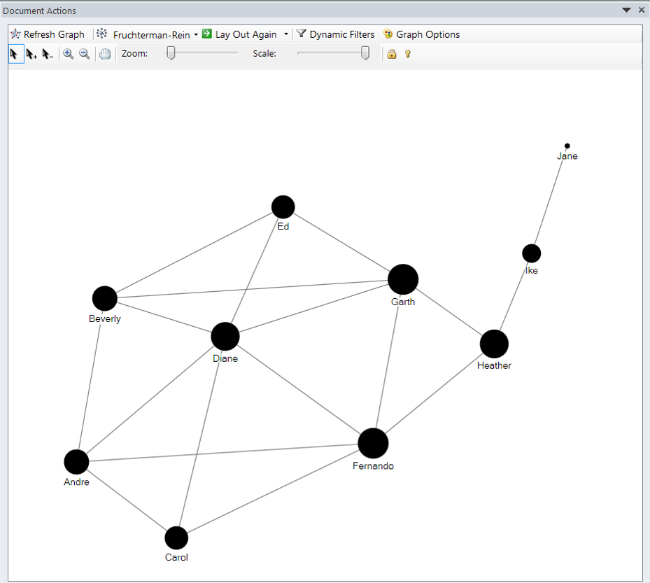
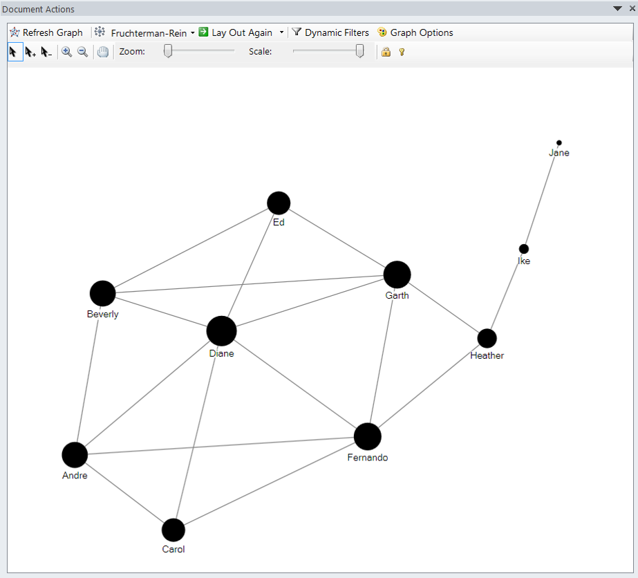
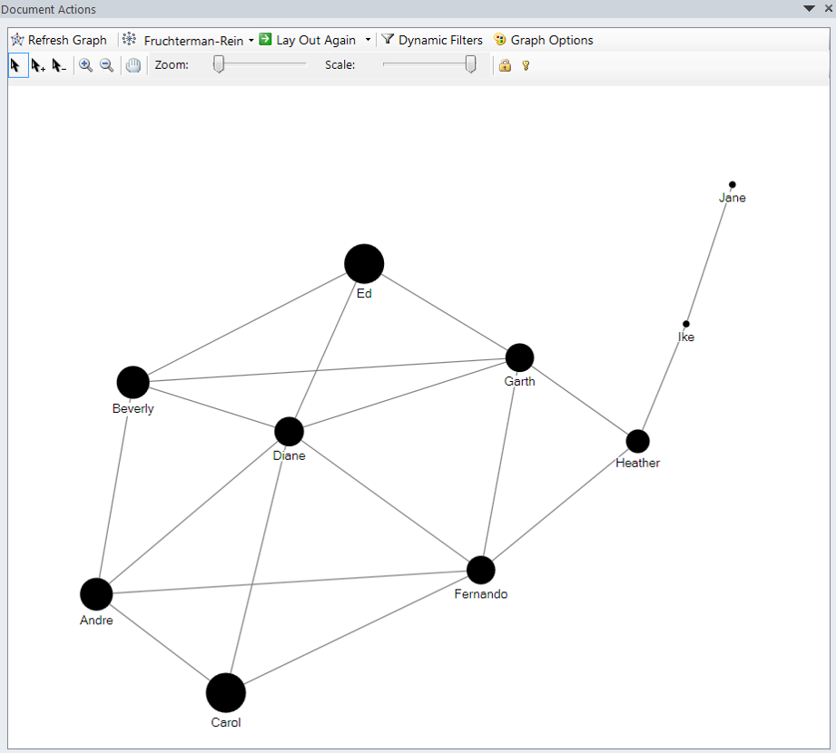
Graph Layout
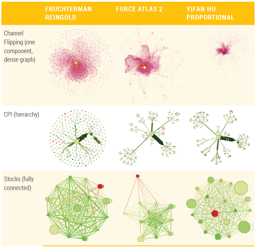
Force-Directed Layout - Fruchterman Reingold layout
- It lays out the graph in a fairly compact circle, and separate components stay within this circle, as opposed to flying away as found in some other layout algorithms.
- The downside to Fruchterman Reingold is that all nodes tend to be the same distance apart, and separate components may not be readily apparent.
- It is highly dependent on the layout before it is run, so a better result may occur after first running one of the other layouts.
IS428 Visual Analytics for Business Intelligence
Lesson 8: Visualising and Analysing Network Data
Graph Layout
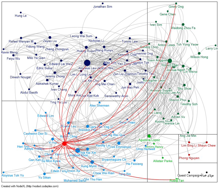
Force-Directed Layout - Force Atlas layout
- It can produce good layouts pulling strongly connected nodes together and weakly connected nodes apart.
- It may require more iterative experimentation with parameters. If available, try Force Atlas 2, and try adjusting parameters such as “Prevent Overlap,” “LogMode,” and “Scaling.” Scaling adjusts the ratio of the attraction force along the links and the repulsion between nodes.
- It can work well for dense graphs and fully connected graphs where the edges have weights associated with them.
- Sometimes it is less effective when the graph is very sparse, or the graph has many components.
components.
IS428 Visual Analytics for Business Intelligence
Lesson 8: Visualising and Analysing Network Data
Graph Layout
Force-Directed Layout - Yifan Hu layout
- It is somewhat similar to Force Atlas. It can be fast on large data sets.
- Whereas Force Atlas tends to get different results tweaking various parameters, Yifan Hu tends to come up with a similar layout.
- Yifan Hu does not take into account node sizes, edge weights, and so on, in the software package Gephi.
IS428 Visual Analytics for Business Intelligence
Lesson 8: Visualising and Analysing Network Data
Graph Layout
Force-Directed Layouts - A comparison
IS428 Visual Analytics for Business Intelligence
Lesson 8: Visualising and Analysing Network Data
Graph Layout
Force Settings
- Attraction/repulsion adjusting the ratio between attraction/repulsion is one important consideration. This may be set as a single parameter (for example, Relative Strength in Yifan Hu, Scaling in Force Atlas, or both in Gephi). If all the nodes are in a blob, increasing repulsion can help push the nodes apart.
- Gravity is similar to attraction, but it applies to all nodes, even when not connected. Turning up gravity can bring very distant nodes back toward the center, but turning up gravity too high will create a packed circle.
- Edge weight is the strength of the attraction can be the same for all nodes, or it can be based on weight of the edges. Strong weights will pull nodes closer together. Edge weight is an attribute provided with the data. This is perhaps the most important additional attribute to include when you prepare your data.
IS428 Visual Analytics for Business Intelligence
Lesson 8: Visualising and Analysing Network Data
Graph Layout
Node-Only Layout
IS428 Visual Analytics for Business Intelligence
Lesson 8: Visualising and Analysing Network Data
Graph Layout
Time-Oriented Layout
IS428 Visual Analytics for Business Intelligence
Lesson 8: Visualising and Analysing Network Data
Graph Layout
Radial Hierarchical Layout
IS428 Visual Analytics for Business Intelligence
Lesson 8: Visualising and Analysing Network Data
Graph Layout
Tree Hierarchical Layout
IS428 Visual Analytics for Business Intelligence
Lesson 8: Visualising and Analysing Network Data
Graph Layout
Geographic Layout
IS428 Visual Analytics for Business Intelligence
Lesson 8: Visualising and Analysing Network Data
Graph Layout
Adjacency Matrix
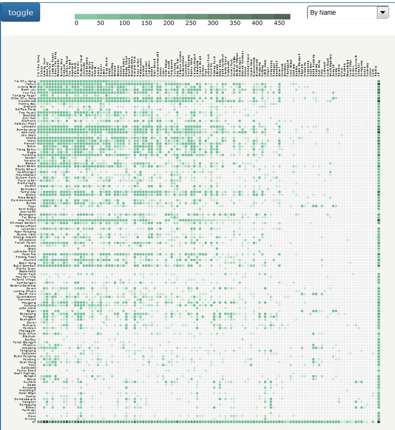
IS428 Visual Analytics for Business Intelligence
Lesson 8: Visualising and Analysing Network Data
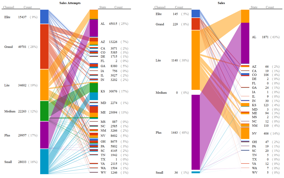
Graph Layout
BiPartite Layout
IS428 Visual Analytics for Business Intelligence
Lesson 8: Visualising and Analysing Network Data
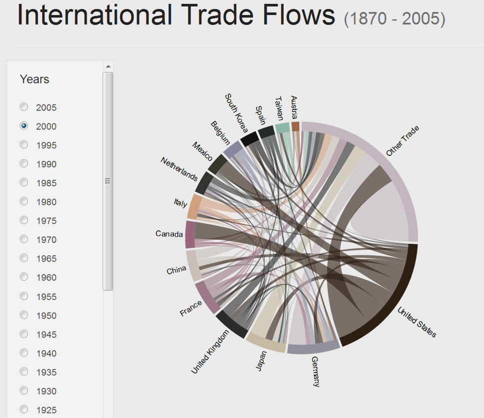
Graph Layout
Chord Diagrams
IS428 Visual Analytics for Business Intelligence
Lesson 8: Visualising and Analysing Network Data
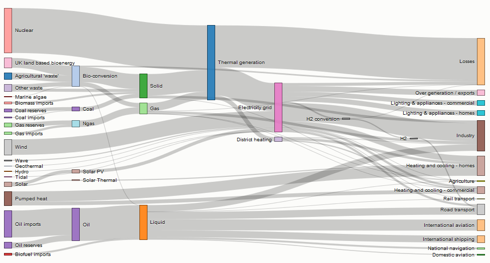
Graph Layout
Sankey Diagrams
IS428 Visual Analytics for Business Intelligence
Lesson 8: Visualising and Analysing Network Data
Graph Layout
Hive Plot
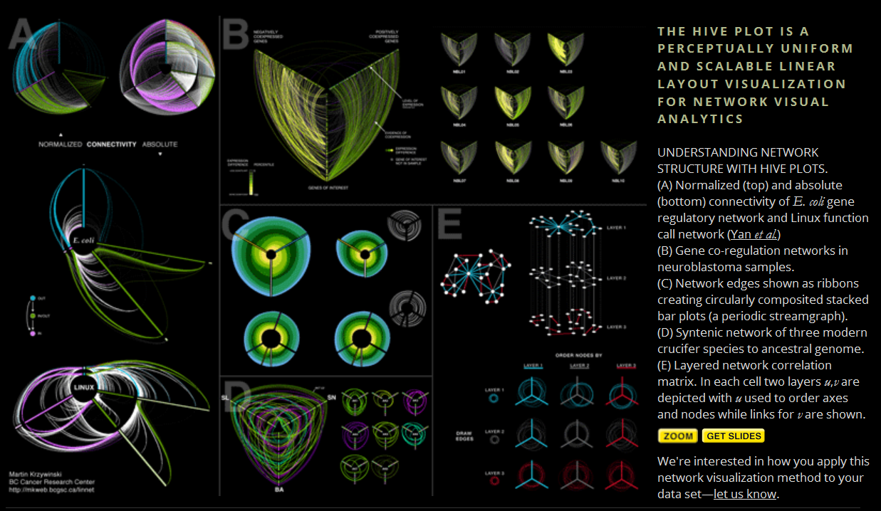
IS428 Visual Analytics for Business Intelligence
Lesson 8: Visualising and Analysing Network Data
Graph Layout
Hive Plot using d3.js
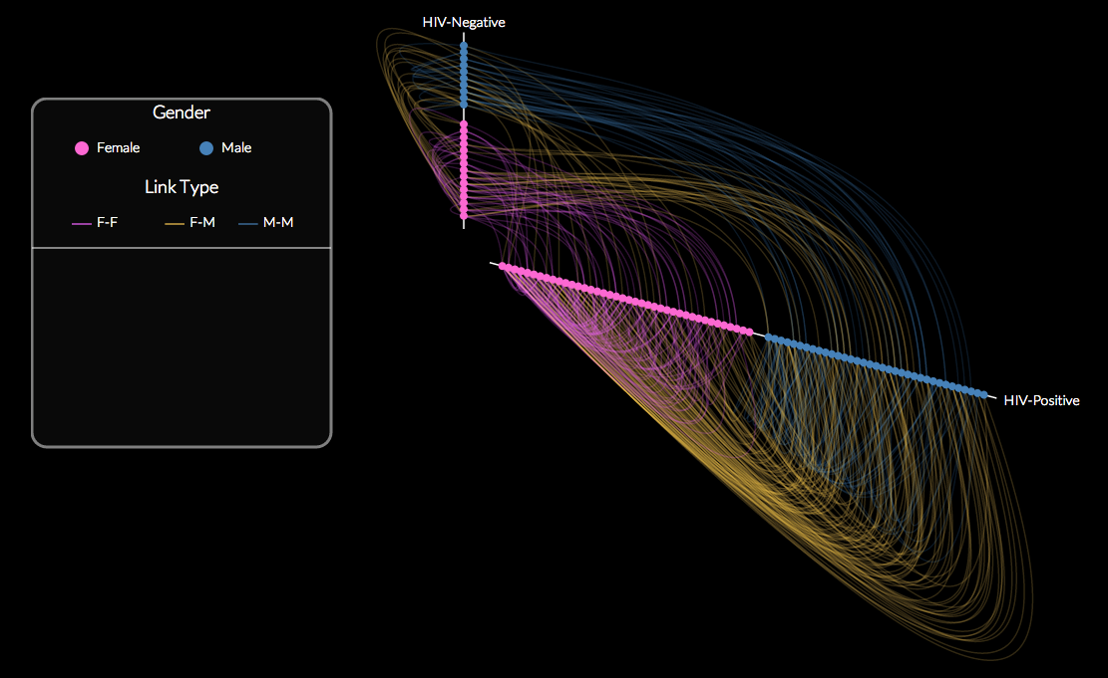
IS428 Visual Analytics for Business Intelligence
Lesson 8: Visualising and Analysing Network Data
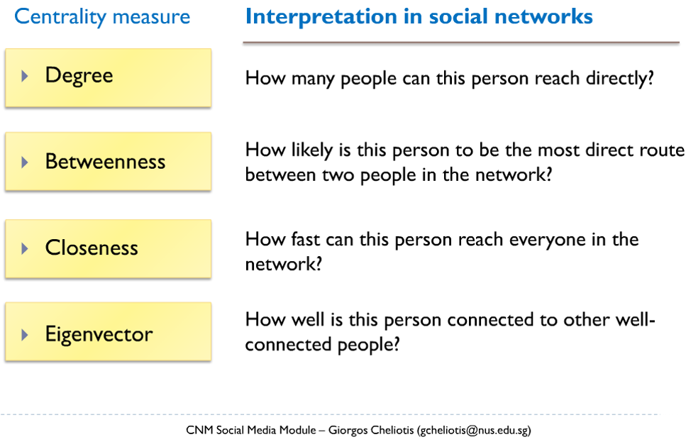
Graph Metrics
-
A collection of statistical measures to report:
-
the connectivity of a node within a network,
-
the complexity of a network,
-
the clusters or sub-groups within a network.
-
IS428 Visual Analytics for Business Intelligence
Lesson 8: Visualising and Analysing Network Data
Graph Metrics
Degree
-
Degree, the number of direct connections a node has.
-
If the network is directed (meaning that ties have direction), then we usually define two separate measures of degree centrality, namely in-degree and out-degree.
IS428 Visual Analytics for Business Intelligence
Lesson 8: Visualising and Analysing Network Data
Graph Metrics
Betweenness centrality
-
Betweenness is a centrality measure of a vertex within a graph (there is also edge betweenness, which is not discussed here).
-
Vertices that occur on many shortest paths between other vertices have higher betweenness than those that do not.
IS428 Visual Analytics for Business Intelligence
Lesson 8: Visualising and Analysing Network Data
Graph Metrics
Closeness Centrality
- In graph theory closeness is a centrality measure of a vertex within a graph.
- Vertices that are 'shallow' to other vertices (that is, those that tend to have short geodesic distances to other vertices with in the graph) have higher closeness.
IS428 Visual Analytics for Business Intelligence
Lesson 8: Visualising and Analysing Network Data
Graph Metrics
Eigenvector Centrality
- A measure of the importance of a node in a network.
- It assigns relative scores to all nodes in the network based on the principle that connections to high-scoring nodes contribute more to the score of the node in question than equal connections to low-scoring nodes.
IS428 Visual Analytics for Business Intelligence
Lesson 8: Visualising and Analysing Network Data
Graph Metrics
Clustering Coefficient
- A measure on how connected a vertex’s neighbours are to one another. More specifically, it is the number of edges connecting a vertex’s neighbours divided by the total number of possible edges between the vertex’s neighbour.
IS428 Visual Analytics for Business Intelligence
Lesson 8: Visualising and Analysing Network Data
Graph Metrics
Summary of Graph Metrics
IS428 Visual Analytics for Business Intelligence
Lesson 8: Visualising and Analysing Network Data
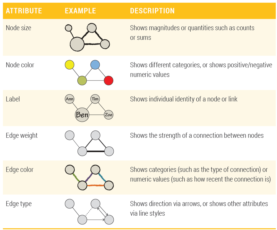
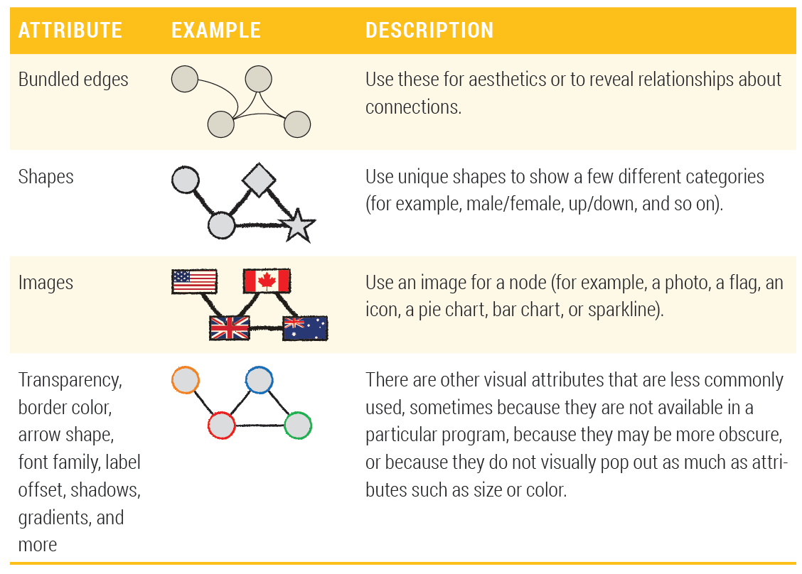
Graph Visual Attributes
Basic visual attributes
IS428 Visual Analytics for Business Intelligence
Lesson 8: Visualising and Analysing Network Data
Graph Visual Attributes
Additional basic visual attributes
IS428 Visual Analytics for Business Intelligence
Lesson 8: Visualising and Analysing Network Data
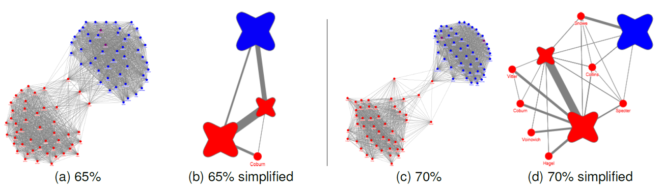
Graph Visual Attributes
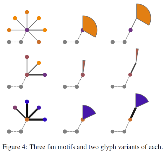
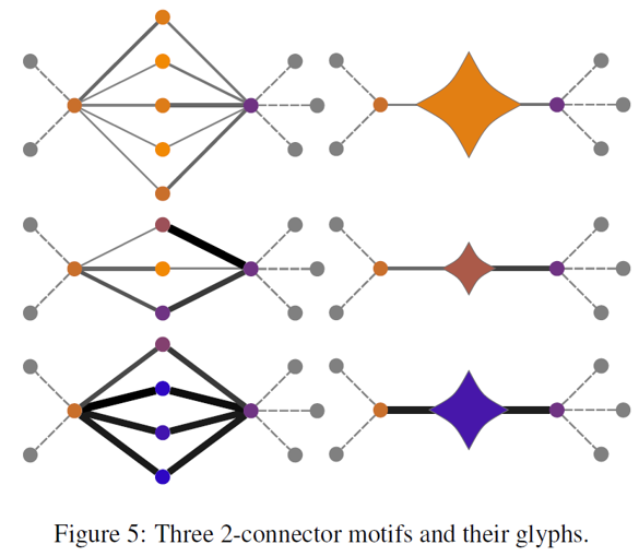
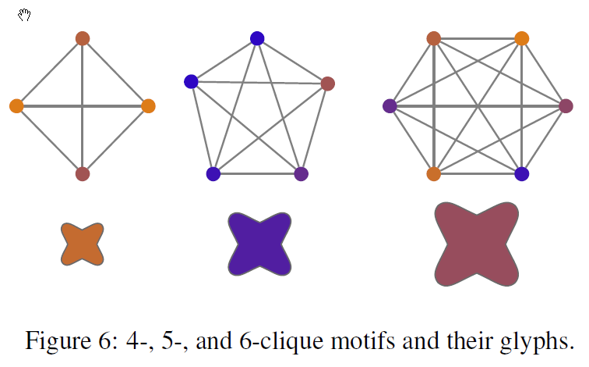
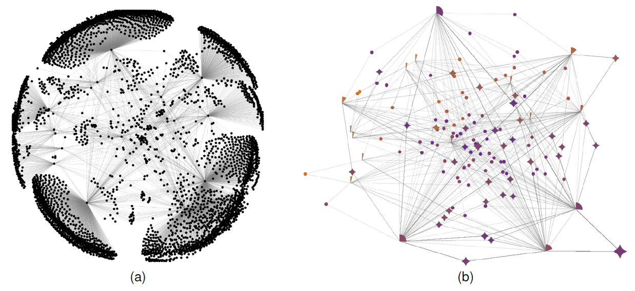
Motif Simplification – Basic concept
IS428 Visual Analytics for Business Intelligence
Lesson 8: Visualising and Analysing Network Data
Graph Visual Attributes
Motif Simplification Methods
IS428 Visual Analytics for Business Intelligence
Lesson 8: Visualising and Analysing Network Data
Graph Visual Attributes
Motif Simplification Methods
IS428 Visual Analytics for Business Intelligence
Lesson 8: Visualising and Analysing Network Data
Graph Visual Attributes
Motif Simplification Methods
IS428 Visual Analytics for Business Intelligence
Lesson 8: Visualising and Analysing Network Data
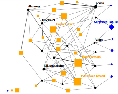
Graph Visual Attributes
Motif Simplification Methods
- NodeXL Implementation of Motif Simplification
IS428 Visual Analytics for Business Intelligence
Lesson 8: Visualising and Analysing Network Data
Graph Analytics Toolkits
- Point and click toolkits
- NodeXL
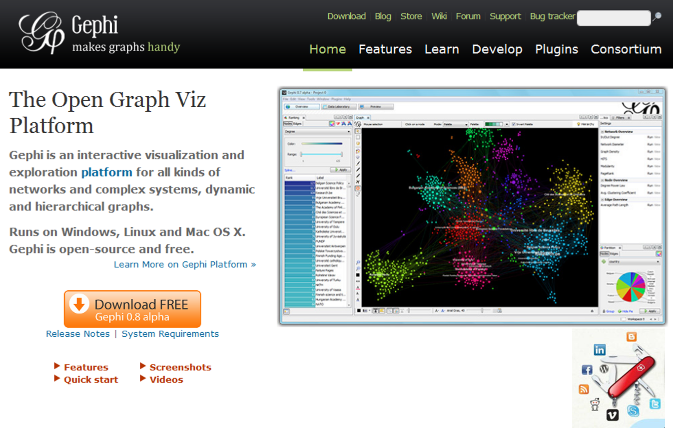
- Gephi
-
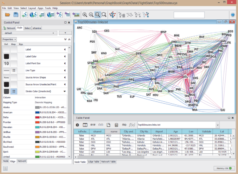
Cytoscape
-
Web development toolkits
-
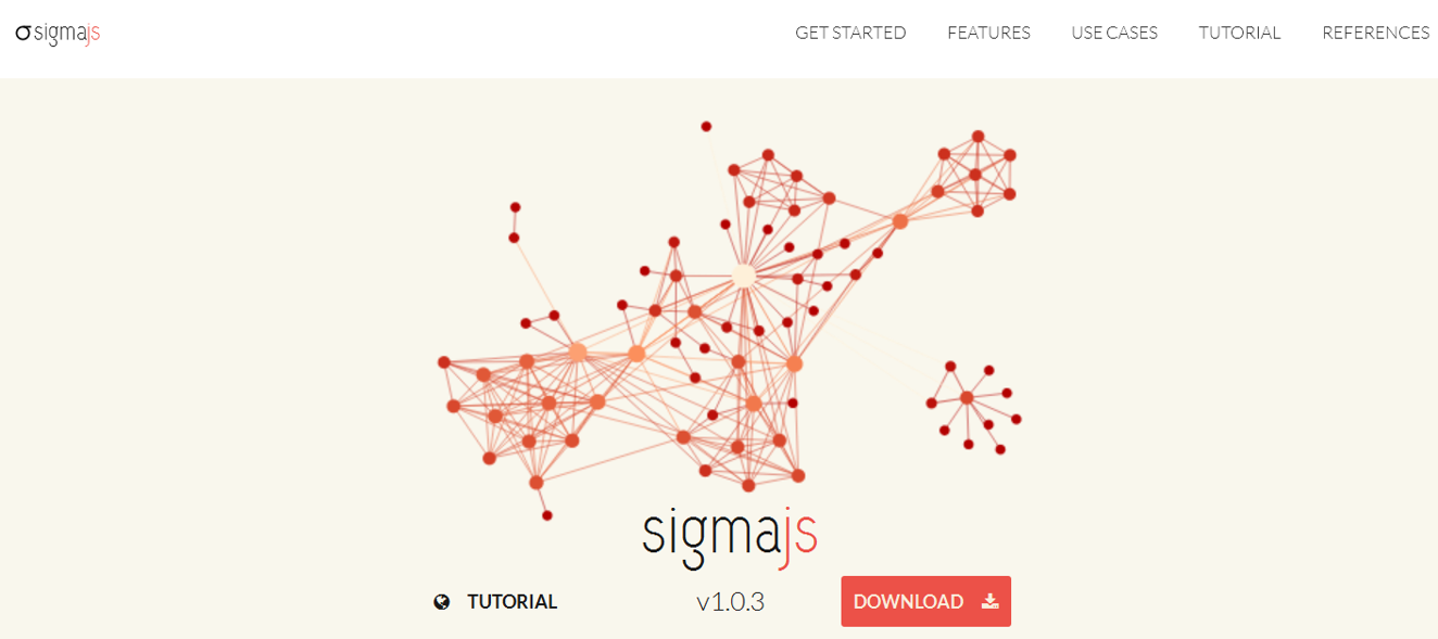
Sigma.js
-
D3.js
-
IS428 Visual Analytics for Business Intelligence
Lesson 8: Visualising and Analysing Network Data
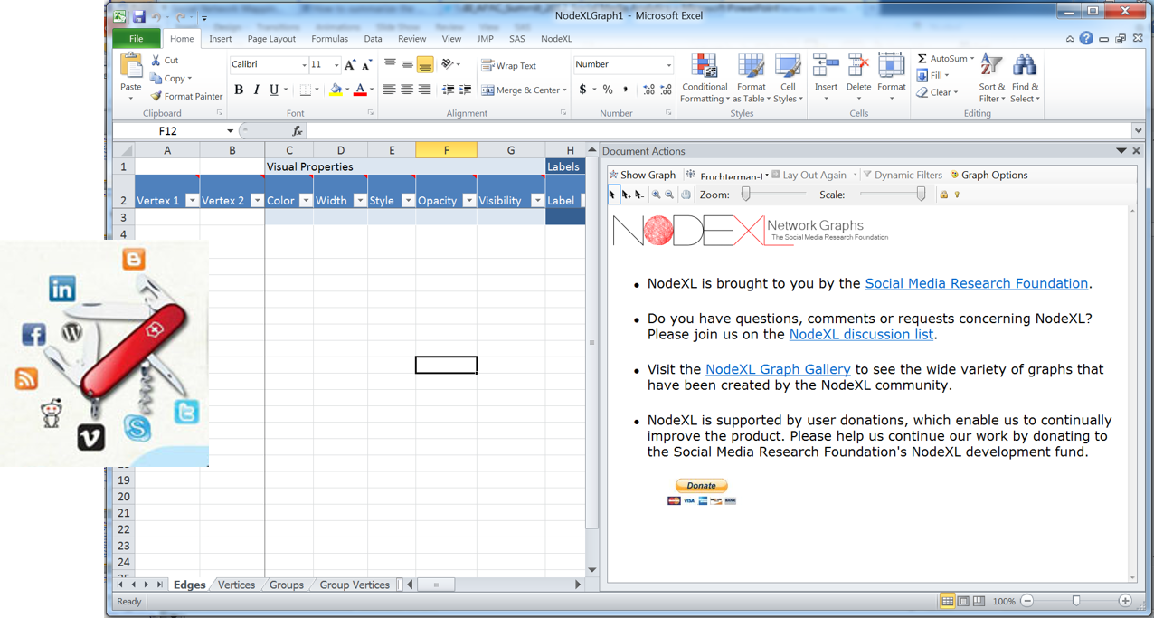
Graph Analytics Toolkits
Point-and-Click Toolkit-NodeXL
IS428 Visual Analytics for Business Intelligence
Lesson 8: Visualising and Analysing Network Data
Graph Analytics Toolkits
Point-and-Click Toolkit-Gephi
IS428 Visual Analytics for Business Intelligence
Lesson 8: Visualising and Analysing Network Data
Graph Analytics Toolkits
Point-and-Click Toolkit-Cytoscape
IS428 Visual Analytics for Business Intelligence
Lesson 8: Visualising and Analysing Network Data
Graph Analytics Toolkits
Web development library - sigma.js
IS428 Visual Analytics for Business Intelligence
Lesson 8: Visualising and Analysing Network Data
Graph Analytics Toolkits
Web development library - d3.js
IS428 Visual Analytics for Business Intelligence
Lesson 8: Visualising and Analysing Network Data
Reference
- Brath, R. and Jonker, D. (2015) Graph Analysis and Visualization. John Wiley & Sons, Indianapolis, IN.
- Cherven, K. (2015) Mastering Gephi Network Visualization. PACKT Publishing, Birmingham, UK.
- Khokhar, D. (2015) Gephi Cookbook, PACKT Publishing, Birmingham, UK.
IS428-Lesson08
By Kam Tin Seong


