In what ways does my magazine use, develop and challenge?
Front Cover: Use
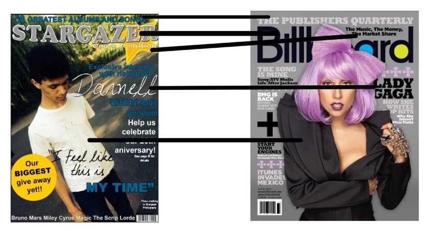
In the image above I have made some arrows to point out similar aspects my magazine shares with the Billboard one. The first one would be that they both have a masthead, this is the most important on a front cover as it is the title and other than the main image is the thing that peoples eyes are drawn too. They want to know your magazines name. The second similarity would be that they both have a main image. The leading line helps sell the magazine so it is an important factor to have on your front cover, the Billboard magazine like mine has a leading line which is on the right side of the page. I think another thing which is the same would be the use of the artists name as the headline, this helps you to understand who is on your front cover and who the main article will be about, which also helps to sell the magazine.
Front Cover: Develop
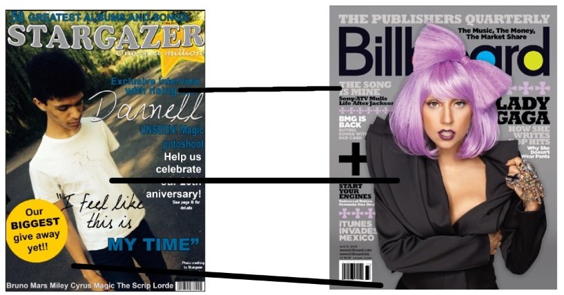
In the image above you can see where I have created arrows to show my areas of development where I have the similar things to the other magazine but they're slightly different. For example the cover line for my magazine is where the headline should so though we both have it they're on different sides of the front cover. Another development of my magazine would be the main image, though we both have one, they are very different, Billboards main image is a frontward facing mid shot in the centre, whereas mine is a near long shot, which is slightly to the left of the cover. Another development is that the Billboard magazine thought is has a background is probably studio shot and a colour was added to it whereas mine has the original background.
Front Cover: Challenge
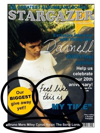
In this step I had to point out the complete differences in the magazine cover. There were only three that my magazine included which the other one did not have. For example my magazine had a quote from the main article, which can help to sell the magazine as it gives you a glimpse of what is on the inside to make you want to read it. Another thing was that mine had a menu strip at the bottom which gave you a taste of which artists are featured in the magazine. Finally my magazine had a give away to give the magazine more of an appeal for people to but for a chance of the give away.
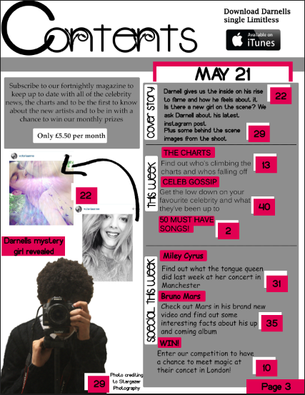
Contents Page: Use
Unlike my other use, develop and challenge this one I chose to do without the lines to show exactly which bits. I chose to just show both contents pages and talk about which bits I used for mine own. I used the generic layout for a contents page, with blocks and things easy to read and understand. Like the we love pop contents page I have numerous images to show what to expect in the magazine. I also similarly to the we love pop have my page numbers for the different images. I have the page number at the bottom like the other magazine and most magazines as it is easier to look for and find.
Contents Page: Develop
For the develop side I did the same as the use and chose to go without arrows. Due to how similar most contents pages are, I chose to change it slightly. For example I have the actual contents on the right side whereas on other magazines such as the we heart pop they are at the bottom. I chose to not have my contents page as bright as a pop magazine would be as it is aimed at the older side of pop so I made the colours relaxed yet interesting I kept to only three colours so it wasn't confusing similar to the we love pop but I chose pink, grey and black. I do not have the images in blocks whereas the we love pop do, I liked the idea of images but I didn't think the generic, blocked in a straight line, contents page look worked to fit my genre.
Contents Page: Challenge
For the challenge section I didn't stick to this magazine, I wanted it to say "Contents" unlike the other magazine where it says "we love this..." . My contents page includes advertisement of the main articles single to show that this weeks issue is mainly about that artist and to promote it more throughout the magazine where as the we love pop does now have advertisement. I also split my actual contents into three parts which are the cover story, this week and special this week, this is different as the other magazine is released monthly and also it has limited information for a monthly issue. Another difference would be that the we love pop has a showcase of posters that are given away in the magazine whereas mine does not
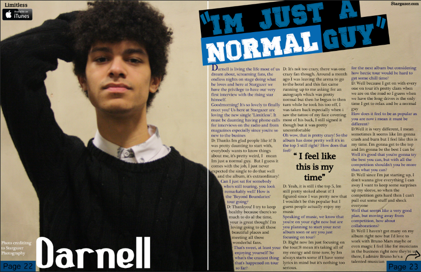
Double Page Spread: Use
For my double page spread I wanted to have it similar to the one next to it as I liked the layout of it. I kept the idea of the image of the artist taking up one page and the text on the other,I chose to do this as sometimes magazines double page spread have the image in the middle of the pages but I felt like the image taking up a full page was better than being cut in half. I also have the page numbers in boxes like the other magazine does. I stuck to basic colours for the double page spread so it was not too difficult to grasp with colours everywhere
Double Page Spread: Develop
For developing my double page spread to make it more of my own, I chose to have the big letter that usually starts the interview or story a lot smaller than the other magazine as I wanted to fit more or the story onto the page. Although the image of the artist covers one page I wanted it be slightly on the other page so I used one of the images from the shoot to achieve this, that was not all of the image is cut off but its not just on one page. Though we both have our page numbers in boxes the other magazine just says the number in a small box whereas mine says "page .." and is in a slightly bigger box.
Double Page Spread: Challenge
Challenging the double page spread was quite easy as I wanted to do things that were not on the other magazine, for example I wanted to add quotes from the interview, so I made the big font a quote which makes it seem like it is a title for the interview. Another thing that I wanted to do was to was add a quote into the text, I've seen it a lot in magazines so wanted it to be in mine as I liked the way it looked. I also, just like on my contents page, added the single and where you can download it from for advertisement just in case people missed it on the contents page. I may have the artists name just like the other magazine does, but I made mine a lot bigger and I have it on the page with the image.
deck
By victoriafillingham