ÚVOD DO GRAFIKY V R
Vít Gabrhel
vit.gabrhel@mail.muni.cz
FSS MU,
30. 10. 2017


Harmonogram
Graphing and figures – general principles
Guidelines for different kinds of graphs and publications:
- Specialist (colour) publications
- Presentations
Journal papers (APA guidelines)
Quick plots using qplot (plus, a review on saving graphs)
More flexible graphs using ggplot
Final formatting using ggplot
Plotting packages in R
Graphics functions in the base package:
- plot( ), hist( ), etc.
Specialised packages:
- ggplot2
- ggvis
- lattice
Specialised functions inside other packages:
- plotrix, car, plotmeans, etc.
Plotting packages in R
General principles: Graphs and figures should...
1.Summarise and/or reveal data, making large datasets coherent
2.Encourage the viewer to think about the data being presented
- Rather than some aspect of the graph, like how pink, “pretty” or poorly visible it is
3.Avoid distorting the data
4.Encourage the viewer to compare different pieces of data
Plotting packages in R
A graph that satisfies all four criteria despite its complexity
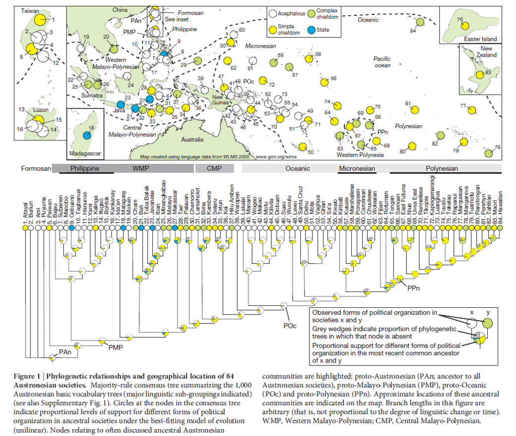
Plotting packages in R
A graph that satisfies all four criteria despite its simplicity
Guidelines for different types of graphs
All graphs:
- Think about when to start scales at the origin (0)
Bar graphs:
- If needing colour, use pastel colours to avoid overwhelming the viewer.
- Best to use some shading (e.g., grey or patterns)
Histograms:
- Consider displaying the mean/median value as well.
Graphs involving points (and possibly lines):
- Vibrant colours work well for points and lines, making them quite visible.
- Best to start y-axis at 0.
- Use a line if there is a flow of time from one point to the next.
- Patterns disappear if you stretch the x-axis too far.
Scatter plots:
- Simplify the look by not using a thick border.
- Any line through the dots must be thicker than the dots or in a brighter colour.
Guidelines for different publication types
Think about:
- What story do you want to tell?
- Who are you telling the story to?
| Journal articles | Specialist (colour) articles | Conference presentations |
|---|
| •Follow APA guidelines – e.g., page 4 in this style manual. (https://intranet.ecu.edu.au/__data/assets/pdf_file/0010/20611/APAstyle.pdf) |
•Follow APA guidelines as much as possible, but use colour if an additional explanatory tool is needed. •Colours: think about whether they should be vibrant or neutral, given (a) your topic, and (b) whether you are plotting points or bars (see previous slide). |
•No caption available, so more labelling in the title or inside the graph is needed. •Figures can •Same advice as for specialist articles regarding colour. •For small sample sizes, you might not even need an x-axis and y-axis. Can instead label points of interest directly. |
Highlighting individual data points

Quick plots using qplot
The qplot function is in the ggplot2 package.
The function is very useful for data exploration, as it is possible to draw fairly complex plots with one or two lines of code.
The function is not useful for final plots for presentations and publications because the overall appearance of the plots is difficult to change.
Basic principle: "geoms" (representations of data) have "aesthetics“ (properties) that can be "mapped" to variables in the dataset or “set” to a desired value
- geom examples: point, histogram, smooth (regression line)
- aesthetics (aes) examples: x and y (the variables being plotted), colour, size, shape, alpha (transparency), group
- additional arguments to do with avoiding overplotting: position and facet (facet_grid and facet_wrap)
Packages + data
ggplot
install.packages("ggplot2")
library("ggplot2")
data
setwd()
NPAS = read.csv2("NPAS.csv", header = TRUE)
NPAS_Clean <- na.omit(NPAS)
| option | description |
|---|---|
| alpha | Alpha transparency for overlapping elements expressed as a fraction between 0 (complete transparency) and 1 (complete opacity) |
| color, shape, size, fill | Associates the levels of variable with symbol color, shape, or size. For line plots, color associates levels of a variable with line color. For density and box plots, fill associates fill colors with a variable. Legends are drawn automatically. |
| data | Specifies a data frame |
| facets | Creates a trellis graph by specifying conditioning variables. Its value is expressed asrowvar ~ colvar. To create trellis graphs based on a single conditioning variable, userowvar~. or .~colvar) |
| geom | Specifies the geometric objects that define the graph type. The geom option is expressed as a character vector with one or more entries. geom values include "point", "smooth", "boxplot", "line", "histogram", "density", "bar", and "jitter". |
| main, sub | Character vectors specifying the title and subtitle |
| method, formula | If geom="smooth", a loess fit line and confidence limits are added by default. When the number of observations is greater than 1,000, a more efficient smoothing algorithm is employed. Methods include "lm" for regression, "gam" for generalized additive models, and "rlm" for robust regression. The formula parameter gives the form of the fit. For example, to add simple linear regression lines, you'd specify geom="smooth", method="lm", formula=y~x. Changing the formula to y~poly(x,2) would produce a quadratic fit. Note that the formula uses the letters x and y, not the names of the variables. For method="gam", be sure to load the mgcv package. For method="rml", load the MASS package. |
| x, y | Specifies the variables placed on the horizontal and vertical axis. For univariate plots (for example, histograms), omit y |
| xlab, ylab | Character vectors specifying horizontal and vertical axis labels |
| xlim,ylim | Two-element numeric vectors giving the minimum and maximum values for the horizontal and vertical axes, respectively |
qplot(x, y, data=, color=, shape=, size=, alpha=, geom=, method=, formula=, facets=, xlim=, ylim= xlab=, ylab=, main=, sub=)
Bar plot
# Data
qplot(data = NPAS, x = urban, geom = "bar") # bar chart with categories on x axis
# Faktorizace proměnné "urban"
NPAS_Clean$urbanFACTOR = NPAS_Clean$urban
NPAS_Clean$urbanFACTOR <- factor(NPAS_Clean$urbanFACTOR,levels=c(1,2,3),
labels=c("Rural","Suburban","Urban"))
# Jednoduchý barplot
qplot(data = NPAS_Clean, x = urbanFACTOR, color = urbanFACTOR, fill = urbanFACTOR, geom = c("bar"), alpha=I(1), main="Respondenti dle typu osídlení", xlab="Typ osídlení", ylab="Počet obyvatel")
# Jednoduchý histogram
qplot(NPAS_Clean$age, geom="histogram")
# Stanovení rozsahu
min(NPAS_Clean$age)
max(NPAS_Clean$age)
qplot(NPAS_Clean$age, geom="histogram", xlim = c(14, 90))
# Šířka jednotlivých sloupců v histogramu
qplot(NPAS_Clean$age, geom="histogram", binwidth = 1, xlim = c(0, 100))
qplot(NPAS_Clean$age,
geom="histogram",
binwidth = 1,
main = "Histogram for věk",
xlab = "Věk",
ylab = "Počet",
fill=I("blue"),
col=I("red"),
alpha=I(.5),
xlim=c(14,90))
# Index nerdství
NPAS_Clean$NerdyPersona = rowSums(NPAS_Clean[, 1:26])
# Jednoduchý scatterplot
qplot(age, NerdyPersona, data = NPAS_Clean, geom = c("point"))
# Data dle vybrané proměnné
qplot(age, NerdyPersona, data = NPAS_Clean, colour = urbanFACTOR, geom = c("point"))
# Scatterplot proložený křivkou
qplot(age, NerdyPersona, data = NPAS_Clean, geom = c("point", "smooth"))
# Scatterplot proložený křivkou dle vybrané proměnné
qplot(age, NerdyPersona, data = NPAS_Clean, geom = c("point", "smooth"), colour = urbanFACTOR)
# Scatterplot se spojnicemi bodů dle vybrané proměnné
qplot(age, NerdyPersona, data = NPAS_Clean, colour = urbanFACTOR, geom = "line")
# Jednoduchý boxplot s "integer" třídou třídící proměnné
qplot(gender, NerdyPersona, data=NPAS_Clean, geom="boxplot")
# Faktorizace proměnné gender
NPAS_Clean$genderFACTOR = NPAS_Clean$urban
NPAS_Clean$genderFACTOR <- factor(NPAS_Clean$genderFACTOR,levels=c(1,2,3),
labels=c("Muž","Žena","Ostatní"))
# Jednoduchý boxplot
qplot(genderFACTOR, NerdyPersona, data=NPAS_Clean, geom="boxplot")
# Jednoduchý boxplot s legendou dané proměnné
qplot(genderFACTOR, NerdyPersona, fill=genderFACTOR, data=NPAS_Clean, geom="boxplot")
Saving graphs: a review
In the Plots tab, Export -> Save Plot As Image... Then choose Image Format and Size
By default, graphs are saved to your working directory, but you can choose any folder by clicking “Directory” after clicking “Save Plot As Image”.
More flexible graphs using ggplot
The ggplot function is also in the ggplot2 package.
Key concepts, apart from the already mentioned geoms, aesthetics, position, facet, setting and mapping:
- Layers (+): The graph is not displayed until you add a layer, but it is customary to specify the aesthetics that apply to all layers at the very beginning.
- Stats: Stats have default geoms, while geoms have default stats.
- Each plot is treated as a variable.
- The aesthetics in each layer override any aesthetics specified at the beginning.
- Search for these terms in the script and in the book for concrete examples.
We covered: overlaying of histograms and regression lines, adding error bars to line plots and bar plots, setting axis limits (coord_cartesian), faceting, and free scales.
Final formatting using ggplot
| Adjusted through | Terms to look for |
|---|
| Overall colour-scheme: •black and white? •settings for colours |
theme_set scale_colour_manual |
theme_bw() scale_colour_hue() scale_colour_grey |
| Appearance of points | geom_point geom_params |
|
| Appearance of error bars | stat_summary (in our script) Other possibilities: geom_errorbar, geom_params |
colour = "gray41" |
| Appearance of lines | scale_linetype_manual | scale_linetype_manual(values=c("dotted", "solid", "longdash", "dotdash")) |
| Gridlines | theme(panel.grid.major = element_line( )) theme(panel.grid.minor = element_line( )) |
panel.grid.major = element_line(colour = "gray41", size = 1) panel.grid.minor.y = element_blank() |
Final formatting using ggplot
| Adjusted through | Terms to look for |
|---|
| Labels along the axes | scale_x_continuous (when x is not a factor variable) scale_x_discrete scale_y_continous scale_y_discrete |
scale_x_continuous(breaks = 1:2, labels = c("Trials 1-24", "Trials 25-48“, name = "Time period") scale_y_continuous(name = "") |
| Facet labels | theme(strip.text = ___) Changes to name of factor levels |
strip.text.y = element_text(size=14, face = "bold") levels(longsub2$Measure) <- c("Kick Dir Entropy", "No. of Player\nChanges") |
| Text size | theme( ___ = element_text( )) | theme(axis.title.x = element_text(size= 20), axis.text.y = element_text(size=14, colour = "black") |
| Legend | scale_linetype_manual scale_colour_hue etc. Depending on what aesthetic (colour, linetype, shape) you have mapped the variable to theme(legend.text = ___) |
scale_linetype_manual(values=c("dotted", "solid", "longdash", "dotdash"), name="Success Slope", breaks=c("Descending", "U-shaped", "Ascending", "Flat"), labels=c("Desc.", "U-shaped", "Ascending", "Flat")) legend.text = element_text(size=12) |
Bar chart
ggplot2
Data + formula
mtc <- mtcars
ggplot(mtc, aes(x = factor(gear))) + geom_bar(stat = "count")
Aggregate data for barplot
summary.mtc <- data.frame(
gear=levels(as.factor(mtc$gear)),
meanwt=tapply(mtc$wt, mtc$gear, mean))
summary.mtc
Bar chart
ggplot2
Horizontal bars, colors, width of bars
#1. horizontal bars
p1<-ggplot(mtc,aes(x=factor(gear),y=wt)) + stat_summary(fun.y=mean,geom="bar") +
coord_flip()
p1
#2. change colors of bars
p2<-ggplot(mtc,aes(x=factor(gear),y=wt,fill=factor(gear))) + stat_summary(fun.y=mean,geom="bar") +
scale_fill_manual(values=c("purple", "blue", "darkgreen"))
p2
#3. change width of bars
p3<-ggplot(mtc,aes(x=factor(gear),y=wt)) + stat_summary(fun.y=mean,geom="bar", aes(width=0.5))
p3
Split and color by another variable
#1. next to each other
p1<-ggplot(mtc,aes(x=factor(gear),y=wt,fill=factor(vs)), color=factor(vs)) +
stat_summary(fun.y=mean,position=position_dodge(),geom="bar")
p1
#2. stacked
p2<-ggplot(mtc,aes(x=factor(gear),y=wt,fill=factor(vs)), color=factor(vs)) +
stat_summary(fun.y=mean,position="stack",geom="bar")
p2
#3. with facets
p3<-ggplot(mtc,aes(x=factor(gear),y=wt,fill=factor(vs)), color=factor(vs)) +
stat_summary(fun.y=mean, geom="bar") +
facet_wrap(~vs)
p3
Bar chart
ggplot2
Add text to the bars, label axes, and label legend
ag.mtc<-aggregate(mtc$wt, by=list(mtc$gear,mtc$vs), FUN=mean)
colnames(ag.mtc)<-c("gear","vs","meanwt")
ag.mtc
g1<-ggplot(ag.mtc, aes(x = factor(gear), y = meanwt, fill=factor(vs),color=factor(vs))) +
geom_bar(stat = "identity", position=position_dodge()) +
geom_text(aes(y=meanwt, ymax=meanwt, label=meanwt),position= position_dodge(width=0.9), vjust=-.5)
g1
#2. fixing the yaxis problem, changing the color of text, legend labels, and rounding to 2 decimals
g2<-ggplot(ag.mtc, aes(x = factor(gear), y = meanwt, fill=factor(vs))) +
geom_bar(stat = "identity", position=position_dodge()) +
geom_text(aes(y=meanwt, ymax=meanwt, label=round(meanwt,2)), position= position_dodge(width=0.9), vjust=-.5, color="black") +
scale_y_continuous("Mean Weight",limits=c(0,4.5),breaks=seq(0, 4.5, .5)) +
scale_x_discrete("Number of Gears") +
scale_fill_discrete(name ="Engine", labels=c("V-engine", "Straight engine"))
g2
Bar chart
ggplot2
Add error bars
summary.mtc2 <- data.frame(
gear=levels(as.factor(mtc$gear)),
meanwt=tapply(mtc$wt, mtc$gear, mean),
sd=tapply(mtc$wt, mtc$gear, sd))
summary.mtc2
ggplot(summary.mtc2, aes(x = factor(gear), y = meanwt)) +
geom_bar(stat = "identity", position="dodge", fill="lightblue") +
geom_errorbar(aes(ymin=meanwt-sd, ymax=meanwt+sd), width=.3, color="darkblue")
Histogram
ggplot2
# Histogram s nastavením hodnot na osách X a Y
ggplot(data=NPAS_Clean, aes(NPAS_Clean$age)) +
geom_histogram(breaks=seq(14, 100, by = 2),
col="red",
fill="green",
alpha = .2) +
labs(title="Histogram for Age") +
labs(x="Age", y="Count") +
xlim(c(14,90)) +
ylim(c(0,250))
# Barva jako intenzita
ggplot(data=NPAS_Clean, aes(NPAS_Clean$age)) +
geom_histogram(breaks=seq(14, 100, by = 2),
col="red",
aes(fill=..count..))
# Dvě barvy pro vyjádření intenzity
ggplot(data=NPAS_Clean, aes(NPAS_Clean$age)) +
geom_histogram(breaks=seq(14, 100, by = 2),
col="red",
aes(fill=..count..)) +
scale_fill_gradient("Count", low = "green", high = "red")
Histogram
ggplot2
# Manipulace s backgroundem:
ggplot(data=NPAS_Clean, aes(NPAS_Clean$age)) +
geom_histogram(breaks=seq(14, 100, by = 2),
col="red",
aes(fill=..count..)) +
scale_fill_gradient("Count", low = "green", high = "red") +
theme(plot.background = element_blank(),
panel.grid.major = element_blank(),
panel.grid.minor = element_blank(),
panel.border = element_blank(),
panel.background = element_blank(),
axis.line = element_line(size=.4))
# You can easily add a trendline to your histogram by adding geom_density to your code:
ggplot(data=NPAS_Clean, aes(NPAS_Clean$age)) +
geom_histogram(aes(y =..density..),
breaks=seq(14, 100, by = 2),
col="red",
fill="green",
alpha = .2) +
geom_density(col=2) +
labs(title="Histogram for Age") +
labs(x="Age", y="Count")
Scatterplot
ggplot2
mtc <- mtcars
# Basic scatterplot
p1 <- ggplot(mtc, aes(x = hp, y = mpg))
# Print plot with default points
p1 + geom_point()
Change color of points
p2 <- p1 + geom_point(color="red") #set one color for all points
p2
p3 <- p1 + geom_point(aes(color = wt)) #set color scale by a continuous variable
p3
p4 <- p1 + geom_point(aes(color=factor(am))) #set color scale by a factor variable
p4
Change default colors in color scale
p1 + geom_point(aes(color=factor(am))) + scale_color_manual(values = c("orange", "purple"))
Scatterplot
ggplot2
Change shape or size of points
p2 <- p1 + geom_point(size = 5) #increase all points to size 5
p2
p3 <- p1 + geom_point(aes(size = wt)) #set point size by continuous variable
p3
p4 <- p1 + geom_point(aes(shape = factor(am))) #set point shape by factor variable p4
Scatterplot
ggplot2
Add lines to scatterplot
p1 + geom_point(aes(shape = factor(am))) + scale_shape_manual(values=c(0,2))
#connect points with line
p2 <- p1 + geom_point(color="blue") + geom_line()
p2
#add regression line
p3 <- p1 + geom_point(color="red") + geom_smooth(method = "lm", se = TRUE)
p3
#add vertical line
p4 <- p1 + geom_point() + geom_vline(xintercept = 100, color="red")
p4
Scatterplot
ggplot2
Change axis labels
#label all axes at once
p2 <- ggplot(mtc, aes(x = hp, y = mpg)) + geom_point()
p3 <- p2 + labs(x="Horsepower",
y = "Miles per Gallon")
p3
#label and change font size
p4 <- p2 + theme(axis.title.x = element_text(face="bold", size=20)) +
labs(x="Horsepower")
p4
#adjust axis limits and breaks
p5 <- p2 + scale_x_continuous("Horsepower",
limits=c(0,400),
breaks=seq(0, 400, 50))
p5
Scatterplot
ggplot2
Change legend options
g1<-ggplot(mtc, aes(x = hp, y = mpg)) + geom_point(aes(color=factor(vs)))
#move legend inside
g2 <- g1 + theme(legend.position=c(1,1),legend.justification=c(1,1))
g2
#move legend bottom
g3 <- g1 + theme(legend.position = "bottom")
g3
#change labels
g4 <- g1 + scale_color_discrete(name ="Engine",
labels=c("V-engine", "Straight engine"))
g4
Scatterplot
ggplot2
Change legend options
If we had changed the shape of the points, we would use scale_shape_discrete() with the same options. We can also remove the entire legend altogether by using theme(legend.position=“none”)
g5<-ggplot(mtc, aes(x = hp, y = mpg)) + geom_point(size=2, aes(color = wt))
g5 + scale_color_continuous(name="Weight", #name of legend
breaks = with(mtc, c(min(wt), mean(wt), max(wt))), #choose breaks of variable
labels = c("Light", "Medium", "Heavy"), #label
low = "pink", #color of lowest value
high = "red") #color of highest value
Scatterplot
ggplot2
Change background color and style
g2<- ggplot(mtc, aes(x = hp, y = mpg)) + geom_point()
g2
#Completely clear all lines except axis lines and make background white
t1<-theme(
plot.background = element_blank(),
panel.grid.major = element_blank(),
panel.grid.minor = element_blank(),
panel.border = element_blank(),
panel.background = element_blank(),
axis.line = element_line(size=.4))
#Use theme to change axis label style
t2<-theme(
axis.title.x = element_text(face="bold", color="black", size=10),
axis.title.y = element_text(face="bold", color="black", size=10),
plot.title = element_text(face="bold", color = "black", size=12))
g3 <- g2 + t1
g3
g4 <- g2 + theme_bw()
g4
g5 <- g2 + theme_bw() + t2 + labs(x="Horsepower", y = "Miles per Gallon", title= "MPG vs Horsepower")
g5
Scatterplot
ggplot2
Change background color and style
g2<- ggplot(mtc, aes(x = hp, y = mpg)) +
geom_point(size=2, aes(color=factor(vs), shape=factor(vs))) +
geom_smooth(aes(color=factor(vs)),method = "lm", se = TRUE) +
scale_color_manual(name ="Engine",
labels=c("V-engine", "Straight engine"),
values=c("red","blue")) +
scale_shape_manual(name ="Engine",
labels=c("V-engine", "Straight engine"),
values=c(0,2)) +
theme_bw() +
theme(
axis.title.x = element_text(face="bold", color="black", size=12),
axis.title.y = element_text(face="bold", color="black", size=12),
plot.title = element_text(face="bold", color = "black", size=12),
legend.position=c(1,1),
legend.justification=c(1,1)) +
labs(x="Horsepower",
y = "Miles per Gallon",
title= "Linear Regression (95% CI) of MPG vs Horsepower by Engine type")
g2
Boxplot
ggplot2
# Prostý boxplot
bp1 <- ggplot(NPAS_Clean, aes(urbanFACTOR, NerdyPersona))
bp1 + geom_boxplot()
# Barva dle proměnné (bez legendy)
bp1 + geom_boxplot(aes(color=urbanFACTOR)) + theme(legend.position='none')
bp1 + geom_boxplot(aes(fill=urbanFACTOR), alpha=I(0.5)) + theme(legend.position='none')
# Manipulace s rozložením bodů
bp1 + geom_boxplot(aes(fill=urbanFACTOR), alpha=I(0.5)) +
geom_point(aes(color=urbanFACTOR), size=3) +
theme(legend.position='none')
bp1 + geom_boxplot(aes(fill=urbanFACTOR), alpha=I(0.5)) +
geom_point(position="jitter", alpha=0.5) +
geom_boxplot(outlier.size=0, alpha=0.5)
Pirate plot
ggplot2
# To use the install_github function, you also need to have the devtools library installed and loaded!
# install.packages("devtools")
library(devtools)
install_github("ndphillips/yarrr")
library("yarrr")
pirateplot(NerdyPersona ~ urbanFACTOR, data = NPAS_Clean, main = "Index nerdství dle typu osídlení")
For each interval, we can state that there is a 95% probability that the true population mean falls within that interval
Pirate plot
ggplot2
# 1 IV
pirateplot(NerdyPersona ~ urbanFACTOR, data = NPAS_Clean,
main = "Index nerdství dle typu osídlení",
pal = "southpark",
theme = 2,
point.o = 1, # Add points
point.col = "black",
point.bg = "purple",
point.pch = 21,
bean.f.o = 0.2, # Turn down bean filling
inf.f.o = 1, # Turn up inf filling
gl.col = "gray", # gridlines
gl.lwd = c(.5, 0)) # turn off minor grid lines)
# 2 IV
pirateplot(formula = NerdyPersona ~ gender + urbanFACTOR,
data = NPAS_Clean,
main = "Index nerdství dle typu osídlení a genderu",
point.pch = 1, # Point specifications...
point.col = "black",
point.o = .7,
inf.f.o = .9, # inference band opacity
gl.col = "gray")
Základní literatura
Wickham, H. (2009). ggplot2: Elegant Graphics for Data Analysis. Available online: http://moderngraphics11.pbworks.com/f/ggplot2-Book09hWickham.pdf
Field, A., Miles, J., & Field, Z. (2012). Discovering Statistics Using R. Sage: UK. Chapter 4. Exploring data with graphs.
Support website: http://docs.ggplot2.org/current/
PSY532, PSY232 - 6. ÚVOD DO GRAFIKY V R
By Vít Gabrhel


