The Grotesque and Impactful: Apocalypse Woodcuts and the Inspiration of Affective Piety
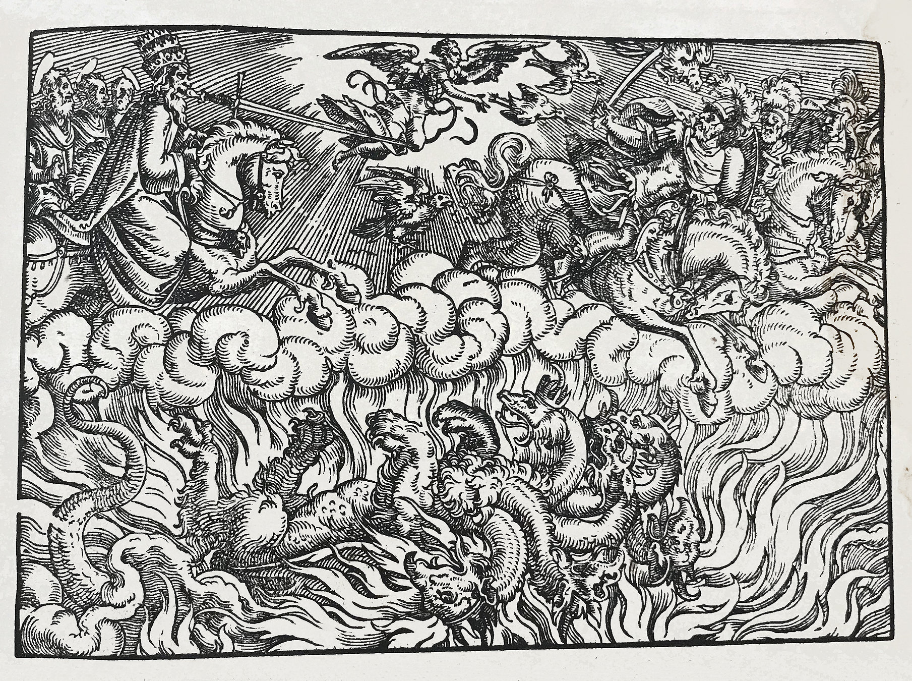
Weygand Hanen Erben, Frankfurt, 1574.
Apocalypses, short manuscripts that contain the text of the Book of Revelation alongside terrifying illustrations, were popular in the Middle Ages. The goal of many apocalypse images was to make the reader feel “affective piety”; that is, to make the image particularly arresting or horrifying in order to inspire fear, repentance, or renewed religious belief. As Luther’s ideas began to spread, the use of vernacular language and increase in religious enthusiasm were largely distanced from medieval ideas about affective piety. However, in many cases the Apocalypses’ goal — to use sensational images to communicate particular morals — remained influential.
Beginning in the mid-fifteenth century, the images of Apocalypses were expressed chiefly through woodcuts. With the advent of printing, the woodcut, which could be printed in relief next to the text, became an ideal way to illustrate early printed books. Masters of the medium included Hans Holbein in Germany and Titian in Italy, while less masterful woodcuts were often used in religious pamphlets to help them stand out in crowded shops and bookstalls.
Many Apocalypse woodcuts are heavily influenced by the Danube School, particularly the work of Albrecht Dürer, whose emphasis on grotesque and impactful imagery is somewhat antithetical to Luther’s emphasis on an accessible and non-threatening approach to religious expression. The resulting tension between the image and the text illustrates the religious complexity and interdependency of the Reformation, and the often differing goals of the book printers and the text itself.
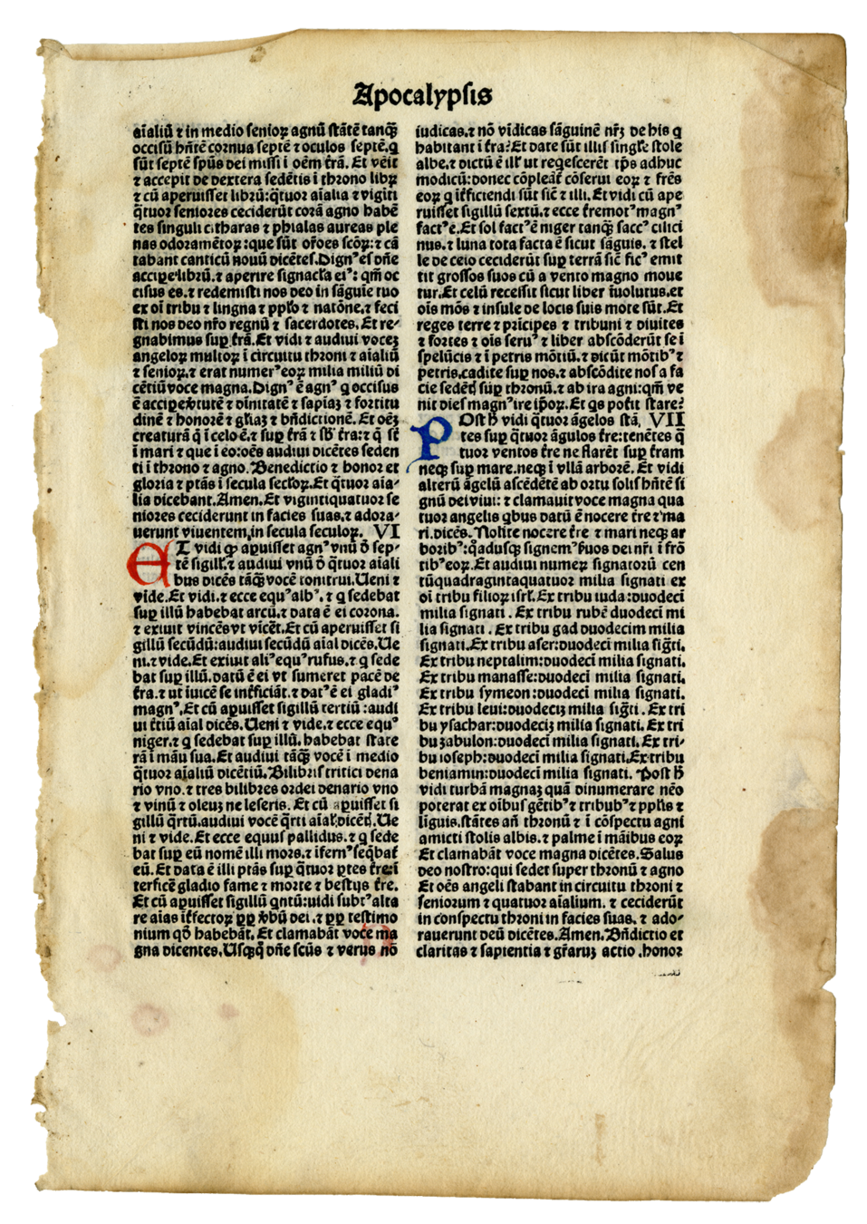
Ottaviano Scoto, Venice, 1480.
Ottaviano Scoto, head of a distinguished Venetian family of printers, was known for his production of music and Latin literature. Scoto became prominent in the area of liturgical printing as the first to use quarto and octavo format for religious incunables. In comparison to the contemporaneous, larger folio volumes, the small size of his works increased their affordability and portability.
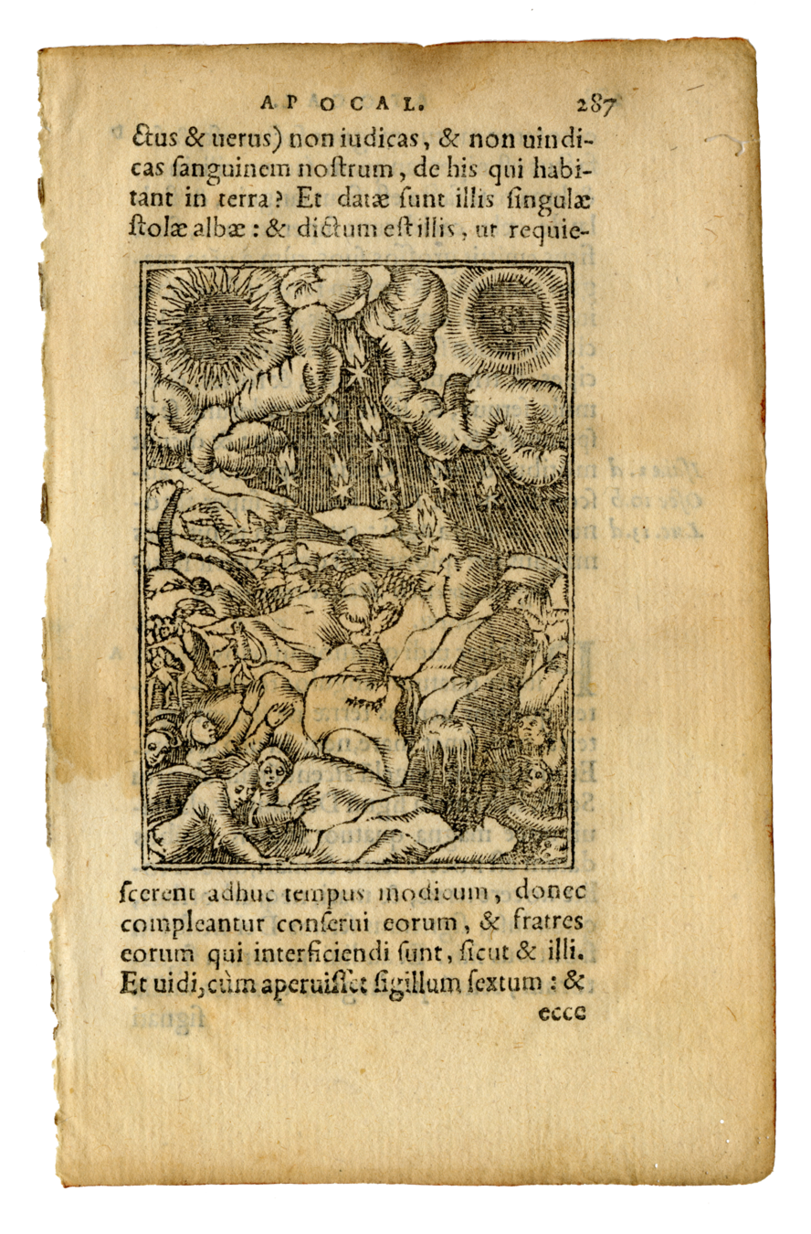
Sebastian Gryphius, Lyon, 1558.
Sebastian Gryphius, also known as the "Prince of the Lyon book trade," ran a print-shop called Atelier du Griffon ("workshop of the griffin") for several decades after moving from Germany to France. His Apocalypse woodcuts were influenced by Albrecht Dürer’s grotesque and even affronting imagery.
This leaf from Revelation 6:12-17, which shows the sky turning black and starless while kings and rich men hide themselves in the rocks, warns of the coming day of judgement, perhaps alluding to the medieval idea of memento mori which emphasized reflection on mortality and the imminent end of the world.
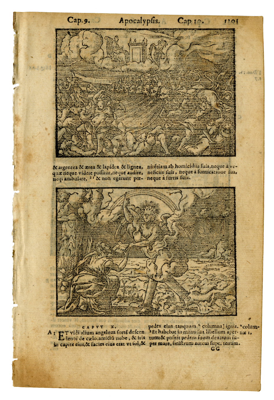
Guillaume Rouillé, Lyon, 1573.
Like Gryphius, Guillaume Rouillé was one of the most prominent humanist booksellers in sixteenth-century Lyon. Throughout his printing career, Rouillé used Pierre Eskrich’s woodcuts to illustrate his various biblical texts. Eskrich is said to have sought commissions from both Roman Catholic printers in Lyon and Protestants in Geneva, participating in both iconographic traditions.
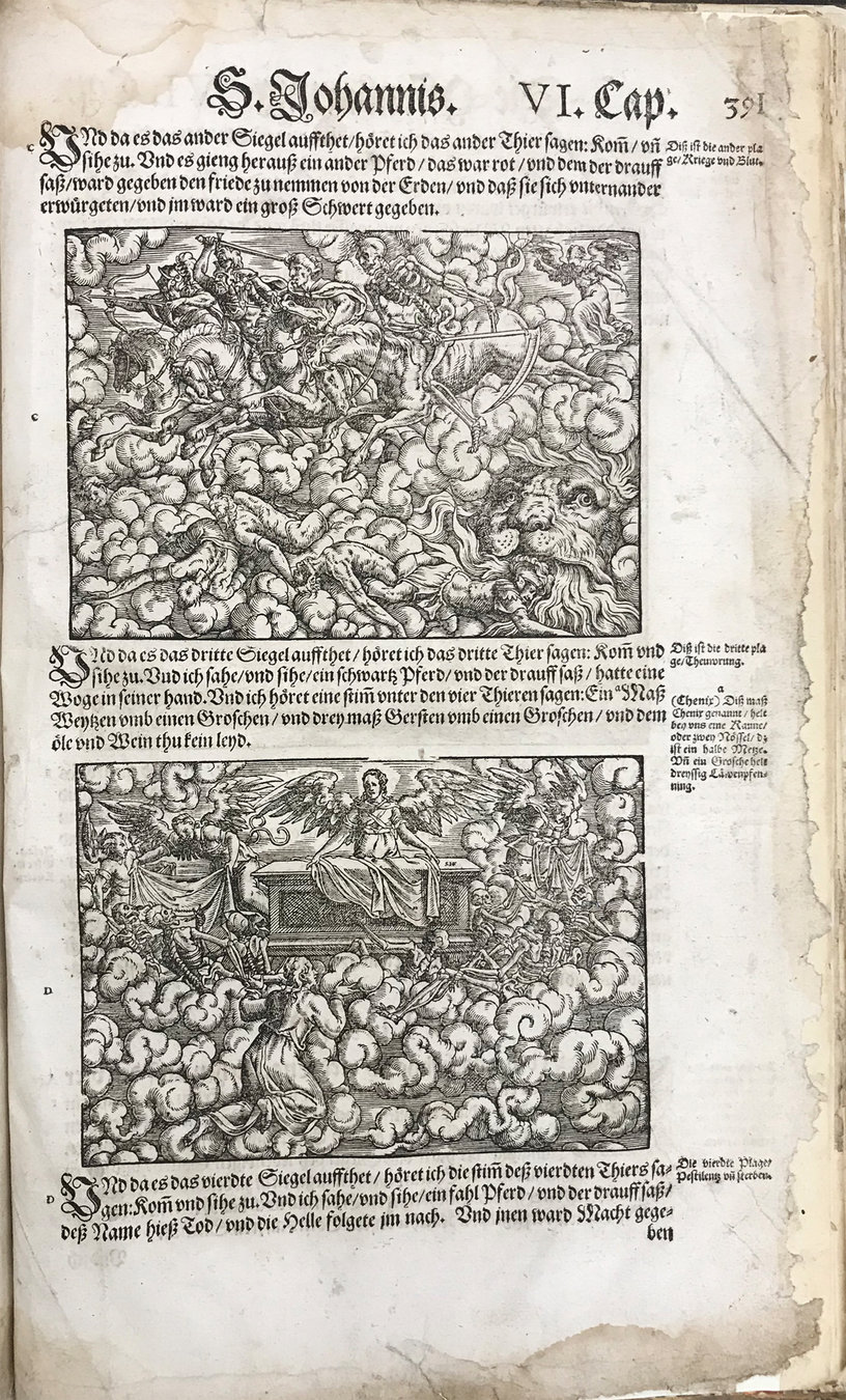
Weygand Hanen Erben, Frankfurt, 1574.
The Book of Revelation in this Luther Bible, printed by Weygand Hanen Erben, contains 26 woodcuts in the style of Albrecht Dürer and Lucas Cranach the Elder. Cranach created 21 woodcuts for Luther’s 1522 New Testament. The size and number of engravings in this cycle cause the images to be as prominent as the text, a choice in printing that might be an attempt to inspire affective piety in the reader.
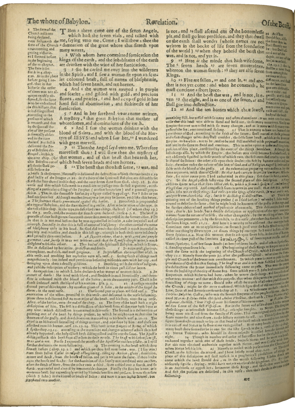
Christopher Barker [Jan Fredericksz Stam], London [Amsterdam], 1599 [c. 1638].
Rather than shocking imagery, the Book of Revelation in the Geneva Bible is known for its notes by Francis Junius. Later revisions of the Bible discontinued these notes, which were overtly anti-papal. On this leaf, the annotations to Revelation 17:4 compare the Roman clergy to the Whore of Babylon in describing the woman’s clothing: “A skarlet colour, that is, with a red and purple garment : and surely it was not without cause that the Romish clergy were so much delighted with this colour.”
William Fulke, London, 1601.
This edition of William Fulke’s Rheims New Testament, printed by Robert Barker, contains the notes and text of the Bishop’s Bible parallel to those of the Rheims. Fulke juxtaposed these Protestant and Catholic works (respectively) with the intention of proving the Rheims text inferior to the Bishop’s. By publishing the two together, both Protestant and Catholic texts could be accessed openly. The complete Douay-Rheims Bible would go on to influence the reemergence of English Catholics as well as the authorized 1611 King James Bible.
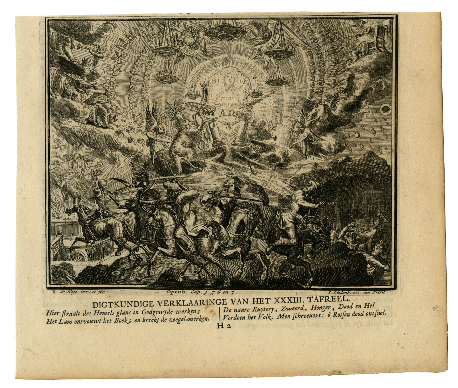
Romeyn de Hooghe, Amsterdam, 1702.
Romeyn de Hooghe, an artist of the late Dutch Golden Age, produced over 3,500 prints during his years of activity (1670-1715). De Hooghe’s art is characterized by his loose, sketch-like lines and heavy contrast in his shading. This style allows his images to contain striking amounts of detail, as seen in this engraving, which manages to capture Revelation chapters 4-7 in a single image.
Gustave Doré, a French printmaker and illustrator, created 241 wood engravings for the 1866 Le Grand Bible de Tours , an edition of the 1843 French translation of the Vulgate. Two volumes were published simultaneously: one by Alfred Henry Armand Mame in France, the other by Cassell and Company in England. This engraving from Revelation 6:7-8 depicts the vision of Death upon a pale horse.
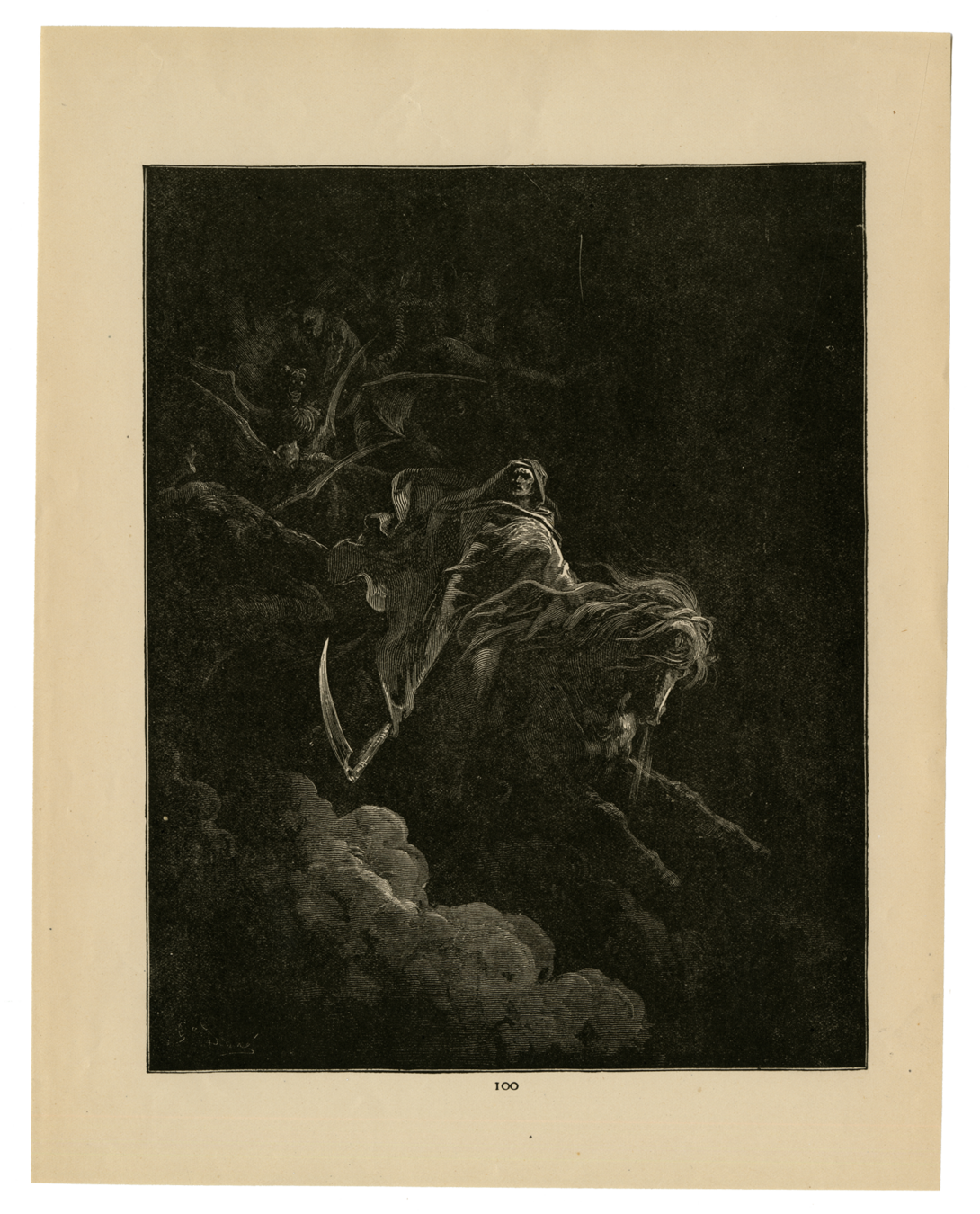
Gustave Doré, Amsterdam, 1866.
Bible Exhibit
By watzek2014