Mobile First
Responsive Web
Had already happened...
Mobile First

The Future
Mobile First
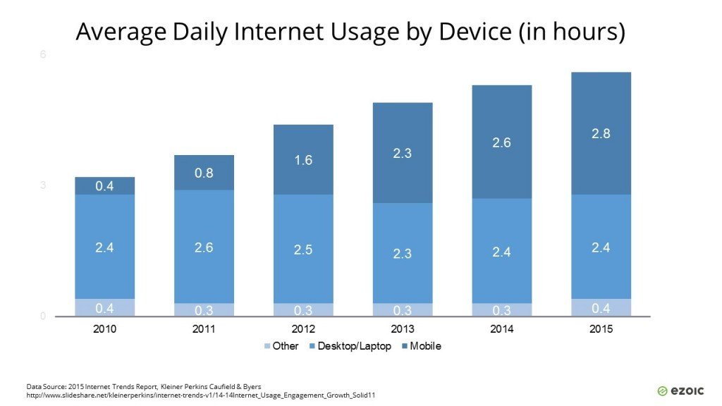
daily Internet usage on mobile devices
increased 600% from 2010 to 2015
Mobile First
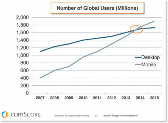
Mobile web usage outweighs Desktops/laptops

Mobile First
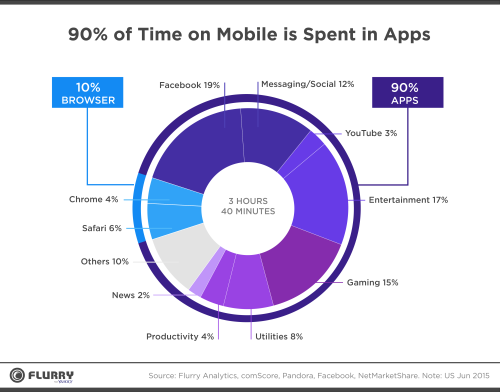
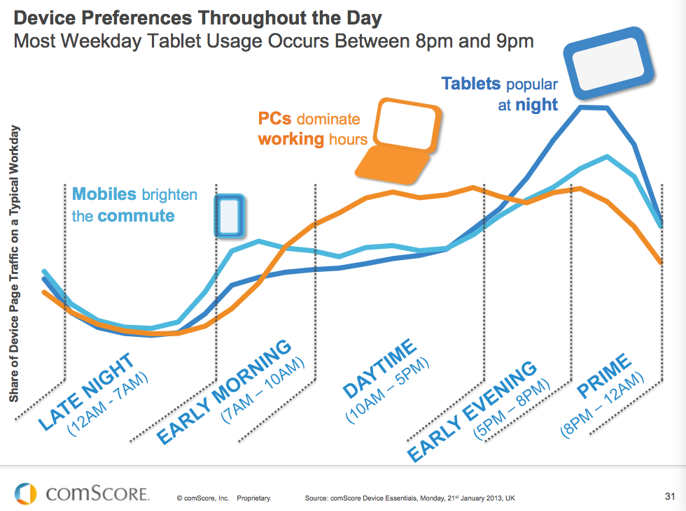
Channels of engagement
Mobile First
Engagement patterns
Mobile First
Keep calm and embrace change

Mobile First
Mobile Development Strategies
* Go Native
Native apps written in Java / Objective C / C# / C++
PhoneGap (or similar) written in HTML+CSS+JS
* Hybrid Apps
* Redirect to a mobile site
Two separate websites - for mobile and desktop
Create a single website using responsive web design
* Responsive web design
* React Native
* Native Script
* Flutter
Mobile First
Go Native
Native apps written to work on a specific mobile OS
- Faster, better performance = more responsive
- Works offline
- Home screen icon
- Access device hardware
(camera, accelerometer, compass, etc.)
Pros:
Cons:
-
Develop 2-3 projects in 2-3 languages (2-3 teams...)
-
Going through app stores
-
Harder to maintain and update app
Mobile First
Hybrid Apps
PhoneGap (or similar) written in HTML+CSS+JS
- Looks like a native app to the end users
- Same source => multiple platforms
- Works offline
- Home screen icon
- Access device hardware
(camera, accelerometer, compass, etc.)
Pros:
Cons:
-
Slower than a native app
-
Harder to deploy and maintain than a website
-
Downloads & updates from the app store...
Mobile First
Redirect to a mobile site
Two separate websites - for mobile and desktop
- Easier to code / separation of concerns
- Content can be completely different
- Interaction style can be different
(e.g. touch vs. mouse)
Pros:
Cons:
-
Content reuse across both sites?
-
Intermediate-sized devices?
-
Probably will auto redirect users
-
What if the user doesn’t want to be redirected?
Mobile First
Responsive web design
Create a single website using responsive web design
- Mobile-first demands a focus on key use cases!
- Will benefit all users, not just mobile
- Relatively future-proof
- Code reuse
Pros:
Cons:
-
Requires excellent javascript and CSS skills
-
Downloading large pages, images, scripts, CSS, etc.
(Http 2.0 & Streaming will make it easier...)
Mobile First
Two ways to go Responsive
-
Build from 1024x768 down to smaller device settings
Desktop First
Mobile First
-
Build from the smallest device up
-
Demands a focus on key use cases

Mobile First means
In the past, when users’ focus was on the desktop Web, mobile design was an afterthought.
Today, more people are using their mobile devices for online shopping and social networking than ever before
The digital landscape has changed, consumers are now accessing more content on their mobile devices than anywhere else.
Mobile first requires a new approach to planning, UX design, and development that puts handheld devices at the forefront of both strategy and implementation.
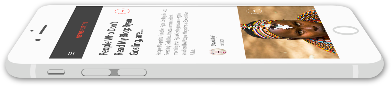
Design for mobile before the desktop Web.

Mobile First
Mobile First means
Instead of users’ viewing desktop versions of Web sites on their mobile device with some adjustments, users are now viewing sites that have been created specifically for their mobile device.
Design for mobile before the desktop Web.

Mobile First
Get inspired with Awesome Responsive Designs

Mobile First
By Yariv Gilad


