Colors and Gradients In CSS
Selectors in CSS

Colors and Gradients
color can be added in 4 ways:
- rgb,a (red, green, blue, alpha) -
contains values from 0 - 255, or 0 - 100%
rgb(183, 21, 64, 50%)
rgb(183 21 64 / 50%) - hex code - (any rgb,a color is converted to hex code)
hexa-decimal: base 16, [0-9 + A-F]
Eg: (b7 15 40)
b = 11*16+7 = 183
rgb(183, 21, 64)
Selectors in CSS
Colors and Gradients
-
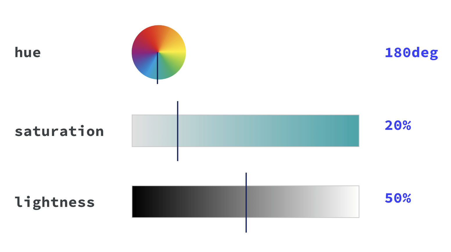
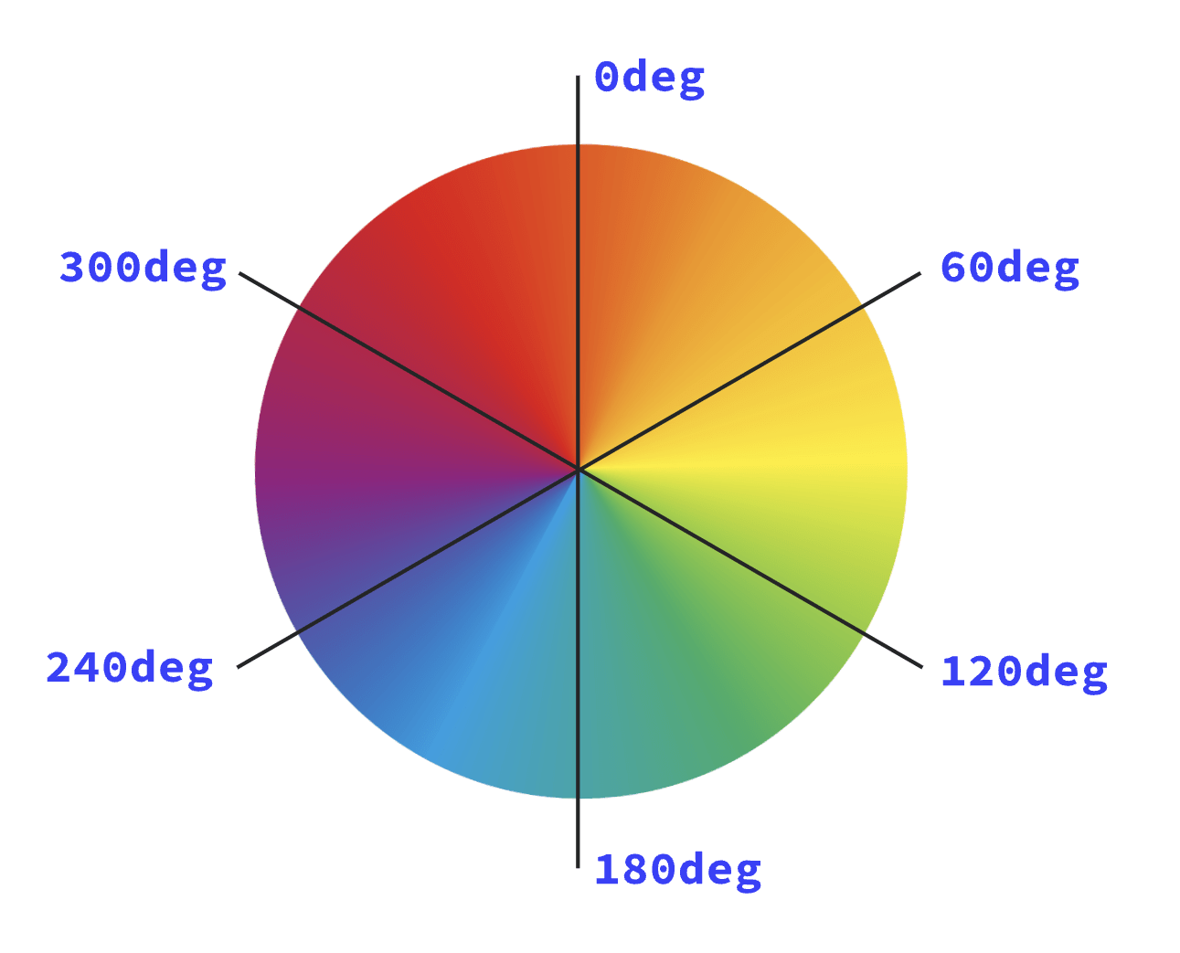
hsl,a
(hue, saturation, lightness, alpha):-
saturation is how vibrant the selected hue is, 0% is grayscale
lightness is the parameter which describes the scale from black to white
Selectors in CSS
Colors and Gradients
- keywords
Selectors in CSS
Colors and Gradients
- Linear Gradients,
- Radial gradients,
- Conic gradients,
- Repeating gradients
Selectors in CSS
Linear Gradient
Simple Gradient with Default Direction (Bottom to Top)
This is the most basic form of the gradient, with a default direction (from top to bottom) and two colors:
.gradent-box {
  border: 2px solid black;
  height: 200px;
  width: 200px;
  background: linear-gradient(red, blue);
}
Selectors in CSS
Linear Gradient
Angle-based Gradient
Here’s a gradient transitioning between three colors at an angle of 45 degrees:
.linear-gradent{
  border: 1px solid black;
  width: 200px;
  height: 200px;
  background: linear-gradient(to right, red 10%, yellow 30%, blue 80%);
}
Selectors in CSS
Linear Gradient
Side and Corner-based Gradient
A gradient going from the top-right corner to the bottom-left corner, with precise color stops:
.linear-gradent{
  border: 1px solid black;
  width: 200px;
  height: 200px;
  background:linear-gradient(to bottom left, red 20%, yellow 50%, blue 90%);
  }
Selectors in CSS
Linear Gradient
Side and Corner-based Gradient
A gradient going from the top-right corner to the bottom-left corner, with precise color stops:
.linear-gradent{
  border: 1px solid black;
  width: 200px;
  height: 200px;
  background:linear-gradient(to bottom left, red 20%, yellow 50%, blue 90%);
}
Selectors in CSS
Linear Gradient
Using Color Hints for Smooth Transitions
Color hints are used to indicate where the color should change more abruptly or more gradually. Here’s an example:
.linear-gradent{
  border: 1px solid black;
  width: 200px;
  height: 200px;
  background:linear-gradient(red 20%, 40%, blue);
  }
Selectors in CSS
Linear Gradient
Gradient with Length Units for Color Stops
Instead of using percentages, you can use length units (like px) to control where the color stops happen:
.linear-gradent{
  border: 1px solid black;
  width: 200px;
  height: 200px;
  background:linear-gradient(to right, red 50px, yellow 100px, blue 200px);
}
Selectors in CSS
Linear Gradient
Using Different Directions with Color Stops
A gradient that moves vertically from bottom to top with precise color stops:
.linear-gradent{
  border: 1px solid black;
  width: 200px;
  height: 200px;
  background:linear-gradient(to top, red 0%, yellow 50%, blue 100%);
}
Selectors in CSS
Linear Gradient
Angle-based Gradient with Color Hints and Stops
Here’s an example of a more complex gradient with an angle, color stops, and hints for smooth transitions:
.linear-gradent{
  border: 1px solid black;
  width: 200px;
  height: 200px;
  background:linear-gradient(135deg, red 10%, 25%, yellow 50%, 75%, blue 90%);
  }
Selectors in CSS
Linear Gradient
Combining Multiple Stops with Smooth Transitions
A gradient with multiple color stops and hints for smooth changes between colors:
.linear-gradent{
  border: 1px solid black;
  width: 200px;
  height: 200px;
  background:linear-gradient(to right, red 0%, yellow 30%, green 60%, blue 100%);
  }
Selectors in CSS
Linear Gradient
Complex Gradient with Lengths, Percentages, and Hints
You can mix both percentages and lengths to achieve very precise control over the gradient:
.linear-gradent{
  border: 1px solid black;
  width: 200px;
  height: 200px;
  background: linear-gradient(to right, red 10%, yellow 50px, green 70%, blue 90%);
}
Selectors in CSS
radial-gradient()
Using Circle Shape:
.radial-gradient-basic {
  border: 1px solid black;
  width: 200px;
  height: 200px;
  background: radial-gradient(circle, red, blue);
}

.radial-gradient-WithPosition {
  border: 1px solid black;
  width: 200px;
  height: 200px;
/*   background: radial-gradient(circle at center, green, yellow); */
      background:  radial-gradient(circle at left top, orange, pink);
  /*     background:  radial-gradient(circle at 75% 25%, purple, cyan); */
}

.radial-gradient-withsize{
   border: 1px solid black;
  width: 200px;
  height: 200px;
/*   background: radial-gradient(circle closest-corner, #ff5733, #33ff57); */
      background: radial-gradient(circle farthest-side, #ff0000, #0000ff)


}
Selectors in CSS
radial-gradient()
Using Ellipse Shape
.radial-gradient-basic {
  border: 1px solid black;
  width: 200px;
  height: 200px;
  background: radial-gradient(ellipse, black, white)

}

.radial-gradient-WithPosition {
  border: 1px solid black;
  width: 200px;
  height: 200px;
  background: radial-gradient(ellipse at right bottom, teal, lime);
  /*     background: radial-gradient(ellipse at 40% 60%, gold, silver) */
}

.radial-gradient-withsize{
   border: 1px solid black;
  width: 200px;
  height: 200px;
  background: radial-gradient(ellipse closest-side, #ffcc00, #00ccff)
  /*     background:radial-gradient(ellipse farthest-corner, #9900cc, #cc0099);
}
Selectors in CSS
radial-gradient()
Using Radial Size with Length
.radial-gradient-circle-with-Length {
  border: 1px solid black;
  width: 200px;
  height: 200px;
  background: radial-gradient(circle 50px, red, blue);

}

.radial-gradient-Ellipse-with-Length {
  border: 1px solid black;
  width: 200px;
  height: 200px;
  background:radial-gradient(ellipse 30px 50px, orange, purple);
/* background:radial-gradient(ellipse 25% 40%, #123456, #654321) */
}
Selectors in CSS
radial-gradient()
With Color Stops and Hints
.radial-gradient-circle{
  border: 1px solid black;
  width: 200px;
  height: 200px;
/*   background: radial-gradient(circle, red 0%, blue 50%, green 100%) */
  background: radial-gradient(circle, #ff0000 10%, #00ff00 40%, #0000ff 70%);
/* background: radial-gradient(circle, #ff5733 0%, #33ff57 50%, #f0f0f0 90%); */
}

.radial-gradient-Ellipse {
  border: 1px solid black;
  width: 200px;
  height: 200px;
  background:radial-gradient(ellipse, rgba(255, 0, 0, 0.5) 0%, rgba(0, 255, 0, 0.5) 100%);
/* background: radial-gradient(ellipse, rgba(0, 0, 255, 0.3) 20%, rgba(255, 255, 0, 0.5) 80%) */
}
Selectors in CSS
radial-gradient()
Complex Combinations with Position and Color Stops
.radial-gradient-circle{
  border: 1px solid black;
  width: 200px;
  height: 200px;
  background:radial-gradient(circle at 10% 20%, red 20%, yellow 60%, green 100%);
/* background: radial-gradient(circle at center, #ff0000 0%, #00ff00 50%, #0000ff 100%) */
}

.radial-gradient-Ellipse {
  border: 1px solid black;
  width: 200px;
  height: 200px;
  background:radial-gradient(ellipse at 50% 50%, #ffffff 30%, #000000 70%);
/* background: radial-gradient(ellipse at 25% 75%, #cccccc 40%, #ffcc00 90%) */

}
CSS: Colors and Gradients
By Yash Priyam


