Ionic
Wenxi Zhu
Intel XDK PRC Team
What is Ionic?
Ionic
Ionic is a powerful HTML5 library that helps building native-feeling mobile apps using web technologies like HTML, CSS and JavaScript.
Ionic is focused mainly on the look and feel, and UI interaction of app.
Ionic currently requires AngularJS in order to work at its full potential, which will NOT be cover in this lecture.
Source: Ionic
Why Ionic?
Advantage of Ionic
-
Performance Obsessed
-
A Match Made in Heaven with Angular
-
Native Focused
-
Beautifully Designed
Ionic CSS
Ionic CSS Component
A comprehensive list of our CSS mobile components, including almost everything mobile developers need.
In this lecture, we will cover:
- Header, Content & Footer
- Tab, List & Form
- Buttons
- Ranger & Select
Although Ionic has a tighter-binding with AngularJS, we can still live without it, by using only the Ionic CSS Component.
Header, Content & Footer
Header
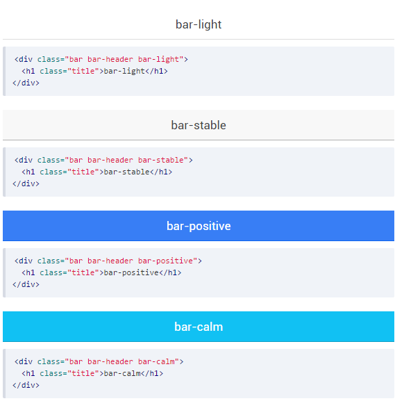
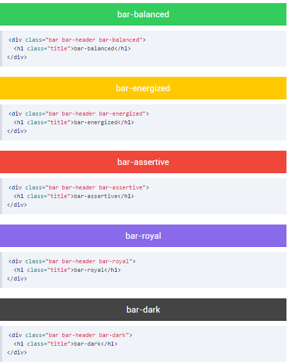
Headers are fixed regions at the top of a screen that can contain a title label, and left/right buttons for navigation or to carry out various actions.
Ionic provide a variety of headers with different color options.
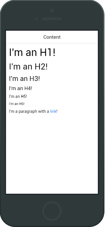
Content
The content area in Ionic is the scrollable viewport of your app. While your headers and footers will be fixed to the top and bottom, respectively, the content area will fill the remaining available space.
<div class="content has-header">
    <h1>I'm an H1!</h1>
    <h2>I'm an H2!</h2>
    <h3>I'm an H3!</h3>
    <h4>I'm an H4!</h4>
    <h5>I'm an H5!</h5>
    <h6>I'm an H6!</h6>
    <p>I'm an pragraph with a <a>link</a></p>
</div>
Footer
Footers are regions at the bottom of a screen that can contain various types of content.
Footers have the same color options as the headers, just use "bar-footer" instead of "bar-header". If a title is present in the footer, any buttons will automatically be placed on the correct side of the title in relation to how the markup was written.
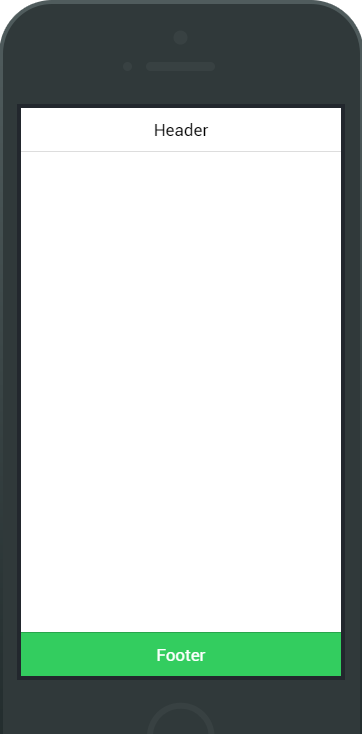
<div class="bar bar-footer bar-balanced">
    <div class="title">Footer</div>
</div>
Tab & List
Tabs
Tabs are a horizontal region of buttons or links that allow for a consistent navigation experience between screens. It can contain any combination of text an icons, and is a popular method for enabling mobile navigation.
Tabs can be styled to match the standard Ionic colors: "tabs-default", "tabs-light", "tabs-stable", "tabs-positive", "tabs-calm", "tabs-balanced", "tabs-energized", "tabs-assertive", "tabs-royal" and "tabs-dark"
<div class="tabs">
    <a class="tab-item">
        Home
    </a>
    <a class="tab-item">
        Favorites
    </a>
    <a class="tab-item">
        Settings
    </a>
</div>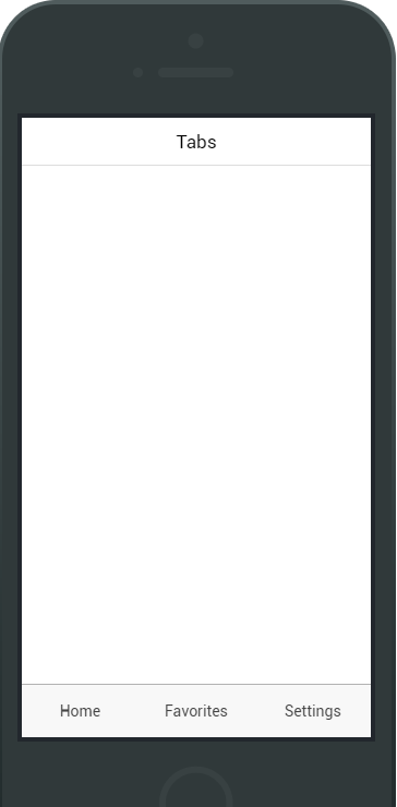
Icon-only Tabs
<div class="tabs tabs-icon-only">
    <a class="tab-item">
        <i class="icon ion-home"></i>
    </a>
    <a class="tab-item">
        <i class="icon ion-star"></i>
    </a>
    <a class="tab-item">
        <i class="icon ion-gear-a"></i>
    </a>
</div>
Text
Add "tabs-icon-only" along with "tabs" classname.
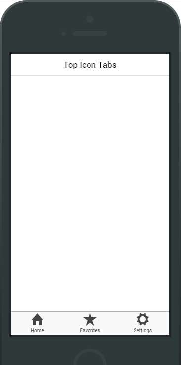
Top Icon Tabs
<div class="tabs tabs-icon-top">
    <a class="tab-item">
        <i class="icon ion-home"></i>
        Home
    </a>
    <a class="tab-item">
        <i class="icon ion-star"></i>
        Favorites
    </a>
    <a class="tab-item">
        <i class="icon ion-gear-a"></i>
        Settings
    </a>
</div>
Add "tabs-icon-top" along with "tabs" classname.
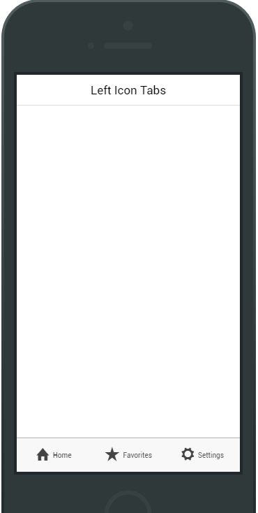
Left Icon Tabs
<div class="tabs tabs-icon-left">
    <a class="tab-item">
        <i class="icon ion-home"></i>
        Home
    </a>
    <a class="tab-item">
        <i class="icon ion-star"></i>
        Favorites
    </a>
    <a class="tab-item">
        <i class="icon ion-gear-a"></i>
        Settings
    </a>
</div>
Add "tabs-icon-left" along with "tabs" classname.
List
The list is a common and simple way of displaying a list view. This is a widely used interface across most current mobile OS's, and can include content ranging from basic text all the way to buttons, icons, toggles and thumbnails.
The list view is a very versatile and powerful component. List views support various interaction modes such as editing, swipe to edit, drag to reorder, and pull to refresh.
<ul class="list">
    <li class="item">
        ...
    </li>
</ul>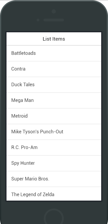
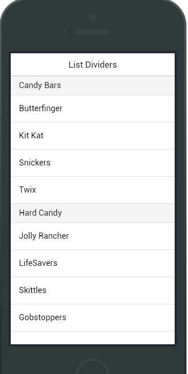
List Dividers
<div class="list">
    <div class="item item-divider">
        Candy Bars
    </div>

    <a class="item" href="#">
        Butterfinger
    </a>
</div>
List items can also be dividers to organize the group the list items.
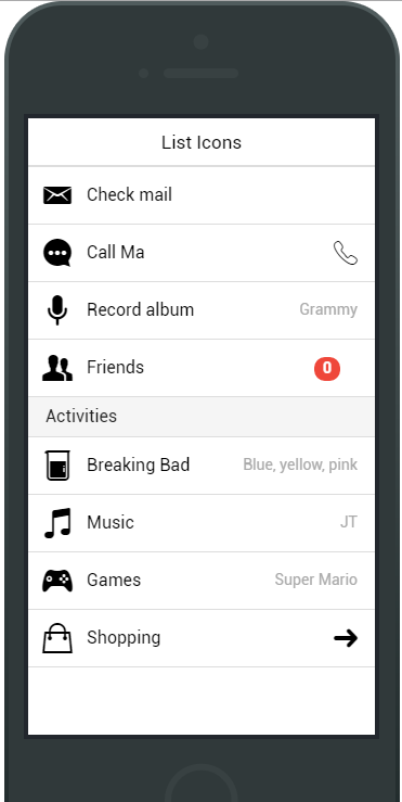
List Icons
<div class="list">

  <a class="item item-icon-left" href="#">
    <i class="icon ion-email"></i>
    Check mail
  </a>

  <a class="item item-icon-left item-icon-right" href="#">
    <i class="icon ion-chatbubble-working"></i>
    Call Ma
    <i class="icon ion-ios-telephone-outline"></i>
  </a>

  <a class="item item-icon-left" href="#">
    <i class="icon ion-mic-a"></i>
    Record album
    <span class="item-note">
      Grammy
    </span>
  </a>

  <a class="item item-icon-left" href="#">
    <i class="icon ion-person-stalker"></i>
    Friends
    <span class="badge badge-assertive">0</span>
  </a>

</div>
List can have icons assigned either to the left and/or right side of each list item.
Item Buttons
<div class="list">

  <div class="item item-button-right">
    Call Ma
    <button class="button button-positive">
      <i class="icon ion-ios-telephone"></i>
    </button>
  </div>

  ...

</div>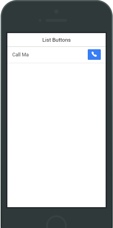
Item Avatars
<div class="list">

    <a class="item item-avatar" href="#">
      <img src="venkman.jpg">
      <h2>Venkman</h2>
      <p>Back off, man. I'm a scientist.</p>
    </a>

    ...

</div>
Item avatars are essentially a showcase of an image larger that an icon but smaller than a thumbnail.
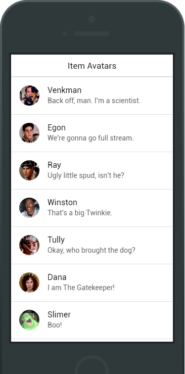
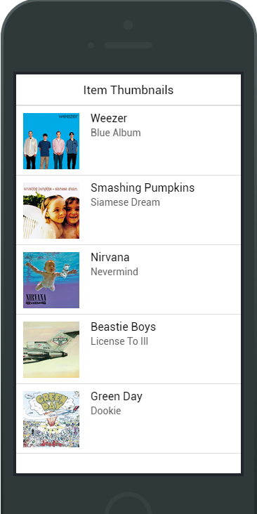
Item Thumbnails
<div class="list">

    <a class="item item-thumbnail-left" href="#">
      <img src="cover.jpg">
      <h2>Pretty Hate Machine</h2>
      <p>Nine Inch Nails</p>
    </a>

    ...

</div>
Larger than an icon and avatar.
Buttons
Button
Button is an essential part of any mobile experience. Like the Header, they come in the full spectrum of Ionic's default color.
By default a button has "display: inline-block" applied. Other options include "block" buttons for a full width.
Typical Button
<button class="button">
  Default
</button>

<button class="button button-light">
  button-light
</button>

<button class="button button-stable">
  button-stable
</button>

<button class="button button-positive">
  button-positive
</button>

<button class="button button-calm">
  button-calm
</button>

<button class="button button-balanced">
  button-balanced
</button>

<button class="button button-energized">
  button-energized
</button>

<button class="button button-assertive">
  button-assertive
</button>

<button class="button button-royal">
  button-royal
</button>

<button class="button button-dark">
  button-dark
</button>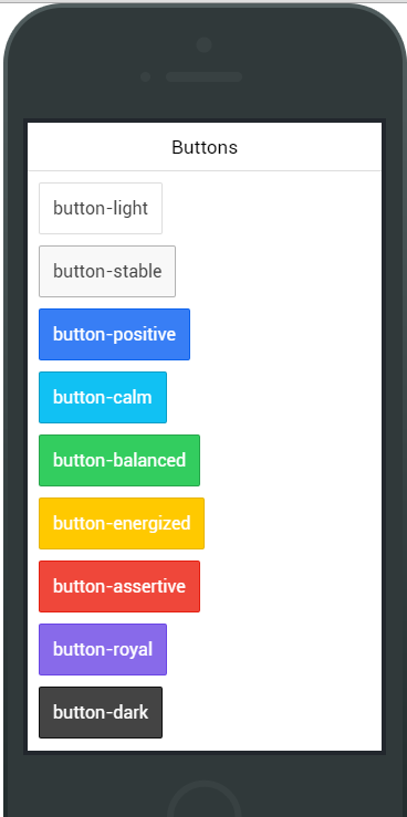
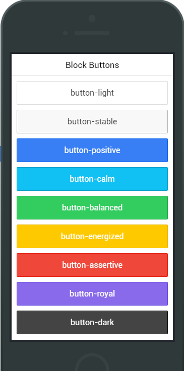
Block Buttons
<button class="button button-block button-positive">
  Block Button
</button>
Add "button-block" to a button applies "display: block" display.
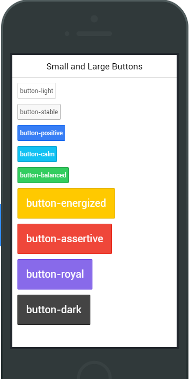
Different Sizes
<button class="button button-small button-assertive">
  Small Button
</button>
<button class="button button-large button-positive">
  Large Button
</button>
Remove borders on the left and right.
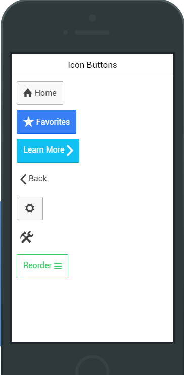
Icon Buttons
<button class="button">
  <i class="icon ion-loading-c"></i> Loading...
</button>

<button class="button icon-left ion-home">Home</button>

<button class="button icon-left ion-star button-positive">Favorites</button>

<a class="button icon-right ion-chevron-right button-calm">Learn More</a>

<a class="button icon-left ion-chevron-left button-clear button-dark">Back</a>

<button class="button icon ion-gear-a"></button>

<a class="button button-icon icon ion-settings"></a>

<a class="button button-outline icon-right ion-navicon button-balanced">Reorder</a>
Remove borders on the left and right.
Checkbox
A checkbox is no different than the HTML checkbox input, except it's styled different.
Ionic prefers to use the <label> element for a checkbox item in order to make the entire checkbox tappable.
Checkboxes can also have colors assigned to them, such as checkbox-assertive to assign the assertive color.
<ul class="list">

  <li class="item item-checkbox">
     <label class="checkbox">
       <input type="checkbox">
     </label>
     Flux Capacitor
  </li>

  ...

</ul>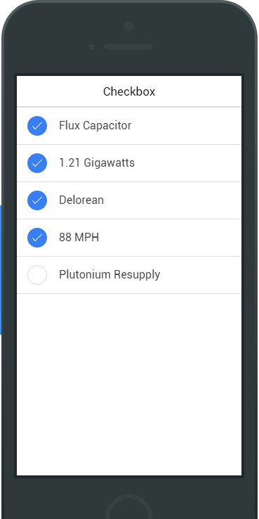
Toggle
A toggle technically is the same thing as an HTML checkbox input, except it looks different and is easier to use on a touch device.
Toggles can also have colors assigned to them, such as toggle-assertive to assign the assertive color.
<ul class="list">

  <li class="item item-toggle">
     HTML5
     <label class="toggle toggle-assertive">
       <input type="checkbox">
       <div class="track">
         <div class="handle"></div>
       </div>
     </label>
  </li>

  ...

</ul>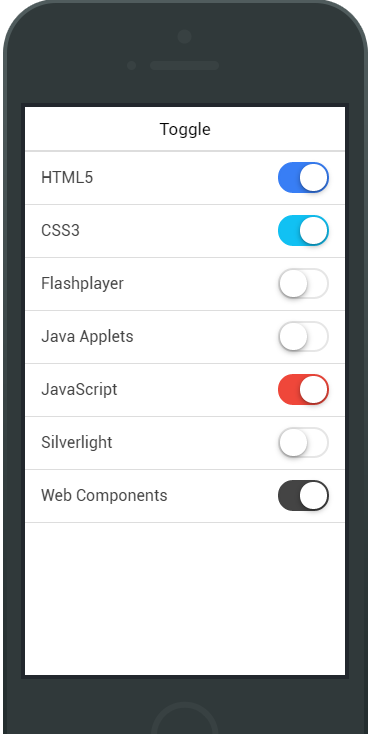
Radio Button
Radio buttons act no differently as standard radio input elements.
Each item-radio must have a radio input with the same input name attribute. The radio-icon class is used to designate when to show and hide the icon element.
<div class="list">

  <label class="item item-radio">
    <input type="radio" name="group">
    <div class="item-content">
      Go
    </div>
    <i class="radio-icon ion-checkmark"></i>
  </label>

  ...

</div>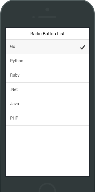
Range, Select & Forms
Range
<div class="item range">
  <i class="icon ion-volume-low"></i>
  <input type="range" name="volume">
  <i class="icon ion-volume-high"></i>
</div>

<div class="list">
  <div class="item range range-positive">
    <i class="icon ion-ios-sunny-outline"></i>
    <input type="range" name="volume" min="0" max="100" value="33">
    <i class="icon ion-ios-sunny"></i>
  </div>
</div>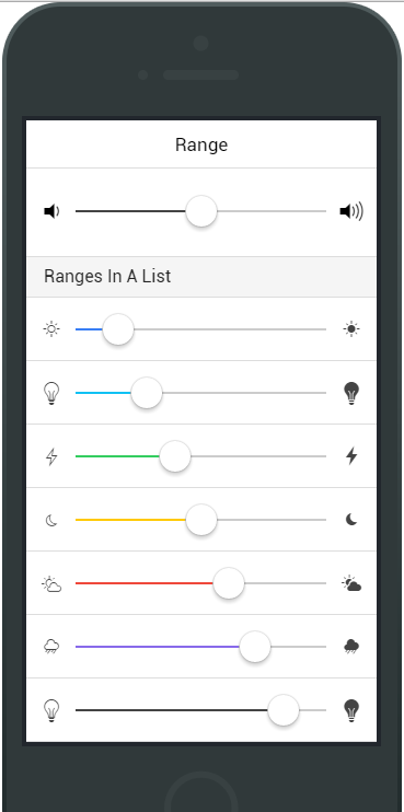
Select
Ionic's select is styled so its appearance is prettied up relative to the browser's default style.
<div class="list">

  <label class="item item-input item-select">
    <div class="input-label">
      Lightsaber
    </div>
    <select>
      <option>Blue</option>
      <option selected>Green</option>
      <option>Red</option>
    </select>
  </label>

</div>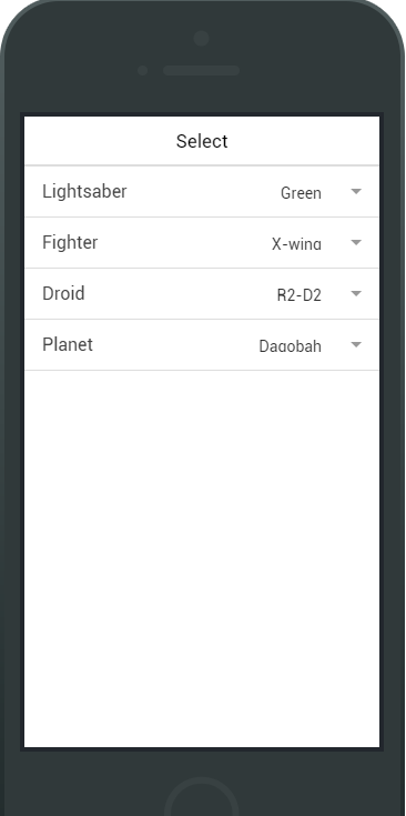
Forms & Inputs
<div class="list">
  <label class="item item-input">
    <input type="text" placeholder="First Name">
  </label>
  <label class="item item-input">
    <input type="text" placeholder="Last Name">
  </label>
</div>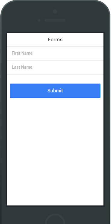
Questions?
ionic
By zhuwenxi