Rethinking Layout With CSS3 3D Transforms Using matrix3d()
Zoltan Hawryluk, zoltan.dulac@gmail.com
WHAT THE HELL IS A ZOLTAN?
- I have been a front-end web developer almost since the before there has been an <img> tag back then
- I am research web technology and write a blog, User Agent Man
- I am the author of several open source web projects (html5Forms.js, CSS3 Font Converter, visibleIf)
- I have contributed to several other open source projects (picturefill, viewport-units-buggyfill.js).
- I love the technical side of what I do for a living.
- I love the creative side of what I do for a living.
- I like to push the envelope of web technology.
WHAT ARE CSS TRansFORMS?
- They allow you to change the shape of HTML Elements through rotating, skewing, flipping and scaling
- They have been around since 2010 in modern browsers, but a crude 2D variant has existed in Internet Explorer since 1997 (version 4.0!)
- There come in 2D and 3D flavours.
- I have done a lot of research to see how they can be used effectively for to exhance typography, animation and layout
EXAMPLES
ONE ANNOYING PROBLEM WITH THEM
- There is nothing in the CSS spec stating how to place some live HTML text in a page/photo inside an arbitrary quadrilateral.
- Wouldn't it be great if you could just place text inside a photo and make it look like it was actually part of the scenery?
- Sapient has had difficulty with this in the past!

WHY IS THIS A PROBLEM?
CSS transform code looks like this:
#obj {
    transform: rotate(45deg) scale(2);
}- There is nothing that says "move the corners of the HTML element to these points".
- Perspective is a huge issue
BUT this is a classic design tool!
- Alexander Rochenko and the Constructivist art movement used this as a great tool for design


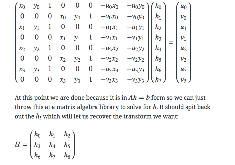
Enter matrix3d()
- I knew it was possible to get pixel perfect transforms with matrix3d()
- The problem is, matrix3d() is not intuitive and it is not possible to "just code" number in it off the top of your head to transform HTML elements to exactly where you wanted them.
OPTION 2a: PICTUREFILL
 transform: matrix3d(2.434961, 0.026393, 0, 0.003202,
                    -0.044022, 0.089971, 0, -0.001254,
                    0, 0, 1, 0,
                    33, 271, 0, 1);
 transform-origin: 0px 0px 0px;
These numbers don't mean anything unless you understand this ....
HOWEVER
-
I have a university degree in math
-
A fellow named James Coglan developed a great matrix Javascript library called Sylvester.js that could do the hard work for me.
-
I like to (try to) solve hard problems.
So I created the Matrix Construction Set
Some (WHat I Think Are) cool examples
REACTION ON TWITTER
The challenge
- These examples are just the beginning.
- We should be using this in client work.
- We go more crazy creative on this.
- We can simulate/emulate working products in the "real world".
- It would be really cool to do further experiments with these (e.g. animate the actual transforms themselves)
Rethinking Layout With CSS3 3D Transforms Using matrix3d()
By Zoltan Hawryluk


