Way to kill indecision
for better UX
9


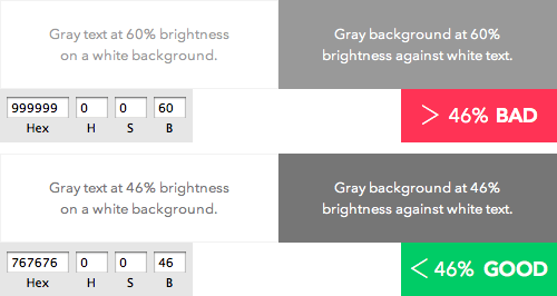
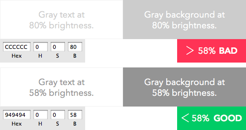
58% Brightness for 18+ Font
46% Brightness
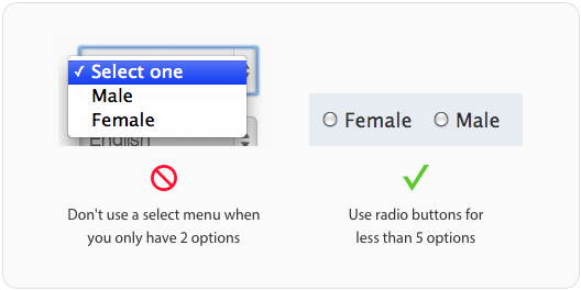
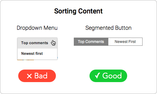
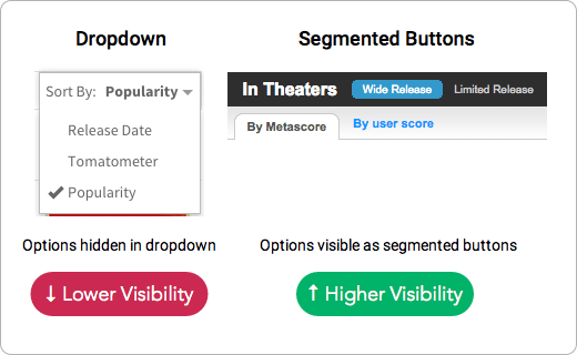
Use Radio buttons for
less than 5 options
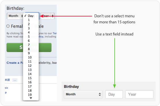
Use text field for more than
15 options of dropdown
Use a Default Select Menu Option
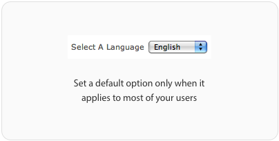
when it applies to most of users
This is what Accordion Menu should be...
Use plus icon and keep it to the left side
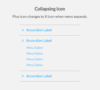
Plus icon changes to X when menu expands
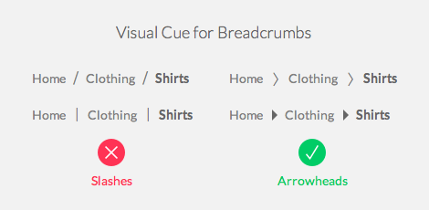
look seperator not navigation
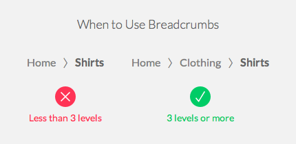
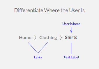
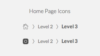
First must be Home page
Here should be Text label
OK Button should on the right side


OK Button should on the right side
Because...
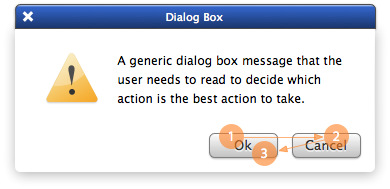
the visual fixations are more and flow in multiple directions.
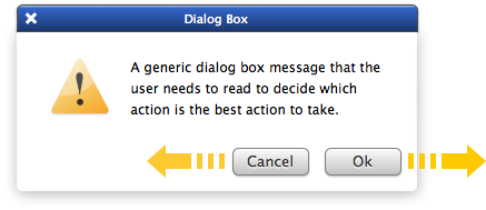
OK = Next, Cancel = Back
fast and easy because the users eyes end on the primary action button.
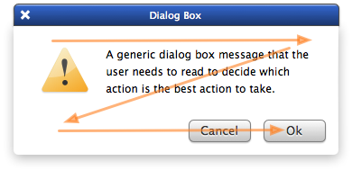
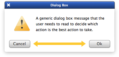
The large visual separation between the buttons makes comparing actions difficult
UX Tips
By Zzo Lay