BEM & SCSS
STYLE GUIDE
What is BEM?
What is BEM?
-
Front-end development methodology
-
User Interface design pattern
-
Ensures maintainability and longevity
-
Ability to efficiently organize people’s work in a team
Block
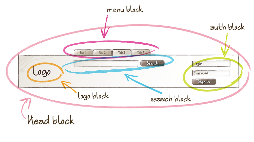
Block.
Block.
-
A logically and functionally independent page component
-
Equivalent of a component in Web Components
-
Encapsulates behavior (JavaScript), templates & styles
-
Independent, contained, reusable and can be nested
Block.
Element
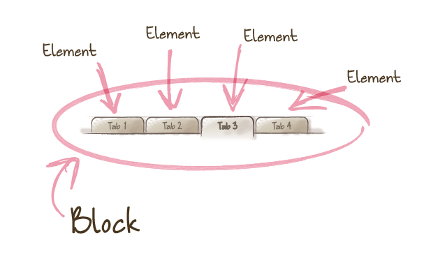
Element.
Element.
-
A constituent part of a block that can't be used outside of it
-
Child elements only relevant to the parent block
-
Never used outside of the context of a parent block
-
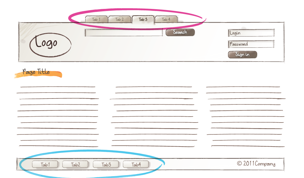
Remember, blocks can be nested
Element.
Modifier
Modifier.
Modifier.
-
Modify the appearance and behavior of a block or an element
-
Similar in essence to HTML attributes
-
Theme switch, active state, size variations
-
The use of modifiers is optional
Modifier.
IRL Example
Template
<header class="header">

    <nav class="nav">

        <ul class="nav__list">

            <li class="nav__item">Home</li>

            <li class="nav__item--active">About</li>

            <li class="nav__item">Work</li>

            <li class="nav__item">What We Do</li>

            <li class="nav__item">Contact</li>

        </ul>

    </nav>

</nav>
Styles
.nav {
    background: dodgerblue;
    display: table;
    width: 100%;
}

.nav--fixed {
    height: 55px;
    position: fixed;
}

.nav__item {
    background: dodgerblue;
    display: table-cell;
    height: 90px;

    &:hover
    &--active {
        background: red;
        color: white;
    }

    .nav--fixed & {
        height: 55px;
    }
}
Crazy
IRL Example
Crazy IRL Example
%panel {
    font-size: 2em;
    height: 100%;
    padding: 4em;
    text-align: center;
    width: 100%;
}

@mixin panel($bg) {
    @extend %panel;
    background: $bg;
}

.panel--red {
    @include panel(#ff0000);
}

.panel--green {
    @include panel(#00ff00);
}

.panel--blue {
    @include panel(#0000ff);
}
Crazy IRL Example
$panels = (
    (
        name: 'red',
        bg: '#ff0000'
    ),
    (
        name: 'green',
        bg: '#00ff00'
    ),
    (
        name: 'blue',
        bg: '#0000ff'
    )
);

@each $panel in $panels {
    .#{map-get($panel, name)} {
        @include panel(#{map-get($panel, bg));
    }
}
JavaScript
JavaScript.
-
Use JavaScript to add behaviour to a component (block)
-
Data attributes to communicate between the two
-
Selection, initialization and modification
-
Template / style agnostic, configurable modules
Data Attributes.
<header class="header">

    <nav class="nav" data-nav>
        <ul>

            <li class="nav__item">
                <a href="#" data-nav-item>
                    Home
                </a>
            </li>

            <li class="nav__item">
                <a href="#" data-nav-item>
                    About
                </a>
            </li>

            <li class="nav__item">
                <a href="#" data-nav-item>
                    Contact
                </a>
            </li>
        </ul>
    </nav>

</header>
JavaScript.
module.exports = (function() {
    'use strict';

    function nav($element) {
        this.$el = $element;
        this.$children = {};
        this.modifier = '';
    }

    // set nav item selector and hook up event listener
    nav.prototype.setChildren = function(selector) {
        this.$children = this.$el.find(selector);

        this.$children.on('click', function(e) {
            e.preventDefault();
            this.activate($(this));
        });

    };

    // set modifier class to use in activating
    nav.prototype.setChildModifier = function(modifier) {
        this.modifier = modifier;
    };

    // active/deactivate nav item
    nav.prototype.activate($child) {
        $child.parent().toggleClass(this.modifier);
    };

    return nav;
})();
JavaScript.
(function() {

    'use strict';


    var // load nav module
        Nav = require('./components/nav'),

        // instantiate new nav instance
        nav = new Nav($('[data-nav]'));

    // set nav children
    nav.setChildren('[data-nav-item]');

    // set class to activate with
    nav.setChildModifier('.nav__item--active');

})();
Data Attributes.
<header class="header">

    <nav class="nav" data-nav='{"scroll": true, "offset": 20}'>
        <ul>

            <li class="nav__item">
                <a href="#" data-nav-item>
                    Home
                </a>
            </li>

            <li class="nav__item">
                <a href="#" data-nav-item>
                    About
                </a>
            </li>

            <li class="nav__item">
                <a href="#" data-nav-item>
                    Contact
                </a>
            </li>
        </ul>
    </nav>

</header>
JavaScript.
(function() {

    'use strict';


    var // load nav module
        Nav = require('./components/nav'),

        $nav = $('[data-nav]'),

        // instantiate new nav instance
        nav = new Nav($nav, JSON.parse($nav.attr('[data-nav]')));

    // set nav children
    nav.setChildren('[data-nav-item]');

    // set class to activate with
    nav.setChildModifier('.nav__item--active');

})();
JavaScript.
module.exports = (function() {
    'use strict';

    function nav($element, opts) {
        this.$el = $element;
        this.$children = {};
        this.modifier = '';
        this.offset = opts.offset || 0;

        // if scroll options set then initialize
        if(opts.scroll) {
            this.initScroll();
        }
    }

    // initialize scroll handler
    nav.prototype.initScroll = function() {

    };

    return nav;
})();
Help not hinder
SCSS Style Guide
Why a style guide?
-
Help us build more modular and maintainable UI components
-
Enforcing simple rules to ensure code follows standards
-
Help us to move more quickly and work as a team
-
It should not slow us down or hinder expression
-
DS Boilerplate has worked wonders for us so lets improve
Linting Sass.
-
Automate the code review process
-
Parse scss, log potential issues and style guide violations
-
Ultimate goal is to have all our codebases look like it was authored by the same developer
Style Rules
-
Hyphenated BEM
-
4 space indentation
-
Single quote strings
-
Maximum 3 levels nesting (& / media queries)
-
No elements in selectors
-
Alphabetical property lists
-
...and more?
Configuration
Configuration
var gulp = require('gulp');
var scssLint = require('gulp-scss-lint');
var config = require('../config');

module.exports = function() {

    gulp.src([config.paths.sassSourceRoot + '/**/*.scss'])

        .pipe(scssLint({
            config: '.scss-lint.yml'
        }))

        .on('error', function() {})
};
Configuration
exclude:
  - 'public_html/src/scss/base/**'
  - 'public_html/src/scss/bourbon/**'
  - 'public_html/src/scss/neat/**'
  - 'public_html/src/scss/components/_icons.scss'
  - 'public_html/src/scss/templates/_icons.scss'

linters:
  Indentation: # Line should be indented 4 spaces, but was indented 2 spaces
    severity: warning
    width: 4
  MergeableSelector:
    enabled: false
  SelectorFormat:
    enabled: false
  StringQuotes: # Prefer single quoted strings
    enabled: true
  SelectorDepth:
    max_depth: 3
  SelectorFormat:
    convention: hyphenated_BEM
DEMOS!
BEM / SCSS Style Guide
By Adam Chambers