Welcome to BrownBag!

Ahem.. is this thing on??
Building a Component Library


What's the point of this talk?
• Explain the what and why of component libs
• Explain the process of building a library
• Encourage you build and publish your own libs
What is a component library?
• a collection of reusable and extensible UI bits
Some Examples


• Usually more than standalone component libs
Why Build My Own?
• Keep UI consistent across multiple applications
• Build once, reuse often
• Leverage predictable and reliable UI
• Version control with npm
• Strengthen your frontend skillset 💪
Why Build My Own?

meme credit here
Why React?
• Component-based structure
• Testability
• Portability

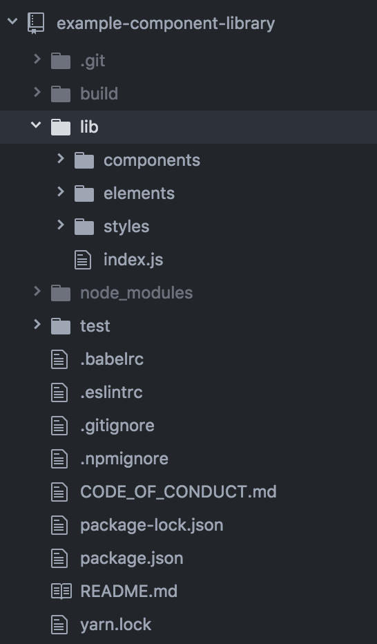
Initial Setup
• Initialize git and npm
• Dependency management and .npmignore
• Use Babel to compile ES2015 (and JSX)
• Add linting and testing
• Add helpful documentation & a CoC
Here's an example starter repo.
Script Overview
// package.json
...
"main": "build/index.js",
...
"scripts": {
"build": "babel lib -d build",
"build:watch": "babel lib -w -d build",
"lint": "eslint lib/**; exit 0",
"lint:watch": "esw -w lib/**",
"prepublish": "npm run build",
"test": "mocha --compilers js:babel-core/register ./test/**/*.spec.js",
"test:watch": "npm test -- --watch"
},
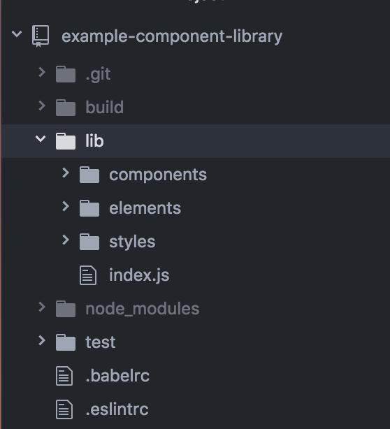
...File Structure
Using Styled Components 💅
• Bundles our CSS with our JS
• Write real CSS 🎊
• Styles are predictable and reliable
• Users don't need to install additional deps
• Server-side rendering (if needed)
• Theming becomes a lot simpler
Applying Atomic Design
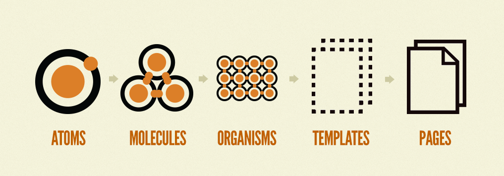
Want to know more?
You can read more or buy Brad Frost's book here.
A Few Modifications
• Atoms => Elements
(spans, buttons, etc.)
• Molecules => Components
(search field, dropdown, etc.)
• Organisms, Templates, & Pages


Adding a Button
import styled from 'styled-components';

const Button = styled.button`
  background: #1FB6FF;
  border: none;
  border-radius: 2px;
  color: #FFFFFF;
  cursor: pointer;
  display: inline-block;
  font-size: 16px;
  line-height: 40px;
  font-weight: 200;
  margin: 8px 0;
  outline: none;
  padding: 0 12px;
  text-transform: uppercase;
  transition: all 300ms ease;
  &:hover {
    background: #009EEB;
  }
`;

export default Button;
Updating index.js
// lib/index.js

import Button from './elements/Button’;

module.exports = {
  Button,
};
Publish! ... right?

Well, it would be nice to test it locally first though...
Development Workflow
// from the root of your component library
$ npm link
// set up a playground app for testing our library
$ git clone git@github.com:alanbsmith/component-lib-playground.git
$ cd component-lib-playground
$ npm install
// link our local module
$ npm link name-of-your-lib
// fire up the app
$ npm run dev
Create a symlink of our module
Add a playground
Hot Updates
// from the root of your component library
$ npm run build:watch
// update our button color to purple
const Button = styled.button`
background: #7E5BEF;
...
&:hover {
background: #592DEA;
}
`;
Run `build:watch` script
Making an update to our lib
This is cool, but...
It would be nice if our users had more control
Things to think about
• Balancing convention and customization
• What use-cases to cover
• Where is our greatest need? (for internal use)
Add a Color Palette
// lib/styles/colors.js
module.exports = {
  white: '#FFFFFF',
  lightBlue: '#85D7FF',
  blue: '#1FB6FF',
  darkBlue: '#009EEB',
  lightPurple: '#A389F4',
  purple: '#7E5BEF',
  darkPurple: '#592DEA',
  lightPink: '#FF7CE5',
  pink: '#FF49DB',
  darkPink: '#FF16D1',
  lightOrange: '#FF9E7C',
  orange: '#FF7849',
  darkOrange: '#FF5216',
  lightGreen: '#29EB7F',
  green: '#13CE66',
  darkGreen: '#0F9F4F',
  lightYellow: '#FFD55F',
  yellow: '#FFC82C',
  darkYellow: '#F8B700',
  ...
};
* This palette is from Marvel's Styleguide, which you can find here.
Updating our Button
// lib/elements/Button.js

import styled from 'styled-components';
import { darken } from 'polished';
import * as colors from '../styles/colors';
const Button = styled.button`
  background: ${({ bgColor })  => colors[bgColor]};
  ...
  color: ${({ fontColor })  => colors[fontColor]};
  ...
  &:hover {
    background: ${({ bgColor })  => darken(0.1, colors[bgColor])};
  }
`;
Button.defaultProps = {
  bgColor: 'blue',
  fontColor: 'white',
};
Ok... now publish!?!
Well, hold on for a second...
Setting Button Sizes
// lib/elements/Button.js
...
const buttonSizes = {
  small: {'font-size': '14px', 'line-height': '30px', padding: '0 8px'},
  medium: {'font-size': '16px', 'line-height': '40px', padding: '0 12px'},
  large: {'font-size': '18px', 'line-height': '50px', padding: '0 16px'},
  wide: {'font-size': '16px', 'line-height': '40px', padding: '0 36px'},
  extraWide: {'font-size': '16px', 'line-height': '40px', padding: '0 72px'},
  fullWidth: {'font-size': '16px', 'line-height': '40px', padding: '0 8px'},
};

function setDisplay({ size }) {
  return size === 'fullWidth' ? 'block' : 'inline-block';
}
function setWidth({ size }) {
  return size === 'fullWidth' ? '100%' : 'initial';
}
const Button = styled.button`
  ...
  display: ${setDisplay};
  font-size: ${({ size }) => buttonSizes[size]['font-size']};
  line-height: ${({ size }) => buttonSizes[size]['line-height']};
  ...
  padding: ${({ size }) => buttonSizes[size]['padding']};
  ...
  width: ${setWidth};
  ...
`;
Button.defaultProps = {
  bgColor: 'blue',
  fontColor: 'white',
  size: 'medium',
};
...
Helpful Hints
• Adopt a grid system
• Think a lot about consistent size and space
• Keep base styles simple
• Adapt styles through prop modifiers
Publishing
// from the root of your component library
$ npm login
// enter your credentials
$ npm publish
// NOTE: your email address is public
$ npm set init.author.name "Your Name"
$ npm set init.author.email "you@example.com"
$ npm set init.author.url "http://yourblog.com"
$ npm adduser
$ npm publishAlready have an account with npm? Run:
New to npm? Run:
Thanks!
Twitter @_alanbsmith

GitHub @alanbsmith


(Yes, we're hiring 🎉)
Building a Component Library
By Alan Smith


