Structuring our Styled-Components
with BEM
Our Inspiration
-
Styled-Components 💅
-
BEM (Blocks, Elements, Modifiers)
BEM
-
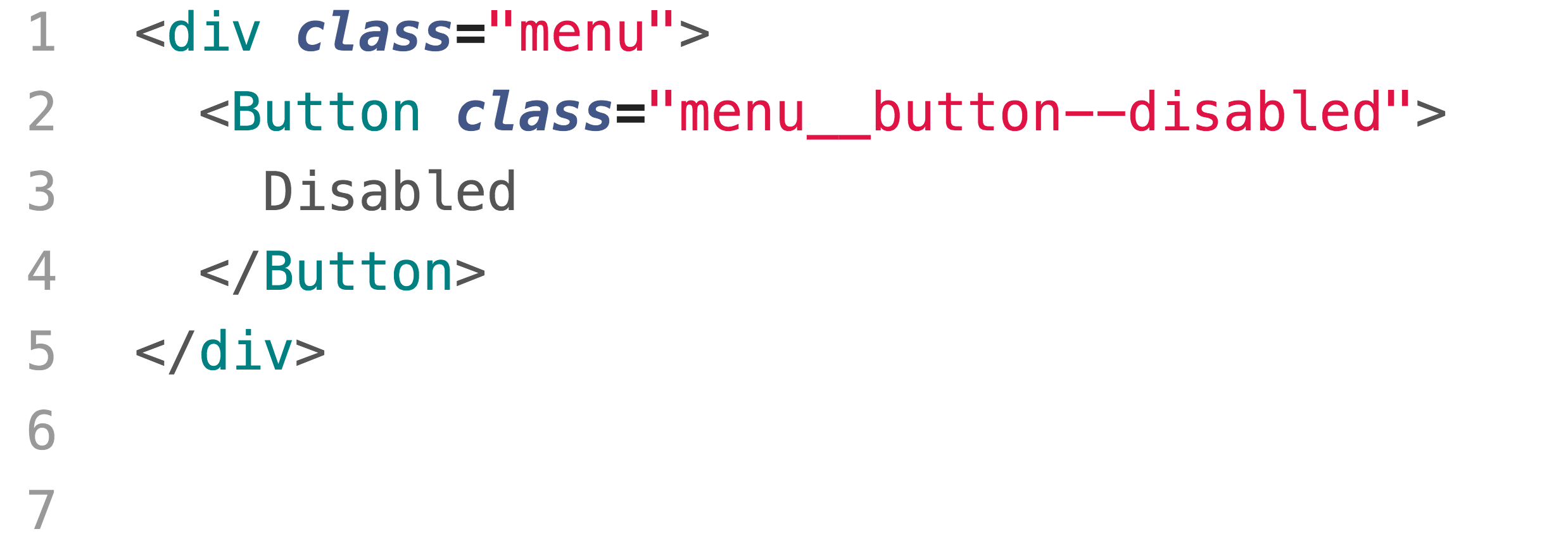
Menu (Block)
-
Button (Element)
-
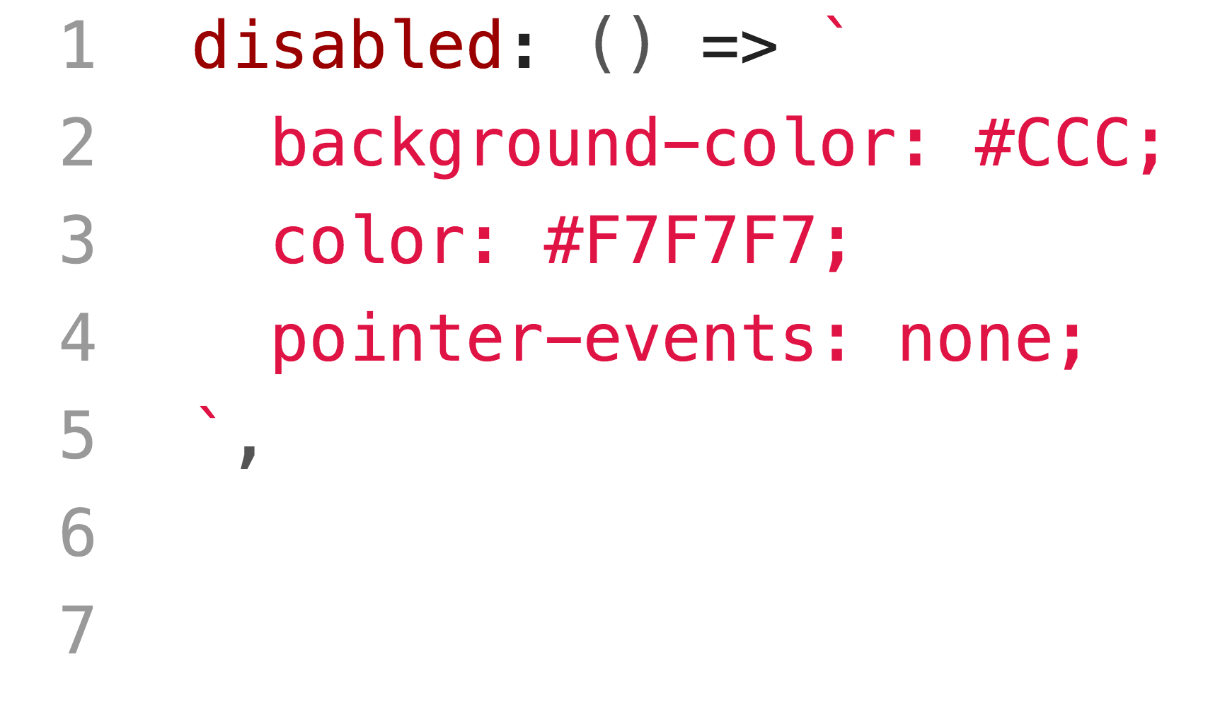
Disabled (Modifier)
Styled-Components
-
Predictable and maintainable styles
What are They Trying to Solve?
-
BEM
-
✅ clear structure
-
✅ naming things is good
-
🚫 naming things is hard
-
🚫 only a convention (no strict enforcement)
-
-
Styled-Components
- ✅ automatic style scoping
- ✅ no more naming
- 🚫 no clear structure
Pros and Cons
Our Challenges
-
Duplicated components & work
-
Inconsistent styles (colors, spacing, etc.)
Our Goals
-
Create easy-to-follow patterns
-
Make mistakes difficult
-
Bake-in consistency
-
Delineate UI types & responsibilities
Our Structure
-
Compositions
-
responsible for app data & higher-level logic
-
-
Components
-
concerned with UI logic & state
-
-
Blocks
-
no logic - provide the context for their elements
-
-
Elements
-
no logic - smallest UI bits - standalone or in blocks
-
-
Modifiers
-
functions to modify blocks and elements predictably
-
common or in blocks / elements
-
An Example
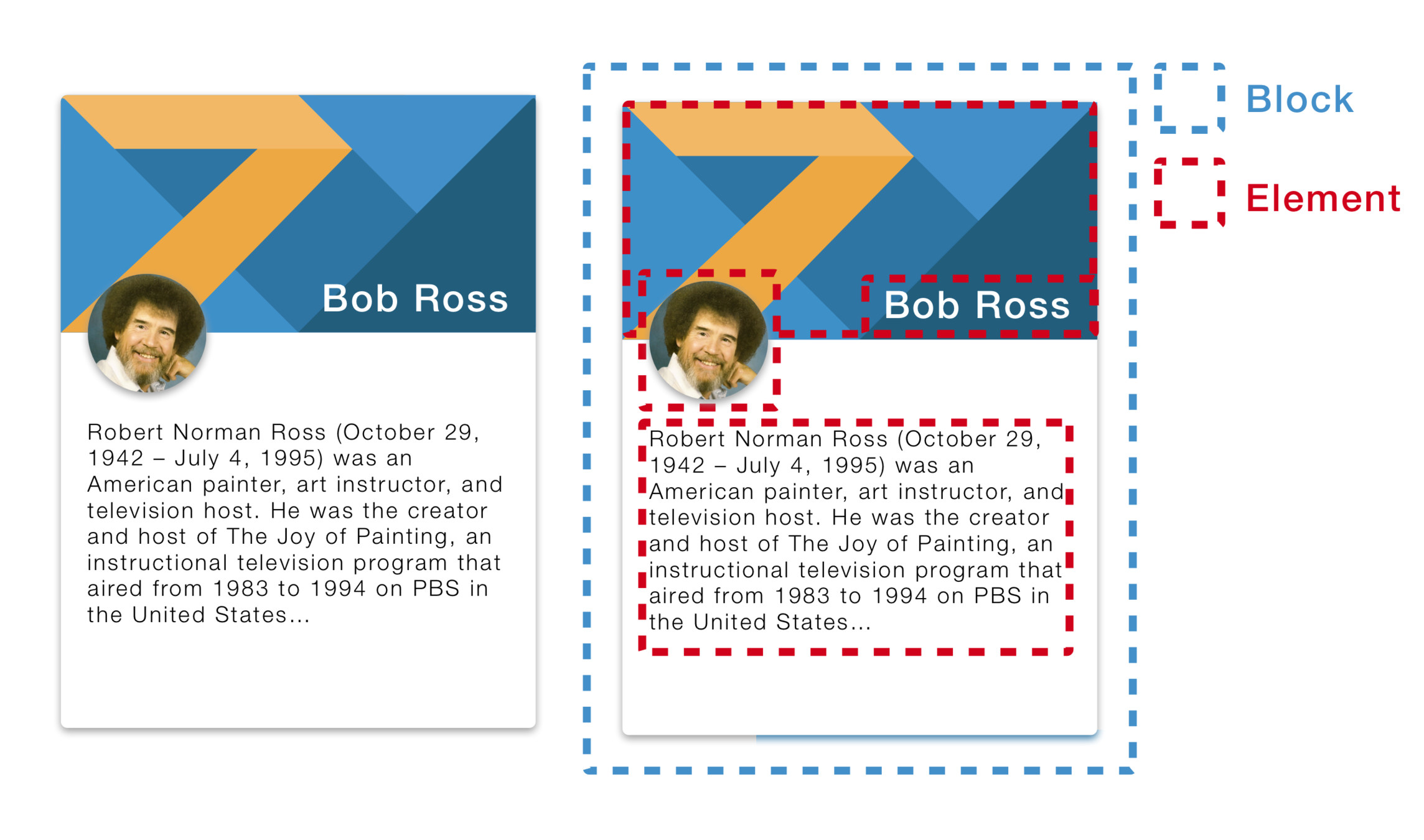
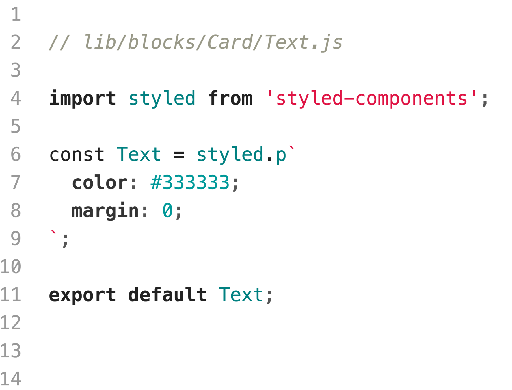
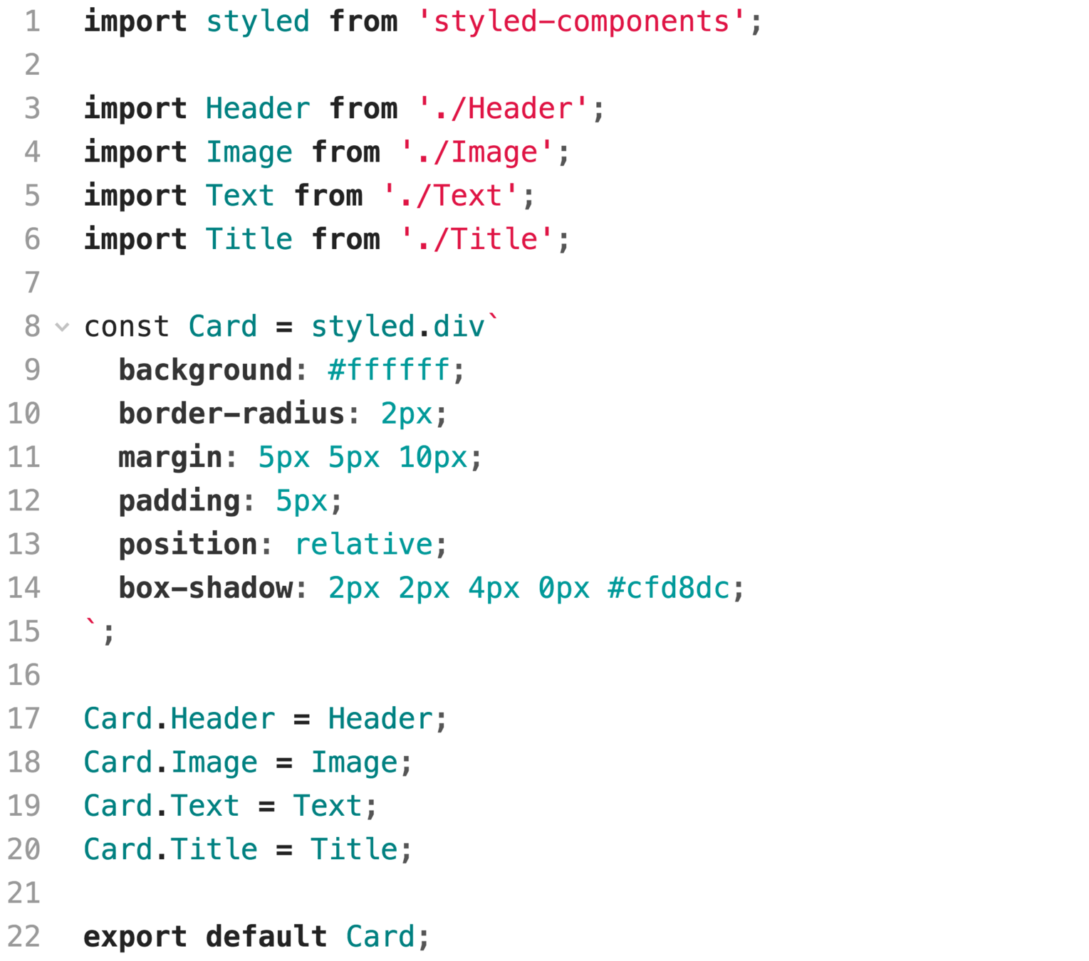
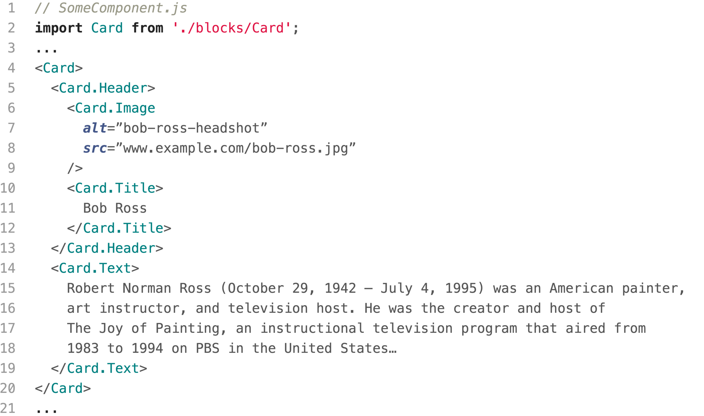
An Example
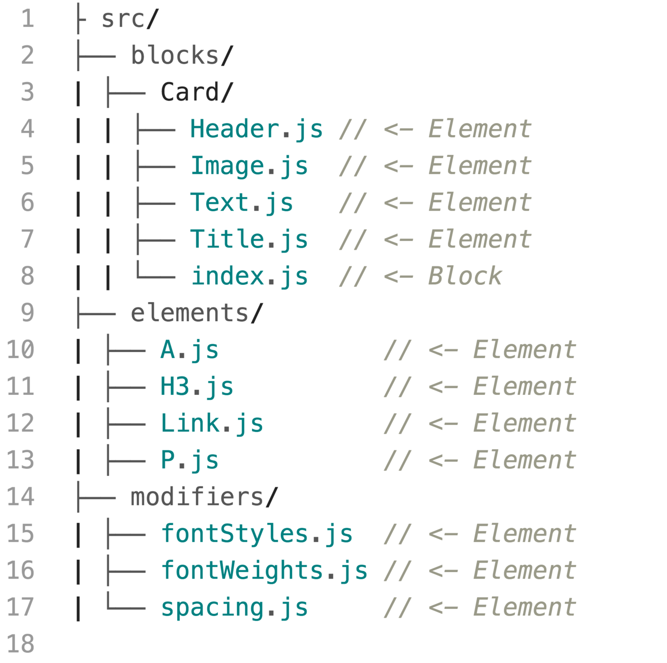
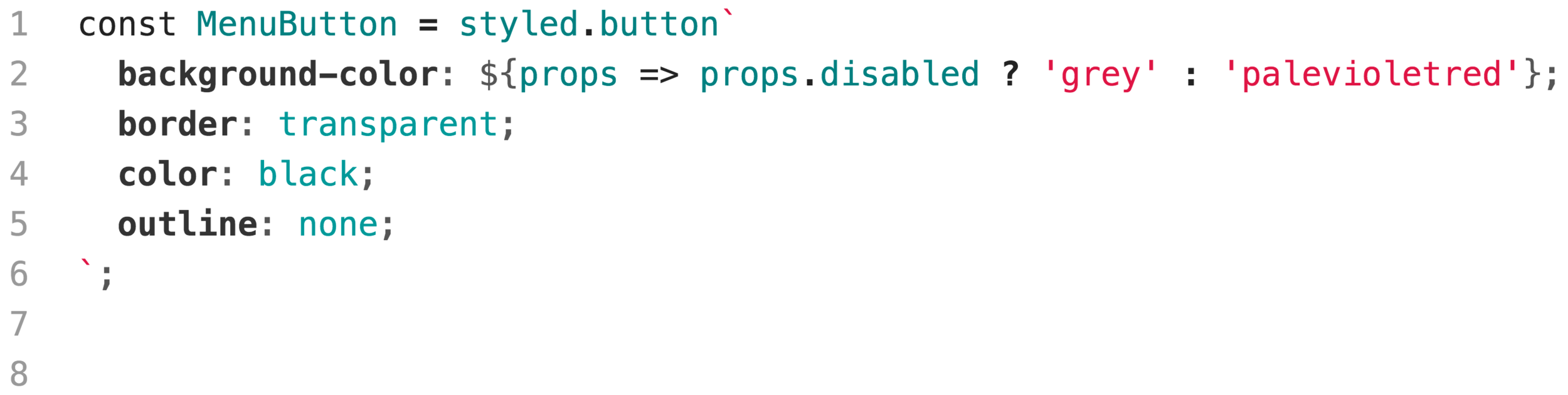
An Example Element
An Example Block
Example Usage
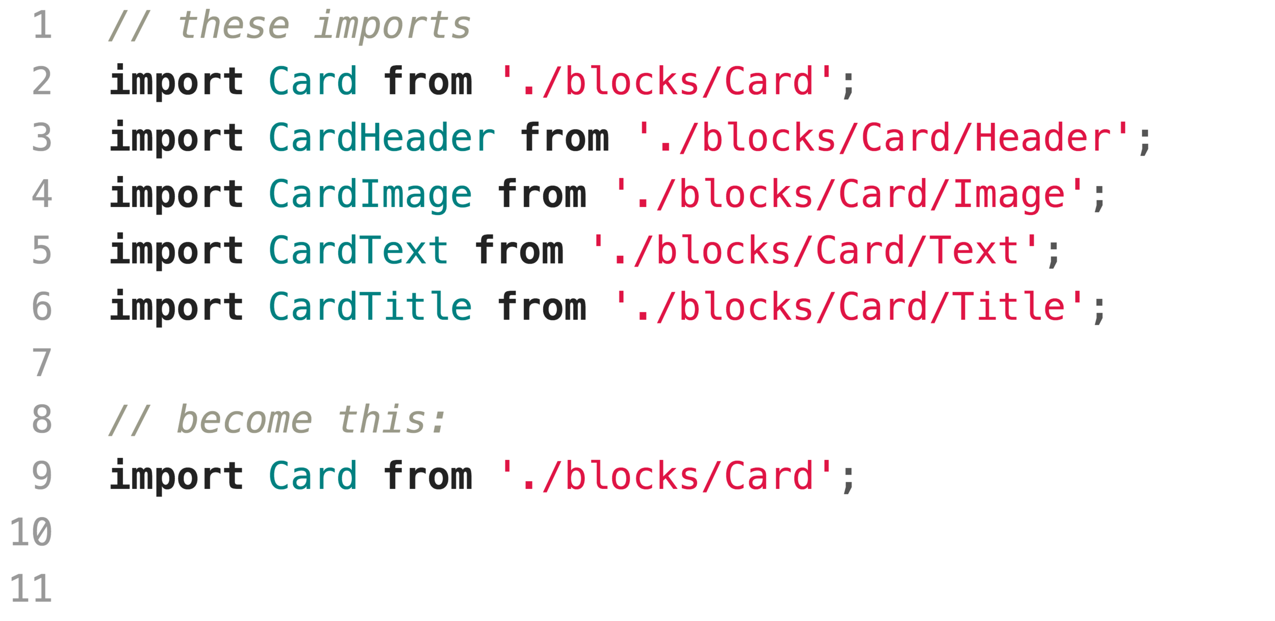
Bonus Win
Modifiers
Modifiers
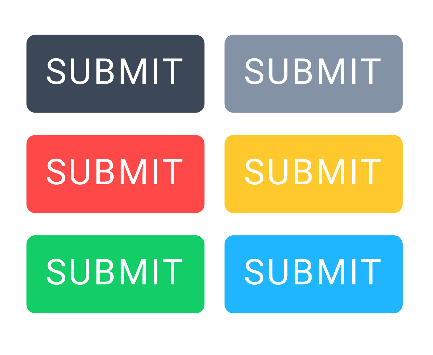
Modifiers
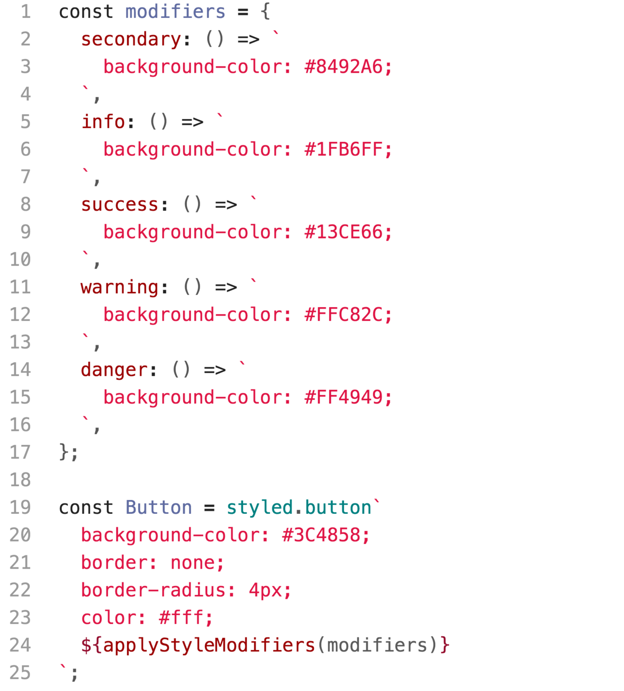
Using Modifiers
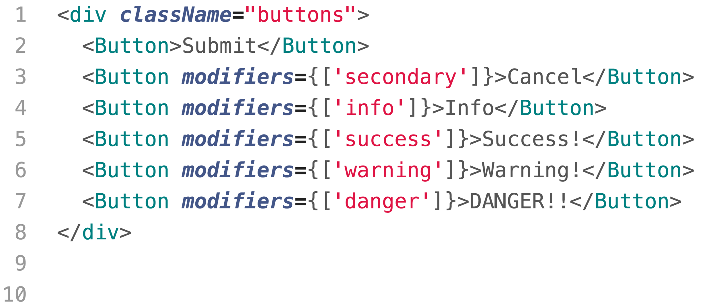
A Live Example

Thanks!

Alan B Smith
Structuring Our Styled-Components with BEM
By Alan Smith


