Music magazine analysis


FC's
DPS
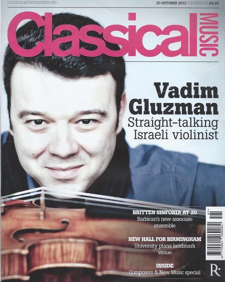
This is a classical music magazine and on the FC we have a picture of 'Vadim Gluzman' , the famous violinist. This would appeal to the older generation as they are typically more interested in this genre than younger generations..
We also will see a violin which may encourage some people to buy if they like this type of this music.
The way that this FC if laid out is very clear with a bold font that is easy to read. This could also be helpful to the older generation as it will be easier to read.
We can also see that the text is over the picture , which gives a clear indication of genre.
The artist 'Vadim Gluzman' also looks very talented, because he is very focused on his instrument
Boy/Girl
Although Vladimir Gluzman is a middle-aged male, he is likely to appeal to both sexes in the 40+ age bracket
I would like to be able to overlay pictures with text as here using Photoshop
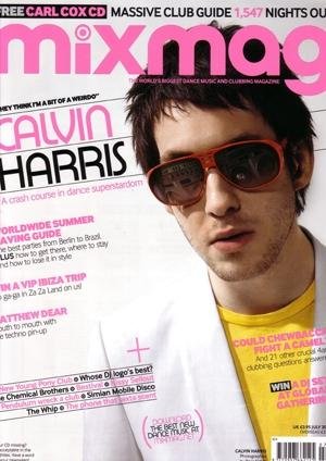
This Mixmag FC has a central image of Calvin Harris , which will automatically interest teenagers , but this will be mostly girls as they may like to find out what he has got up to and information like tours. This would be in the cover lines and the plugs. This will also determine the age range at around '13-20'
The text size is also bold but is also has some smaller text which may mean that there could be a younger audience as some older people may struggle to read it.
We can also see that they have buzz words , which will attract some people and encourage them to buy it
The way that Mix Mag has placed Calvin Harris on the FC makes him seem very relaxed and almost like a rock star as he is wearing a cool pair of shades
Boy/Girl
The sloping text is eye catching and is something I would like to use in my FC
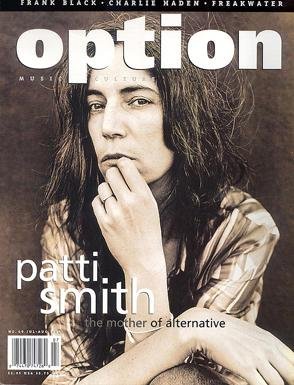
We can see from the start that this magazine is for someone in their 30's , who would like rock and roll/ pop and we can tell this from the by-line as it is Patti Smith, who is a famous singer.
This FC is very plain with no additional material, which is completely different to the other magazines that we have looked at, like the mixmag. It suggests that Option is a very serious music magazine.
The way that Patti Smith has been pictured on the FC makes him look as if he has just jumped out of bed and this is shown as he has really messy hair. He looks like a stereotypical rock-star with connotations of wild American indians
I like this idea of having a star on the FC in black and white as this will also stand out from any other magazines, so I may think of having this on my magazine.
Boy/Girl
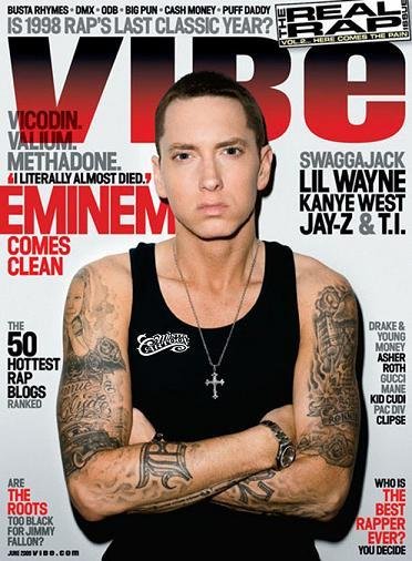
This magazine is a rap based magazine and we can see this from the names of the singers like Jay-Z and Kanye West. This magazine is aimed at a 15-25 year old audience of rap music fans.
The way that Eminem is standing makes a very strong and mean impression on the reader . As he also has his arms folded he also looks as if he this may also show that he does not care about anything. The vest, tatooes and crucifix chain add to the aggressive image, as does the fact that he is staring straight at the camera. His appearance has connotations of violence.
We can also see that the magazine is being very sarcastic as it reads "Who is the best rapper ever?". This a rhetorical question, which will draw in fans , who are interested in the answer to this question.
This FC is very macho, which means that the magazine is clearly targeting a young male audience. It would rarely appeal to the opposite sex.
Boy/Girl
I like the variety of plugs on this Fc and would like to do something similar myself because it makes the layout more interesting
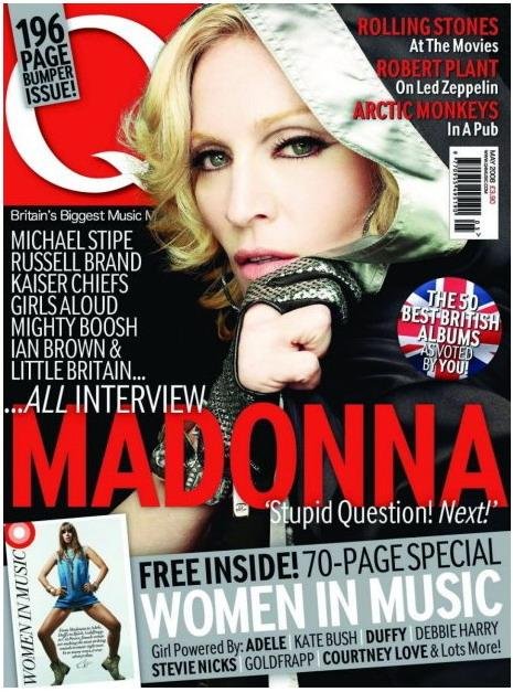
We can see Madonna in a bold font, but she is also the central image for this Q magazine cover. As Madonna is so very popular, she will attract a very wide readership aged from 15-60.
The flash at the foot of the FC catches the eye, because it advertises a FREE 70-PAGE supplement on women in music, which may also attract some customers, who do not regularly buy Q magazine.
The buzz words "...all interview Madonna" will draw potential buyers' attention, because it suggests that only Q magazine has the interview in full. The picture, showing Madonna as if she is going in to a boxing ring, suggests it will a hard-hitting interview.
Madonna is such a long-standing, global superstar that her appearance on the FC is likely to appeal equally to men and women - she is a sex symbol for the former and a feminist icon for the latter.
Boy/Girl

DPS
DPS
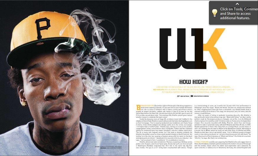
This make the artist look as if he has just got out of bed from the way that he is positioned. The way that he has got the smoke from his cigarette over his face gives the impression that he cant be bothered to blow it away , which gives him a lazy, laid back look, which would appeal to the rap readership.
On the right-hand page there is dense text with a big WK above it , which looks smart and draws the eye by combining the two characters in an original manner. I t dominates the page with oversize letters and is something I will consider trying in my construction.
From looking at the text and the photograph I think that the age range of this double page spread would be around 17-30 - someone smoking would not be aimed at a younger audience . It may even have connotations of drug-takling. The presentation style is also quite sophisticated.
Boy/Girl

Boy/Girl
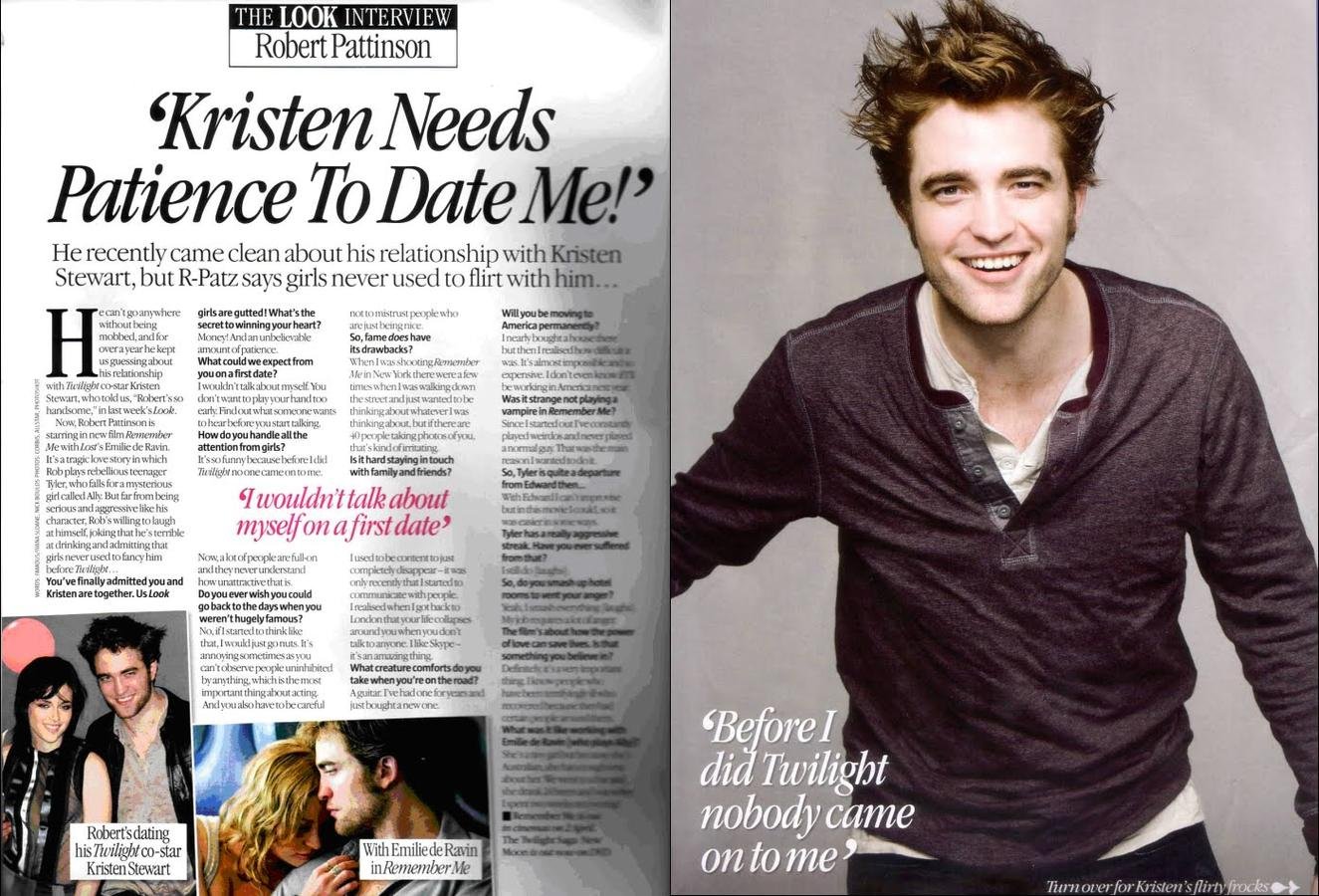
The main picture on the double page spread make this magazine stand out for a girl as it shows an attractive young man. In addition the pink text suggests a female audience. The headline refers to the star's love-life, which would also interest female readers.
I think that the age range for this magazine could start at a younger age , perhaps14 and appeal to readers up to the age of 50. I believe that the friendly image projected by this young man would appeal to a wide age range.
Text
It is a good idea to print the interview questions in bold, which is certainly I will consider for my DPS.
Boy/Girl
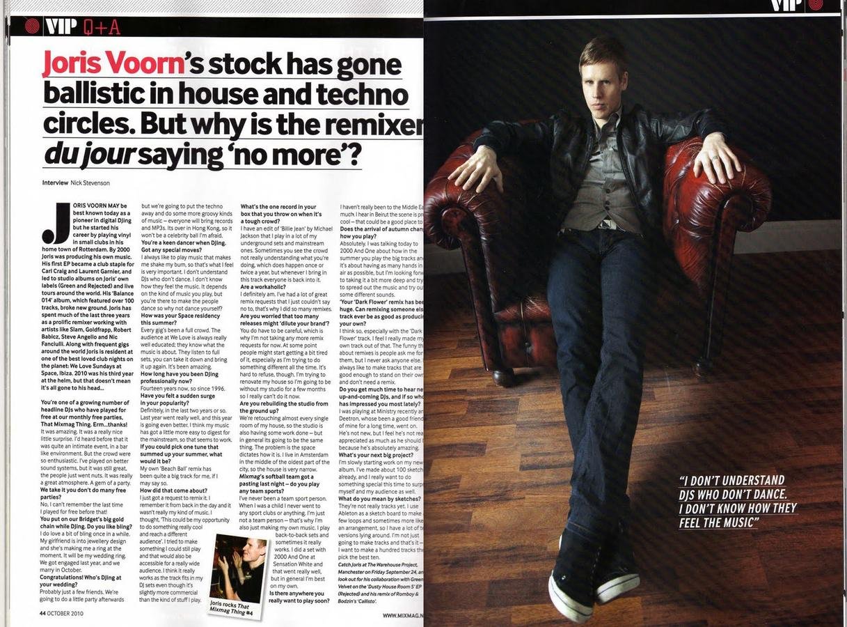
I think that the age range for this magazine would be older because of the image projected: expensive leather armchair, leather jacket, polished floortiles. From this I think that the age range could be around 18-40
I think also that the audience for this double page spread would be male , as it has a predominantly dark look, which would be less likely to appeal to female readers. Also the model's pose and appearance is not designed to attract the opposite sex.
The camera angle in the main image is interesting, because it gives the artist an air of power. I will look at using camera angles in my magazine pages.

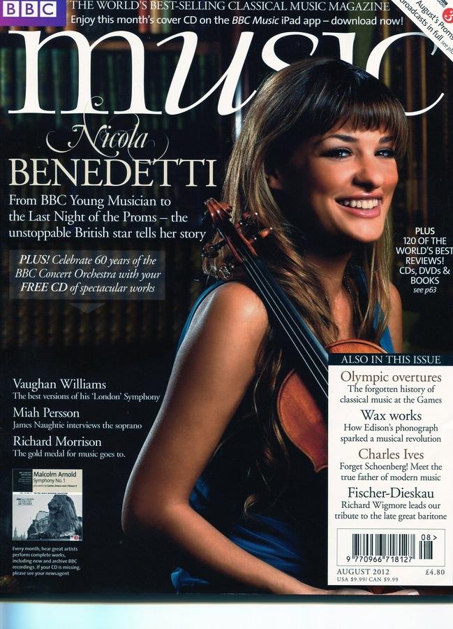
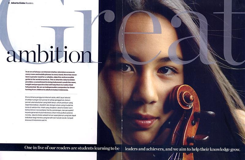
This is double page spared has an extreme close -up of the artist and also has an eye-catching header across the whole double-page. This will give a powerful effect on the reader, suggesting that it really is a "great" artist. The artist draws us in by looking straight at the camera and having her violin close to her face shows how much she loves her music.
This double page spread is designed to appeal to an older age range, maybe 30-70. This is because it is clearly a classical musician. Also the artist is relatively mature and quite traditional in appearance. There is nothing about her to particularly appeal to younger readers.
I think that classical music could appeal equally to both sexes. The fact that the artist is an attractive female, may make it slightly more male-targeted.
Boy/Girl
Text
Text
The header is the main affect
I would like to copy in my work

Boy/Girl
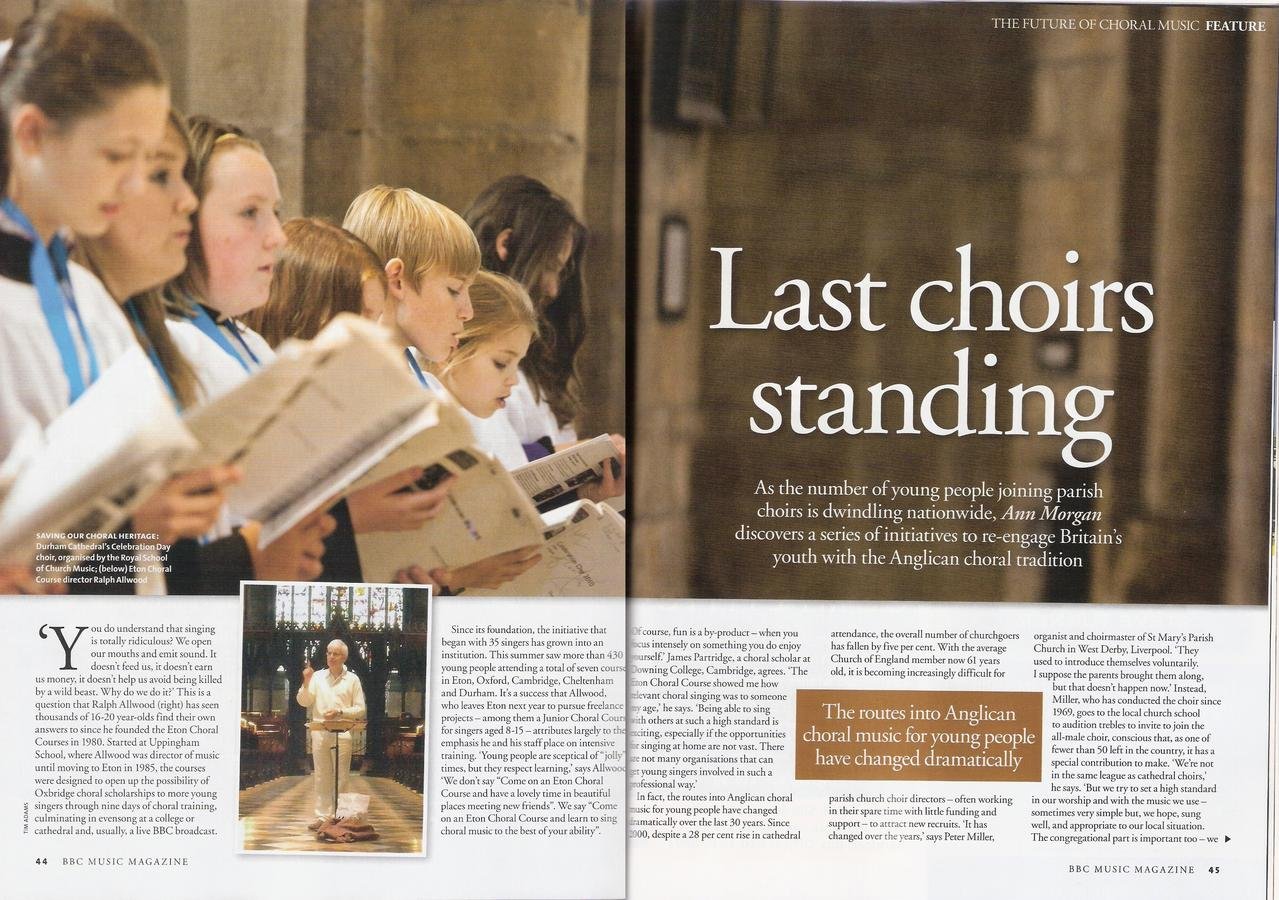
This magazine double page spared could be for an older age range, as the church setting for choir music is more likely to appeal to older readers.
I think that the gender of this magazine would be male and female as it could interest people of both sexes.
The lay-out of the pages in terms of text, photos and effects is very conservative, which is also appropriate to the target audience. It has little, which would be appropriate to my Indie-rock magazine.
Contents page
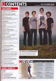
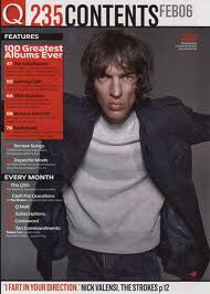
This contents will be for the age range of around 16-35 as this there is a picture of a middle-aged artist . His appearance is quite rough: dishevelled hair, jeans and a jacket without shirt and tie. His look suggests the rock genre and Mick Jagger in particular - this would inevitably appeal to older fans.
I think that the gender of this contents would be more of a male magazine as there is very little in the appearance of the artist that would appeal to a younger/female audience: his look is unfriendly, untidy and aggressively masculine - totally unlike popular boy bands like One Direction!
Boy/Girl
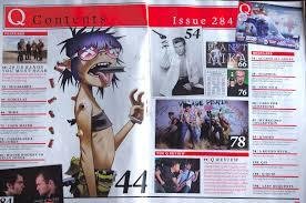
This contents page could appeal to a younger audience as it has cartoons images of the band Gorillaz . This could bring the age range down slightly. However, Q magazine is generally male-orientated, specialising in rock and indie rock, and this reflected in the images used.
Boy/Girl
I think that this contents page could be for boys and girls as it has a selection of different images, although it is still more targeted towards male readers.
Boy/Girl
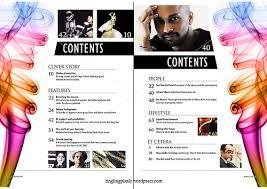
This contents page will be for girls as there is a girl on the page but also as the main colours on the page are white and pink this will also subject that it would be for a girl and not for boy's.
I think that the age range of this magazine could be younger as it has some one of the page that looks like they have come out of a fairy tail and this would gave the impression that It will be younger a audience. 15-30
Boy/Girl
I think that this may have a younger audience as it has some parts where you think that this would be a younger audience but I could also have a older audience as it has a lot of information/ gossip and some older people may want to read this.
This magazine contents page would be for boys and girls as it will have bits of information that will interest people from both sides and they would want to read it.
This contents page makes the could be from a rage of ages as it has bright colours and the information is set out so that it is easy to read and this will make it easier to navigate for all ages.
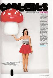
I think that this magazine contents page could be for girls but it could have a couple of boys that may want to read this as it has bright colours but also male artists on the contents page meaning that it could be for everyone.
Boy/Girl
media stud
By alexbridgewood