Thanks to our sponsors





CONTENTS
- A bit of web design history
- Flexbox
- CSS Grid
INTRO
(pre) History of web design
...and then there was light
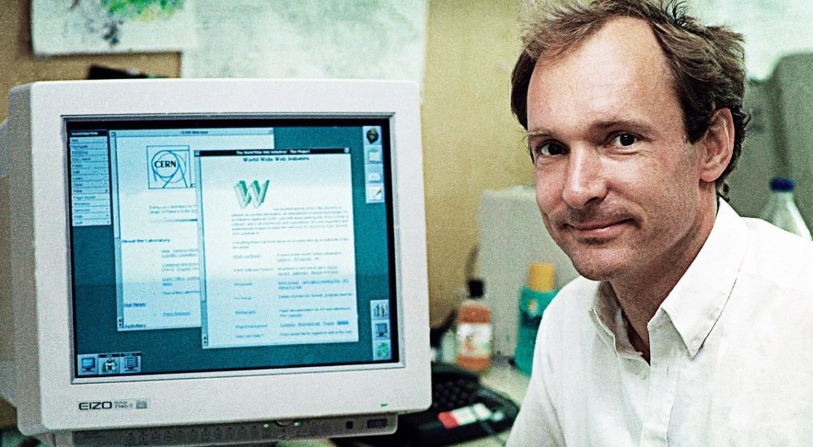

- The World Wide Web was invented by Tim Berners-Lee and developed at CERN in 1989-1990
- The first web browser was released to the public on August 1991
1991
- First Linux kernel released by Linus Torvald
- Intel 486 chip released
- Creative Labs releases first sound card
- Street Fighter 2 released
- Symantec releases Norton Anti Virus
- Terminator 2: Judgment Day released
- The Soviet Union dissolved - end of Cold War
- Start of Gulf War and Balkan War
- Nirvana releases Nevermind album
- Freddie Mercury died
The web close to day 10.000

The car at day 10.000

The TV at day 10.000
The phone at day 10.000
Andrei at day 10.000


The first web page
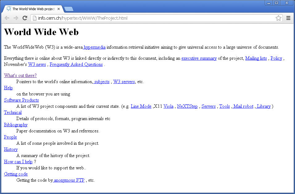
The need for styling

(BODY fontSize=normal
      BGColor=white
      FGColor=black
  (H1   fontSize=largest
        BGColor=red
        FGColor=white)
)
First styling language
<LINK REL="STYLE" HREF="URL_to_a_stylesheet">
Referencing external stylesheets
First comercial browsers


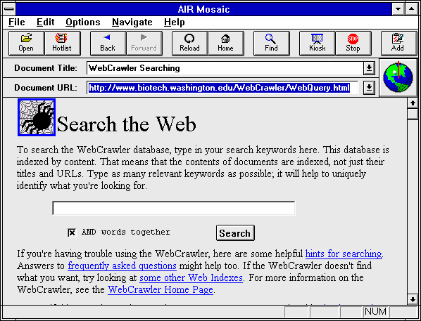
1993 - Mosaic browser - first commercial browser
1995 - Netscape and Internet Explorer

Browser quirks
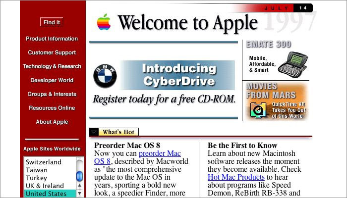
Early days
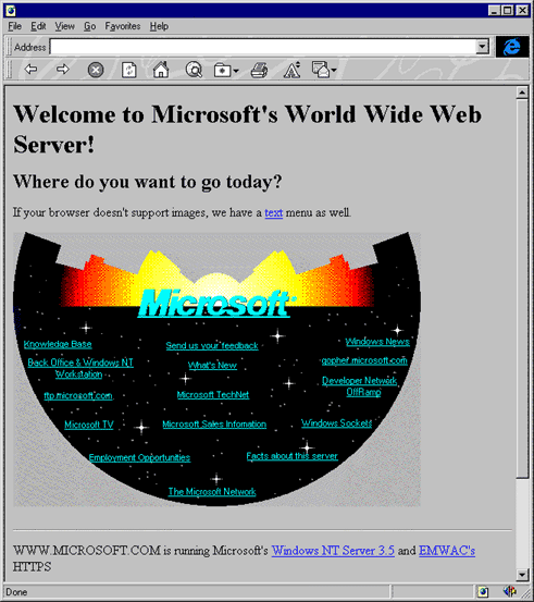
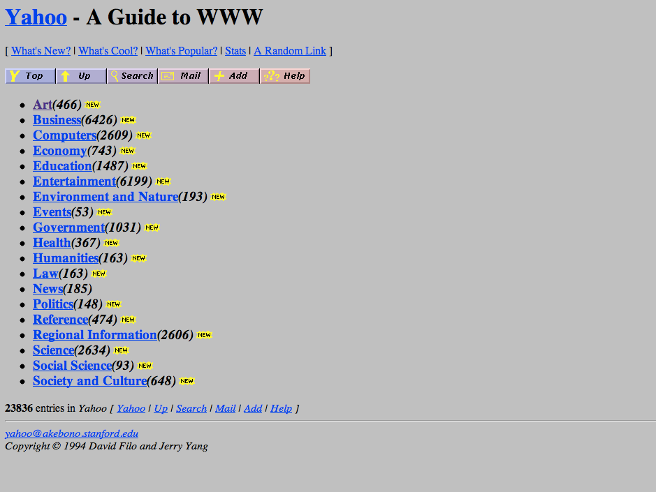
Second generation webistes
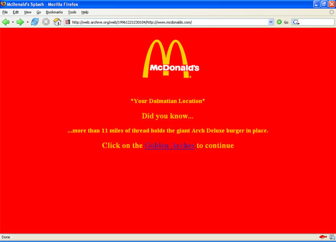
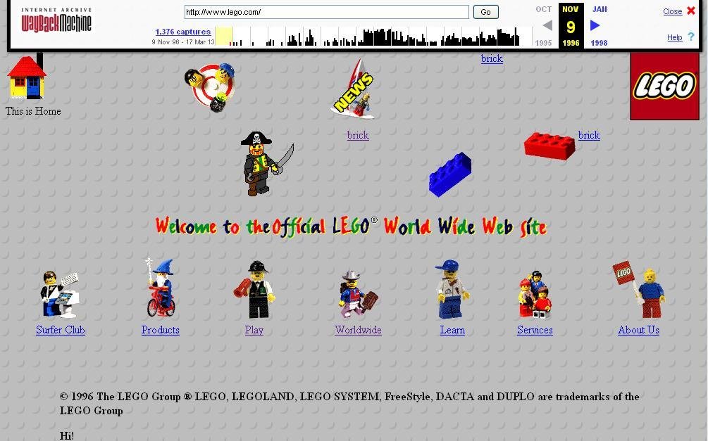
Table based layouts
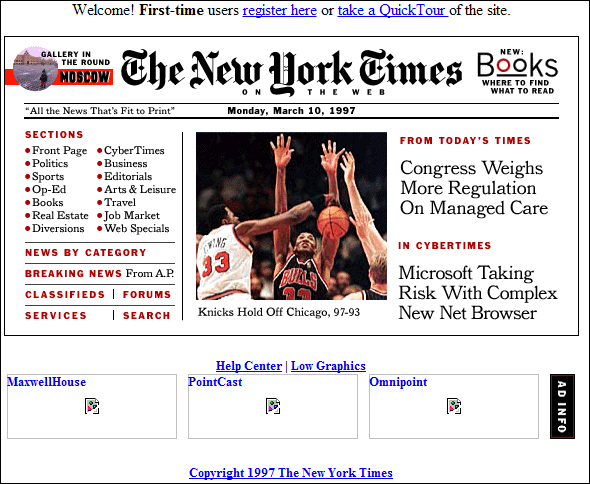
Spacer gif
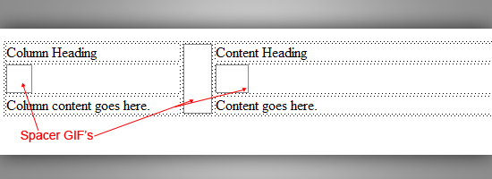
Table based layouts

Design revolution

Design revolution


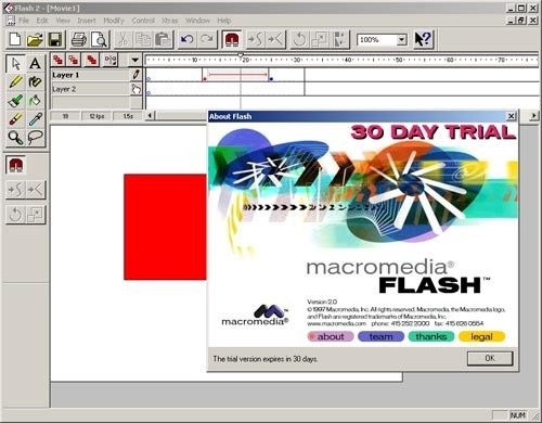
Macromedia Flash
CSS Timeline
- CSS (1996) allows the user to select font style and size and change the colour of the text and background.
- CSS2 (1998) has capabilities that allows the user to design page layout.
- CSS3 (1999) allows the user to create presentations from documents and to select from a wider range of fonts including those from Google and Typecast. Uniquely, CSS3 allows the user to incorporate rounded borders and use multiple columns. CSS3 is considered to be easier to use (when compared to CSS2) because it has different modules
Responsive Design
and
Media Queries
CSS Frameworks
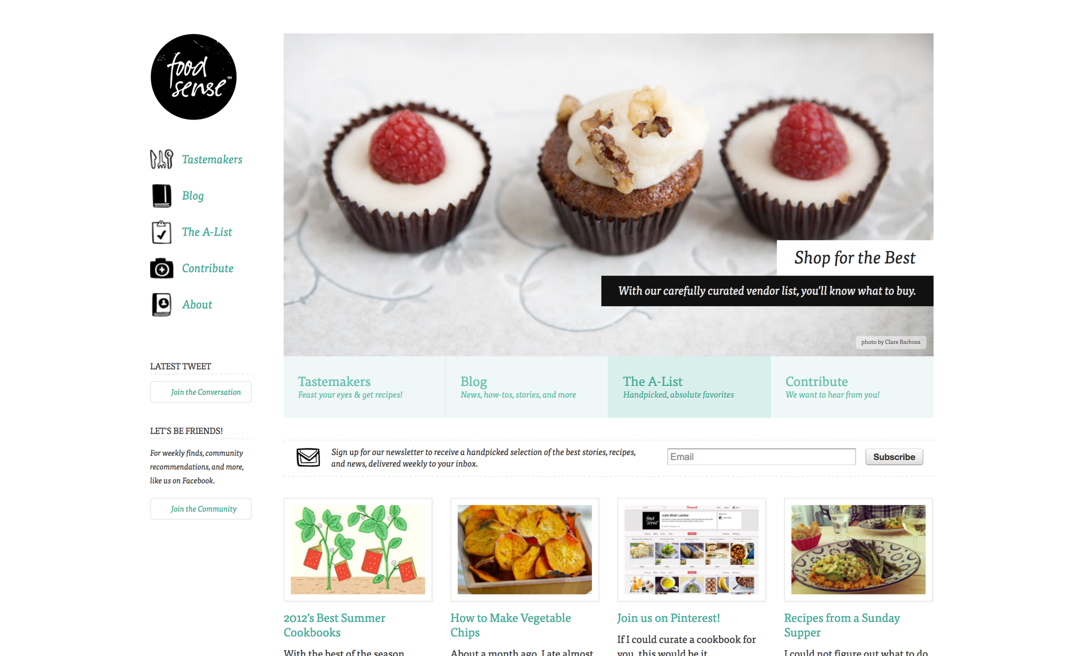
Design for multiple screens
Responsive web design
Responsive web design
- Definition
- Responsive web design means designing your website so that it responds to your users environment based on screen size, platform and orientation.
Responsive web design
- Definition
- It looks different and things jiggle around, scale, re-order, appear, and disappear so it works well in your browser size or whatever device you’re using to view it...
Responsive web design
Responsive web design
Responsive web design
Responsive web design
Responsive web design
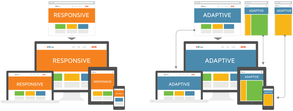
Adaptive vs Responsive
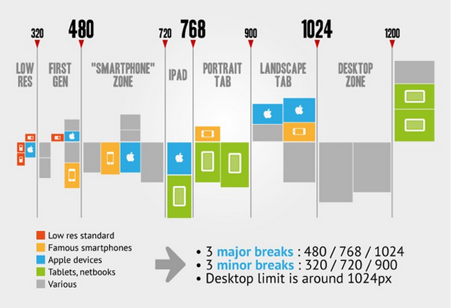
Breakpoints
Responsive web design
- New ways of thinking
- Works on everything - Design for many sizes at once
- Clean design - reduce clutter, essential content only
- Design from the content out - Let content decide breakpoints
- Less Graphic files - CSS gradients, font icons
Layout patterns
- Fluid Layout
Layout patterns
- Column Drop
Layout patterns
- Layout shifter
Navigation patterns
- Toggle Navigation
Navigation patterns
- Left Nav Flyout - aka Hamburger menu
Design patterns
- Source order shift
RWD components
-
Flexible, grid-based layouts
- % widths and em units, not fixed pixels
-
Flexible images and media
- width/height not fixed
-
CSS3 Media Queries
- @media rule
Flexible layouts
- Building the layout of a website with a flexible grid, capable of dynamically resizing to any width
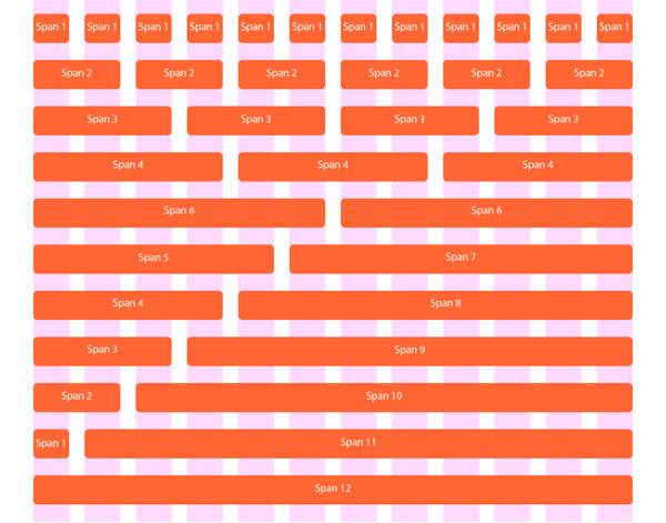
Grid systems
Media queries
- Media queries provide the ability to specify different styles for individual browser and device circumstances -
- apply uniquely targeted styles
// HTML

<!-- Separate CSS File -->
<link href="styles.css" rel="stylesheet" media="all and (max-width: 1024px)">
// CSS

/* @media Rule */
@media all and (max-width: 1024px) {...}

/* @import Rule */
@import url(styles.css) all and (max-width: 1024px) {...}
Media queries
@media screen and ( min-width: 500px ) and ( max-width: 800px ) {

 /* CSS declarations */

}
- The width of the window must be AT LEAST 500px
- The width of the window must ALSO be NO MORE THAN 800px
media_feature: width | min-width | max-width | height | min-height | max-height | aspect-ratio | min-aspect-ratio | max-aspect-ratio | color | min-color | max-color | color-index | min-color-index | max-color-index | monochrome | min-monochrome | max-monochrome | resolution | min-resolution | max-resolution | scan | grid
media_type: all | aural | braille | handheld | print | projection | screen | tty | tv | embossed | speech
Media queries
@media screen and ( min-width: 500px ) and ( max-width: 800px ) {

    img {
        border: 5px solid #!f;
    }

}
- Images will have a white border when the window is from 500px to 800px wide
Responsive images
<img
 srcset="
  /wp-content/uploads/picture4x.jpg 4025w,
  /wp-content/uploads/picture3x.jpg 3019w,
  /wp-content/uploads/picture2x.jpg 2013w,
  /wp-content/uploads/picture1x.jpg 1006w
 "
 src="/wp-content/uploads/flamingo-fallback.jpg"
>
- Serve Different Images to Different Visitors based on their screen size
Viewport <meta> tag
<meta name="viewport" content="width=device-width, initial-scale=1">
Layout basics
Basis of layout
- The "display" property
- Block
- Inline
- None
inline | block | flex | inline-block | inline-flex | inline-table | list-item | run-in | table | table-caption | table-column-group | table-header-group | table-footer-group | table-row-group | table-cell | table-column | table-row | none | initial | inherit
Basis of layout
#main {
  max-width: 600px;
  margin: 0 auto;
}
- Centering elements and max-width
Basis of layout
- Box model
Basis of layout
div {
  width: 300px;
  height: 200px;
  padding: 15px;
  border: 5px solid gray;
  margin: 30px;
  box-sizing: content-box;
}
- Box model
div {
  width: 300px;
  height: 200px;
  padding: 15px;
  border: 5px solid gray;
  margin: 30px;
  box-sizing: border-box;
}
Basis of layout
- Positioning
- static
- relative
- fixed
- absolute
Floats
img {
  float: right;
  margin: 0 0 1em 1em;
}
Clearfix
.clearfix:after {
  content: "";
  display: table;
  clear: both;
}
Floating layout
nav {
  float: left;
  width: 200px;
}
section {
  margin-left: 200px;
}
nav {
  float: left;
  width: 25%;
}
section {
  margin-left: 25%;
}
Inline-block layout
nav {
  display: inline-block;
  vertical-align: top;
  width: 25%;
}
.column {
  display: inline-block;
  vertical-align: top;
  width: 75%;
}
Layout issues
- Grids
Layout issues
- Vertical centering
- nasty
padding
line-height
transform
.element {
  position: relative;
  top: 50%;
  transform: translateY(-50%);
}
.middle {
    display: table-cell;
    vertical-align: middle;
}
Flexbox
CONTENTS
By Andrei Antal
CONTENTS
- 1,464


