Week 3, Day 1
Performance
Why Performance Matters
Sites have more features than ever before.
So much so, that many sites now struggle to achieve a high level of performance across a variety of network conditions and devices.
Performance is about retaining users
- Pinterest increased search engine traffic and sign-ups by 15% when they reduced perceived wait times by 40%.
- COOK increased conversions by 7%, decreased bounce rates by 7%, and increased pages per session by 10% when they reduced average page load time by 850 milliseconds.
Performance is about the user experience

Performance is about people
Poorly performing sites and applications can also pose real costs for the people who use them.
As mobile users continue to make up a larger portion of internet users worldwide, it's important to bear in mind that many of these users access the web through mobile LTE, 4G, 3G and even 2G networks.
Mind what resources you send
What can you do?
- An effective method of building high performance applications is to audit what resources you send to users.
- While the Network panel in Chrome DevTools does a fantastic job of summarizing all the resources used on a given page, it can be daunting to know where to start if you haven't considered performance until now.
- Here are a few suggestions:
- If you use Bootstrap or Foundation to build your UI, ask yourself if they're necessary.
- Such abstractions add heaps of CSS the browser must download, parse, and apply to a page, all before your site-specific CSS enters the picture.
- Flexbox and Grid are superb at creating both simple and complex layouts with relatively little code.
- Because CSS is a render blocking resource, the overhead of a CSS framework can delay rendering significantly.
- You can speed up your rendering by removing unnecessary overhead whenever possible.
- JavaScript libraries are convenient, but not always necessary.
- Take jQuery for example: Element selection has been greatly simplified thanks to methods like querySelector and querySelectorAll.
- Event binding is easy with addEventListener.
- classList, setAttribute, and getAttribute offer easy ways of working with classes and element attributes.
- If you must use a library, research for leaner alternatives.
- For example, Zepto is a smaller jQuery alternative, and Preact is a much smaller alternative to React.
- Not all websites need to be single page applications (SPAs), as they often make extensive use of JavaScript.
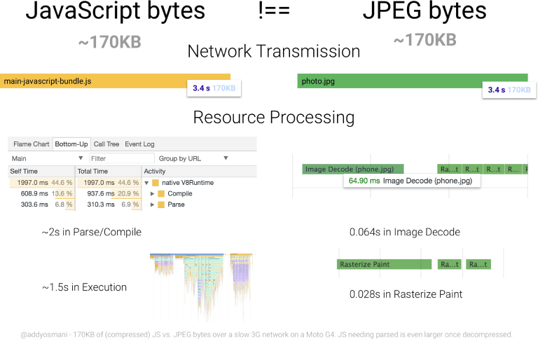
- JavaScript is the most expensive resource we serve on the web byte for byte, as it must not only be downloaded, but parsed, compiled and executed as well.
- For example, news and blog sites with optimized front end architecture can perform well as traditional multipage experiences.
- Particularly if HTTP caching is configured properly, and optionally, if a service worker is used.
Mind how you send resources
Migrate to HTTP/2. HTTP/2 addresses many performance problems inherent in HTTP/1.1, such as concurrent request limits and the lack of header compression.
- Download resources earlier using resource hints. rel=preload is one such resource hint that allows early fetches of critical resources before the browser would otherwise discover them.
- This can have a pronounced positive effect on page rendering and lowering Time to Interactive when used judiciously. rel=preconnect is another resource hint that can mask the latency of opening new connections for resources hosted on third party domains.
- Modern sites ship a lot of JavaScript and CSS on average. It was common to bundle styles and scripts into large bundles in HTTP/1 environments.
- This was done because a large amount of requests was detrimental to performance.
- This is no longer the case now that HTTP/2 is on the scene, as multiple, simultaneous requests are cheaper.
- Consider using code splitting in webpack to limit the amount of scripts downloaded to only what is needed by the current page or view.
- Separate your CSS into smaller template or component-specific files, and only include those resources where they're likely to be used.
Mind how much data you send
- Minify text assets.
- Minification is the removal of unnecessary whitespace, comments and other content in text-based resources.
- It significantly reduces the amount of data you send to users without impacting functionality.
- Use uglification in JavaScript to get more savings through shortening variable and method names. Since SVG is a text-based image format, it can be optimized with SVGO.
- Configure your server to compress resources. Compression drastically reduces the amount of data you send to users, especially text assets.
- GZIP is a popular option, but Brotli compression can go further.
- Understand, however, that compression is not a catch-all for performance woes: Some file formats which are implicitly compressed (e.g., JPEG, PNG, GIF, WOFF, et cetera) don't respond to compression because they're already compressed.
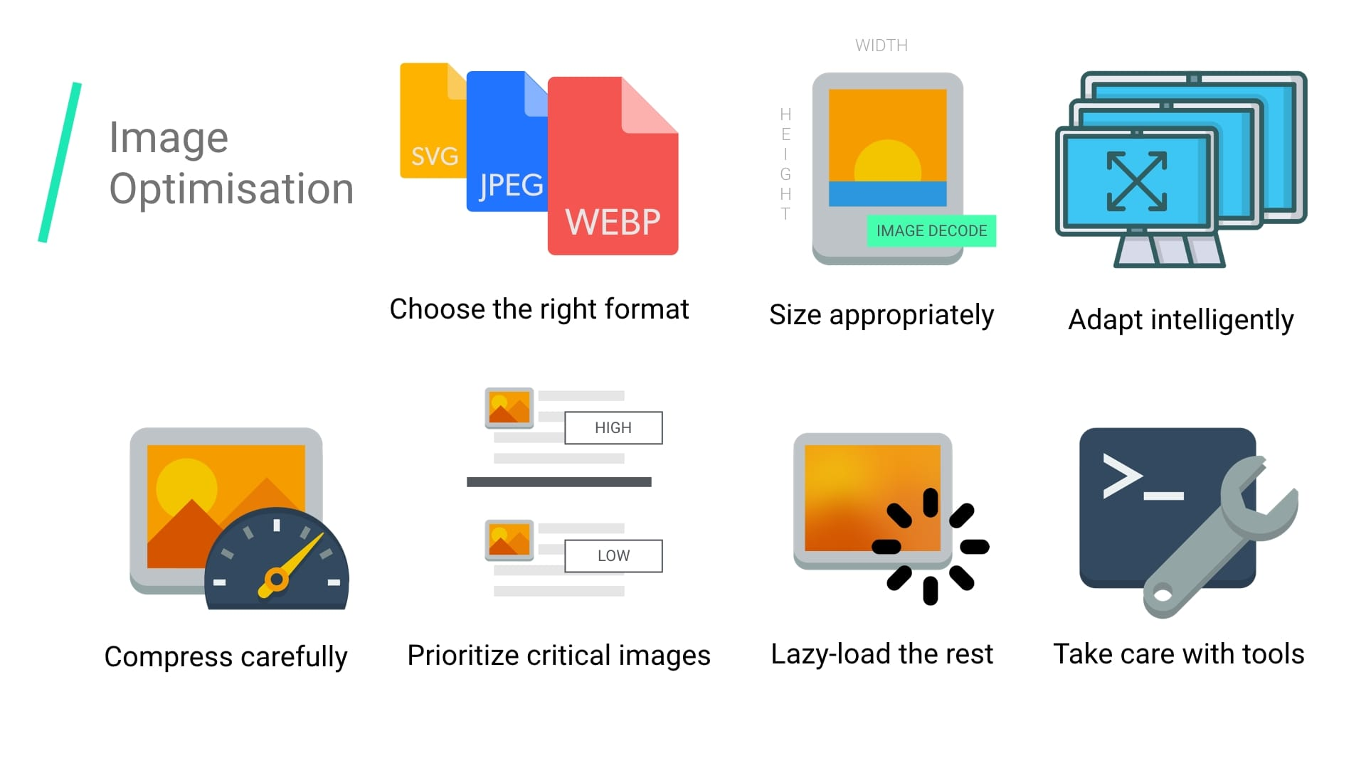
- Optimize images to ensure your site sends as little image data as possible.
- Since images make up a large portion of the average per-page payload on the web, image optimization represents a uniquely large opportunity to boost performance.
<img
 srcset="
  /wp-content/uploads/flamingo4x.jpg 4x,
  /wp-content/uploads/flamingo3x.jpg 3x,
  /wp-content/uploads/flamingo2x.jpg 2x,
  /wp-content/uploads/flamingo1x.jpg 1x
 "
 src="/wp-content/uploads/flamingo-fallback.jpg"
>- If you have time, consider serving alternative image formats.
- WebP enjoys reasonably broad browser support, and uses less data than JPEG and PNG while keeping visual quality high.
- JPEG XR is another alternative format supported in IE and Edge offering similar savings.
- Deliver images responsively.
- The huge diversity of devices and their screens presents a tremendous opportunity to improve performance by sending images that are the best fit for the screens that view them.
- In the simplest use cases, you can add an srcset attribute to an <img> element to specify an array of images the browser can choose from.
- On the more complex side of things, you can use <picture> to help the browser choose the most optimal format (e.g., WebP over JPEG or PNG), or serve altogether different treatments of images for different screen sizes.
- Use video instead of animated GIFs. Animated GIFs are massive.
- Videos of similar quality are far smaller, often by 80% or so.
- If your site makes heavy use of animated GIFs, this is probably the most impactful thing you can do to improve loading performance.
- The NetworkInformation API exposes information about the user's network connection.
- This information can be used to modify application experiences for users on slower networks.
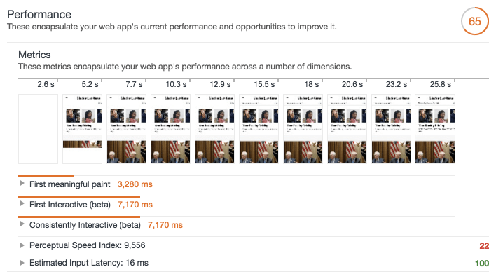
Example
Frames
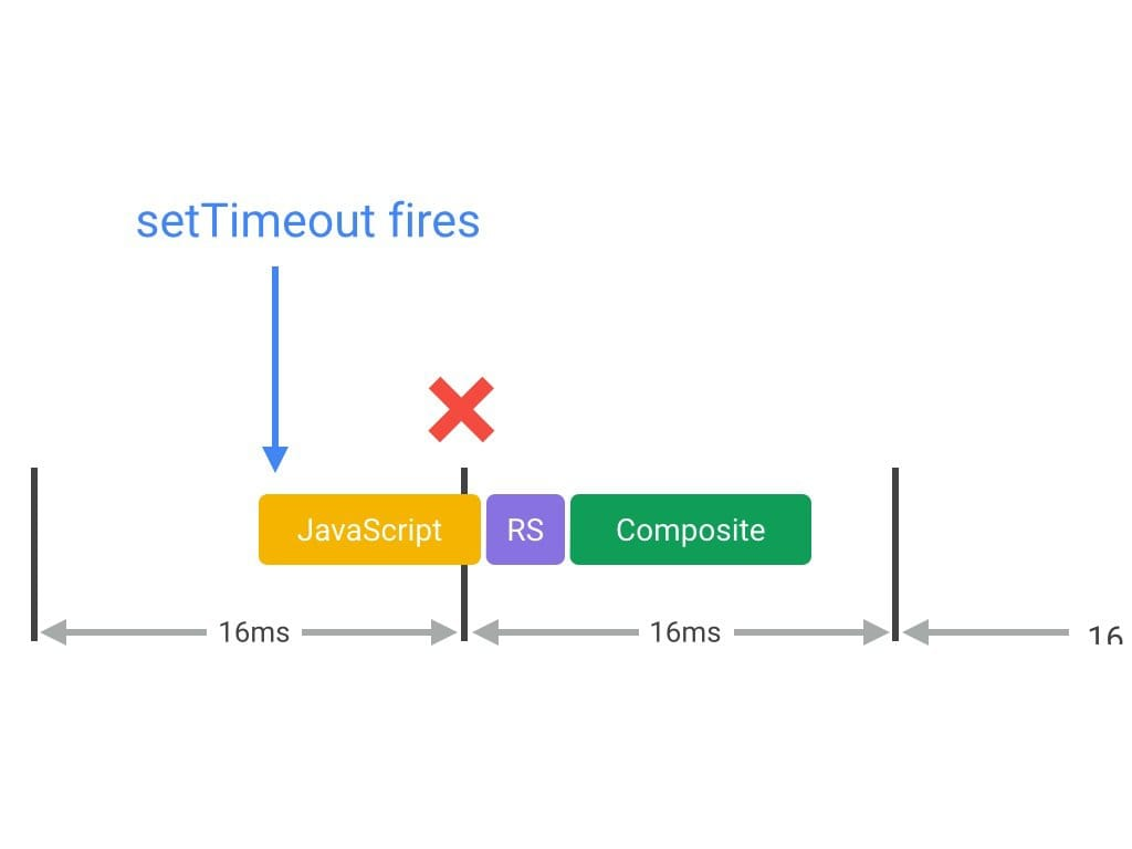
For websites to show silky smooth animation, the browser has to render at least 60 frames per second.
To render 60 fps, we have only 16.67 ms of time to process a frame. This involves parsing and executing javascript, rendering, compositing layers, and painting.
But the browser also has some house-keeping stuff to do (like monitor for network responses and coordinate with the OS). So realistically, we only have ~10 ms
Website Performance Optimization
Critical Rendering Path
Optimizing the critical rendering path refers to prioritizing the display of content that relates to the current user action.
The intermediate steps between receiving the HTML, CSS, and JavaScript bytes and the required processing to turn them into rendered pixels - that's the critical rendering path.
- Delivering a fast web experience requires a lot of work by the browser.
- Most of this work is hidden from us as web developers: we write the markup, and a nice looking page comes out on the screen.
- But how exactly does the browser go from consuming our HTML, CSS, and JavaScript to rendered pixels on the screen?
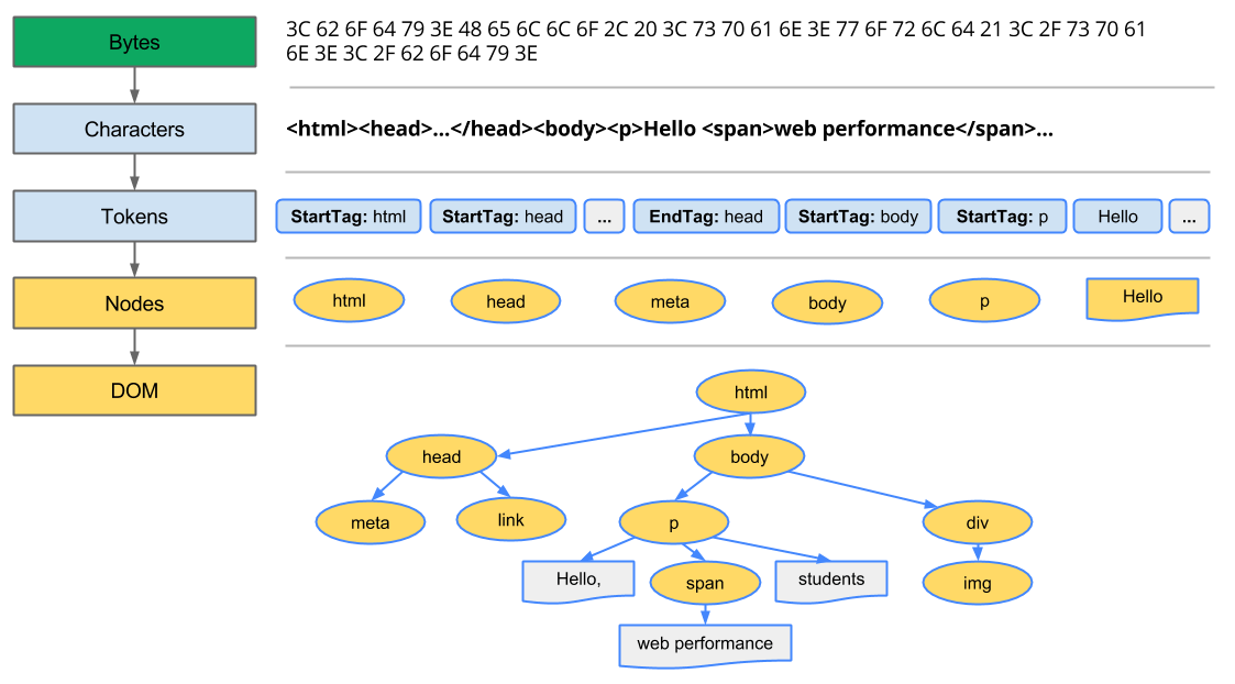
Constructing the Object Model
-
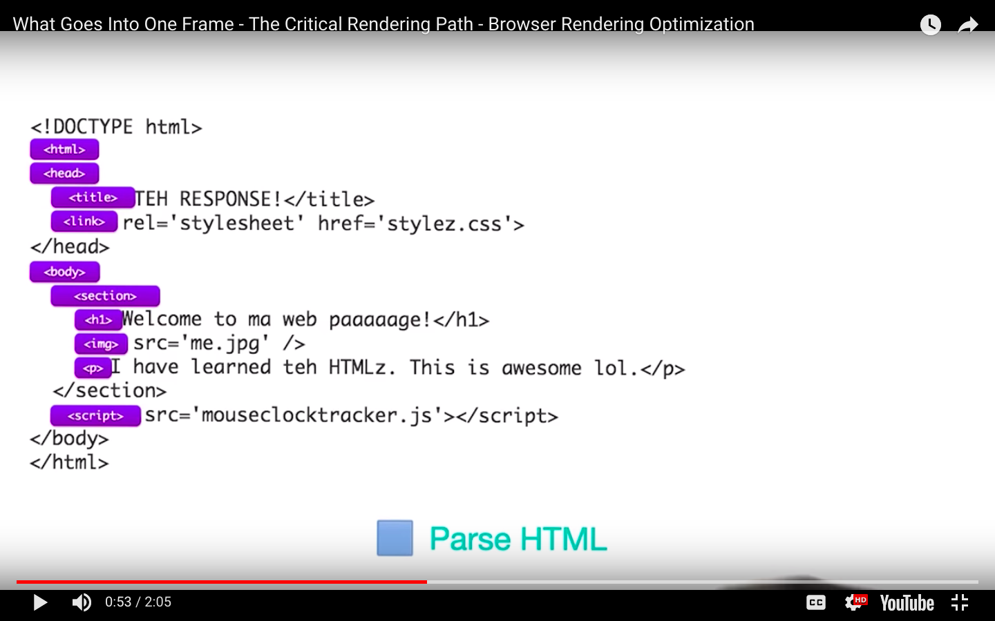
Conversion: The browser reads the raw bytes of HTML
off the disk or network, and translates them to individual characters based onspecified encoding of the file (for example, UTF-8). - Tokenizing: The browser converts strings of characters into distinct tokens—as specified by the W3C HTML5 standard; for example, "<html>", "<body>"—and other strings within angle brackets. Each token has a special meaning and its own set of rules.
- Lexing: The emitted tokens are converted into "objects," which define their properties and rules.
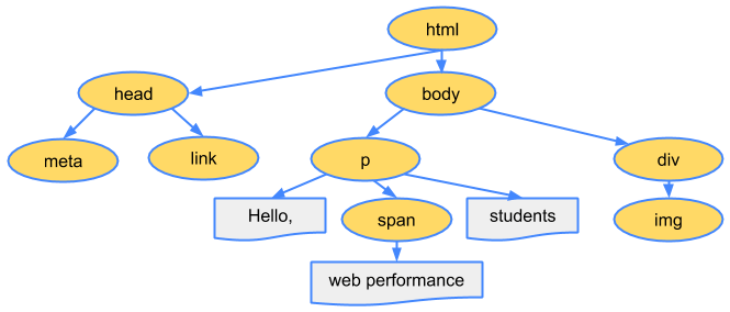
- DOM construction: Finally, because the HTML markup defines relationships between different tags (some tags are contained within other tags) the created objects are linked in a tree data structure that also captures the parent-child relationships defined in the original markup: the HTML object is a parent of the body object, the body is a parent of the paragraph object, and so on.
In Chrome DevTools, this phase is called "Parse HTML" phase.
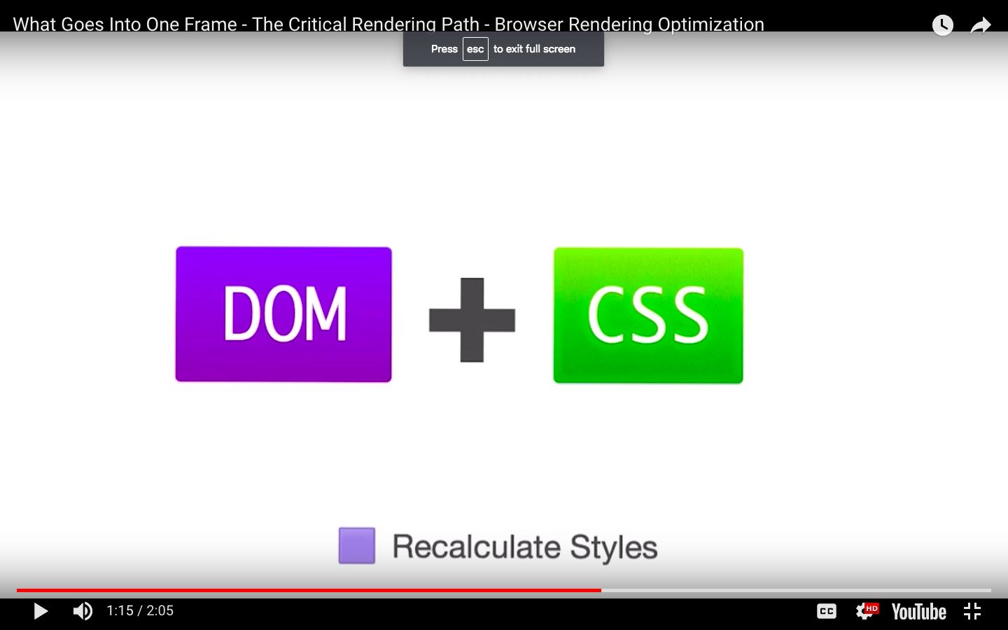
The DOM tree captures the properties and relationships of the document markup, but it doesn't tell us how the element will look when rendered. That’s the responsibility of the CSSOM.
CSS Object Model (CSSOM)
- As with HTML, we need to convert the received CSS rules into something that the browser can understand and work with.
- Hence, we repeat the HTML process, but for CSS instead of HTML:

body { font-size: 16px }
p { font-weight: bold }
span { color: red }
p span { display: none }
img { float: right }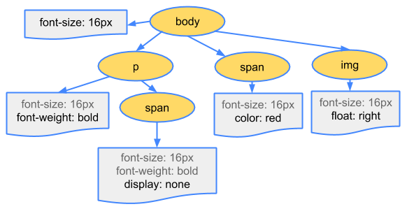
Why does the CSSOM have a tree structure?
When computing the final set of styles for any object on the page, the browser starts with the most general rule applicable to that node (for example, if it is a child of a body element, then all body styles apply) and then recursively refines the computed styles by applying more specific rules; that is, the rules "cascade down."
- To find out how long the CSS processing takes you can record a timeline in DevTools and look for "Recalculate Style" event:
- unlike DOM parsing, the timeline doesn’t show a separate "Parse CSS" entry, and instead captures parsing and CSSOM tree construction, plus the recursive calculation of computed styles under this one event.
Render-tree Construction
The CSSOM and DOM trees are combined into a render tree, which is then used to compute the layout of each visible element and serves as an input to the paint process that renders the pixels to screen.
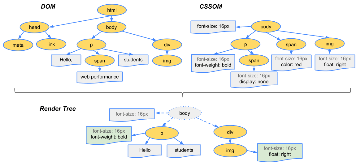
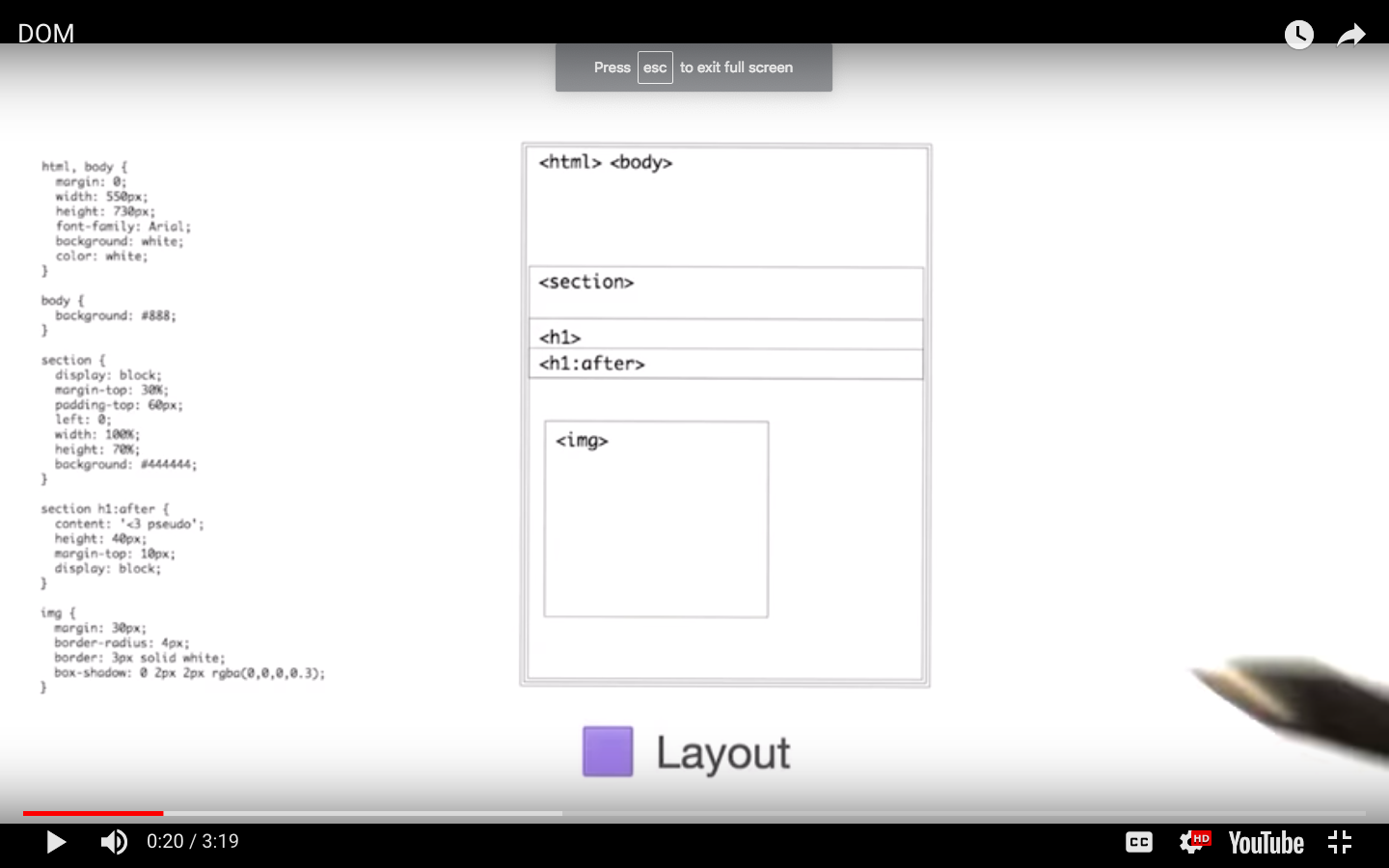
- To construct the render tree, the browser roughly does the following:
- Starting at the root of the DOM tree, traverse each visible node.
- Some nodes are not visible (for example, script tags, meta tags, and so on), and are omitted since they are not reflected in the rendered output.
- Some nodes are hidden via CSS and are also omitted from the render tree; for example, the span node---in the example above---is missing from the render tree because we have an explicit rule that sets the "display: none" property on it.
- For each visible node, find the appropriate matching CSSOM rules and apply them.
- Emit visible nodes with content and their computed styles.
- Starting at the root of the DOM tree, traverse each visible node.
Layout
<!DOCTYPE html>
<html>
  <head>
    <meta name="viewport" content="width=device-width,initial-scale=1">
    <title>Critial Path: Hello world!</title>
  </head>
  <body>
    <div style="width: 50%">
      <div style="width: 50%">Hello world!</div>
    </div>
  </body>
</html>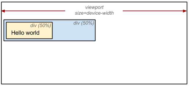
The output of the layout process is a "box model," which precisely captures the exact position and size of each element within the viewport: all of the relative measurements are converted to absolute pixels on the screen.
Now that we know which nodes are visible, and their computed styles and geometry, we can pass this information to the final stage, which converts each node in the render tree to actual pixels on the screen. This step is often referred to as "painting" or "rasterizing."
The "Layout" event captures the render tree construction, position, and size calculation in the Timeline.
When layout is complete, the browser issues "Paint Setup" and "Paint" events, which convert the render tree to pixels on the screen.
Here's a quick recap of the browser's steps:
- Process HTML markup and build the DOM tree.
- Process CSS markup and build the CSSOM tree.
- Combine the DOM and CSSOM into a render tree.
- Run layout on the render tree to compute geometry of each node.
- Paint the individual nodes to the screen.
Optimizing the critical rendering path is the process of minimizing the total amount of time spent performing steps 1 through 5 in the above sequence.
Render Blocking CSS
- In the render tree construction we saw that the critical rendering path requires both the DOM and the CSSOM to construct the render tree.
- This creates an important performance implication: both HTML and CSS are render blocking resources.


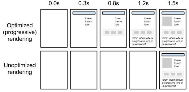
The above example, showing the NYTimes website with and without CSS, demonstrates why rendering is blocked until CSS is available---without CSS the page is relatively unusable. The experience on the right is often referred to as a "Flash of Unstyled Content" (FOUC).
CSS is a render blocking resource. Get it to the client as soon and as quickly as possible to optimize the time to first render.
<link href="style.css" rel="stylesheet">
<link href="print.css" rel="stylesheet" media="print">
<link href="other.css" rel="stylesheet" media="(min-width: 40em)">
<link href="portrait.css" rel="stylesheet" media="orientation:portrait">
However, what if we have some CSS styles that are only used under certain conditions, for example, when the page is being printed or being projected onto a large monitor?
JavaScript
JavaScript can also block DOM construction and delay when the page is rendered.
When the HTML parser encounters a script tag, it pauses its process of constructing the DOM and yields control to the JavaScript engine; after the JavaScript engine finishes running, the browser then picks up where it left off and resumes DOM construction.
Another subtle property of introducing scripts into our page is that they can read and modify not just the DOM, but also the CSSOM properties. The end result? We now have a race condition.
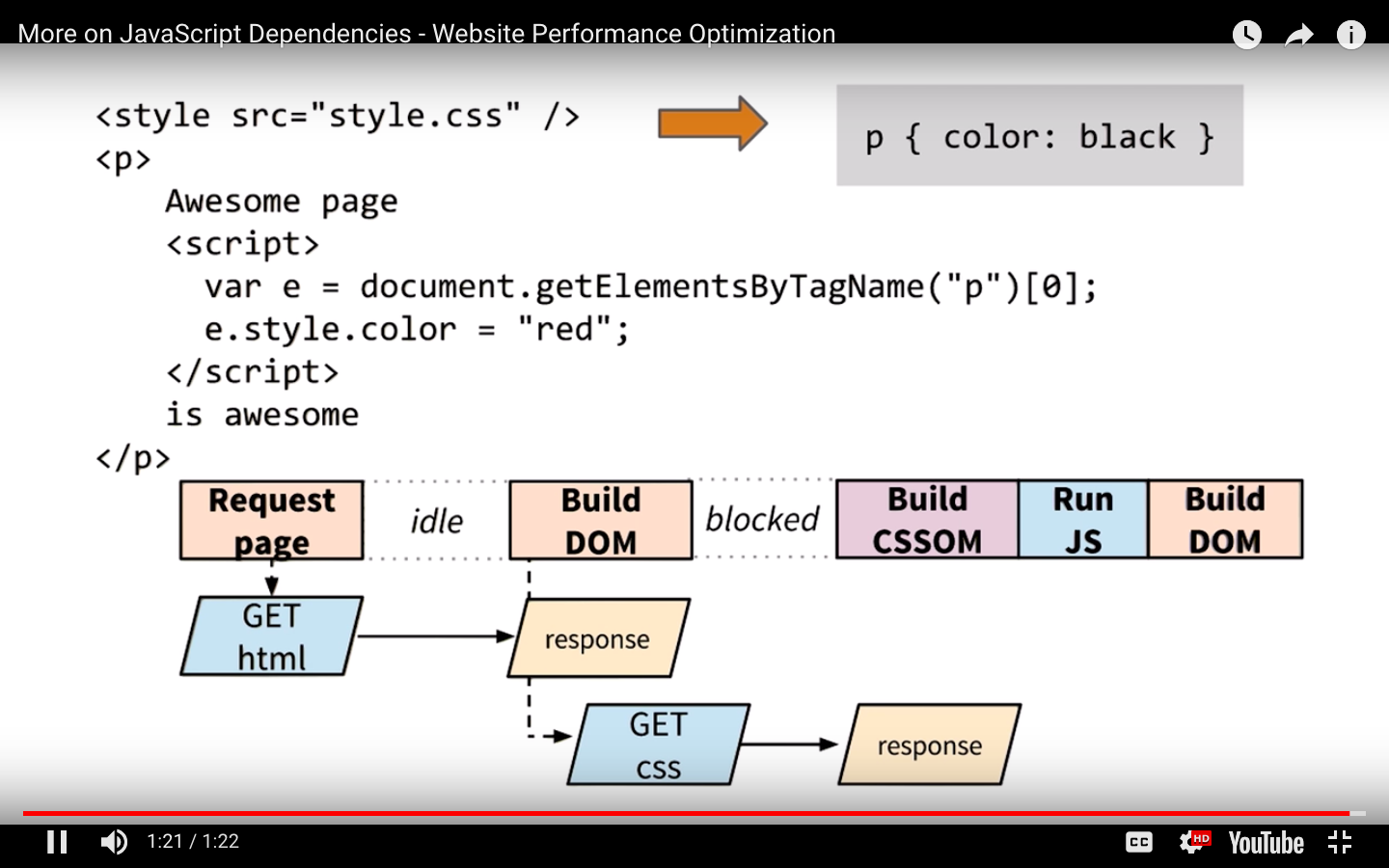
What if the browser hasn't finished downloading and building the CSSOM when we want to run our script?
The answer is simple and not very good for performance:
the browser delays script execution and DOM construction until it has finished downloading and constructing the CSSOM.
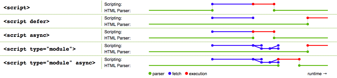
- Whether we use a <script> tag or an inline JavaScript snippet, you'd expect both to behave the same way.
- In both cases, the browser pauses and executes the script before it can process the remainder of the document.
- However, in the case of an external JavaScript file the browser must pause to wait for the script to be fetched from disk, cache, or a remote server, which can add tens to thousands of milliseconds of delay to the critical rendering path.
Async and Defer
WITH ASYNC, IN THE HEAD
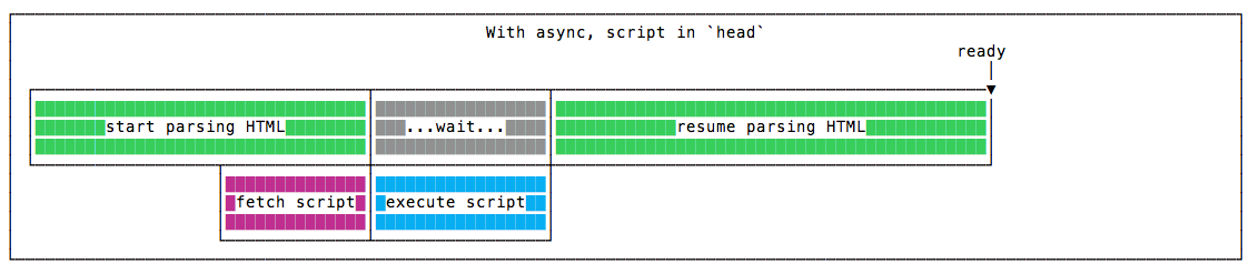
The script is fetched asynchronously, and when it’s ready the HTML parsing is paused to execute the script, then it’s resumed.
WITH DEFER, IN THE HEAD
The script is fetched asynchronously, and it’s executed only after the HTML parsing is done.
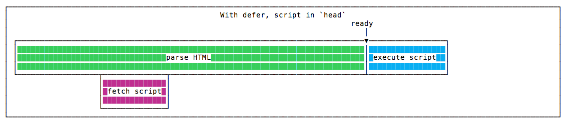
Defer scripts guarantees the order of execution in which they appear in the page.
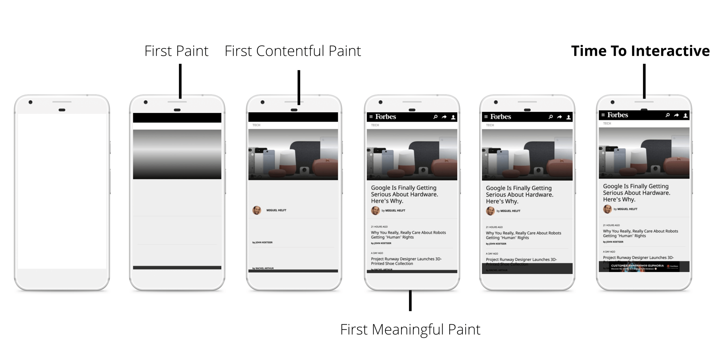
Measuring the Critical Rendering Path
The combination of the Navigation Timing API and other browser events emitted as the page loads allows you to capture and record the real-world CRP performance of any page.
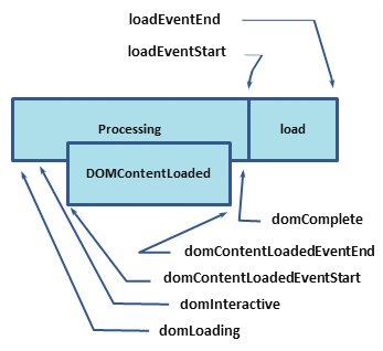
Each of the labels in the above diagram corresponds to a high resolution timestamp that the browser tracks for each and every page it loads.
So, what do these timestamps mean?
- domLoading: this is the starting timestamp of the entire process, the browser is about to start parsing the first received bytes of the HTML document.
- domInteractive: marks the point when the browser has finished parsing all of the HTML and DOM construction is complete.
-
domContentLoaded: marks the point when both the DOM is ready and there are no stylesheets that are blocking JavaScript execution - meaning we can now (potentially) construct the render tree.
- Many JavaScript frameworks wait for this event before they start executing their own logic. For this reason the browser captures the EventStart and EventEnd timestamps to allow us to track how long this execution took.
- domComplete: as the name implies, all of the processing is complete and all of the resources on the page (images, etc.) have finished downloading - in other words, the loading spinner has stopped spinning.
- loadEvent: as a final step in every page load the browser fires an onload event which can trigger additional application logic.
Analyzing Critical Rendering Path Performance
<!DOCTYPE html>
<html>
  <head>
    <meta name="viewport" content="width=device-width,initial-scale=1">
    <title>Critical Path: No Style</title>
  </head>
  <body>
    <p>Hello <span>web performance</span> students!</p>
    <div><img src="awesome-photo.jpg"></div>
  </body>
</html>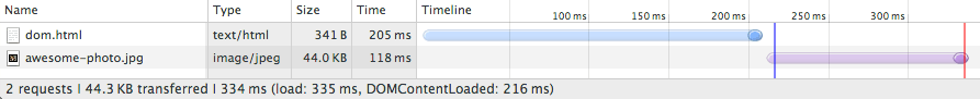
- A network roundtrip (propagation latency) to the server costs 100ms.
- Server response time is 100ms for the HTML document and 10ms for all other files.
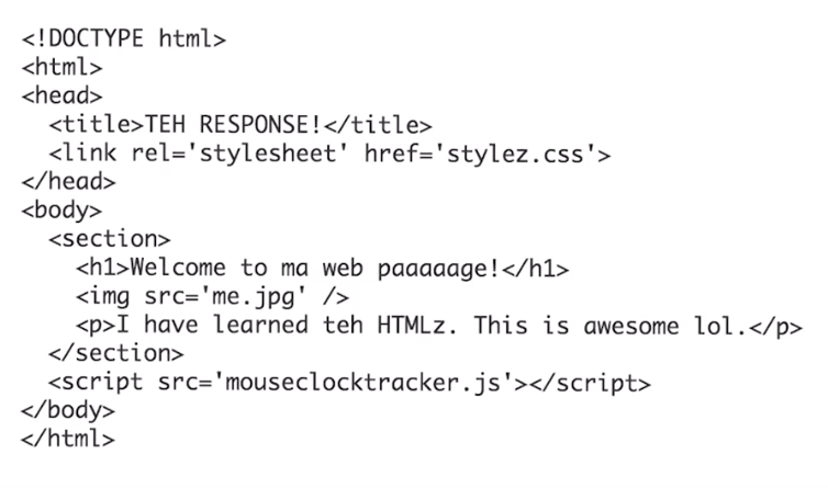
<!DOCTYPE html>
<html>
  <head>
    <title>Critical Path: Measure Script</title>
    <meta name="viewport" content="width=device-width,initial-scale=1">
    <link href="style.css" rel="stylesheet">
  </head>
  <body onload="measureCRP()">
    <p>Hello <span>web performance</span> students!</p>
    <div><img src="awesome-photo.jpg"></div>
    <script src="timing.js"></script>
  </body>
</html>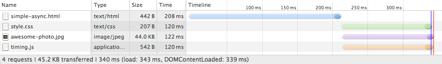
What happened?
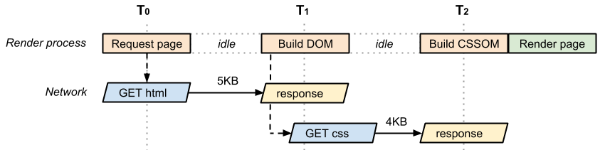
- Unlike our plain HTML example, we also need to fetch and parse the CSS file to construct the CSSOM, and we need both the DOM and CSSOM to build the render tree.
- Because the page also contains a parser blocking JavaScript file, the domContentLoaded event is blocked until the CSS file is downloaded and parsed: because the JavaScript might query the CSSOM, we must block the CSS file until it downloads before we can execute JavaScript.
Performance patterns
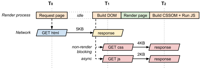
The simplest possible page consists of just the HTML markup; no CSS, no JavaScript, or other types of resources.
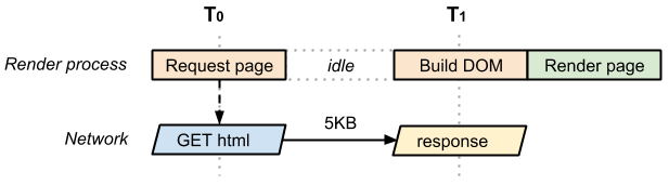
- The time between T0 and T1 captures the network and server processing times.
- In the best case (if the HTML file is small), just one network roundtrip fetches the entire document.
- Due to how the TCP transports protocols work, larger files may require more roundtrips.
- As a result, in the best case the above page has a one roundtrip (minimum) critical rendering path.
- Critical Resource: Resource that could block initial rendering of the page.
- Critical Path Length: Number of roundtrips, or the total time required to fetch all of the critical resources.
- Critical Bytes: Total number of bytes required to get to first render of the page, which is the sum of the transfer filesizes of all critical resources.
Let's define the vocabulary we use to describe the critical rendering path:
if the CSS stylesheet were only needed for print, how would that look?
Optimizing the Critical Rendering Path
To deliver the fastest possible time to first render, we need to minimize three variables:
-
The number of critical resources.
-
The critical path length.
-
The number of critical bytes.
A critical resource is a resource that could block initial rendering of the page. The fewer of these resources, the less work for the browser, the CPU, and other resources.
-
Similarly, the critical path length is a function of the dependency graph between the critical resources and their bytesize:
-
some resource downloads can only be initiated after a previous resource has been processed, and the larger the resource the more roundtrips it takes to download.
-
Finally, the fewer critical bytes the browser has to download, the faster it can process content and render it visible on the screen.
-
To reduce the number of bytes, we can reduce the number of resources (eliminate them or make them non-critical) and ensure that we minimize the transfer size by compressing and optimizing each resource.
The general sequence of steps to optimize the critical rendering path is:
-
Minify, Compress, and Cache
-
Analyze and characterize your critical path: number of resources, bytes, length.
-
Minimize number of critical resources: eliminate them, defer their download, mark them as async, and so on.
-
Optimize the number of critical bytes to reduce the download time (number of roundtrips).
-
Optimize the order in which the remaining critical resources are loaded: download all critical assets as early as possible to shorten the critical path length.
Prefetching
If we're certain that a specific resource will be required in the future, then we can ask the browser to request that item and store it in the cache for reference later.
-
However, this is dependent on a number of conditions, as prefetching can be ignored by the browser.
-
For example, a client might abandon the request of a large font file on a slow network.
-
Firefox will only prefetch resources when "the browser is idle".
-
As developers, we know our applications better than the browser does. We can use this information to inform the browser about core resources.
DNS prefetching
-
That simple line will tell supportive browsers to start prefetching the DNS for that domain a fraction before it's actually needed.
-
This means that the DNS lookup process will already be underway by the time the browser hits the script element that actually requests the widget.
-
It just gives the browser a small head start.
<link rel="dns-prefetch" href="//example.com">Preconnect
Much like the DNS prefetch method, preconnect will resolve the DNS but it will also make the TCP handshake, and optional TLS negotiation.
<link rel="preconnect" href="http://css-tricks.com">Prerender
This is the nuclear option, as prerender gives us the ability to preemptively load all of the assets of a certain document, like so:
<link rel="prerender" href="http://css-tricks.com">
-
This is like opening the URL in a hidden tab – all the resources are downloaded, the DOM is created, the page is laid out, the CSS is applied, the JavaScript is executed, etc.
-
If the user navigates to the specified href, then the hidden page is swapped into view making it appear to load instantly.
Preload
The preload value of the <link> element's rel attribute allows you to write declarative fetch requests in your HTML <head>, specifying resources that your pages will need very soon after loading, which you therefore want to start preloading early in the lifecycle of a page load, before the browser's main rendering machinery kicks in.
It allows you to force the browser to make a request for a resource without blocking the document’s onload event.
<head>
  <meta charset="utf-8">
  <title>JS and CSS preload example</title>

  <link rel="preload" href="style.css" as="style">
  <link rel="preload" href="main.js" as="script">

  <link rel="stylesheet" href="style.css">
</head>

<body>
  <h1>bouncing balls</h1>
  <canvas></canvas>

  <script src="main.js"></script>
</body>
Making a Frame


Measure Performance with the RAIL Model
RAIL is a user-centric performance model that breaks down the user's experience into key actions.
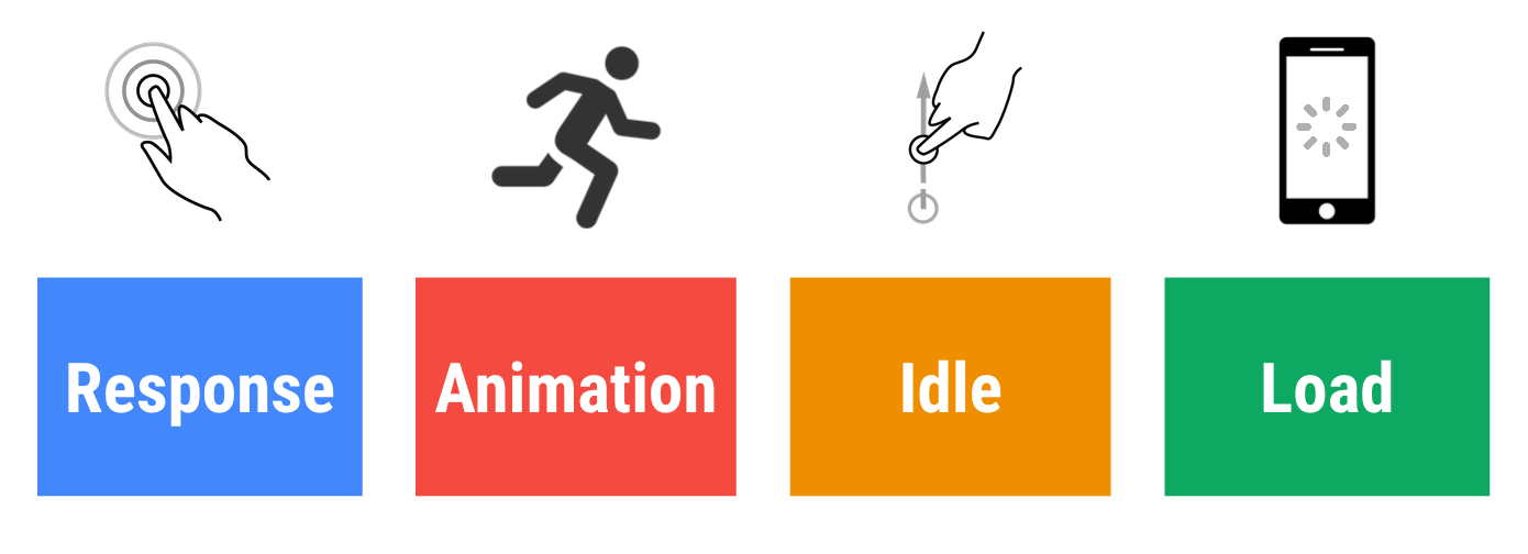
Every web app has four distinct aspects to its life cycle, and performance fits into them in different ways:
- Goals. Key performance metrics related to user experience.
- Since human perception is relatively constant, these goals are unlikely to change any time soon.
- Guidelines. Recommendations that help you achieve goals.
- These may be specific to current hardware and network connection conditions, and therefore may change over time.
Goals and guidelines
In the context of RAIL, the terms goals and guidelines have specific meanings:
User Perception Of Performance Delays
0 to 16ms
- Users are exceptionally good at tracking motion, and they dislike it when animations aren't smooth.
- They perceive animations as smooth so long as 60 new frames are rendered every second.
- That's 16ms per frame, including the time it takes for the browser to paint the new frame to the screen, leaving an app about 10ms to produce a frame.
0 to 100ms
- Respond to user actions within this time window and users feel like the result is immediate.
- Any longer, and the connection between action and reaction is broken.
100 to 300ms
Users experience a slight perceptible delay.
300 to 1000ms
- Within this window, things feel part of a natural and continuous progression of tasks.
- For most users on the web, loading pages or changing views represents a task.
1000ms or more
Beyond 1000 milliseconds (1 second), users lose focus on the task they are performing.
10000ms or more
- Beyond 10000 milliseconds (10 seconds), users are frustrated and are likely to abandon tasks.
- They may or may not come back later.
Load
Keep in mind that although your typical mobile user's device might claim that it's on a 2G, 3G, or 4G connection, in reality the effective connection speed is often significantly slower, due to packet loss and network variance.
Idle: maximize idle time
Goal: Maximize idle time to increase the odds that the page responds to user input within 50ms.
- Use idle time to complete deferred work. For example, for the initial page load, load as little data as possible, then use idle time to load the rest.
- Perform work during idle time in 50ms or less. Any longer, and you risk interfering with the app's ability to respond to user input within 50ms.
- If a user interacts with a page during idle time work, the user interaction should always take the highest priority and interrupt the idle time work.
Guidelines:
Animation: produce a frame in 10ms
Goals:
Technically, the maximum budget for each frame is 16ms (1000ms / 60 frames per second ≈ 16ms)
Guidelines:
In high pressure points like animations, the key is to do nothing where you can, and the absolute minimum where you can't.
Also animations
- Visual animations, such as entrances and exits, tweens, and loading indicators.
- Scrolling. This includes flinging, which is when the user starts scrolling, then lets go, and the page continues scrolling.
- Dragging. Animations often follow user interactions, such as panning a map or pinching to zoom.
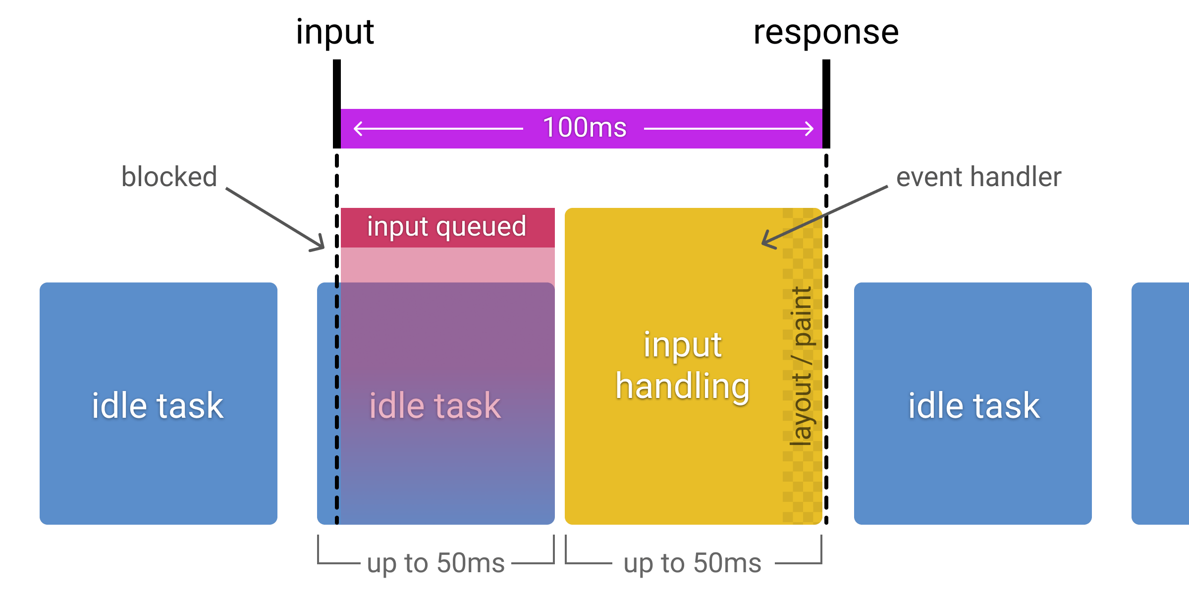
Response: process events in under 50ms
Goal: Complete a transition initiated by user input within 100ms.
Guidelines:
- Process user input events within 50ms to ensure a visible response within 100ms, otherwise the connection between action and reaction is broken.
- This applies to most inputs, such as clicking buttons, toggling form controls, or starting animations. This does not apply to touch drags or scrolls.
- Though it may sound counterintuitive, it's not always the right call to respond to user input immediately. You can use this 100ms window to do other expensive work.
- But be careful not to block the user. If possible, do work in the background.
- For actions that take longer than 50ms to complete, always provide feedback.
Goals:
Animation: produce a frame in 10ms
- Produce each frame in an animation in 10ms or less. Technically, the maximum budget for each frame is 16ms (1000ms / 60 frames per second ≈ 16ms), but browsers need about 6ms to render each frame, hence the guideline of 10ms per frame.
- Aim for visual smoothness. Users notice when frame rates vary.
Guidelines
- In high pressure points like animations, the key is to do nothing where you can, and the absolute minimum where you can't.
- Whenever possible, make use of the 100ms response to pre-calculate expensive work so that you maximize your chances of hitting 60fps.
- Each of these interactions are considered animations:
- Visual animations, such as entrances and exits, tweens, and loading indicators.
- Scrolling. This includes flinging, which is when the user starts scrolling, then lets go, and the page continues scrolling.
- Dragging. Animations often follow user interactions, such as panning a map or pinching to zoom.
Measure Performance
- Lighthouse - Lighthouse is primarily for your local iteration as you build your site.
- PageSpeed Insights - PageSpeed Insights is great if you aren't sure where to start and want a useful overview of improvement opportunities.
- WebPageTest - WebPageTest is excellent for testing on real mobile devices and envisioning a more real-world setup.
- Pingdom
Demo
Optimizing JavaScript
What is tree shaking?
- Tree shaking is a form of dead code elimination.
- The term was popularized by Rollup, but the concept of dead code elimination has existed for some time.
// Import all the array utilities!
import arrayUtils from "array-utils";
// Import only some of the utilities!
import { unique, implode, explode } from "array-utils";Keeping Babel from transpiling ES6 modules to CommonJS modules
- If you're using babel-preset-env, one thing it automatically does for you is transpile your nice ES6 modules into more widely compatible CommonJS modules (i.e., modules you require instead of import).
- The problem is that tree shaking is much more difficult to do for CommonJS modules, and webpack won't know what to prune from the bundle if you decide to use them.
{
  "presets": [
    ["env", {
      "modules": false
    }]
  ]
}
Keeping side effects in mind
let fruits = ["apple", "orange", "pear"];

console.log(fruits); // (3) ["apple", "orange", "pear"]

const addFruit = function(fruit) {
  fruits.push(fruit);
};

addFruit("kiwi");

console.log(fruits); // (4) ["apple", "orange", "pear", "kiwi"]- Side effects also apply to ES6 modules, and that matters in the context of tree shaking.
- Modules that take predictable inputs and spit out equally predictable outputs without modifying anything outside of their own scope are dependencies we can safely shake if we're not using them.
Optimize JavaScript Execution
Use requestAnimationFrame for visual changes
- When visual changes are happening on screen you want to do your work at the right time for the browser, which is right at the start of the frame.
- The only way to guarantee that your JavaScript will run at the start of a frame is to use requestAnimationFrame.
Reduce complexity or use Web Workers
- JavaScript runs on the browser’s main thread, right alongside style calculations, layout, and, in many cases, paint.
- If your JavaScript runs for a long time, it will block these other tasks, potentially causing frames to be missed.
- If you’re in an animation like scrolling, you should ideally be looking to keep your JavaScript to something in the region of 3-4ms. Any longer than that and you risk taking up too much time.
- If your work must be on the main thread, consider a batching approach, where you segment the larger task into micro-tasks,
Reduce the Scope and Complexity of Style Calculations
Changing the DOM, through adding and removing elements, changing attributes, classes, or through animation, will all cause the browser to recalculate element styles and, in many cases, layout (or reflow) the page, or parts of it.
.box:nth-last-child(-n+1) .title {
  /* styles */
}
.final-box-title {
/* styles */
}Reduce the complexity of your selectors; use a class-centric methodology like BEM.
is this an element with a class of title which has a parent who happens to be the minus nth child plus 1 element with a class of box?
Avoid layout wherever possible
Changes to “geometric properties”, such as widths, heights, left, or top all require layout.
Layout is almost always scoped to the entire document. If you have a lot of elements, it’s going to take a long time to figure out the locations and dimensions of them all.
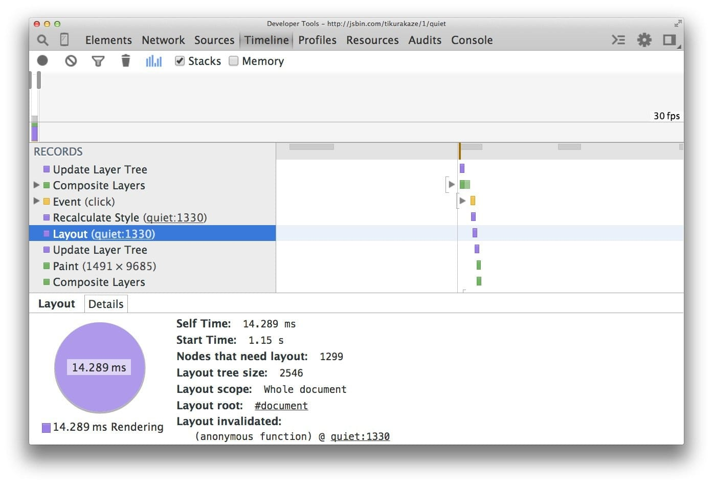
Use flexbox over older layout models
- The web has a range of layout models, some being more widely supported than others.
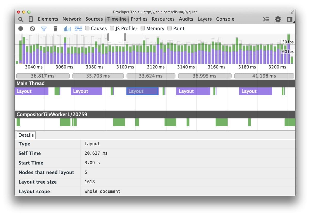
- The oldest CSS layout model allows us to position elements on screen relatively, absolutely, and by floating elements.
- The screenshot below shows the layout cost when using floats on 1,300 boxes.
- It is, admittedly, a contrived example, because most applications will use a variety of means to position elements.
If we update the sample to use Flexbox, a more recent addition to the web platform, we get a different picture:
Avoid forced synchronous layouts
- First the JavaScript runs, then style calculations, then layout. It is, however, possible to force a browser to perform layout earlier with JavaScript. It is called a forced synchronous layout.
- The first thing to keep in mind is that as the JavaScript runs all the old layout values from the previous frame are known and available for you to query.
// Schedule our function to run at the start of the frame.
requestAnimationFrame(logBoxHeight);

function logBoxHeight() {
  // Gets the height of the box in pixels and logs it out.
  console.log(box.offsetHeight);
}


function logBoxHeight() {

  box.classList.add('super-big');

  // Gets the height of the box in pixels
  // and logs it out.
  console.log(box.offsetHeight);
}
Avoid layout thrashing
There’s a way to make forced synchronous layouts even worse: do lots of them in quick succession. Take a look at this code:
function resizeAllParagraphsToMatchBlockWidth() {

  // Puts the browser into a read-write-read-write cycle.
  for (var i = 0; i < paragraphs.length; i++) {
    paragraphs[i].style.width = box.offsetWidth + 'px';
  }
}
var width = box.offsetWidth;
function resizeAllParagraphsToMatchBlockWidth() {
for (var i = 0; i < paragraphs.length; i++) {
// Now write.
paragraphs[i].style.width = width + 'px';
}
}
Optimising Text Content
In a web page, every character of that content, structure, formatting, and behavior must be fetched from the server and downloaded to the browser, a decidedly non-trivial task.
Separate Development from Deployment
Always keep development and deployment files separate to avoid replacing a development file with a deployment version.
Minify Your Code
HTML, CSS and JS all can be minified.
Frameworks
Use task runners such as gulp or module bundler such as webpack to automate the task
Compress Text Resources
- So far we've talked about compression in terms of individual image and text files.
- But it would also be helpful if we could get our server to automatically compress entire file sets as well, and that's where Gzip comes in
Gzip performs best on text resources, and can regularly achieve up to 70% compression
Already-compressed content: Most images, music and videos are already compressed. Don’t waste time compressing them again.
Reduce Library Use
jQuery, for example -- depending on the version and the compression algorithms applied -- might range from 28k to over 250k.
- If you need most of a given library's features, fine;
- but if you only need one or two specific things, you can save a lot of download time by replacing those features with single-use functions or CSS rules.
Optimizing Graphical Content
HTTPArchive notes that images account for approximately 50% of the average web site's content.
Remove Unnecessary Images
It's a question that apparently isn't asked enough
- Can it be loaded later, after more critical content?
- If not, can it be optimized so that it has the least effect on the page load?
Choose Appropriate Image Types
As a rule of thumb, use PNGs for clip art, line drawings, or wherever you need transparency, JPGs for photographs, and GIFs when you need animation.
Remove Image Metadata
Can lead to size decrease upto 10%.
Resize Images
Size images based on their intended use
All your images should be appropriately sized for their intended use and should not rely on the browser to resize them for rendering.
For example, you might have a 1200 x 600 pixel image that you present at 60 x 30 (as a 5% thumbnail) and roll it up to full size on hover using a CSS transition.
It works fine and looks great, but if the user never actually hovers over the thumbnail, then 95% of the time that image took to download was wasted.
Crop images to show only what's important
omitting parts of the image that aren't important to information delivery.

Reduce image quality


burger80.jpg -- 80%, 60k
burger25.jpg -- 25%, 20k
Compress Images
PNG and JPG images can be squashed down even more using compression tools.
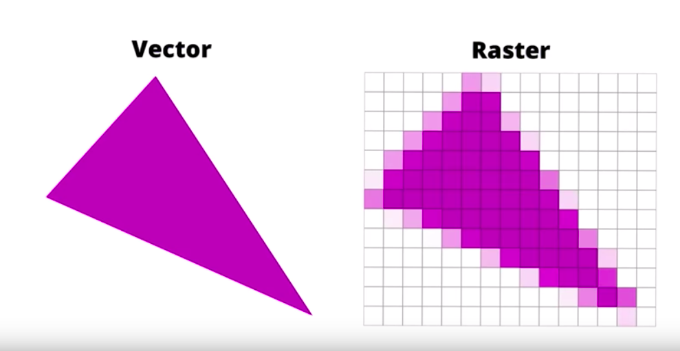
Vector vs. Raster images
- Vector images are ideal for images that consist of geometric shapes
- Vector images are zoom and resolution-independent
- Raster images should be used for complex scenes with lots of irregular shapes and details.
- As a result, you may need to save multiple versions of a raster image at various resolutions to deliver the optimal experience to your users.
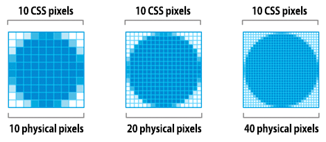
Implications of high-resolution screens
- High resolution screens have multiple device pixels per CSS pixel
- High resolution images require significantly higher number of pixels and bytes
- Image optimization techniques are the same regardless of resolution
| Screen resolution | Total pixels | Uncompressed filesize (4 bytes per pixel) |
|---|---|---|
| 1x | 100 x 100 = 10,000 | 40,000 bytes |
| 2x | 100 x 100 x 4 = 40,000 | 160,000 bytes |
| 3x | 100 x 100 x 9 = 90,000 | 360,000 bytes |
When we double the resolution of the physical screen, the total number of pixels increases by a factor of four: double the number of horizontal pixels, times double the number of vertical pixels.
Delivering HiDPI images using srcset
The Device Pixel Ratio (DPR) (also called the "CSS pixel ratio") determines how a device’s screen resolution is interpreted by CSS.
<img srcset="paul-irish-320w.jpg,
             paul-irish-640w.jpg 2x,
             paul-irish-960w.jpg 3x"
src="paul-irish-960w.jpg" alt="Paul Irish cameo">- srcset allows a browser to select the best available image per device, e.g selecting a 2x image for a 2x mobile display.
- Browsers without srcset support can fallback to the default src specified in the <img> tag.
Optimizing vector images
- SVG files should be minified and compressed with GZIP
- Use svgo
Automating image optimization
Most CDNs (e.g Akamai) and third-party solutions like Cloudinary, imgix, Fastly's Image Optimizer, Instart Logic's SmartVision or ImageOptim API offer comprehensive automated image optimization solutions.
Everyone should be compressing their images efficiently.
At minimum: use ImageOptim. It can significantly reduce the size of images while preserving visual quality.
- More specifically: run your JPEGs through MozJPEG (q=80 or lower is fine for web content) and consider Progressive JPEG support,
- PNGs through pngquant and SVGs through SVGO. Explicitly strip out metadata (--strip for pngquant) to avoid bloat.
- Instead of crazy huge animated GIFs, deliver H.264 videos (or WebM for Chrome, Firefox and Opera)!
- If you can't at least use Giflossy.
- If you can spare the extra CPU cycles, need higher-than-web-average quality and are okay with slow encode times: try Guetzli.
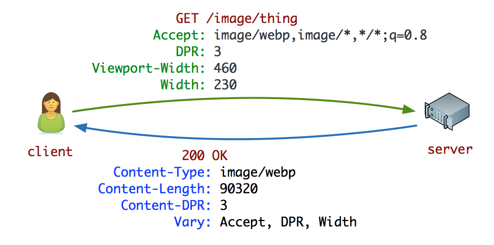
- Some browsers advertise support for image formats via the Accept request header. This can be used to conditionally serve formats: e.g lossy WebP for Blink-based browsers like Chrome and fallbacks like JPEG/PNG for other browsers.
- There's always more you can do. Tools exists to generate and serve srcset breakpoints.
- Resource selection can be automated in Blink-based browsers with client-hints and you can ship fewer bytes to users who opted into "data savings" in-browser by heeding the Save-Data hint.
JPEG compression modes
Three popular modes are baseline (sequential), Progressive JPEG (PJPEG) and lossless.
Baseline JPEGs (the default for most image editing and optimization tools) are encoded and decoded in a relatively simple manner: top to bottom.

Lossless JPEGs are similar but have a smaller compression ratio.
Baseline JPEGs load top to bottom while Progressive JPEGs load from blurry to sharp.
- Progressive JPEGs divide the image into a number of scans.
- The first scan shows the image in a blurry or low-quality setting and following scans improve image quality.
- Think of this as "progressively" refining it.
- Each "scan" of an image adds an increasing level of detail.
- When combined this creates a full-quality image.

The advantages of Progressive JPEGs
The ability for PJPEGs to offer low-resolution "previews" of an image as it loads improves perceived performance - users can feel like the image is loading faster compared to adaptive images.
On slower 3G connections, this allows users to see (roughly) what's in an image when only part of the file has been received and make a call on whether to wait for it to fully load.
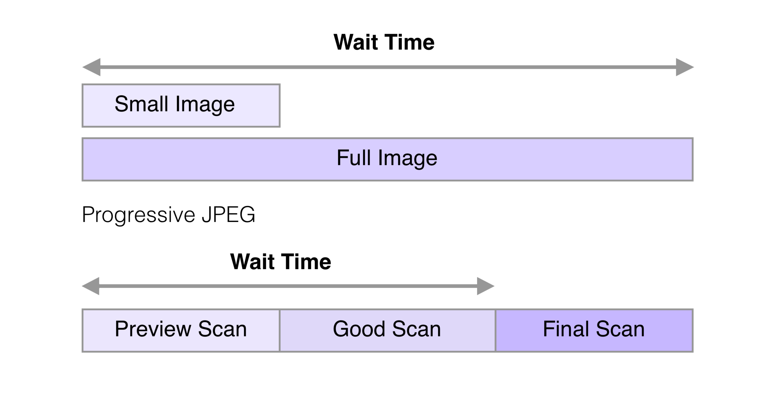
The disadvantages of Progressive JPEGs
PJPEGs can be slower to decode than baseline JPEGs - sometimes taking 3x as long.
Progressive JPEGs are also not always smaller. For very small images (like thumbnails), progressive JPEGs can be larger than their baseline counterparts.
How do you create Progressive JPEGs?
Tools and libraries like ImageMagick, libjpeg, jpegtran, jpeg-recompress and imagemin support exporting Progressive JPEGs.
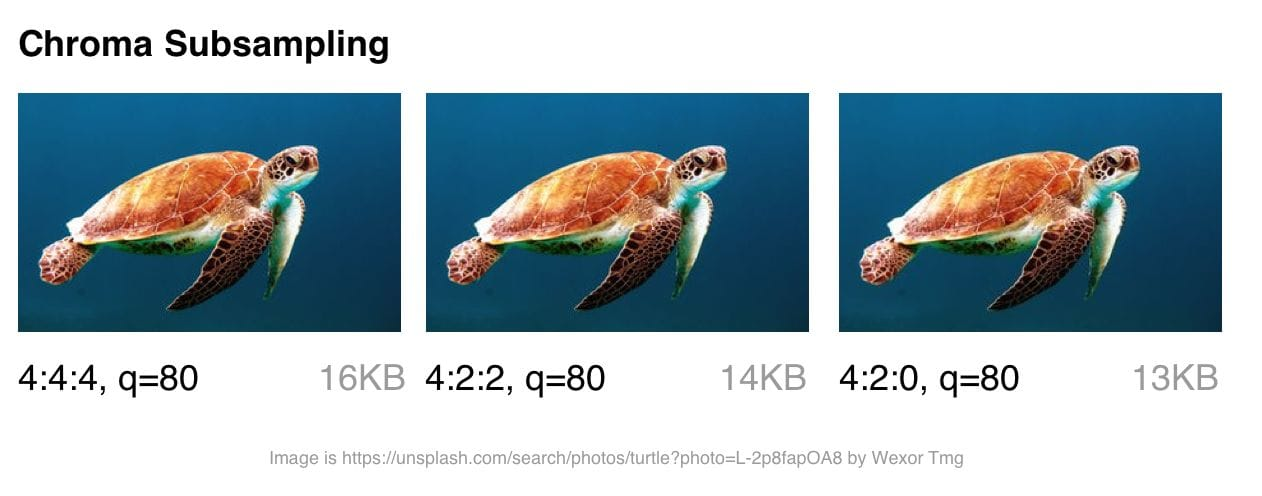
Chroma (or color) subsampling
- Our eyes are more forgiving to loss of color detail in an image (chroma) than they are luminance (or luma for short - a measure of brightness).
- Chroma subsampling is a form of compression that reduces the precision of color in a signal in favor of luma.
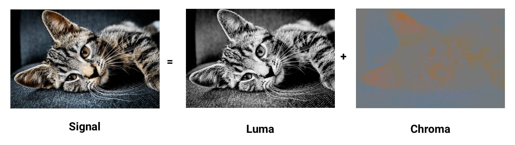
As contrast is responsible for forming shapes that we see in an image, luma, which defines it, is pretty important.
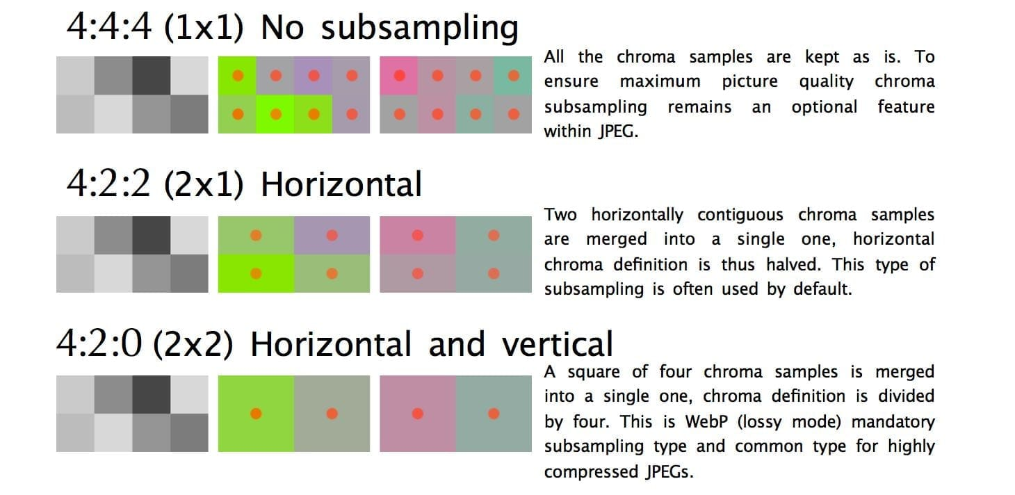
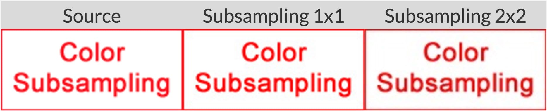
compress-or-die.com recommends sticking with a subsampling of 4:4:4 (1x1) when working with images containing text.
Compressing Animated GIFs and why <video> is better
- Animated GIFs continue to enjoy widespread use, despite being a very limited format.
- Although everything from social networks to popular media sites embed animated GIFs heavily, the format was never designed for video storage or animation.
- In fact, the GIF89a spec notes "the GIF is not intended as a platform for animation".
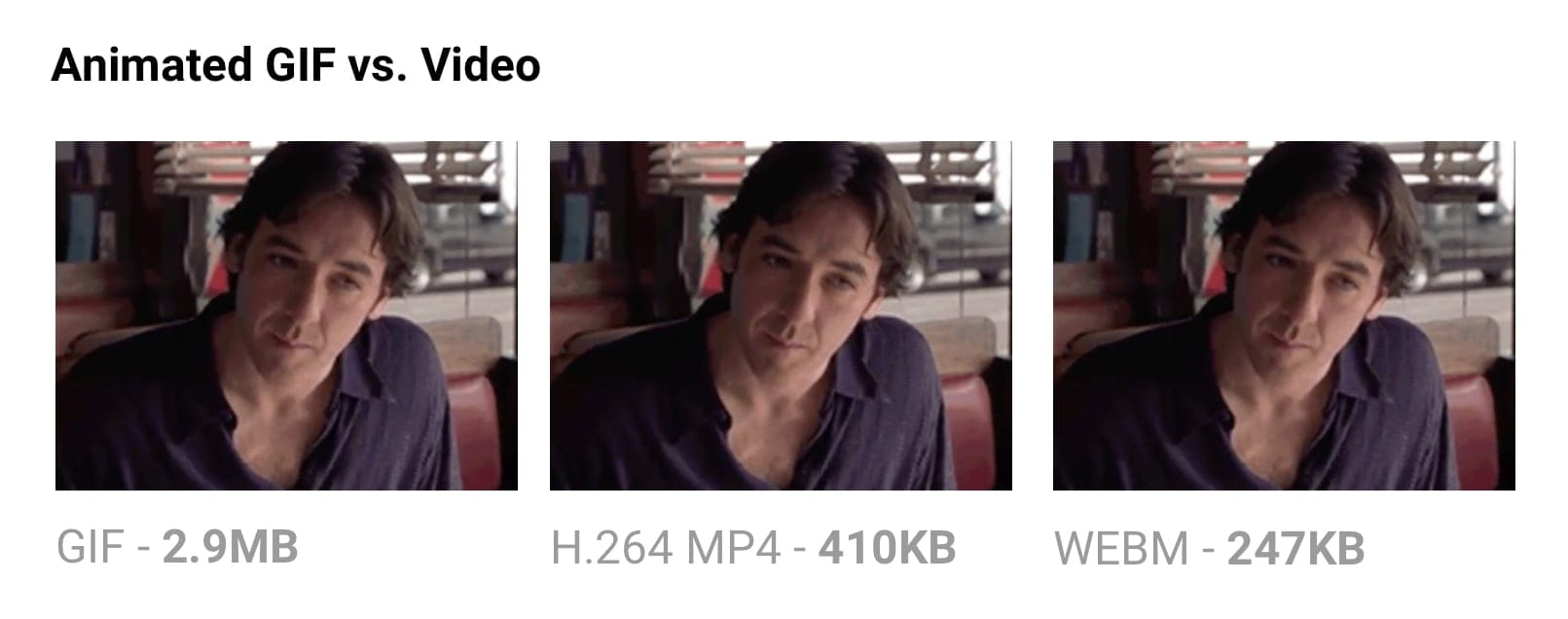
- Delivering the same file as an MP4 video can often shave 80% or more off your file-size.
- Not only do GIFs often waste significant bandwidth, but they take longer to load, include fewer colors and generally offer sub-part user experiences.
Why are GIFs many times larger?
- Animated GIFs store each frame as a lossless GIF image - yes, lossless.
- The degraded quality we often experience is due to GIFs being limited to a 256-color palette.
Use ffmpeg to convert your animated GIFs (or sources) to H.264 MP4s.
Consider a lossy GIF encoder. The Giflossy fork of Gifsicle supports this with the —lossy flag and can shave ~60-65% off size.
Avoid recompressing images with lossy codecs
- It is recommended to always compress from the original image.
- Recompressing images has consequences. Let's say you take a JPEG that's already been compressed with a quality of 60.
- If you recompress this image with lossy encoding, it will look worse.
- Each additional round of compression is going to introduce generational loss - information will be lost and compression artifacts will start to build up.
Lazy-load non-critical images
Lazy loading is a web performance pattern that delays the loading of images in the browser until the user needs to see it.
Images that must appear "above the fold," or when the web page first appears are loaded straight away.
Why is Lazy Loading Useful?
- Reduced data consumption
- Reduced battery consumption
- Improved download speed
Caveats
- Avoid lazy-loading images above the fold.
- Be very careful lazy-loading images when scrolling.
- Screen readers, some search bots and any users with JavaScript disabled will not be able to view images lazy loaded with JavaScript.
- Scroll listeners, such as used for determining when to load a lazy-loaded image, can have an adverse impact on browser scrolling performance.
- One possible solution is Intersection Observer, which is supported by lazysizes.
How Can I Apply Lazy Loading to My Pages?
I recommend lazysizes by Alexander Farkas because of its decent performance, features, its optional integration with Intersection Observer, and support for plugins.
Avoiding the display:none trap
<img src="img.jpg">
<style>
@media (max-width: 640px) {
    img {
        display: none;
    }
}
</style>
A quick check against the Chrome DevTools network panel will verify that images hidden using these approaches still get fetched, even when we expect them not to be.
Again, where possible, use <picture> and <img srcset> instead of relying on display:none.
Client-side Caching
Memory Cache
- It contains all the resources that the renderer fetched as part of the current document and kept during the document’s lifetime.
- The memory cache keeps resources around only until the end of their navigation, and in some cases, even less than that.
- The preloader is probably the biggest one reason for it.
- Explicit preload directives (<link rel=preload>) is another big case where the preloaded resources are stored in the Memory Cache.
- One thing that Memory Cache doesn’t care about is HTTP semantics. If the resource stored in it has max-age=0 or no-cache Cache-Control headers, that’s not something that Memory Cache cares about.
Service Worker Cache
- Unlike the Memory Cache, the Service Worker doesn’t follow any conventional rules.
- It only exists if a Service Worker was installed by the page.
- One major difference between it and the Memory Cache is that it is persistent.
- Resources stored in that cache are kept around, even if the tab closes or the browser restarted.
HTTP Caching ("Disk Cache")
- The first time a browser loads a web page, it stores the page resources in the HTTP Cache.
- The next time the browser hits that page, it can look in the cache for resources that were previously fetched and retrieve them from disk, often faster than it can download them from the network.
- the HTTP cache abides to HTTP semantics.
- It will happily serve resources that it considers “fresh” (based on caching lifetime, indicated by their response’s caching headers), revalidate resources that need revalidation, and refuse to store resources that it shouldn’t store.
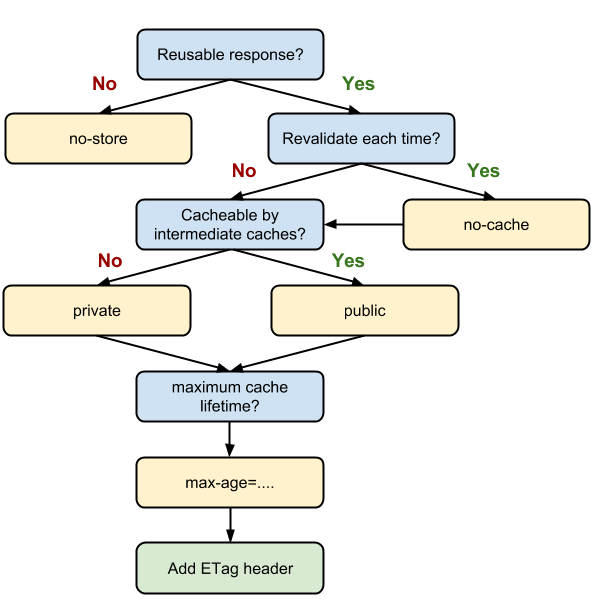
Cache Headers
Two main types of cache headers, cache-control and expires, define the caching characteristics for your resources.
- Cache-Control: must-revalidate
- Cache-Control: no-cache
- Cache-Control: no-store
- Cache-Control: no-transform
- Cache-Control: public
- Cache-Control: private
- Cache-Control: proxy-revalidate
- Cache-Control: max-age=<seconds>
- Cache-Control: s-maxage=<seconds>
<filesMatch ".(ico|jpg|jpeg|png|gif)$">
 Header set Cache-Control "max-age=2592000, public"
</filesMatch>

<filesMatch ".(css|js)$">
 Header set Cache-Control "max-age=86400, public"
</filesMatch>
- no-cache: Somewhat of a misnomer, specifies that content can be cached but, if so, it must be re-validated on each request before being served to a client.
- This forces the client to check for freshness but allows it to avoid downloading the resource again if it has not changed.
- Mutually exclusive with no-store.
- no-store: Indicates that the content actually cannot be cached in any way by any primary or intermediate cache.
- public: Indicates that the content can be cached by the browser and by any intermediate caches.
- private: Designates content that may be stored by the user's browser, but may not be cached by any intermediate caches.
- max-age: Defines the maximum time that the content may be cached before it must be revalidated or downloaded again from the original server.
- This option generally replaces the expires header and takes a value in seconds, with a maximum valid age of one year (31536000 seconds).
Expires Caching
You can also enable caching by specifying expiration, or expiry, times for certain types of files, which tell browsers how long to use a cached resource before requesting a fresh copy from the server.
Tip: Don't use an expiry greater than one year; that's effectively forever on the internet and, as noted above, is the maximum value for max-age under cache-control.
## EXPIRES CACHING ##
ExpiresActive On
ExpiresByType image/jpg "access plus 1 year"
ExpiresByType image/jpeg "access plus 1 year"
ExpiresByType text/x-javascript "access plus 1 month"
ExpiresByType application/x-shockwave-flash "access plus 1 month"
ExpiresByType image/x-icon "access plus 1 year"
ExpiresDefault "access plus 2 days"
## EXPIRES CACHING ##
Pattern 1: Immutable content + long max-age
Cache-Control: max-age=31536000
- The content at this URL never changes, therefore…
- The browser/CDN can cache this resource for a year without a problem
- Cached content younger than max-age seconds can be used without consulting the server
- In this pattern, you never change content at a particular URL, you change the URL:
<script src="/script-f93bca2c.js"></script>
<link rel="stylesheet" href="/styles-a837cb1e.css">
<img src="/cats-0e9a2ef4.jpg" alt="…">
However, this pattern doesn't work for things like articles & blog posts. Their URLs cannot be versioned and their content must be able to change.
Pattern 2: Mutable content, always server-revalidated
Cache-Control: no-cache
- The content at this URL may change, therefore…
- Any locally cached version isn't trusted without the server's say-so
- Also must-revalidate doesn't mean "must revalidate", it means the local resource can be used if it's younger than the provided max-age, otherwise it must revalidate.
- In this pattern you can add an ETag or Last-Modified date header to the response.
- Next time the client fetches the resource, it echoes the value for the content it already has via If-None-Match and If-Modified-Since respectively, allowing the server to say "Just use what you've already got, it's up to date", or as it spells it, "HTTP 304".
Etag
- The ETag HTTP response header is an identifier for a specific version of a resource.
- It allows caches to be more efficient, and saves bandwidth, as a web server does not need to send a full response if the content has not changed.
ETag: "33a64df551425fcc55e4d42a148795d9f25f89d4"
ETag: W/"0815"
Avoiding mid-air collisions
- With the help of the ETag and the If-Match headers, you are able to detect mid-air edit collisions.
- If the hashes don't match, it means that the document has been edited in-between and a 412 Precondition Failed error is thrown.
max-age on mutable content is often the wrong choice
A refresh sometimes fixes it
If the page is loaded as part of a refresh, browsers will always revalidate with the server, ignoring max-age.
A service worker can extend the life of these bugs
const version = '2';

self.addEventListener('install', event => {
  event.waitUntil(
    caches.open(`static-${version}`)
      .then(cache => cache.addAll([
        '/styles.css',
        '/script.js'
      ]))
  );
});

self.addEventListener('activate', event => {
  // …delete old caches…
});

self.addEventListener('fetch', event => {
  event.respondWith(
    caches.match(event.request)
      .then(response => response || fetch(event.request))
  );
});
Caching checklist
- Use consistent URLs
- Ensure that the server provides a validation token (ETag)
- Identify which resources can be cached by intermediaries
- Determine the optimal cache lifetime for each resource
- Determine the best cache hierarchy for your site
- Minimize churn: some resources are updated more frequently than others. If there is a particular part of a resource (for example, a JavaScript function or a set of CSS styles) that is often updated, consider delivering that code as a separate file.
deck
By Arfat Salman


