Inspiring Digipak
Made By:
Arooj Tassadaq
CD- COVER
1st CD- Cover
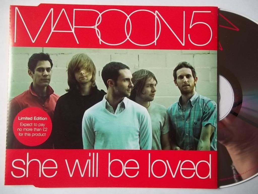
MAROON 5
This album cover by Maroon5 has image of the whole band members, they are not making eye contact with the audience. They are dressed in very casual clothing. The band name is written on top, it is Maroon5 and is in capital letters with white fonts and red headline type line has been placed as background to band's names. This highlights the band band name and bottom album name has been mentioned but not in capital the puff is in red color with white font on it. The album cover is very simple. It is inspirational because our artist is male and this album is very simple.

2nd CD- Cover
Rihanna
Rihanna's album cover has a very prominent image of her face in the front cover. She looks very classic , as she is directly looking into the camera. Her lips are very prominent with red lipstick on her and also her earnings which are also very prominent. Which givers her a bold personality look too. Rihanna's name is written in red, Italic font and capital letters. Color palette is red, black and white. Her nails are painted red too. This album cover is inspirational because of Rihanna's prominent image in it and her bold expressions.
3rd CD- Cover
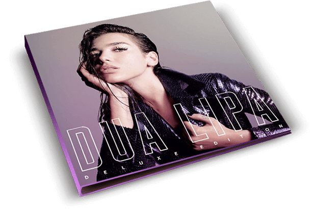
DUA LIPA
This album cover by Dua Lipa is one of the most simple. It has a back, elite and purple color is written in transparent color and capital font with white outline around her name. Deluxe editor is written below her name across the album cover. Her image is in center of the cover. Her image is in center of the cover. She is giving off very bold expressions as she is pulling at her jacket which is black in color white purple shine on it. We find it inspirational because of the color palette.
4th CD-Cover
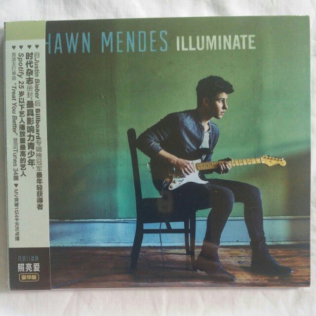
Shawn Mendes
This album covers is by Shawn Mendes for Illuminate. It is different shades of blue and is very core of eyes. He is looking away in distance, holding a guitar, sitting on a chair. The guitar colors are in match with his white shirt and brown floor boards. Shawn Mendes name is written in capital big font, it is blue too and album name matches with the color palette too. We found this album cover inspirational because it gives off vey mysterious feel as if he is far away in his feels. The aura around him is very peaceful and blue color connotes water.
5th CD-COVER
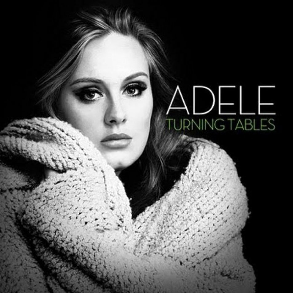
ADELE TURNING TABLES
This album cover is from ADELE TURNING TABLES. It has simple black and white color palette with one exceptions that the color of album name, which is in green color. Her name is written in capital white font. Her name is a gloomy figure. She is wearing a white jersey and gloomily looking at camera. As it is all in a darker tone, we like it because name four album is Yaadeh that is about memories.
CD-BACK
1st CD- BACK
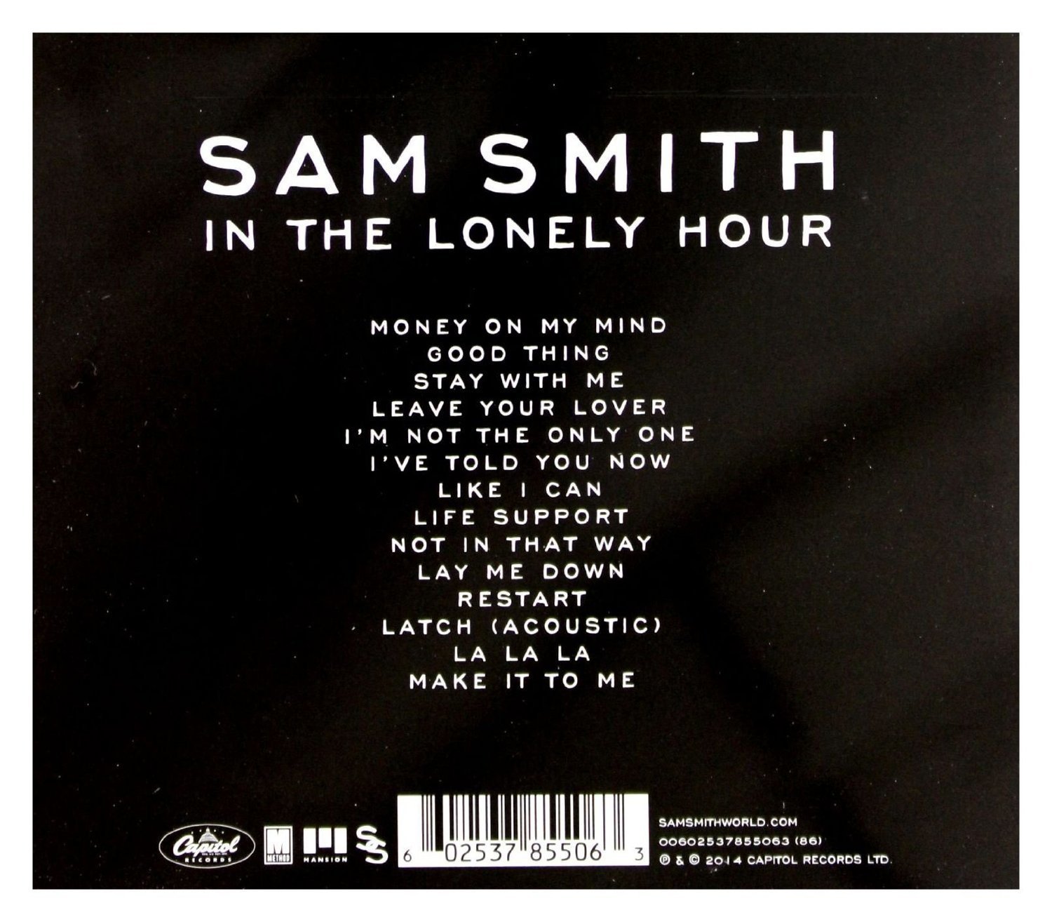
SAM SMITH
This back cover is by Sam Smith album 'In the lonely hours. His name is written on top in white font and it is bold. The song names are written in center. Bar code is placed in center bottom of the album.
On the right side of it his website has been mentioned as well the record label name. On left side of the barcode around it. Black and white is the color palette we found it inspirational because it is very simple.
2nd CD- BACK
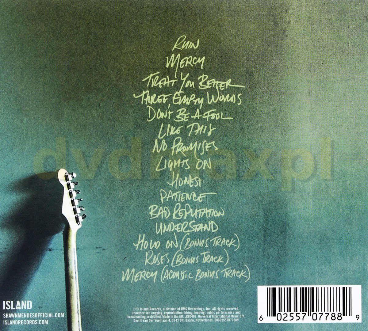
Shawn Mendes
The back cover of the Illuminate by Shawn Mendes is again a color palette of shades of blue, mustard and white. It again gives off peaceful vibes like the cover page. Song names are in light yellow Italic font and are aligned in center. On bottom record label company's information is given.On right side bar code is placed, an image of half of Shawn's guitar is added too.
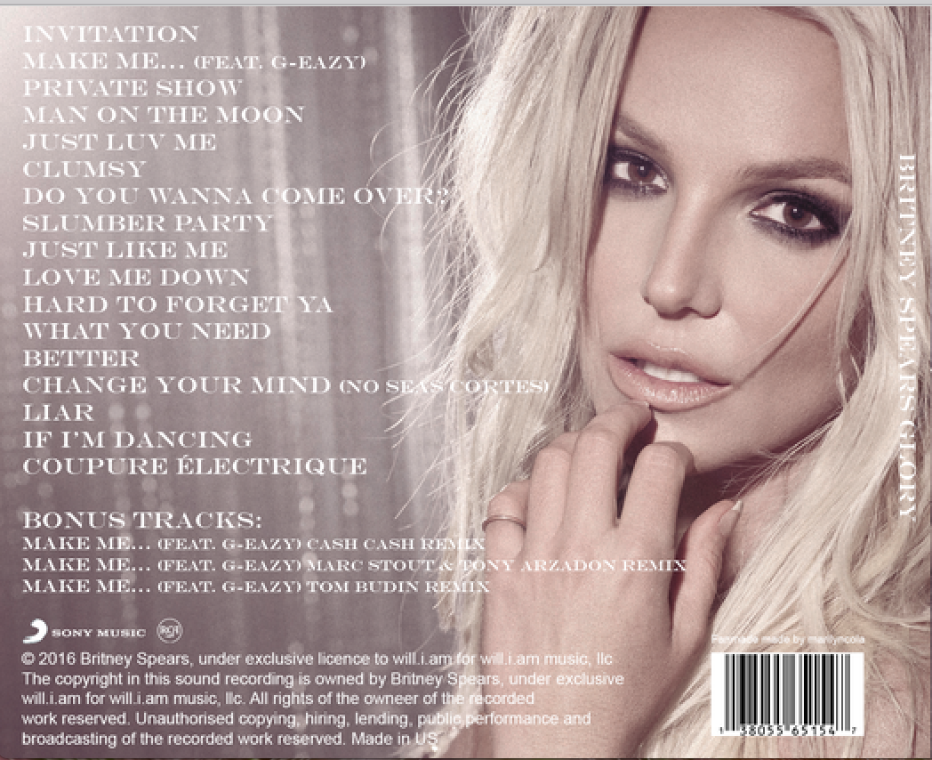
Britney Spears
3rd CD- BACK
The back cover is in shade of Nudes colors matching with Britney's hair color that is blonde. Her makeup is also syncing with her nature skin tone. Her eyes are smoking and not so much educative. She seams to be giving more of thoughtful look. Bar code is bottom right on top of it record label name is mentioned on bottom left too copy right have been given. The song name are written in white color. We found this back cover very inspirational because it is filed and color palette is very mature as we;; the back cover is not empty.
4th CD- BACK
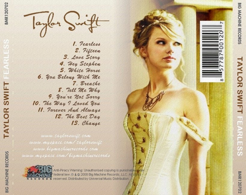
Taylor Swift
This back cover is from Taylor swift's album Fearless. It is very unique back cover. It seems to be divided into two shades of pinks and light yellow. Taylor's image is on the right side in a yellow glow. She is looking of towards her left. Her hair, color, dress color and skin tone are matching, yellow glow. She does not look seductive here but as if she is looking at distance and is in some thought and she looks innocent as well. Barcode is placed on top right side while record label company's name, BNR her name and album edges left and right. On left half shade of skin pink her name has been written in a maroons brown shade and Italic font, very girlish . it center the song names and numbers are written in same font.
Beneath the name website have been mentioned in white font but same Italic font. At the end of the back cover record label company's logo is placed along with the copyrights. It gives of feel of a Disney princess. This back cover inspired us because but as our artist is male we did not like the color palette and font style suitable for back corner o0f our album digipak because it would be too girlish but we like d the placing of all the features on back cover as they are in right place.
CD- INLAY
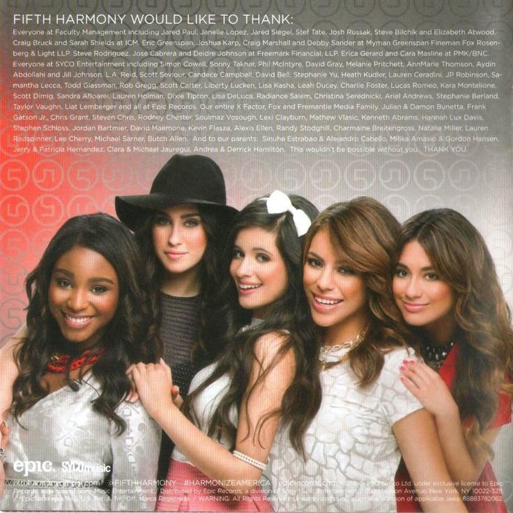
Fifth Harmony Better Together
Fifth Harmony Better Together. This inlay text is on the right side with the tank you not to the helpers, who made their album a success along with their image. The thank you note is in white color against a very colorful bright background reddish and grayish. The girls are dressed in glittery. They are wearing formal part wear dresses. They are looking at camera and looking happy too. At the bottom the record label company name is given and copy right have been placed. We liked this inlay because we liked the idea of giving medics to helpers as well the evilness of the inlay.
1st-Inlay
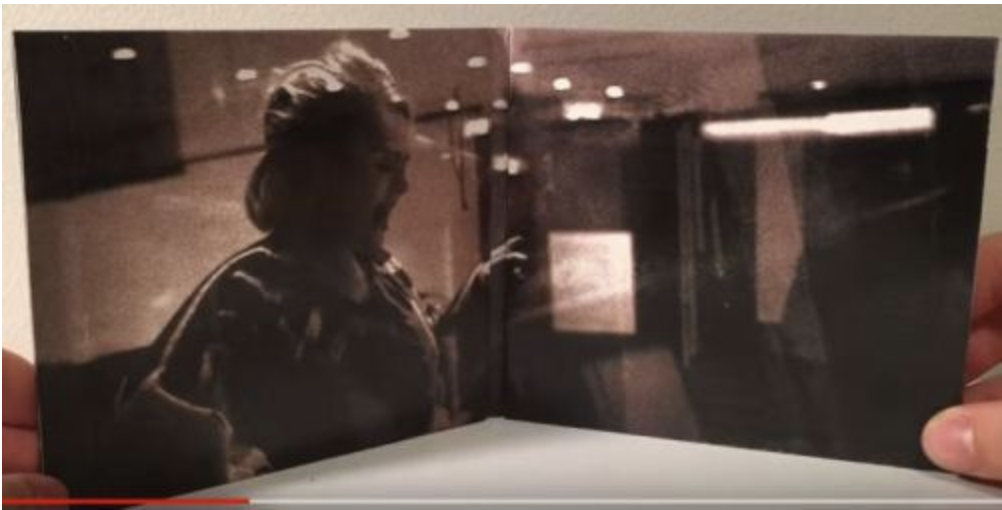
Reputation
Inlay contains an image of Adele singing in an acoustic session wearing a formal dress. Here again the lighting is low key. The inlay overall gives a gloomy feeling too like the whole digipak does. We have found this inlay because a newspaper image has been taken which is a very unique style of inlay.
2nd-Inlay
3rd -Inlay
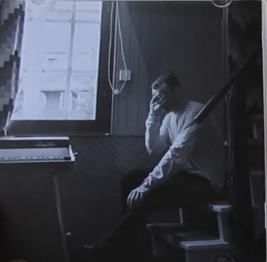
Sam Smith-Thill of it all
This is inlay of Sam Smith album Thrill of it all. The left page has a picture of Sam Smith sitting in his room on stairs. This is acoustic too. He is looking very gloom and a piano is placed in front of him. He is shading his eyes against little light coming from window. This gives a feeling that he has little light in his life which he is rejecting too. Our albums name is Yaadain meaning memories, we like this inlay because it is closer to nostalgic feels.
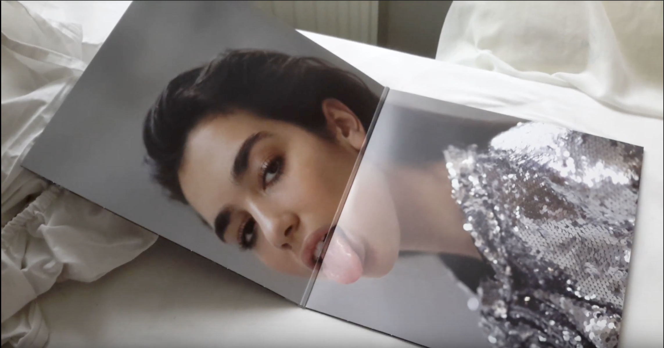
DUA LIPA
This inlay is form Dua Lipa's albuM. It is a simple picture of her against gray background wearing a glittery grayish shirt. Her hair are tied. She looks very ate like a little brat as she is packing out her tongue. She is also wearing little makeup. Although this is very girly, But we like the simplicity of inlay. Such as image of artist brings them close to audience.
4th-Inlay
CD

1ST-CD
ED SHREEN
This CD is in orange color matching with the digipack color. It has ED SHREEN name on it at bottom. Logo of the album is in large bold on top of album, to make it stand out. There are no credits on the CD. It is very simple as well.
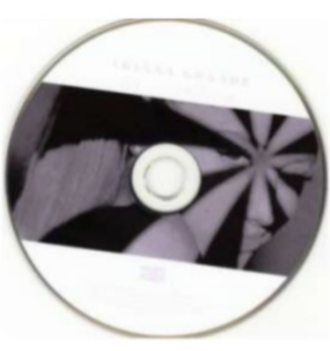
2nd CD
Ariana Grande
Name of the artist Ariana Grande is written in kurining font iconic to her brand identity. The use of black and white is also used on the font cover scene of house stile. Which also empresses simplicity of the digipack and creates a classic style which links in to her music style and songs on the album closeup on the CD uses direct address. which is interrupted by thr shadows across the artist's face. This again suggest mystery like her own personality.
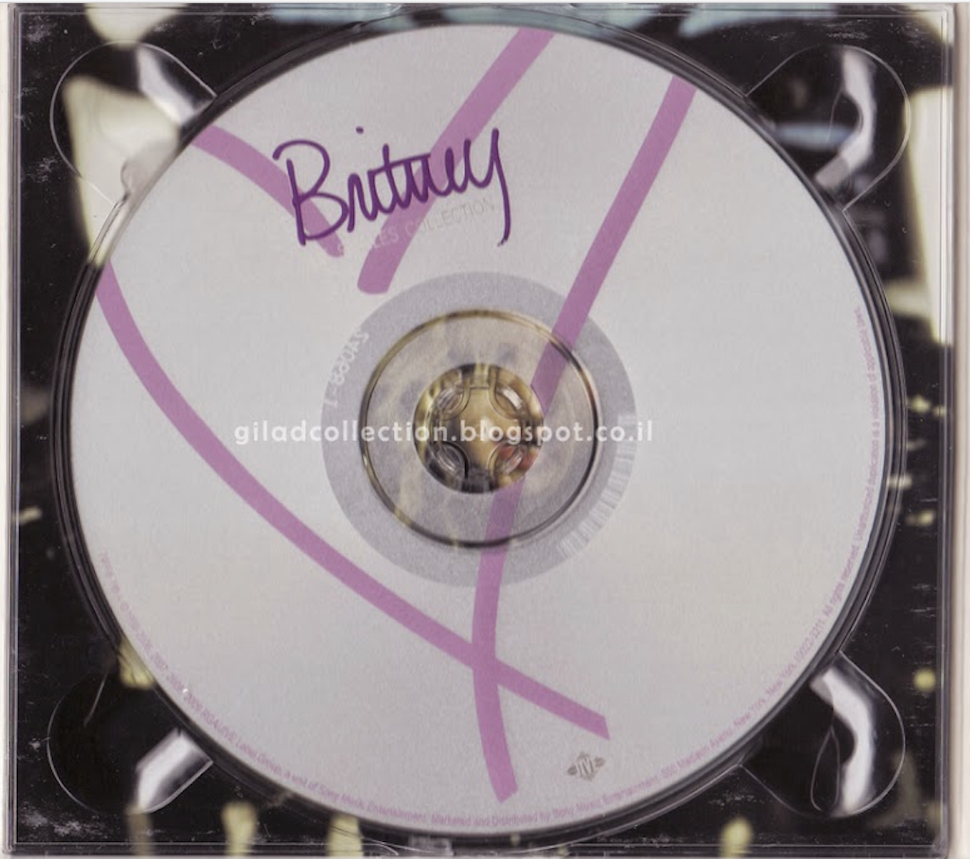
Britney Spear
This CD is white with the girlish ribbon like symbols made on it with the baby pink color. This represents that Britney is very girlish. This could also give off audience message that it is for female the CD record label company have gives credits. They are in in baby pink color too. Below left is a trademark sign of Britney.
3rd-CD
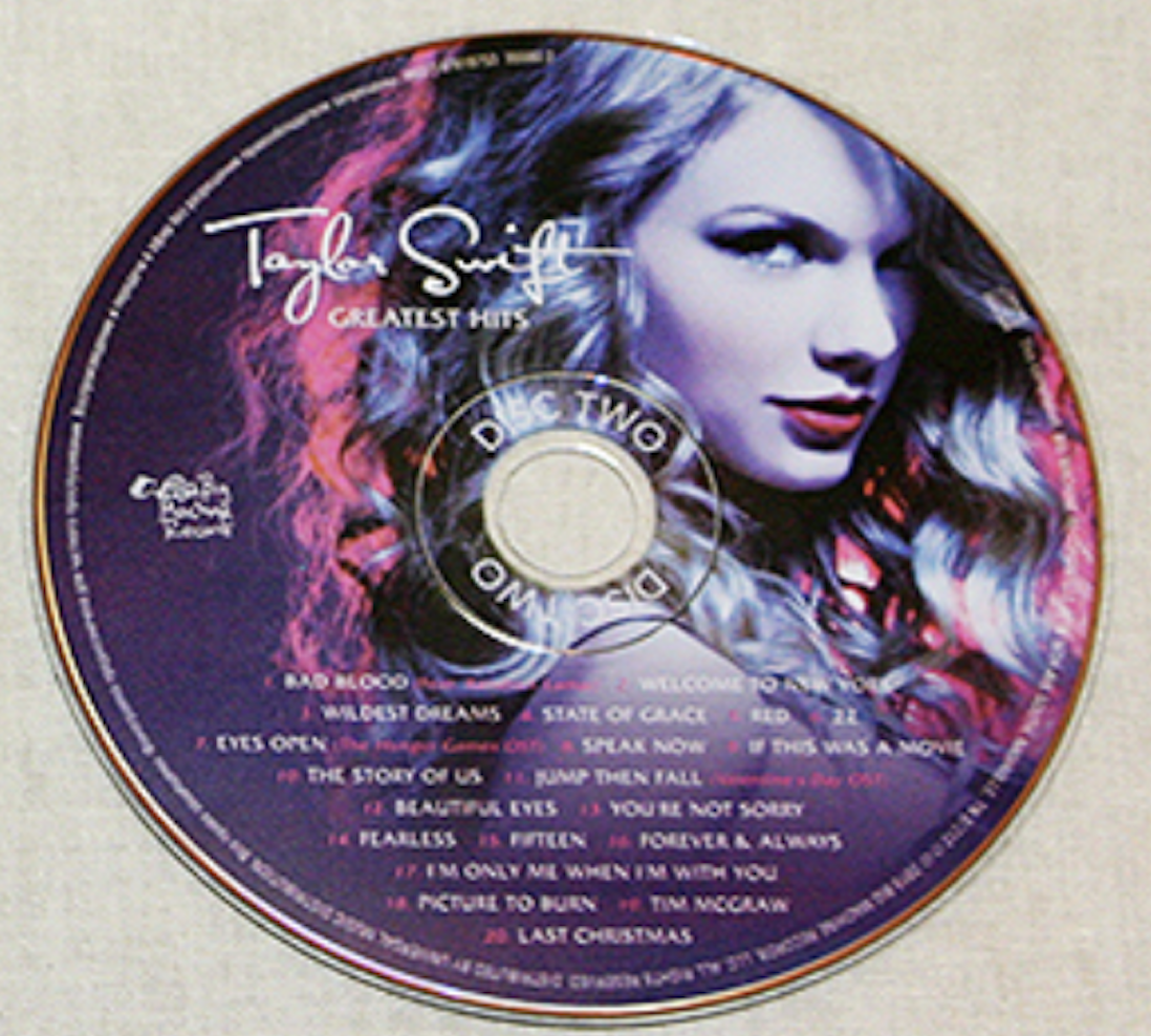
Taylor Swift
This CD by Taylor Swift complexly designed, this is what it's look like because her name is very brilliantly captured. The lighting reflecting on her hair is bright pink color on the left side while other Remaining of her hair are giving light publish color. This time she is not wearing her trade mark red lipstick but bright pink one. The CD is purple and pink color palette with all the font white in color except the numbers of the album name and fearuring credits in front. These are in shocking pink color. Around the record label credits have been mentioned in white font too. Tylor's name have been put in Italic font in white color. Tylor's name is very seductive she us boldly making contact with the camera and a mysterious bold look like always. The ciolor palette is in girlish colors. However the whole CD does give audience feel that it is for female due to her seductive looks.
4TH-CD
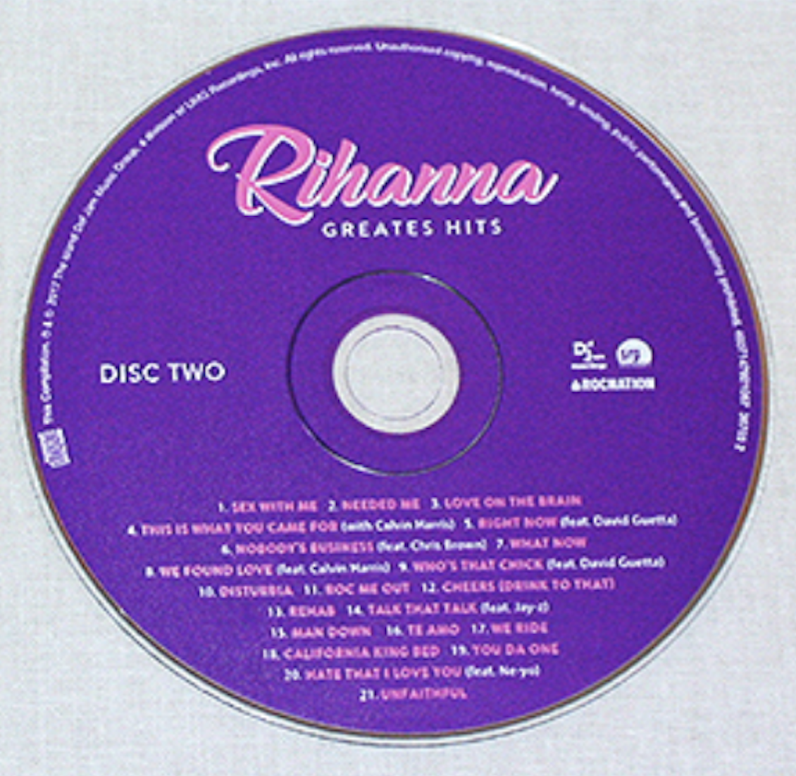
Rihanna
The CD of Rihanna is in purple color. Rihanna is written in baby pink color with Italic fonts and white outlines around her name. This is the biggest font on CD below her name ' Creates Hits' is written in capital font, in white color. On left middle disk number has been mentioned on left side, record label company symboles has been inited. Around the CD record label credits have been placed, they are also in white color. Below at the bottom half of the CD the song name have been typed in baby pink color with the numbers in white. They are not Italic, however the feeding credits in front of some songs names have been mentioned in withe again. Italic font the color palette again gives girlish feel and it many suggest to audience it is for female audience.
5TH-CD
deck
By aroojtas123


