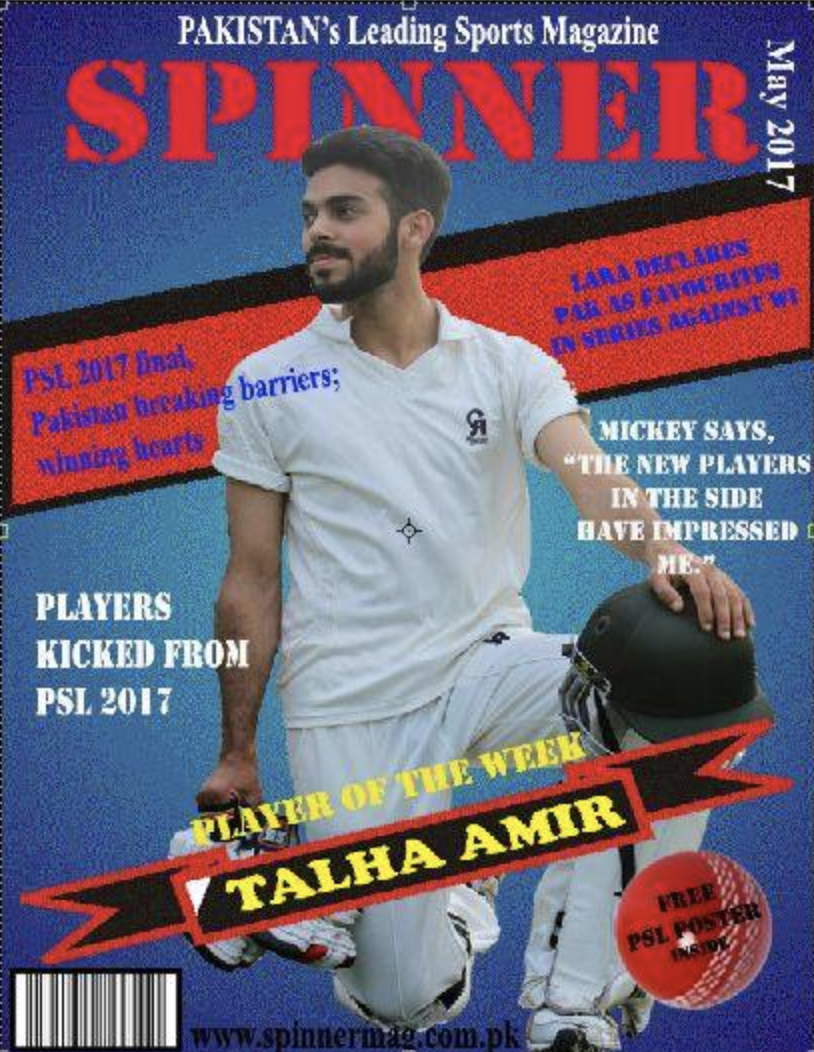
Final Magazine Cover
It was time to design my won magazine cover, So i chooses to create the layout of my cover through Adobe Photoshop as I have used it before as well. It was an interesting experience for me. I began with just one selected image for my cover page and the finalized name of my magazine But it all kept going ahead as I tried new things with it.
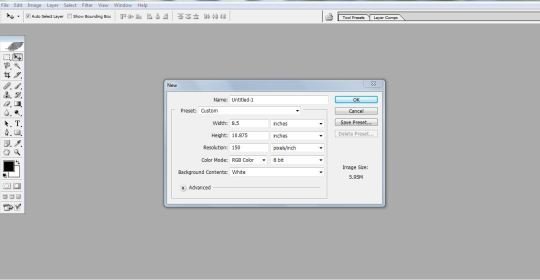
I opened a new file in Adobe Photoshop and used the costume setting for my new file; with page width and height your an A4 size and a resolution of 150ppi. The color mode was RGB at 8 bit.
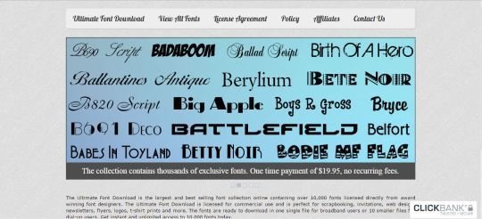
Prove to that I had downloaded some good font styles to be used in my cover page.
I had already installed these fonts in my PC so that I could use them for my text entire in my magazine cover.
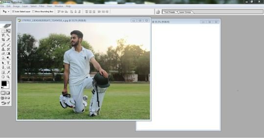
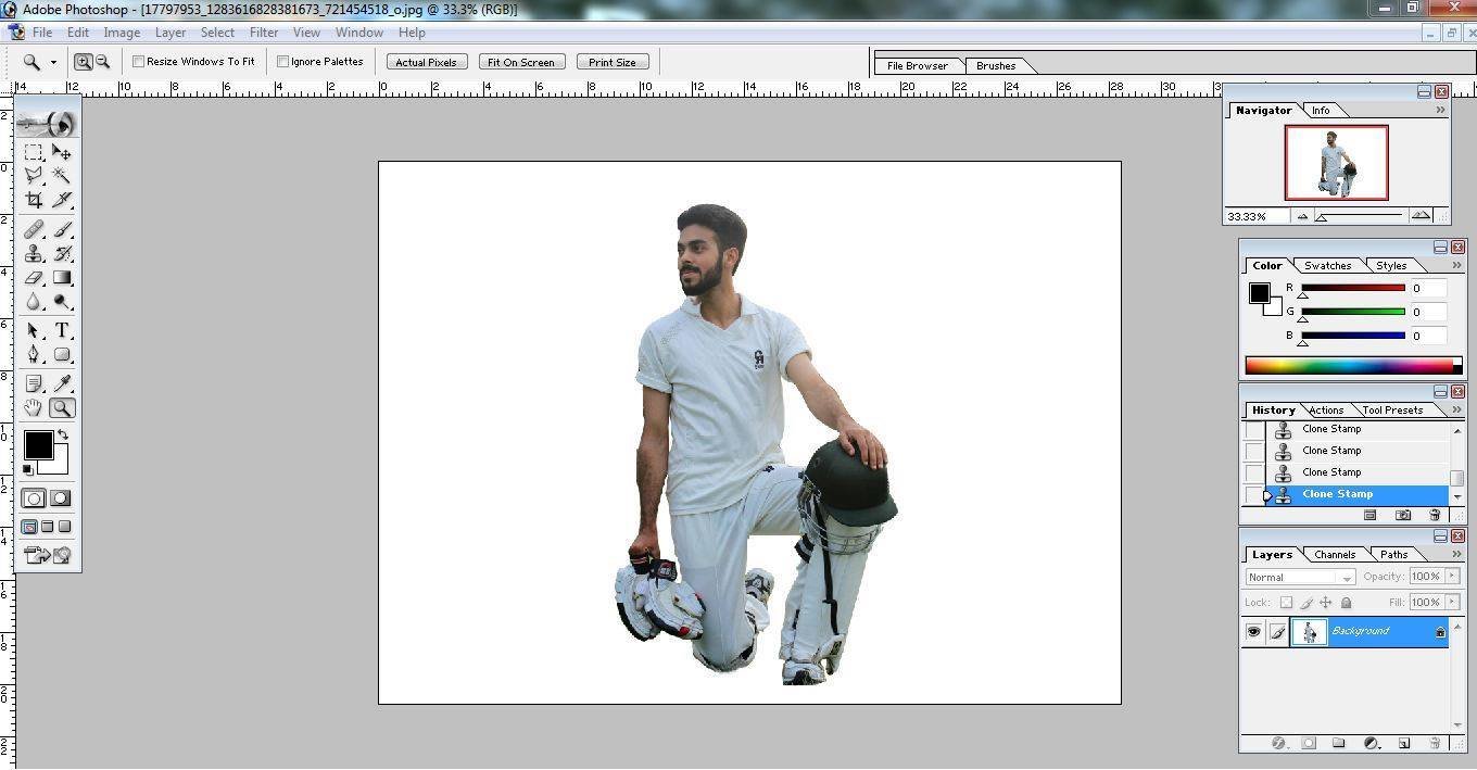
I had choose this picture for my main image in the cover page, but I needed to crop and resize it before I cover use it. So I opened it in the Adobe Photoshop tool to make with my cover page layout.
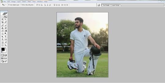
This is what my main cover image looked like after having it cropped and with adjusted brightness etc.
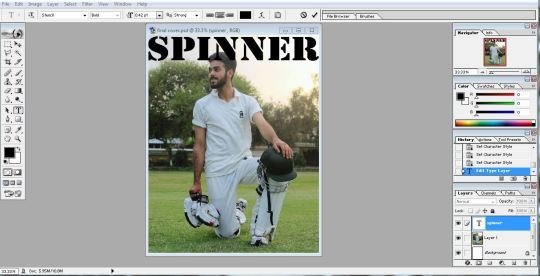
The first thing I did was to place the image on the cover page. Then I typed the mast head in black color and a bold caption font style.
I selected the image layout and placed it on top of the mast head so it overlapped the tittle text.
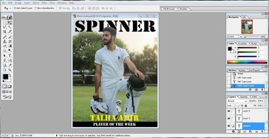
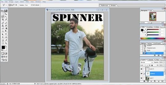
I placed a strip at the bottom of the page with the introduction statement. This some how did not appeal to me that ,much. So I soon changed it. The new look was a bit better then the previous one.
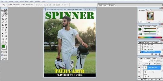
Then I changed the color of the mast head to green, giving it a more Pakistani look.
I got a bar code image from the google and placed it at the left bottom corner. I also added a puff to the top right corner just below the mast head.
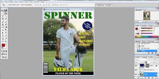
I added a tag line under neath the puff and gave it a bright yellow color to look prominent.
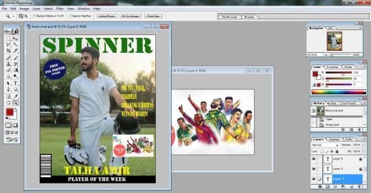
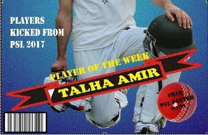
I added an image from the internet regarding the PSL and shifted the puff to the other side. I added a couple of more tag lines on the left side of the page and placed the date just below the mast head.
I made a puff more prominent by placing a different color out line around it. I also change the strip and gave it a more attractive look by using predefined shapes in adobe Photoshop. I also placed a cricket ball image an top of the mast head to make it look related to the sport of cricket. I added a couple of more images next to the tag lines. Now my cover page looked almost final.
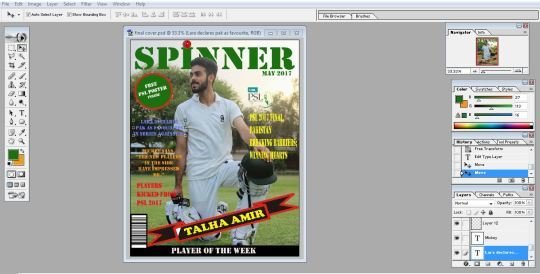

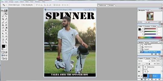
I finally remove the tag line images of Brain Lara and Mickey Arthur as they did not look nice on the cover and gave my cover page and a finished final look.
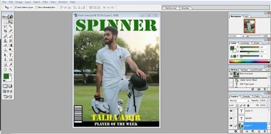
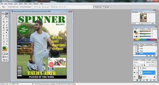
Although that I had finished the layout of the cover page but still it did not look attractive and somehow I did not like it.
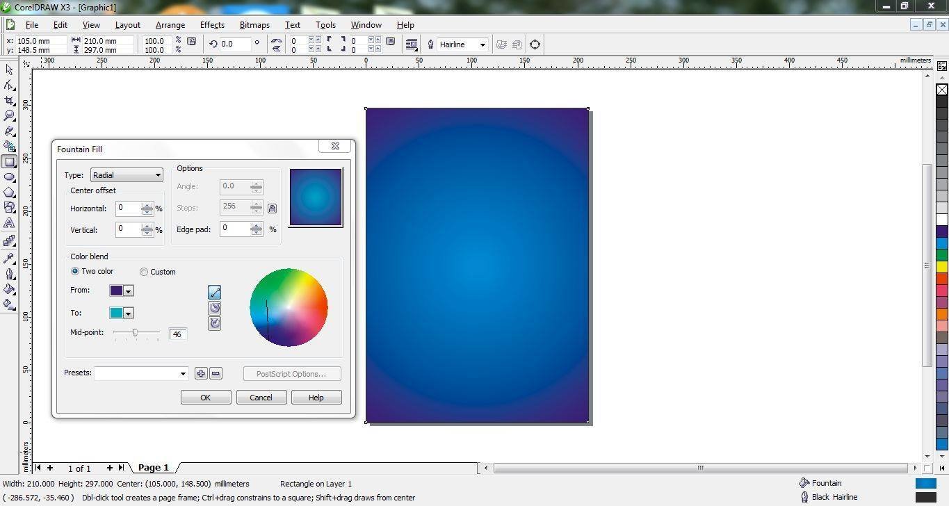
So I decided to re-design the layout with a different idea. This one had a scattered use of the color palette and it was hard to pick some text due to the background image. So I started to change it altogether.
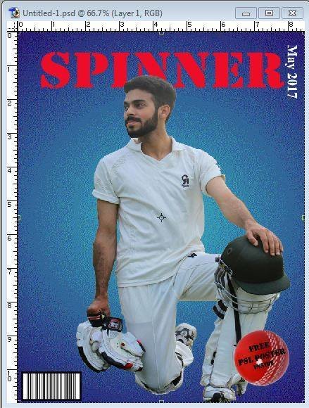
First of all, I selected the image of the model from the main image picture using the selection lasso tool. I mored my selection to a new page with a plain background.
After that I opened a new page with the dimensions required fro the cover page of the magazine and chose a color for the background. Using a color for the background. Using the Fountain fill dialogue box, I applied a radial fill type to give it a glowing look.
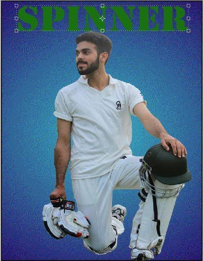
Then I placed the selected image of the model on to this new page. It looked more prominent on this new and plain background. I also sdded design on top of this page.
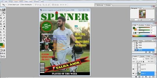
I placed the layer of the mast head behind the layer of the main image. I also changed the color of the next masthead to red, so that it was more obvious and eye catching.
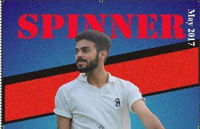
I placed the puff on the bottom right sooner. Changing the position of the puff gave me a lot more space on the page. where I can add more stuff
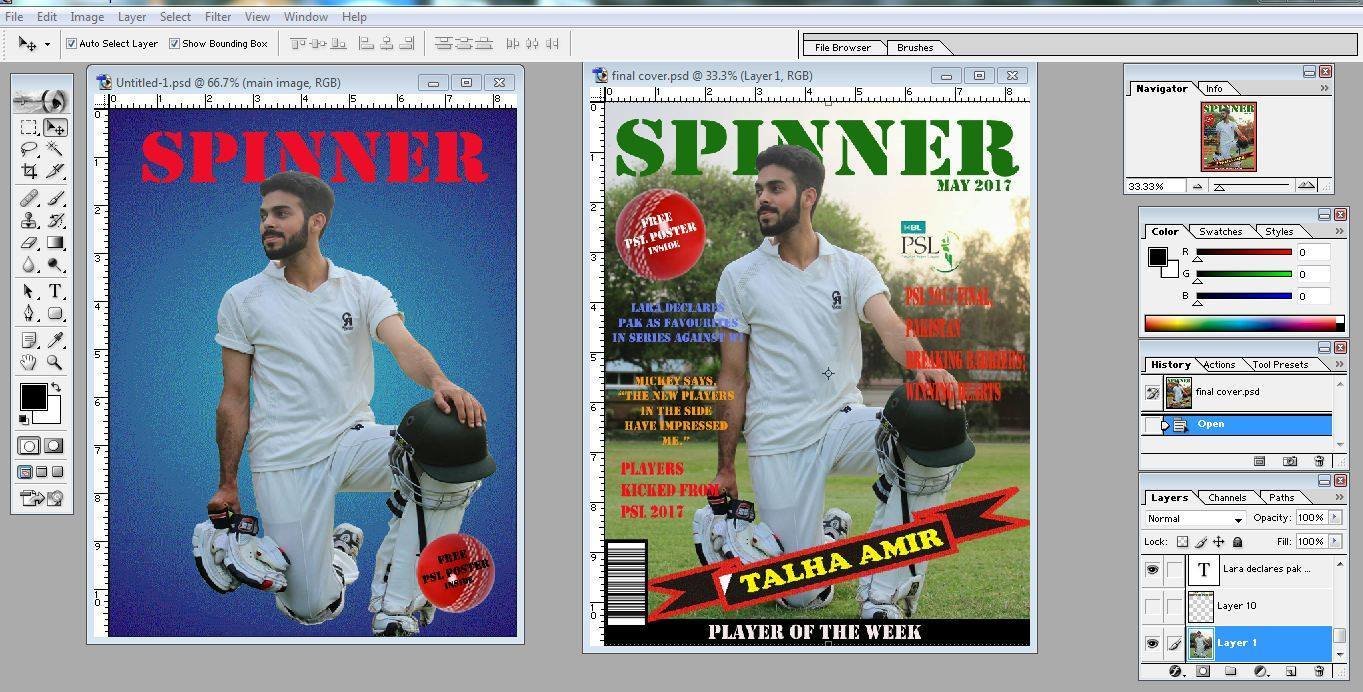
In the mean time I also compared the new design with the older one to see what Prominent changes I could bring in it.
Then I moved the barcode in the bottom left corner and gave it a horizontal orientation
And placed the date at the end of the behind head in 90 rotated vatical position I also used the shape tool to create a strip behind the main image.
Then I moved the top lines and other Things and arranged them in a different positions to make the cover page look different and proper.
I also change some fount style and font color and finally the cover page looked a lot more reasonable.
Now I thing this is something more reasonable which I really wanted to make.
deck
By aroojtas123


