Rejected Digipak
Made BY
Arooj Tassadaq
The first attempt
CD- COVER

First of all the picture I choose was my artist side pose while sitting. I tried different background colors but i ended up using this black color which also merges with my main image and looks more good. I kept it very simple and wrote the title Yaadein in white and outlined with the red color. On the bottom is Talha Aamir which addresses his name to the audience which shows that it is his own album cover. Where as on the right bottom end I added the barcode and in the end I outlined the CD cover with the red color
CD-INLAY

This inlay color them was red and black because I used these colors in the CD color so this them was supposed to be followed further. On the top is the T-Series logo with the saying past is never gone and the title Yaadein also BY Talha Aamir text are the same as I used in the CD cover. In this inlay I wrote a simple saying Which addresses the audience thought Artist prospective to believe in your self. The image I used was taken during the shoot of the video while He was playing the Guitar and I blurred it a little bit to add the signatures of the artist.
CD-BACK

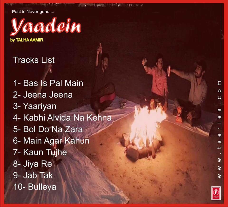
This digipack Back Cover is very appealing because of the pictures I used which shows happiness and friends meetup, charing in the air while holding drinks in their hand. the flame of the bonfire lit the picture more. The only major things I added in it are the track list of the album and the website link of the top of T-Series i-cone
Conclusion why is it rejected
The after It was done very nicely but due to some facts I rejected it. Firstly did not gone with the theme of our music video and the darker color ton because black is mysteriously color associated with fear and the unknown. It usually has a negative connection combined with the re gives a very aggressive color scheme and I had non other operation then using these colors just because of the pictures I used.
Second Attempt
CD-COVER
The new digipack was design using the images from the new photoshoot of the artist. I also change the color theme of the design to orange. The CD cover showed the image of the protagonist sitting in a beanbag and holding his guitar, with his right hand folded behind his head. It looked stylish and impressive.

CD
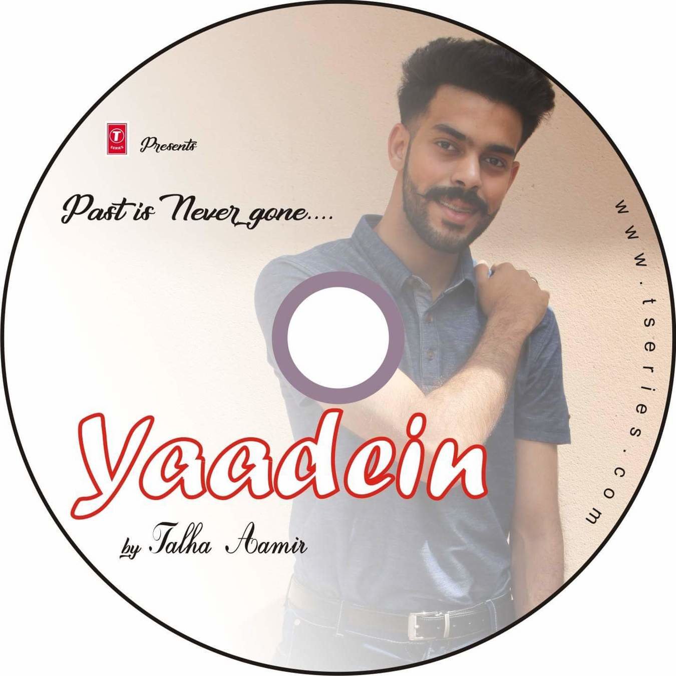
The CD also had a new image of the artist. He was in a standing posture holding his left shoulder with the right hand, as he smiled. The CD looked quite simple and much like the cover, it also did not have much printed on it expect, the name and tag line of the album, the name of the artist, the web-address and logo of the recording company.

CD-INLAY
For the CD-INLAY, I used the same image that I had used in my previous design. Infect it was just like the previous one with only change in theme color and some of The font.

CD-BACK
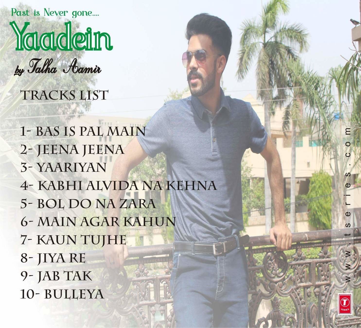
The CD-BACK also had the same kind of design as the previous one, except that This time. I used a new image of the artist, standing against a fence in a balcony. Also the color theme was change to orange. The tracks-hits remained unchanged.

CD-SPINE
The SPINE also had the same color theme as the rest of the components and it displayed the album title, artist's name the tag line and the recording company's logo.

Conclusion why is it rejected
Although that it was a nice looking digipack but some how I was not satisfied by it as I thought the color scheme was not in accordance with the theme of the album and it's tracks, so I rejected it and decided to make some further changes.
Third Attempt
CD-COVER

It is the same as the previous CD-Cover with some changes in it the the font style of the tag line and the tittle is change and the colors as well. On the major point it looks different is due to the orange color layer I used behind my main image. I removed it now and left it with the the natural colors of the picture
CD

For the CD it is the same as the previous one. with only the font style and the color change in it like I did in the
CD-COVER
CD-INLAY
For this digipack I though of change the whole inlay so for that I first of all I used a new image. which have a black background.He's standing a bit tilted, facing towards facing downward with left hand a bit high. At the back of it i used a yellow color layer. I bluer the image from the left down side with and kept the quote same as before. Copied the font style and the tagline as above used in this same digipack

BACK cover
There was not much changes in this Back Cover. The only thing I changed was the removing of the back orange layer which I inserted in the previous back cover. Also the tagline and the title color's font style was change like in the CD cover I did.

CD-SPINE

The SPINE also had the same color theme as the rest of the components and it displayed the album title, artist's name the tag line and the recording company's logo. I gave it a yellow background color because my this digipack had the yellow as the theme color.
Conclusion why is it rejected
Although this digipack was not that bad after all the I changed the pictures and the colors from orange to yellow and the change of the font style. Still my team members and I did not satisfied with even this and that is why I rejected this as well. Although, I Spend a lot of time in the making of these digipack but we want the best.
deck
By aroojtas123
deck
- 167


