Album Release Posters
rihanna
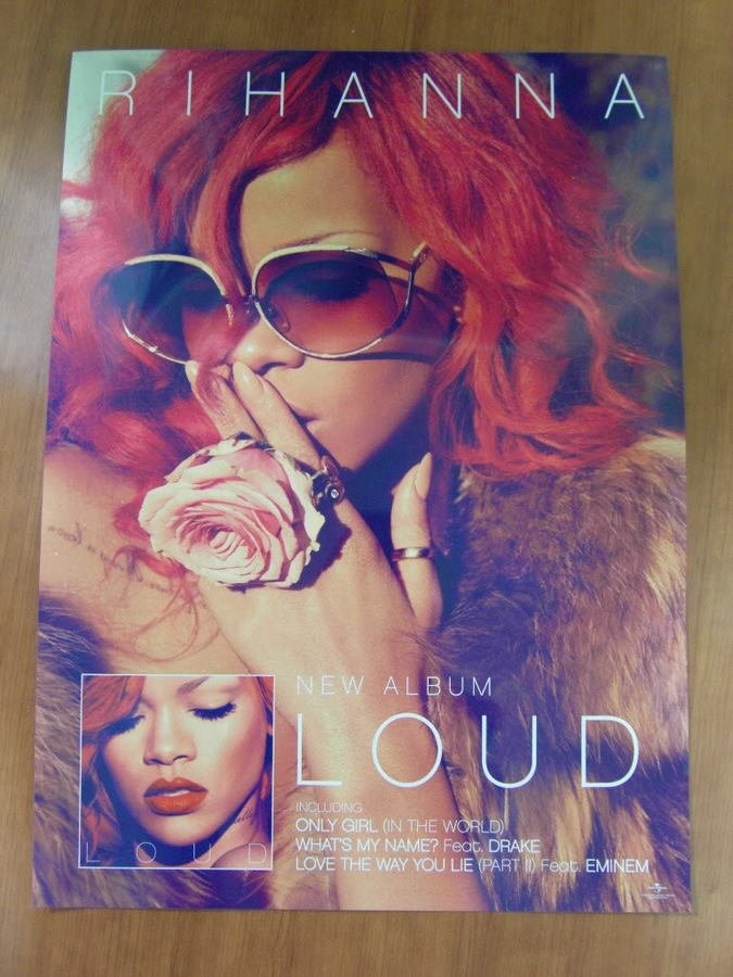
At the time of this release, Rihanna had created her signature style - vibrant red hair with matching rouged lips. The images on the poster follow this style, making the album instantly recognisable to be that of the artist. The bright colour palette has two purposes: to conform to the conventions of the pop genre whilst being eye catching.
As this is a promotional poster, the album art and title is displayed. It also lists some of the songs that the album includes. This encourages people to buy the album as the song "Only Girl In The World", for example, was one single that was incredibly successful. The other songs listed are collaborations with other well known artists (Drake and Eminem) and so will interest a wider audience.
Ariana grande
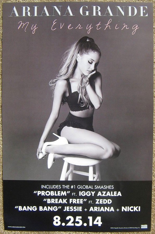
This poster follows a monochromatic palette, excluding the album title which is a pale pink colour. Pink is a stereotypically feminine colour and ties in with Ariana Grande's celebrity persona.
Similar to Rihanna's album, it also lists popular songs that are on the album. All of which are also collaborations with global celebrities and would thus also engage the fan bases of those artists.
Another important convention of this promotional poster is the release date. The font is emboldened, catching people's attention and creating excitement for the release.
arctic monkeys
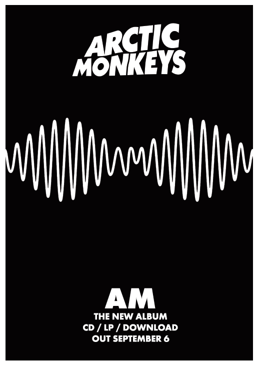
This poster is unusual in the way that it does not include a photo of the artist. It is, however, the album art and creates brand recognition.
The poster is very simplistic and, unlike the other albums, does not list the songs included. The focal point of the poster is the album name - not the release date that is seen on many.
It also includes the platforms the album is available to listen on and thus reaches out to a wider audience.
deck
By bailey-welch