


John C. Osborn
Data Journalist/Front-end Developer/Game Designer
Getting your hands dirty
@bayreporta
Tell one story.
Think less, understand more.
Respect the chart.
Know your audience.
What is the most important information you're trying to convey?
Text
Text
Text
Text
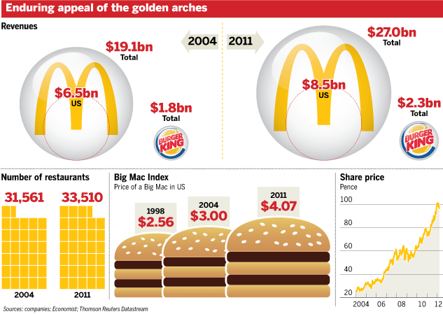
Source: New York Times
Text
Text
Text
Text
Source: Globe and Mail
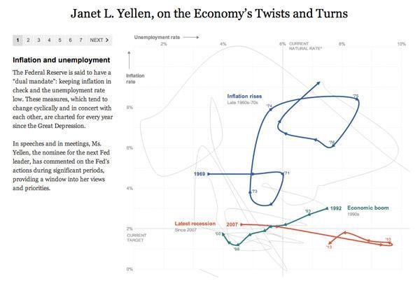
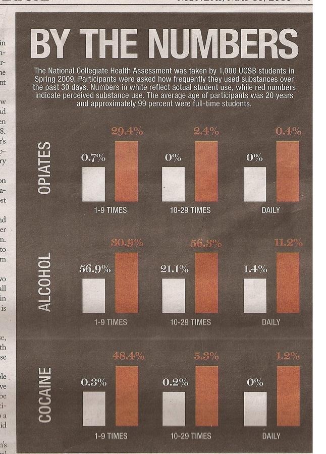
Text
Text
Text
Text
Source: KQED
Consider data literacy.
Accuracy.
Avoid gimmick.
WTF?
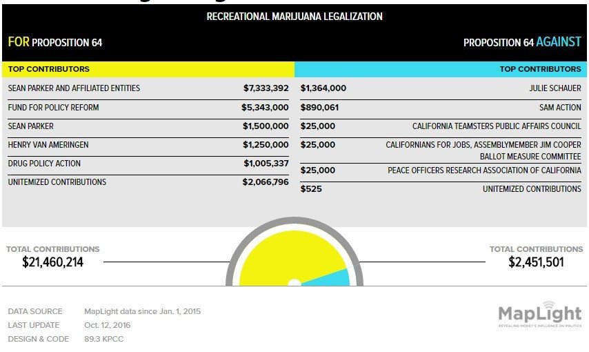
Source: UK Guardian
Source: Fox News
Source: Financial Times
Source: Canadian Broadcast Corporation
General or niche?
Desktop vs. mobile?
Data literacy, again.
Label sparingly.
A Minimalist's Guide
Mute gridlines and axis lines.
Think critically about color and shading.
Don't misrepresent the data.
Let the data determine the best chart.
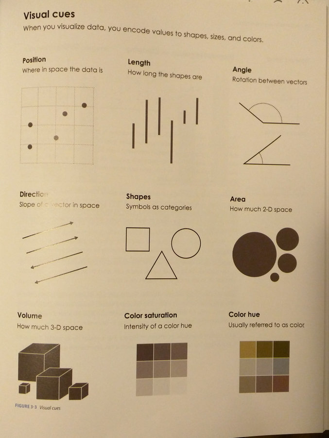
Ways to visualize data
Table
Line Chart
Area Chart
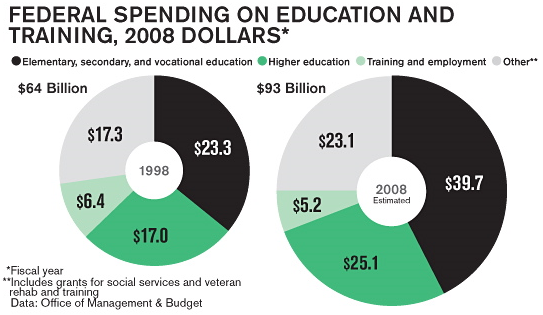
Pie Chart
Bar Chart
Stacked Bar Chart
Scatter Plot Chart
Bubble Chart
Text
Display large amounts of data.
Allows for exploration of data.
Search functions can assist with queries.
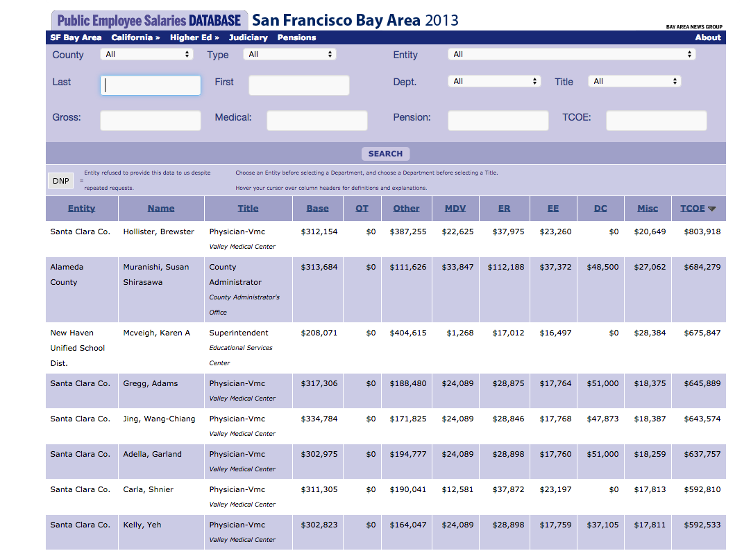
Not Pretty, But Useful
Text
Tips and Considerations
Shade columns for emphasis.
Search functions to filter data.
Strategic gridlines.
Logical sorting.
Align text left, align numbers right.
Great Search, Random Emphasis
Source: Bay Area News Group
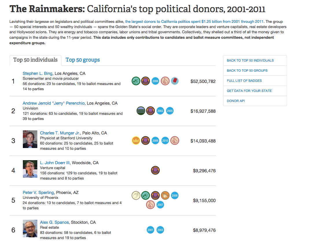
A Different Take
Source: Center for Investigative Reporting
Simple Tools
Google Charts
DataWrapper
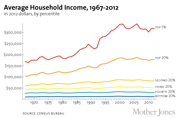
Don't Trend on Me
Change over time, especially small changes.
Works well with one or more variables.
Relationship between time and data.
Tips and Considerations
Be aware of the baseline.
Use color and shading strategically.
Label lines directly.
Clear axis ticks.
Clean, Strategic Color Use
Source: Mother Jones
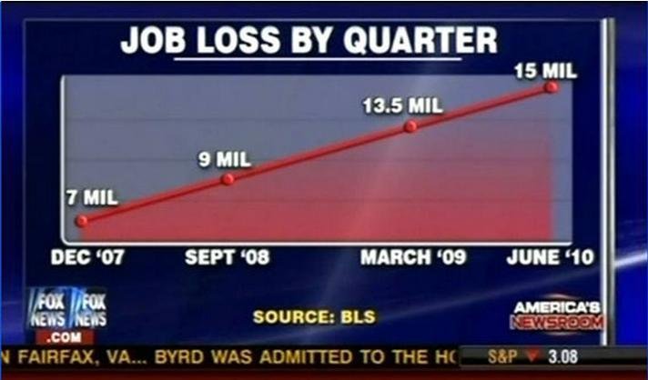
Baseline and Axis Distortion
Source: Fox News
Simple Tools
Google Charts
DataWrapper
DataVisual
Line Chart Plus
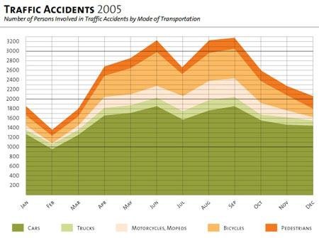
Comparing parts of a whole over time.
Where lines show rate, fill shows substance.
Shows cumulation.
Tips and Considerations
Avoid visual overlap.
Best at showing vast differences.
When showing cumulation, clarity is required.
Cumulation or Proportion?
Source: christina29 info blog
Simple Tools
Google Charts
DataVisual
Not Just For Eating
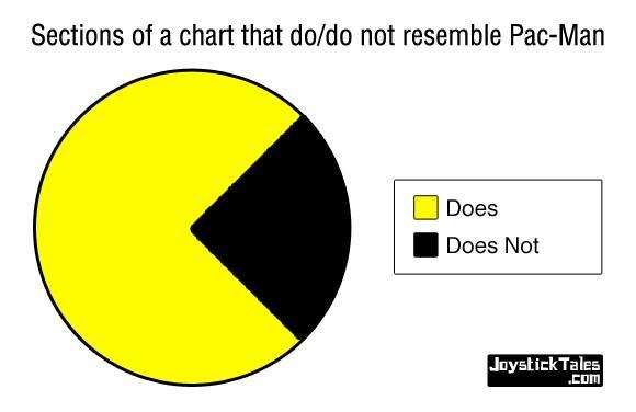
Comparing parts of the whole.
Best when data is categorical.
Even better when showing distinct differences.
Tips and Considerations
Avoid 3D and donut variants.
Restrict variables to a few.
Never compare different pie charts.
Largest segment top right, then work counter-clockwise.
Clear Difference Between Variables
Source: Joystick Tales
NEVER DO THIS!!!!
Source: THINK Magazine
Great for Eating, Bad for Visualization
Source: Business Week
Simple Tools
Google Charts
DataWrapper
DataVisual
Rectangles Are Cool
Good for showing large changes over time.
Easy to compare differences.
Best at ranking data.
Histogram variant for distribution.
Tips and Considerations
Watch those baselines!
If ranking, sort by largest to smallest.
Avoid narrow bars and mind the gap.
Avoid 3D.
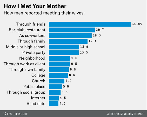
Ranked Bars
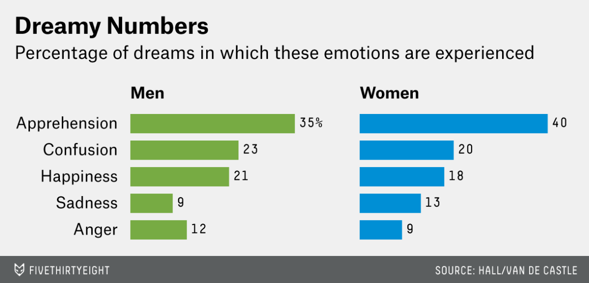
Source: 538
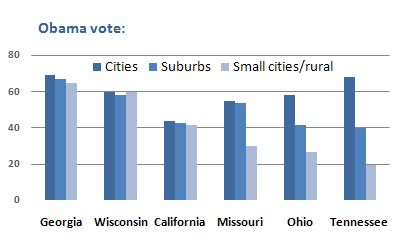
Comparing Different Variables
Source: New York Times
What's Going On Here?
Source: Perceptual Edge
Simple Tools
Google Charts
DataVisual (Column only)
DataWrapper
Stacked Rectangles Are Cooler
Easily compare across bars.
Comparing parts of a whole.
Percentage or Proportion.
Tips and Considerations
Largest value first.
Horizontal bars best for comparison.
If showing percentage, data adds up to 100 percent.
Limit the number of variables for each bar.
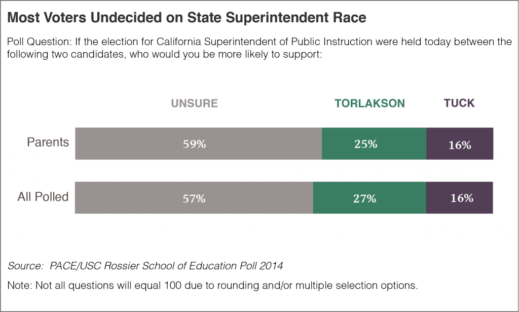
Focus on Largest Chunk
Source: Edsource
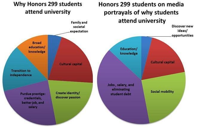
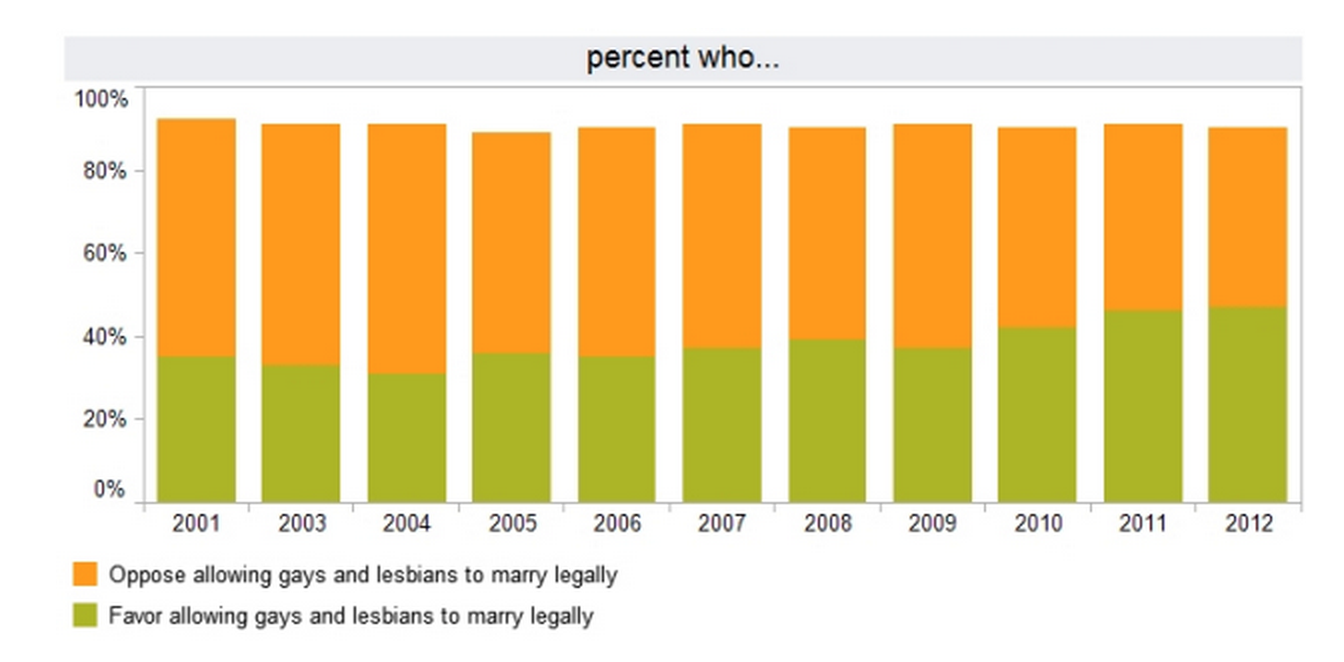
Equals 100 percent?
Source: Flowing Data
Simple Tools
Google Charts
DataVisual (Column only)
DataWrapper
Correlation!
Shows distribution of data.
Add trendline to test distance from average.
Great for exploring relationship between two datasets.
Tips and Considerations
Strategically label when data points are numerous.
Keep an eye out for outliers and clusters.
Correlation != Causation.
Thoughts?
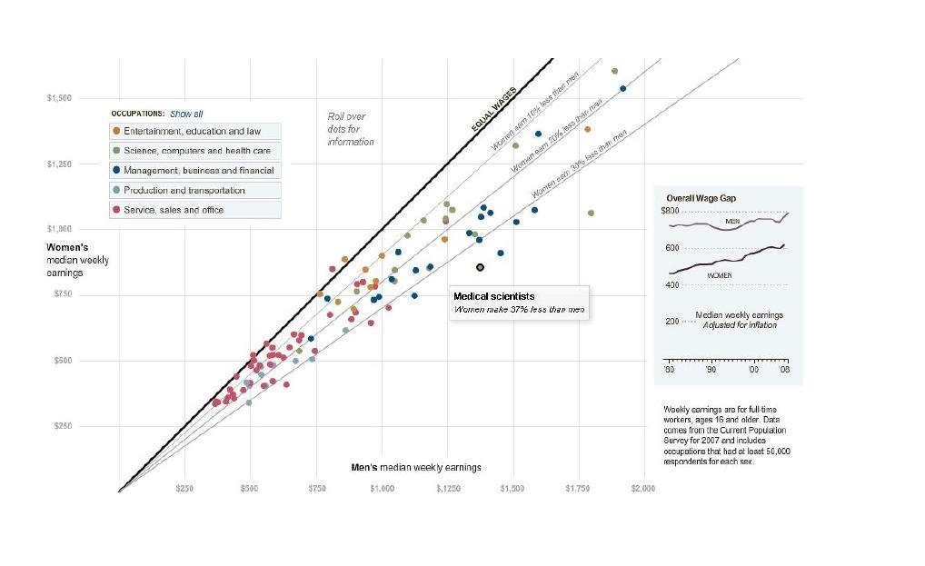
Source: New York Times
Using the Trendline
Source: New York Times
Simple Tools
Google Charts
DataVisual
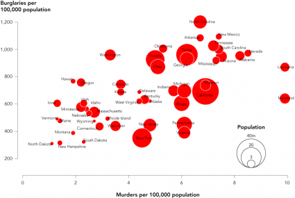
When Two Dimensions Don't Cut It
Can show up to four dimensions of data.
Uses an X-Axis, Y-Axis, Size, and Color.
Works with categorical and quantitative data.
Tips and Considerations
Think critically about what dimensions will tell the story.
Population as size may distort other points.
Only use the dimensions you need.
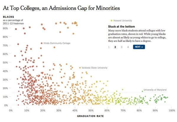
Good Use of Population as Size
Source: Flowing Data
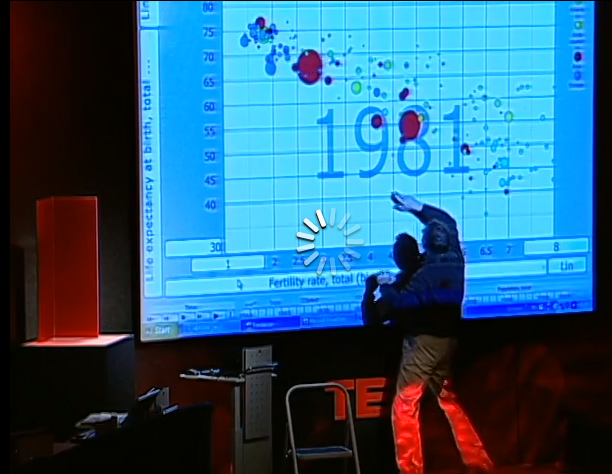
The Most Insane Thing Ever
Source: TED
Simple Tools
Google Charts
Simplify.
Let the data tell the story.
Tell one story in a chart, even if there are many.
Get inspiration.
By John C. Osborn
This deck contains information presented at the September 2014 "Introduction to Data Visualization" workshop hosted by KDMC Berkeley.