Data Visualization
Brittany Fong | @bfongdata
bfongdata.com


Tableau Ambassador
DC User Group
Why data viz?
Data Viz Tools

PowerBI

A History of Data Visualization
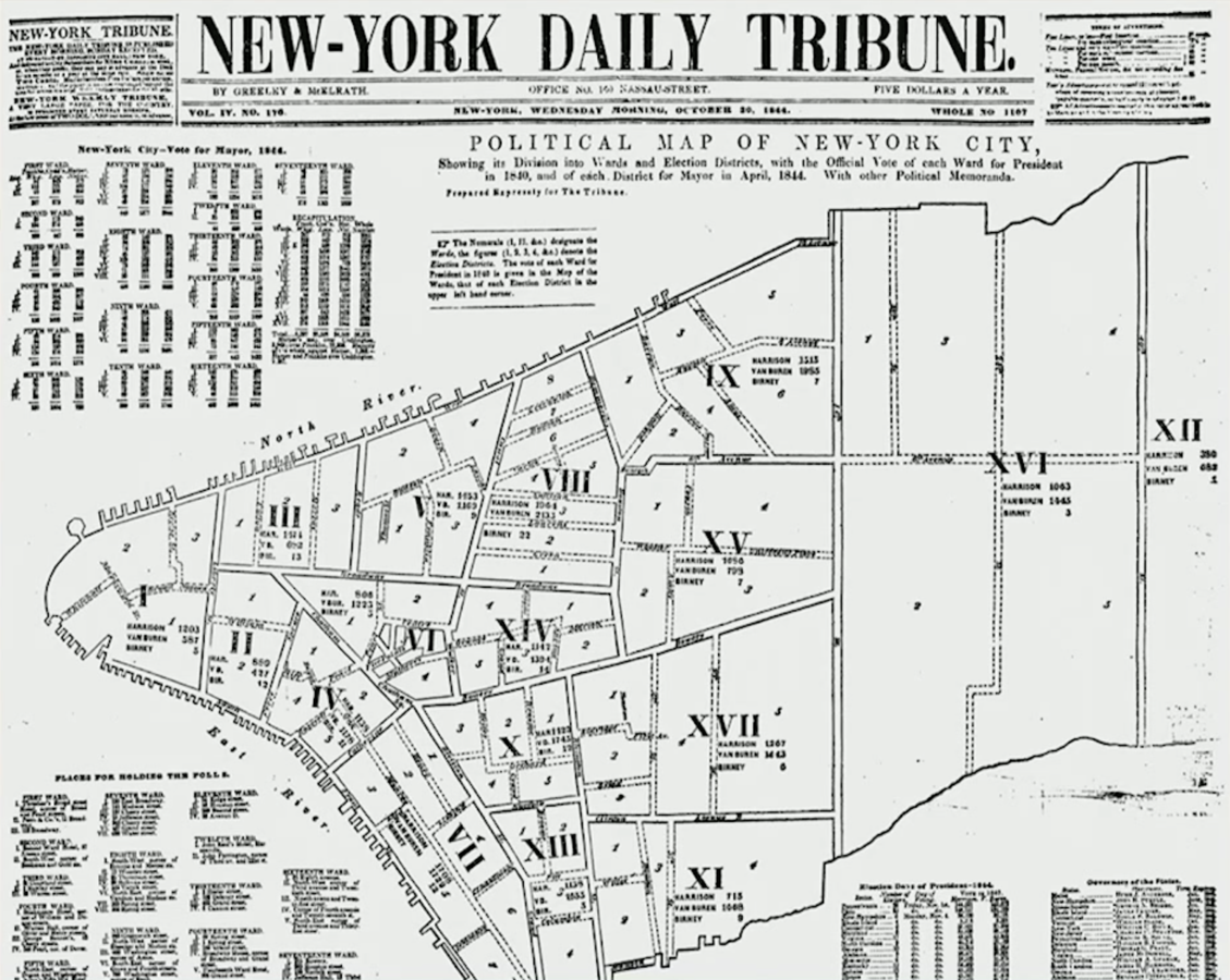
1844 The New York Daily Tribune
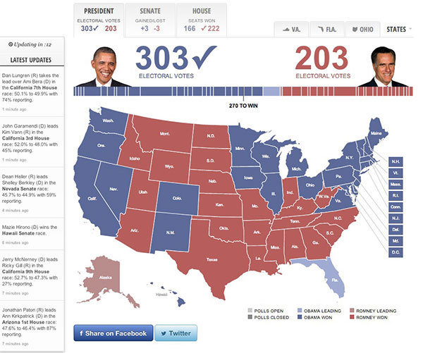
1968 New York Times
2012 Five Thirty Eight
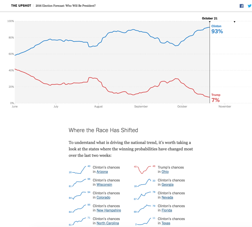
2016 The Upshot
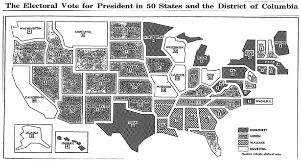
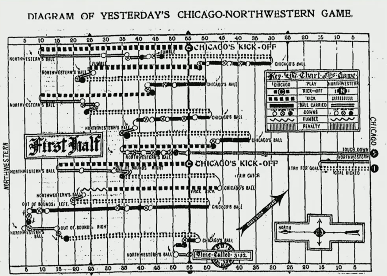
1900 Chicago Tribune
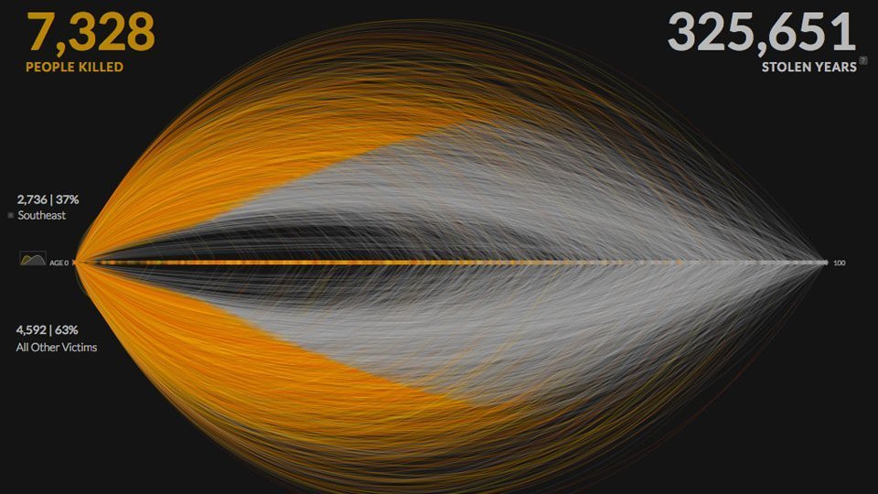
2013 Periscopic
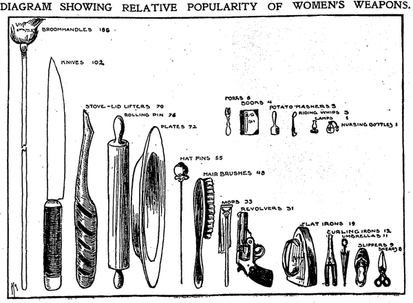
1901 The Chicago Tribune
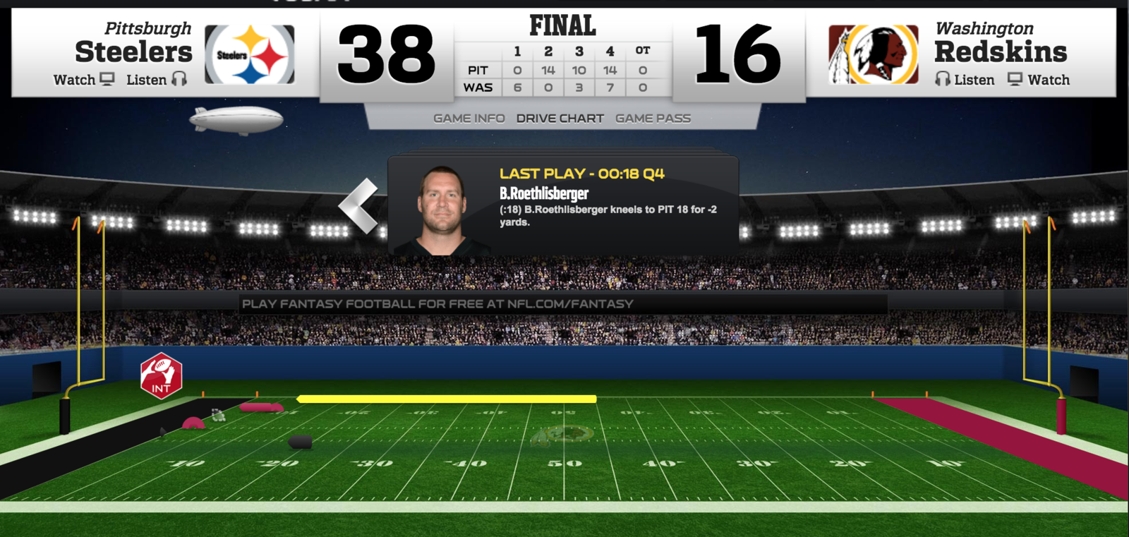
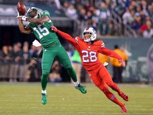
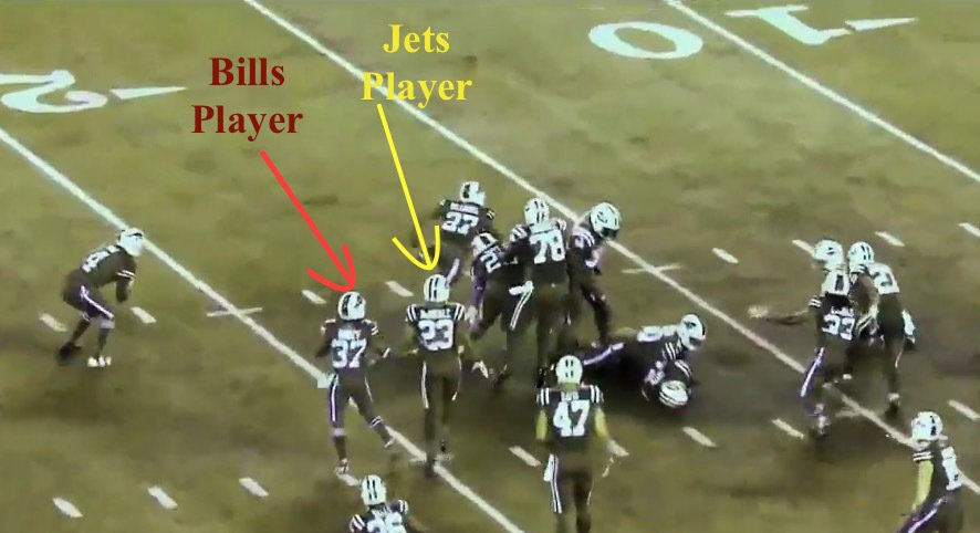
2016 NFL Game Center
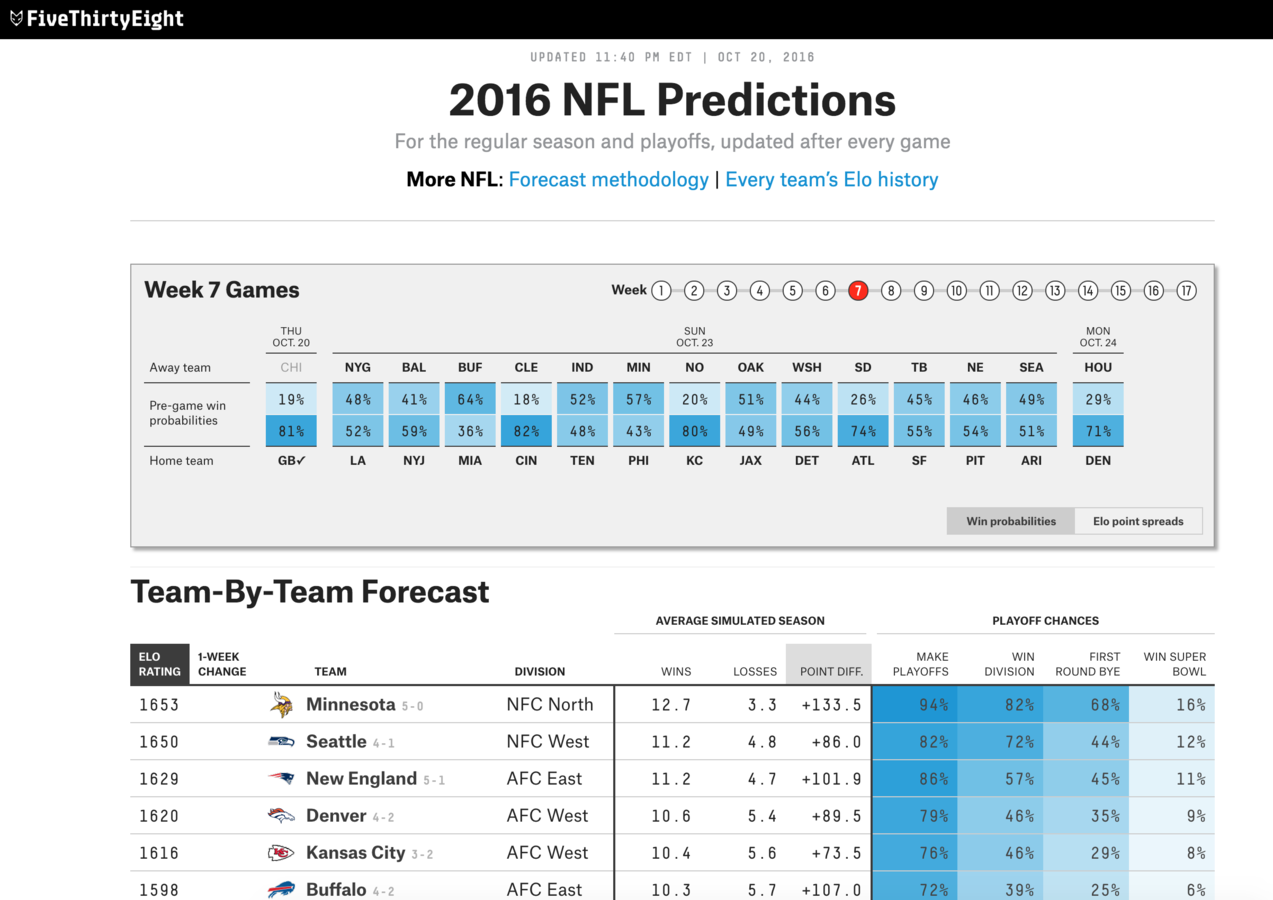
2016 Five Thirty Eight
Question
Data
Audience
Creation
Building a data viz
Start with a question

What is the purpose/goal of the visualization?
What questions are the visualizations going to answer?
How should people feel?
What data do you have?
Is there a unique identifier?
What level of detail is the data at?
Do you need to bring in additional data/tables?
What is the quality of the data?
Cater to your audience


What level of detail do they want to see?
How complex can the visualizations be?
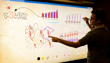
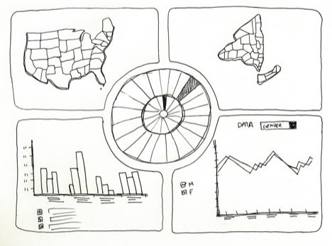
Create a sketch
Pull out a pencil and paper to get the ideas flowing
How will the visualization be viewed? (mobile, print, web)
Common Data Visualization Graphs
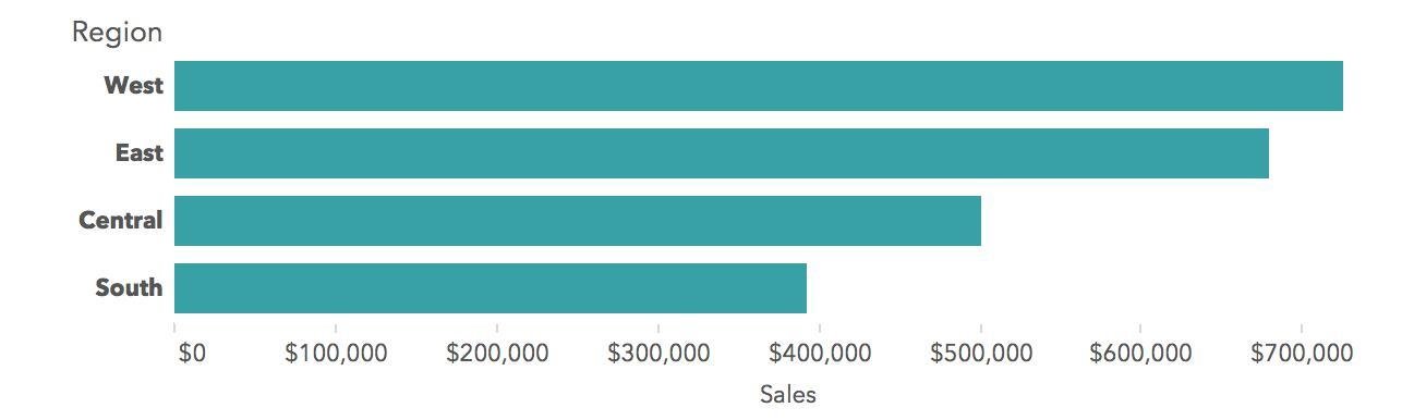
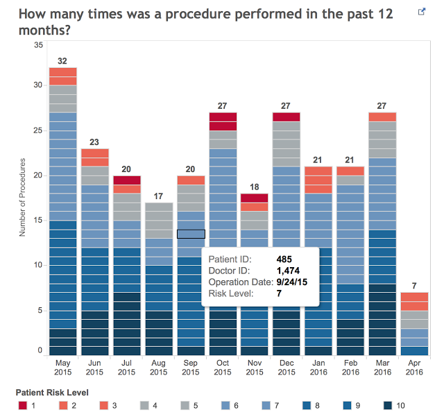
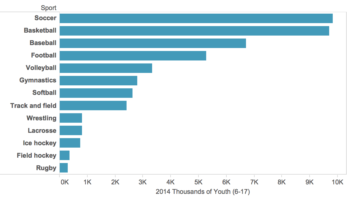
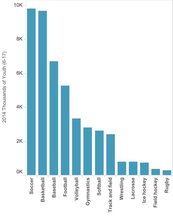
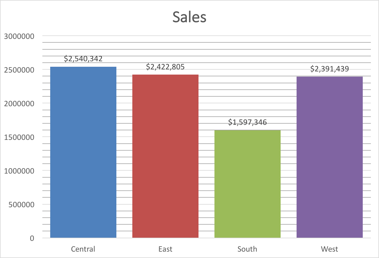
Bar Chart
Used for: Comparing categories
Other variations: stacked bar, nested bar, paired bar, multiple bars
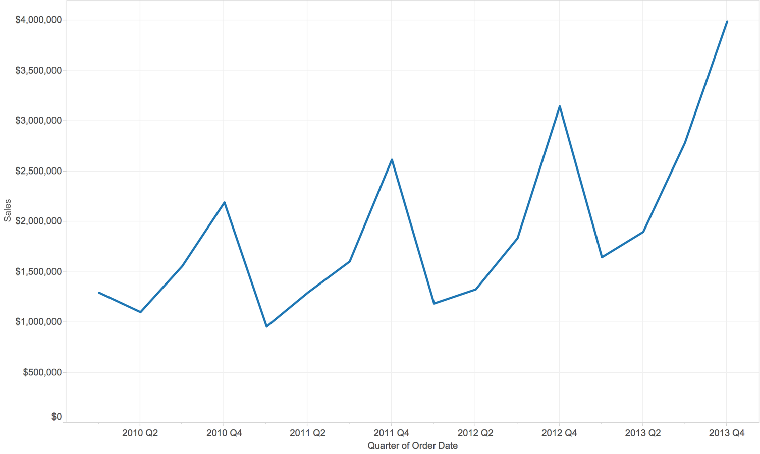
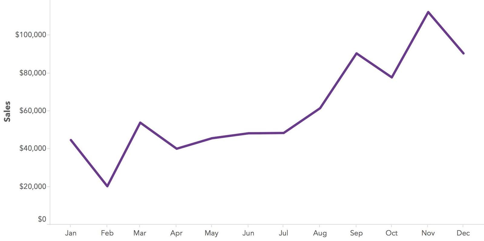
Line Graph
Used for: Viewing trends over time
Other variations: year over year trends, add trend line
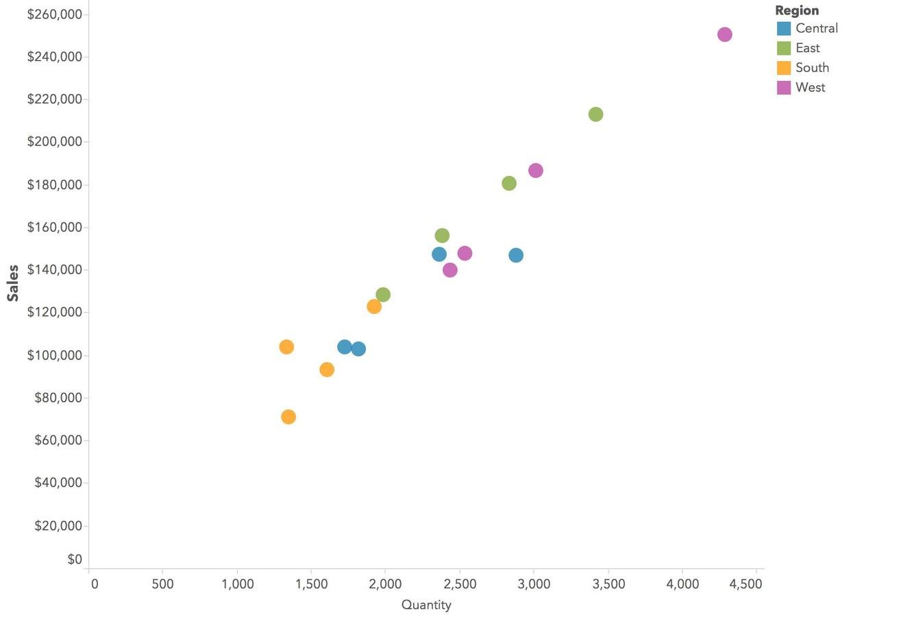
Scatterplot
Use for: Comparing two measures to see how they relate to each other
Other variations: add trend line, create quadrants
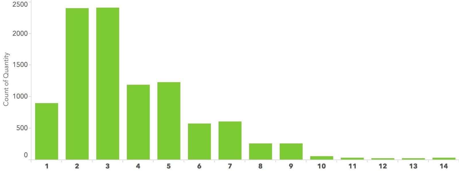
Histogram
Use for: Viewing the distribution of values
Ex: Most common number of units sold per order (3 and 2)
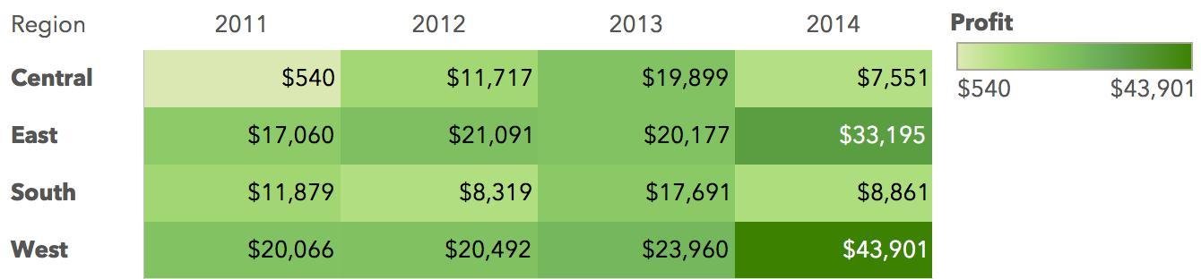
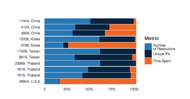
Heat Map
Used for: Comparing values by a set color palette
Other Variations: maps
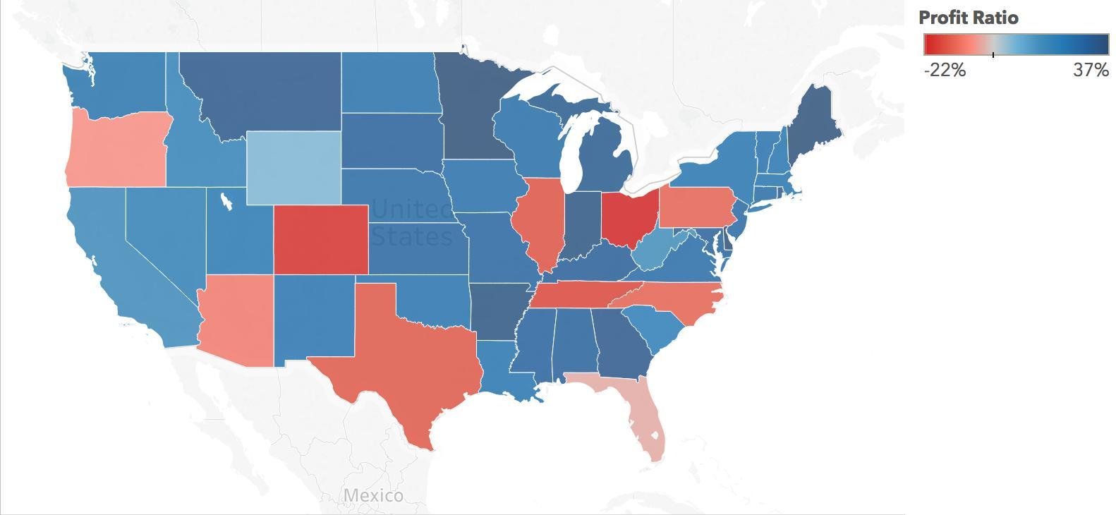
Cartogram
Used for: Geographically mapping a value by color
Less common Data Visualization Graphs
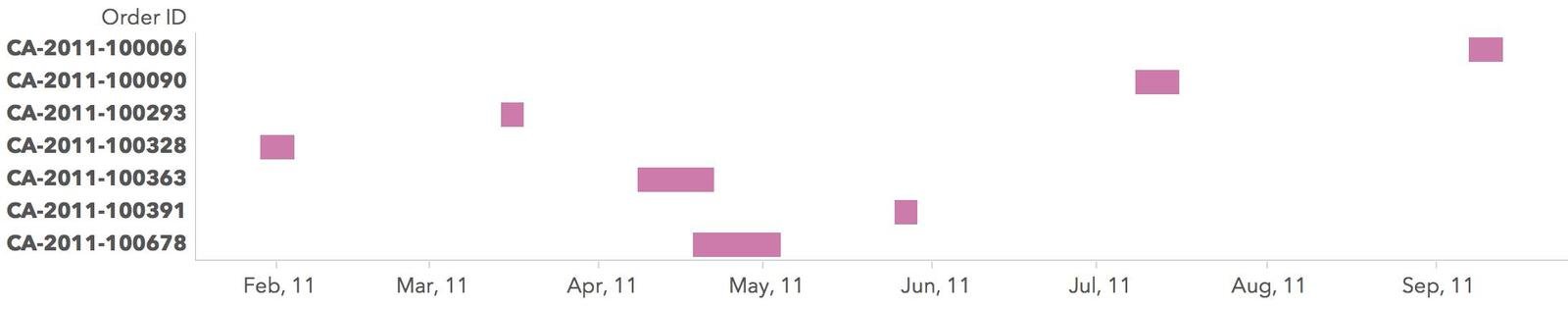
Gantt Chart
Used for: Viewing duration over time
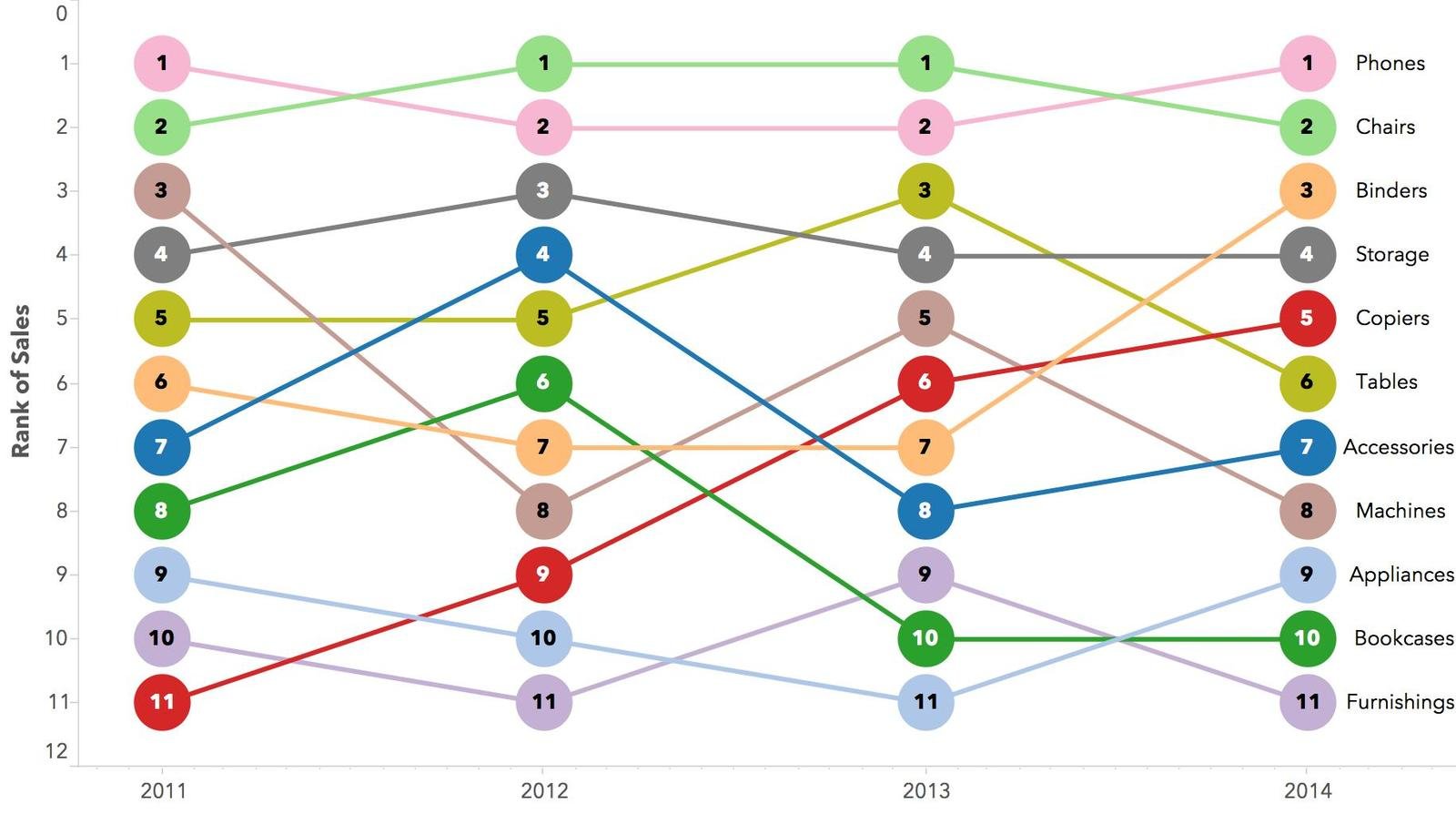
Bump Chart
Used for: Viewing category's rank over time
Other variations: slope chart (comparison from beginning to end)
Unit Chart
Used for: Viewing overall trends in addition to unit level details
Other variations: scatterplot, dot plot, strip plot
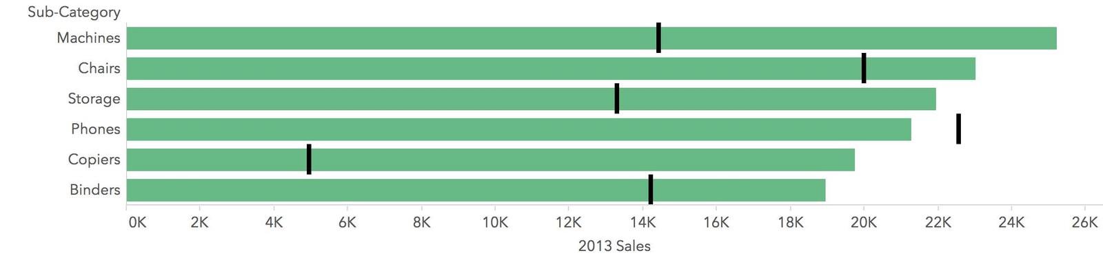
Bullet Graph
Used for: Comparing two measures
Other variations: Add indicator colors to background
Data Visualization Best Practices
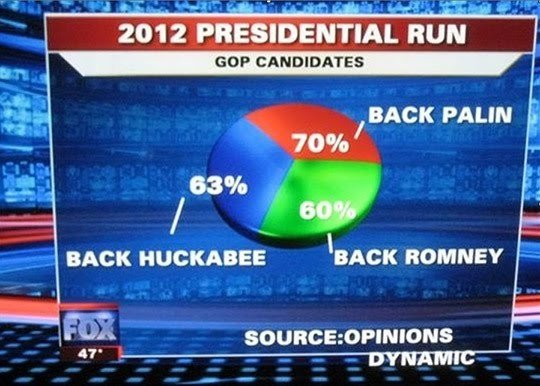
Why are best practices important?
So we don't end up here!
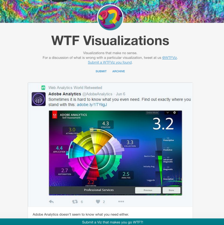
viz.wtf
Ease of Understanding
Make the visualization as easy as possible to read and understand
Axes
Keep axes clear and consistent
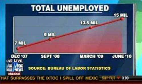
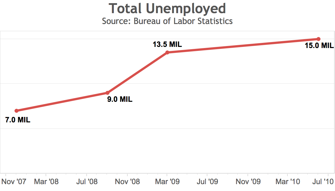
Avoid skipping numbers and Always start from 0
Color
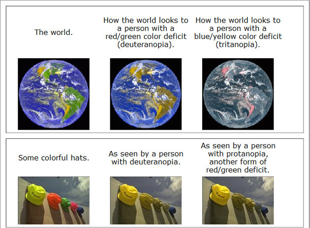
Accessibility - Color Blind (508 Compliant) and make sure your colors have enough contrast (black and white print out)
Clear Labels
Titles, sub-titles, axes, legends, data source, outliers (if necessary)
Try the 30 second test
Context
How do I know if this number is good or bad? I need some sort of reference.

vs
Keep it simple
Don't add colors when it's not necessary
If it doesn't help explain the visual get rid of it
Don't add too many labels

Check your work
Does the visualization logically make sense? If you must use a pie chart it better add up to 100%
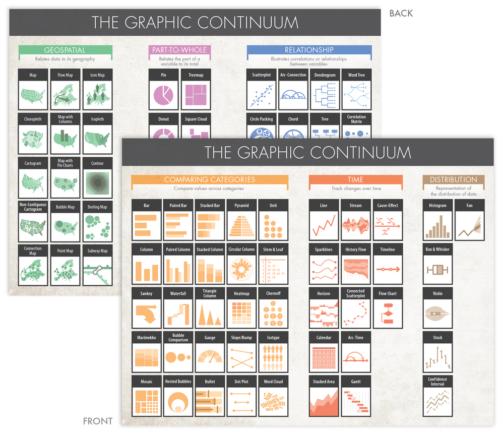
Use the right graph
Jon Schwabish's Graphic Continuum
What can I do?
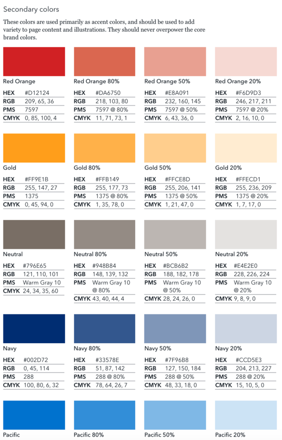
Style Guides with Brand compliant color palettes
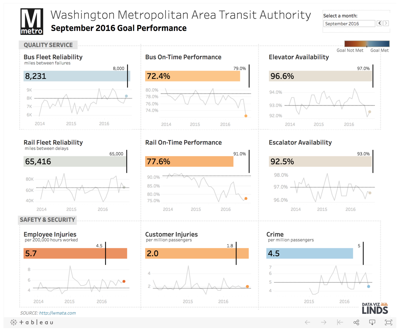
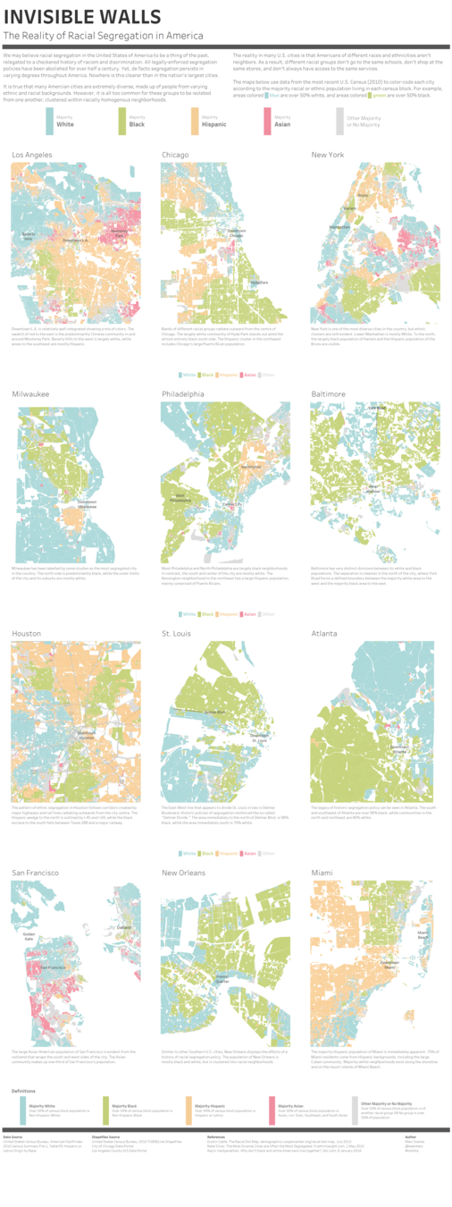
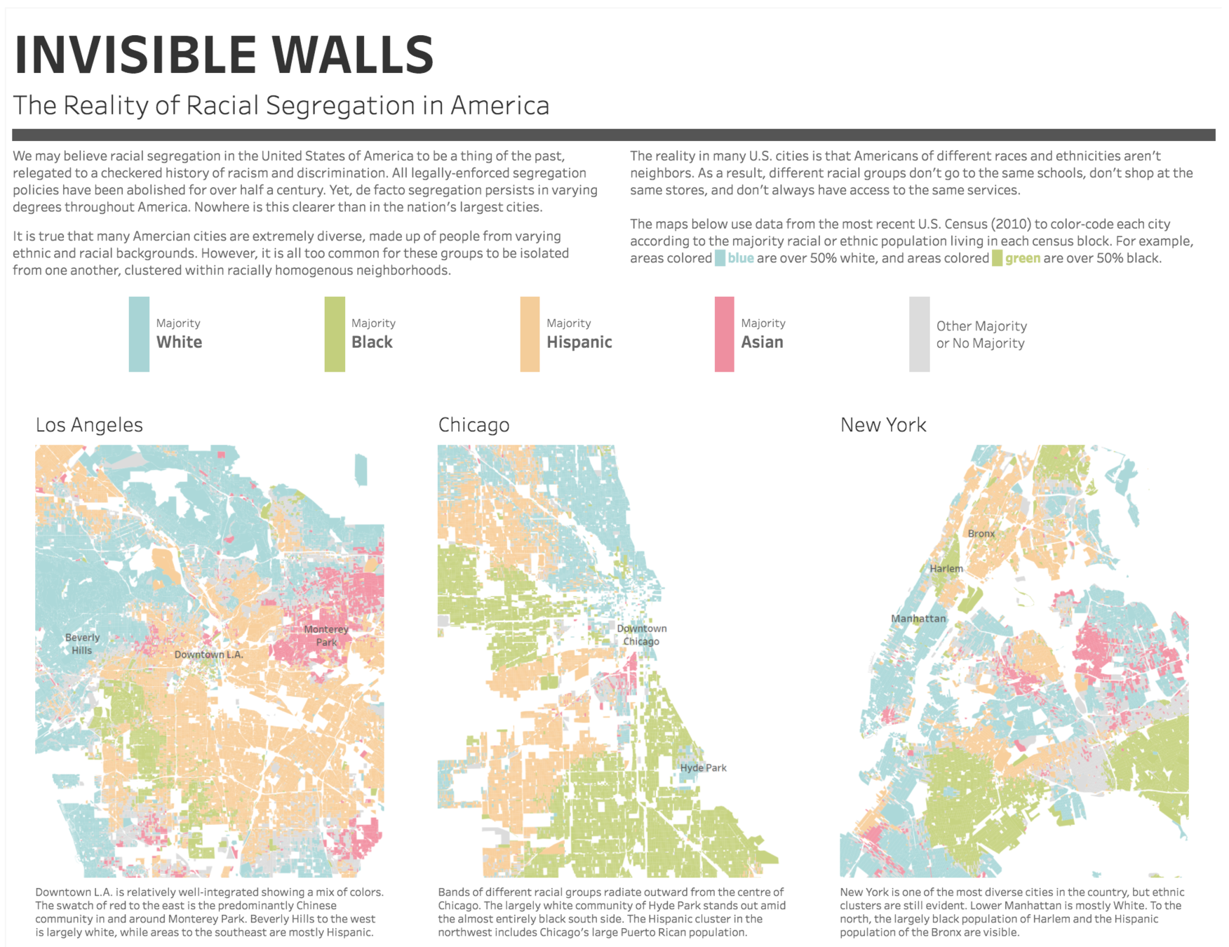
Example Dashboards
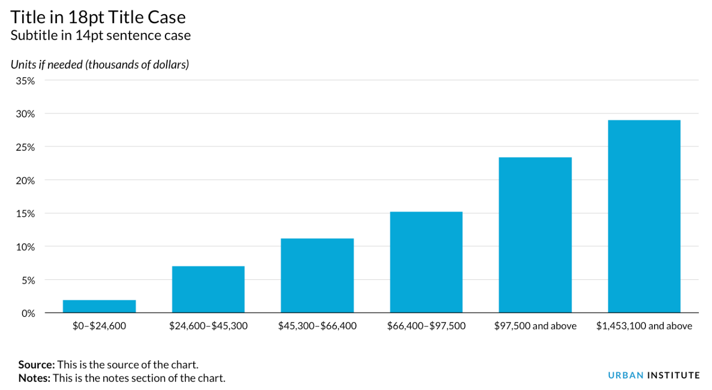
Title Text
Lindsey Poulter @datavizlinds
Marc Soares @marc_soares
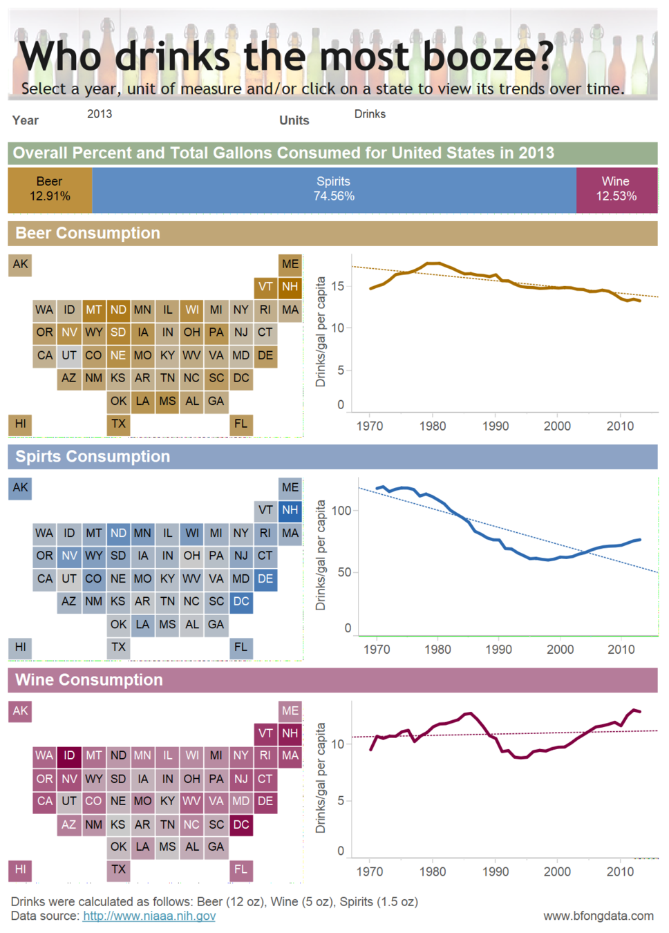
Chantilly Jaggernauth @chanjagg
Brittany Fong
@bfongdata
Data Visualization Resources
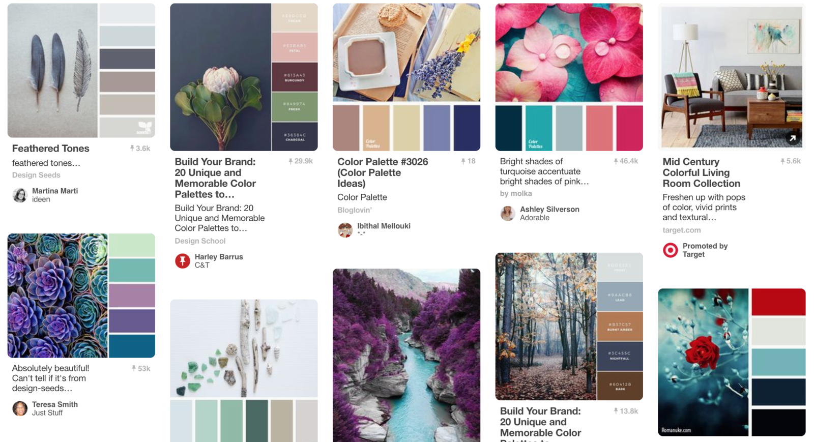
Color palettes
pinterest.com
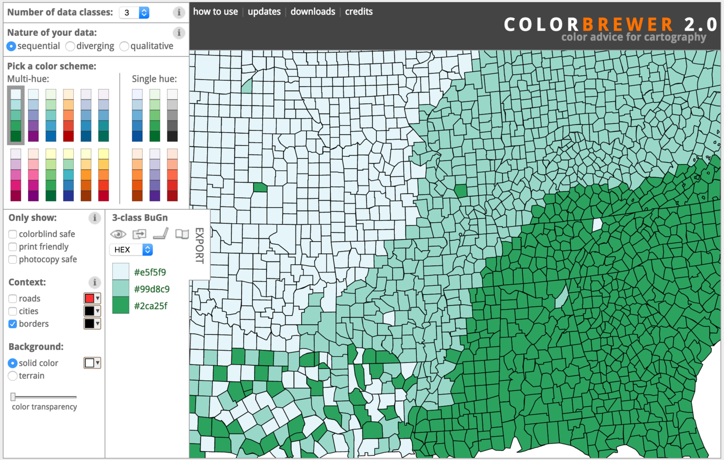
colorbrewer2.org
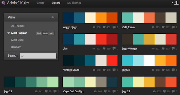
color.adobe.com
vischeck.com
Data wrangling


Data viz examples and information
-
Dear Data (dear-data.com)
-
Makeover Monday (http://www.makeovermonday.co.uk/)
-
Flowing Data (flowingdata.com)
-
The Functional Art (http://www.thefunctionalart.com/)
-
Storytelling with Data (http://www.storytellingwithdata.com/gallery/)
-
Tableau Public (public.tableau.com)
Data viz resources
-
Tableau Website Training Videos
-
(https://www.tableau.com/learn/training)
-
-
Tableau Community (forums, knowledge base, white papers)
-
https://www.tableau.com/learn/training
-
-
Tableau User Groups (local, internal, and subject specific)
-
dctug.com
-
-
Twitter
Visualize your data and influence the world!
Brittany Fong
bfongdata.com
bfongdata@gmail.com
Data Visualization
By bfongdata


