"Tableau" Your Data
MedStar May 25, 2016
Brittany Fong
So you want to create a viz?

Why?
Start with a question or multiple questions that you want to answer.
What data do you have?
Is there a unique identifier?
What level of detail is the data at?
Do you need additional data/tables?
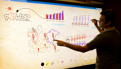
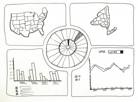
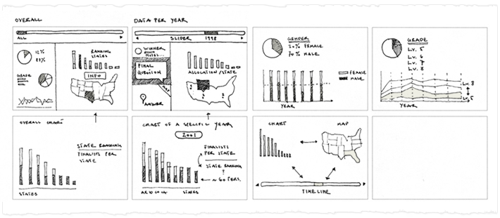
create a sketch
Pull out a pencil and paper to get the ideas flowing.
Just Because you can...doesn't mean you should
Keep visualizations simple
Cater to your audience


Levels of complexity
Executive - Quick glance summary
Manager - High level comparisons
Analyst - In depth discoveries
helpful tableau graphs, Tips, and Tricks!
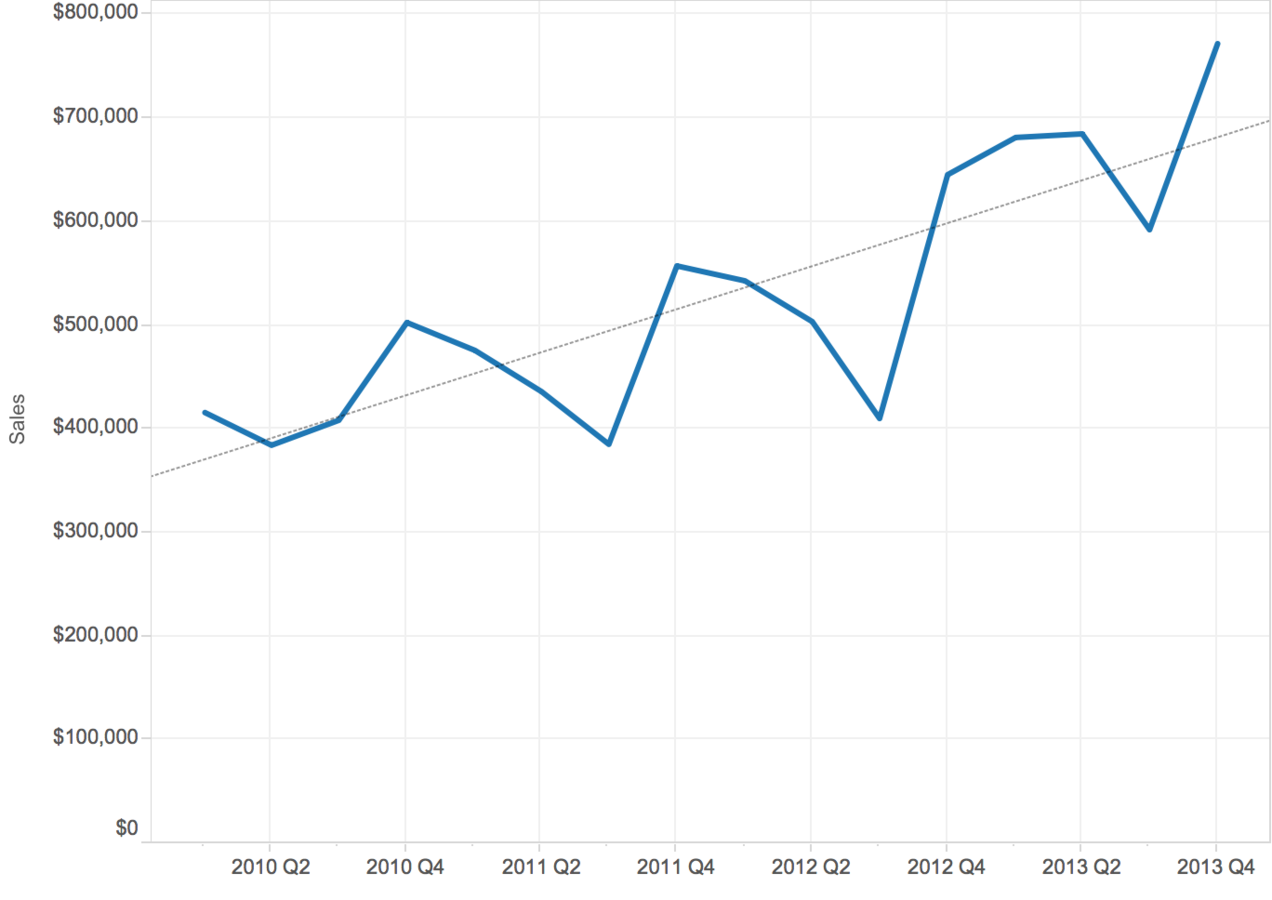
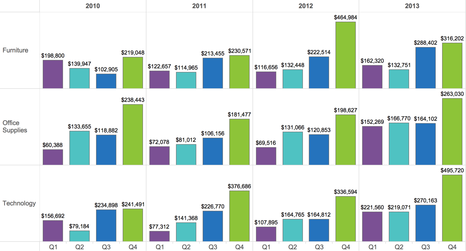
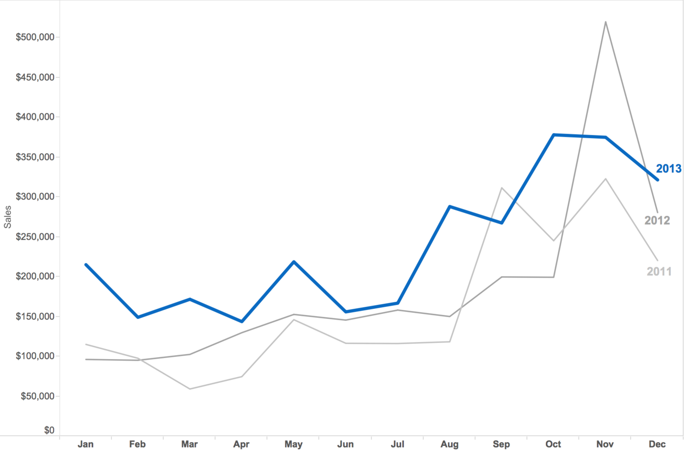
Comparisons over time
Use color to compare quarters but still have the ability to see over all changes over time
Using color to highlight
Change the color or size of data to highlight and guide your user through analysis
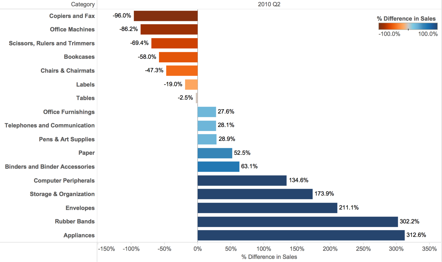
Percent Change Over Time
View percent changes between periods on a sorted bar graph to make comparisons over time and easily view top and bottom performers
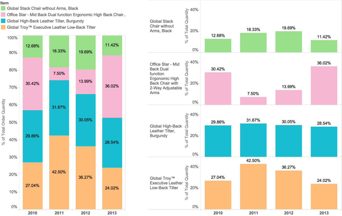
Percent of Total Over TIme
View percent of total across periods to determine which items make up the biggest percentage of quantity sold
Parameters
Give your users the flexibility to choose what they want to view
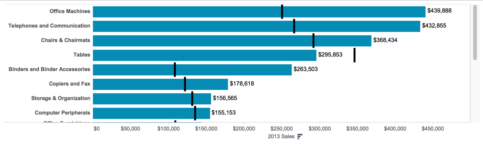
Bullet Graphs
- Can be used to measure key performance indicators or view year over year comparisons
- Replacement graph to gauges and bar charts (with multiple bars/measures) because they save room
- The traditional bar represents the actual metric and the "hash mark" is the goal or comparison
- Optional: add shaded reference lines to indicate poor, good, exceptional differentiation
Top N data
See the top N items in each product category
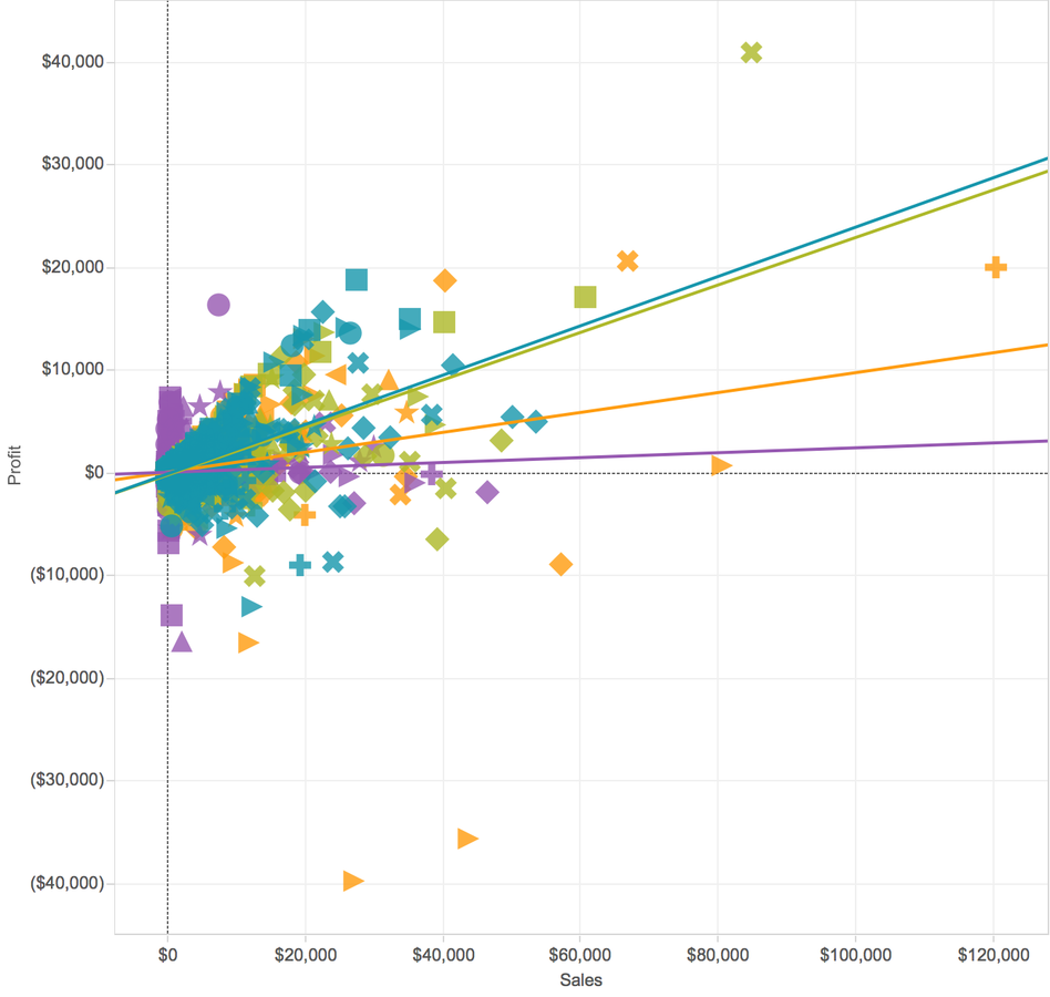
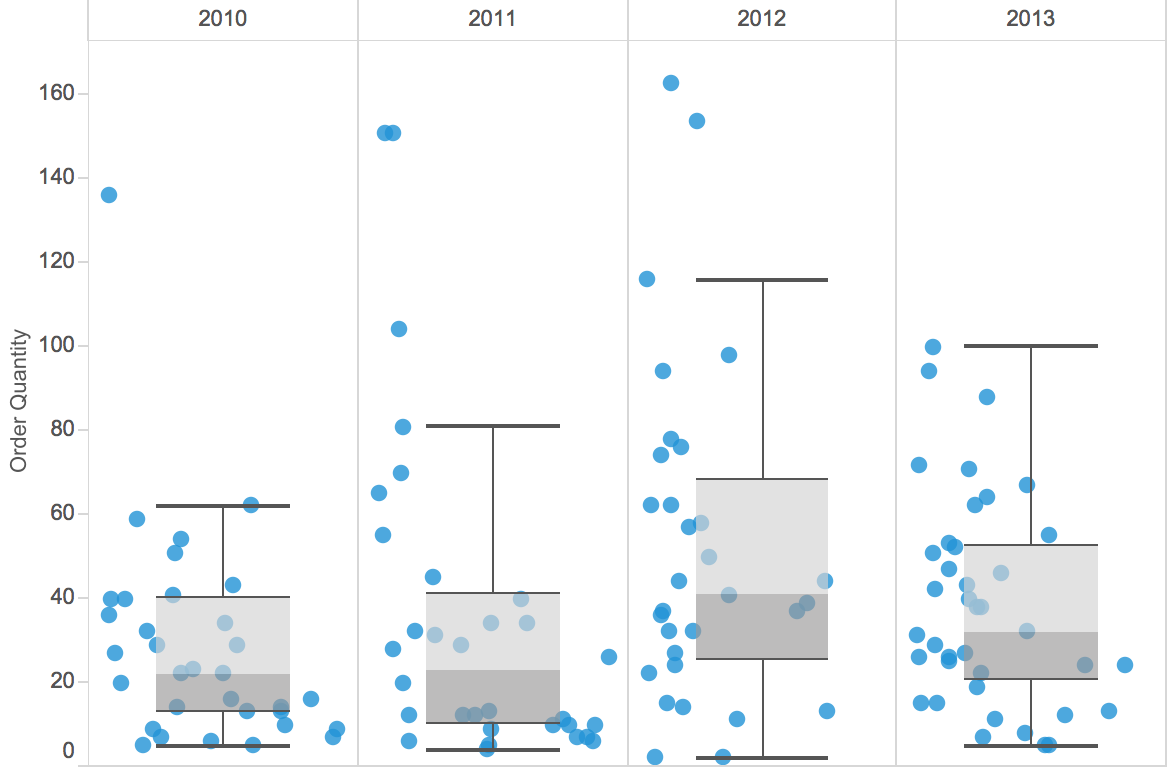
Box and Whisker Plots
- Can show data at a lower level of detail
- Show the distribution of data points, averages, and outliers
- Can be harder for your audience to understand
MedStar
By bfongdata


