Title Text

Graphic Design Final Assessment
Thank you cards
Title Text
Problem:
How might you utilize your graphic design skills to create a thank you card to bring happiness to a group of
essential workers?
Title Text
Requirements:
-
4''x6'' or 6'' x 4''
-
RGB color mode and 300 resolution
-
Must include a custom made pattern
-
Must include an element of typography
-
No copyrighted artwork
-
One Sided
Title Text
Design Considerations:
-
How are you using shape, line and space to create a visually interesting design?
-
How might pattern/repetition add unity to your design?
-
How can you use color to communicate?
-
Is your use of typography eye catching and consistent with your audience and purpose?
Title Text
Look for Inspiration!
-
The Pattern Topic has a few sources but a Google or Pinterest search for Thank You cards would be a good start
-
Consider narrowing your search: Funny Thank You Cards, Patterned Thank You Cards, Unique Thank You Cards, etc
-
-
Take Screenshots so you can place them in Illustrator to look at while you are designing
-
DON'T Imitate! Identify what you like and go from there.
Title Text
Inspiration for my first card:

Title Text
Examples

This was my first draft. I played with integrating subtle patterns, pairing fonts. I definitely need to fix the icon.
Title Text
Examples

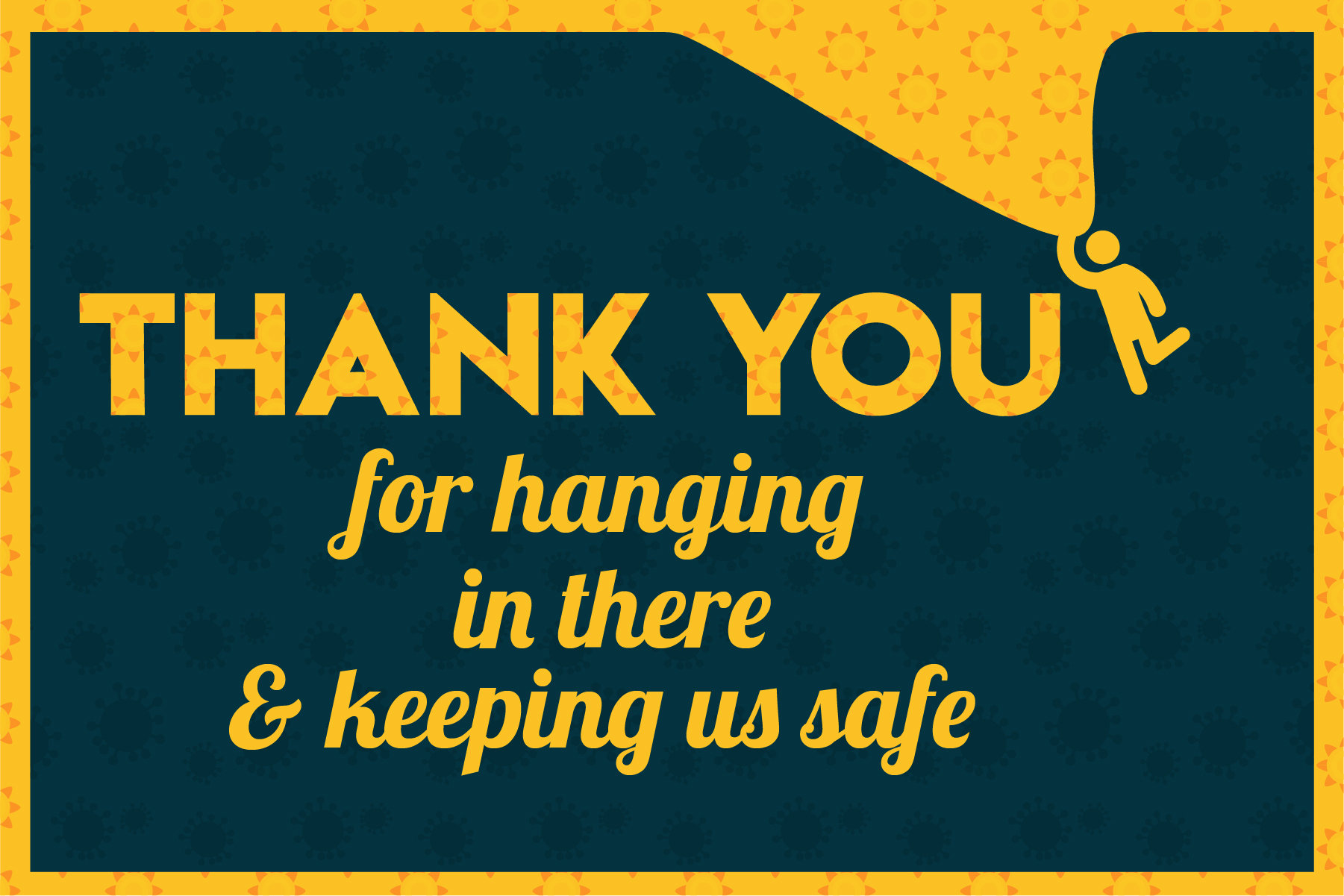
Second version. I liked how extending the yellow pattern to the edges unified the design. I used the pen tool to alter the icon.
Title Text
Examples
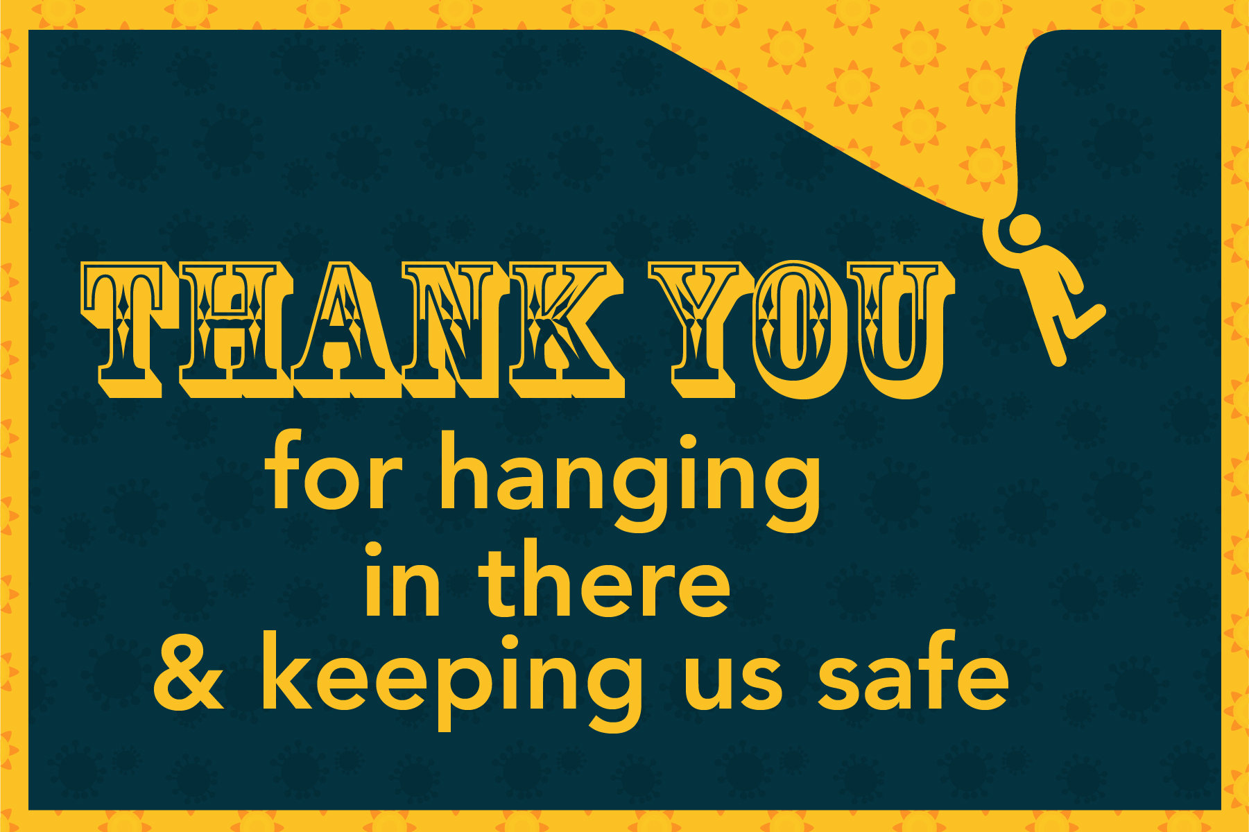
Third version. I thought I might like to see the pattern on "Thank You." I was wrong. Too busy. I think I will stick with the second version.
Title Text
Examples
DON'T DO THIS! Make sure your typography is easy to read and is consistent with your audience and purpose.
Title Text
Examples

DON'T DO THIS! When pairing fonts, find two fonts that contrast and compliment each other. In this case, the two hand written fonts conflict because they are too similiar.
Title Text
Inspiration for my second card:
Title Text
Examples

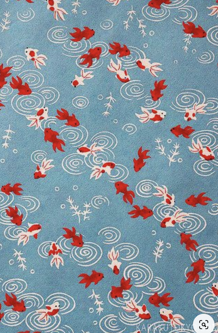
I found an inspirational pattern with ripples and thought that went well with the idea of these essential workers making a difference. I HATED this font! I actually spent more time finding fonts than I did making the pattern.
Title Text
Examples

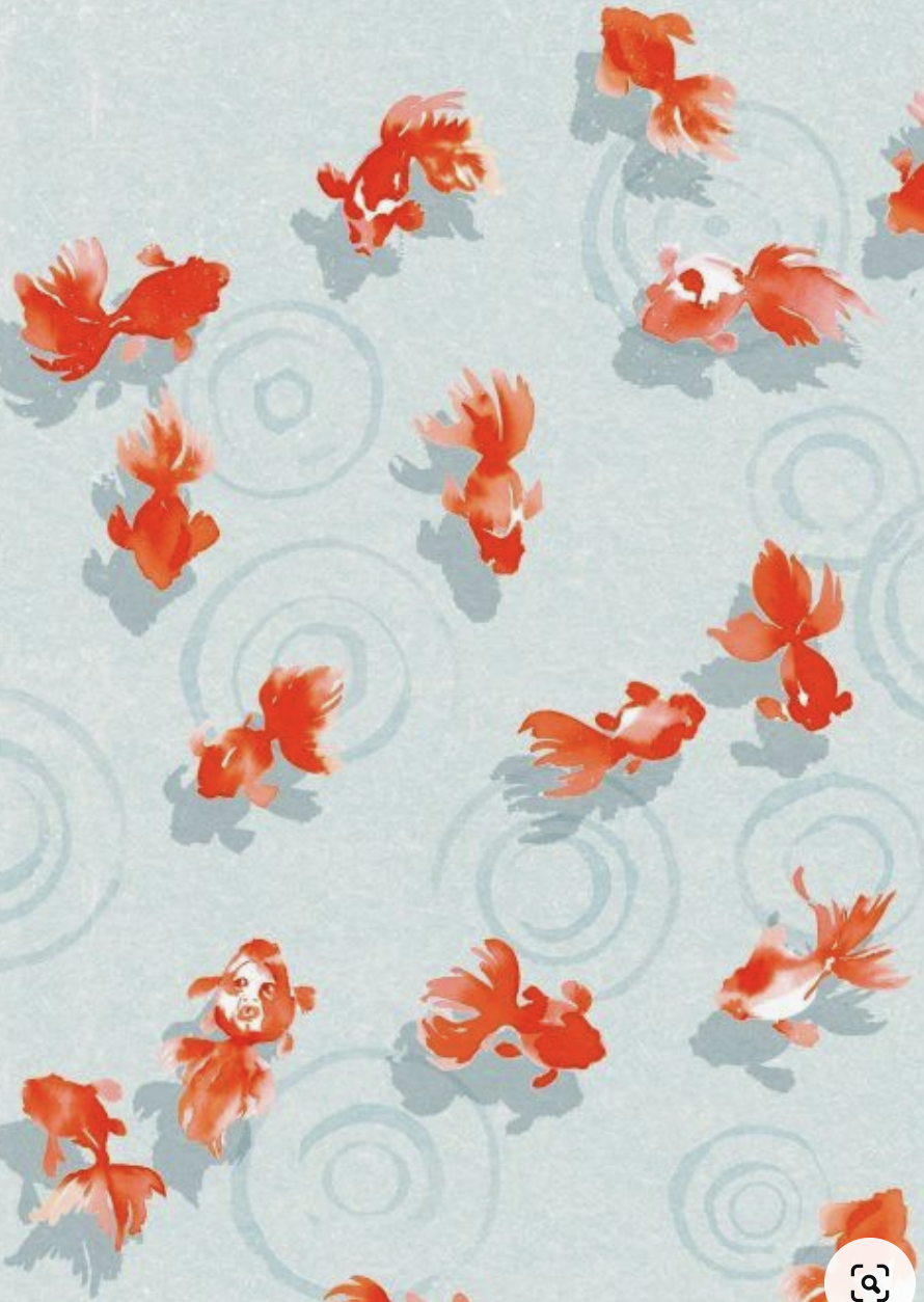
Better. Still not sure if I have found the perfect font but I chose to go with the same font, just different styles. I like how the art seems to be on top of the words.
Title Text
Inspiration for my third card:

Title Text
Examples
I made this pattern with icons I found on the Noun Project. This was a hand-made pattern and I used the shape builder tool to colorize the medical professional. Where do I put the text?
Title Text
Examples
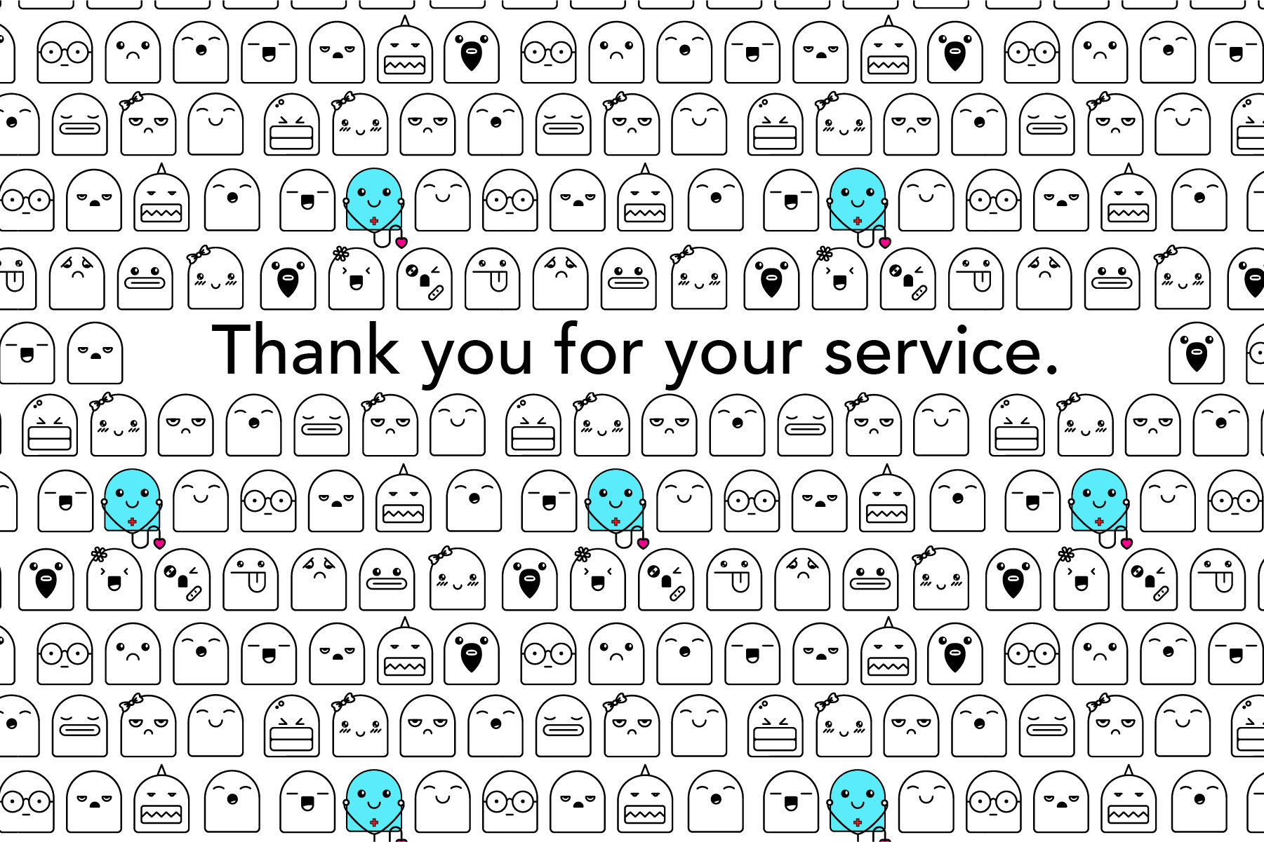
I decided to use the Pattern Tool in Illustrator to turn it into a much smaller, repeating pattern. I had to play a lot with spacing and the placement of the medical professional. Then I just put a white rectangle over a few to make space for the message. I like how simple it is.
Title Text
TIPS:
-
The most important part of this design is to remember who you are designing for and why
-
This serves as your final assessment because you must prove you understand how to use your composition, typography, color and graphics to communicate
-
Technically, you must include a pattern and an element of typography
-
I would suggest you use the Color Themes panel to help create a unified, effective color scheme
-
You can add more fonts to Illustrator by going to fonts.adobe.com
Thank you cards
By carafosterstl


