


Carmen Ansio
Design Engineer at LottieFiles
<h1 class="title" id="title-id">Carmen Ansio</h1>
h1 {
    font-family: serif;
}

#title-id {
    font-family: sans-serif;
}

.title {
    font-family: monospace;
}
<button>Carmen Ansio</button>
button {
  color: red;
}

button {
  color: blue;
}
<div class=”pink purple”> Carmen Ansio </div>
<div class=”purple pink”> Carmen Ansio </div>
.pink {
color: pink;
}
.purple {
color: purple;
}.card {}
.card:hover {}
/* podemos hacerlo anidando de esta forma */
.card {
&:hover {
}
}table.colortable {
& td {
text-align: center;
.c {
text-transform: uppercase;
}
&:first-child,
&:first-child + td {
border: 1px solid black;
}
}
& th {
text-align: center;
background: black;
color: white;
}
}table.colortable {
:is(td) {
text-align: center;
.c {
text-transform: uppercase;
}
&:first-child,
&:first-child + td {
border: 1px solid black;
}
} :is(th) {
text-align: center;
background: black;
color: white;
}
}.card {
display: grid;
gap: 1rem;
@container (width >= 480px) {
display: flex;
}
}@container style(--sunny: true) {
.weather-card {
background: linear-gradient(-30deg, yellow, orange);
}
.weather-card:after {
content: url(<data-uri-for-demo-brevity>);
background: gold;
}
}@scope (.card) {
.title {
font-weight: bold;
}
}h1 {
--fluid-type-min: 2.5rem;
--fluid-type-max: 5rem;
--fluid-type-target: 5vw;
max-width: 15ch;
}
h2 {
--fluid-type-min: 1.8rem;
--fluid-type-max: 3rem;
}
h3 {
--fluid-type-min: 1.5rem;
--fluid-type-max: 2.5rem;
}
h2,
h3 {
max-width: 30ch;
}
p {
max-width: 60ch;
}
/* clamp(min, val, max) */
width: clamp(200px, 50%, 500px);
h1,
h2,
h3,
p {
font-size: clamp(
var(--fluid-type-min, 1rem),
calc(1rem + var(--fluid-type-target, 3vw)),
var(--fluid-type-max, 1.3rem)
);
}
@font-face {
  font-family: "JobClarendon";
  src: url("job-clarendon.woff2") format("woff2 supports variations"),
       url("job-clarendon.woff2") format("woff2-variations");
  font-weight: 100 1000;
}:root {
--font-fallback: "Helvetica Neue", sans-sans;
}
h1, h2 {
font-family: "JobClarendon", var(--font-fallback);
}color-mix(in srgb, blue, white);
color-mix(in srgb-linear, blue, white);
color-mix(in lch, blue, white);
color-mix(in oklch, blue, white);
color-mix(in lab, blue, white);
color-mix(in oklab, blue, white);
color-mix(in xyz, blue, white);.progress {
animation: progress both linear;
animation-timeline: scroll(root);
transform-origin: 0 50%;
}
@keyframes progress {
0% {
scale: 0 1;
}
100% {
scale: 1 1; }
}.container {
display: flex;
justify-content: space-between;
align-items: center;
}
.item {
flex: 1;
margin: 5px;
}
.container {
  display: grid;
  grid-template-columns: repeat(3, 1fr);
  grid-template-rows: auto;
  gap: 10px;
}

.item {
  grid-column: span 1;
  grid-row: span 1;
}
.item-large {
  grid-column: span 2;
  grid-row: span 2;
}
.video {
  width: 100%
  aspect-ratio: 16 / 9;
}.video {
width: 100%;
padding-top: 56.25%;
}.img {
aspect-ratio: 1;
width: 300px;
object-view-box: inset(25% 20% 15% 5%);
object-fit: cover;
} /*
La propiedad overflow: hidden;,
posicionando y escalando el contenido
en su interior.
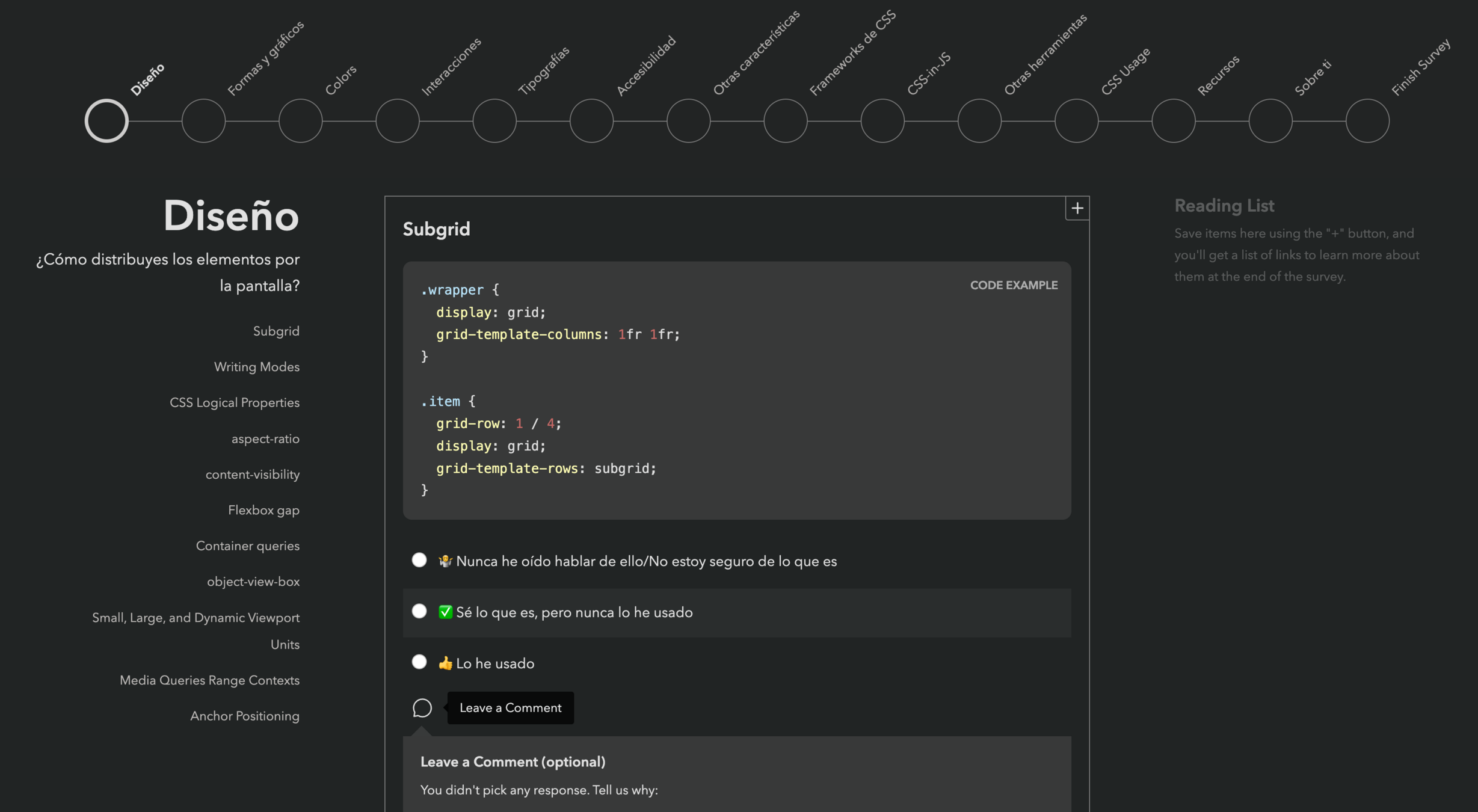
*/.grid-wrapper {
display: grid;
grid-gap: 10px;
grid-template-columns: repeat(auto-fit, minmax(250px, 1fr));
grid-auto-rows: 200px;
grid-auto-flow: dense;
}img {
max-width: 100%;
height: auto;
vertical-align: middle;
display: inline-block;
mix-blend-mode: color-dodge;
}.container {
display: grid;
gap: 10px;
grid-template-columns: repeat(auto-fill, minmax(120px, 1fr));
grid-template-rows: masonry;
}By Carmen Ansio


