


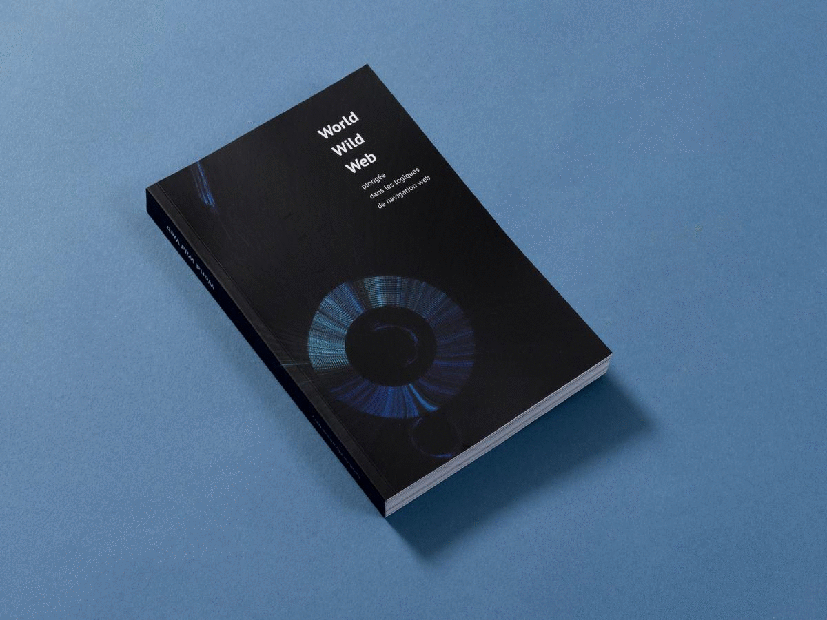


Caroline Moureaux-Néry
UX/UI Designer
UX/UI Designer
Caroline Moureaux-Néry
January 2021
Diploma project ENSCI - Les Ateliers
Under the direction of Galilée Al Rifaï
November 2020
1 | Visualize our web history
"I feel guilty spending so much time on YouTube and Facebook. Most of the time, I'm just watching stupid videos."
"I can spend 6 hours in a row watching Netflix, unable to turn it off. That's' absurd."
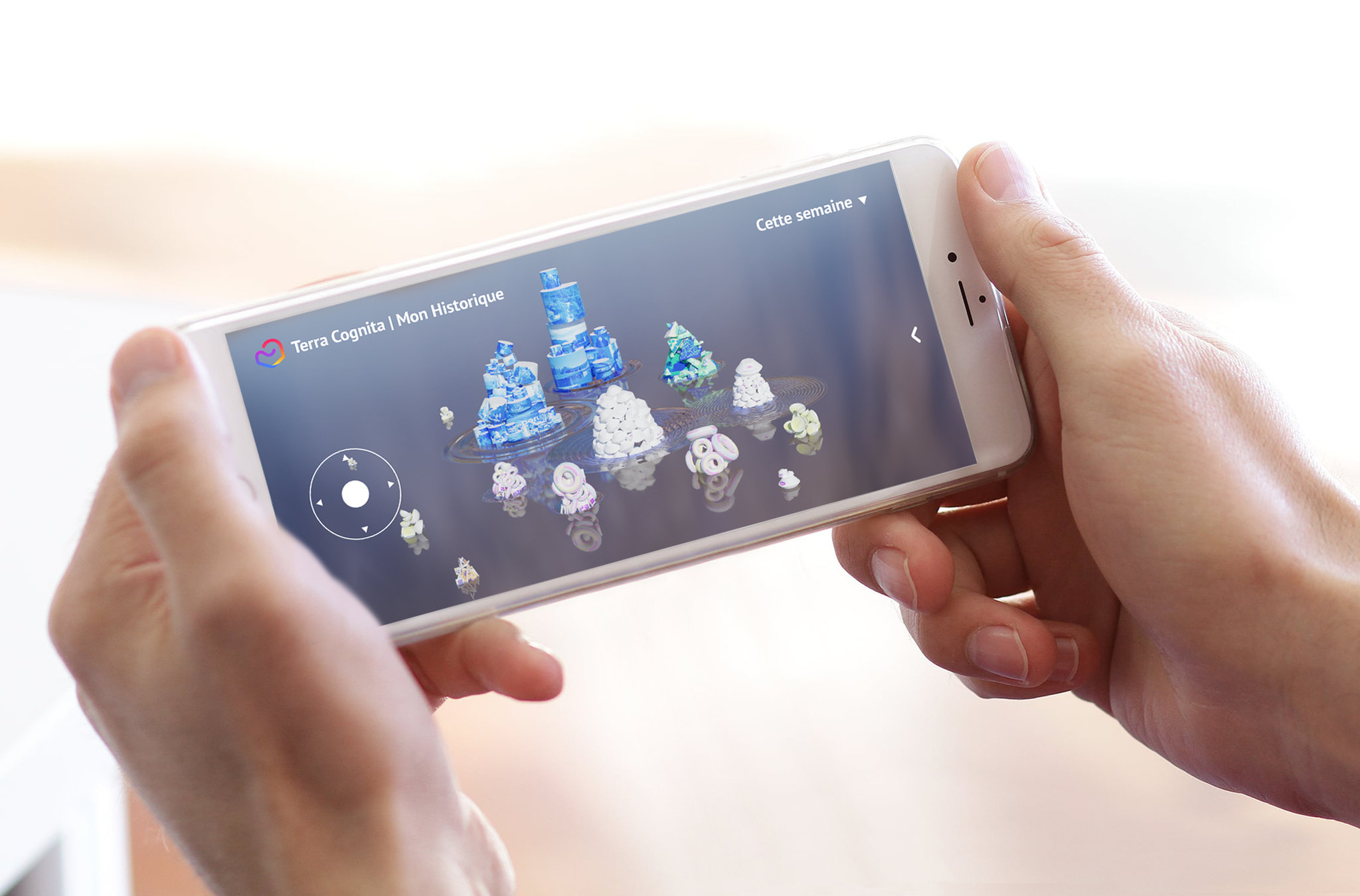
Browsing the web often comes with guilt. We are arguably spending "too much time" on uninteresting content. As a means to browse the web more freely and to feel less guilty doing it, I believe we need to better understand our own web history. Here is Terra Cognita, an application which turns our web history into an interactive 3D landscape.
#UX #UI
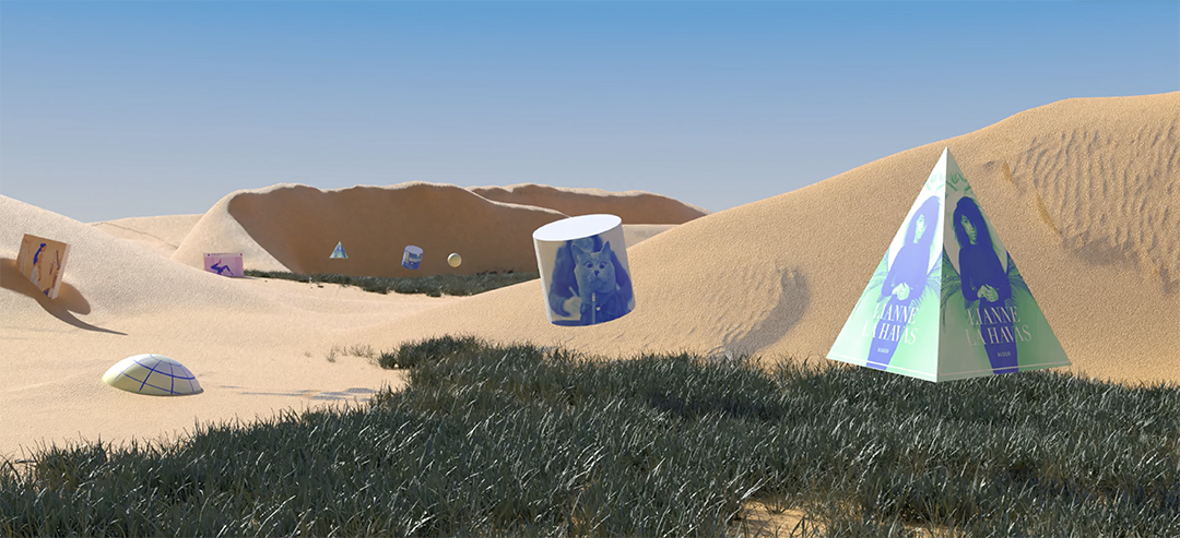
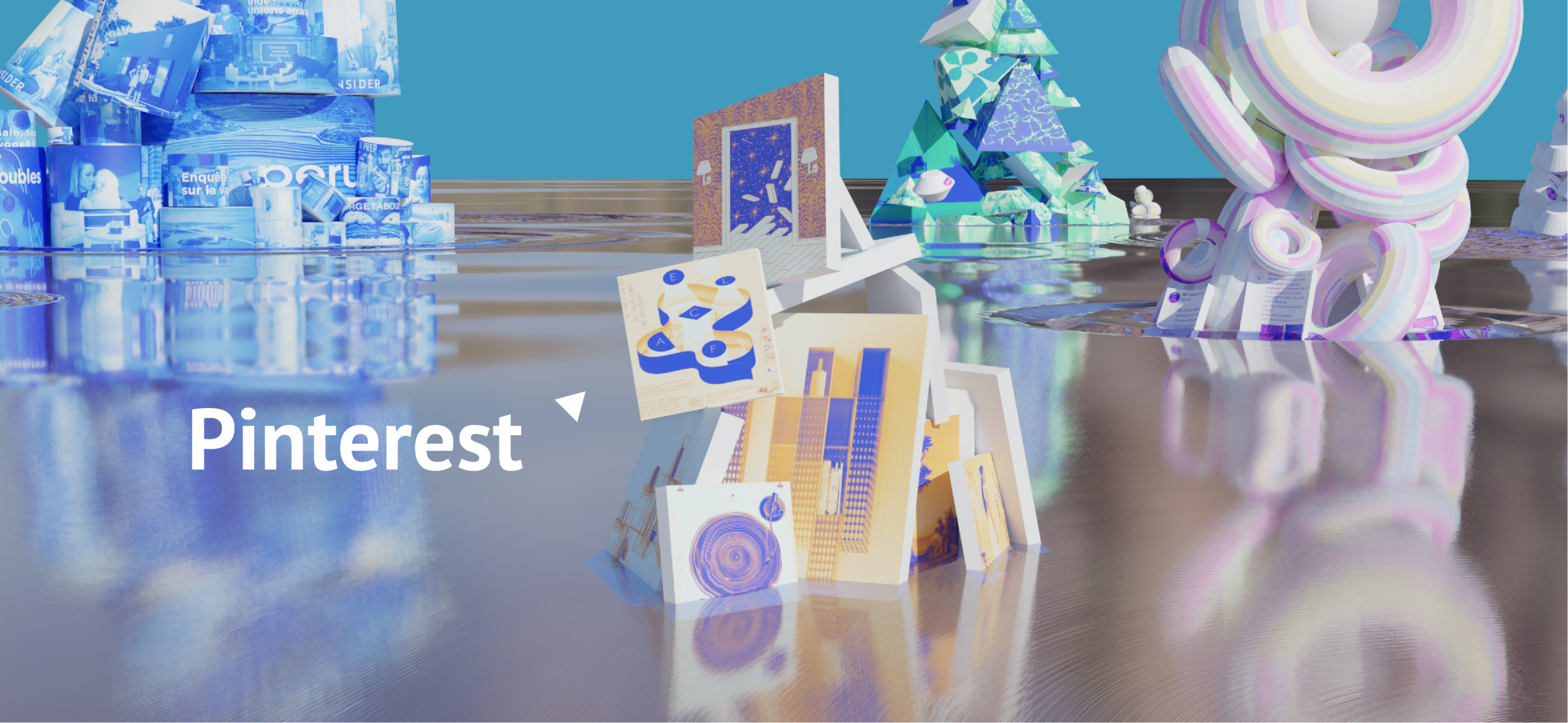
First and foremost, I believe we need to better understand how we use the web. Even if we spend a lot of time surfing the web, it is actually quite difficult to get a clear image of our trajectory through this digital space. With Terra Cognita, I offer to turn the endless lists of our web history, unable to offer an overview, into a unique landscape we can zoom in and out of.
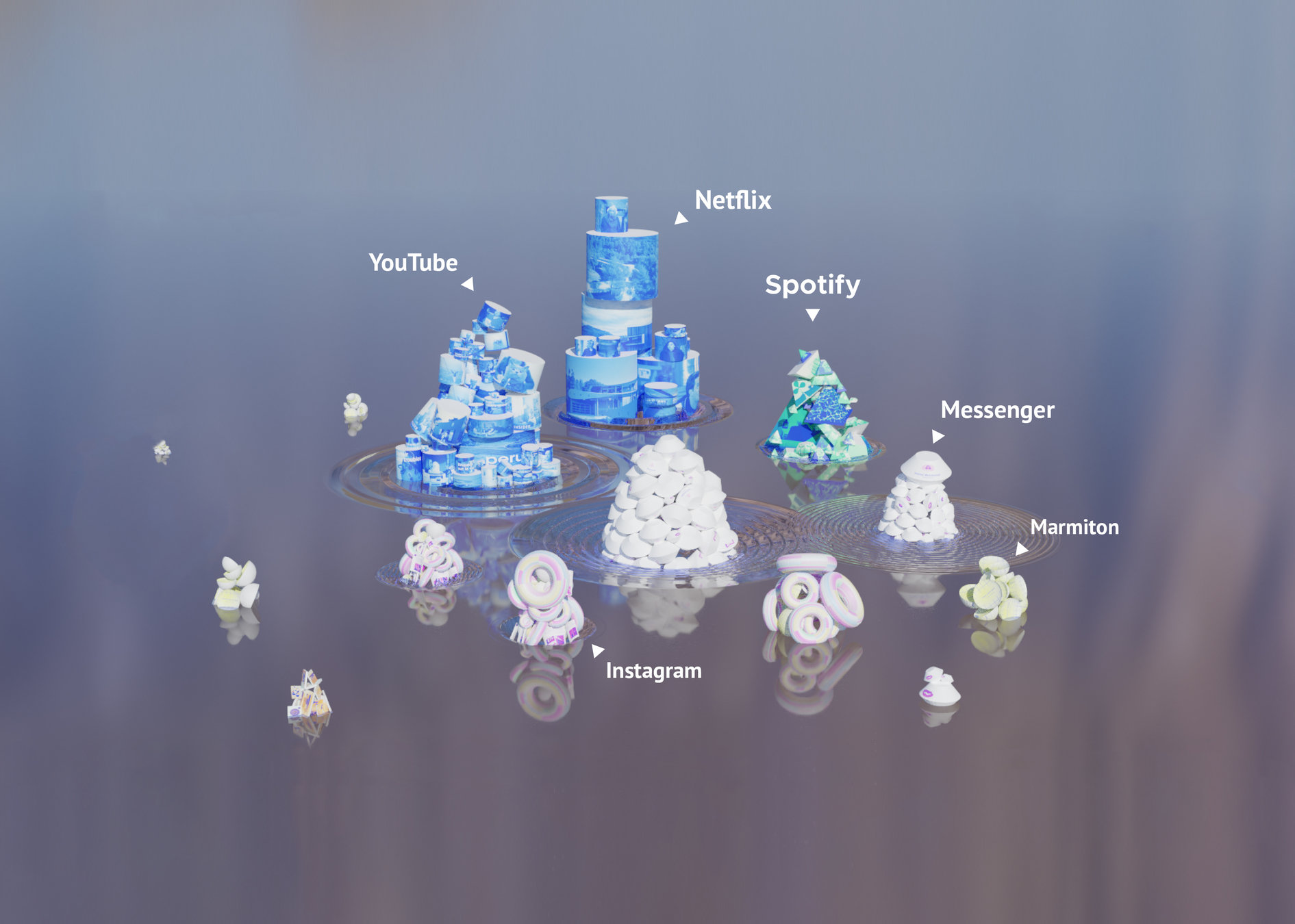
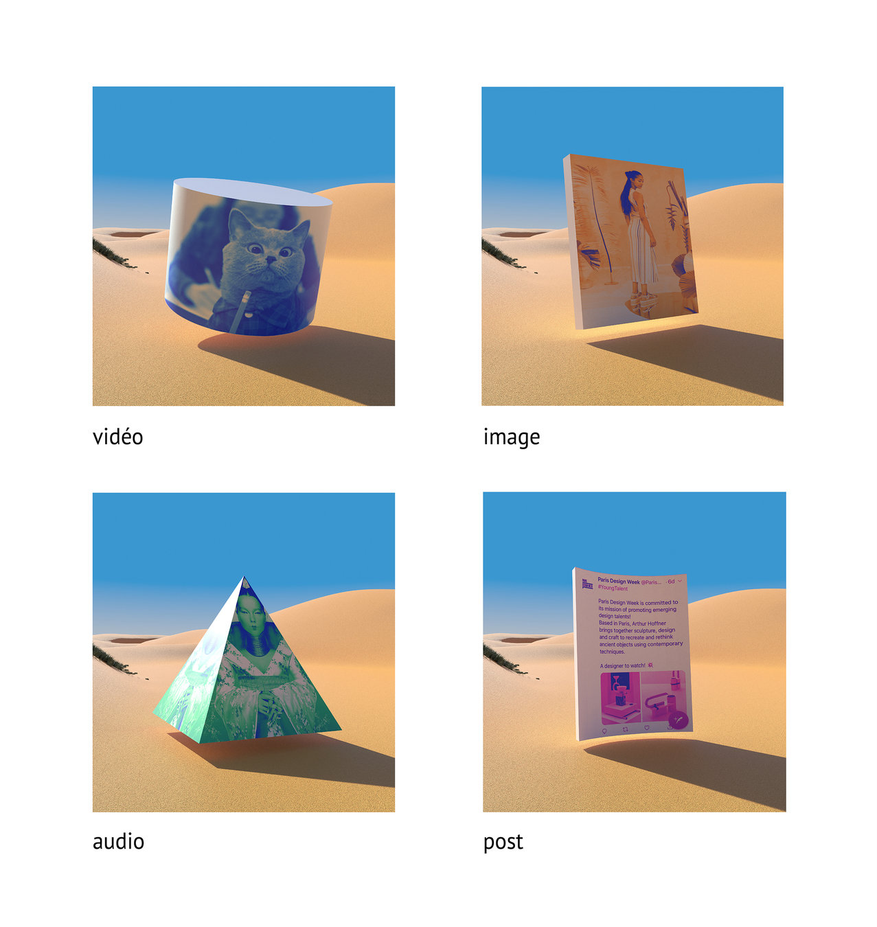
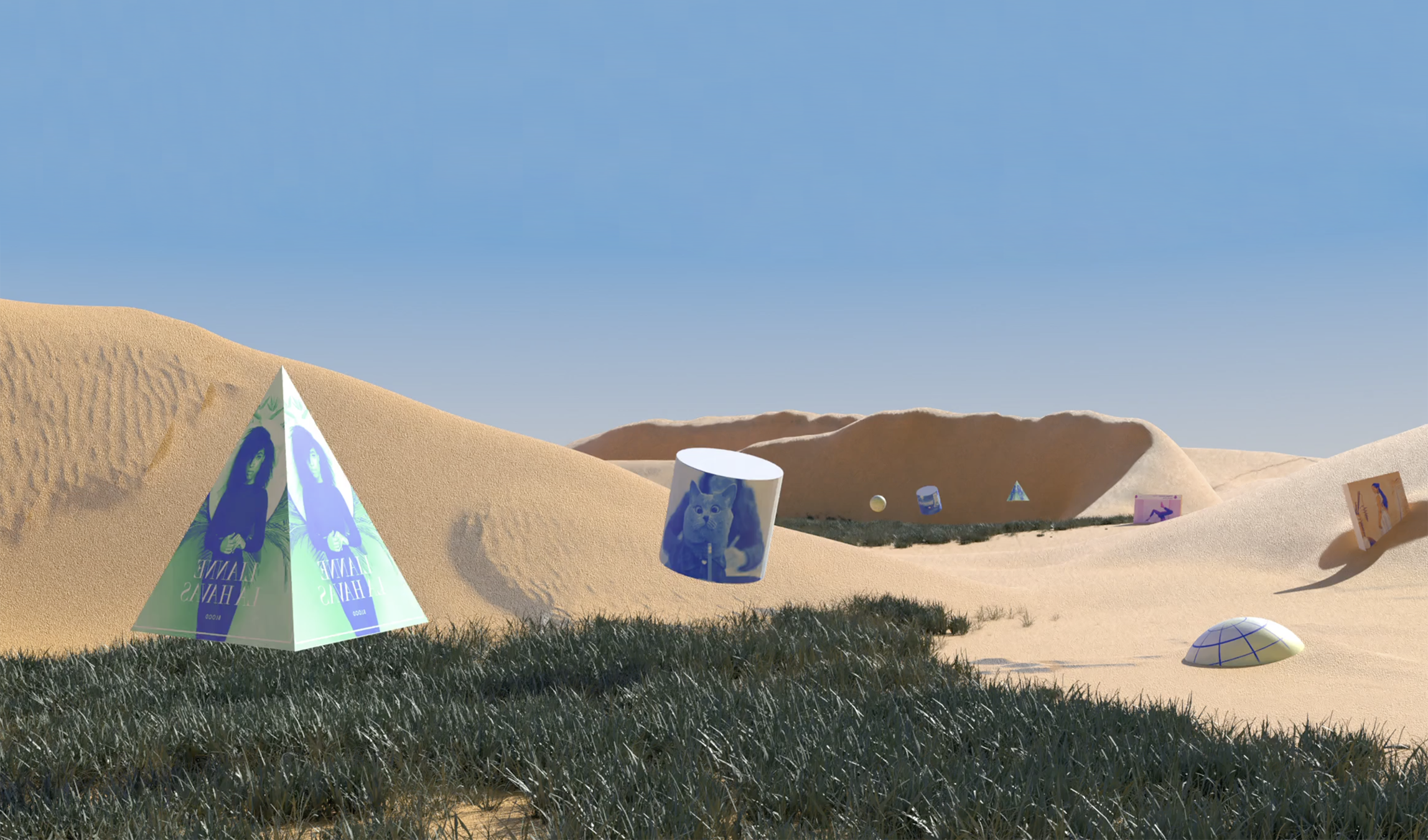
Each previously consulted element becomes a volume. Its shape and color each depend on the type of media. Gathered into islands each representing websites, the size depends on the time spent browsing each website.
video
picture
audio
post
message
webpage
news feed
website
Zooming in and out allows to switch from an overview of our web activity to the specific resources consulted.
Spotify
Messenger
Other animations show the methods used to catch our attention such as content recommendations, infinite news feeds or the autoplay function. These animations help understand the size of certain islands and reveals how our attention is constantly manipulated on the web.
Ripples in the surrounding water represent how attractive the platforms are to the user. Their height and frequency depends on the users web habits.
diploma project ENSCI - Les Ateliers
under the direction of Galilée Al Rifaï
november 2020
2 | Explore our archives
#UX #UI
While surfing the web we often encounter contents that we want to save for future use. But existing tools for storing web contents are scattered; we can save it as a bookmark, save it directly from the platform, or add it into a playlist.. As a result, recovering the content when needed can be quite tedious. With Terra Cognita, I designed a second space which centralizes all the contents saved from the web. From the same space, we can finally recover posts saved from Instagram, Spotify playlists or bookmarks.
Contents frequently consulted float above lawns. Others slowly sink into the ground, being forgotten.
With a lack of inspiration, instead of scrolling Netflix for hours hoping to find interesting content to watch, the user can now browse the collection of movies and tv shows he specifically put to the side for later. Here, they recover items from their Netflix playlist, but also ones they saved from Arte replay or trailers "liked" from Youtube.
Users can easily switch between the web history landscape and the archive.
If they aren't satisfied with their collection, the user can search the web to find other similar content. Terra Cognita uses a recommendation algorithm, but instead of being limited to one platform’s catalogue, the search is trans-platform and multimedia.
While browsing these new suggestions, the user can play with parameters in order to control the recommendations.
Finally, the world is designed as a way of encouraging the removal of useless content. The fact that a specific content has sunk into the ground helps users spot the things they don't often consult. Several mini-games, inspired by smartphone arcade games, make the deletion more playful. When deleting content from the landscape, it also disappears from its stored place, whereas it was a bookmark, a Pinterest picture or a song in one of the user Spotify playlists.
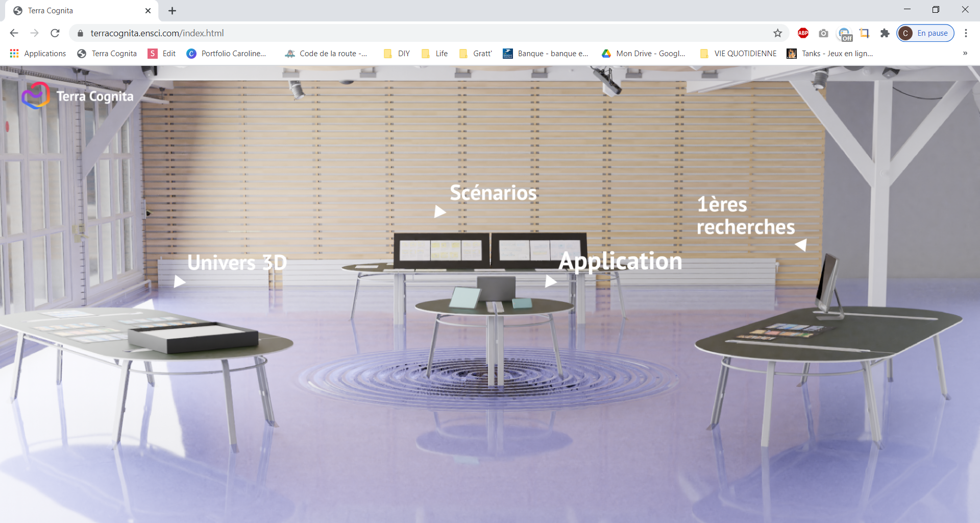
I presented my degree during the second lockdown. Part of the jury and all of the audience was remote. In order to improve their experience, I designed a web version of my diploma exhibition : https://terracognita.ensci.com/
thesis ENSCI - Les Ateliers
under the direction of Loup Cellard
march 2020
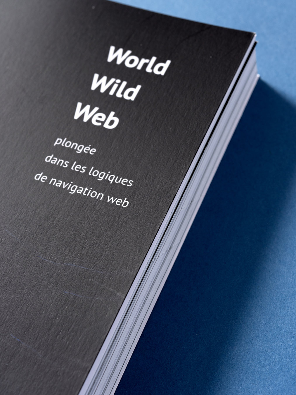
Dive into web conception methods
THESIS : The first characteristic of the web is that it is a navigable space. But even if it is used daily by millions of people the web remains quite mysterious to most of its users. With this thesis I explain what is the web, conceptually speaking, but also what the basic technical concepts are. The goal was to understand how the web has been designed and how it determines the way we browse the web today. By combining analysis of web conception methods, technical tutorials, user interviews and design fiction, I came to understand how our daily navigations are built and the potential of these daily navigations to change.
#UX #Edition
ENSCI - Les Ateliers
working with Thibault Perrin
june 2017
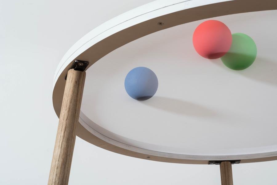
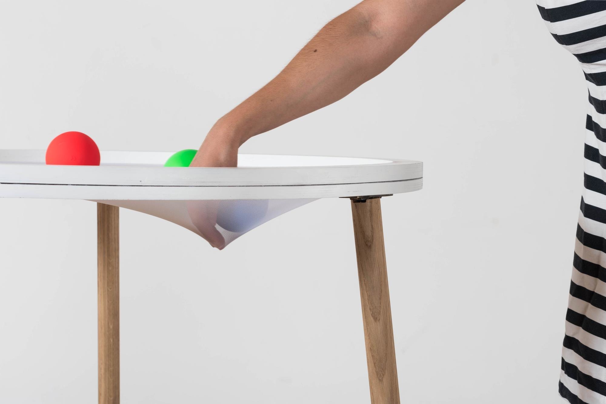
Touching sound
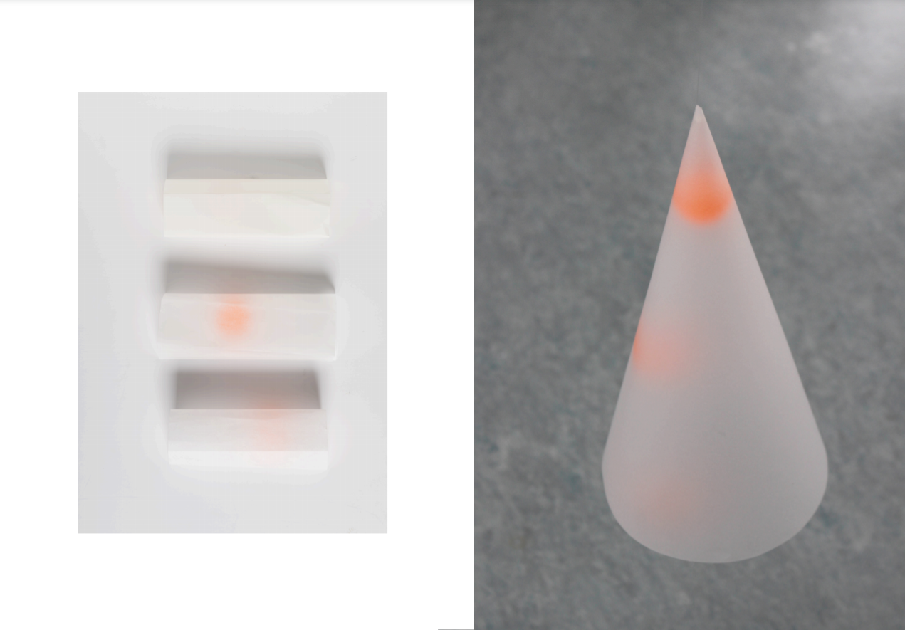
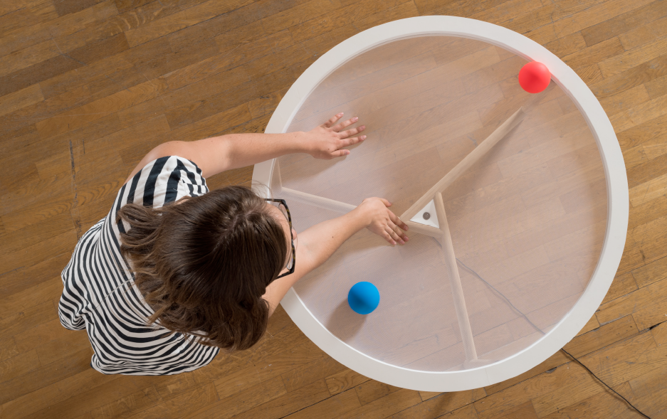
We were asked to design a new game using a basic technology. With a particular interest in video tracking, we designed Gravités Sonores, an installation to manipulate sounds.
The user places colored balls on a translucide textile. As they move their hands across the surface, balls start to follow. Their movements, detected by a video camera under the structure, modulate sound tracks.
#UX #Interaction Design
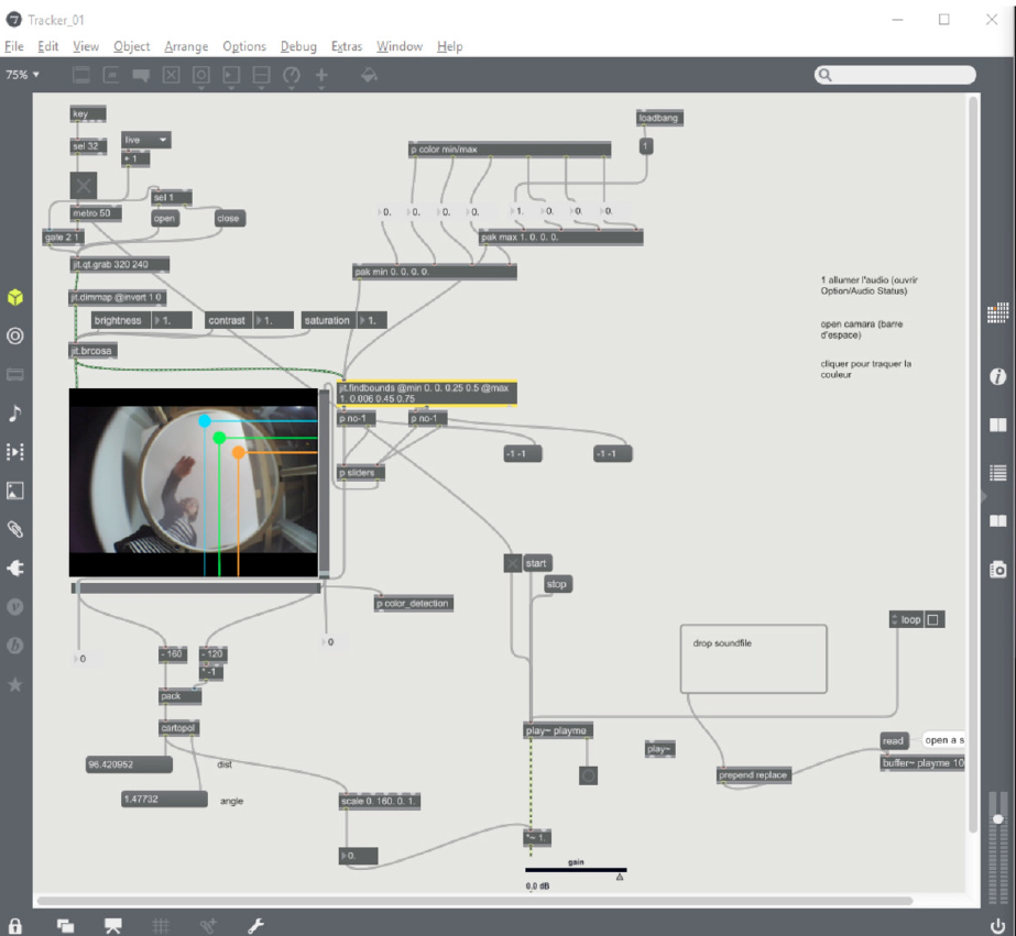
We prototyped both the product and and the sound interactions which allowed us to test and refine the prototype.
I used Processing and Max/MSP to code the interactions.
ENSCI - Les Ateliers
partnership with Alessi
january 2018
IoT Tribe for Alessi
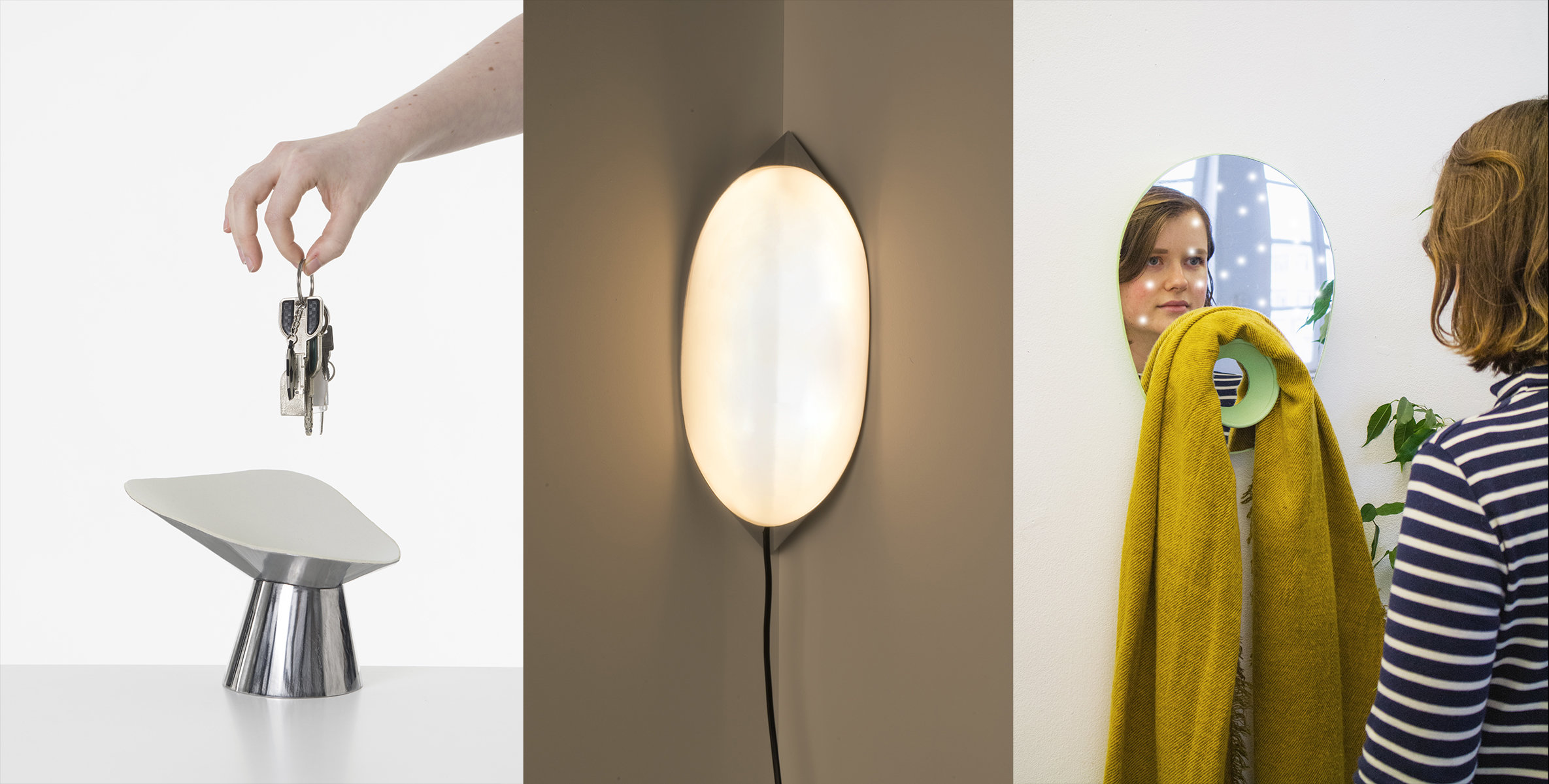
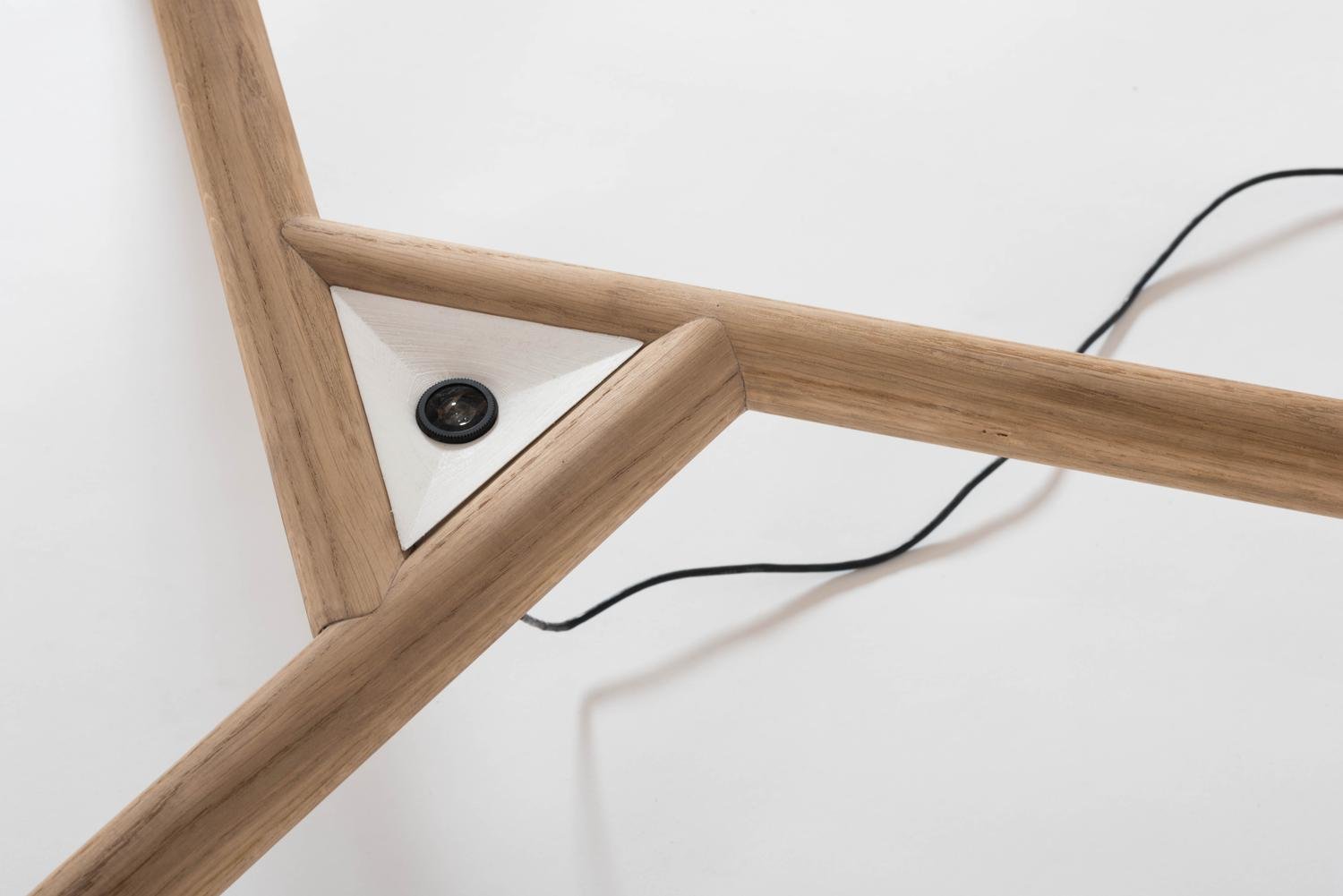
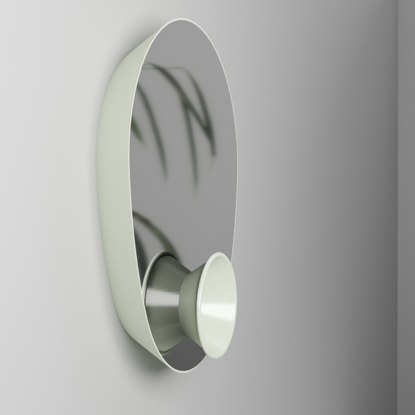
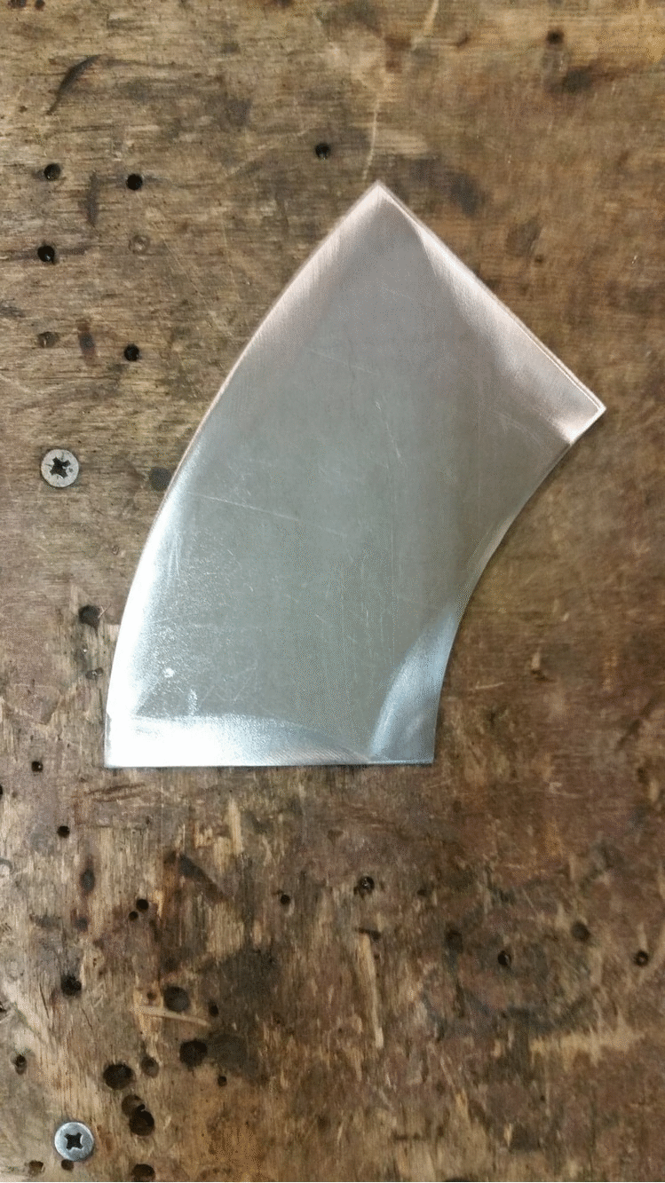
What would a connected object look like if it was designed for Alessi ?
Inspired by the brand's playful and unique identity, I design Andersen, a family of three connected objects. Here, objects not only bring information to the user but also communicate with each other. This second connection is seen as a means to bring poetry and entertainment to the home.
#Object #Interaction Design
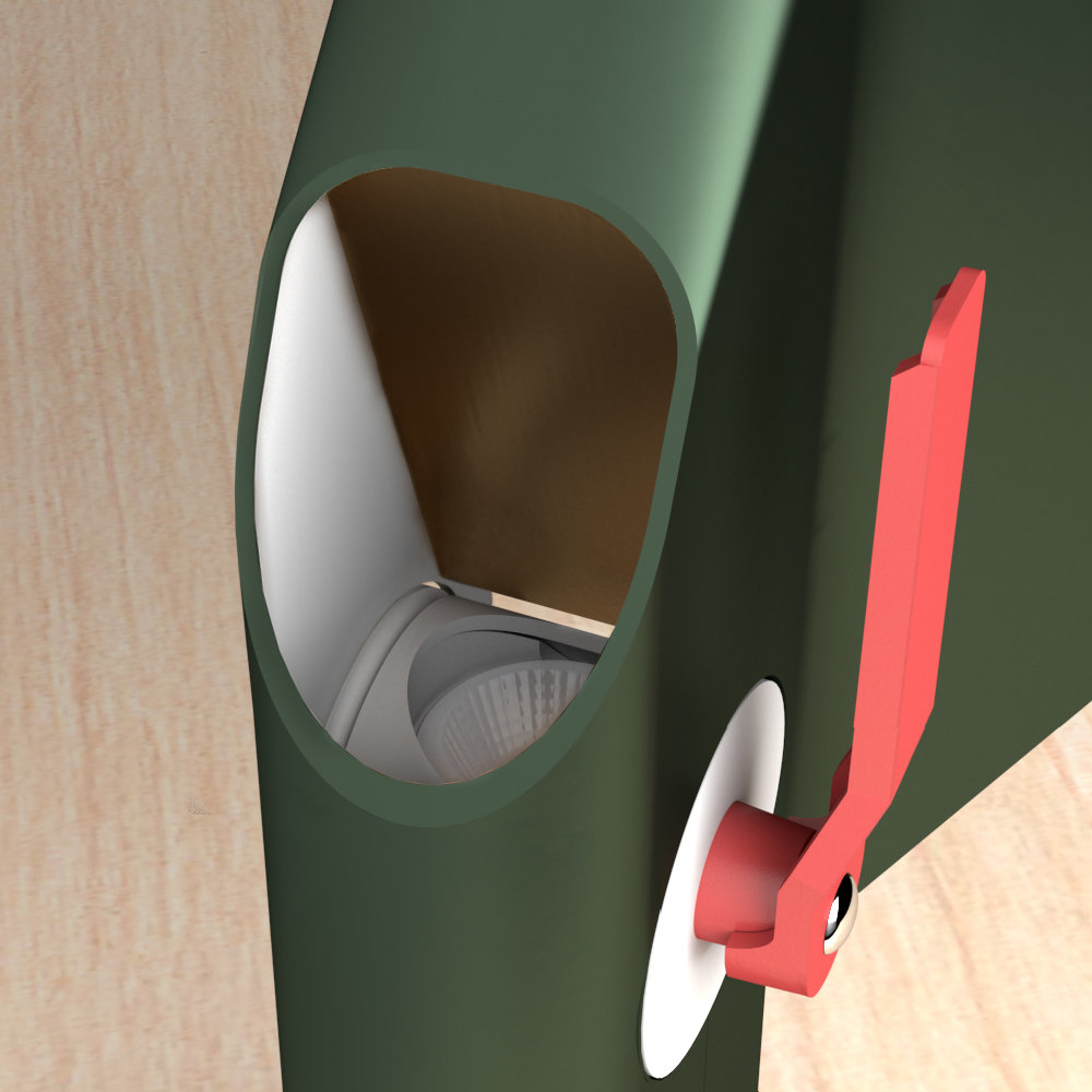
Objects are in chrome steel, Alessi's signature material. The range is designed using the same formal principle : the pinch of steel sheets. It brings strong consistency throughout the range while allowing the design of radically different shapes.
Technical parts are hidden inside. It is the case here with Filip. The LEDs will light up when the user approaches the mirror.
Cinna design contest
october 2019
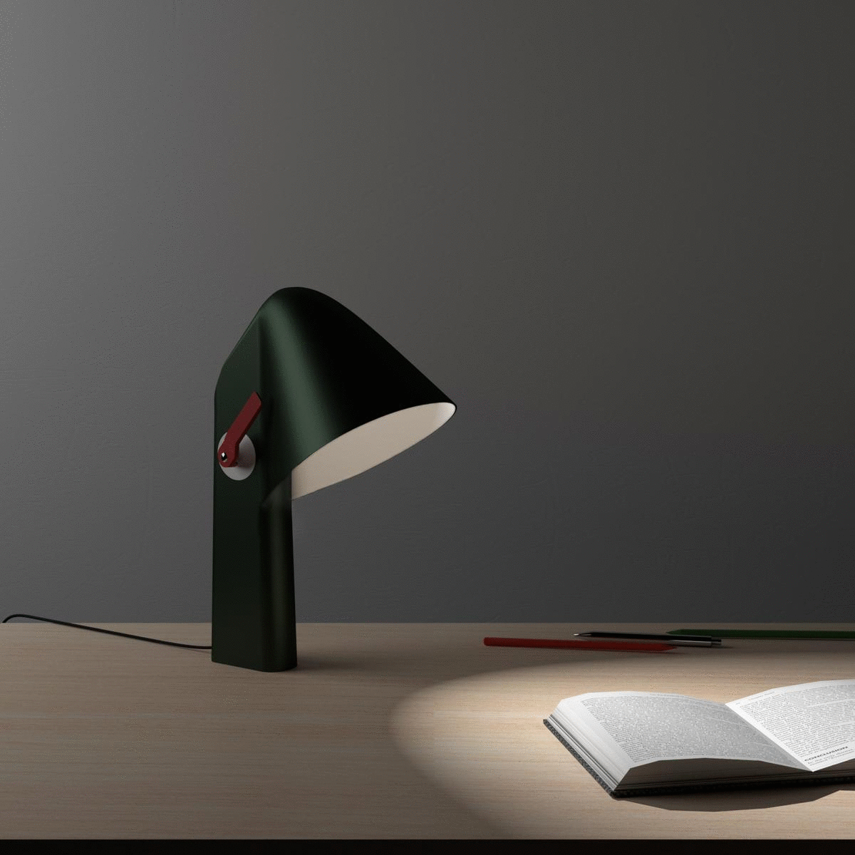
Handy desk lamp
For its 12th design contest, Cinna asked participants to design a lamp within the theme of mobility. As I investigated professional mobility, I realised that more and more people are now working from home. In this context, the desk is taking a bigger space inside the home. I wondered how to adapt this new dedicated space to working as well as times of relaxation.
Toucan is a desk lamp designed for this specific context. It is designed so that the user can manually adjust the position of the light bulb, and thus change the direction and quality of the light.
#Object #Interaction Design
Inspired by plumbing valves and control levers, the handle incites to manipulate the light. It is then directed toward one reflector or the other.
partnership with LETI (CEA's Lab)
in team with : Clémence Godinot,
Jana Darwich, et Sophie Portzert
june 2016
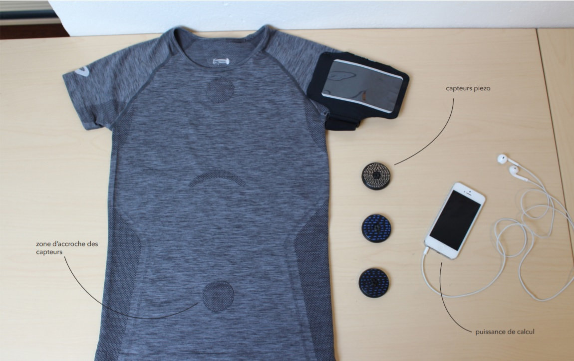
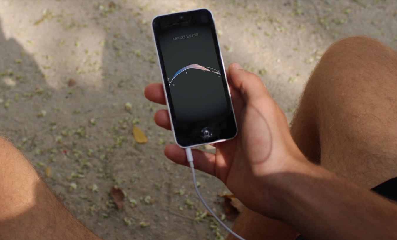
Quantified Self and running
This project arose from an investigation into Quantified Self tools and methodologies. We noticed that quantified self devices usually aim efficiency. In particular, this is true for sport accessories, even when it is designed for amateurs. But wouldn't this quantification be more useful if it was aimed at gauging our well being instead ?
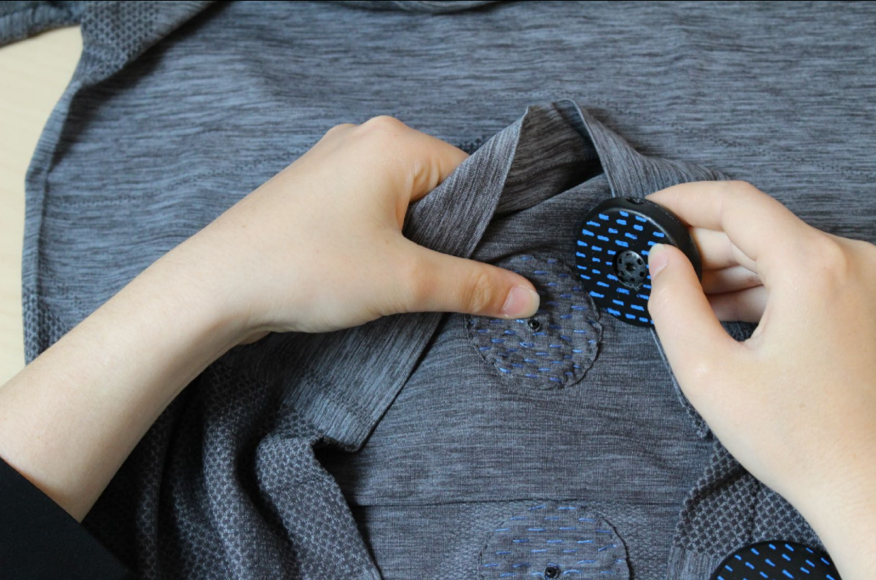
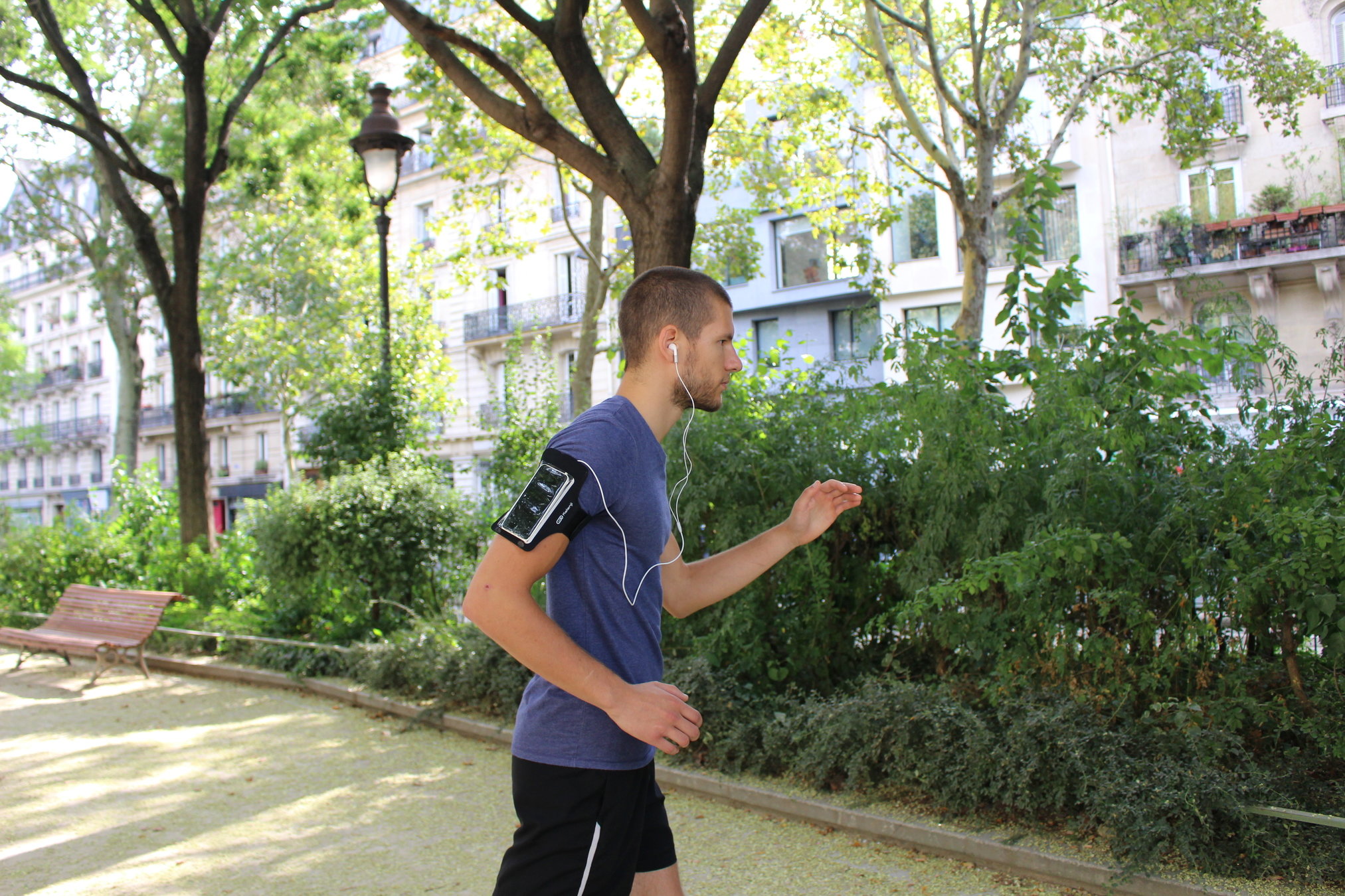
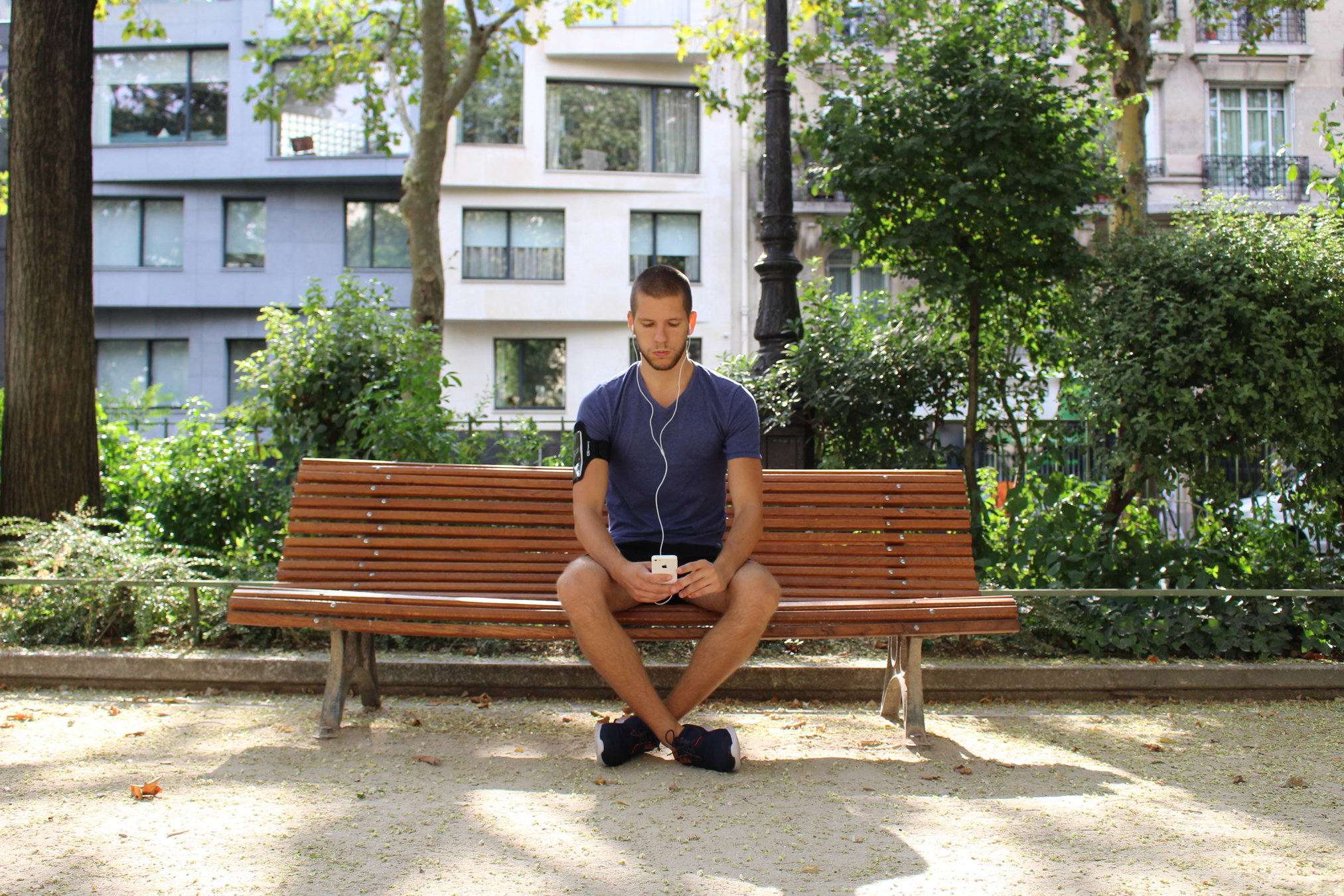
We investigated running, a sport most often practiced alone and without prior training. By meeting with runners and coaches we realized that correctly breathing while running is necessary but somewhat non-intuitive. This is why we designed Second Souffle, a training device that helps runners find their breathing rhythm.
#UX #UI
With the help of a sophrologist (a breathing specialist) that we designed a shirt able to detect the wearers breathing type and rhythm while running. Three captors are strategically placed on the torso to monitor the breathing. This data is then used by the app to assist the runner at three key moments.
Before the run, the app offers to practice meditation and breathing exercises.
After the run, the user can visualize how they were breathing during their last runs. They can also see how different songs interfered with their performances. It helps them sort out a playlist that will help them to breath correctly.
While running, the user listens to their usual playlist. If they are struggling to find their breath, a sound will appear and help them adjust their breathing rhythm.
visual research
color range and installations
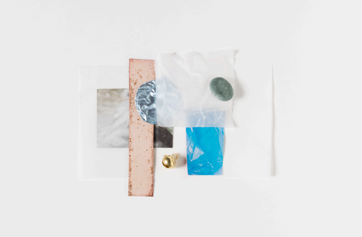
Visual research
Fascinated by blurry effects, I created a misty visual identity.
#Colors and materials
I started to work in 2D, piling up translucid and perforated sheets.
I then worked in volume, playing with deep field effects. Finally, putting filters in the room allowed me to blur people and their movements. I found it created a more contemplative atmosphere where every movement seems to slow down.
By Caroline Moureaux-Néry
(english version)
